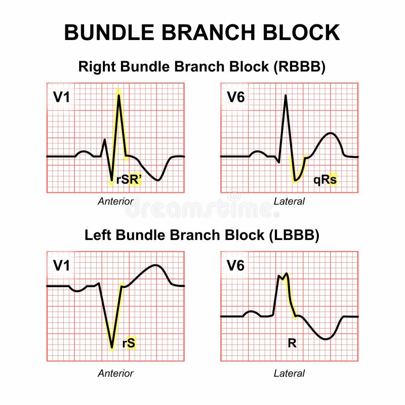
Free with trial Electrocardiogram (ECG) graphs illustrate the differences between right and left bundle branch blocks. The right bundle branch block (RBBB) shows V1 with an rSR' pattern and V6 with a qRs pattern. The left bundle branch block (LBBB) displays V1 with an rS pattern and V6 with an R pattern. Each graph is set on a grid with small and large squares, indicating time and amplitude intervals, essential for analyzing cardiac conduction abnormalities. Amplitude intervals vectors Bundle Branch Block (RBBB and LBBB). Electrocardiogram (ECG) graphs illustrate the differences between right and left bundle branch blocks. The right bundle branch block (RBBB) shows V1 with an rSR' pattern and V6 with a qRs pattern. The left bundle branch block (LBBB) displays V1 with an rS pattern and V6 with an R pattern. Each graph is set on a grid with small and large squares, indicating time and amplitude intervals, essential for analyzing cardiac conduction abnormalities.
Free with trial Position-time graphs are fundamental in physics and are used to analyze and describe the motion of objects in a quantitative manner. They are particularly useful for understanding concepts such as velocity, acceleration, and displacement over specific time intervals. Amplitude intervals vectors Position time graph. Position-time graphs are fundamental in physics and are used to analyze and describe the motion of objects in a quantitative manner. They are particularly useful for understanding concepts such as velocity, acceleration, and displacement over specific time intervals.
Free with trial The image shows a graphical representation of an audio waveform, characterized by a series of smooth, oscillating curves above and below a central axis. The waveform illustrates changes in amplitude over time, which is typical in visualizing sound signals. The peaks and troughs indicate the loudness and softness of the sound at different intervals, providing insight into the signal's frequency and. Amplitude intervals illustrations A waveform illustration depicting a sound signal with varying amplitude over time. The image shows a graphical representation of an audio waveform, characterized. The image shows a graphical representation of an audio waveform, characterized by a series of smooth, oscillating curves above and below a central axis. The waveform illustrates changes in amplitude over time, which is typical in visualizing sound signals. The peaks and troughs indicate the loudness and softness of the sound at different intervals, providing insight into the signal's frequency and
Free with trial An electrocardiogram (ECG) trace with a red line depicting the heartbeat pattern on a pink grid background. The waveform shows a regular series of peaks�P, QRS complex, and T waves�indicating electrical activity associated with the heart's contraction and relaxation phases. The grid helps quantify time intervals and amplitude, crucial for medical analysis. Amplitude intervals illustrations An electrocardiogram (ECG) trace with a red line depicting the heartbeat pattern on
Free with trial This image depicts a sound wave visualized in green against a dark background. The wave exhibits a prominent peak in the center, indicating a significant amplitude at that point. The vertical lines in red and green mark specific intervals or time frames within the sound wave. The overall visualization suggests an analysis of audio frequency and amplitude. Amplitude intervals illustrations Green sound wave analysis. This image depicts a sound wave visualized in green against a dark background. The wave exhibits a prominent peak in the center, indicating a significant amplitude at that point. The vertical lines in red and green mark specific intervals or time frames within the sound wave. The overall visualization suggests an analysis of audio frequency and amplitude
Free with trial This image depicts a 3D graphical representation of wave functions over time. The graph illustrates the evolution of wave patterns at different time intervals, specifically at t 1. 5 and t 2. The wave functions are visualized using a grid and mesh structure, showing how the amplitude and phase change over time. The image also includes mathematical symbols representing complex numbers and their. Amplitude intervals illustrations 3d graphical representation of wave functions over time
Free with trial Zoom zooming into an ekg line with high contrast style illustration waveform cardiology, heartbeat rhythm, spikes intervals zoom zooming into an ekg line with high contrast style. Amplitude intervals illustrations Zoom zooming into an ekg line with high contrast style
Free with trial A detailed illustration of an abstract sound wave, depicted with varying heights and intervals, creating a visual representation of audio frequency and amplitude. Amplitude intervals illustrations Abstract sound wave illustration. A detailed illustration of an abstract sound wave, depicted with varying heights and intervals, creating a visual representation of audio frequency and amplitude
Free with trial This image features an electrocardiogram (ECG) printout showing the electrical activity of the heart. The black waveform line traces heartbeats across a red grid background made of small squares, used to measure time intervals and amplitude. Peaks and troughs represent phases of the cardiac cycle. Ideal for visuals related to medical diagnostics, heart health, clinical monitoring, or educational materials on cardiovascular function and arrhythmia detection. Amplitude intervals illustrations Electrocardiogram waveform tracing heart activity on red grid background for diagnostics. This image features an electrocardiogram (ECG) printout showing the electrical activity of the heart. The black waveform line traces heartbeats across a red grid background made of small squares, used to measure time intervals and amplitude. Peaks and troughs represent phases of the cardiac cycle. Ideal for visuals related to medical diagnostics, heart health, clinical monitoring, or educational materials on cardiovascular function and arrhythmia detection.
Free with trial Electrocardiogram (ECG) waveform shows an irregular heartbeat pattern, depicted with red lines on a blue-lined grid paper. The waveform consists of unevenly spaced peaks and valleys, indicating variations in heart rhythm. The grid paper provides a standardized background for measuring time intervals and amplitude, essential for diagnosing cardiac conditions such as arrhythmias. Each grid square typically represents a specific time duration and voltage, aiding in precise analysis of the heart's electrical activity. Amplitude intervals vectors Irregular Heartbeat ECG Waveform on Grid Paper. Electrocardiogram (ECG) waveform shows an irregular heartbeat pattern, depicted with red lines on a blue-lined grid paper. The waveform consists of unevenly spaced peaks and valleys, indicating variations in heart rhythm. The grid paper provides a standardized background for measuring time intervals and amplitude, essential for diagnosing cardiac conditions such as arrhythmias. Each grid square typically represents a specific time duration and voltage, aiding in precise analysis of the heart's electrical activity.
Free with trial The image shows a waveform with a color gradient transitioning from dark purple to red. The waveform appears to represent audio signals, with each color segment likely indicating different frequencies or time intervals. The left side of the waveform has lower frequencies with larger amplitudes, transitioning to higher frequencies with smaller amplitudes as it moves to the right. The gradient. Amplitude intervals illustrations Color gradient waveform displaying audio frequency variations over time. The image shows a waveform with a color gradient transitioning from dark purple to red. The waveform appears to represent audio signals, with each color segment likely indicating different frequencies or time intervals. The left side of the waveform has lower frequencies with larger amplitudes, transitioning to higher frequencies with smaller amplitudes as it moves to the right. The gradient
Free with trial This image displays a series of waveforms with different frequencies and amplitudes, ranging from -40 to 40 units. The top row shows waveforms with consistent amplitudes but varying frequencies, while the bottom row depicts waveforms with constant frequency but different amplitudes. Each waveform is segmented into intervals, indicating a possible analysis of harmonic or periodic properties, likely. Amplitude intervals illustrations A visual representation of varying frequencies and amplitudes in a waveform diagram. This image displays a series of waveforms with different frequencies and amplitudes, ranging from -40 to 40 units. The top row shows waveforms with consistent amplitudes but varying frequencies, while the bottom row depicts waveforms with constant frequency but different amplitudes. Each waveform is segmented into intervals, indicating a possible analysis of harmonic or periodic properties, likely
Free with trial This image displays an electrocardiogram (ECG or EKG) strip featuring a series of heartbeats with noticeable irregularities. The tracing shows variations in the QRS complexes and intervals between beats, suggesting potential arrhythmia or abnormal heart rhythm. The red and pink lines highlight the electrical activity of the heart, with the pink line possibly indicating a reference or average beat. Amplitude intervals illustrations Electrocardiogram showing irregular heart rhythm patterns and potential arrhythmia. This image displays an electrocardiogram (ECG or EKG) strip featuring a series of heartbeats with noticeable irregularities. The tracing shows variations in the QRS complexes and intervals between beats, suggesting potential arrhythmia or abnormal heart rhythm. The red and pink lines highlight the electrical activity of the heart, with the pink line possibly indicating a reference or average beat
Free with trial Complex brainwave activity displayed in eeg graph. Amplitude intervals vectors Complex brainwave activity displayed in eeg graph
Free with trial Blue and orange lines represent market trends on a dynamic financial chart, highlighting fluctuations over time. The lines have sharp peaks and troughs, displayed on a dark background with grid lines indicating numerical values and time intervals. The blue line appears to rise sharply before a gradual decline, while the orange line follows a similar pattern but with variations in amplitude. This setup is typical for financial analysis reports, conveying information on market performance and aiding decision-making processes. Amplitude intervals illustrations Dynamic financial chart displaying market trends with blue and orange lines for business analysis reports. Blue and orange lines represent market trends on a dynamic financial chart, highlighting fluctuations over time. The lines have sharp peaks and troughs, displayed on a dark background with grid lines indicating numerical values and time intervals. The blue line appears to rise sharply before a gradual decline, while the orange line follows a similar pattern but with variations in amplitude. This setup is typical for financial analysis reports, conveying information on market performance and aiding decision-making processes.
Free with trial Vivid representation of frequency distribution demonstrates audio analysis with teal and red peaks over time, highlighting fluctuations in sound intensity. Amplitude intervals illustrations Colorful Frequency Distribution Chart Showing Audio Analysis With Peaks and Valleys Across Various Time Intervals. Vivid representation of frequency distribution demonstrates audio analysis with teal and red peaks over time, highlighting fluctuations in sound intensity.