Free with trial The image showcases a collection of visual representations of various business performance metrics, such as growth percentages, market shares, and financial gains. Each cube features different types of charts and graphs, including bar graphs, line graphs, pie charts, and target indicators, illustrating growth rates like 5%, 8%, 15%, and market share percentages. The visuals emphasize positive and. Decrease performance illustrations Diverse business performance metrics and growth indicators isolated on white background. The image showcases a collection of visual representations of various. The image showcases a collection of visual representations of various business performance metrics, such as growth percentages, market shares, and financial gains. Each cube features different types of charts and graphs, including bar graphs, line graphs, pie charts, and target indicators, illustrating growth rates like 5%, 8%, 15%, and market share percentages. The visuals emphasize positive and
Free with trial Chart bars down, icon in line design. Chart, bars, down, decrease, drop, decline, graph on white background vector. Chart bars down editable stroke icon. Decrease performance vectors Chart bars down, icon in line design. Chart, bars, down, decrease, drop, decline, graph on white background vector
Free with trial Cost meter RGB color icon. Money coin, price. Finance, economics. Increase and decrease arrows. Efficiency, performance. Isolated vector illustration. Simple filled line drawing. Editable stroke. Decrease performance vectors Cost meter RGB color icon
Free with trial The image displays an oval-shaped graphic with a yellow background and a red text in the center that reads '-10%'. This design is commonly used to indicate a discount, reduction, or decrease of ten percent in various contexts such as sales, pricing, or performance metrics. Decrease performance illustrations A visual representation of a ten percent discount or decrease highlighted in an oval shape. The image displays an oval-shaped graphic with a yellow background and a red text in the center that reads '-10%'. This design is commonly used to indicate a discount, reduction, or decrease of ten percent in various contexts such as sales, pricing, or performance metrics
Free with trial This image shows a financial chart comparing the performance of two data series, CONSEDATION and FUS, over a period of time. The chart includes percentage changes and error bars to indicate variability and uncertainty in the data. Decrease performance illustrations Financial performance comparison of consedation and fus over time with percentage changes. This image shows a financial chart comparing the performance of two data series, CONSEDATION and FUS, over a period of time. The chart includes percentage changes and error bars to indicate variability and uncertainty in the data
Free with trial A 3D app icon displays an alert for a website traffic decrease of -5. 2% with a red downward arrow. Decrease performance illustrations 3D App Icon Alerting to Website Traffic Decrease with Percentage Drop notification warning. A 3D app icon displays an alert for a website traffic decrease of -5.2% with a red downward arrow
Free with trial The image features a bold red zigzag arrow pointing downward, commonly used to symbolize a decline, decrease, or downward trend in various contexts such as economics, performance metrics, or data visualization. Decrease performance illustrations A downward zigzag arrow indicating a decline or reduction trend isolated on white background. The image features a bold red zigzag arrow pointing downward, commonly used to symbolize a decline, decrease, or downward trend in various contexts such as economics, performance metrics, or data visualization
Free with trial A 3D rendered blue arrow pointing downwards is adorned with a pink circular tag featuring a white percentage symbol. The graphic is isolated on a clean white background, symbolizing a decrease or reduction. Decrease performance illustrations Blue downward arrow with a pink percentage symbol tag on a white background decrease decline. A 3D rendered blue arrow pointing downwards is adorned with a pink circular tag featuring a white percentage symbol. The graphic is isolated on a clean white background, symbolizing a decrease or reduction
Free with trial The image displays a 3D bar chart comparing performance metrics between two distinct time periods labeled as 'Time Period 1' and 'Time Period 2'. The chart shows a significant decline in the metrics from Time Period 1 to Time Period 2, with an initial high value in Time Period 1 that progressively reduces across the categories. The bars are color-coded, with Time Period 1 having taller bars in. Decrease performance illustrations Comparison of performance metrics between two different time periods for project analysis. The image displays a 3D bar chart comparing performance metrics between two distinct time periods labeled as 'Time Period 1' and 'Time Period 2'. The chart shows a significant decline in the metrics from Time Period 1 to Time Period 2, with an initial high value in Time Period 1 that progressively reduces across the categories. The bars are color-coded, with Time Period 1 having taller bars in
Free with trial The image depicts a bar graph with blue bars that increase in height initially, then gradually decrease, symbolizing growth followed by decline. An upward-pointing arrow overlays the graph, indicating an overall upward trend or potential future growth despite the current decline in the bars' heights. This visual is often used in business, finance, and analytics to illustrate performance trends. Decrease performance illustrations Growth trend represented by increasing and then decreasing blue bar graph with upward arrow. The image depicts a bar graph with blue bars that increase in height initially, then gradually decrease, symbolizing growth followed by decline. An upward-pointing arrow overlays the graph, indicating an overall upward trend or potential future growth despite the current decline in the bars' heights. This visual is often used in business, finance, and analytics to illustrate performance trends
Free with trial The image shows two arrows, one red with a downward direction and a percentage symbol indicating a decrease, and another green with an upward direction and a percentage symbol indicating an increase. These visuals are commonly used to represent opposing trends, such as declines and rises in data like stock prices, economic indicators, or performance metrics. Decrease performance illustrations Opposing trends represented by percentage change indicators with upward and downward arrows. The image shows two arrows, one red with a downward direction and a percentage symbol indicating a decrease, and another green with an upward direction and a percentage symbol indicating an increase. These visuals are commonly used to represent opposing trends, such as declines and rises in data like stock prices, economic indicators, or performance metrics
Free with trial Downward trend graph on clipboard icon representing financial loss and negative market performance. Decrease performance vectors Downward trend graph on clipboard icon representing financial loss and negative market performance
Free with trial Financial planner analyzing declining savings performance using tablet with downward chart and piggy bank. Concept of financial risk, savings loss, economic downturn, personal finance challenge. Decrease performance illustrations Financial planner analyzing declining savings performance using tablet with downward chart and piggy bank. Concept of financial
Free with trial The image shows two arrows, one red pointing downward and the other green pointing upward, each accompanied by a percentage symbol. This visual metaphor typically represents a decrease and an increase in percentage values, respectively. Such symbols are often used in financial, statistical, or performance contexts to indicate trends or changes over time. Decrease performance illustrations Visual representation of increasing and decreasing percentage trends with directional arrows. The image shows two arrows, one red pointing downward and the other green pointing upward, each accompanied by a percentage symbol. This visual metaphor typically represents a decrease and an increase in percentage values, respectively. Such symbols are often used in financial, statistical, or performance contexts to indicate trends or changes over time
Free with trial This image depicts a canvas with an easel showing a bar and line graph combination illustrating a downward trend. The bars start high and gradually decline, while the line graph also trends downward, indicating a decrease in values. Such visuals are often used in business to represent declining sales, market performance, or economic downturns over time. Decrease performance illustrations Visual Representation Of Declining Trends In Business Performance And Market Analysis. This image depicts a canvas with an easel showing a bar and line graph combination illustrating a downward trend. The bars start high and gradually decline, while the line graph also trends downward, indicating a decrease in values. Such visuals are often used in business to represent declining sales, market performance, or economic downturns over time
Free with trial Green arrow showing a downward trend in a dark hallway. Concept of business decline or falling performance in an organization or education. Decrease performance illustrations Green arrow showing a downward trend in a dark hallway. Concept of business decline or falling performance
Free with trial Iconographic display of economic downturn and business challenges. A black bar graph accompanied by a descending arrow, representing loss, decrease, and negative market trends. Useful for financial reports and risk analysis. Decrease performance illustrations Black bar chart with downward arrow signifying financial decline and negative market performance. Iconographic display of economic downturn and business challenges. A black bar graph accompanied by a descending arrow, representing loss, decrease, and negative market trends. Useful for financial reports and risk analysis
Free with trial Oil industry performance represented with weather icons above graph and barrels below, in a simple, clean and modern graphic style. Decrease performance vectors Infographic Showing Oil Industry Performance with Weather Elements and Economic Indicators. Oil industry performance represented with weather icons above graph and barrels below, in a simple, clean and modern graphic style.
Free with trial This image depicts a circular gauge showing a sixty percent reduction, indicated by the minus sixty percent symbol. Such visuals are often used in data analytics, financial reports, or performance tracking to illustrate declines in metrics like sales, resources, or efficiency. The gauge design emphasizes the negative change, making it clear and visually impactful for quick interpretation by. Decrease performance illustrations Understanding the representation of a sixty percent decrease in a visual gauge or progress indicator. This image depicts a circular gauge showing a sixty percent reduction, indicated by the minus sixty percent symbol. Such visuals are often used in data analytics, financial reports, or performance tracking to illustrate declines in metrics like sales, resources, or efficiency. The gauge design emphasizes the negative change, making it clear and visually impactful for quick interpretation by
Free with trial A businessman points to a digital interface displaying glowing neon icons and text related to vendor performance metrics and business growth. Decrease performance illustrations Businessman points to vendor performance metrics on screen. A businessman points to a digital interface displaying glowing neon icons and text related to vendor performance metrics and business growth
Free with trial PNG 3D Bar Chart Data Visualization Business Analytics Performance Metrics Colorful Graph against transparent Background. Decrease performance illustrations PNG 3D Bar Chart Data Visualization Business Analytics Performance Metrics Colorful Graph against transparent Background
Free with trial Business Concept of Quality and Cost Management with Graphs Showing Increase and Decrease Percentages in Professional Setting. Qubit. Decrease performance illustrations Business Concept of Quality and Cost Management with Graphs Showing Increase and Decrease Percentages in Professional
Free with trial This cartoon character holding a large red arrow pointing down represents the concept of decline or decrease. The character's sad expression and downward posture suggest a negative trend or loss in value. This image could be used to illustrate a variety of topics, such as declining sales, decreasing market share, or a drop in performance. The bold red arrow draws the viewer's attention and emphasizes the seriousness of the situation. Overall, this image effectively conveys the message of decline and can be a valuable asset in visual communication. Decrease performance illustrations Cartoon Character Holding Large Red Arrow Pointing Down - Concept of Decline or Decrease. This cartoon character holding a large red arrow pointing down represents the concept of decline or decrease. The character's sad expression and downward posture suggest a negative trend or loss in value. This image could be used to illustrate a variety of topics, such as declining sales, decreasing market share, or a drop in performance. The bold red arrow draws the viewer's attention and emphasizes the seriousness of the situation. Overall, this image effectively conveys the message of decline and can be a valuable asset in visual communication.
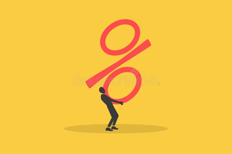
Free with trial Businessman lifting up percentage sign. concept of Inflation or interest rate falling down, decrease, profit fall in economic recession. Decrease performance vectors Businessman lifting up percentage sign. concept of Inflation or interest rate falling down, decrease, profit fall in economic
Free with trial 3d man analyzing bar chart, a visual representation of growth, business performance, and investment strategy ,Generative ai. Decrease performance illustrations 3d man analyzing bar chart, a visual representation of growth, business performance, and investment strategy
Free with trial A flat icon of a bar chart with a downward arrow and a dollar symbol, representing financial loss, market decline, decreased revenue, negative performance, economic downturns, and investment risks in business environments. Decrease performance vectors Declining financial chart icon with downward arrow showing loss decrease and negative dollar trend. A flat icon of a bar chart with a downward arrow and a dollar symbol, representing financial loss, market decline, decreased revenue, negative performance, economic downturns, and investment risks in business environments.
Free with trial Line art business graphs set featuring financial growth and decline with dollar signs for economic performance. Decrease performance vectors Line art business graphs set featuring financial growth and decline with dollar signs for economic performance
Free with trial Stylized vector graphic featuring an upward arrow and percentage sign, connected by lines, demonstrating rising performance and decreasing rates against a dark background. Decrease performance vectors Rising Performance and Decreasing Costs: Stylized Arrow and Percentage Icons Illustrating Financial Trends. Stylized vector graphic featuring an upward arrow and percentage sign, connected by lines, demonstrating rising performance and decreasing rates against a dark background.
Free with trial This image depicts a bold red zigzag arrow pointing downward, enclosed within a circular outline. The downward direction of the arrow suggests a trend of decline, reduction, or decrease, often used in contexts such as financial markets, performance metrics, or general downward trends. The circular boundary emphasizes containment or focus on the downward movement itself. Decrease performance illustrations Downward zigzag arrow inside a circular boundary indicating decline or reduction isolated on white background. This image depicts a bold red zigzag arrow pointing downward, enclosed within a circular outline. The downward direction of the arrow suggests a trend of decline, reduction, or decrease, often used in contexts such as financial markets, performance metrics, or general downward trends. The circular boundary emphasizes containment or focus on the downward movement itself
Free with trial Three dimensional blue arrows and plus sign representing growth, progress, increase, decrease, statistics, data analysis, business, finance, charts, and trends. Decrease performance vectors Three dimensional blue arrows and plus sign symbolizing growth progress increase decrease statistics data analysis. Three dimensional blue arrows and plus sign representing growth, progress, increase, decrease, statistics, data analysis, business, finance, charts, and trends
Free with trial A close-up shot shows a businessman in a suit using a marker to draw a sharp downward trend line over a bar graph, symbolizing significant cost reduction and a decrease in percentage. Decrease performance illustrations Businessman drawing a downward trend graph indicating cost reduction and percentage decrease with a marker background image. A close-up shot shows a businessman in a suit using a marker to draw a sharp downward trend line over a bar graph, symbolizing significant cost reduction and a decrease in percentage
Free with trial This image shows a colorful bar graph with a downward trend line, symbolizing decline, loss, or negative performance in a business or financial context on a white background. Decrease performance vectors Vector art of colorful bar graph with downward trend line, depicting decline, loss, or negative performance in business or. This image shows a colorful bar graph with a downward trend line, symbolizing decline, loss, or negative performance in a business or financial context on a white background
Free with trial Golden coin stacks decrease in height. Red arrow shows downward trend. Financial loss and economic downturn illustration. Minimalist design depicts, budget cut. Decrease performance illustrations Golden coin stacks decrease in height. Red arrow shows downward trend. Financial loss and economic downturn illustration.
Free with trial Minus 5 percent decrease red arrow. Plus 10 percent increase green arrow. Economic indicators. Financial statistics. Business performance. Market fluctuations shown. Decrease performance illustrations Red down arrow with minus 5 percent and green up arrow with plus 10 percent on white background. Minus 5 percent decrease red arrow. Plus 10 percent increase green arrow. Economic indicators. Financial statistics. Business performance. Market fluctuations shown
Free with trial The image showcases a collection of 3D graphical elements representing different business and market performance metrics. It includes growth percentages, market share gains, pie charts, bar graphs, and target indicators. Each element highlights positive and negative trends, market shares, and growth rates, useful for illustrating financial reports, business presentations, or performance analyses. Decrease performance illustrations Visual representation of various business performance metrics and market growth indicators isolated on white background. The image showcases a collection of 3D graphical elements representing different business and market performance metrics. It includes growth percentages, market share gains, pie charts, bar graphs, and target indicators. Each element highlights positive and negative trends, market shares, and growth rates, useful for illustrating financial reports, business presentations, or performance analyses.
Free with trial Decrease and increase arrows. Red down arrow and green up arrow side by side. Business growth and decline concept. Financial trends represented. Market fluctuation. Decrease performance illustrations Red down arrow and green up arrow symbolizing decrease and increase on white background. Decrease and increase arrows. Red down arrow and green up arrow side by side. Business growth and decline concept. Financial trends represented. Market fluctuation
Free with trial The image showcases a collection of 3D graphical elements representing different business and market performance metrics. It includes growth percentages, market share gains, pie charts, bar graphs, and target indicators. Each element highlights positive and negative trends, market shares, and growth rates, useful for illustrating financial reports, business presentations, or performance analyses. Decrease performance illustrations Visual representation of various business performance metrics and market growth indicators isolated on white background. The image showcases a collection of 3D graphical elements representing different business and market performance metrics. It includes growth percentages, market share gains, pie charts, bar graphs, and target indicators. Each element highlights positive and negative trends, market shares, and growth rates, useful for illustrating financial reports, business presentations, or performance analyses.
Free with trial This image showcases a businessman illustrating the concept of cost reduction and profit growth holding graphic elements that represent financial data analysis market performance and strategic planning The composition suggests a focus on improving business outcomes through careful financial management and investment decisions leading to increased profitability and overall success in competitive. Decrease performance illustrations Cost reduction and profit growth strategy depicted by businessman with graphic elements indicating financial performance and. This image showcases a businessman illustrating the concept of cost reduction and profit growth holding graphic elements that represent financial data analysis market performance and strategic planning The composition suggests a focus on improving business outcomes through careful financial management and investment decisions leading to increased profitability and overall success in competitive
Free with trial Decreasing Bar Chart with Arrow: Economic Decline Visualization, Business Graph, Financial Performance Overview, Downward Trend Graphic. Decrease performance vectors Decreasing Bar Chart with Arrow: Economic Decline Visualization, Business Graph, Financial Performance Overview, Downward Trend
Free with trial Exponential Decay Curve Graph, icon in line design. Exponential, decay, curve, graph, decrease, decline, reduction on white background vector. Exponential Decay Curve Graph editable stroke icon. Decrease performance vectors Exponential Decay Curve Graph, icon in line design. Exponential, decay, curve, graph, decrease, decline, reduction on
Free with trial This image displays financial performance indicators, highlighting data trends and market volatility. It represents economic analysis and strategic decision-making processes. Decrease performance vectors Vector art of financial performance indicators, showcasing data trends, market volatility, and economic analysis for strategic. This image displays financial performance indicators, highlighting data trends and market volatility. It represents economic analysis and strategic decision-making processes
Free with trial Illustration of business downfall with a declining bar chart, downward arrow indicating decrease, and silhouette icons of people representing workforce or customer loss, signifying reduction. Decrease performance illustrations Bar chart with downward arrow and people icons showing decline in workforce or sales decrease business downfall illustration. Illustration of business downfall with a declining bar chart, downward arrow indicating decrease, and silhouette icons of people representing workforce or customer loss, signifying reduction
Free with trial Red arrow with "DECREASE" text pointing down alongside stacks of gold coins. Symbolizes financial downturn, economic challenges, and declining investment returns. Business slump. Decrease performance illustrations Red arrow with Decrease text pointing down with stacks of gold coins financial downturn. Red arrow with "DECREASE" text pointing down alongside stacks of gold coins. Symbolizes financial downturn, economic challenges, and declining investment returns. Business slump
Free with trial Graphic representation of declining business. Bar chart shows falling trend. Arrow points downwards. Silhouettes of people signify workforce reduction. Concept for economic downturn, negative growth, or company challenges. Decrease performance illustrations Declining bar chart with downward arrow and silhouettes of people representing decrease in workforce or business performance loss. Graphic representation of declining business. Bar chart shows falling trend. Arrow points downwards. Silhouettes of people signify workforce reduction. Concept for economic downturn, negative growth, or company challenges
Free with trial Red percent decrease arrow and green percent increase arrow. Interest rates inflation economy concept. Up and down arrows for financial market change. Price decrease increase symbol. Decrease performance illustrations Red percent decrease arrow and green percent increase arrow represent interest rates inflation economy. Red percent decrease arrow and green percent increase arrow. Interest rates inflation economy concept. Up and down arrows for financial market change. Price decrease increase symbol
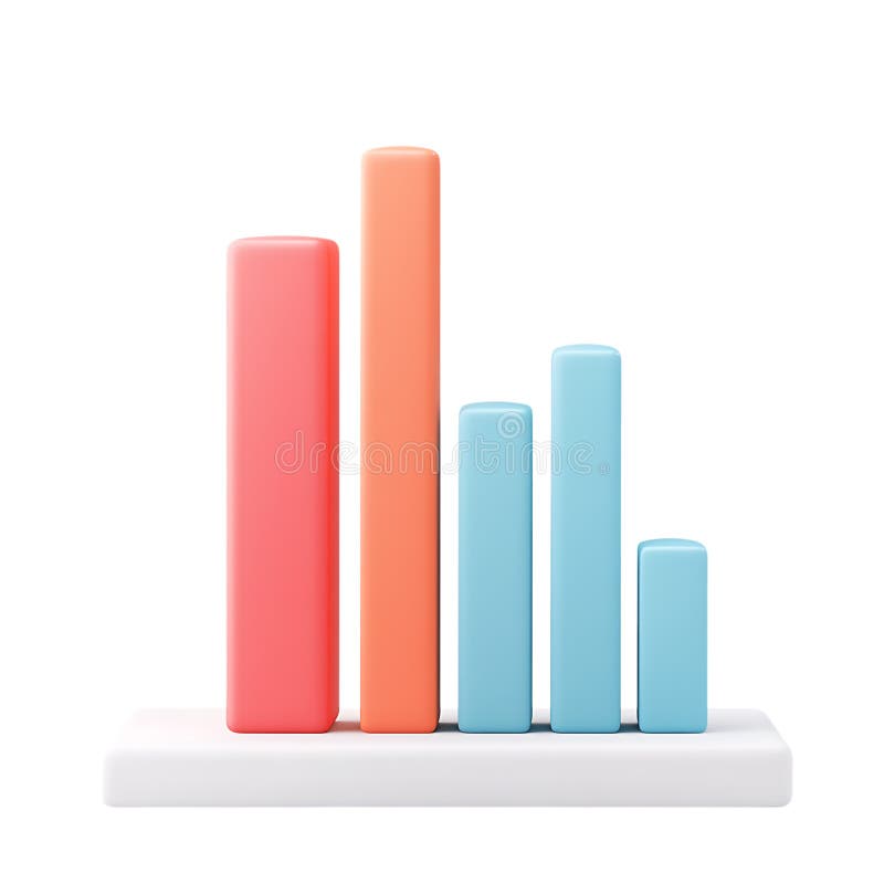
Free with trial Colorful bar charts are presenting statistical trends and business performance data across different time periods. Possibly days of the week. Using a vibrant color scheme of blue. Purple. And orange. Decrease performance illustrations Colorful bar charts are presenting statistical trends and business performance data across different time periods
Free with trial A clean, minimalist bar chart displays a gradual decline in financial performance, with rising bars depicted in soft blue against a serene teal background. Decrease performance illustrations Minimalist financial bar chart illustrating gradual decline in economic performance. A clean, minimalist bar chart displays a gradual decline in financial performance, with rising bars depicted in soft blue against a serene teal background.
Free with trial This image features a conceptual bar graph, illustrating contrasting trends of growth and decline in business performance, ideal for data analysis presentations. Decrease performance illustrations Growth and Decline: Conceptual Bar Graph Illustrating Positive and Negative Trends in Business Performance Data Visualization. This image features a conceptual bar graph, illustrating contrasting trends of growth and decline in business performance, ideal for data analysis presentations
Free with trial This image features colorful 3D bar graphs representing both growth and decline trends, ideal for business analytics and financial performance visualizations. Decrease performance illustrations Colorful 3D Bar Graphs Displaying Growth and Decline Trends in Business Analytics and Financial Performance on a Clean White. This image features colorful 3D bar graphs representing both growth and decline trends, ideal for business analytics and financial performance visualizations
Free with trial Statistic graph progress, financial profit growth, increase, and decrease line icons set. Infographic charts with arrows, circles, and bars thin black outline symbols vector illustration. Decrease performance vectors Statistic graph progress, financial profit growth, increase and decrease line icons set. Statistic graph progress, financial profit growth, increase, and decrease line icons set. Infographic charts with arrows, circles, and bars thin black outline symbols vector illustration.
Free with trial Man in blue shirt analyzing colorful bar chart, business performance review and data analysis,Generative AI. Decrease performance illustrations Man in blue shirt analyzing colorful bar chart, business performance review and data analysis
Free with trial This vibrant illustration features colorful bar graphs that visualize business growth and performance metrics, ideal for presentations, reports, and analysis. Decrease performance illustrations Colorful Bar Graphs Representing Business Growth and Performance Metrics in Vibrant Tones of Red, Orange, Yellow, White, and Green. This vibrant illustration features colorful bar graphs that visualize business growth and performance metrics, ideal for presentations, reports, and analysis
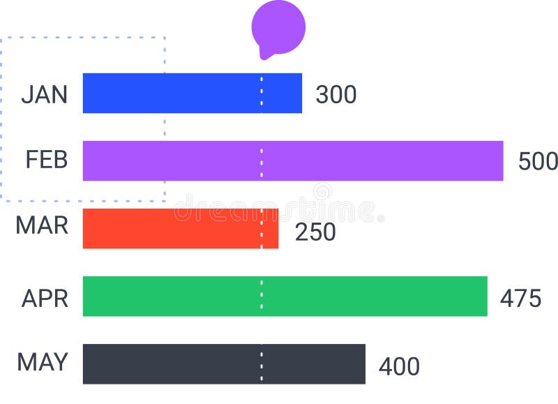
Free with trial Colorful horizontal bar chart is displaying monthly statistics from january to may, indicating trends and performance with a speech bubble above. Decrease performance vectors Colorful horizontal bar chart is displaying monthly statistics from january to may, indicating trends and performance
Free with trial Colorful horizontal bar chart is displaying monthly statistics from january to may, indicating trends and performance with a speech bubble above. Decrease performance vectors Colorful horizontal bar chart is displaying monthly statistics from january to may, indicating trends and performance
Free with trial Businessman analyzes financial data on digital tablet. Graphs, charts display performance, cost reduction. Modern business strategy project management concepts in focus. Data analysis. Decrease performance illustrations Businessman analyzes financial data on digital tablet. Graphs, charts display performance, cost reduction. Modern business
Free with trial The sales target schedule displays flat trends alongside varying performance metrics in a colorful chart Sales target schedule is trending flat. Decrease performance vectors The sales target schedule displays flat trends alongside varying performance metrics in a colorful chart Sales target schedule is
Free with trial Close-up of a fluctuating red graph line on a digital screen, symbolizing market trends and financial performance, Generative AI. Decrease performance illustrations Close-up of a fluctuating red graph line on a digital screen, symbolizing market trends and financial performance
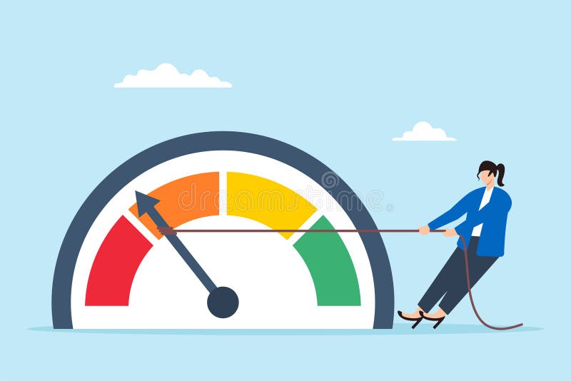
Free with trial Flat illustration of businesswoman pull meter down reducing risk level red alert to green reduce stress decrease anxiety or danger indicator. Decrease performance illustrations Flat illustration of businesswoman pull meter down reducing risk level red alert to green reduce stress decrease anxiety or danger
Free with trial Rating and green and red arrows on buttons of remote control. Selecting a service level. Increase or decrease in product quality. Customer experience concept. 3d render. Decrease performance illustrations Rating and green and red arrows on buttons of remote control. Selecting a service level. Increase or decrease in product quality
Free with trial Downward trend line color icon. Statistical chart, metric analysis. Performance decrease, data visualization. Isolated vector illustration. Flat colorful symbol design. Editable stroke. Decrease performance vectors Downward trend line color icon
Free with trial A dynamic 3D illustration of a glossy red arrow pointing downwards in a jagged, volatile path. Isolated on a white background, this graphic icon is a powerful symbol for negative concepts. It represents decline, decrease, failure, loss, and crisis. This visual is perfect for illustrating stock market crashes, economic recession, financial downturns, poor business performance, or any downward trend in data and statistics. An ideal element for reports, presentations, and financial news, with ample copy space. Decrease performance illustrations Red Jagged Arrow of Decline - Financial Crisis Concept. A dynamic 3D illustration of a glossy red arrow pointing downwards in a jagged, volatile path. Isolated on a white background, this graphic icon is a powerful symbol for negative concepts. It represents decline, decrease, failure, loss, and crisis. This visual is perfect for illustrating stock market crashes, economic recession, financial downturns, poor business performance, or any downward trend in data and statistics. An ideal element for reports, presentations, and financial news, with ample copy space.
Free with trial Candlestick chart showing a series of red and green bars representing price fluctuations over time. Each rectangular bar displays financial data, with green indicating an increase and red indicating a decrease. Thin vertical lines extend above and below the bars, illustrating price range. Numerical values such as 20. 800 and 213. 500 label specific points on the chart, judging stock or currency performance. Horizontal lines suggest moving averages, highlighting trends in the data. Decrease performance illustrations Candlestick chart showing a series of red and green bars representing price
Free with trial Word ranking near decrease graph. 3d render. Decrease performance illustrations Word ranking near decrease graph
Free with trial Efficiency of cost optimization strategy, effective business plan of price decrease, investment. Tiny people control needle of speedometer dial to make minimum cost cartoon vector illustration. Decrease performance vectors Efficiency of cost optimization strategy, effective plan of price decrease of tiny people. Efficiency of cost optimization strategy, effective business plan of price decrease, investment. Tiny people control needle of speedometer dial to make minimum cost cartoon vector illustration
Free with trial The image shows a neon-style graph illustrating a business downturn. the graph features an orange line depicting a downward trend, punctuated by blue vertical lines that may represent key milestones or events. the background is dark, emphasizing the neon glow of the graph elements. the graph suggests a decline in business performance, with the orange line representing a decrease in value or profit over time. Decrease performance illustrations Business downturn neon chart illustration. the image shows a neon-style graph illustrating a business downturn. the graph features an orange line depicting a downward trend, punctuated by blue vertical lines that may represent key milestones or events. the background is dark, emphasizing the neon glow of the graph elements. the graph suggests a decline in business performance, with the orange line representing a decrease in value or profit over time.
Free with trial A minimalist white 3D bar graph illustrates a significant downward trend. The bars decrease in height from left to right, connected by a dashed line that forms a descending path, culminating in an arrow pointing downwards. The graphic is rendered in an isometric perspective on a white background, representing decline, loss, or negative performance. Decrease performance illustrations White 3D Bar Graph Showing a Downward Trend chart decline. A minimalist white 3D bar graph illustrates a significant downward trend. The bars decrease in height from left to right, connected by a dashed line that forms a descending path, culminating in an arrow pointing downwards. The graphic is rendered in an isometric perspective on a white background, representing decline, loss, or negative performance
Free with trial A simple and modern black silhouette icon of a business graph, isolated on a white background. This flat vector illustration combines a bar chart with an overlaid line graph, showing a fluctuating trend with a general decline. The graphic symbolizes concepts such as data analysis, financial reporting, market statistics, economic downturn, and business performance metrics. It's an ideal visual element for presentations, infographics, websites, and applications related to finance, economics, and analytics, representing concepts of decrease, loss, or market volatility. Decrease performance vectors Business Data Analytics Chart Icon. A simple and modern black silhouette icon of a business graph, isolated on a white background. This flat vector illustration combines a bar chart with an overlaid line graph, showing a fluctuating trend with a general decline. The graphic symbolizes concepts such as data analysis, financial reporting, market statistics, economic downturn, and business performance metrics. It's an ideal visual element for presentations, infographics, websites, and applications related to finance, economics, and analytics, representing concepts of decrease, loss, or market volatility.
Free with trial This image shows a whiteboard displaying a bar graph with a downward trend, generated by AI. The graph illustrates a clear decline in performance over time, potentially indicating financial losses or market setbacks. The simple, clean presentation highlights the severity of the decrease. Decrease performance illustrations Declining Business Graph. This image shows a whiteboard displaying a bar graph with a downward trend, generated by AI. The graph illustrates a clear decline in performance over time, potentially indicating financial losses or market setbacks. The simple, clean presentation highlights the severity of the decrease.
Free with trial A colored outline vector icon of a line graph showing a downward trend, indicating a decrease or decline. Represents financial trends, statistics, losses, or negative performance. Useful for finance, business reports, or data visualization showing reduction. Illustrates a declining value over time, vector design Generative AI. Decrease performance vectors Decreasing Trend Stock Market Graph Vector, vector design Generative AI. A colored outline vector icon of a line graph showing a downward trend, indicating a decrease or decline. Represents financial trends, statistics, losses, or negative performance. Useful for finance, business reports, or data visualization showing reduction. Illustrates a declining value over time, vector design Generative AI
Free with trial Color megaphone icon with word decrease in white banner on blue background. Decrease performance vectors Color megaphone with word decrease in white banner on blue background
Free with trial Long, three dimensional arrow pointing downwards, symbolizing a decrease or decline. Decrease performance illustrations Isometric arrow pointing down representing decrease. Long, three dimensional arrow pointing downwards, symbolizing a decrease or decline
Free with trial Decrease glowing style sales graph split illustration profit revenue, analysis forecast, growth decline decrease glowing style sales graph split. Decrease performance illustrations Decrease glowing style sales graph split
Free with trial A sharp downward-pointing arrow, symbolizing decline, decrease, or negative trend. Ideal for financial charts, market downturns, and challenging situations. Represents reduction and negative performance, perfect for business analytics or economic reports, vector design Generative AI. Decrease performance vectors Downward Trend Arrow Financial Decline, vector design Generative AI. A sharp downward-pointing arrow, symbolizing decline, decrease, or negative trend. Ideal for financial charts, market downturns, and challenging situations. Represents reduction and negative performance, perfect for business analytics or economic reports, vector design Generative AI
Free with trial Colourful decrease arrow chart icon template. Business icon. Decrease performance vectors Colourful decrease arrow chart icon template
Free with trial An outline vector icon of a line graph showing a sharp decline, symbolizing falling stock prices or negative market performance. Represents financial downturns, losses, or economic decline. Useful for finance, business analysis, or reporting on market volatility. Emphasizes a significant decrease, vector design Generative AI. Decrease performance vectors Falling Stock Market Graph Vector Outline Icon, vector design Generative AI. An outline vector icon of a line graph showing a sharp decline, symbolizing falling stock prices or negative market performance. Represents financial downturns, losses, or economic decline. Useful for finance, business analysis, or reporting on market volatility. Emphasizes a significant decrease, vector design Generative AI
Free with trial A hand in a black suit sleeve points downward against a red background. The hand is prominently featured in the foreground, emphasizing direction. Behind it, a red zigzag line graph with an arrow points downward, symbolizing decline or reduction. The red background accentuates the theme of loss or decrease, commonly associated with financial or performance downturns. The image combines elements of business attire with graphical data representation, conveying a message of falling trends or negative outcomes. Decrease performance illustrations A hand in a black suit sleeve points downward against a red background. The hand
Free with trial Decrease isolated on transparent background. Decrease performance illustrations Decrease on transparent background. Decrease isolated on transparent background
Free with trial An icon of a line graph showing a downward trend, symbolizing decline, decrease, or negative performance. Ideal for financial reports, market analysis, and economic downturns. Represents challenges and reduction, perfect for business analytics and reports, vector design Generative AI. Decrease performance vectors Downward Trend Graph Icon for Business Decline, vector design Generative AI. An icon of a line graph showing a downward trend, symbolizing decline, decrease, or negative performance. Ideal for financial reports, market analysis, and economic downturns. Represents challenges and reduction, perfect for business analytics and reports, vector design Generative AI
Free with trial A minimal style of a red down graph of the financial crisis, economic downturn, inflation, recession, failure, bankruptcy, and crisis concept. A businessman pushes a decrease business chart diagram. Decrease performance vectors A businessman pushes a decrease business chart diagram
Free with trial A minimal style of a red down graph of the financial crisis, economic downturn, inflation, recession, failure, bankruptcy, and crisis concept. A businessman push up a decrease business chart diagram. Decrease performance vectors A businessman push up a decrease business chart diagram