Free with trial A 3D rendered blue starburst shape with sharp points features a white percentage sign and two white dots in its center. The icon is presented against a clean, light gray background, casting a subtle shadow. This graphic element is suitable for representing discounts, sales, or special offers in marketing and commerce. Decrease price illustrations Blue Starburst Percentage Sign Icon With White Dots On A Light Gray Background discount. A 3D rendered blue starburst shape with sharp points features a white percentage sign and two white dots in its center. The icon is presented against a clean, light gray background, casting a subtle shadow. This graphic element is suitable for representing discounts, sales, or special offers in marketing and commerce
Free with trial Illustration of up and down percentage arrow line icon. Percentage arrow with percent sign. Design concept for banking, credit, interest rates, finance and financial fields. isolated white background. Decrease price illustrations Illustration of up and down percentage arrow line icon.
Free with trial Illustration of up and down percentage arrow line icon. Percentage arrow with percent sign. Design concept for banking, credit, interest rates, finance and financial fields. isolated white background. Decrease price illustrations Illustration of up and down percentage arrow line icon.
Free with trial European Union - dropping fuel prices concept - 3D illustration. Decrease price illustrations European Union - dropping fuel prices concept
Free with trial United Kingdom - dropping fuel prices concept - 3D illustration. Decrease price illustrations United Kingdom - dropping fuel prices concept
Free with trial Percent growth and decline arrow icon vector. Up and down percentage arrows sign symbol. Decrease price vectors Percent growth and decline arrow icon. Up and down percentage arrows sign symbol
Free with trial Papua New Guinea - dropping fuel prices concept - 3D illustration. Decrease price illustrations Papua New Guinea - dropping fuel prices concept
Free with trial Equatorial Guinea - dropping fuel prices concept - 3D illustration. Decrease price illustrations Equatorial Guinea - dropping fuel prices concept
Free with trial Red graph shows plummeting house prices scattered coins coin scatter investment strategy Vector illustration. Decrease price illustrations Red graph shows plummeting house prices; scattered coins , coin scatter, investment strategy. Red graph shows plummeting house prices scattered coins coin scatter investment strategy Vector illustration.
Free with trial Up and down percent arrow icon vector. Percentage growth and decline arrows sign symbol. Decrease price vectors Up and down percent arrow icon. Percentage growth and decline arrows sign symbol
Free with trial Deficit outline icon in white and black colors. deficit flat vector icon from business collection for web, mobile apps and ui. Decrease price vectors Deficit outline icon in white and black colors. deficit flat vector icon from business collection for web, mobile apps and ui
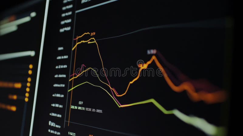
Free with trial Financial chart displaying a series of candlestick patterns on a digital screen, used for stock data analysis. The chart features vertical bars in orange against a blue background with grid lines. Each candlestick represents price movements within a specific time frame, showcasing market trends. The background includes a blurred assortment of lights and other graphical elements, indicating a financial data interface, likely used for investment portfolio analysis and trading activities. Decrease price illustrations Financial Chart And Stock Data Analysis For Investment Portfolio. Candle Stick Graph For Trade. Financial chart displaying a series of candlestick patterns on a digital screen, used for stock data analysis. The chart features vertical bars in orange against a blue background with grid lines. Each candlestick represents price movements within a specific time frame, showcasing market trends. The background includes a blurred assortment of lights and other graphical elements, indicating a financial data interface, likely used for investment portfolio analysis and trading activities.
Free with trial United Arab Emirates - dropping fuel prices concept - 3D illustration. Decrease price illustrations United Arab Emirates - dropping fuel prices concept
Free with trial Percent arrow up and down icon vector. Growth and decline percentage arrows sign symbol. Decrease price vectors Percent arrow up and down icon. Growth and decline percentage arrows sign symbol
Free with trial Up and down dollar arrow icon on circle line. USD growth and decline sign symbol vector. Decrease price vectors Up and down dollar arrow icon on circle line. USD growth and decline sign symbol
Free with trial Dollar arrow growth and decline icon on circle line. USD up and down sign symbol vector. Decrease price vectors Dollar arrow growth and decline icon on circle line. USD up and down sign symbol
Free with trial Bosnia and Herzegovina - dropping fuel prices concept - 3D illustration. Decrease price illustrations Bosnia and Herzegovina - dropping fuel prices concept
Free with trial Percent arrow growth and decline outline icon vector. Percentage up and down sign symbol. Decrease price vectors Percent arrow growth and decline outline icon. Percentage up and down sign symbol
Free with trial Central African Republic - dropping fuel prices concept - 3D illustration. Decrease price illustrations Central African Republic - dropping fuel prices concept
Free with trial Composite collage image of inflation recession sad female arrow down investment billboard comics zine minimal. Decrease price illustrations Composite collage image of inflation recession sad female arrow down investment billboard comics zine minimal
Free with trial This image depicts a stock market decline with a red bar chart against a dark background, illustrating a financial crisis concept. The chart shows a downward trend, indicating negative market performance. Decrease price illustrations Red Stock Market Decline Chart Displaying Financial Crisis on Dark Background. This image depicts a stock market decline with a red bar chart against a dark background, illustrating a financial crisis concept. The chart shows a downward trend, indicating negative market performance
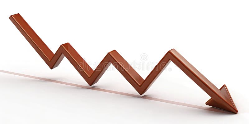
Free with trial The Red arrow Down on Business background 3d rendering. Decrease price illustrations The Red arrow Down on Business background 3d rendering
Free with trial The Red arrow Down on Business background 3d rendering. Decrease price illustrations The Red arrow Down on Business background 3d rendering
Free with trial The Red arrow Down on Business background 3d rendering. Decrease price illustrations The Red arrow Down on Business background 3d rendering
Free with trial This image features a house with a dollar sign and downward arrows, representing decreasing costs. It is isolated on a white background and is perfect for any design. Decrease price vectors Illustration of a house with a dollar sign and downward arrows, representing decreasing costs. This image features a house with a dollar sign and downward arrows, representing decreasing costs. It is isolated on a white background and is perfect for any design
Free with trial Up and down arrow dollar icon on black circle. USD growth and decline sign symbol vector. Decrease price vectors Up and down arrow dollar icon on black circle. USD growth and decline sign symbol
Free with trial The Red arrow Down on Business background 3d rendering. Decrease price illustrations The Red arrow Down on Business background 3d rendering
Free with trial Dollar arrow growth and decline icon on black circle. USD up and down sign symbol vector. Decrease price vectors Dollar arrow growth and decline icon on black circle. USD up and down sign symbol
Free with trial The Red arrow Down on Business background 3d rendering. Decrease price illustrations The Red arrow Down on Business background 3d rendering
Free with trial The Red arrow Down on Business background 3d rendering. Decrease price illustrations The Red arrow Down on Business background 3d rendering
Free with trial The Red arrow Down on Business background 3d rendering. Decrease price illustrations The Red arrow Down on Business background 3d rendering
Free with trial The Red arrow Down on Business background 3d rendering. Decrease price illustrations The Red arrow Down on Business background 3d rendering
Free with trial Black and white graphic symbol of a percentage sign within a circular badge with jagged edges. Decrease price vectors Black and white graphic symbol of a percentage sign within a circular badge with jagged edges
Free with trial Economic Loss icon Flat set in black and white color outline vector. Decrease price vectors Economic Loss Icon for Financial Downturns, Business Challenges, and Market Analysis Illustrations. Economic Loss icon Flat set in black and white color outline vector
Free with trial Financial Data Graph With Falling And Rising Lines. Stock Market Volatility. Digital Business. , Generated by AI. Decrease price illustrations Financial Data Graph With Falling And Rising Lines. Stock Market Volatility. Digital Business.
Free with trial Trend chart icon in black circle. Growth and decline symbol. Up and down arrow with bar graph illustration. Decrease price vectors Trend chart icon in black circle. Growth and decline symbol. Up and down arrow with bar graph
Free with trial A financial chart displaying market analysis and business growth with increasing and decreasing trends. Decrease price illustrations Financial chart showing growth and market analysis data isolated on transparent background. A financial chart displaying market analysis and business growth with increasing and decreasing trends.
Free with trial Democratic Republic of the Congo - dropping fuel prices concept - 3D illustration. Decrease price illustrations Democratic Republic of the Congo - dropping fuel prices concept
Free with trial Attention Shoppers Unbelievable Ninety Percent Off Sale on Selected Items, Limited Time Offer, Generated by AI. Decrease price illustrations Attention Shoppers Unbelievable Ninety Percent Off Sale on Selected Items, Limited Time Offer
Free with trial Graph going Up and Down sign with blue arrows vector. Flat design vector illustration concept of sales bar chart symbol icon with arrow moving down and sales bar chart with arrow moving up. Decrease price vectors Graph going Up and Down sign with blue arrows vector. Flat design vector illustration concept of sales bar chart symbol icon. Graph going Up and Down sign with blue arrows vector. Flat design vector illustration concept of sales bar chart symbol icon with arrow moving down and sales bar chart with arrow moving up.
Free with trial Up and down trend chart icon in black circle. Business growth and decline symbol illustration. Decrease price vectors Up and down trend chart icon in black circle. Business growth and decline symbol
Free with trial Percent up and down icon. Percentage upward and downward sign. Growth and decline symbol vector. Decrease price vectors Percent up and down icon. Percentage upward and downward sign. Growth and decline symbol
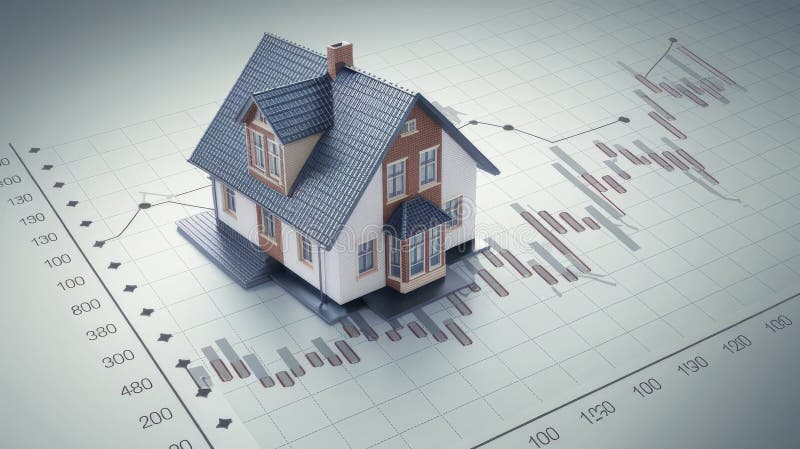
Free with trial House model placed on a graph showcasing fluctuating mortgage rates ok. Decrease price illustrations House model placed on a graph showcasing fluctuating mortgage rates
Free with trial House model placed on a graph showcasing fluctuating mortgage rates ok. Decrease price illustrations House model placed on a graph showcasing fluctuating mortgage rates
Free with trial Hand drawn black and white illustration of a percent sign inside a circular arrow pointing down. Decrease price vectors Hand drawn black and white illustration of a percent sign inside a circular arrow pointing down
Free with trial A red stock market chart declines sharply against a blurred dark city background. This image illustrates a financial crisis and economic downturn, showing a dramatic fall in market values. Decrease price illustrations Red stock market crash with bar chart and blurred city background depicting financial decline. A red stock market chart declines sharply against a blurred dark city background. This image illustrates a financial crisis and economic downturn, showing a dramatic fall in market values
Free with trial Percentage growth and decline icons. Percent arrow up and down flat style symbols - stock vector. Decrease price illustrations Percentage growth and decline icons. Percent arrow up and down flat style symbols - stock vector
Free with trial Generative ai, The image shows a red background with a grid pattern on it. The image also contains a large red arrow pointing down, suggesting a sharp decline. The image is likely representative of a negative financial trend on a stock chart or a si. Decrease price illustrations The image shows a red arrow pointing down on a red background grid. The arrow is pointing down with a sharp decline, symbolizing a. generative ai, The image shows a red background with a grid pattern on it. The image also contains a large red arrow pointing down, suggesting a sharp decline. The image is likely representative of a negative financial trend on a stock chart or a si
Free with trial Loan interest rate doodle icon set. Hand drawn sketch doodle line style bank money loan interest rate icon for house, car discount percentage concept. Trendy cute element. Vector illustration. Decrease price vectors Loan interest rate doodle icon set. Hand drawn sketch doodle line style bank money loan interest rate icon for house
Free with trial The Lost Decade refers to a period of economic stagnation in Japan that began in the early 1990s and, by some accounts, extended into the 2000. Decrease price illustrations The Lost Decade on Japan Business Background 3d rendering. The Lost Decade refers to a period of economic stagnation in Japan that began in the early 1990s and, by some accounts, extended into the 2000
Free with trial Growth and decline percent arrow outline icon on black circle. Percentage up and down sign symbol vector. Decrease price vectors Growth and decline percent arrow outline icon on black circle. Percentage up and down sign symbol
Free with trial Illustration of up and down percentage arrow line icon. Percentage arrow with percent sign. Design concept for banking, credit, interest rates, finance and financial fields. isolated white background. Decrease price illustrations Illustration of up and down percentage arrow line icon.
Free with trial Illustration of up and down percentage arrow line icon. Percentage arrow with percent sign. Design concept for banking, credit, interest rates, finance and financial fields. isolated white background. Decrease price illustrations Illustration of up and down percentage arrow line icon.
Free with trial Illustration of up and down percentage arrow line icon. Percentage arrow with percent sign. Design concept for banking, credit, interest rates, finance and financial fields. isolated white background. Decrease price illustrations Illustration of up and down percentage arrow line icon.
Free with trial Illustration of up and down percentage arrow line icon. Percentage arrow with percent sign. Design concept for banking, credit, interest rates, finance and financial fields. isolated white background. Decrease price illustrations Illustration of up and down percentage arrow line icon.
Free with trial Illustration of up and down percentage arrow line icon. Percentage arrow with percent sign. Design concept for banking, credit, interest rates, finance and financial fields. isolated white background. Decrease price illustrations Illustration of up and down percentage arrow line icon.
Free with trial Illustration of up and down percentage arrow line icon. Percentage arrow with percent sign. Design concept for banking, credit, interest rates, finance and financial fields. isolated white background. Decrease price illustrations Illustration of up and down percentage arrow line icon.
Free with trial Illustration of up and down percentage arrow line icon. Percentage arrow with percent sign. Design concept for banking, credit, interest rates, finance and financial fields. isolated white background. Decrease price illustrations Illustration of up and down percentage arrow line icon.
Free with trial Illustration of up and down percentage arrow line icon. Percentage arrow with percent sign. Design concept for banking, credit, interest rates, finance and financial fields. isolated white background. Decrease price illustrations Illustration of up and down percentage arrow line icon.
Free with trial The Lost Decade refers to a period of economic stagnation in Japan that began in the early 1990s and, by some accounts, extended into the 2000. Decrease price illustrations The Lost Decade on Japan Business Background 3d rendering. The Lost Decade refers to a period of economic stagnation in Japan that began in the early 1990s and, by some accounts, extended into the 2000
Free with trial Composite 3D photo collage design trend sketch of young lady wow face stand hand hold scissors cut percent arrow earnings market bank. Decrease price illustrations Composite 3D photo collage design trend sketch of young lady wow face stand hand hold scissors cut percent arrow
Free with trial Loan interest rate doodle icon set. Hand drawn sketch doodle line style bank money loan interest rate icon for house, car discount percentage concept. Trendy cute element. Vector illustration. Decrease price vectors Loan interest rate doodle icon set. Hand drawn sketch doodle line style bank money loan interest rate icon for house
Free with trial Loan interest rate doodle icon set. Hand drawn sketch doodle line style bank money loan interest rate icon for house, car discount percentage concept. Trendy cute element. Vector illustration. Decrease price vectors Loan interest rate doodle icon set. Hand drawn sketch doodle line style bank money loan interest rate icon for house
Free with trial Loan interest rate doodle icon set. Hand drawn sketch doodle line style bank money loan interest rate icon for house, car discount percentage concept. Trendy cute element. Vector illustration. Decrease price vectors Loan interest rate doodle icon set. Hand drawn sketch doodle line style bank money loan interest rate icon for house
Free with trial This compelling red zigzag line graph vividly illustrates a downward market trend, offering a concise yet insightful representation of declining stock prices. The dynamic zigzag pattern clearly highlights fluctuations and sharp drops in the data, making it an ideal tool for visualizing market analysis and economic indicators. The falling red line graph effectively communicates the negative. Decrease price illustrations Analyzing a Declining Market Trend Visualizing Falling Stock Prices with a Red Zigzag Line Graph. This compelling red zigzag line graph vividly illustrates a downward market trend, offering a concise yet insightful representation of declining stock prices. The dynamic zigzag pattern clearly highlights fluctuations and sharp drops in the data, making it an ideal tool for visualizing market analysis and economic indicators. The falling red line graph effectively communicates the negative
Free with trial Trend artwork collage template sketch of oil barrel sanctions arrow business finance investor reduction earnings inflation young man run. Decrease price illustrations Trend artwork collage template sketch of oil barrel sanctions arrow business finance investor reduction earnings
Free with trial Loan interest rate doodle icon set. Hand drawn sketch doodle line style bank money loan interest rate icon for house, car discount percentage concept. Trendy cute element. Vector illustration. Decrease price vectors Loan interest rate doodle icon set. Hand drawn sketch doodle line style bank money loan interest rate icon for house
Free with trial A sharp red arrow, indicating a downward trend, is superimposed over a thick stack of green dollar bills. The dollar bills are depicted with a subtle texture and the dollar sign. The image is set against a clean white background, emphasizing the concept of financial decline or loss. Decrease price illustrations Red Downward Arrow Graph Over a Stack of Green Dollar Bills on White Background money finance. A sharp red arrow, indicating a downward trend, is superimposed over a thick stack of green dollar bills. The dollar bills are depicted with a subtle texture and the dollar sign. The image is set against a clean white background, emphasizing the concept of financial decline or loss
Free with trial An image with a signpost pointing in two different directions in German. One direction points to Tariff Change, the other points to Expensive. Decrease price illustrations Signposts the direct way to Tariff Change versus Expensive. An image with a signpost pointing in two different directions in German. One direction points to Tariff Change, the other points to Expensive
Free with trial The image shows a candlestick stock chart on a black background, depicting price movements with green and red candlesticks. Suitable for finance and business concepts. Generative AI. Decrease price illustrations Stock market candlestick chart isolated on black background for financial and business concepts. The image shows a candlestick stock chart on a black background, depicting price movements with green and red candlesticks. Suitable for finance and business concepts. Generative AI
Free with trial Reduction chart icon vector logo set collection for web app ui. Decrease price vectors Reduction chart icon set depicting data reduction symbols, ideal for business analytics and performance visuals. Reduction chart icon vector logo set collection for web app ui
Free with trial A financial illustration shows coins decreasing in size along a horizontal axis, representing devaluation. An upward-pointing arrow indicates increasing inflation percentages, with labels of "4%", "20%", and "50%". The chart is labeled "INFLATION" at the top, with percentages scattered around. Broken pieces from a large coin suggest fragmentation and loss of value. The background features a subtle line graph, reinforcing the economic theme. Decrease price illustrations Inflation increasing and devaluing money, showing a financial chart with coins and an arrow going up. A financial illustration shows coins decreasing in size along a horizontal axis, representing devaluation. An upward-pointing arrow indicates increasing inflation percentages, with labels of "4%", "20%", and "50%". The chart is labeled "INFLATION" at the top, with percentages scattered around. Broken pieces from a large coin suggest fragmentation and loss of value. The background features a subtle line graph, reinforcing the economic theme.
Free with trial Is driving the increase or decrease in South Korean oil prices. Global economic instability, market volatility, and the growing demand for energy security are represented by the combination of an oil pump jack, oil barrels, and the national flag of South Korea. Decrease price illustrations The backdrop of geopolitical challenges and economic volatility. Is driving the increase or decrease in South Korean oil prices. Global economic instability. is driving the increase or decrease in South Korean oil prices. Global economic instability, market volatility, and the growing demand for energy security are represented by the combination of an oil pump jack, oil barrels, and the national flag of South Korea.Global economic instability, market volatility, and the growing demand for energy security are represented by the combination of an oil pump jack, oil barrels, and the national flag of South Korea.
Free with trial Colorful Cost reduction icon isolated on white background. Square button. 3D render illustration. Decrease price illustrations Colorful Cost reduction icon isolated on white background. Square button. 3D render illustration
Free with trial Minimalist Percentage Sign Icon in a Circular Frame Representing Discount Sale Rate Calculation. Decrease price vectors Minimalist Percentage Sign Icon in a Circular Frame Representing Discount Sale Rate Calculation
Free with trial Inflation rate graph on digital display vivid data visualization highlighting economic concerns, Generated by AI. Decrease price illustrations Inflation rate graph on digital display vivid data visualization highlighting economic concerns
Free with trial Composite collage image of arrow point down trader entrepreneur company employee crisis inflation concept bizarre unusual fantasy billboard. Decrease price illustrations Composite collage image of arrow point down trader entrepreneur company employee crisis inflation concept bizarre
Free with trial Concept of Bitcoin bubble and speculation. Risks and dangers of investing to Bitcoin. Financial bubble. Flat cartoon illustration. Decrease price vectors Concept of Bitcoin bubble and speculation.Risks and dangers of investing to Bitcoin. Financial bubble. Flat cartoon illustration
Free with trial A percentage sign is a symbol used to indicate a proportion or ratio in relation to a whole. It is commonly used in finance, business, and marketing contexts, and more. Decrease price vectors Illustration of a percentage sign, a symbol used to indicate a proportion or ratio in relation to a whole. A percentage sign is a symbol used to indicate a proportion or ratio in relation to a whole. It is commonly used in finance, business, and marketing contexts, and more
Free with trial Financial crisis. Economic collapse. Unfavorable conditions for a startup. The person tries to keep the falling histogram. Decrease price vectors Financial crisis. Economic collapse. Unfavorable conditions for a startup. The person tries to keep the falling histogram