Free with trial This image showcases a collection of different data visualization techniques displayed on multiple screens. It includes a pie chart, bar graph, stock chart, scatter plot, density plot, and network graph, each representing distinct types of data analysis. Different data visualization techniques illustrations Various data visualization techniques. This image showcases a collection of different data visualization techniques displayed on multiple screens. It includes a. This image showcases a collection of different data visualization techniques displayed on multiple screens. It includes a pie chart, bar graph, stock chart, scatter plot, density plot, and network graph, each representing distinct types of data analysis
Free with trial The image depicts a collection of different chart and graph types such as bar charts, line graphs, scatter plots, pie charts, histograms, and heatmaps, all rendered in a minimalist grayscale style with thin lines and subtle shading. These visual elements are scattered across a white background, illustrating diverse data visualization techniques used to represent data trends, comparisons, and. Different data visualization techniques illustrations A visual representation of various types of charts and graphs. The image depicts a collection of different chart and graph types such as bar charts, line graphs. The image depicts a collection of different chart and graph types such as bar charts, line graphs, scatter plots, pie charts, histograms, and heatmaps, all rendered in a minimalist grayscale style with thin lines and subtle shading. These visual elements are scattered across a white background, illustrating diverse data visualization techniques used to represent data trends, comparisons, and
Free with trial This image contains a variety of icons representing different data visualization techniques and business concepts. The icons include bar charts, line graphs, pie charts, scatter plots, and other graphical representations. Additionally, there are icons depicting data processing, analysis, and storage, such as gears, magnifying glasses, and file folders. Different data visualization techniques vectors Collection of data visualization and business icons. This image contains a variety of icons representing different data visualization techniques and business. This image contains a variety of icons representing different data visualization techniques and business concepts. The icons include bar charts, line graphs, pie charts, scatter plots, and other graphical representations. Additionally, there are icons depicting data processing, analysis, and storage, such as gears, magnifying glasses, and file folders
Free with trial The image displays a diverse array of graphs and charts, including pie charts, bar graphs, and line graphs, all presented in shades of blue, orange, and yellow, showcasing different data visualization techniques. Different data visualization techniques illustrations A collection of various colorful graphs and charts for data analysis and visualization purposes. The image displays a diverse array of graphs and charts. The image displays a diverse array of graphs and charts, including pie charts, bar graphs, and line graphs, all presented in shades of blue, orange, and yellow, showcasing different data visualization techniques
Free with trial This image showcases a diverse collection of charts and graphs, including bar charts, pie charts, line graphs, scatter plots, and more, all isolated on a transparent background. The visual elements are vibrant and varied, representing different data visualization techniques. This image is ideal for presentations, educational materials, or any project requiring clear, professional data. Different data visualization techniques illustrations Various types of charts and graphs isolated on transparent background. This image showcases a diverse collection of charts and graphs, including bar charts, pie. This image showcases a diverse collection of charts and graphs, including bar charts, pie charts, line graphs, scatter plots, and more, all isolated on a transparent background. The visual elements are vibrant and varied, representing different data visualization techniques. This image is ideal for presentations, educational materials, or any project requiring clear, professional data
Free with trial Colors represent different data points in a network. Connections between nodes show relationships. The setting is focused on data visualization methods and their applications. Different data visualization techniques vectors Network of connections with blue and pink nodes on a dark background during a. Colors represent different data points in a network. Connections between nodes. Colors represent different data points in a network. Connections between nodes show relationships. The setting is focused on data visualization methods and their applications.
Free with trial 3D infographic elements surround a central blue microchip, featuring colorful charts including pie charts, bar graphs, and stacked charts. The microchip's circuitry is depicted with yellow lines extending outward, connecting the various elements. Charts use a range of colors like green, orange, blue, and purple, arranged in a circular layout on a white background. Each element represents different data visualization techniques, demonstrating interconnectedness and data processing themes. Different data visualization techniques illustrations 3d colorful business infographic elements and microchip. 3D infographic elements surround a central blue microchip, featuring colorful charts including pie. 3D infographic elements surround a central blue microchip, featuring colorful charts including pie charts, bar graphs, and stacked charts. The microchip's circuitry is depicted with yellow lines extending outward, connecting the various elements. Charts use a range of colors like green, orange, blue, and purple, arranged in a circular layout on a white background. Each element represents different data visualization techniques, demonstrating interconnectedness and data processing themes.
Free with trial The image displays three circular brain visualizations, each segmented into distinct regions with varying colors, representing different data clustering techniques or brain activity patterns. The leftmost visualization shows large, smooth segments in shades of yellow and orange, the middle visualization features smaller, more granular regions in similar colors, and the rightmost visualization. Different data visualization techniques illustrations Visualization of brain activity areas using different data clustering techniques isolated on transparent background, isolated on. The image displays three. The image displays three circular brain visualizations, each segmented into distinct regions with varying colors, representing different data clustering techniques or brain activity patterns. The leftmost visualization shows large, smooth segments in shades of yellow and orange, the middle visualization features smaller, more granular regions in similar colors, and the rightmost visualization
Free with trial This image showcases a variety of data visualization techniques pinned to a corkboard. It includes bar charts, line graphs, histograms, pie charts, scatter plots, and network diagrams, each representing different types of data analysis. Different data visualization techniques illustrations Various data visualization techniques displayed on a corkboard. This image showcases a variety of data visualization techniques pinned to a corkboard. It. This image showcases a variety of data visualization techniques pinned to a corkboard. It includes bar charts, line graphs, histograms, pie charts, scatter plots, and network diagrams, each representing different types of data analysis
Free with trial This image depicts a detailed and intricate representation of a human brain, surrounded by various technological elements such as graphs, charts, and data visualizations. The central brain image is highlighted in a glowing blue color, suggesting advanced imaging techniques. Surrounding the brain are multiple panels displaying different types of data, including neural pathways, molecular structures. Different data visualization techniques illustrations Advanced brain imaging and data analysis. This image depicts a detailed and intricate representation of a human brain, surrounded by various technological. This image depicts a detailed and intricate representation of a human brain, surrounded by various technological elements such as graphs, charts, and data visualizations. The central brain image is highlighted in a glowing blue color, suggesting advanced imaging techniques. Surrounding the brain are multiple panels displaying different types of data, including neural pathways, molecular structures
Free with trial The image displays a detailed 3D model of an urban environment with layered architectural and structural elements. Different colors represent various building materials, heights, and structural components, highlighting the complexity and density of the cityscape. The model appears to incorporate data visualization techniques to distinguish between different urban features such as buildings, roads. Different data visualization techniques illustrations 3d visualization of a complex urban environment showing architectural and structural data. The image displays a detailed 3D model of an urban environment with. The image displays a detailed 3D model of an urban environment with layered architectural and structural elements. Different colors represent various building materials, heights, and structural components, highlighting the complexity and density of the cityscape. The model appears to incorporate data visualization techniques to distinguish between different urban features such as buildings, roads
Free with trial The image shows three different 3D reconstructions of buildings using point cloud data visualization techniques. Each reconstruction highlights structural details and architectural elements in varying color-coded densities, with some areas marked in red to emphasize specific features or densities. The models are displayed in a grayscale background to contrast the colored point clouds, revealing. Different data visualization techniques illustrations 3d reconstructions of buildings using point cloud data visualization isolated on transparent background, isolated on white. The image shows three different 3D. The image shows three different 3D reconstructions of buildings using point cloud data visualization techniques. Each reconstruction highlights structural details and architectural elements in varying color-coded densities, with some areas marked in red to emphasize specific features or densities. The models are displayed in a grayscale background to contrast the colored point clouds, revealing
Free with trial This image showcases a variety of data visualization techniques including bar graphs, pie charts, line graphs, and histograms. Each type of graph is displayed in different colors and styles, providing a comprehensive overview of data representation methods. Different data visualization techniques illustrations Comprehensive data visualization collection. This image showcases a variety of data visualization techniques including bar graphs, pie charts, line graphs, and. This image showcases a variety of data visualization techniques including bar graphs, pie charts, line graphs, and histograms. Each type of graph is displayed in different colors and styles, providing a comprehensive overview of data representation methods
Free with trial A detailed topographic map displays four distinct agricultural fields arranged in a grid-like pattern, each labeled with crop identifiers including Coght, ORPES, OrpEs, and OroPd, with color-coded sections in green, orange, brown, and blue representing different vegetation types, accompanied by a comprehensive color chart on the right side that provides a visual key connecting hues to specific. Different data visualization techniques illustrations Agricultural field map showing different crop types in grid pattern with color-coded legend for farming planning and land. A detailed topographic map displays. A detailed topographic map displays four distinct agricultural fields arranged in a grid-like pattern, each labeled with crop identifiers including Coght, ORPES, OrpEs, and OroPd, with color-coded sections in green, orange, brown, and blue representing different vegetation types, accompanied by a comprehensive color chart on the right side that provides a visual key connecting hues to specific
Free with trial The image presents a visual comparison of different data representation techniques used in analysis and visualization. It features nine panels arranged in a 3x3 grid, each showing a variation of a hexagonal heatmap or density plot. The top row displays variations with color overlays in green, red, and magenta hues. The middle row shows similar hexagonal plots but without color fills, highlighting. Different data visualization techniques illustrations Visual comparison of data representation techniques in analysis. The image presents a visual comparison of different data representation techniques used in. The image presents a visual comparison of different data representation techniques used in analysis and visualization. It features nine panels arranged in a 3x3 grid, each showing a variation of a hexagonal heatmap or density plot. The top row displays variations with color overlays in green, red, and magenta hues. The middle row shows similar hexagonal plots but without color fills, highlighting
Free with trial The image showcases various data visualization techniques. It includes a grid fill chart with colored dots, multiple linear progress bars with different percentages, and circular progress indicators. The linear progress bars display values such as 2%, 64%, and 65%. There is also a colorful circular progress indicator showing 62%. Additionally, a bar chart is present, depicting growth over time. Different data visualization techniques illustrations Various data visualization techniques in circular and grid formats. The image showcases various data visualization techniques. It includes a grid fill chart with. The image showcases various data visualization techniques. It includes a grid fill chart with colored dots, multiple linear progress bars with different percentages, and circular progress indicators. The linear progress bars display values such as 2%, 64%, and 65%. There is also a colorful circular progress indicator showing 62%. Additionally, a bar chart is present, depicting growth over time
Free with trial The image displays a combination of data visualization techniques. The top left shows a line graph depicting an upward trend over time, indicating growth or increase. Adjacent to it is a bar chart labeled 'by category,' showing comparative data across different categories with a noticeable rise in the final category. Below, there are two pie charts: one labeled 'by segment' with a 60% and 40%. Different data visualization techniques illustrations Analytical visualization combining line graph, bar chart, and pie charts for data insights. The image displays a combination of data visualization techniques. The image displays a combination of data visualization techniques. The top left shows a line graph depicting an upward trend over time, indicating growth or increase. Adjacent to it is a bar chart labeled 'by category,' showing comparative data across different categories with a noticeable rise in the final category. Below, there are two pie charts: one labeled 'by segment' with a 60% and 40%
Free with trial The image displays four different 3D reconstructions of a brain, likely obtained through various imaging modalities. The top-left and top-right images show grayscale volumetric renderings with intricate structural details. The bottom-left image presents a color-coded heatmap overlay, indicating varying intensities or activity levels within the brain structure. The bottom-right image appears to be. Different data visualization techniques illustrations High resolution 3d reconstructions of a brain using different imaging techniques isolated on transparent background, isolated on. The image displays four. The image displays four different 3D reconstructions of a brain, likely obtained through various imaging modalities. The top-left and top-right images show grayscale volumetric renderings with intricate structural details. The bottom-left image presents a color-coded heatmap overlay, indicating varying intensities or activity levels within the brain structure. The bottom-right image appears to be
Free with trial The image displays a scatterplot matrix with multiple hexagonal binning plots, each representing clusters of data points. Different color schemes such as shades of gray, blue, green, pink, brown, and orange highlight distinct segmentation patterns. The central scatterplots show varying densities and distributions, while the surrounding histograms provide univariate analysis of individual variables. Different data visualization techniques illustrations Visualization of data clusters with different color-coded segmentation techniques isolated on transparent background, isolated on. The image displays a. The image displays a scatterplot matrix with multiple hexagonal binning plots, each representing clusters of data points. Different color schemes such as shades of gray, blue, green, pink, brown, and orange highlight distinct segmentation patterns. The central scatterplots show varying densities and distributions, while the surrounding histograms provide univariate analysis of individual variables
Free with trial This image features a collection of 25 different icons representing various data visualization techniques and business-related symbols. The icons include bar charts, line graphs, pie charts, scatter plots, network diagrams, decision trees, and more. Each icon is designed in a minimalist black and white style, making them suitable for use in presentations, reports, and digital media. Different data visualization techniques vectors Collection of various data visualization and business icons. This image features a collection of 25 different icons representing various data visualization. This image features a collection of 25 different icons representing various data visualization techniques and business-related symbols. The icons include bar charts, line graphs, pie charts, scatter plots, network diagrams, decision trees, and more. Each icon is designed in a minimalist black and white style, making them suitable for use in presentations, reports, and digital media
Free with trial The image depicts a heat map of a city, highlighting temperature variations with different colors ranging from dark purple (cooler areas) to bright yellow and red (hotter areas). Roads, buildings, and green spaces are clearly visible, with urban structures clustered in the lower half and a mix of high-density and sparse areas. The map appears to use data visualization techniques to represent. Different data visualization techniques illustrations Urban heat map visualization showing temperature variations across a city isolated on transparent background, isolated on white. The image depicts a heat map of. The image depicts a heat map of a city, highlighting temperature variations with different colors ranging from dark purple (cooler areas) to bright yellow and red (hotter areas). Roads, buildings, and green spaces are clearly visible, with urban structures clustered in the lower half and a mix of high-density and sparse areas. The map appears to use data visualization techniques to represent
Free with trial This image showcases different types of infographics each representing 70% data. It includes a grid fill, a linear progress bar, a doughnut chart, and a ring gauge. Each infographic visually emphasizes the 70% value through various graphical techniques. Different data visualization techniques illustrations Visual representations of 70% data in various infographics. This image showcases different types of infographics each representing 70% data. It includes a grid. This image showcases different types of infographics each representing 70% data. It includes a grid fill, a linear progress bar, a doughnut chart, and a ring gauge. Each infographic visually emphasizes the 70% value through various graphical techniques
Free with trial A collection of four different colorful charts and graphs showing data visualization techniques. Different data visualization techniques illustrations Colorful data visualization charts and graphs for business analytics presentation. A collection of four different colorful charts and graphs showing data. A collection of four different colorful charts and graphs showing data visualization techniques
Free with trial The image showcases three distinct types of data visualization techniques. On the left, there is a bar chart displaying data in vertical bars of different colors. In the center, a pie chart is depicted, divided into multiple colored segments representing various proportions. On the right, a line graph is shown, featuring multiple lines that indicate trends over time. These visualizations are. Different data visualization techniques illustrations Visual representation of data analysis techniques. The image showcases three distinct types of data visualization techniques. On the left, there is a bar chart. The image showcases three distinct types of data visualization techniques. On the left, there is a bar chart displaying data in vertical bars of different colors. In the center, a pie chart is depicted, divided into multiple colored segments representing various proportions. On the right, a line graph is shown, featuring multiple lines that indicate trends over time. These visualizations are
Free with trial This image showcases a variety of data visualization techniques and graphs. It includes bar charts, line graphs, pie charts, scatter plots, and other statistical representations. Each type of chart is depicted in a simple, monochromatic style, highlighting different methods of data representation and analysis. The image is useful for understanding the diversity of visual tools available for data. Different data visualization techniques vectors Collection of various data visualization graphs and charts. This image showcases a variety of data visualization techniques and graphs. It includes bar charts. This image showcases a variety of data visualization techniques and graphs. It includes bar charts, line graphs, pie charts, scatter plots, and other statistical representations. Each type of chart is depicted in a simple, monochromatic style, highlighting different methods of data representation and analysis. The image is useful for understanding the diversity of visual tools available for data
Free with trial The image showcases a variety of data visualizations, including line graphs, bar charts, scatter plots, and donut charts. These visualizations are colorful and detailed, each representing different data sets and trends. The charts are arranged in a grid format, providing a comprehensive overview of various data analysis techniques. Different data visualization techniques illustrations Diverse collection of colorful and detailed data visualizations. The image showcases a variety of data visualizations, including line graphs, bar charts, scatter. The image showcases a variety of data visualizations, including line graphs, bar charts, scatter plots, and donut charts. These visualizations are colorful and detailed, each representing different data sets and trends. The charts are arranged in a grid format, providing a comprehensive overview of various data analysis techniques
Free with trial This image illustrates various tools and techniques used in data analysis. It includes bar graphs, pie charts, cloud storage, data visualization on a laptop, global data connections, magnifying glasses for data inspection, web-based data dashboards, data servers, data processing pipelines, and security measures. Each icon represents a different aspect of the data analysis process, from collection. Different data visualization techniques vectors Visual representation of data analysis techniques and tools. This image illustrates various tools and techniques used in data analysis. It includes bar graphs. This image illustrates various tools and techniques used in data analysis. It includes bar graphs, pie charts, cloud storage, data visualization on a laptop, global data connections, magnifying glasses for data inspection, web-based data dashboards, data servers, data processing pipelines, and security measures. Each icon represents a different aspect of the data analysis process, from collection
Free with trial The image showcases a variety of data visualization techniques, including pie charts and bar graphs. The pie charts are vibrant and segmented into different colors, representing distinct data categories. The bar graphs, also colorful, display data in a vertical format. The image emphasizes the importance of visual data representation for effective analysis and communication. Different data visualization techniques illustrations Colorful data representation with pie charts and bar graphs. The image showcases a variety of data visualization techniques, including pie charts and bar graphs. The image showcases a variety of data visualization techniques, including pie charts and bar graphs. The pie charts are vibrant and segmented into different colors, representing distinct data categories. The bar graphs, also colorful, display data in a vertical format. The image emphasizes the importance of visual data representation for effective analysis and communication
Free with trial The image displays six different types of graphs, each representing unique data visualization methods. These include a bar graph, line graph, scatter plot, area graph, and more. Different data visualization techniques illustrations Six distinct types of graphs showcasing various data visualization techniques. The image displays six different types of graphs, each representing unique data. The image displays six different types of graphs, each representing unique data visualization methods. These include a bar graph, line graph, scatter plot, area graph, and more
Free with trial The image illustrates three distinct brain imaging methodologies. The first section shows a heat map of the brain, likely representing functional MRI (fMRI) data highlighting brain activity. The second section depicts structural network mapping, which visualizes the brain's connectivity and neural pathways. The third section features parcellation, where the brain is divided into distinct. Different data visualization techniques illustrations Visualizing brain imaging techniques through different perspectives and analyses. The image illustrates three distinct brain imaging methodologies. The first. The image illustrates three distinct brain imaging methodologies. The first section shows a heat map of the brain, likely representing functional MRI (fMRI) data highlighting brain activity. The second section depicts structural network mapping, which visualizes the brain's connectivity and neural pathways. The third section features parcellation, where the brain is divided into distinct
Free with trial The image showcases a variety of data visualization techniques including bar charts, pie charts, line graphs, and network diagrams. Each visualization uses different colors and styles to represent data trends, proportions, and relationships. These visuals are typically used in business analytics, academic research, and data science to communicate complex information effectively and intuitively. Different data visualization techniques illustrations Diverse collection of data visualization charts and graphs for analytical representation. The image showcases a variety of data visualization techniques. The image showcases a variety of data visualization techniques including bar charts, pie charts, line graphs, and network diagrams. Each visualization uses different colors and styles to represent data trends, proportions, and relationships. These visuals are typically used in business analytics, academic research, and data science to communicate complex information effectively and intuitively
Free with trial A complex and detailed data visualization dashboard featuring a world map overlaid with statistical information. The map is rendered with a dot matrix style, highlighting different regions. Various charts, graphs, and numerical data displays surround the map, providing a comprehensive overview of global trends and analytics. The dark background enhances the visibility of the data elements, creating a modern and sophisticated look. Different data visualization techniques illustrations Global Data Visualization Dashboard. A complex and detailed data visualization dashboard featuring a world map overlaid with statistical information. The map is. A complex and detailed data visualization dashboard featuring a world map overlaid with statistical information. The map is rendered with a dot matrix style, highlighting different regions. Various charts, graphs, and numerical data displays surround the map, providing a comprehensive overview of global trends and analytics. The dark background enhances the visibility of the data elements, creating a modern and sophisticated look.
Free with trial Infographic featuring various charts and graphs, including bar, line, and pie charts, all presented on a dark background. Colors include shades of pink, orange, gray, and white. Elements are diverse, with circular, rectangular, and linear designs illustrating data and percentages. Icons, such as social media and communication symbols, are integrated throughout. Layout is organized into sections showcasing different data visualization techniques, making it suitable for educational or analytical purposes. Different data visualization techniques illustrations Infographic featuring various charts and graphs, including bar, line, and pie chart. S, all presented on a dark background. Colors include shades of pink, orange. Infographic featuring various charts and graphs, including bar, line, and pie charts, all presented on a dark background. Colors include shades of pink, orange, gray, and white. Elements are diverse, with circular, rectangular, and linear designs illustrating data and percentages. Icons, such as social media and communication symbols, are integrated throughout. Layout is organized into sections showcasing different data visualization techniques, making it suitable for educational or analytical purposes.
Free with trial Abstract flowing holographic waves with glowing particles futuristic energy motion background design. A dynamic abstract composition showcasing flowing holographic waves intertwined with glowing particles. The image captures a sense of motion and energy through its fluid shapes and vibrant light interactions. The color palette features iridescent tones of blue, purple, and subtle neon highlights, creating a futuristic and immersive visual experience. The wave-like structures appear to move organically across the frame, resembling energy fields, digital currents, or electromagnetic flows. Small luminous particles scattered throughout the composition enhance the feeling of motion and depth, making the image visually engaging and rich in detail. This artwork is highly suitable for technology-related themes, including artificial intelligence, data visualization, and digital communication. It can also be used for creative branding, music visuals, and modern advertising campaigns. The holographic effect adds a premium and cutting-edge feel, aligning well with contemporary design trends. The composition maintains a balance between complexity and clarity, ensuring that it remains versatile for different design applications. Designers can easily incorporate text or additional elements without losing visual harmony. The lighting effects create contrast and depth, enhancing the overall aesthetic appeal. Advanced editing techniques have been used to refine color transitions, enhance brightness, and improve sharpness. The final image delivers a high-quality visual suitable for commercial use across multiple digital and print platforms. abstract waves, holographic background, glowing particles, futuristic design, energy flow, digital waves, neon colors, light effects, motion background, fluid shapes, abstract energy, technology background, modern design, colorful gradient, sci-fi art, digital abstract, luminous particles, creative background, wave pattern, dynamic texture, glowing lines, abstract motion, innovation design, visual effects, gradient waves, high tech background, fantasy energy, digital flow, vibrant colors, modern wallpaper. Different data visualization techniques illustrations Abstract flowing holographic waves with glowing particles futuristic energy motion background design. A dynamic abstract composition showcasing flowing. Abstract flowing holographic waves with glowing particles futuristic energy motion background design.A dynamic abstract composition showcasing flowing holographic waves intertwined with glowing particles. The image captures a sense of motion and energy through its fluid shapes and vibrant light interactions. The color palette features iridescent tones of blue, purple, and subtle neon highlights, creating a futuristic and immersive visual experience.The wave-like structures appear to move organically across the frame, resembling energy fields, digital currents, or electromagnetic flows. Small luminous particles scattered throughout the composition enhance the feeling of motion and depth, making the image visually engaging and rich in detail.This artwork is highly suitable for technology-related themes, including artificial intelligence, data visualization, and digital communication. It can also be used for creative branding, music visuals, and modern advertising campaigns. The holographic effect adds a premium and cutting-edge feel, aligning well with contemporary design trends.The composition maintains a balance between complexity and clarity, ensuring that it remains versatile for different design applications. Designers can easily incorporate text or additional elements without losing visual harmony. The lighting effects create contrast and depth, enhancing the overall aesthetic appeal.Advanced editing techniques have been used to refine color transitions, enhance brightness, and improve sharpness. The final image delivers a high-quality visual suitable for commercial use across multiple digital and print platforms.abstract waves, holographic background, glowing particles, futuristic design, energy flow, digital waves, neon colors, light effects, motion background, fluid shapes, abstract energy, technology background, modern design, colorful gradient, sci-fi art, digital abstract, luminous particles, creative background, wave pattern, dynamic texture, glowing lines, abstract motion, innovation design, visual effects, gradient waves, high tech background, fantasy energy, digital flow, vibrant colors, modern wallpaper
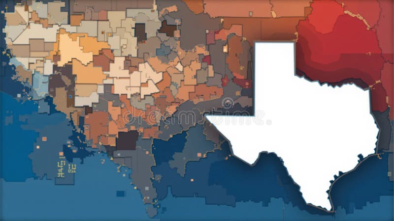
Free with trial Abstract map of Texas highlighting regional variations through a mosaic of colored polygons. The map uses shades of blue, red, orange, and beige to represent different areas, creating a gradient effect. Texas is outlined prominently in white, while the surrounding area displays a complex patchwork of small, varied geometric shapes, suggesting data distribution or statistical representations. The map blends artistic abstraction with geographical data visualization, emphasizing the state's diverse regions. Different data visualization techniques illustrations Abstract Texas Map: Data Visualization of Regional Variations. Abstract map of Texas highlighting regional variations through a mosaic of colored polygons. The. Abstract map of Texas highlighting regional variations through a mosaic of colored polygons. The map uses shades of blue, red, orange, and beige to represent different areas, creating a gradient effect. Texas is outlined prominently in white, while the surrounding area displays a complex patchwork of small, varied geometric shapes, suggesting data distribution or statistical representations. The map blends artistic abstraction with geographical data visualization, emphasizing the state's diverse regions.
Free with trial This image features various data visualization techniques including pie charts and a bar chart. The top left section displays a donut chart with segments representing different percentages. The top right section shows a bar chart with increasing heights indicating different data points. The bottom section includes a world map with highlighted regions and a pie chart displaying global data. Different data visualization techniques illustrations Global data visualization with pie and bar charts. This image features various data visualization techniques including pie charts and a bar chart. The top left. This image features various data visualization techniques including pie charts and a bar chart. The top left section displays a donut chart with segments representing different percentages. The top right section shows a bar chart with increasing heights indicating different data points. The bottom section includes a world map with highlighted regions and a pie chart displaying global data
Free with trial This image showcases a variety of data visualization techniques. It includes examples of different chart types such as line graphs, bar charts, pie charts, donut charts, radar charts, area charts, scatter plots, network diagrams, bubble charts, heat maps, histograms, gauge charts, pyramid charts, treemaps, and candlestick charts. Each chart type is visually represented with sample data to. Different data visualization techniques illustrations Collection of various data visualization chart types. This image showcases a variety of data visualization techniques. It includes examples of different chart. This image showcases a variety of data visualization techniques. It includes examples of different chart types such as line graphs, bar charts, pie charts, donut charts, radar charts, area charts, scatter plots, network diagrams, bubble charts, heat maps, histograms, gauge charts, pyramid charts, treemaps, and candlestick charts. Each chart type is visually represented with sample data to
Free with trial Abstract flowing holographic waves with glowing particles futuristic energy motion background design. A dynamic abstract composition showcasing flowing holographic waves intertwined with glowing particles. The image captures a sense of motion and energy through its fluid shapes and vibrant light interactions. The color palette features iridescent tones of blue, purple, and subtle neon highlights, creating a futuristic and immersive visual experience. The wave-like structures appear to move organically across the frame, resembling energy fields, digital currents, or electromagnetic flows. Small luminous particles scattered throughout the composition enhance the feeling of motion and depth, making the image visually engaging and rich in detail. This artwork is highly suitable for technology-related themes, including artificial intelligence, data visualization, and digital communication. It can also be used for creative branding, music visuals, and modern advertising campaigns. The holographic effect adds a premium and cutting-edge feel, aligning well with contemporary design trends. The composition maintains a balance between complexity and clarity, ensuring that it remains versatile for different design applications. Designers can easily incorporate text or additional elements without losing visual harmony. The lighting effects create contrast and depth, enhancing the overall aesthetic appeal. Advanced editing techniques have been used to refine color transitions, enhance brightness, and improve sharpness. The final image delivers a high-quality visual suitable for commercial use across multiple digital and print platforms. abstract waves, holographic background, glowing particles, futuristic design, energy flow, digital waves, neon colors, light effects, motion background, fluid shapes, abstract energy, technology background, modern design, colorful gradient, sci-fi art, digital abstract, luminous particles, creative background, wave pattern, dynamic texture, glowing lines, abstract motion, innovation design, visual effects, gradient waves, high tech background, fantasy energy, digital flow, vibrant colors, modern wallpaper. Different data visualization techniques illustrations Abstract flowing holographic waves with glowing particles futuristic energy motion background design. A dynamic abstract composition showcasing flowing. Abstract flowing holographic waves with glowing particles futuristic energy motion background design.A dynamic abstract composition showcasing flowing holographic waves intertwined with glowing particles. The image captures a sense of motion and energy through its fluid shapes and vibrant light interactions. The color palette features iridescent tones of blue, purple, and subtle neon highlights, creating a futuristic and immersive visual experience.The wave-like structures appear to move organically across the frame, resembling energy fields, digital currents, or electromagnetic flows. Small luminous particles scattered throughout the composition enhance the feeling of motion and depth, making the image visually engaging and rich in detail.This artwork is highly suitable for technology-related themes, including artificial intelligence, data visualization, and digital communication. It can also be used for creative branding, music visuals, and modern advertising campaigns. The holographic effect adds a premium and cutting-edge feel, aligning well with contemporary design trends.The composition maintains a balance between complexity and clarity, ensuring that it remains versatile for different design applications. Designers can easily incorporate text or additional elements without losing visual harmony. The lighting effects create contrast and depth, enhancing the overall aesthetic appeal.Advanced editing techniques have been used to refine color transitions, enhance brightness, and improve sharpness. The final image delivers a high-quality visual suitable for commercial use across multiple digital and print platforms.abstract waves, holographic background, glowing particles, futuristic design, energy flow, digital waves, neon colors, light effects, motion background, fluid shapes, abstract energy, technology background, modern design, colorful gradient, sci-fi art, digital abstract, luminous particles, creative background, wave pattern, dynamic texture, glowing lines, abstract motion, innovation design, visual effects, gradient waves, high tech background, fantasy energy, digital flow, vibrant colors, modern wallpaper
Free with trial This image showcases a variety of modern data visualization techniques. It includes multiple infographics and dashboards with different styles of charts and graphs such as line graphs, bar charts, pie charts, donut charts, and gauges. The visualizations are presented with a dark theme, featuring vibrant colors for data points and metrics. These visual tools are used for analytics and data. Different data visualization techniques illustrations Collection of modern data visualization infographics and dashboards. This image showcases a variety of modern data visualization techniques. It includes multiple. This image showcases a variety of modern data visualization techniques. It includes multiple infographics and dashboards with different styles of charts and graphs such as line graphs, bar charts, pie charts, donut charts, and gauges. The visualizations are presented with a dark theme, featuring vibrant colors for data points and metrics. These visual tools are used for analytics and data
Free with trial The image showcases various types of colorful charts and graphs used in data visualization. It includes bar graphs with bars of different heights and colors, pie charts with multiple segments in various colors, and line graphs with multiple lines intersecting. The vibrant colors and clear distinctions between different data sets highlight the importance of visual representation in data analysis. Different data visualization techniques illustrations Colorful graphs and charts illustrating data visualization techniques. The image showcases various types of colorful charts and graphs used in data visualization. The image showcases various types of colorful charts and graphs used in data visualization. It includes bar graphs with bars of different heights and colors, pie charts with multiple segments in various colors, and line graphs with multiple lines intersecting. The vibrant colors and clear distinctions between different data sets highlight the importance of visual representation in data analysis
Free with trial The image displays multiple views of 3D medical imaging data, likely from a CT or MRI scan, showing cross-sectional, sagittal, coronal, and 3D reconstructions of anatomical structures. The visualizations include segmented regions with different colors, highlighting specific areas of interest or tissues. The images are presented in a grid layout, illustrating various perspectives and depths of the. Different data visualization techniques illustrations Visualization of 3d medical imaging data in different anatomical planes. The image displays multiple views of 3D medical imaging data, likely from a CT or MRI. The image displays multiple views of 3D medical imaging data, likely from a CT or MRI scan, showing cross-sectional, sagittal, coronal, and 3D reconstructions of anatomical structures. The visualizations include segmented regions with different colors, highlighting specific areas of interest or tissues. The images are presented in a grid layout, illustrating various perspectives and depths of the
Free with trial Abstract flowing holographic waves with glowing particles futuristic energy motion background design. A dynamic abstract composition showcasing flowing holographic waves intertwined with glowing particles. The image captures a sense of motion and energy through its fluid shapes and vibrant light interactions. The color palette features iridescent tones of blue, purple, and subtle neon highlights, creating a futuristic and immersive visual experience. The wave-like structures appear to move organically across the frame, resembling energy fields, digital currents, or electromagnetic flows. Small luminous particles scattered throughout the composition enhance the feeling of motion and depth, making the image visually engaging and rich in detail. This artwork is highly suitable for technology-related themes, including artificial intelligence, data visualization, and digital communication. It can also be used for creative branding, music visuals, and modern advertising campaigns. The holographic effect adds a premium and cutting-edge feel, aligning well with contemporary design trends. The composition maintains a balance between complexity and clarity, ensuring that it remains versatile for different design applications. Designers can easily incorporate text or additional elements without losing visual harmony. The lighting effects create contrast and depth, enhancing the overall aesthetic appeal. Advanced editing techniques have been used to refine color transitions, enhance brightness, and improve sharpness. The final image delivers a high-quality visual suitable for commercial use across multiple digital and print platforms. abstract waves, holographic background, glowing particles, futuristic design, energy flow, digital waves, neon colors, light effects, motion background, fluid shapes, abstract energy, technology background, modern design, colorful gradient, sci-fi art, digital abstract, luminous particles, creative background, wave pattern, dynamic texture, glowing lines, abstract motion, innovation design, visual effects, gradient waves, high tech background, fantasy energy, digital flow, vibrant colors, modern wallpaper. Different data visualization techniques illustrations Abstract flowing holographic waves with glowing particles futuristic energy motion background design. A dynamic abstract composition showcasing flowing. Abstract flowing holographic waves with glowing particles futuristic energy motion background design.A dynamic abstract composition showcasing flowing holographic waves intertwined with glowing particles. The image captures a sense of motion and energy through its fluid shapes and vibrant light interactions. The color palette features iridescent tones of blue, purple, and subtle neon highlights, creating a futuristic and immersive visual experience.The wave-like structures appear to move organically across the frame, resembling energy fields, digital currents, or electromagnetic flows. Small luminous particles scattered throughout the composition enhance the feeling of motion and depth, making the image visually engaging and rich in detail.This artwork is highly suitable for technology-related themes, including artificial intelligence, data visualization, and digital communication. It can also be used for creative branding, music visuals, and modern advertising campaigns. The holographic effect adds a premium and cutting-edge feel, aligning well with contemporary design trends.The composition maintains a balance between complexity and clarity, ensuring that it remains versatile for different design applications. Designers can easily incorporate text or additional elements without losing visual harmony. The lighting effects create contrast and depth, enhancing the overall aesthetic appeal.Advanced editing techniques have been used to refine color transitions, enhance brightness, and improve sharpness. The final image delivers a high-quality visual suitable for commercial use across multiple digital and print platforms.abstract waves, holographic background, glowing particles, futuristic design, energy flow, digital waves, neon colors, light effects, motion background, fluid shapes, abstract energy, technology background, modern design, colorful gradient, sci-fi art, digital abstract, luminous particles, creative background, wave pattern, dynamic texture, glowing lines, abstract motion, innovation design, visual effects, gradient waves, high tech background, fantasy energy, digital flow, vibrant colors, modern wallpaper
Free with trial A world map with highlighted regions showing different levels of data visualization intensity, with darker shades indicating higher data density or engagement. The map includes a zoom-in effect on specific areas, such as Europe, the eastern United States, and parts of Asia, to emphasize detailed data representations. The visualization uses a gradient color scale to represent varying levels of data. Different data visualization techniques illustrations World map highlighting regions with varying data visualization intensities. A world map with highlighted regions showing different levels of data visualization. A world map with highlighted regions showing different levels of data visualization intensity, with darker shades indicating higher data density or engagement. The map includes a zoom-in effect on specific areas, such as Europe, the eastern United States, and parts of Asia, to emphasize detailed data representations. The visualization uses a gradient color scale to represent varying levels of data
Free with trial This image presents a grid of various data visualization techniques, including donut charts, bar graphs, histograms, and line plots. The charts use a color palette of orange, blue, and grey to represent different datasets, illustrating diverse methods for presenting statistical information, numerical trends, and categorical comparisons in a clear, analytical format. Different data visualization techniques illustrations A collection of various statistical data visualization charts displaying complex information. This image presents a grid of various data visualization techniques. This image presents a grid of various data visualization techniques, including donut charts, bar graphs, histograms, and line plots. The charts use a color palette of orange, blue, and grey to represent different datasets, illustrating diverse methods for presenting statistical information, numerical trends, and categorical comparisons in a clear, analytical format
Free with trial This image depicts a scatter plot with numerous data points clustered in different color groups. The points are spread across a light background, with some areas showing dense concentrations of green, blue, and purple clusters. The visualization appears to represent a network or distribution of interconnected or related data, possibly indicating different communities or categories within the. Different data visualization techniques illustrations A colorful scatter plot visualization with clustered data points in various shades. This image depicts a scatter plot with numerous data points clustered in. This image depicts a scatter plot with numerous data points clustered in different color groups. The points are spread across a light background, with some areas showing dense concentrations of green, blue, and purple clusters. The visualization appears to represent a network or distribution of interconnected or related data, possibly indicating different communities or categories within the
Free with trial Abstract flowing holographic waves with glowing particles futuristic energy motion background design. A dynamic abstract composition showcasing flowing holographic waves intertwined with glowing particles. The image captures a sense of motion and energy through its fluid shapes and vibrant light interactions. The color palette features iridescent tones of blue, purple, and subtle neon highlights, creating a futuristic and immersive visual experience. The wave-like structures appear to move organically across the frame, resembling energy fields, digital currents, or electromagnetic flows. Small luminous particles scattered throughout the composition enhance the feeling of motion and depth, making the image visually engaging and rich in detail. This artwork is highly suitable for technology-related themes, including artificial intelligence, data visualization, and digital communication. It can also be used for creative branding, music visuals, and modern advertising campaigns. The holographic effect adds a premium and cutting-edge feel, aligning well with contemporary design trends. The composition maintains a balance between complexity and clarity, ensuring that it remains versatile for different design applications. Designers can easily incorporate text or additional elements without losing visual harmony. The lighting effects create contrast and depth, enhancing the overall aesthetic appeal. Advanced editing techniques have been used to refine color transitions, enhance brightness, and improve sharpness. The final image delivers a high-quality visual suitable for commercial use across multiple digital and print platforms. abstract waves, holographic background, glowing particles, futuristic design, energy flow, digital waves, neon colors, light effects, motion background, fluid shapes, abstract energy, technology background, modern design, colorful gradient, sci-fi art, digital abstract, luminous particles, creative background, wave pattern, dynamic texture, glowing lines, abstract motion, innovation design, visual effects, gradient waves, high tech background, fantasy energy, digital flow, vibrant colors, modern wallpaper. Different data visualization techniques illustrations Abstract flowing holographic waves with glowing particles futuristic energy motion background design. A dynamic abstract composition showcasing flowing. Abstract flowing holographic waves with glowing particles futuristic energy motion background design.A dynamic abstract composition showcasing flowing holographic waves intertwined with glowing particles. The image captures a sense of motion and energy through its fluid shapes and vibrant light interactions. The color palette features iridescent tones of blue, purple, and subtle neon highlights, creating a futuristic and immersive visual experience.The wave-like structures appear to move organically across the frame, resembling energy fields, digital currents, or electromagnetic flows. Small luminous particles scattered throughout the composition enhance the feeling of motion and depth, making the image visually engaging and rich in detail.This artwork is highly suitable for technology-related themes, including artificial intelligence, data visualization, and digital communication. It can also be used for creative branding, music visuals, and modern advertising campaigns. The holographic effect adds a premium and cutting-edge feel, aligning well with contemporary design trends.The composition maintains a balance between complexity and clarity, ensuring that it remains versatile for different design applications. Designers can easily incorporate text or additional elements without losing visual harmony. The lighting effects create contrast and depth, enhancing the overall aesthetic appeal.Advanced editing techniques have been used to refine color transitions, enhance brightness, and improve sharpness. The final image delivers a high-quality visual suitable for commercial use across multiple digital and print platforms.abstract waves, holographic background, glowing particles, futuristic design, energy flow, digital waves, neon colors, light effects, motion background, fluid shapes, abstract energy, technology background, modern design, colorful gradient, sci-fi art, digital abstract, luminous particles, creative background, wave pattern, dynamic texture, glowing lines, abstract motion, innovation design, visual effects, gradient waves, high tech background, fantasy energy, digital flow, vibrant colors, modern wallpaper
Free with trial The image features a stylized representation of a world map in the center, with various graphical elements and icons surrounding it. There are circular diagrams, possibly representing data or statistics, and lines that could indicate connections or relationships between different elements. The color scheme is predominantly dark with blue tones, and there are hints of orange and white, which might be used to highlight specific areas or data points. The overall design has a modern and digital feel, with a focus on information and data visualization. - This image was created using AI, Midjourney 6 to be specifc. Different data visualization techniques illustrations Modern World Map Data Visualization. The image features a stylized representation of a world map in the center, with various graphical elements and icons. The image features a stylized representation of a world map in the center, with various graphical elements and icons surrounding it. There are circular diagrams, possibly representing data or statistics, and lines that could indicate connections or relationships between different elements. The color scheme is predominantly dark with blue tones, and there are hints of orange and white, which might be used to highlight specific areas or data points. The overall design has a modern and digital feel, with a focus on information and data visualization. - This image was created using AI, Midjourney 6 to be specifc.
Free with trial The image displays nine different visual representations of global data, organized in a 3x3 grid. The top row features three flat, two-dimensional global maps with varying color schemes and data distributions. The middle row shows three perspective views of the globe, tilted and rotated to highlight different hemispheres or orientations, using the same color schemes as the top row. The bottom row. Different data visualization techniques illustrations Comparative view of global data visualization techniques and perspectives isolated on transparent background, isolated on white. The image displays nine. The image displays nine different visual representations of global data, organized in a 3x3 grid. The top row features three flat, two-dimensional global maps with varying color schemes and data distributions. The middle row shows three perspective views of the globe, tilted and rotated to highlight different hemispheres or orientations, using the same color schemes as the top row. The bottom row
Free with trial A microchip being analyzed using data visualization techniques. The colors blue and red are used to represent different data points and the neon glow. Generative AI. Different data visualization techniques illustrations Data Analysis on Microchip in Blue and Red Neon. A microchip being analyzed using data visualization techniques. The colors blue and red are used to represent. a microchip being analyzed using data visualization techniques. The colors blue and red are used to represent different data points and the neon glow. Generative AI
Free with trial Futuristic smart city infrastructure with connected buildings and digital network system in monochrome style. A highly detailed futuristic visualization of a smart city environment, featuring interconnected buildings, roads, and infrastructure elements designed in a clean monochrome aesthetic. The composition highlights the integration of digital networks within urban environments, representing the concept of intelligent cities powered by data and automation. The layout presents a structured cityscape with organized blocks, symbolizing efficient planning and modern urban development. The interconnected pathways and subtle glowing lines suggest the presence of data exchange, IoT systems, and real-time communication between different components of the city. This image reflects the evolution of traditional cities into smart ecosystems where technology enhances efficiency, sustainability, and quality of life. It is suitable for topics such as urban planning, digital transformation, smart infrastructure, and future mobility solutions. The minimal color palette enhances clarity and professionalism, making it ideal for corporate presentations, technology platforms, and architectural concepts. The clean design allows for easy integration into various design projects. The composition also emphasizes scalability and modularity, key aspects of modern urban design. It can be used to represent smart grids, connected transportation systems, and automated services. The high level of detail and precision demonstrates advanced design techniques, ensuring a polished and professional visual output. It is suitable for both digital and print applications. This artwork conveys innovation, efficiency, and forward-thinking urban development, making it a valuable asset for technology and infrastructure-related content. Keywords:smart city, futuristic city, urban technology, digital infrastructure, connected buildings, IoT, city network, modern architecture, urban planning, smart grid, technology city, data network, automation, intelligent systems, digital transformation, innovation, cityscape, infrastructure design, modern city, high tech, future city, network system, communication, smart environment, architecture concept, urban development, technology background, city model, digital city, connected world. Different data visualization techniques illustrations Futuristic smart city infrastructure with connected buildings and digital network system in monochrome style. A highly detailed futuristic visualization of a. Futuristic smart city infrastructure with connected buildings and digital network system in monochrome style.A highly detailed futuristic visualization of a smart city environment, featuring interconnected buildings, roads, and infrastructure elements designed in a clean monochrome aesthetic. The composition highlights the integration of digital networks within urban environments, representing the concept of intelligent cities powered by data and automation.The layout presents a structured cityscape with organized blocks, symbolizing efficient planning and modern urban development. The interconnected pathways and subtle glowing lines suggest the presence of data exchange, IoT systems, and real-time communication between different components of the city.This image reflects the evolution of traditional cities into smart ecosystems where technology enhances efficiency, sustainability, and quality of life. It is suitable for topics such as urban planning, digital transformation, smart infrastructure, and future mobility solutions.The minimal color palette enhances clarity and professionalism, making it ideal for corporate presentations, technology platforms, and architectural concepts. The clean design allows for easy integration into various design projects.The composition also emphasizes scalability and modularity, key aspects of modern urban design. It can be used to represent smart grids, connected transportation systems, and automated services.The high level of detail and precision demonstrates advanced design techniques, ensuring a polished and professional visual output. It is suitable for both digital and print applications.This artwork conveys innovation, efficiency, and forward-thinking urban development, making it a valuable asset for technology and infrastructure-related content.Keywords:smart city, futuristic city, urban technology, digital infrastructure, connected buildings, IoT, city network, modern architecture, urban planning, smart grid, technology city, data network, automation, intelligent systems, digital transformation, innovation, cityscape, infrastructure design, modern city, high tech, future city, network system, communication, smart environment, architecture concept, urban development, technology background, city model, digital city, connected world
Free with trial A microchip being analyzed using data visualization techniques. The colors blue and red are used to represent different data points and the neon glow. Generative AI. Different data visualization techniques illustrations Data Analysis on Microchip in Blue and Red Neon. A microchip being analyzed using data visualization techniques. The colors blue and red are used to represent. a microchip being analyzed using data visualization techniques. The colors blue and red are used to represent different data points and the neon glow. Generative AI
Free with trial This study explores integrating Geographic Information Systems GIS with advanced data visualization techniques for better spatial data interpretation across different geographic areas. Different data visualization techniques illustrations Statistical Analysis for Geographic Zones: GIS and Data Visualization Integration. This study explores integrating Geographic Information Systems GIS with. This study explores integrating Geographic Information Systems GIS with advanced data visualization techniques for better spatial data interpretation across different geographic areas
Free with trial Experience the intricate dance of data as circular sound waves radiate outward, vividly representing complex information flows. This wide-angle 3D render showcases a mesmerizing visualization technique, perfect for conveying big data insights. The dynamic interplay of concentric circles, varying in color and intensity, represents different data streams and their interactions. The futuristic. Different data visualization techniques illustrations Dynamic Data Visualization Futuristic Circular Sound Waves Illustrate Complex Information Flow in a WideAngle 3D Render. Experience the intricate dance of data. Experience the intricate dance of data as circular sound waves radiate outward, vividly representing complex information flows. This wide-angle 3D render showcases a mesmerizing visualization technique, perfect for conveying big data insights. The dynamic interplay of concentric circles, varying in color and intensity, represents different data streams and their interactions. The futuristic
Free with trial Futuristic smart city infrastructure with connected buildings and digital network system in monochrome style. A highly detailed futuristic visualization of a smart city environment, featuring interconnected buildings, roads, and infrastructure elements designed in a clean monochrome aesthetic. The composition highlights the integration of digital networks within urban environments, representing the concept of intelligent cities powered by data and automation. The layout presents a structured cityscape with organized blocks, symbolizing efficient planning and modern urban development. The interconnected pathways and subtle glowing lines suggest the presence of data exchange, IoT systems, and real-time communication between different components of the city. This image reflects the evolution of traditional cities into smart ecosystems where technology enhances efficiency, sustainability, and quality of life. It is suitable for topics such as urban planning, digital transformation, smart infrastructure, and future mobility solutions. The minimal color palette enhances clarity and professionalism, making it ideal for corporate presentations, technology platforms, and architectural concepts. The clean design allows for easy integration into various design projects. The composition also emphasizes scalability and modularity, key aspects of modern urban design. It can be used to represent smart grids, connected transportation systems, and automated services. The high level of detail and precision demonstrates advanced design techniques, ensuring a polished and professional visual output. It is suitable for both digital and print applications. This artwork conveys innovation, efficiency, and forward-thinking urban development, making it a valuable asset for technology and infrastructure-related content. Keywords:smart city, futuristic city, urban technology, digital infrastructure, connected buildings, IoT, city network, modern architecture, urban planning, smart grid, technology city, data network, automation, intelligent systems, digital transformation, innovation, cityscape, infrastructure design, modern city, high tech, future city, network system, communication, smart environment, architecture concept, urban development, technology background, city model, digital city, connected world. Different data visualization techniques illustrations Futuristic smart city infrastructure with connected buildings and digital network system in monochrome style. A highly detailed futuristic visualization of a. Futuristic smart city infrastructure with connected buildings and digital network system in monochrome style.A highly detailed futuristic visualization of a smart city environment, featuring interconnected buildings, roads, and infrastructure elements designed in a clean monochrome aesthetic. The composition highlights the integration of digital networks within urban environments, representing the concept of intelligent cities powered by data and automation.The layout presents a structured cityscape with organized blocks, symbolizing efficient planning and modern urban development. The interconnected pathways and subtle glowing lines suggest the presence of data exchange, IoT systems, and real-time communication between different components of the city.This image reflects the evolution of traditional cities into smart ecosystems where technology enhances efficiency, sustainability, and quality of life. It is suitable for topics such as urban planning, digital transformation, smart infrastructure, and future mobility solutions.The minimal color palette enhances clarity and professionalism, making it ideal for corporate presentations, technology platforms, and architectural concepts. The clean design allows for easy integration into various design projects.The composition also emphasizes scalability and modularity, key aspects of modern urban design. It can be used to represent smart grids, connected transportation systems, and automated services.The high level of detail and precision demonstrates advanced design techniques, ensuring a polished and professional visual output. It is suitable for both digital and print applications.This artwork conveys innovation, efficiency, and forward-thinking urban development, making it a valuable asset for technology and infrastructure-related content.Keywords:smart city, futuristic city, urban technology, digital infrastructure, connected buildings, IoT, city network, modern architecture, urban planning, smart grid, technology city, data network, automation, intelligent systems, digital transformation, innovation, cityscape, infrastructure design, modern city, high tech, future city, network system, communication, smart environment, architecture concept, urban development, technology background, city model, digital city, connected world
Free with trial An image of communication technology with a global internet network and telecommunication systems could depict a world map with interconnected nodes representing data centers and communication hubs. The image could also show big data visualization techniques that highlight the flow and exchange of data across different regions and continents. Different data visualization techniques illustrations Communication technology, global internet network, telecommunication, data transfer, world map, generative AI. An image of communication technology with a global. An image of communication technology with a global internet network and telecommunication systems could depict a world map with interconnected nodes representing data centers and communication hubs. The image could also show big data visualization techniques that highlight the flow and exchange of data across different regions and continents.
Free with trial An image of communication technology with a global internet network and telecommunication systems could depict a world map with interconnected nodes representing data centers and communication hubs. The image could also show big data visualization techniques that highlight the flow and exchange of data across different regions and continents. Different data visualization techniques illustrations Communication technology, global internet network, telecommunication, data transfer, world map, generative AI. An image of communication technology with a global. An image of communication technology with a global internet network and telecommunication systems could depict a world map with interconnected nodes representing data centers and communication hubs. The image could also show big data visualization techniques that highlight the flow and exchange of data across different regions and continents.
Free with trial An image of communication technology with a global internet network and telecommunication systems could depict a world map with interconnected nodes representing data centers and communication hubs. The image could also show big data visualization techniques that highlight the flow and exchange of data across different regions and continents. Different data visualization techniques illustrations Communication technology, global internet network, telecommunication, data transfer, world map, generative AI. An image of communication technology with a global. An image of communication technology with a global internet network and telecommunication systems could depict a world map with interconnected nodes representing data centers and communication hubs. The image could also show big data visualization techniques that highlight the flow and exchange of data across different regions and continents.
Free with trial The image displays a world map with various colored clusters of data points distributed across different continents and regions. The clusters are represented by distinct colors such as red, purple, blue, green, and yellow, indicating different groupings or categories of data. The map highlights concentrations of these clusters in specific areas, with some regions showing dense aggregations while. Different data visualization techniques illustrations World map showing global distribution of data points colored by clusters isolated on transparent background, isolated on white. The image displays a world map. The image displays a world map with various colored clusters of data points distributed across different continents and regions. The clusters are represented by distinct colors such as red, purple, blue, green, and yellow, indicating different groupings or categories of data. The map highlights concentrations of these clusters in specific areas, with some regions showing dense aggregations while
Free with trial This image illustrates a variety of interconnected data visualizations, including line graphs, bar charts, scatter plots, and histograms. The central focus is on a prominent line graph with an upward trend, surrounded by smaller graphs that highlight different data relationships and patterns. Different data visualization techniques illustrations Exploring data visualization techniques for insightful analysis. This image illustrates a variety of interconnected data visualizations, including line graphs. This image illustrates a variety of interconnected data visualizations, including line graphs, bar charts, scatter plots, and histograms. The central focus is on a prominent line graph with an upward trend, surrounded by smaller graphs that highlight different data relationships and patterns
Free with trial The image shows eight 3D reconstructions of potted plants, each rendered with a distinct color scheme to represent different scanning techniques or data processing methods. The reconstructions vary in quality, detail resolution, and structural accuracy, highlighting the impact of each method on the final 3D model. Some models exhibit smooth, detailed textures, while others show pixelation, noise,. Different data visualization techniques illustrations Colorful 3d reconstructions of potted plants using different scanning methods isolated on transparent background, isolated on. The image shows eight 3D. The image shows eight 3D reconstructions of potted plants, each rendered with a distinct color scheme to represent different scanning techniques or data processing methods. The reconstructions vary in quality, detail resolution, and structural accuracy, highlighting the impact of each method on the final 3D model. Some models exhibit smooth, detailed textures, while others show pixelation, noise,
Free with trial Three vertical graphs and charts featuring bar graphs, line graphs, and pie charts in pink, blue, and green color schemes are arranged in a triangular formation on a clean white background, with the first bar graph displaying multiple bars of different heights labeled STEETISAL, the second line graph illustrating cancer diagnosis statistics with a blue trend line, and additional graphs showing. Different data visualization techniques illustrations Modern colorful data visualization graphs and charts arranged in triangular formation on white background for business analytics. Three vertical graphs and. Three vertical graphs and charts featuring bar graphs, line graphs, and pie charts in pink, blue, and green color schemes are arranged in a triangular formation on a clean white background, with the first bar graph displaying multiple bars of different heights labeled STEETISAL, the second line graph illustrating cancer diagnosis statistics with a blue trend line, and additional graphs showing
Free with trial The image shows three 3D reconstructions of the same molecular structure, likely obtained through different computational or imaging techniques. The leftmost reconstruction is rendered in red hues, the middle in yellow, and the rightmost in blue tones, with each displaying varying levels of detail and texture. In the background, a grid pattern is faintly visible, suggesting a computational or. Different data visualization techniques illustrations Comparison of 3d reconstructions of a molecular structure using different methods isolated on transparent background, isolated on. The image shows three 3D. The image shows three 3D reconstructions of the same molecular structure, likely obtained through different computational or imaging techniques. The leftmost reconstruction is rendered in red hues, the middle in yellow, and the rightmost in blue tones, with each displaying varying levels of detail and texture. In the background, a grid pattern is faintly visible, suggesting a computational or
Free with trial Shapes in purple and blue represent structured and unstructured data. The design shows how data can have different forms and organization levels. Different data visualization techniques illustrations Shapes in purple and blue represent structured and unstructured data. The design shows how data can have different forms and. Organization levels
Free with trial This image illustrates various methods of organizing and presenting content and data visually. It includes examples of content cards, checklists, flowcharts, progress tracking, and data categorization. Ideal for UI UX designers and developers, it showcases different user interface elements to enhance user experience and data comprehension. Different data visualization techniques vectors Visual Guide to Content Organization and Data Representation Techniques. This image illustrates various methods of organizing and presenting content and data. This image illustrates various methods of organizing and presenting content and data visually. It includes examples of content cards, checklists, flowcharts, progress tracking, and data categorization. Ideal for UI UX designers and developers, it showcases different user interface elements to enhance user experience and data comprehension
Free with trial The image displays multiple views of brain structures with different visualization techniques, including connectivity networks, parcellation maps, and structural representations. These depictions illustrate various methods of analyzing and segmenting brain regions for neuroimaging research, highlighting the diversity of approaches in mapping brain anatomy and function. Different data visualization techniques illustrations Visualization of brain connectivity and parcellation in neuroimaging studies isolated on transparent background, isolated on white. The image displays multiple. The image displays multiple views of brain structures with different visualization techniques, including connectivity networks, parcellation maps, and structural representations. These depictions illustrate various methods of analyzing and segmenting brain regions for neuroimaging research, highlighting the diversity of approaches in mapping brain anatomy and function
Free with trial The image shows nine 3D reconstructions of a building from multiple angles and using various imaging methods, including aerial, ground-level, and thermal imaging. The reconstructions highlight different aspects such as structural details, vegetation coverage, thermal signatures, and surface textures. Each view provides a unique perspective for analyzing the building's condition and environment. Different data visualization techniques illustrations 3d reconstruction of a building using different imaging techniques isolated on transparent background, isolated on white. The image shows nine 3D reconstructions. The image shows nine 3D reconstructions of a building from multiple angles and using various imaging methods, including aerial, ground-level, and thermal imaging. The reconstructions highlight different aspects such as structural details, vegetation coverage, thermal signatures, and surface textures. Each view provides a unique perspective for analyzing the building's condition and environment
Free with trial This captivating painting beautifully illustrates the relationship between flowers and a tranquil lake, symbolizing the harmony of data analytics and business intelligence. Each flower represents a different type of data visualization, effectively showcasing how organizations can transform complex data into actionable insights for informed strategic decision-making in the digital age. Different data visualization techniques illustrations A Serene Watercolor Depiction of a Digital Garden Full of Data Visualizations Transforming Business Insights. This captivating painting beautifully illustrates. This captivating painting beautifully illustrates the relationship between flowers and a tranquil lake, symbolizing the harmony of data analytics and business intelligence. Each flower represents a different type of data visualization, effectively showcasing how organizations can transform complex data into actionable insights for informed strategic decision-making in the digital age
Free with trial A collection of map infographics depicting North and South America. Each map is styled differently, showing variations in color themes, such as blues, greens, and oranges. Some maps highlight countries like Canada, the United States, and various South American nations. Others present simplified outlines or geometric patterns. Additionally, there are bar graphs and pie charts included, offering statistical representations alongside the maps. The maps feature different design techniques to emphasize geographic and data visualization aspects. Different data visualization techniques illustrations Countries like Canada, the United States, and various South American. A collection of map infographics depicting North and South America. Each map is styled. A collection of map infographics depicting North and South America. Each map is styled differently, showing variations in color themes, such as blues, greens, and oranges. Some maps highlight countries like Canada, the United States, and various South American nations. Others present simplified outlines or geometric patterns. Additionally, there are bar graphs and pie charts included, offering statistical representations alongside the maps. The maps feature different design techniques to emphasize geographic and data visualization aspects.
Free with trial The image presents various types of data visualizations. It includes bar charts with upward trend lines, a pie chart divided into colorful segments, and network diagrams with interconnected nodes. These visualizations are used to represent different data relationships and structures effectively. Different data visualization techniques illustrations Illustrative examples of various data visualization techniques. The image presents various types of data visualizations. It includes bar charts with upward trend. The image presents various types of data visualizations. It includes bar charts with upward trend lines, a pie chart divided into colorful segments, and network diagrams with interconnected nodes. These visualizations are used to represent different data relationships and structures effectively
Free with trial The image shows multiple brain scans using different imaging techniques including fMRI, CT, and diffusion MRI, displayed both in grayscale and color-coded formats. The color-coded versions highlight specific regions of interest in the brain, such as areas of activation, structural differences, and connectivity patterns, using various colors including red, orange, purple, and cyan. Different data visualization techniques illustrations A comparison of various brain imaging techniques and their color-coded visualizations isolated on transparent background, isolated. The image shows multiple. The image shows multiple brain scans using different imaging techniques including fMRI, CT, and diffusion MRI, displayed both in grayscale and color-coded formats. The color-coded versions highlight specific regions of interest in the brain, such as areas of activation, structural differences, and connectivity patterns, using various colors including red, orange, purple, and cyan
Free with trial The image depicts five 3D bar charts arranged in a cross formation, each displaying layered bars of varying colors and heights to represent different data points or values. The charts appear to be visualizing multi-dimensional data or comparisons across categories, with each bar likely representing a specific metric or observation. The color gradients range from cooler tones like blue and green to. Different data visualization techniques illustrations 3d bar chart visualization showing complex data distribution across multiple categories. The image depicts five 3D bar charts arranged in a cross formation, each. The image depicts five 3D bar charts arranged in a cross formation, each displaying layered bars of varying colors and heights to represent different data points or values. The charts appear to be visualizing multi-dimensional data or comparisons across categories, with each bar likely representing a specific metric or observation. The color gradients range from cooler tones like blue and green to
Free with trial The image displays a digital tablet with a collection of different data visualizations including a pie chart, bar graph, and a table. The visual elements are stylized with vibrant colors, representing data analytics, business intelligence, and statistical reporting methods. The tablet setting suggests a modern, tech-driven approach to presenting complex data in an easily digestible format for. Different data visualization techniques illustrations Colorful infographic showcasing various data visualization techniques and analytics tools. The image displays a digital tablet with a collection of different. The image displays a digital tablet with a collection of different data visualizations including a pie chart, bar graph, and a table. The visual elements are stylized with vibrant colors, representing data analytics, business intelligence, and statistical reporting methods. The tablet setting suggests a modern, tech-driven approach to presenting complex data in an easily digestible format for
Free with trial This visualization creatively depicts the vibrant growth of the digital economy using a large group of colorful balloons as a metaphor. Each balloon represents different economic indicators, showcasing the dynamic nature of economic trends and data analysis in a visually engaging way. Different data visualization techniques illustrations Exploring the Vibrant World of Digital Economy Growth Through Colorful Balloons and Data Points. This visualization creatively depicts the vibrant growth of the. This visualization creatively depicts the vibrant growth of the digital economy using a large group of colorful balloons as a metaphor. Each balloon represents different economic indicators, showcasing the dynamic nature of economic trends and data analysis in a visually engaging way
Free with trial The image displays a world map with various regions highlighted in different colors such as red, blue, yellow, and purple. These colored areas are scattered across continents, indicating specific data points or regions of interest. The map is overlaid with a grid-like pattern, suggesting a structured or analytical approach to the highlighted regions. The background is a light grey color, providing. Different data visualization techniques illustrations World map with highlighted regions showing global data distribution patterns isolated on transparent background, isolated on white. The image displays a world. The image displays a world map with various regions highlighted in different colors such as red, blue, yellow, and purple. These colored areas are scattered across continents, indicating specific data points or regions of interest. The map is overlaid with a grid-like pattern, suggesting a structured or analytical approach to the highlighted regions. The background is a light grey color, providing
Free with trial The image shows eight 3D models of a human body in various visual styles and color schemes, including wireframe, voxelization, surface rendering, and segmentation, each with a rotating base. The models appear to be used for medical imaging, anatomical study, or computer graphics visualization, showcasing different techniques for representing and analyzing human anatomy. Different data visualization techniques illustrations 3d model representations of human body with different visualizations isolated on transparent background, isolated on white. The image shows eight 3D models of a. The image shows eight 3D models of a human body in various visual styles and color schemes, including wireframe, voxelization, surface rendering, and segmentation, each with a rotating base. The models appear to be used for medical imaging, anatomical study, or computer graphics visualization, showcasing different techniques for representing and analyzing human anatomy
Free with trial The image displays five vertically stacked hierarchical clustering dendrograms, each illustrating different data structures and clustering patterns. The top dendrogram shows a uniform black-and-white pattern, indicating clear separation or homogeneity. The second dendrogram highlights a bright orange cluster at the top, suggesting a distinct group or anomaly. The third and fourth dendrograms. Different data visualization techniques illustrations Visual representation of hierarchical data clustering techniques isolated on transparent background, isolated on white background. The image displays five. The image displays five vertically stacked hierarchical clustering dendrograms, each illustrating different data structures and clustering patterns. The top dendrogram shows a uniform black-and-white pattern, indicating clear separation or homogeneity. The second dendrogram highlights a bright orange cluster at the top, suggesting a distinct group or anomaly. The third and fourth dendrograms
Free with trial The image shows a spherical world map with a grid-like distortion overlay, where different regions are highlighted with varying colors and intensities. This visualization likely represents global data distribution, internet connectivity, or some form of spatial data analysis, where brighter or more intense colors indicate higher values or concentrations of the measured parameter. The grid pattern. Different data visualization techniques illustrations World map distorted to represent global data distribution and connectivity isolated on transparent background, isolated on white. The image shows a spherical. The image shows a spherical world map with a grid-like distortion overlay, where different regions are highlighted with varying colors and intensities. This visualization likely represents global data distribution, internet connectivity, or some form of spatial data analysis, where brighter or more intense colors indicate higher values or concentrations of the measured parameter. The grid pattern
Free with trial Golden bar graphs and a line graph display market trends and growth data clearly. The visual shows rising values over different periods in a business context. Different data visualization techniques illustrations Market trends shown with golden bar graphs and line graphs illustrating growth over time. Golden bar graphs and a line graph display market trends and growth. Golden bar graphs and a line graph display market trends and growth data clearly. The visual shows rising values over different periods in a business context.
Free with trial The image displays a collection of brain visualizations using different imaging techniques and data representations. It includes colored 3D brain models, mesh grids, segmented regions, and cross-sectional views, illustrating various methods for analyzing and interpreting brain anatomy and function. Different data visualization techniques illustrations Various 3d representations and visualizations of brain structures and data isolated on transparent background, isolated on white. The image displays a collection. The image displays a collection of brain visualizations using different imaging techniques and data representations. It includes colored 3D brain models, mesh grids, segmented regions, and cross-sectional views, illustrating various methods for analyzing and interpreting brain anatomy and function
Free with trial Visualize the power of Analysis of Variance (ANOVA) with this captivating image. The interplay of wooden blocks, a detailed graph, a magnifying glass, and a pen illustrates the core concepts of this fundamental statistical method. ANOVA, a crucial tool in data science, is used to compare means across different groups. This image breaks down complex statistical analysis into easily digestible. Different data visualization techniques illustrations Understanding Statistical Analysis with ANOVA A Visual Guide to Data Science Techniques Using Wooden Blocks Graph. Visualize the power of Analysis of Variance (. Visualize the power of Analysis of Variance (ANOVA) with this captivating image. The interplay of wooden blocks, a detailed graph, a magnifying glass, and a pen illustrates the core concepts of this fundamental statistical method. ANOVA, a crucial tool in data science, is used to compare means across different groups. This image breaks down complex statistical analysis into easily digestible
 Sign in