Free with trial Extra Credit words and A Plus grade on a lined paper for school homework assignment or test where bonus points are awarded for additional effort and results. Highest points illustrations Extra Credit Added Points Results Graded School Paper Homework. Extra Credit words and A Plus grade on a lined paper for school homework assignment or test where bonus points are awarded for additional effort and results
Free with trial Reward program, game winner, best performance, top result, shiny trophy, award ceremony, first place cup, high score achievement, premium service concept, earn points, vector icon, flat illustration. Highest points vectors Top result, shiny trophy, reward program, game winner, best performance, award ceremony, first place cup, high score achievement. Reward program, game winner, best performance, top result, shiny trophy, award ceremony, first place cup, high score achievement, premium service concept, earn points, vector icon, flat illustration
Free with trial Sharp points and steep slopes against a blue sky. Highest points illustrations Peaks and slopes. Sharp points and steep slopes against a blue sky
Free with trial How High Can You Go Steps Stairs Achieve Success 3d Illustration. Highest points illustrations How High Can You Go Steps Stairs Achieve Success
Free with trial Customer rating. The best estimate of performance, the score of five points. People leave feedback and comments, successful work is the highest score. Flat vector illustration. Highest points illustrations Customer rating. The best estimate of performance, the score of five points. People leave feedback and comments
Free with trial 3d five stars the best estimate of performance, the score of five points. People leave feedback and comments, successful work is the highest score vector. 3d vector illustration on background. Highest points vectors 3d five stars the best estimate of performance, the score of five points. People leave feedback and comments, successful
Free with trial Vector illustration on white background. best performance, score five points. people leave reviews and comments that successful work is the highest score, the hand shows the gesture a class. Highest points vectors Score five points
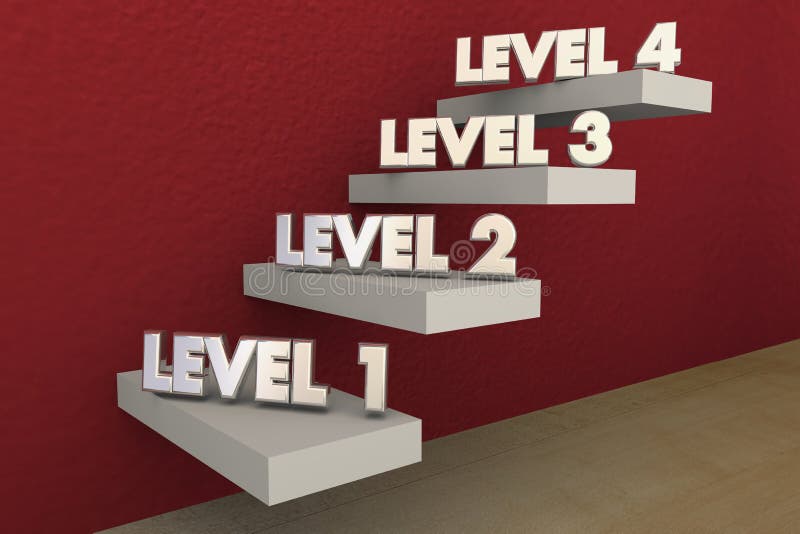
Free with trial Levels Steps Stairs 1 to 4 Rising Climbing Higher 3d Illustration. Highest points illustrations Levels Steps Stairs 1 to 4 Rising Climbing Higher
Free with trial Vector cartoon illustration of tiny people with big stars in them hands. The best estimate, the score of five points. Characters leave feedback and comments, successful work is the highest score. Highest points vectors People leave feedback and comments. Vector cartoon illustration of tiny people with big stars in them hands . The best estimate, the score of five points. Characters leave feedback and comments, successful work is the highest score.
Free with trial Ten 3D rating stars. Vector gold stars to indicate the rating of products or films. Vector clipart for your projects. Highest points vectors Ten 3D rating stars. Vector gold stars to indicate the rating of products or films.
Free with trial Rating five stars. 3d stars. Vector gold stars to indicate the rating of products or films. Vector clipart for your projects. Highest points vectors Rating five stars. 3d stars. Vector gold stars to indicate the rating of products or films.
Free with trial This portrait-style topographic map of Africa showcases intricate elevation details, meticulously derived from WGS84 data. The map reveals a stunning array of geographical features, from the towering peaks of the Atlas Mountains and the dramatic Rift Valley to the vast plateaus and coastal plains. Visualize the diverse landscapes, from the highest points to the deepest valleys, and observe how. Highest points illustrations Detailed Topographic Map of Africa Exploring Elevation Variations Across the Continent Using WGS84 Data. This portrait-style topographic map of Africa showcases intricate elevation details, meticulously derived from WGS84 data. The map reveals a stunning array of geographical features, from the towering peaks of the Atlas Mountains and the dramatic Rift Valley to the vast plateaus and coastal plains. Visualize the diverse landscapes, from the highest points to the deepest valleys, and observe how
Free with trial Tall sy ladders are set up to reach the highest points for the grand finale creating a pictureperfect scene against the dark sky.. Vector illustration. Highest points vectors Tall sy ladders are set up to reach the highest points for the grand finale creating a pictureperfect scene against the
Free with trial Best performance, score five points. people leave reviews and comments that successful work is the highest score, the hand shows the gesture a class vector. Highest points vectors Best performance, score five points. people leave reviews and comments that successful work is the highest score, the hand shows
Free with trial This image depicts a 3D bar graph with data points represented as bars, showing a consistent upward trend. The bars are illuminated with a blue glow, and a star symbol at the top right indicates the highest data point. Highest points illustrations A 3d graph showing a steady increase in data points over time. This image depicts a 3D bar graph with data points represented as bars, showing a consistent upward trend. The bars are illuminated with a blue glow, and a star symbol at the top right indicates the highest data point
Free with trial This image features a bar chart with a large number of bars, each representing a data point. The bars are arranged in a symmetrical pattern, with the highest concentration of data points in the center and fewer data points as you move towards the edges. The colors of the bars range from light to dark blue, creating a gradient effect that emphasizes the height of the bars. The chart appears to be. Highest points illustrations A detailed bar chart illustrating the distribution of data points across a range of values. This image features a bar chart with a large number of bars, each representing a data point. The bars are arranged in a symmetrical pattern, with the highest concentration of data points in the center and fewer data points as you move towards the edges. The colors of the bars range from light to dark blue, creating a gradient effect that emphasizes the height of the bars. The chart appears to be
Free with trial The image consists of four scatter plots arranged in a 2x2 grid. Each plot displays data points colored in a gradient from yellow (high density) to red (lower density) against a light pink background, with the highest density regions marked by black outlines. The plots show different clustering patterns, likely representing variations in data distribution or algorithmic outputs. Highest points illustrations Visualization of data points clustered by density and coloring intensity isolated on transparent background, isolated on white. The image consists of four scatter plots arranged in a 2x2 grid. Each plot displays data points colored in a gradient from yellow (high density) to red (lower density) against a light pink background, with the highest density regions marked by black outlines. The plots show different clustering patterns, likely representing variations in data distribution or algorithmic outputs
Free with trial Drone vertical shot of person hiking on rugged island trail. Trail connects highest points of Madeira island in Portugal. Person walks on rocky path, with steep slope. Highest points illustrations Drone vertical shot of person hiking on rugged island trail. Trail connects highest points of Madeira island in Portugal. Person
Free with trial The image depicts a circular temperature gauge displaying a reading of 85 degrees Fahrenheit. The gauge has a color-coded scale ranging from blue at the lowest temperatures to red at the highest. The needle points to the 85-degree mark, indicating the current temperature. The gauge is encased in a metallic frame, giving it a robust and professional appearance. Highest points vectors Temperature gauge at 85 degrees fahrenheit. The image depicts a circular temperature gauge displaying a reading of 85 degrees Fahrenheit. The gauge has a color-coded scale ranging from blue at the lowest temperatures to red at the highest. The needle points to the 85-degree mark, indicating the current temperature. The gauge is encased in a metallic frame, giving it a robust and professional appearance
Free with trial The image features a round temperature gauge that displays both Fahrenheit and Celsius scales. The gauge is color-coded, with blue representing lower temperatures, green for moderate temperatures, yellow for higher temperatures, and red for the highest temperatures. The needle points to a specific temperature value, and the gauge includes a red indicator at the bottom. Highest points vectors Colorful temperature gauge displaying fahrenheit and celsius. The image features a round temperature gauge that displays both Fahrenheit and Celsius scales. The gauge is color-coded, with blue representing lower temperatures, green for moderate temperatures, yellow for higher temperatures, and red for the highest temperatures. The needle points to a specific temperature value, and the gauge includes a red indicator at the bottom
Free with trial A graphic design featuring a silhouette of mountain peaks, adorned with stars on the highest points and a whimsical. Highest points illustrations Mountain peaks silhouette with stars and bell logo mountain range mountains. A graphic design featuring a silhouette of mountain peaks, adorned with stars on the. A graphic design featuring a silhouette of mountain peaks, adorned with stars on the highest points and a whimsical
Free with trial The image depicts a combination of a bar graph and a line graph. The bar graph consists of alternating purple and orange bars, representing different data points. The line graph, which is overlaid on the bar graph, connects the highest points of the bars with purple dots and lines, indicating a trend over time. The overall trend shows an upward trajectory, suggesting an increase in the data values. Highest points illustrations Graph showing data trends over time. The image depicts a combination of a bar graph and a line graph. The bar graph consists of alternating purple and orange bars, representing different data points. The line graph, which is overlaid on the bar graph, connects the highest points of the bars with purple dots and lines, indicating a trend over time. The overall trend shows an upward trajectory, suggesting an increase in the data values
Free with trial A dark brown background is illuminated by a cascade of golden glittering particles. The particles vary in size and intensity, with some appearing as sharp points of light and others as soft, blurred bokeh circles. The density of the particles is highest at the of the creating a shimmering curtain that gradually thins out as it descends. Highest points illustrations Golden Glittering Particles Falling on Dark Brown Background. A dark brown background is illuminated by a cascade of golden glittering particles. The particles vary in size and intensity, with some appearing as sharp points of light and others as soft, blurred bokeh circles. The density of the particles is highest at the of the creating a shimmering curtain that gradually thins out as it descends
Free with trial This image depicts a topographic map of North America, showcasing the elevation variations across the continent. The map uses color gradients to represent different elevations, with red indicating the highest points and green the lowest. Major geographical features such as mountain ranges, plains, and coastal areas are clearly visible. The map also includes the Arctic Ocean to the north and the. Highest points illustrations North american topographic map. This image depicts a topographic map of North America, showcasing the elevation variations across the continent. The map uses color gradients to represent different elevations, with red indicating the highest points and green the lowest. Major geographical features such as mountain ranges, plains, and coastal areas are clearly visible. The map also includes the Arctic Ocean to the north and the
Free with trial A majestic eagle is depicted soaring upwards, leaving a trail that points towards a star. This powerful image symbolizes freedom, ambition, patriotism, and aiming for the highest goals. Ideal for corporate branding, leadership, and motivational content. vector design Generative AI. Highest points vectors An eagle flying high in the sky, leaving a trail towards a star. vector design Generative AI. A majestic eagle is depicted soaring upwards, leaving a trail that points towards a star. This powerful image symbolizes freedom, ambition, patriotism, and aiming for the highest goals. Ideal for corporate branding, leadership, and motivational content. vector design Generative AI
Free with trial The image depicts a colorful temperature gauge displaying degrees in a range from 0 to 180. The gauge is segmented into various color-coded sections, representing different temperature ranges. The needle on the gauge points to a specific temperature, indicating the current reading. The colors transition smoothly from blue at the lowest temperature to red at the highest, passing through green,. Highest points vectors Colorful temperature gauge displaying degrees
Free with trial The image depicts a bar graph with a prominent upward trend, symbolizing growth and improvement in business performance. The graph features multiple bars of varying heights, with the highest bars representing the most significant growth. An arrow at the top of the graph points upward, emphasizing the upward trajectory. The colors used in the graph are vibrant, with shades of blue and gray for the. Highest points illustrations Growing business performance graph. The image depicts a bar graph with a prominent upward trend, symbolizing growth and improvement in business performance. The graph features multiple bars of varying heights, with the highest bars representing the most significant growth. An arrow at the top of the graph points upward, emphasizing the upward trajectory. The colors used in the graph are vibrant, with shades of blue and gray for the
Free with trial The image depicts a bar graph with an upward trend. The graph starts with a low bar and progressively increases in height, culminating in the highest bar at the top. An arrow at the top right corner points upwards, emphasizing the upward trend. This type of graph is commonly used to illustrate growth or improvement over time. Highest points illustrations Graph showing increasing trend. The image depicts a bar graph with an upward trend. The graph starts with a low bar and progressively increases in height, culminating in the highest bar at the top. An arrow at the top right corner points upwards, emphasizing the upward trend. This type of graph is commonly used to illustrate growth or improvement over time
Free with trial The image depicts a bar graph with a series of increasing bars, each one taller than the last. The bars transition from light blue to dark blue, indicating a rising trend. A green arrow at the top of the highest bar points upward, emphasizing the upward trajectory. Highest points illustrations Growing bar graph with upward trend. The image depicts a bar graph with a series of increasing bars, each one taller than the last. The bars transition from light blue to dark blue, indicating a rising trend. A green arrow at the top of the highest bar points upward, emphasizing the upward trajectory
Free with trial This image depicts a vibrant 3D graph with a series of peaks and valleys. The graph features a gradient of colors, ranging from blue at the base to red at the highest points. The intricate structure suggests complex data visualization, likely representing variations in data over a specific range. The smooth transitions between colors indicate gradual changes in values. Highest points illustrations Colorful 3d graph with peaks and valleys. This image depicts a vibrant 3D graph with a series of peaks and valleys. The graph features a gradient of colors, ranging from blue at the base to red at the highest points. The intricate structure suggests complex data visualization, likely representing variations in data over a specific range. The smooth transitions between colors indicate gradual changes in values
Free with trial An illustration symbolizing peak environmental performance. A gauge's needle points to the highest green level, indicating an optimal eco-friendly rating. Highest points vectors Maximum Sustainability Score on EcoFriendly Gauge. An illustration symbolizing peak environmental performance. A gauge's needle points to the highest green level, indicating an optimal eco-friendly rating
Free with trial This image features a bar graph with bars of increasing height, each in a different vibrant color. An orange arrow points upward from the top of the highest bar, symbolizing growth, progress, and success. Highest points illustrations Growth and success represented by increasing bar graph. This image features a bar graph with bars of increasing height, each in a different vibrant color. An orange arrow points upward from the top of the highest bar, symbolizing growth, progress, and success
Free with trial A businessman's hand points to the highest satisfaction emoji on a virtual interface, symbolizing excellent customer service and positive feedback. Digital survey for user experience. Highest points illustrations Positive customer feedback selection for great service. A businessman's hand points to the highest satisfaction emoji on a virtual interface, symbolizing excellent customer service and positive feedback. Digital survey for user experience
Free with trial A computer screen shows a graph with red and blue lines. The red lines are the highest points on the graph, and the blue lines are the lowest points. Generative AI. Highest points illustrations A computer screen shows a graph with red and blue lines
Free with trial A modern digital illustration of a steel industry infographic features a dark blue background with the text 'Steel Infographic' in white at the top left, and a dynamic vertical bar graph in vibrant orange at the center, where bars of varying heights represent different data points related to steel production, demand, or performance, arranged from lowest at the top to highest at the bottom,. Highest points illustrations Modern steel industry infographic with dark blue background and vertical bar graph showing growth trends in orange. A modern digital illustration of a steel industry infographic features a dark blue background with the text 'Steel Infographic' in white at the top left, and a dynamic vertical bar graph in vibrant orange at the center, where bars of varying heights represent different data points related to steel production, demand, or performance, arranged from lowest at the top to highest at the bottom,
Free with trial The image displays a spherical world map with a gradient color scheme primarily in shades of blue and gray. The darkest blues represent the highest density or concentration of data points, while lighter blues and grays indicate lower density. The map appears to highlight regions with varying intensities, suggesting geographical data distribution across the continents and oceans. Highest points illustrations A world map visualization with varying shades of blue and gray. The image displays a spherical world map with a gradient color scheme primarily in shades of blue and gray. The darkest blues represent the highest density or concentration of data points, while lighter blues and grays indicate lower density. The map appears to highlight regions with varying intensities, suggesting geographical data distribution across the continents and oceans
Free with trial The image depicts a world map with numerous interconnected data points and network lines, highlighting the distribution and connection of information across different regions. The density of connections is highest in North America, Europe, and parts of Asia, with sparse connections in other areas such as Africa and South America. Highest points illustrations Global data points networked across a world map visualization. The image depicts a world map with numerous interconnected data points and network lines, highlighting the distribution and connection of information across different regions. The density of connections is highest in North America, Europe, and parts of Asia, with sparse connections in other areas such as Africa and South America
Free with trial A detailed close-up of a yellow notebook lying open on a wooden desk features a hand-drawn vertical bar graph with six distinct bars representing different data levels, where the highest bar is labeled Dummy and a middle bar is marked with a dotted reference line, accompanied by handwritten notes in black cursive ink listing data points on the right side, with a laptop and a desk lamp visible in. Highest points illustrations Close-up of a yellow notebook featuring a vertical bar graph with six data levels and handwritten notes on a wooden desk with. A detailed close-up of a yellow notebook lying open on a wooden desk features a hand-drawn vertical bar graph with six distinct bars representing different data levels, where the highest bar is labeled Dummy and a middle bar is marked with a dotted reference line, accompanied by handwritten notes in black cursive ink listing data points on the right side, with a laptop and a desk lamp visible in
Free with trial This 3D rendering features a horizontal bar graph with four distinct colored bars arranged in descending order on a gray concrete surface, where orange, yellow, green, and blue bars represent data points with the highest bar indicating 15% rating down as labeled in the top left corner, creating a modern visual for business analytics, financial reports, or marketing presentations that need to. Highest points illustrations A 3D rendered bar graph with colorful horizontal bars showing data decline on a textured concrete background for business. This 3D rendering features a horizontal bar graph with four distinct colored bars arranged in descending order on a gray concrete surface, where orange, yellow, green, and blue bars represent data points with the highest bar indicating 15% rating down as labeled in the top left corner, creating a modern visual for business analytics, financial reports, or marketing presentations that need to
Free with trial A breathtaking drone photograph of Lake Yumoto in Nikkล National Park, capturing the perfectly still, mirror-like surface that reflects the surrounding mountains covered in fiery autumn foliage. The volcanic peaks of Nantai-san are visible in the distance, with early snow dusting the highest points. Photorealistic, mirror lake, autumn reflection, volcanic peaks, serene atmosphere. Generative. Highest points illustrations Aerial Shot of Nikkล National Lake Yumoto Autumn Mirror Surface. A breathtaking drone photograph of Lake Yumoto in Nikkล National Park, capturing the perfectly still, mirror-like surface that reflects the surrounding mountains covered in fiery autumn foliage. The volcanic peaks of Nantai-san are visible in the distance, with early snow dusting the highest points. Photorealistic, mirror lake, autumn reflection, volcanic peaks, serene atmosphere. Generative
Free with trial A breathtaking panoramic view of jagged mountain peaks reflected in a calm alpine lake at sunrise. The peaks are sharp and dramatic, with snow on their highest points catching the first golden light. The lake is perfectly still, creating a mirror image of the mountains and the colorful sky above. The sky transitions from deep blue to warm orange and pink. Pine trees line the shoreline. The wide. Highest points illustrations Panoramic mountain view with jagged peaks and alpine lake at sunrise. A breathtaking panoramic view of jagged mountain peaks reflected in a calm alpine lake at sunrise. The peaks are sharp and dramatic, with snow on their highest points catching the first golden light. The lake is perfectly still, creating a mirror image of the mountains and the colorful sky above. The sky transitions from deep blue to warm orange and pink. Pine trees line the shoreline. The wide
Free with trial This image shows a heat map of a geographic area with varying densities of data points. The central region is depicted in dark purple, surrounded by concentric layers of orange and yellow, transitioning outward to green and light green. The concentration of data points is highest in the central dark area, gradually decreasing towards the outer edges, suggesting a densely populated or highly active. Highest points illustrations Visual representation of a dense urban heat map with central intensity. This image shows a heat map of a geographic area with varying densities of data points. The central region is depicted in dark purple, surrounded by concentric layers of orange and yellow, transitioning outward to green and light green. The concentration of data points is highest in the central dark area, gradually decreasing towards the outer edges, suggesting a densely populated or highly active
Free with trial The image shows a heatmap overlay on a geographical map, with varying intensities of red, yellow, and white colors indicating the concentration of data points or activity. The highest concentration appears in the central region of the map, with lower densities radiating outward in lighter shades. The surrounding areas are marked with grayed-out regions, possibly representing regions with no data. Highest points illustrations Heatmap visualization of data concentration across a geographical area. The image shows a heatmap overlay on a geographical map, with varying intensities of red, yellow, and white colors indicating the concentration of data points or activity. The highest concentration appears in the central region of the map, with lower densities radiating outward in lighter shades. The surrounding areas are marked with grayed-out regions, possibly representing regions with no data
Free with trial The image displays a multi-colored data visualization with a dense central area of dark red, surrounded by lighter shades of red and various other colors including yellow, green, and blue. The gradient and intensity suggest hierarchical clustering or density distribution, with the darkest red indicating the highest concentration or most significant data points. The image is symmetric, featuring a. Highest points illustrations Visualization of data clusters with a prominent central dark red section. The image displays a multi-colored data visualization with a dense central area of dark red, surrounded by lighter shades of red and various other colors including yellow, green, and blue. The gradient and intensity suggest hierarchical clustering or density distribution, with the darkest red indicating the highest concentration or most significant data points. The image is symmetric, featuring a
Free with trial This educational infographic presents a visual comparison of atmospheric turbulence and temperature differences across various global locations including Comperaite Ridge A, Ridge A, Frost White, Hawaii, and Chile, featuring wave-like patterned lines that illustrate temperature fluctuations from highest to lowest points against a dark blue background with white text and a small globe illustration. Highest points illustrations Infographic comparing atmospheric turbulence and temperature variations between countries with wave pattern lines on dark blue. This educational infographic presents a visual comparison of atmospheric turbulence and temperature differences across various global locations including Comperaite Ridge A, Ridge A, Frost White, Hawaii, and Chile, featuring wave-like patterned lines that illustrate temperature fluctuations from highest to lowest points against a dark blue background with white text and a small globe illustration
Free with trial This image is a heatmap representing the intensity or density of data points across a geographic region. The color gradient ranges from light shades (indicating lower density) to darker shades (indicating higher density), with dark red and purple representing the highest concentrations. The map appears to be overlaid on a geographic layout, possibly a map of a country or region, with notable. Highest points illustrations Heatmap visualization showing data distribution across geographic regions. This image is a heatmap representing the intensity or density of data points across a geographic region. The color gradient ranges from light shades (indicating lower density) to darker shades (indicating higher density), with dark red and purple representing the highest concentrations. The map appears to be overlaid on a geographic layout, possibly a map of a country or region, with notable
Free with trial This heatmap displays the density and distribution of a population across an urban area. Darker green and red areas indicate higher density or concentration of data points, with red regions showing the highest density in the southern part of the map. The image uses a gradient to represent varying levels of intensity, providing a clear visual representation of population clusters, density gradients. Highest points illustrations Heatmap visualization of urban density patterns and demographic distribution. This heatmap displays the density and distribution of a population across an urban area. Darker green and red areas indicate higher density or concentration of data points, with red regions showing the highest density in the southern part of the map. The image uses a gradient to represent varying levels of intensity, providing a clear visual representation of population clusters, density gradients
Free with trial A serene twilight landscape of majestic mountains as the last light fades. The sky is a deep gradient of dark blue and purple, with the first few bright stars beginning to appear. The mountain peaks are silhouetted against the sky, with a faint alpenglow still visible on the highest points. Snow on the peaks catches the last light. The valleys below are filled with deep shadow. The scene captures. Highest points illustrations Twilight landscape scenery with deep blue sky and first stars over mountains. A serene twilight landscape of majestic mountains as the last light fades. The sky is a deep gradient of dark blue and purple, with the first few bright stars beginning to appear. The mountain peaks are silhouetted against the sky, with a faint alpenglow still visible on the highest points. Snow on the peaks catches the last light. The valleys below are filled with deep shadow. The scene captures
Free with trial The image displays a three-dimensional globe with a dense concentration of green hexagonal data points covering most landmasses, indicating areas of high data connectivity or activity. The points are interconnected by fine white lines, suggesting relationships or data flows between locations. The highest density of data points appears in North America, Europe, and parts of Asia, with sparser. Highest points illustrations Detailed visualization of global data points representing interconnected networks. The image displays a three-dimensional globe with a dense concentration of green hexagonal data points covering most landmasses, indicating areas of high data connectivity or activity. The points are interconnected by fine white lines, suggesting relationships or data flows between locations. The highest density of data points appears in North America, Europe, and parts of Asia, with sparser
Free with trial This image depicts a seismic graph, which is a visual representation of the ground motion recorded during an earthquake. The graph shows the amplitude and frequency of the seismic waves, with the vertical axis representing amplitude and the horizontal axis representing time. The spikes in the graph indicate the points of highest intensity during the earthquake. Highest points illustrations A detailed seismic graph illustrating the intensity and frequency of an earthquake. This image depicts a seismic graph, which is a visual representation of the ground motion recorded during an earthquake. The graph shows the amplitude and frequency of the seismic waves, with the vertical axis representing amplitude and the horizontal axis representing time. The spikes in the graph indicate the points of highest intensity during the earthquake
Free with trial This image depicts a classic archery target with a series of concentric circles, each representing different scoring zones. The innermost circle, which is black, is the highest scoring area with a value of 9 points. Surrounding this central black circle are progressively lighter rings, each labeled with their respective scores, such as 8, 7, 5, 4, 3, 2, and 1, moving outward. The outermost ring is. Highest points vectors A detailed target archery scoring diagram with concentric rings and numerical scoring system. This image depicts a classic archery target with a series of concentric circles, each representing different scoring zones. The innermost circle, which is black, is the highest scoring area with a value of 9 points. Surrounding this central black circle are progressively lighter rings, each labeled with their respective scores, such as 8, 7, 5, 4, 3, 2, and 1, moving outward. The outermost ring is
Free with trial This image showcases a visually appealing gradient terrain map with varying shades of color representing different elevations. The map transitions smoothly from deep purples at the highest points to warm oranges and browns at the lowest, giving a clear sense of depth and geographical variation. The texture and shading enhance the perception of a three-dimensional landscape, ideal for illustrating. Highest points illustrations Colorful gradient terrain with layered elevation depicting a digital topographic map. This image showcases a visually appealing gradient terrain map with varying shades of color representing different elevations. The map transitions smoothly from deep purples at the highest points to warm oranges and browns at the lowest, giving a clear sense of depth and geographical variation. The texture and shading enhance the perception of a three-dimensional landscape, ideal for illustrating