Free with trial Bar chart illustrating sequential contributions using green and red arrows for percentages. The x-axis depicts different stages: Initial Value, Regribution, and multiple Contributions leading to Total Value. Each stage shows percentage increases: 1. 40%, 4. 00%, 2. 55%, 4. 50%, 4. 95%, and 1205% cumulatively. A blue bar on the right indicates a Total of 22. 00%, further broken down to 2. 00%. Labels "Peget" and "Running Total" distinguish between green and red elements, with a clean white background. Initial axis illustrations Depicts different stages: Initial Value, Regribution, and multiple. Bar chart illustrating sequential contributions using green and red arrows for percentages. Bar chart illustrating sequential contributions using green and red arrows for percentages. The x-axis depicts different stages: Initial Value, Regribution, and multiple Contributions leading to Total Value. Each stage shows percentage increases: 1.40%, 4.00%, 2.55%, 4.50%, 4.95%, and 1205% cumulatively. A blue bar on the right indicates a Total of 22.00%, further broken down to 2.00%. Labels "Peget" and "Running Total" distinguish between green and red elements, with a clean white background.
Free with trial Linear timeline showing quality assurance steps including initial inspection and in process checks. Graphic elements include magnifying glass and conveyor belt icons connected by arrows on horizontal axis to represent product validation standards. Initial axis vectors Quality control inspection stages infographic featuring blue icons for receiving raw materials through shipment. Linear timeline showing quality assurance steps. Linear timeline showing quality assurance steps including initial inspection and in process checks. Graphic elements include magnifying glass and conveyor belt icons connected by arrows on horizontal axis to represent product validation standards
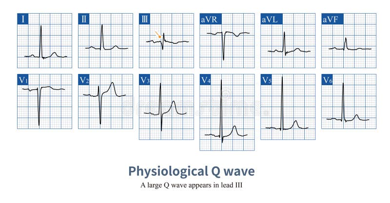
Free with trial Male, 23 years old, healthy. When the initial excitation potential of the ventricle deviates from a certain lead axis, a Q wave will be projected onto that lead, which is a physiological Q wave. Initial axis illustrations Physiological Q wave. Male, 23 years old, healthy. When the initial excitation potential of the ventricle deviates from a certain lead axis, a Q wave will be. Male, 23 years old, healthy. When the initial excitation potential of the ventricle deviates from a certain lead axis, a Q wave will be projected onto that lead, which is a physiological Q wave.
Free with trial A minimalist black outline icon of a line graph on a white background. It features an x-axis and y-axis with arrows, and a line connecting three data points that show an initial increase, a slight dip, and then a strong upward trend. This versatile graphic represents data visualization, business growth, financial progress, statistics, analytics, and market trends. Ideal for digital interfaces, presentations, reports, and informational graphics. Generated by AI. Initial axis vectors Simple Line Graph Icon for Data, Business & Growth. A minimalist black outline icon of a line graph on a white background. It features an x-axis and y-axis with. A minimalist black outline icon of a line graph on a white background. It features an x-axis and y-axis with arrows, and a line connecting three data points that show an initial increase, a slight dip, and then a strong upward trend. This versatile graphic represents data visualization, business growth, financial progress, statistics, analytics, and market trends. Ideal for digital interfaces, presentations, reports, and informational graphics. Generated by AI
Free with trial A scientific line graph displays the relationship between protons and proton beam intensity over time, with the x-axis indicating time periods and the y-axis showing numerical values, featuring a blue line representing proton levels and a green line tracking proton beam values, illustrating a steady increase in proton beam activity despite initial lower values, with two labeled data points marked. Initial axis illustrations Proton and proton beam activity over time graph with dual data lines. A scientific line graph displays the relationship between protons and proton beam intensity. A scientific line graph displays the relationship between protons and proton beam intensity over time, with the x-axis indicating time periods and the y-axis showing numerical values, featuring a blue line representing proton levels and a green line tracking proton beam values, illustrating a steady increase in proton beam activity despite initial lower values, with two labeled data points marked
Free with trial A detailed, cross-section illustration of a dicotyledonous seed undergoing germination. The image clearly depicts the seed coat, cotyledons filled with stored food, the embryonic axis with a developing radicle (root) and plumule (shoot), and the initial growth of root hairs. The internal structure of the cotyledons, showing vascular bundles, is. Initial axis illustrations Detailed illustration of a dicotyledonous seed in longitudinal section, showing germination. A detailed, cross-section illustration of a dicotyledonous seed. A detailed, cross-section illustration of a dicotyledonous seed undergoing germination. The image clearly depicts the seed coat, cotyledons filled with stored food, the embryonic axis with a developing radicle (root) and plumule (shoot), and the initial growth of root hairs. The internal structure of the cotyledons, showing vascular bundles, is...
Free with trial Squared Letter PG or GP Logo Template Design. Initial axis illustrations Squared Letter PG or GP Logo Template. Design
Free with trial Geometric Square Letter PF or FP Logo Template. Letter P Logo Idea. Letter F Logo Concept Design. Initial axis illustrations Geometric Square Letter PF or FP Logo Template. Letter P Logo Idea. Letter F Logo Concept. Design
Free with trial A clean, minimalist 3D render of a large, white, sans-serif letter 'X' positioned centrally against a dark, subtly textured background. The letter has a smooth, polished surface with soft shadows and highlights, giving it a sense of depth and volume. The overall aesthetic is modern and sophisticated, suitable for a wide range of design applications. Initial axis illustrations 3D White Letter X on Dark Background. A clean, minimalist 3D render of a large, white, sans-serif letter 'X' positioned centrally against a dark, subtly textured. A clean, minimalist 3D render of a large, white, sans-serif letter 'X' positioned centrally against a dark, subtly textured background. The letter has a smooth, polished surface with soft shadows and highlights, giving it a sense of depth and volume. The overall aesthetic is modern and sophisticated, suitable for a wide range of design applications.
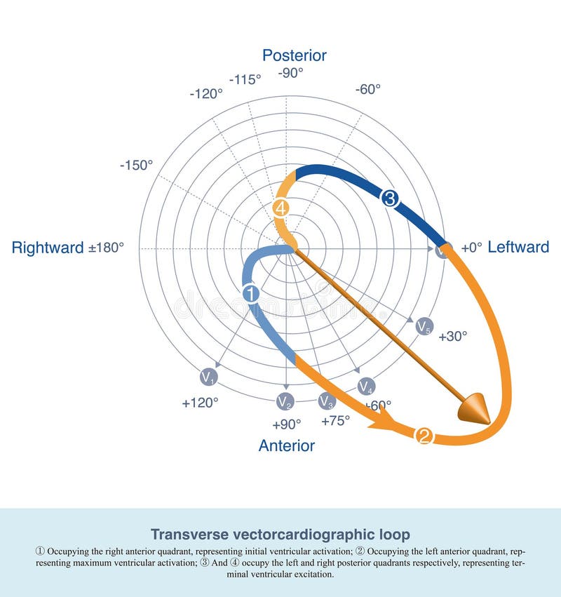
Free with trial The common ECG changes in COPD patients include right axis deviation, low voltage, right atrial abnormality and clockwise rotation. Initial axis illustrations Transverse vectorcardiographic loop. The common ECG changes in COPD patients include right axis deviation, low voltage, right atrial abnormality and clockwise. The common ECG changes in COPD patients include right axis deviation, low voltage, right atrial abnormality and clockwise rotation.
Free with trial Trigonometry word cloud collage, education concept background. Initial axis illustrations Trigonometry word cloud collage. Education concept background
Free with trial The image depicts a line graph with a green line that starts at the origin and increases steadily over time. The x-axis is labeled 'Time' and the y-axis is labeled 'Profit'. The graph shows a slow initial growth, followed by a period of stability, and then a sharp increase in profit towards the end. This image was generated using artificial intelligence. Initial axis illustrations A green line graph showing a steady increase in profit over time. The image depicts a line graph with a green line that starts at the origin and increases. The image depicts a line graph with a green line that starts at the origin and increases steadily over time. The x-axis is labeled 'Time' and the y-axis is labeled 'Profit'. The graph shows a slow initial growth, followed by a period of stability, and then a sharp increase in profit towards the end. This image was generated using artificial intelligence.
Free with trial Detailed physics diagram illustrating projectile motion with its exact parabolic trajectory equation, velocity vectors, and gravity. Ideal for educational content, scientific explanations, or engineering presentations. This image was created using artificial intelligence technology. Initial axis illustrations Physics diagram showing exact parabolic trajectory with equation and vectors. Detailed physics diagram illustrating projectile motion with its exact parabolic. Detailed physics diagram illustrating projectile motion with its exact parabolic trajectory equation, velocity vectors, and gravity. Ideal for educational content, scientific explanations, or engineering presentations.This image was created using artificial intelligence technology.
Free with trial Trigonometry word cloud collage, education concept background. Initial axis illustrations Trigonometry word cloud collage, education concept background. Trigonometry word cloud collage, education concept
Free with trial Trigonometry word cloud collage, education concept background. Initial axis illustrations Trigonometry word cloud collage. Education concept background
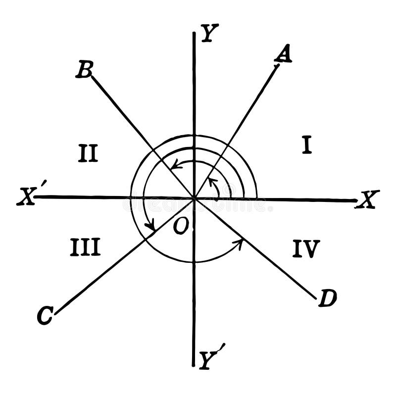
Free with trial An image showing trigonometric angles and quadrants. The X axis and the Y axis intersect, vintage line drawing or engraving illustration. Initial axis vectors Trigonometric Angles and Quadrants. vintage illustration. An image showing trigonometric angles and quadrants. The X axis and the Y axis intersect, vintage line. An image showing trigonometric angles and quadrants. The X axis and the Y axis intersect, vintage line drawing or engraving illustration
Free with trial A stylized monogram logo features two white letter "H"s oriented symmetrically around a central axis, forming a circular shape. The design is set against a black background, emphasizing the contrast. Below the logo, the text "CREATIVE DESIGN" appears in white, with "YOUR TAGLINE HERE" in smaller font beneath. The overall look is modern and sleek, with a minimalist aesthetic. Initial axis vectors Circle letter H H monogram logo. A stylized monogram logo features two white letter 'H's oriented symmetrically around a central axis, forming a circular shape. A stylized monogram logo features two white letter "H"s oriented symmetrically around a central axis, forming a circular shape. The design is set against a black background, emphasizing the contrast. Below the logo, the text "CREATIVE DESIGN" appears in white, with "YOUR TAGLINE HERE" in smaller font beneath. The overall look is modern and sleek, with a minimalist aesthetic.
Free with trial Trigonometry word cloud collage, education concept background. Initial axis illustrations Trigonometry word cloud collage, education concept background
Free with trial Trigonometry word cloud collage, education concept. Background. Initial axis illustrations Trigonometry word cloud collage, education concept. Background
Free with trial This graph illustrates a growth curve, generated by AI, showing a rapid initial increase followed by a slower, more gradual ascent. The data points suggest an asymptotic approach to a maximum value. This type of curve is common in various fields, from population growth to technological adoption. Initial axis illustrations AI-Generated Growth Curve. This graph illustrates a growth curve, generated by AI, showing a rapid initial increase followed by a slower, more gradual ascent. This graph illustrates a growth curve, generated by AI, showing a rapid initial increase followed by a slower, more gradual ascent. The data points suggest an asymptotic approach to a maximum value. This type of curve is common in various fields, from population growth to technological adoption.
 Sign in