Free with trial Economic crisis line icon of real estate value down or property depreciation, vector outline symbol. Real estate value decrease with arrow down icon for global economic crisis and financial downturn. Low decrease vectors Economic crisis line icon, real estate value down. Economic crisis line icon of real estate value down or property depreciation, vector outline symbol. Real estate value decrease with arrow down icon for global economic crisis and financial downturn
Free with trial Illustration of reduce risk level concept. Businessman pull risk indicators to low. Illustrations for websites, landing pages, mobile apps, posters and banners. Low decrease vectors Illustration of reduce risk level concept
Free with trial Economic crisis line icon of investment decline with arrow down, vector outline symbol. Global economy downturn and bankruptcy or world crisis in banking business and stock exchange decrease. Low decrease vectors Economic crisis line icon of investment decline
Free with trial A 3D render of a red thermometer with a white liquid column indicating a low temperature, positioned next to a blue square icon featuring three white downward-pointing arrows. The objects are isolated on a clean white background, suggesting a concept of decreasing temperature or a negative trend. Low decrease illustrations Red Thermometer Icon With Down Arrow Symbol On White Background temperature cold. A 3D render of a red thermometer with a white liquid column indicating a low temperature, positioned next to a blue square icon featuring three white downward-pointing arrows. The objects are isolated on a clean white background, suggesting a concept of decreasing temperature or a negative trend
Free with trial The image depicts a simple line graph that illustrates the fluctuation of data over a period of time. The x-axis represents the time, while the y-axis represents the variable being measured. The line graph shows several peaks and troughs, indicating variations in the data points. The graph starts at a low point, rises to a peak, dips to a trough, and then continues to fluctuate in this manner. The. Low decrease vectors Graphical representation of fluctuating data over time. The image depicts a simple line graph that illustrates the fluctuation of data over a period of time. The x-axis represents the time, while the y-axis represents the variable being measured. The line graph shows several peaks and troughs, indicating variations in the data points. The graph starts at a low point, rises to a peak, dips to a trough, and then continues to fluctuate in this manner. The
Free with trial A bold, red, transparent percentage symbol is combined with a downward-pointing arrow, creating a strong visual representation of a decrease or reduction. The material appears to be glass or acrylic, with light reflecting off its smooth surfaces. The symbol is isolated on a clean white background, making its message of decline or discount clear and impactful. Low decrease illustrations Red Transparent Percentage Symbol with Downward Arrow on White Background image photo. A bold, red, transparent percentage symbol is combined with a downward-pointing arrow, creating a strong visual representation of a decrease or reduction. The material appears to be glass or acrylic, with light reflecting off its smooth surfaces. The symbol is isolated on a clean white background, making its message of decline or discount clear and impactful
Free with trial Money loss and economic crisis, money market crash and global financial downturn, vector line icons. Economic crisis icons of bankruptcy, price decrease with money inflation and unemployment growth. Low decrease vectors Money loss and economic crisis, money market crash
Free with trial Decline investment color line icon. Vector graph of cost reduction and financial decrease with down red arrow and money. Economy, business, finance crisis, stock market crash, bankruptcy outline sign. Low decrease vectors Decline investment arrow graph color line icon. Decline investment color line icon. Vector graph of cost reduction and financial decrease with down red arrow and money. Economy, business, finance crisis, stock market crash, bankruptcy outline sign
Free with trial Money loss and economic crisis, money market crash and global financial downturn, vector line icons. Economic crisis icons of bankruptcy, price decrease with money inflation and unemployment growth. Low decrease vectors Money loss and economic crisis, money market crash
Free with trial A businessman's hands interact with a futuristic virtual interface displaying a declining bar chart, symbolizing cost reduction or performance decrease. This central icon is encircled by various business process icons, representing data analysis, management, and strategy. The concept illustrates managing a business downturn, financial crisis, or economic recession through technology and data-driven decisions. It's an ideal visual for topics like risk management, cost optimization, efficiency improvement, and corporate strategy in a challenging economic environment, set against a modern, dark background. Low decrease illustrations Business Cost Reduction and Performance Decline Analysis Concept. A businessman's hands interact with a futuristic virtual interface displaying a declining bar chart, symbolizing cost reduction or performance decrease. This central icon is encircled by various business process icons, representing data analysis, management, and strategy. The concept illustrates managing a business downturn, financial crisis, or economic recession through technology and data-driven decisions. It's an ideal visual for topics like risk management, cost optimization, efficiency improvement, and corporate strategy in a challenging economic environment, set against a modern, dark background.
Free with trial Economic crisis line icon of graph going down, economy downturn and bankruptcy vector symbol. Stock exchange or economical index decrease linear icon of financial crisis and global economy recession. Low decrease vectors Economic crisis icon of economy graph going down. Economic crisis line icon of graph going down, economy downturn and bankruptcy vector symbol. Stock exchange or economical index decrease linear icon of financial crisis and global economy recession
Free with trial Composite sketch design artwork 3D photo collage of young lady shocked arrow point low coins downwards crisis budget bankruptcy investor. Low decrease illustrations Composite sketch design artwork 3D photo collage of young lady shocked arrow point low coins downwards crisis budget
Free with trial Decline investment color line icon. Vector graph of cost reduction and financial decrease with down red arrow and money. Economy, business, finance crisis, stock market crash, bankruptcy outline sign. Low decrease illustrations Decline investment arrow graph color line icon. Decline investment color line icon. Vector graph of cost reduction and financial decrease with down red arrow and money. Economy, business, finance crisis, stock market crash, bankruptcy outline sign
Free with trial This candlestick chart displays the stock price movements of a particular stock over a specific period. Each candlestick represents the opening, closing, high, and low prices for a given time frame, with green candlesticks indicating a price increase and red candlesticks indicating a price decrease. Low decrease illustrations Candlestick chart showing stock price movements over a period of time. This candlestick chart displays the stock price movements of a particular stock over a specific period. Each candlestick represents the opening, closing, high, and low prices for a given time frame, with green candlesticks indicating a price increase and red candlesticks indicating a price decrease
Free with trial Red arrow pointing downwards financial chart. Economic recession. Financial crisis, stock market crash. Losses, decline, decrease, financial risk. Graph shows falling sales revenue. Low decrease illustrations Red arrow pointing downwards financial chart. Economic recession. Financial crisis, stock market crash. Losses, decline
Free with trial Sad man holds declining chart symbolizing beginning of crisis and financial recession affecting income. Upset guy with red down arrow reports decrease in number of clients or decrease in wages. Low decrease vectors Sad man holds declining chart symbolizing beginning crisis and financial recession affecting income. Sad man holds declining chart symbolizing beginning of crisis and financial recession affecting income. Upset guy with red down arrow reports decrease in number of clients or decrease in wages
Free with trial Stylized graphic shows two graphs trending downwards against a yellow background. A line graph shows minor fluctuations while another heavier, bolder line with an arrow accentuates the downward trend. Image may illustrate loss, decline, or decrease in reports and presentations. Vector illustration. Low decrease illustrations Declining trend graphic falling line chart with downward arrow indicator. Stylized graphic shows two graphs trending downwards against a yellow background. A line graph shows minor fluctuations while another heavier, bolder line with an arrow accentuates the downward trend. Image may illustrate loss, decline, or decrease in reports and presentations. Vector illustration
Free with trial A glass jar with bills and coins, against a background of graphs with green arrows pointing downward. Concept decline in interest rates and potential decrease in income. Low decrease illustrations A glass jar with bills and coins, against a background of graphs with green arrows pointing downward. Concept decline in interest
Free with trial This image depicts a candlestick chart, a type of financial chart used to describe price movements of securities, derivatives, or currencies. The chart shows a series of green and red vertical bars, with each bar representing a specific time period. The green bars indicate a price increase, while the red bars indicate a price decrease. Each bar has a rectangular body and thin lines, or wicks,. Low decrease illustrations Candlestick chart showing the rise and fall of stock prices over time. This image depicts a candlestick chart, a type of financial chart used to describe price movements of securities, derivatives, or currencies. The chart shows a series of green and red vertical bars, with each bar representing a specific time period. The green bars indicate a price increase, while the red bars indicate a price decrease. Each bar has a rectangular body and thin lines, or wicks,
Free with trial The image depicts a stock chart with a blue background, displaying the fluctuations of a stock's value over a period. The chart includes various data points, such as the opening, closing, high, and low prices, represented by different candlestick patterns. The x-axis represents time, while the y-axis represents the stock price. The chart shows an overall upward trend with some periods of decline. Low decrease illustrations A detailed stock chart showing the rise and fall of a stock\'s value over time. The image depicts a stock chart with a blue background, displaying the fluctuations of a stock's value over a period. The chart includes various data points, such as the opening, closing, high, and low prices, represented by different candlestick patterns. The x-axis represents time, while the y-axis represents the stock price. The chart shows an overall upward trend with some periods of decline
Free with trial A stylized black and white illustration shows a bar chart with bars of decreasing height, leading to a sharp downward-pointing arrow. Low decrease vectors Decreasing bar chart with downward arrow decrease downward recession statistics negative. A stylized black and white illustration shows a bar chart with bars of. A stylized black and white illustration shows a bar chart with bars of decreasing height, leading to a sharp downward-pointing arrow
Free with trial A glossy red percentage symbol is superimposed on a downward pointing arrow, suggesting a decrease in value or price. Low decrease vectors Red percentage symbol with downward arrow isolated on a transparent background sign. A glossy red percentage symbol is superimposed on a downward pointing arrow, suggesting a decrease in value or price
Free with trial Minimalist flat icon of an empty shopping basket with a red arrow pointing down, representing a decrease in sales. Low decrease vectors Red arrow pointing down to empty shopping basket minimalist icon. Minimalist flat icon of an empty shopping basket with a red arrow pointing down, representing a decrease in sales
Free with trial Visualize cost reduction with this impactful image. A hand carefully arranges wooden blocks featuring a percentage symbol and a downward-pointing arrow, representing a decrease in business costs. This graphic illustrates financial savings, investment, and improved profitability. Perfect for illustrating marketing materials, financial planning, and budget presentations, the image effectively. Low decrease illustrations Reducing business costs concept using wooden blocks with percentage symbol and arrow down. Visualize cost reduction with this impactful image. A hand carefully arranges wooden blocks featuring a percentage symbol and a downward-pointing arrow, representing a decrease in business costs. This graphic illustrates financial savings, investment, and improved profitability. Perfect for illustrating marketing materials, financial planning, and budget presentations, the image effectively
Free with trial Cooling concept, thermometer gauge showing low temperature, weather device, scientific tool, temperature drop indicator. Low decrease vectors 3d render of a thermometer with red liquid and a blue downward arrow on transparent background. Cooling concept, thermometer gauge showing low temperature, weather device, scientific tool, temperature drop indicator
Free with trial Three green arrows with white percent symbols pointing downward, representing concept of interest rate decrease or sale discount. Low decrease illustrations Three green percentage arrows pointing down isolated on white background indicating reduction. Three green arrows with white percent symbols pointing downward, representing concept of interest rate decrease or sale discount
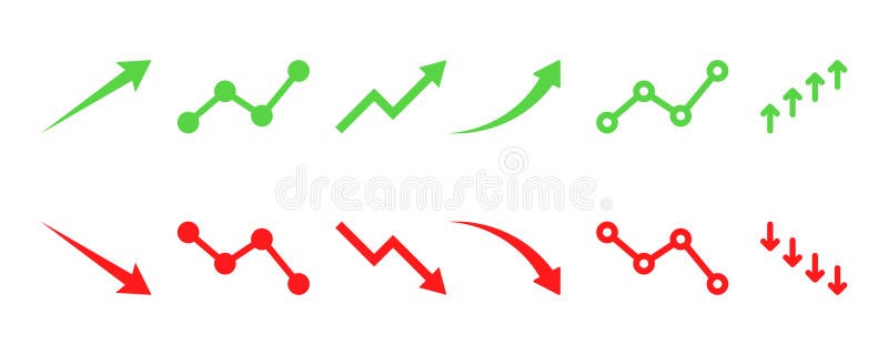
Free with trial Set of financial arrows up and down. Green and red arrows with shadow. Increase and decrease. Vector 10 EPS. Low decrease illustrations Set of financial arrows up and down. Green and red arrows with shadow.
Free with trial Measuring device indicating low temperature, cold weather symbol, scientific equipment, falling temperature indication, climate. Low decrease vectors Thermometer with red liquid and blue arrow shows declining temperature against transparent background. Measuring device indicating low temperature, cold weather symbol, scientific equipment, falling temperature indication, climate
Free with trial Outdoor thermometer weather measurement low temperature heat indicator outdoor, forecast, cool, minus, negative, climate. Low decrease vectors Thermometer showing 18.5 degrees Celsius with downward arrow indicating cold temperature and decrease concept. Outdoor thermometer weather measurement low temperature heat indicator outdoor, forecast, cool, minus, negative, climate
Free with trial Weather thermometer cold climate temperature reading decrease symbol freezing frost, outdoor,. Low decrease vectors Red and white thermometer with blue downward arrow showing low temperature for cold weather or freezing point. Weather thermometer cold climate temperature reading decrease symbol freezing frost, outdoor,
Free with trial This image shows a gradient heatmap with varying colors representing different intensities of data or values. The top section contains a solid blue band indicating high intensity or values, while the lower section displays a smooth gradient transitioning from pink and orange at the top to dark tones at the bottom. The gradient suggests a gradual decrease in intensity or value from the top to the. Low decrease illustrations Gradient heatmap representing data intensity across a rectangular area. isolated on transparent background, isolated on white. This image shows a gradient heatmap with varying colors representing different intensities of data or values. The top section contains a solid blue band indicating high intensity or values, while the lower section displays a smooth gradient transitioning from pink and orange at the top to dark tones at the bottom. The gradient suggests a gradual decrease in intensity or value from the top to the
Free with trial Up and down line icon Percentage arrow, Design concept for banking credit interest rate finance. Low decrease vectors Up, percentage, decline, pictogram, interest, decrease, increase, interest rate, gdp, growth, business growth, profit, arrow up. up and down line icon Percentage arrow, Design concept for banking credit interest rate finance
Free with trial Set of financial arrows up and down. Green and red arrows. Increase and decrease. Vector 10 EPS. Low decrease illustrations Set of financial arrows up and down. Green and red arrows.
Free with trial A figure disintegrates into particles under a low battery symbol, capturing burnout. Set in a dim gray office, this animation highlights fatigue, stress, and the need for work-life balance, perfect. Low decrease illustrations Fragmenting Adult Stickman Drained Battery Symbolizes Burnout in Gray Office with Dim Lighting Desktop Computer and. A figure disintegrates into particles under a low battery symbol, capturing burnout. Set in a dim gray office, this animation highlights fatigue, stress, and the need for work-life balance, perfect
Free with trial Cost reduction icon with dollar sign and downward arrow in circle. Financial symbol for, saving money. Economy and budget concept. Decrease expense logo. Low decrease illustrations Cost reduction icon with dollar sign and downward arrow in circle. Financial symbol for saving money. Economy and budget concept. Cost reduction icon with dollar sign and downward arrow in circle. Financial symbol for, saving money. Economy and budget concept. Decrease expense logo.
Free with trial Crude oil price decraese icon Vector symbol or sign set collection in black and white outline. Low decrease vectors Crude oil price decrease flat line icon set. Crude oil price decrease Thin line illustration vector. crude oil price decraese icon Vector symbol or sign set collection in black and white outline
Free with trial Financial arrows up and down. Green and red arrow. Increase and decrease. Vector 10 EPS. Low decrease illustrations Financial arrows up and down. Green and red arrow.
Free with trial Simple percent decline or low cost price icon. concept of debt sign or recession. simple style trend modern business or gdp logotype graphic art design web element isolated on white background. Low decrease vectors Simple percent decline or low cost price icon
Free with trial Reduce labor costs icon logo sign vector outline in black and white color. Low decrease vectors Labor Cost Reduction Icons for Worker Pay Salary and Wage Income Decrease. Reduce labor costs icon logo sign vector outline in black and white color
Free with trial This compelling image depicts a visual representation of the current state of the real estate market. Wooden houses, symbolic of residential properties, are nestled within an empty shopping cart. A red downward-trending chart, overlaid with a soft bokeh effect, graphically illustrates the negative market trend. This visual narrative conveys a significant drop in sales, a decrease in property. Low decrease illustrations Wooden Homes in Shopping Cart A Visual Representation of the Declining Real Estate Market and Reduced Demand. This compelling image depicts a visual representation of the current state of the real estate market. Wooden houses, symbolic of residential properties, are nestled within an empty shopping cart. A red downward-trending chart, overlaid with a soft bokeh effect, graphically illustrates the negative market trend. This visual narrative conveys a significant drop in sales, a decrease in property
Free with trial CO2 reducing icon on green leaf with water droplet for decrease CO2 , carbon footprint and carbon credit to limit global warming from climate change, Bio Circular Green Economy concept. Low decrease illustrations CO2 reducing icon on green leaf with water droplet for decrease CO2
Free with trial CO2 reducing icon on green leaf with water droplet for decrease CO2 , carbon footprint and carbon credit to limit global warming from climate change, Bio Circular Green Economy concept. Low decrease illustrations CO2 reducing icon on green leaf with water droplet for decrease CO2
Free with trial The concept of low price icons with percentages with up and down arrows. Vector illustration. Low decrease vectors The concept of low price icons with percentages with up and down arrows.
Free with trial Decrease icon or logo isolated sign symbol vector illustration - Collection of high quality black style vector icons, seles chart icon isolated sign symbol vector illustration - Collection of high quality. Low decrease vectors Decrease icon or logo isolated sign symbol vector illustration
Free with trial Transparent Backgrounds Mock-up. Flat 3d isometric businessman hand turn cost dial to low position. Cost reduction management concept. Supports PNG files with transparent backgrounds. Low decrease vectors Transparent Backgrounds Mock-up.Flat 3d isometric businessman hand turn cost dial to low position.
Free with trial Cash loss graph. Finance inflation schedule, money loss and decrease in income. Trader loss data, budget losses graph or investment bankruptcies isolated vector illustration. Low decrease vectors Money loss and decrease in income. Trader loss data, budget losses graph or
Free with trial Reduce labor costs icon vector logo set collection for web app ui. Low decrease vectors Reduce labor costs icon. reduction in worker pay salary or wage income set. loss or decrease in employee payment in dollar symbol. Reduce labor costs icon vector logo set collection for web app ui
Free with trial Sperm count. Concerned man evaluates his sperm count, looking at magnified sample revealing low percentage. Health and fertility check. Flat vector illustration. Low decrease vectors Sperm count. Concerned man evaluates his sperm count, looking at magnified
Free with trial A white and red isometric arrow moving downward on a dark red grid pattern. Business concept representing decrease, loss, negative profit, economic crash, and market decline with blurred background. Low decrease illustrations Isometric red arrow moving down on dark grid background with selective focus. A white and red isometric arrow moving downward on a dark red grid pattern. Business concept representing decrease, loss, negative profit, economic crash, and market decline with blurred background.
Free with trial A black and white line illustration features a speech bubble with a downward arrow and a dollar sign, indicating a decrease in value. Below, a stylized gold bar is depicted, flanked by two sparkles. The minimalistic design suggests an economic theme, likely related to changes in gold prices. Low decrease vectors Gold Price Down. A black and white line illustration features a speech bubble with a downward arrow and a dollar sign, indicating a decrease in value. Below, a stylized gold bar is depicted, flanked by two sparkles. The minimalistic design suggests an economic theme, likely related to changes in gold prices.
Free with trial A graphic icon shows a stylized gold bar with two sparkle symbols on either side, suggesting value or shine. Above, a speech bubble contains a downward-facing arrow and a dollar sign, indicating a decrease or decline in value or price. The design uses a simple black and white color scheme, conveying information clearly and directly. Low decrease vectors Gold Price Down. A graphic icon shows a stylized gold bar with two sparkle symbols on either side, suggesting value or shine. Above, a speech bubble contains a downward-facing arrow and a dollar sign, indicating a decrease or decline in value or price. The design uses a simple black and white color scheme, conveying information clearly and directly.
Free with trial High-Quality Vector Icons. Low decrease vectors Low Price icon vector. High-Quality Vector Icons
Free with trial Downward thick arrow black glyph icon. Pointer symbolizing direction or download. Falling down. Decrease and discount. Silhouette symbol on white space. Solid pictogram. Vector isolated illustration. Low decrease vectors Downward thick arrow black glyph icon
Free with trial High-Quality Vector Icons. Low decrease vectors Decrease Volume icon vector. High-Quality Vector Icons
Free with trial Hydration or dehydration, loss or gain liquid, thin line symbol on white background. Low decrease vectors Dehydration, low body water line icon. Hydration or dehydration, loss or gain liquid, thin line symbol on white background
Free with trial Graph with a downward trend shows a decrease in profits. Low decrease vectors Money downward trend graph showing economic crisis. Graph with a downward trend shows a decrease in profits
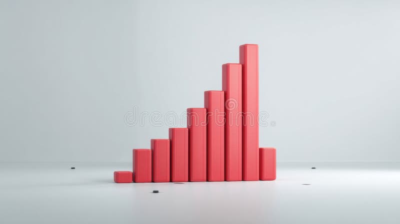
Free with trial A minimalist white 3D bar graph illustrates a significant downward trend. The bars decrease in height from left to right, connected by a dashed line that forms a descending path, culminating in an arrow pointing downwards. The graphic is rendered in an isometric perspective on a white background, representing decline, loss, or negative performance. Low decrease illustrations White 3D Bar Graph Showing a Downward Trend chart decline. A minimalist white 3D bar graph illustrates a significant downward trend. The bars decrease in height from left to right, connected by a dashed line that forms a descending path, culminating in an arrow pointing downwards. The graphic is rendered in an isometric perspective on a white background, representing decline, loss, or negative performance
Free with trial Money loss and economic crisis, money market crash and global financial downturn, vector line icons. Economic crisis icons of bankruptcy, price decrease with money inflation and unemployment growth. Low decrease vectors Money loss and economic crisis, money market crash
Free with trial A simple and modern black silhouette icon of a business graph, isolated on a white background. This flat vector illustration combines a bar chart with an overlaid line graph, showing a fluctuating trend with a general decline. The graphic symbolizes concepts such as data analysis, financial reporting, market statistics, economic downturn, and business performance metrics. It's an ideal visual element for presentations, infographics, websites, and applications related to finance, economics, and analytics, representing concepts of decrease, loss, or market volatility. Low decrease vectors Business Data Analytics Chart Icon. A simple and modern black silhouette icon of a business graph, isolated on a white background. This flat vector illustration combines a bar chart with an overlaid line graph, showing a fluctuating trend with a general decline. The graphic symbolizes concepts such as data analysis, financial reporting, market statistics, economic downturn, and business performance metrics. It's an ideal visual element for presentations, infographics, websites, and applications related to finance, economics, and analytics, representing concepts of decrease, loss, or market volatility.
Free with trial Graph and arrow red stock marketing fall background. economy finance crisis low investment. Low decrease vectors Graph and arrow red stock marketing fall background. economy finance
Free with trial Downward thick arrow white linear icon for dark theme. Pointer symbolizing direction or download. Falling down. Decrease. Thin line illustration. Isolated symbol for night mode. Editable stroke. Low decrease vectors Downward thick arrow white linear icon for dark theme
Free with trial Cartoon Gesture Icon Mockup. Flat 3d isometric businessman hand turn cost dial to low position. Cost reduction management concept. 3D rendering on white background. Low decrease vectors Cartoon Gesture Icon Mockup.Flat 3d isometric businessman hand turn cost dial to low position.
Free with trial Cartoon Gesture Icon Mockup. Flat 3d isometric businessman hand turn cost dial to low position. Cost reduction management concept. 3D rendering on white background. Low decrease vectors Cartoon Gesture Icon Mockup.Flat 3d isometric businessman hand turn cost dial to low position.
Free with trial Cartoon Gesture Icon Mockup. Flat 3d isometric businessman hand turn cost dial to low position. Cost reduction management concept. 3D rendering on white background. Low decrease vectors Cartoon Gesture Icon Mockup.Flat 3d isometric businessman hand turn cost dial to low position.
Free with trial Economic crisis line icons of global financial downturn and business bankruptcy, vector banner. Money loss and banking crisis icons of depreciation, unemployment and price decrease of pandemic crisis. Low decrease vectors Economic crisis icons of global financial downturn. Economic crisis line icons of global financial downturn and business bankruptcy, vector banner. Money loss and banking crisis icons of depreciation, unemployment and price decrease of pandemic crisis
Free with trial Transparent Backgrounds Mock-up. Flat 3d isometric businessman hand turn cost dial to low position. Cost reduction management concept. Supports PNG files with transparent backgrounds. Low decrease vectors Transparent Backgrounds Mock-up.Flat 3d isometric businessman hand turn cost dial to low position.
Free with trial Transparent Backgrounds Mock-up. Flat 3d isometric businessman hand turn cost dial to low position. Cost reduction management concept. Supports PNG files with transparent backgrounds. Low decrease vectors Transparent Backgrounds Mock-up.Flat 3d isometric businessman hand turn cost dial to low position.
Free with trial Transparent Backgrounds Mock-up. Flat 3d isometric businessman hand turn cost dial to low position. Cost reduction management concept. Supports PNG files with transparent backgrounds. Low decrease vectors Transparent Backgrounds Mock-up.Flat 3d isometric businessman hand turn cost dial to low position.
Free with trial Transparent Backgrounds Mock-up. Flat 3d isometric businessman hand turn cost dial to low position. Cost reduction management concept. Supports PNG files with transparent backgrounds. Low decrease vectors Transparent Backgrounds Mock-up.Flat 3d isometric businessman hand turn cost dial to low position.
Free with trial , Applied for Info Graphics, Design Elements, Websites, Presentations, and Application - Vector. Low decrease illustrations Decrease Icon. Down Symbol within Glyph Style - Vector. , Applied for Info Graphics, Design Elements, Websites, Presentations, and Application - Vector.
Free with trial Beige mailbox on wooden post with a declining bar graph, suggesting a decrease in mail volume or economic downturn. Image is digitally rendered. Low decrease illustrations Beige Mailbox and Declining Bar Graph on Wooden Post. Beige mailbox on wooden post with a declining bar graph, suggesting a decrease in mail volume or economic downturn. Image is digitally rendered
Free with trial Several blue arrows are pointing down, representing a decrease or negative trend. Low decrease vectors Blue arrows pointing down representing negative trend. Several blue arrows are pointing down, representing a decrease or negative trend
Free with trial 3D price and discount icons with down arrow and percent sign. Modern vector design symbolizing sale, offer, and financial decrease for business, economy, or Black Friday promotion. Low decrease vectors 3D price and discount icons with down arrow and percent sign. Modern vector design symbolizing sale, offer, and
Free with trial A dark icon showing a dollar sign within a circle, with a downward arrow signifying a decrease in price or value. Low decrease vectors Dollar sign with downward arrow indicating cost reduction. A dark icon showing a dollar sign within a circle, with a downward arrow signifying a decrease in price or value
Free with trial This 3D rendered bar graph, generated by AI, visually represents a downward trend. The red bars progressively decrease in height, illustrating a clear decline. Perfect for illustrating concepts related to loss, decrease, or decline in presentations and reports. Low decrease illustrations Declining Bar Graph. This 3D rendered bar graph, generated by AI, visually represents a downward trend. The red bars progressively decrease in height, illustrating a clear decline. Perfect for illustrating concepts related to loss, decrease, or decline in presentations and reports.
Free with trial Three identical red arrows, each featuring a white percentage symbol (%) and the word "DISCOUNT" in white text, are shown pointing downwards against a black background. The arrows have a slightly rounded, three-dimensional appearance, suggesting a concept of decrease or reduction in price. This visual strongly relates to sales and promotions. Low decrease illustrations Three red discount arrows pointing down with percentage signs. Three identical red arrows, each featuring a white percentage symbol (%) and the word "DISCOUNT" in white text, are shown pointing downwards against a black background. The arrows have a slightly rounded, three-dimensional appearance, suggesting a concept of decrease or reduction in price. This visual strongly relates to sales and promotions
Free with trial Inflation, Bitcoin project and Report line icons. Pack of Money, Low percent, Increasing percent icon. Checklist, Wallet, Discount message pictogram. Currency exchange, Dollar target. Vector. Low decrease vectors Inflation, Bitcoin project and Report line icons. For web app, printing. Line icons. Vector. Inflation, Bitcoin project and Report line icons. Pack of Money, Low percent, Increasing percent icon. Checklist, Wallet, Discount message pictogram. Currency exchange, Dollar target. Vector
Free with trial Black and white bitcoin coin with a blue downward arrow indicating a decrease in value. Ideal for economic trends, cryptocurrency market analysis, financial decline, forex trading, money management. Low decrease vectors Bitcoin Price Drop Representation with Blue Downward Arrow and Coin Illustration. Black and white bitcoin coin with a blue downward arrow indicating a decrease in value. Ideal for economic trends, cryptocurrency market analysis, financial decline, forex trading, money management
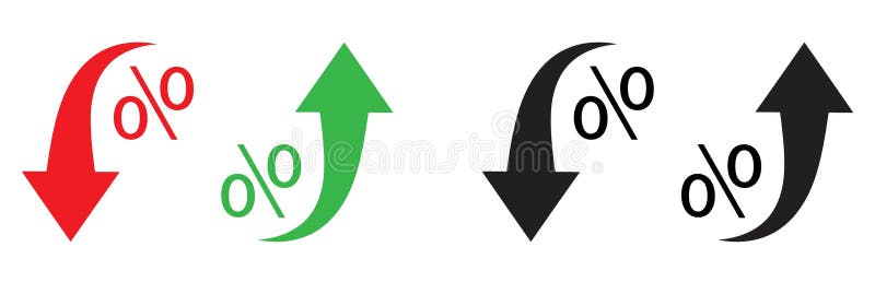
Free with trial Red and black arrows point downward, while green and black arrows point upward. Each arrow is curved, paired with a percentage symbol (%), indicating changes in rate or value. The red and black arrows denote decrease, and the green and black arrows denote increase, suggesting economic or statistical trends. The arrows and symbols are bold and stylized for emphasis. Low decrease vectors Percent arrow icon. Growth, increase, decrease arrow filled icons. Up arrows, down arrows. Red and black arrows point downward, while green and black arrows point upward. Each arrow is curved, paired with a percentage symbol (%), indicating changes in rate or value. The red and black arrows denote decrease, and the green and black arrows denote increase, suggesting economic or statistical trends. The arrows and symbols are bold and stylized for emphasis.
Free with trial The "Vector Dollar Down Icon Symbol" is a graphical representation designed to indicate a decrease or downward trend related to financial aspects, specifically involving currency or value. Low decrease vectors Vector Dollar Down Icon Symbol