Free with trial Big Data flow visualization. Digital data stream. Multiple point wave. Abstract technology background in blue colors. Vector. Multiple data visualization vectors Big Data flow visualization. Digital data stream. Multiple point wave. Abstract technology background in blue colors. Vector
Free with trial Professional analyst examining multiple data visualization screens with financial charts and market trends in a modern trading environment. Generative AI. Multiple data visualization illustrations Professional analyst examining multiple data visualization screens with financial charts and market trends in a modern trading
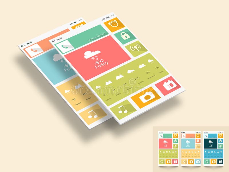
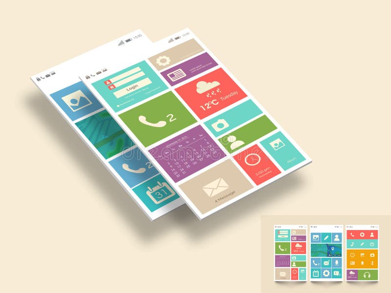
Free with trial Creative mobile screen presentation with different application and multiple color choice on beige background. Multiple data visualization illustrations Template or layout for mobile user interface. Creative mobile screen presentation with different application and multiple color choice on beige background.
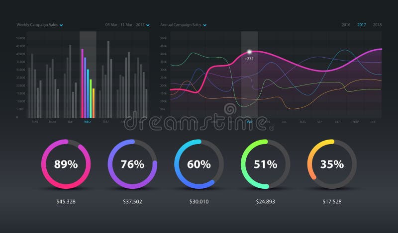
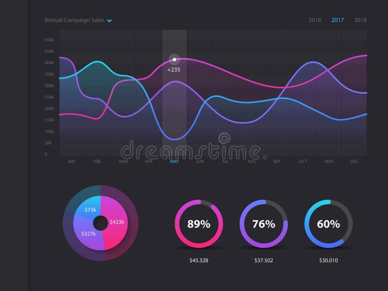
Free with trial Dashboard infographic template with modern design weekly and annual statistics graphs. Pie charts, workflow, web design, UI elements. Vector EPS 10. Multiple data visualization vectors Dashboard infographic template with modern design weekly and annual statistics graphs. Pie charts, workflow,, UI. EPS 10. Dashboard infographic template with modern design weekly and annual statistics graphs. Pie charts, workflow, web design, UI elements. Vector EPS 10
Free with trial Dashboard infographic template with modern design weekly and annual statistics graphs. Pie charts, workflow, web design, UI elements. Vector EPS 10. Multiple data visualization vectors Dashboard infographic template with modern design weekly and annual statistics graphs. Pie charts, workflow,, UI. EPS 10. Dashboard infographic template with modern design weekly and annual statistics graphs. Pie charts, workflow, web design, UI elements. Vector EPS 10
Free with trial The image depicts a smartphone screen showcasing various data visualization graphs. The screen is divided into multiple sections, each containing different types of graphs such as line charts, bar graphs, and pie charts. The smartphone has a home button at the bottom and various icons at the top representing different functionalities. The overall design is minimalistic and focused on presenting. Multiple data visualization illustrations Smartphone displaying multiple data visualization graphs. The image depicts a smartphone screen showcasing various data visualization graphs. The screen is divided into multiple sections, each containing different types of graphs such as line charts, bar graphs, and pie charts. The smartphone has a home button at the bottom and various icons at the top representing different functionalities. The overall design is minimalistic and focused on presenting
Free with trial Creative mobile screen presentation with different application and multiple color choice on beige background. Multiple data visualization illustrations Stylish template for mobile user interface. Creative mobile screen presentation with different application and multiple color choice on beige background.
Free with trial Creative mobile screen presentation with different application and multiple color choice on beige background. Multiple data visualization illustrations Template or layout for mobile user interface. Creative mobile screen presentation with different application and multiple color choice on beige background.
Free with trial The image showcases a high-tech control panel filled with various data visualization displays, including graphs, charts, and dials. The panel has a sleek, futuristic design with a blue and black color scheme. It features multiple interactive elements such as buttons, sliders, and touch-sensitive areas. The central display is a large circular gauge surrounded by smaller gauges and readouts. The. Multiple data visualization illustrations A futuristic control panel with multiple data visualization displays and interactive elements. The image showcases a high-tech control panel filled with various data visualization displays, including graphs, charts, and dials. The panel has a sleek, futuristic design with a blue and black color scheme. It features multiple interactive elements such as buttons, sliders, and touch-sensitive areas. The central display is a large circular gauge surrounded by smaller gauges and readouts. The
Free with trial Professional analyst examining multiple data visualization screens with financial charts and market trends in a modern trading environment. Generative AI. Multiple data visualization illustrations Professional analyst examining multiple data visualization screens with financial charts and market trends in a modern trading
Free with trial This image showcases a dynamic infographic with a central hub connected to multiple data visualization elements. It includes bar charts, pie charts, line graphs, and other statistical representations, all interconnected to illustrate the flow and relationship between different data sets. The color scheme is predominantly blue and green, creating a visually appealing and informative display. Multiple data visualization illustrations A vibrant infographic displaying various data visualization charts and graphs. This image showcases a dynamic infographic with a central hub connected to multiple data visualization elements. It includes bar charts, pie charts, line graphs, and other statistical representations, all interconnected to illustrate the flow and relationship between different data sets. The color scheme is predominantly blue and green, creating a visually appealing and informative display
Free with trial A clean interface showing various data visualization tools including bar graphs. Multiple data visualization illustrations Colorful business dashboard UI with multiple data visualization charts and analytics widgets dashboard analytics. A clean interface showing various data visualization tools including bar graphs
Free with trial A futuristic digital landscape featuring a grid system and multiple data visualization screens floating in a virtual environment, surrounded by binary code and a dark blue background. Multiple data visualization illustrations Futuristic digital landscape with data visualization and grid system in a virtual environment. A futuristic digital landscape featuring a grid system and multiple data visualization screens floating in a virtual environment, surrounded by binary code and a dark blue background
Free with trial Multiple data visualization panels display various charts and graphs against a dark background. The visualizations include bar charts, line graphs, and circular charts with diverse color schemes like orange, teal, and purple. Each panel contains detailed numerical data, labeled axes, and specific metrics, possibly related to financial or analytical trends. The arrangement is orderly, suggesting a dashboard interface for tracking performance metrics or data analysis. Multiple data visualization illustrations Multiple data visualization panels feature various charts and graphs. Multiple data visualization panels display various charts and graphs against a dark background. The visualizations include bar charts, line graphs, and circular charts with diverse color schemes like orange, teal, and purple. Each panel contains detailed numerical data, labeled axes, and specific metrics, possibly related to financial or analytical trends. The arrangement is orderly, suggesting a dashboard interface for tracking performance metrics or data analysis.
Free with trial Multiple data visualization panels feature various charts and graphs. The charts display fluctuating data trends in orange and green, including line graphs and bar charts. Numeric values and percentages are present, providing detailed insights. The layout is organized into grids, likely representing different data sets or metrics. The dark background enhances the visibility of the brightly colored data elements. The arrangement suggests a focus on financial or statistical analysis. Multiple data visualization illustrations Multiple data visualization panels feature various charts and graphs.
Free with trial Multiple data visualization panels display various charts and graphs. The screen is divided into sections with tables featuring numerical data and labels in Greek. A large teal line graph with peaks and valleys represents trends over time, while a red bar graph shows fluctuations. Other sections include data tables with metrics and categories. The interface has a dark background with contrasting colors for readability, likely part of a business intelligence or analytics software. Multiple data visualization illustrations Multiple data visualization panels feature various charts and graphs. Multiple data visualization panels display various charts and graphs. The screen is divided into sections with tables featuring numerical data and labels in Greek. A large teal line graph with peaks and valleys represents trends over time, while a red bar graph shows fluctuations. Other sections include data tables with metrics and categories. The interface has a dark background with contrasting colors for readability, likely part of a business intelligence or analytics software.
Free with trial A robotic hand interacts with multiple data visualization screens, showcasing artificial intelligence in a modern digital workspace environment filled with charts and analytics. Synapse. Multiple data visualization illustrations Futuristic Robot Hand Interacting with Data Visualization Screens on Artificial Intelligence Technology in a Digital. A robotic hand interacts with multiple data visualization screens, showcasing artificial intelligence in a modern digital workspace environment filled with charts and analytics. Synapse
Free with trial This sleek and modern illustration showcases a Glassmorphism-inspired user interface dashboard designed with a transparent, frosted glass aesthetic. The layout integrates multiple data visualization panels, including line graphs, analytics widgets, progress indicators, and control elements�all rendered in smooth gradients of teal and cyan. The clean typography and luminous highlights create a futuristic, holographic feel, symbolizing innovation in UI UX design. Perfect for concept presentations, tech branding, and digital product prototypes, this dashboard embodies elegance, clarity, and high-end functionality in modern interface design. Multiple data visualization illustrations Futuristic Glass UI Dashboard: Minimalist Data Visualization Interface Design. This sleek and modern illustration showcases a Glassmorphism-inspired user interface dashboard designed with a transparent, frosted glass aesthetic. The layout integrates multiple data visualization panels, including line graphs, analytics widgets, progress indicators, and control elements�all rendered in smooth gradients of teal and cyan. The clean typography and luminous highlights create a futuristic, holographic feel, symbolizing innovation in UI UX design. Perfect for concept presentations, tech branding, and digital product prototypes, this dashboard embodies elegance, clarity, and high-end functionality in modern interface design.
Free with trial A digital dashboard displaying multiple data visualization charts and graphs. Multiple data visualization illustrations Data Analysis Dashboard with Various Charts. A digital dashboard displaying multiple data visualization charts and graphs
Free with trial Professional business dashboard interface featuring comprehensive data visualization with various chart types including bar charts, pie charts, donut charts, line graphs, and statistical indicators. Modern flat design with colorful elements displaying business intelligence, analytics, and key performance indicators. Perfect for presentations, reports, business analysis, financial planning, and corporate strategy materials. Clean layout with organized sections showing multiple data perspectives and metrics. Multiple data visualization illustrations Comprehensive Business Dashboard with Multiple Data Visualization Charts and Analytics Interface. Professional business dashboard interface featuring comprehensive data visualization with various chart types including bar charts, pie charts, donut charts, line graphs, and statistical indicators. Modern flat design with colorful elements displaying business intelligence, analytics, and key performance indicators. Perfect for presentations, reports, business analysis, financial planning, and corporate strategy materials. Clean layout with organized sections showing multiple data perspectives and metrics
Free with trial Professional business dashboard interface featuring comprehensive data visualization with various chart types including bar charts, pie charts, donut charts, line graphs, and statistical indicators. Modern flat design with colorful elements displaying business intelligence, analytics, and key performance indicators. Perfect for presentations, reports, business analysis, financial planning, and corporate strategy materials. Clean layout with organized sections showing multiple data perspectives and metrics. Multiple data visualization illustrations Comprehensive Business Dashboard with Multiple Data Visualization Charts and Analytics Interface. Professional business dashboard interface featuring comprehensive data visualization with various chart types including bar charts, pie charts, donut charts, line graphs, and statistical indicators. Modern flat design with colorful elements displaying business intelligence, analytics, and key performance indicators. Perfect for presentations, reports, business analysis, financial planning, and corporate strategy materials. Clean layout with organized sections showing multiple data perspectives and metrics
Free with trial Professional business dashboard interface featuring comprehensive data visualization with various chart types including bar charts, pie charts, donut charts, line graphs, and statistical indicators. Modern flat design with colorful elements displaying business intelligence, analytics, and key performance indicators. Perfect for presentations, reports, business analysis, financial planning, and corporate strategy materials. Clean layout with organized sections showing multiple data perspectives and metrics. Multiple data visualization illustrations Comprehensive Business Dashboard with Multiple Data Visualization Charts and Analytics Interface. Professional business dashboard interface featuring comprehensive data visualization with various chart types including bar charts, pie charts, donut charts, line graphs, and statistical indicators. Modern flat design with colorful elements displaying business intelligence, analytics, and key performance indicators. Perfect for presentations, reports, business analysis, financial planning, and corporate strategy materials. Clean layout with organized sections showing multiple data perspectives and metrics
Free with trial Professional business dashboard interface featuring comprehensive data visualization with various chart types including bar charts, pie charts, donut charts, line graphs, and statistical indicators. Modern flat design with colorful elements displaying business intelligence, analytics, and key performance indicators. Perfect for presentations, reports, business analysis, financial planning, and corporate strategy materials. Clean layout with organized sections showing multiple data perspectives and metrics. Multiple data visualization illustrations Comprehensive Business Dashboard with Multiple Data Visualization Charts and Analytics Interface. Professional business dashboard interface featuring comprehensive data visualization with various chart types including bar charts, pie charts, donut charts, line graphs, and statistical indicators. Modern flat design with colorful elements displaying business intelligence, analytics, and key performance indicators. Perfect for presentations, reports, business analysis, financial planning, and corporate strategy materials. Clean layout with organized sections showing multiple data perspectives and metrics
Free with trial Professional business dashboard interface featuring comprehensive data visualization with various chart types including bar charts, pie charts, donut charts, line graphs, and statistical indicators. Modern flat design with colorful elements displaying business intelligence, analytics, and key performance indicators. Perfect for presentations, reports, business analysis, financial planning, and corporate strategy materials. Clean layout with organized sections showing multiple data perspectives and metrics. Multiple data visualization illustrations Comprehensive Business Dashboard with Multiple Data Visualization Charts and Analytics Interface. Professional business dashboard interface featuring comprehensive data visualization with various chart types including bar charts, pie charts, donut charts, line graphs, and statistical indicators. Modern flat design with colorful elements displaying business intelligence, analytics, and key performance indicators. Perfect for presentations, reports, business analysis, financial planning, and corporate strategy materials. Clean layout with organized sections showing multiple data perspectives and metrics
Free with trial Professional business dashboard interface featuring comprehensive data visualization with various chart types including bar charts, pie charts, donut charts, line graphs, and statistical indicators. Modern flat design with colorful elements displaying business intelligence, analytics, and key performance indicators. Perfect for presentations, reports, business analysis, financial planning, and corporate strategy materials. Clean layout with organized sections showing multiple data perspectives and metrics. Multiple data visualization illustrations Comprehensive Business Dashboard with Multiple Data Visualization Charts and Analytics Interface. Professional business dashboard interface featuring comprehensive data visualization with various chart types including bar charts, pie charts, donut charts, line graphs, and statistical indicators. Modern flat design with colorful elements displaying business intelligence, analytics, and key performance indicators. Perfect for presentations, reports, business analysis, financial planning, and corporate strategy materials. Clean layout with organized sections showing multiple data perspectives and metrics
Free with trial The image depicts a futuristic digital interface composed of multiple transparent screens displaying various types of data visualizations. These include pie charts, bar graphs, and line graphs, all rendered in vibrant colors such as blue, pink, and purple. The screens are arranged in a layered, overlapping manner, creating a sense of depth and complexity. The background is dark, which makes the. Multiple data visualization illustrations Futuristic digital interface with multiple data visualization screens. The image depicts a futuristic digital interface composed of multiple transparent screens displaying various types of data visualizations. These include pie charts, bar graphs, and line graphs, all rendered in vibrant colors such as blue, pink, and purple. The screens are arranged in a layered, overlapping manner, creating a sense of depth and complexity. The background is dark, which makes the
Free with trial A grid of data visualization panels displays numerous charts and graphs on a dark background. The panels feature various types, including bar graphs, line charts, and histograms in colors like orange, green, and yellow. Each chart is distinct, showing different data metrics with labeled axes and legends. The panels are neatly organized, providing an overview of diverse data sets, possibly related to financial or statistical analysis. Numbers and percentages are visible, enhancing the interpretability of the data presented. Multiple data visualization illustrations Multiple data visualization panels feature various charts and graphs. A grid of data visualization panels displays numerous charts and graphs on a dark background. The panels feature various types, including bar graphs, line charts, and histograms in colors like orange, green, and yellow. Each chart is distinct, showing different data metrics with labeled axes and legends. The panels are neatly organized, providing an overview of diverse data sets, possibly related to financial or statistical analysis. Numbers and percentages are visible, enhancing the interpretability of the data presented.
Free with trial A desktop computer monitor displays a comprehensive project management software dashboard featuring multiple data visualization elements including a world map, line graphs tracking progress over time, a pie chart with blue data segments, and bar graphs showing project completion percentages, all arranged within a modern interface with distinct color-coded sections while situated on a wooden desk. Multiple data visualization illustrations Project management software dashboard displayed on a computer monitor in a modern office workspace setting with data visualization. A desktop computer monitor displays a comprehensive project management software dashboard featuring multiple data visualization elements including a world map, line graphs tracking progress over time, a pie chart with blue data segments, and bar graphs showing project completion percentages, all arranged within a modern interface with distinct color-coded sections while situated on a wooden desk
Free with trial Business finance forecast dashboard displaying statistics and multiple data visualization charts. Future economic analytics report 2026. Multiple data visualization illustrations Digital dashboard with financial analytics 2026 forecast and data visualization charts. Business finance forecast dashboard displaying statistics and multiple data visualization charts. Future economic analytics report 2026
Free with trial Futuristic tech dashboard featuring team performance metrics. Central icon displays group of people, surrounded by multiple data visualization elements. Includes line graphs, bar charts, and circular progress indicators with percentages (75%, 43%, 92%). Predominantly blue hue with glowing accents enhances technological feel. Charts show upward trends and segmented data analysis. Digital interface is sleek, with dark background and lighter hues emphasizing data points and structure. Multiple data visualization illustrations Futuristic Tech Dashboard: Team Performance Metrics, Data Visualization, Blue Hue. Futuristic tech dashboard featuring team performance metrics. Central icon displays group of people, surrounded by multiple data visualization elements. Includes line graphs, bar charts, and circular progress indicators with percentages (75%, 43%, 92%). Predominantly blue hue with glowing accents enhances technological feel. Charts show upward trends and segmented data analysis. Digital interface is sleek, with dark background and lighter hues emphasizing data points and structure.
Free with trial The image displays a grid of multiple data visualization templates including bar graphs, pie charts, and line graphs, all presented in shades of blue and green on a white background. Multiple data visualization illustrations Collection of various data visualization charts and graphs for analytics purposes. The image displays a grid of multiple data visualization templates including bar graphs, pie charts, and line graphs, all presented in shades of blue and green on a white background
Free with trial A digital globe displays Earth with intricate networks of illuminated lines representing airplane paths, highlighting global travel and connectivity. The globe's surface is detailed with geographic borders and cities. In the background, a dark room features multiple data visualization screens. The focus on Africa indicates the image's central location, showcasing advanced technology and global connections in air travel. Multiple data visualization illustrations Futuristic World Globe with Airplane Paths Illustrating Global Travel and Connectivity, Backed by Data Visualization Screens in a. A digital globe displays Earth with intricate networks of illuminated lines representing airplane paths, highlighting global travel and connectivity. The globe's surface is detailed with geographic borders and cities. In the background, a dark room features multiple data visualization screens. The focus on Africa indicates the image's central location, showcasing advanced technology and global connections in air travel.
Free with trial The image shows a computer screen with multiple data visualization charts and graphs. The charts include bar graphs, line graphs, and pie charts, all in various shades of blue and green. The screen appears to be displaying data analysis or business intelligence information, with a clean, professional layout. Multiple data visualization illustrations Computer screen displaying a variety of colorful data visualization charts and graphs. The image shows a computer screen with multiple data visualization charts and graphs. The charts include bar graphs, line graphs, and pie charts, all in various shades of blue and green. The screen appears to be displaying data analysis or business intelligence information, with a clean, professional layout
Free with trial A visually striking image featuring a large mechanical clock surrounded by interconnected gears and multiple data visualization screens displaying graphs, charts, and analytics. Perfect for concepts related to time management, engineering, automation, digital technology, and business intelligence. Multiple data visualization illustrations Large Mechanical Clock with Gears and Data Visualization Screens for Business and Technology. A visually striking image featuring a large mechanical clock surrounded by interconnected gears and multiple data visualization screens displaying graphs, charts, and analytics. Perfect for concepts related to time management, engineering, automation, digital technology, and business intelligence.
Free with trial The image shows an open laptop with a vibrant screen displaying multiple data visualization dashboards. Each dashboard features colorful charts, graphs, and analytics, likely representing business metrics, performance indicators, or statistical data. The laptop appears to be placed on a wooden surface, and the overall setup suggests a professional or analytical work environment. Multiple data visualization illustrations Laptop displaying colorful data visualization dashboards with analytics charts and graphs. The image shows an open laptop with a vibrant screen displaying multiple data visualization dashboards. Each dashboard features colorful charts, graphs, and analytics, likely representing business metrics, performance indicators, or statistical data. The laptop appears to be placed on a wooden surface, and the overall setup suggests a professional or analytical work environment
Free with trial A dark-themed risk management dashboard interface featuring multiple data visualization widgets. The layout includes numerical metrics for compliance and risk exposure, a line chart tracking policy adherence over time, a bar chart for risk levels, and a donut chart for policy violations. A floating panel additional data. The interface uses a clean, structured with neon-colored accents against a. Multiple data visualization illustrations Risk management dashboard interface with compliance data and policy adherence analytics charts. A dark-themed risk management dashboard interface featuring. A dark-themed risk management dashboard interface featuring multiple data visualization widgets. The layout includes numerical metrics for compliance and risk exposure, a line chart tracking policy adherence over time, a bar chart for risk levels, and a donut chart for policy violations. A floating panel additional data. The interface uses a clean, structured with neon-colored accents against a
Free with trial A man in a suit is shown interacting with multiple holographic screens displaying various data visualizations, including pie charts, bar graphs, and circular diagrams. He is using his finger to touch one of the screens, indicating engagement with the data. A laptop and financial reports are on the desk. The image represents advanced data analysis and business intelligence. Multiple data visualization illustrations Businessman reviewing multiple data visualization screens. A man in a suit is shown interacting with multiple holographic screens displaying various data visualizations, including pie charts, bar graphs, and circular diagrams. He is using his finger to touch one of the screens, indicating engagement with the data. A laptop and financial reports are on the desk. The image represents advanced data analysis and business intelligence
Free with trial Flat design illustration showcasing a computer monitor with multiple data visualization panels, charts, and graphs. The image is arranged on a desk with accessories. Multiple data visualization illustrations Flat design illustration of a computer monitor with data visualization displays. Flat design illustration showcasing a computer monitor with multiple data visualization panels, charts, and graphs. The image is arranged on a desk with accessories
Free with trial A dark-themed business analytics dashboard interface displaying multiple data visualization modules including line charts, donut charts, and bar charts. The dashboard features sections titled "Revenue," "Profit," and "Quarterly Earnings" with percentage values (25%, 27%, 04%) and numerical data (1545. 89, 1444, etc. ). The interface presents a comprehensive business data analysis display on a dark background. Multiple data visualization illustrations Enterprise Analytics Dashboard illustrations. A dark-themed business analytics dashboard interface displaying multiple data visualization modules including line charts, donut charts, and bar charts. The dashboard features sections titled "Revenue," "Profit," and "Quarterly Earnings" with percentage values (25%, 27%, 04%) and numerical data (1545.89, 1444, etc.). The interface presents a comprehensive business data analysis display on a dark background.
Free with trial Clean digital dashboard displaying multiple data visualization and business intelligence icons. Multiple data visualization illustrations Modern Business Dashboard Interface with Analytics Icons. Clean digital dashboard displaying multiple data visualization and business intelligence icons
Free with trial A digital dashboard interface featuring a left-hand navigation menu with options like Overview, Analytics, and Settings. The main area multiple data visualization cards, including line graphs showing trends, bar charts illustrating data distribution, and circular charts representing proportions. Metrics such as Active Users, Revenue, Churn Rate, and Feature Adoption are presented with numerical. Multiple data visualization illustrations Business Analytics Dashboard with Navigation Menu and Various Data Visualizations Keywords. A digital dashboard interface featuring a left-hand navigation menu with options like Overview, Analytics, and Settings. The main area multiple data visualization cards, including line graphs showing trends, bar charts illustrating data distribution, and circular charts representing proportions. Metrics such as Active Users, Revenue, Churn Rate, and Feature Adoption are presented with numerical
Free with trial A dimly lit immersive control room featuring a panoramic array of monitors displaying network diagrams security feeds graphs and complex data logs signifying high level system monitoring and threat detection. Multiple data visualization illustrations Cyber Security Operations Center SOC Control Room with Multiple Data Visualization Monitors. A dimly lit immersive control room featuring a panoramic array of monitors displaying network diagrams security feeds graphs and complex data logs signifying high level system monitoring and threat detection
Free with trial Dashboard interface with multiple data visualization elements. Includes bar graphs, pie charts, line graphs, and flow diagrams, all in blue, orange, green, and yellow. Sections labeled for traffic, conversions, clicks, campaign performance, and traffic sources. Features icons for settings, messages, and user profiles at the top. The design suggests digital analytics or marketing insights, presented in a structured, colorful layout for easy data interpretation. Multiple data visualization illustrations Labeled for traffic, conversions, clicks, campaign performance, and