Free with trial Set Mobile stock trading, Dollar rate decrease, Briefcase and Falling property prices icon. Vector. Stock decrease vectors Set Mobile stock trading, Dollar rate decrease, Briefcase and Falling property prices icon. Vector
Free with trial Up and down graph chart icon. Growth increase and decrease sign. Graph or diagram with arrow going up and down. Vector illustration. Stock decrease illustrations Up and down graph chart icon. Growth increase and decrease sign. Graph or diagram with arrow going up and down. Vector
Free with trial Bullish vs bearish stock price arrow background vector. Stock decrease illustrations Bullish vs bearish stock price arrow background
Free with trial Red arrow going down stock icon on white background. Decrease, Bankruptcy, financial market crash icon for your web site design, logo, app, UI. graph chart downtrend symbol. chart going down sign. Stock decrease vectors Red arrow going down stock icon on white background. Decrease, Bankruptcy, financial market crash icon
Free with trial Set Fire in burning house, Debt ball chained to coin, Dollar rate decrease and Mobile stock trading icon. Vector. Stock decrease vectors Set Fire in burning house, Debt ball chained to coin, Dollar rate decrease and Mobile stock trading icon. Vector
Free with trial Set Isometric Contract money and pen, Pie chart infographic, Mobile stock trading and Dollar rate decrease icon. Vector. Stock decrease illustrations Set Isometric Contract money and pen, Pie chart infographic, Mobile stock trading and Dollar rate decrease icon. Vector
Free with trial Economy, balloons or man on graph for crisis, stock market investment or inflation on white background. Financial decrease, crash or trader on charts for price drop or crypto profit risk in studio. Stock decrease illustrations Economy, balloons or man on graph for crisis, stock market investment or inflation on white background. Financial
Free with trial Next economic recession forecast or prediction, stock market decline or revenue decrease, low performance or GDP falling down concept, businessman investor look through telescope to see despair graph. Stock decrease vectors Next economic recession forecast or prediction, stock market decline or revenue decrease, low performance or GDP falling down
Free with trial Next economic recession forecast or prediction, stock market decline or revenue decrease, low performance or GDP falling down concept, businesswoman investor look through telescope to see despair graph. Stock decrease vectors Next economic recession forecast or prediction, stock market decline or revenue decrease, low performance or GDP falling down
Free with trial Inflation or interest rate falling down, decrease or reduction, profit fall in economic recession, stock market value loss, FED reduce interest rate, businessman on percentage sign with falling down. Stock decrease vectors Inflation or interest rate falling down, decrease or reduction, profit fall in economic recession, stock market value loss, FED
Free with trial Inflation or interest rate falling down, decrease or reduction, profit fall in economic recession, stock market value loss, FED reduce interest rate, businessman on percentage sign with falling down. Stock decrease vectors Inflation or interest rate falling down, decrease or reduction, profit fall in economic recession, stock market value loss, FED
Free with trial Profit growing and decrease sumbol. Statistic up and down arrows. Business growths chart. Green and red arrow - stock vector. Stock decrease illustrations Profit growing and decrease sumbol. Statistic up and down arrows. Business growths chart. Green and red arrow - stock vector
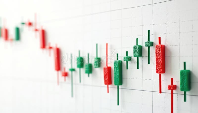
Free with trial Candlestick chart shows stock market fluctuations. Green candles show price increase, red candles pointing price decrease. Financial diagram of investment chart shows up down trends. Stock decrease illustrations Candlestick chart shows stock market fluctuations. Green candles show price increase, red candles pointing price decrease.
Free with trial Set line Falling property prices Dollar rate decrease Tearing money banknote Storm Drop crude oil Mobile stock trading Briefcase and icon. Vector. Stock decrease illustrations Set line Falling property prices, Dollar rate decrease, Tearing money banknote, Storm, Drop crude oil, Mobile stock. Set line Falling property prices Dollar rate decrease Tearing money banknote Storm Drop crude oil Mobile stock trading Briefcase and icon. Vector.
Free with trial Set Global economic crisis Mobile stock trading Dollar rate decrease Hanging sign with Sale Stop delivery cargo truck and Shutdown of factory icon. Vector. Stock decrease illustrations Set Global economic crisis, Mobile stock trading, Dollar rate decrease, Hanging sign with Sale, Stop delivery cargo. Set Global economic crisis Mobile stock trading Dollar rate decrease Hanging sign with Sale Stop delivery cargo truck and Shutdown of factory icon. Vector.
Free with trial Set line Dollar rate decrease Drop in crude oil price Mobile stock trading Briefcase Global economic crisis and Bank building icon. Vector. Stock decrease vectors Set line Dollar rate decrease, Drop in crude oil price, Mobile stock trading, Briefcase, Global economic crisis, and. Set line Dollar rate decrease Drop in crude oil price Mobile stock trading Briefcase Global economic crisis and Bank building icon. Vector.
Free with trial Set line Shutdown of factory Dollar rate decrease Debt ball chained coin Calculation expenses Mobile stock trading Worker and Global economic crisis news icon. Vector. Stock decrease illustrations Set line Shutdown of factory, Dollar rate decrease, Debt ball chained coin, Calculation expenses, Mobile stock trading. Set line Shutdown of factory Dollar rate decrease Debt ball chained coin Calculation expenses Mobile stock trading Worker and Global economic crisis news icon. Vector.
Free with trial Set line Drop in crude oil price Global economic crisis Prison cell door Dollar rate decrease Mobile stock trading and icon. Vector. Stock decrease illustrations Set line Drop in crude oil price, Global economic crisis, Prison cell door, Dollar rate decrease, Mobile stock trading. Set line Drop in crude oil price Global economic crisis Prison cell door Dollar rate decrease Mobile stock trading and icon. Vector.
Free with trial Set line Safe Drop in crude oil price Dollar rate decrease Money bag Mobile stock trading Pie chart infographic and icon. Vector. Stock decrease vectors Set line Safe, Drop in crude oil price, Dollar rate decrease, Money bag, Mobile stock trading, Pie chart infographic and
Free with trial Set Isometric Tearing money banknote, Global economic crisis, Mobile stock trading and Dollar rate decrease icon. Vector. Stock decrease illustrations Set Isometric Tearing money banknote, Global economic crisis, Mobile stock trading and Dollar rate decrease icon. Vector
Free with trial Bear represents falling stock market on red chart background. Financial graph shows investment loss, price decrease. Bearish concept symbolizes economic recession, downturn global. Stock decrease illustrations Bear represents falling stock market on red chart background. Financial graph shows investment loss, price decrease. Bearish
Free with trial Red bear market illustration financial downturn. Bear character sitting near chart, graph, showing decrease. Concept of economic crisis, stock market crash, financial losses trading. Stock decrease illustrations Red bear market illustration financial downturn. Bear character sitting near chart, graph, showing decrease. Concept of economic
Free with trial Golden dollar sign with red arrow pointing down. Financial crisis concept, recession chart, stock market crash symbol. Economic downturn, loss, decrease, risk, bad investment money. Stock decrease illustrations Golden dollar sign with red arrow pointing down. Financial crisis concept, recession chart, stock market crash symbol. Economic
Free with trial Red arrow graph indicates stock market decline, real estate downturn, financial loss. 3d illustration visualizes business concept of negative progress, sale reduction, profit decrease. Stock decrease illustrations Red arrow graph indicates stock market decline, real estate downturn, financial loss. 3d illustration visualizes business concept
Free with trial Uptrend candle sticks, arrow and stacking coins on white background. Uptrend stock and crypto currency investment situation concept. Stock trading, finances and market growth concept. Stock decrease vectors Uptrend candle sticks, arrow and stacking coins on white background. Uptrend stock and crypto currency investment
Free with trial Financial market crash and economic decline downward arrows on digital blue dashboard with global statistics investment loss stock price reduction in global trade. Stock decrease vectors Financial market crash and economic decline downward arrows on digital blue dashboard with global statistics investment loss stock
Free with trial Fall down arrow. Decrease icon. Loss sign isolated on white background. Stock decrease vectors Fall down arrow. Decrease icon. Loss sign
Free with trial 3D stock chart. Invest trade market. Forex candlestick graph of economy data exchange. Digital business technology. Investment infographic render arrow buttons. Profit rate motion. Vector background. Stock decrease vectors 3D stock chart. Invest trade market. Forex candlestick graph of economy data exchange. Business technology. Investment infographic. 3D stock chart. Invest trade market. Forex candlestick graph of economy data exchange. Digital business technology. Investment infographic render arrow buttons. Profit rate motion. Vector background
Free with trial Red neon arrows moving down, financial loss abstract vector background. Modern downward graphic, negative market trend, stock recession metrics, and business decrease concept. Stock decrease vectors Red neon arrows moving down, financial loss
Free with trial Red neon arrows moving down, financial loss abstract vector background. Modern downward graphic, negative market trend, stock recession metrics, and business decrease concept. Stock decrease vectors Red neon arrows moving down, financial loss
Free with trial 3D Red down arrow showing declining trend. Business stock market decrease symbol. Economic crisis concept. Vector illustration. Stock decrease vectors 3D Red down arrow showing declining trend
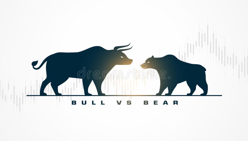
Free with trial Stock market trade bull vs bear yellow background vector. Stock decrease vectors Stock market trade bull vs bear yellow background
Free with trial Bull vs bear stock market trade chart background vector. Stock decrease vectors Bull vs bear stock market trade chart background
Free with trial Stock market trading bull vs bear strategy background vector. Stock decrease vectors Stock market trading bull vs bear strategy background
Free with trial Bull profit vs bear loss stock trade dark background vector. Stock decrease vectors Bull profit vs bear loss stock trade dark background
Free with trial Collapse stock market is seen by man invested money, standing near collapsing financial chart. Crisis in stock market and sharp stop in growth or beginning of decline in prices for stocks and bonds. Stock decrease vectors Collapse of stock market is seen by man invested money, standing near collapsing financial chart. Collapse stock market is seen by man invested money, standing near collapsing financial chart. Crisis in stock market and sharp stop in growth or beginning of decline in prices for stocks and bonds
Free with trial Bullish vs bearish stock market trade chart background vector. Stock decrease vectors Bullish vs bearish stock market trade chart background
Free with trial Particle style bull vs bear stock market trade background vector. Stock decrease vectors Particle style bull vs bear stock market trade background
Free with trial Stock market bullish vs bearish economy trend background vector. Stock decrease vectors Stock market bullish vs bearish economy trend background
Free with trial Bullish vs bearish stock trade strategy concept background vector. Stock decrease vectors Bullish vs bearish stock trade strategy concept background
Free with trial Indian stock market bull vs bear background with rupee sign vector. Stock decrease vectors Indian stock market bull vs bear background with rupee sign
Free with trial Stock market bull vs bear price trade volatility background vector. Stock decrease vectors Stock market bull vs bear price trade volatility background
Free with trial Bull vs bear indian stock market background with rupee sign vector. Stock decrease vectors Bull vs bear indian stock market background with rupee sign
Free with trial Stock market financial chart bear vs bull strategy background vector. Stock decrease vectors Stock market financial chart bear vs bull strategy background
Free with trial Bullish vs bearish stock market price indicator chart background vector. Stock decrease vectors Bullish vs bearish stock market price indicator chart background
Free with trial Symbol of stock market bullish profit vs bearish loss background vector. Stock decrease vectors Symbol of stock market bullish profit vs bearish loss background
Free with trial Stock market profit with uptrend candle sticks and money coins. 3D render vector illustration, arrow and stacking coins on green background. Uptrend stock and crypto currency investment situation. Stock decrease vectors Stock market profit with uptrend candle sticks and money coins. 3D render vector illustration, arrow and stacking coins
Free with trial Financial crisis, loss money and capital, sad man and economy loss, man concept failure, down graph, investment stock bankruptcy, problem fall, vector illustration. Stock decrease vectors Financial crisis, loss money and capital, sad man and economy loss, man concept failure, down graph, investment stock
Free with trial 3D Isometric Flat Vector Illustration of Stock Failure, Businesspeople With Financial Problems And A Decreasing Arrow Chart. Stock decrease vectors 3D Isometric Flat Vector Illustration of Stock Failure
Free with trial Bull vs bear stock market sentiment concept background vector. Stock decrease vectors Bull vs bear stock market sentiment concept background
Free with trial Bull growth vs bear decline stock trade concept background vector. Stock decrease vectors Bull growth vs bear decline stock trade concept background
Free with trial Bullish profit vs bearish loss stock market price chart design vector. Stock decrease vectors Bullish profit vs bearish loss stock market price chart design
Free with trial Euro Currency Decrease Icon Set: Financial Decline Symbol vol 34475. Stock decrease vectors Euro Currency Decrease Icon Set: Financial Decline Symbol
Free with trial Up and down graph chart icon. Growth increase and decrease sign. Graph or diagram with arrow going up and down. Vector illustration. Stock decrease vectors Up and down graph chart icon. Growth increase and decrease sign. Graph or diagram with arrow going up and down. Vector
Free with trial Economic crisis line icon of investment decline with arrow down, vector outline symbol. Global economy downturn and bankruptcy or world crisis in banking business and stock exchange decrease. Stock decrease vectors Economic crisis line icon of investment decline
Free with trial Currency crisis line icon with color money and down arrow graph. Vector economy crisis, financial stock prices decrease, cost reduction and bankruptcy, money loss and business recession outline symbol. Stock decrease vectors Currency crisis line icon, money down arrow graph. Currency crisis line icon with color money and down arrow graph. Vector economy crisis, financial stock prices decrease, cost reduction and bankruptcy, money loss and business recession outline symbol
Free with trial Stylized vector icon depicting a stock market downturn with an arrow pointing down and coin illustration. Flat graphic style. Stock decrease vectors Stock market decline icon showing financial graph downturn trend. Stylized vector icon depicting a stock market downturn with an arrow pointing down and coin illustration. Flat graphic style.
Free with trial Economic crisis icon of stock market crash and global financial downturn, line vector. Stock exchange market index fall down with money inflation and devaluation in economic crisis and trade recession. Stock decrease vectors Economic crisis line icon of stock market crash. Economic crisis icon of stock market crash and global financial downturn, line vector. Stock exchange market index fall down with money inflation and devaluation in economic crisis and trade recession
Free with trial Stock market crash graph line icon with color down arrow, vector economic crisis, finance and business recession. Outline laptop screen with financial chart of declining stock prices, bankruptcy. Stock decrease vectors Stock market crash line icon, economic crisis. Stock market crash graph line icon with color down arrow, vector economic crisis, finance and business recession. Outline laptop screen with financial chart of declining stock prices, bankruptcy
Free with trial Outline icons set depicting stock market concepts like surge, decline, performance, savings, and activity. Preferably at the end of the sentence. Stock decrease vectors Outline icons set depicting stock market concepts like surge, decline,... Outline icons set depicting stock market concepts like surge, decline, performance, savings, and activity. Preferably at the end of the sentence.
Free with trial A 3D financial chart depicting a stock market downturn. The chart features blue and pink bar graphs with numerical values like 45,971 and 37,020. A red downward-curving line with arrows illustrates the declining trend. The background is dark, emphasizing the vibrant colors of the bars and line. Small numbers indicate data points along the bottom, highlighting the decrease in value over time. The visual representation effectively conveys a negative financial trend. Stock decrease illustrations Declining Stock Market Performance Financial Charts Showing Downturn Trend. A 3D financial chart depicting a stock market downturn. The chart features blue and pink bar graphs with numerical values like 45,971 and 37,020. A red downward-curving line with arrows illustrates the declining trend. The background is dark, emphasizing the vibrant colors of the bars and line. Small numbers indicate data points along the bottom, highlighting the decrease in value over time. The visual representation effectively conveys a negative financial trend.
Free with trial Economic crisis icon, analysis of global market economy downturn and bankruptcy, vector line symbol. Magnifier and arrow down icon of stock exchange and economical index decrease of financial crisis. Stock decrease vectors Economic crisis icon, analysis of market downturn. Economic crisis icon, analysis of global market economy downturn and bankruptcy, vector line symbol. Magnifier and arrow down icon of stock exchange and economical index decrease of financial crisis
Free with trial Decline disintegrating stock chart illustration bearish trend, selloff downturn, crash correction decline disintegrating stock chart. Stock decrease illustrations Decline disintegrating stock chart
Free with trial Bull vs bear stock market trade volatility concept vector. Stock decrease vectors Bull vs bear stock market trade volatility concept
Free with trial This image depicts a 3D stock market chart with green and red candlesticks. The chart shows fluctuations in stock prices over a period of time. Green candlesticks indicate an increase in stock prices, while red candlesticks indicate a decrease. The chart is set on a grid background, providing a clear visualization of the price movements. Stock decrease illustrations Stock market chart with green and red candles
Free with trial Bull buy vs bear sell stock market trade background vector. Stock decrease vectors Bull buy vs bear sell stock market trade background
Free with trial Bullish vs bearish stock trading sentiment background vector. Stock decrease vectors Bullish vs bearish stock trading sentiment background
Free with trial Bull upward vs bear downward stock trade arrow design vector. Stock decrease vectors Bull upward vs bear downward stock trade arrow design
Free with trial Candlestick chart displaying financial data trends with red and green bars on a white background. Each candlestick represents price movement over a specific time period, reflecting opening, closing, high, and low prices. Green candles indicate a price increase, while red ones signify a decrease. Vertical lines, or wicks, extend above and below the body of the candle, showing price extremes. This visualization is commonly used in financial markets to analyze stock prices and trends. Stock decrease illustrations Candlestick chart displaying financial data trends with red and green bars on a
Free with trial Bullish profit vs bearish loss stock trading background vector. Stock decrease vectors Bullish profit vs bearish loss stock trading background
Free with trial Bull vs bear symbol of stock exchange market background vector. Stock decrease vectors Bull vs bear symbol of stock exchange market background
Free with trial Metal barrels of oil with green and red arrows. Showing rise and fall of gasoline prices. Fuel costs. Stock market investment. Economy growth or crisis recession. Diesel gallon trade. Vector concept. Stock decrease vectors Metal barrels of oil with green and red arrows. Showing rise and fall of gasoline prices. Stock market investment. Economy growth. Metal barrels of oil with green and red arrows. Showing rise and fall of gasoline prices. Fuel costs. Stock market investment. Economy growth or crisis recession. Diesel gallon trade. Vector concept
Free with trial Bull vs bear stock trading investing strategy background vector. Stock decrease vectors Bull vs bear stock trading investing strategy background
Free with trial A vibrant digital explosion of glowing stock market data, featuring percentage gains and losses, trading volumes, and financial charts on a dark background. Stock decrease illustrations Digital Stock Market Data Explosion with Glowing Graphs Percentages and Financial Numbers. A vibrant digital explosion of glowing stock market data, featuring. A vibrant digital explosion of glowing stock market data, featuring percentage gains and losses, trading volumes, and financial charts on a dark background
Free with trial This image displays a stock market chart that shows the daily price fluctuations of a particular stock over a period from January 1 to February 1. The chart includes green and red candlesticks representing price movements, with green indicating an increase and red indicating a decrease. The y-axis represents the stock price ranging from 5000 to 12000, while the x-axis shows the timeline. The chart. Stock decrease illustrations Stock market chart showing daily price fluctuations. This image displays a stock market chart that shows the daily price fluctuations of a particular stock over a period from January 1 to February 1. The chart includes green and red candlesticks representing price movements, with green indicating an increase and red indicating a decrease. The y-axis represents the stock price ranging from 5000 to 12000, while the x-axis shows the timeline. The chart
Free with trial Young woman cuts off percentage sign with knife. Financial recession. Finance crisis. Expense decrease percent. Income reduction. Banking tax cost. Rate split. Vector concept of monetary inflation. Stock decrease vectors Young woman cuts off percentage sign with knife. Financial recession. Finance crisis. Expense decrease percent. Income reduction
Free with trial Bearish disintegrating stock chart illustration trend selloff, downturn crash, correction recession bearish disintegrating stock chart. Stock decrease illustrations Bearish disintegrating stock chart
Free with trial Bullish growth vs bearish decline stock volatility background vector. Stock decrease vectors Bullish growth vs bearish decline stock volatility background
Free with trial Bull vs bear global stock volatility background with dollar sign vector. Stock decrease vectors Bull vs bear global stock volatility background with dollar sign
Free with trial Laptop Showing Bearish Stock Market Chart, market downturn concept. Stock decrease illustrations Laptop Showing Bearish Stock Market Chart, market downturn concept