Free with trial Mechanic of Fluid law theory and physics mathematical formula equation, doodle handwriting icon in white isolated background with hand drawn model, create by vector. Variable density vectors Mechanic of Fluid law theory and physics mathematical formula. Equation, doodle handwriting icon in white isolated background with hand drawn model, create by
Free with trial Gaus chart with different height columns. Normal distribution graph. Bell shaped curve template for statistics or logistic data. Probability theory math function. Vector flat illustration. Variable density vectors Gaussian or normal distribution graph. Bell shaped curve template for statistics or logistic data. Probability theory. Gaus chart with different height columns. Gaus chart with different height columns. Normal distribution graph. Bell shaped curve template for statistics or logistic data. Probability theory math function. Vector flat illustration
Free with trial The background of different colored dots of variable sizes, located of different density on white for text and logo. Variable density vectors The background of different colored dots of variable sizes, located of different density on white. The background of different colored dots of variable sizes. The background of different colored dots of variable sizes, located of different density on white for text and logo.
Free with trial The background of different colored dots of variable sizes, located of different density on white for text and logo. Variable density vectors The background of different colored dots of variable sizes, located of different density on white. The background of different colored dots of variable sizes. The background of different colored dots of variable sizes, located of different density on white for text and logo.
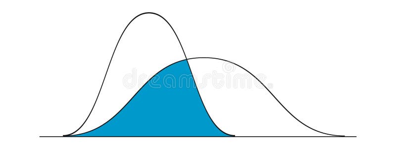
Free with trial Gaussian or normal distribution graphs examples. Bell curve templates. Probability theory concept. Layout for statistics or logistic data isolated on white background. Vector illustration. Variable density vectors Gaussian or normal distribution graphs examples. Bell curve templates. Probability theory concept. Layout for statistics. Or logistic data isolated on white. Gaussian or normal distribution graphs examples. Bell curve templates. Probability theory concept. Layout for statistics or logistic data isolated on white background. Vector illustration
Free with trial Gauss distribution. Standard normal distribution. Bell curve symbol. Math probability theory. Vector illustration isolated on white background. Variable density vectors Gauss distribution. Standard normal distribution. Bell curve symbol. Math probability theory. Vector illustration. Isolated on white background
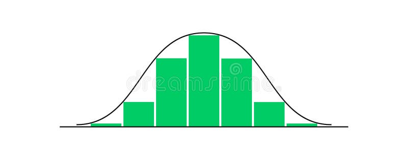
Free with trial Bell shaped curve with different heights columns. Gaussian or normal distribution graph. Template for statistics or logistic data. Probability theory mathematical function. Vector flat illustration. Variable density vectors Bell shaped curve with different heights columns. Gaussian or normal distribution graph. Template for statistics or. Logistic data. Probability theory. Bell shaped curve with different heights columns. Gaussian or normal distribution graph. Template for statistics or logistic data. Probability theory mathematical function. Vector flat illustration
Free with trial Created with visual precision, monochrome halftone dot pattern variable density grid offers flexible usage across surface design, advertising materials, and modern layouts. Variable density vectors Artistic Monochrome Halftone Dot Pattern Variable Density Vector Design. Created with visual precision, monochrome halftone dot pattern variable density grid. Created with visual precision, monochrome halftone dot pattern variable density grid offers flexible usage across surface design, advertising materials, and modern layouts
Free with trial The image is a world map with countries shaded in different colors, ranging from green to red. The colors likely represent a variable or metric such as population density, economic development, environmental performance, or another socio-economic indicator. Countries in green may represent lower values, while those in red indicate higher values. The map provides a visual comparison of the selected. Variable density illustrations World map with countries colored by a specific variable or metric. The image is a world map with countries shaded in different colors, ranging from green to red. The image is a world map with countries shaded in different colors, ranging from green to red. The colors likely represent a variable or metric such as population density, economic development, environmental performance, or another socio-economic indicator. Countries in green may represent lower values, while those in red indicate higher values. The map provides a visual comparison of the selected
Free with trial The image displays a heatmap overlaid on a geographic map. The heatmap uses a gradient of colors ranging from light green to dark green, with darker shades indicating higher population density or intensity of a measured variable. The map covers a large land area with visible borders, and the distribution shows clustered regions of high density in the central and southeastern parts, while lower. Variable density illustrations Heatmap showing population density distribution across a geographic region isolated on transparent background, isolated on white. The image displays a heatmap. The image displays a heatmap overlaid on a geographic map. The heatmap uses a gradient of colors ranging from light green to dark green, with darker shades indicating higher population density or intensity of a measured variable. The map covers a large land area with visible borders, and the distribution shows clustered regions of high density in the central and southeastern parts, while lower
Free with trial A circular heat map of a country, likely representing population density or another demographic variable. The map uses concentric circles to display data intensity, with the highest concentration in the center fading outward. The background is a hexagonal grid pattern, and the color gradient ranges from dark gray in the outermost region to bright yellow in the central area, indicating varying data. Variable density illustrations Circular heat map showing population density across a country. A circular heat map of a country, likely representing population density or another demographic. A circular heat map of a country, likely representing population density or another demographic variable. The map uses concentric circles to display data intensity, with the highest concentration in the center fading outward. The background is a hexagonal grid pattern, and the color gradient ranges from dark gray in the outermost region to bright yellow in the central area, indicating varying data
Free with trial The image displays a parallel coordinates plot, a common visualization technique used in data analysis to represent multi-dimensional datasets. Each vertical axis corresponds to a different variable or dimension, while the numerous lines intersecting the axes represent individual data points. The varying shades of gray indicate density or frequency, with darker regions showing higher. Variable density illustrations Visualization of high-density data clusters in parallel coordinates. The image displays a parallel coordinates plot, a common visualization technique used in. The image displays a parallel coordinates plot, a common visualization technique used in data analysis to represent multi-dimensional datasets. Each vertical axis corresponds to a different variable or dimension, while the numerous lines intersecting the axes represent individual data points. The varying shades of gray indicate density or frequency, with darker regions showing higher
Free with trial Beige-tinted cumulus clouds appear isolated. These clouds have a fluffy appearance, typical of cumulus formations, characterized by their soft, rounded shapes and variable density. The clouds exhibit varying shades of beige and gray, providing depth and texture. This isolated view is ideal for creative design applications, emphasizing the clouds' versatile shapes and subtle coloring. Variable density vectors Versatile beige-tinted cumulus cloud group isolated for creative design compositions. Beige-tinted cumulus clouds appear isolated. These clouds have a fluffy. Beige-tinted cumulus clouds appear isolated. These clouds have a fluffy appearance, typical of cumulus formations, characterized by their soft, rounded shapes and variable density. The clouds exhibit varying shades of beige and gray, providing depth and texture. This isolated view is ideal for creative design applications, emphasizing the clouds' versatile shapes and subtle coloring.
Free with trial The image displays a world map composed of hexagonal cells in varying shades of yellow, orange, and green. The hexagonal grid overlays the continents, with denser, darker shades in certain regions and lighter shades in others. The map likely represents data density, population distribution, or another quantitative variable with a color gradient from low (light) to high (dark). The hexagonal. Variable density illustrations Hexagonal grid overlay on a global map highlighting data distribution. The image displays a world map composed of hexagonal cells in varying shades of yellow. The image displays a world map composed of hexagonal cells in varying shades of yellow, orange, and green. The hexagonal grid overlays the continents, with denser, darker shades in certain regions and lighter shades in others. The map likely represents data density, population distribution, or another quantitative variable with a color gradient from low (light) to high (dark). The hexagonal
Free with trial A futuristic data visualization interface displays a terrain analysis with a green color scheme on a black background. The screen features three-dimensional topographic lines and variable graphs, possibly indicating tree density, growth rate, and AI control measures. The title "Regeneration Zone" is prominently displayed, suggesting a focus on ecological restoration or environmental monitoring. Multiple data panels on the sides provide detailed metrics and calculations, enhancing the technical and analytical aspect of the display. ai generative. Variable density illustrations Futuristic Data Visualization Interface Displaying Complex Terrain Analysis. A futuristic data visualization interface displays a terrain analysis with a green. A futuristic data visualization interface displays a terrain analysis with a green color scheme on a black background. The screen features three-dimensional topographic lines and variable graphs, possibly indicating tree density, growth rate, and AI control measures. The title "Regeneration Zone" is prominently displayed, suggesting a focus on ecological restoration or environmental monitoring. Multiple data panels on the sides provide detailed metrics and calculations, enhancing the technical and analytical aspect of the display. ai generative
Free with trial Variable pulsating envelope illustration cepheid luminosity, amplitude instability, oscillation resonance variable pulsating envelope. Variable density illustrations Variable pulsating envelope. Illustration cepheid luminosity, amplitude instability, oscillation resonance AI generated. variable pulsating envelope illustration cepheid luminosity, amplitude instability, oscillation resonance variable pulsating envelope
Free with trial This image displays a contour plot with multiple concentric levels, illustrating variations in density or intensity. The plot uses a gradient of green shades, ranging from light to dark, to represent different levels of concentration. The central region shows the highest density, gradually decreasing outward, forming smooth, flowing contours. Such visualizations are often used in fields like. Variable density illustrations A gradient contour plot depicting a topographical density distribution in green hues. This image displays a contour plot with multiple concentric levels. This image displays a contour plot with multiple concentric levels, illustrating variations in density or intensity. The plot uses a gradient of green shades, ranging from light to dark, to represent different levels of concentration. The central region shows the highest density, gradually decreasing outward, forming smooth, flowing contours. Such visualizations are often used in fields like
Free with trial The image displays four ridgeline plots that illustrate the distribution of data across a continuous variable. Each plot shows a density estimation with overlapping curves, suggesting variations in data trends. The plots likely represent different datasets, conditions, or time periods, with subtle differences in the shape and spread of distributions. Ridgeline plots are useful for visualizing. Variable density illustrations Four visualizations of ridgeline plots depicting data distribution trends over time. The image displays four ridgeline plots that illustrate the distribution of. The image displays four ridgeline plots that illustrate the distribution of data across a continuous variable. Each plot shows a density estimation with overlapping curves, suggesting variations in data trends. The plots likely represent different datasets, conditions, or time periods, with subtle differences in the shape and spread of distributions. Ridgeline plots are useful for visualizing
Free with trial The image displays a pixelated map with a mix of warm and cool colors, illustrating a geographical region with varying intensity and density. The colors transition smoothly from light yellows and oranges in the center and top, to greens, blues, and darker tones towards the edges, suggesting elevation, population density, or another spatial variable. The pixelation creates a mosaic effect,. Variable density illustrations A vibrant pixelated map showcasing diverse color gradients across a geographical region. The image displays a pixelated map with a mix of warm and cool colors. The image displays a pixelated map with a mix of warm and cool colors, illustrating a geographical region with varying intensity and density. The colors transition smoothly from light yellows and oranges in the center and top, to greens, blues, and darker tones towards the edges, suggesting elevation, population density, or another spatial variable. The pixelation creates a mosaic effect,
Free with trial This image appears to be a stylized geographical map with a distinct color gradient ranging from dark gray to bright orange. The map features intricate, white, branching lines that likely represent rivers or borders. The gradient suggests varying levels of elevation, density, or another geographic variable, with darker shades in the upper regions and lighter shades transitioning to warmer tones in. Variable density illustrations Geographical map with color gradient representing elevation or density. This image appears to be a stylized geographical map with a distinct color gradient. This image appears to be a stylized geographical map with a distinct color gradient ranging from dark gray to bright orange. The map features intricate, white, branching lines that likely represent rivers or borders. The gradient suggests varying levels of elevation, density, or another geographic variable, with darker shades in the upper regions and lighter shades transitioning to warmer tones in
Free with trial The image displays three distinct probability density function curves, each exhibiting different shapes and characteristics. The curves appear to show variations in distribution such as normal, skewed, and possibly bimodal distributions. Each curve is accompanied by a horizontal axis, likely representing the variable space, and a vertical axis, indicating the probability density values. The dotted. Variable density illustrations Graphical representation of probability density functions with varying distributions. The image displays three distinct probability density function curves, each. The image displays three distinct probability density function curves, each exhibiting different shapes and characteristics. The curves appear to show variations in distribution such as normal, skewed, and possibly bimodal distributions. Each curve is accompanied by a horizontal axis, likely representing the variable space, and a vertical axis, indicating the probability density values. The dotted
Free with trial The image displays a world map segmented into numerous small squares, each filled with varying colors ranging from blue to red. The color intensity likely represents the magnitude or density of a specific variable, with red indicating higher values and blue indicating lower values. The map covers all continents, including Antarctica, with detailed representations of regions such as North America,. Variable density illustrations Visualization of global data distribution with color-coded intensity patterns isolated on transparent background, isolated on. The image displays a world map. The image displays a world map segmented into numerous small squares, each filled with varying colors ranging from blue to red. The color intensity likely represents the magnitude or density of a specific variable, with red indicating higher values and blue indicating lower values. The map covers all continents, including Antarctica, with detailed representations of regions such as North America,
Free with trial The image displays a progression of concentric shapes or layers transitioning from grayscale on the left, through blue gradients in the middle, to red hues on the right. The shapes appear to represent data points, particles, or elements in a visual simulation, highlighting changes in intensity, density, or another variable. The overall structure suggests a spatial or volumetric representation. Variable density illustrations A 3d visualization showcasing a transition from grayscale to colored concentric shapes isolated on transparent background,. The image displays a progression of. The image displays a progression of concentric shapes or layers transitioning from grayscale on the left, through blue gradients in the middle, to red hues on the right. The shapes appear to represent data points, particles, or elements in a visual simulation, highlighting changes in intensity, density, or another variable. The overall structure suggests a spatial or volumetric representation
Free with trial The image displays a circular heatmap with concentric rings emanating from the center, illustrating data density or intensity. The inner ring is colored in shades of red, indicating higher density or concentration, which gradually transitions to orange, yellow, and then to lighter shades on the outer rings, representing lower density. The background is a grayscale map, likely representing. Variable density illustrations Heatmap visualization showing density distribution with concentric rings and color gradients isolated on transparent background,. The image displays a circular. The image displays a circular heatmap with concentric rings emanating from the center, illustrating data density or intensity. The inner ring is colored in shades of red, indicating higher density or concentration, which gradually transitions to orange, yellow, and then to lighter shades on the outer rings, representing lower density. The background is a grayscale map, likely representing
Free with trial A cloudy sky featuring a mosaic of soft grey clouds, creating a textured and diffused appearance. The clouds vary in density and shape, with some patches appearing darker, suggesting potential rain. The overall atmosphere conveys a typical overcast day, with no visible elements such as the sun or blue sky, indicating a uniform cloud cover. The image captures the natural, variable patterns formed by the cloud layers. Variable density illustrations Cloudy Sky with Image Submission Guidelines. A cloudy sky featuring a mosaic of soft grey clouds, creating a textured and diffused appearance. The clouds vary in. A cloudy sky featuring a mosaic of soft grey clouds, creating a textured and diffused appearance. The clouds vary in density and shape, with some patches appearing darker, suggesting potential rain. The overall atmosphere conveys a typical overcast day, with no visible elements such as the sun or blue sky, indicating a uniform cloud cover. The image captures the natural, variable patterns formed by the cloud layers.
Free with trial This visual chart showcases 12 different analog film grain textures at varying ISO sensitivities, simulating noise and texture effects commonly used in photography and video editing. The grid provides a reference for how grain density and tonality change with increasing ISO numbers, offering rich overlay possibilities. Rendered by Ai, this abstract visual tool is useful for designers and editors. Variable density illustrations Analog Film Grain ISO Samples Texture Grid. This visual chart showcases 12 different analog film grain textures at varying ISO sensitivities, simulating noise. This visual chart showcases 12 different analog film grain textures at varying ISO sensitivities, simulating noise and texture effects commonly used in photography and video editing. The grid provides a reference for how grain density and tonality change with increasing ISO numbers, offering rich overlay possibilities. Rendered by Ai, this abstract visual tool is useful for designers and editors
Free with trial This image displays a multi-layered heatmap representing geographic or spatial data distributions. The top section features a colorful gradient, likely indicating varying intensities or densities of a specific variable across regions. The middle section appears to show a distinct boundary, possibly a coastline or administrative border. The bottom portion contains a grayscale pixelated layer, which. Variable density illustrations Vibrant heatmap visualization of geographic data patterns. This image displays a multi-layered heatmap representing geographic or spatial data distributions. The. This image displays a multi-layered heatmap representing geographic or spatial data distributions. The top section features a colorful gradient, likely indicating varying intensities or densities of a specific variable across regions. The middle section appears to show a distinct boundary, possibly a coastline or administrative border. The bottom portion contains a grayscale pixelated layer, which
Free with trial Varied colored bubble chart plot on axis plane in flat style. Ideal for cluster analysis, multi-variable matrix mapping, market positioning, and statistical data visualization. Variable density vectors Bubble Scatter Chart Matrix in Minimal Vector Style for Multi-Dimensional Data Analysis. Varied colored bubble chart plot on axis plane in flat style. Ideal for. Varied colored bubble chart plot on axis plane in flat style. Ideal for cluster analysis, multi-variable matrix mapping, market positioning, and statistical data visualization.
Free with trial Astrophysics pulsating envelope illustration variable cepheid, luminosity amplitude, instability oscillation astrophysics pulsating envelope. Variable density illustrations Astrophysics pulsating envelope. Illustration variable cepheid, luminosity amplitude, instability oscillation AI generated. astrophysics pulsating envelope illustration variable cepheid, luminosity amplitude, instability oscillation astrophysics pulsating envelope
Free with trial This image depicts a heatmap of an urban area, where various shades of color represent different densities or intensities of a variable, most likely population density or traffic flow. The colors range from light yellow in low-density regions to darker orange and red in high-density regions, forming a dense corridor from the top left to the bottom right. The heatmap overlays a street grid,. Variable density illustrations Heatmap visualization of a densely populated urban area with color gradients. This image depicts a heatmap of an urban area, where various shades of color. This image depicts a heatmap of an urban area, where various shades of color represent different densities or intensities of a variable, most likely population density or traffic flow. The colors range from light yellow in low-density regions to darker orange and red in high-density regions, forming a dense corridor from the top left to the bottom right. The heatmap overlays a street grid,
Free with trial The image displays a hexagonal heatmap with a detailed grid system at its core. Concentric circles of varying colors create color gradients, moving outward from the center. These color gradients represent data density or intensity. The hexagonal shape is highlighted with white edges, and the image is set against a neutral background. The heatmap visualization includes a color legend in the bottom. Variable density illustrations A hexagonal heatmap visualization with concentric color gradients. The image displays a hexagonal heatmap with a detailed grid system at its core. Concentric. The image displays a hexagonal heatmap with a detailed grid system at its core. Concentric circles of varying colors create color gradients, moving outward from the center. These color gradients represent data density or intensity. The hexagonal shape is highlighted with white edges, and the image is set against a neutral background. The heatmap visualization includes a color legend in the bottom
Free with trial Star pulsating envelope illustration astrophysics variable, cepheid luminosity, amplitude instability star pulsating envelope. Variable density illustrations Star pulsating envelope. Illustration astrophysics variable, cepheid luminosity, amplitude instability AI generated. star pulsating envelope illustration astrophysics variable, cepheid luminosity, amplitude instability star pulsating envelope
Free with trial The image displays a geographical heat map of a country, likely representing population density, economic activity, or another statistical variable. Different regions are color-coded, with darker shades indicating higher values and lighter shades indicating lower values. The map includes a detailed coastline and administrative boundaries, with some urban areas highlighted in distinct colors. Variable density illustrations Geographical heat map showing regional data distribution across a country. The image displays a geographical heat map of a country, likely representing. The image displays a geographical heat map of a country, likely representing population density, economic activity, or another statistical variable. Different regions are color-coded, with darker shades indicating higher values and lighter shades indicating lower values. The map includes a detailed coastline and administrative boundaries, with some urban areas highlighted in distinct colors
Free with trial Abstract pattern with a radial halftone effect, featuring small black dots increasing in density towards the center. The design forms a starburst or pinwheel-like shape, creating an optical illusion of depth and movement. Predominantly black and white, the image plays with contrast and geometric precision, often used in graphic design to convey dynamic energy or as a visual texture. The dots create gradients through their variable spacing and size, allowing for a visually engaging composition. Variable density vectors Abstract pattern with a radial halftone effect, featuring small black dots increasing in density towards the center. The design forms a starburst or pinwheel
Free with trial A heat map visualization of a city or region, showcasing varying levels of intensity or density across different areas. The map transitions from green to red, indicating a gradual increase in the measured variable. The image is set against a gray background, with a subtle grid pattern and faint outlines of surrounding areas. Variable density illustrations Heat Map of a City or Region. A heat map visualization of a city or region, showcasing varying levels of intensity or density across different areas. The map. A heat map visualization of a city or region, showcasing varying levels of intensity or density across different areas. The map transitions from green to red, indicating a gradual increase in the measured variable. The image is set against a gray background, with a subtle grid pattern and faint outlines of surrounding areas.
Free with trial This scatter plot visualizes data points distributed across a range of variables, with each point colored according to its value. The plot features a dense cluster of points in the center, gradually thinning out towards the edges, indicating a higher concentration of data in the middle range of values. The x-axis represents the variable, while the y-axis represents the frequency or count of. Variable density illustrations A vibrant scatter plot showcasing data distribution across a range of variables. This scatter plot visualizes data points distributed across a range of variables. This scatter plot visualizes data points distributed across a range of variables, with each point colored according to its value. The plot features a dense cluster of points in the center, gradually thinning out towards the edges, indicating a higher concentration of data in the middle range of values. The x-axis represents the variable, while the y-axis represents the frequency or count of
Free with trial The image is a choropleth map of the contiguous United States, including Alaska and Hawaii, where each state is shaded in different intensities of green, orange, and brown colors. The shading likely represents varying levels of a quantitative variable, such as population density, economic activity, or environmental factors, with darker shades indicating higher values and lighter shades indicating. Variable density illustrations Choropleth map of the united states displaying varying data intensity by state. The image is a choropleth map of the contiguous United States, including Alaska. The image is a choropleth map of the contiguous United States, including Alaska and Hawaii, where each state is shaded in different intensities of green, orange, and brown colors. The shading likely represents varying levels of a quantitative variable, such as population density, economic activity, or environmental factors, with darker shades indicating higher values and lighter shades indicating
Free with trial The image presents a histogram with numerous bars of varying heights, indicating a distribution of data across different categories or ranges. The histogram features multiple peaks, suggesting that there are several points of high frequency or density within the dataset. The bars are predominantly short, with a few taller ones scattered throughout, indicating a possible skewed distribution. The x-. Variable density vectors This is a representation of a histogram with multiple peaks and variable bar heights. The image presents a histogram with numerous bars of varying heights. The image presents a histogram with numerous bars of varying heights, indicating a distribution of data across different categories or ranges. The histogram features multiple peaks, suggesting that there are several points of high frequency or density within the dataset. The bars are predominantly short, with a few taller ones scattered throughout, indicating a possible skewed distribution. The x-
Free with trial The image displays four distinct histogram charts, each illustrating different data distributions and their corresponding bin structures. The first two histograms use a single color to represent data density, with the second one employing a variable bin width approach, resulting in a non-uniform distribution of data points. The third histogram shows a uniform bin width with a clear peak in the. Variable density illustrations Comparative visualization of different histogram structures and data distributions. The image displays four distinct histogram charts, each illustrating. The image displays four distinct histogram charts, each illustrating different data distributions and their corresponding bin structures. The first two histograms use a single color to represent data density, with the second one employing a variable bin width approach, resulting in a non-uniform distribution of data points. The third histogram shows a uniform bin width with a clear peak in the
Free with trial This is a sleek, modern background featuring a dark perforated metal mesh texture with variable hole sizes. The texture conveys a strong industrial and high-tech aesthetic. A dramatic spotlight illuminates the upper center, creating high contrast and depth across the black surface. Rendered by Ai, this abstract design is ideal for technology and dark mode applications. Variable density illustrations Dark Perforated Metal Mesh Background Design. This is a sleek, modern background featuring a dark perforated metal mesh texture with variable hole sizes. The. This is a sleek, modern background featuring a dark perforated metal mesh texture with variable hole sizes. The texture conveys a strong industrial and high-tech aesthetic. A dramatic spotlight illuminates the upper center, creating high contrast and depth across the black surface. Rendered by Ai, this abstract design is ideal for technology and dark mode applications
Free with trial Probability Distribution Word Cloud. Composition Of Terms Related To Randomness, Statistics, Probability Models, Risk, And Quantitative Data Analysis For Research And Education. Variable density illustrations Probability Distribution Word Cloud. Key Concepts Of Random Variables, Density, Inference, Models, And Statistical Analysis In. Probability Distribution Word. Probability Distribution Word Cloud. Composition Of Terms Related To Randomness, Statistics, Probability Models, Risk, And Quantitative Data Analysis For Research And Education
Free with trial The image shows a detailed heatmap representing demographic data across a geographic region, likely a country or state. The map uses a gradient color scheme, with lighter shades representing lower values and darker shades indicating higher values. Various regions are highlighted in different shades of green, orange, red, and gray, indicating varying levels of the measured demographic variable. The. Variable density illustrations A detailed heatmap of demographic data across a geographic region. The image shows a detailed heatmap representing demographic data across a geographic region. The image shows a detailed heatmap representing demographic data across a geographic region, likely a country or state. The map uses a gradient color scheme, with lighter shades representing lower values and darker shades indicating higher values. Various regions are highlighted in different shades of green, orange, red, and gray, indicating varying levels of the measured demographic variable. The
Free with trial This image presents a detailed map of New York City with varying color intensities indicating different data points or metrics across the boroughs. The map uses a gradient of colors, primarily pinks, yellows, and greens, to represent areas with varying levels of a specific variable, such as population density, economic activity, or another statistical measure. The color intensity appears higher in. Variable density illustrations Detailed map of New York City with color-coded data visualization. This image presents a detailed map of New York City with varying color intensities indicating. This image presents a detailed map of New York City with varying color intensities indicating different data points or metrics across the boroughs. The map uses a gradient of colors, primarily pinks, yellows, and greens, to represent areas with varying levels of a specific variable, such as population density, economic activity, or another statistical measure. The color intensity appears higher in
Free with trial A minimalist vector illustration featuring three overlapping bell-shaped curves, commonly known as normal or Gaussian distributions. The curves are filled with vertical lines, suggesting a density plot or histogram. Small square markers are scattered around and on the curves, representing abstract data points. Enclosed within a clean rectangular frame, this black and white line art graphic visually represents statistical data analysis, probability, and the comparison of multiple datasets or trends. Ideal for scientific, educational, business, or technology-related content requiring abstract data visualization. Variable density illustrations Statistical Normal Distribution Graph with Overlapping Bell Curves. A minimalist vector illustration featuring three overlapping bell-shaped curves, commonly. A minimalist vector illustration featuring three overlapping bell-shaped curves, commonly known as normal or Gaussian distributions. The curves are filled with vertical lines, suggesting a density plot or histogram. Small square markers are scattered around and on the curves, representing abstract data points. Enclosed within a clean rectangular frame, this black and white line art graphic visually represents statistical data analysis, probability, and the comparison of multiple datasets or trends. Ideal for scientific, educational, business, or technology-related content requiring abstract data visualization.
Free with trial The image depicts a scatter plot representing gene expression data, likely from single-cell RNA sequencing, where each point corresponds to a cell and its position reflects the expression levels of two genes. Points are colored based on another variable, such as cell type or cluster, and a density overlay highlights regions with higher concentrations of data points. The plot is framed within a. Variable density illustrations A detailed scatter plot of gene expression levels in a cell population. The image depicts a scatter plot representing gene expression data, likely from single. The image depicts a scatter plot representing gene expression data, likely from single-cell RNA sequencing, where each point corresponds to a cell and its position reflects the expression levels of two genes. Points are colored based on another variable, such as cell type or cluster, and a density overlay highlights regions with higher concentrations of data points. The plot is framed within a
Free with trial The image depicts a density map with multiple overlapping data points, primarily concentrated in a central region with a high density of green and white hexagons. The map likely represents urban areas with the highest concentrations of a particular variable, such as population, activity, or points of interest. The surrounding areas show a more sparse distribution of data points, indicating less. Variable density illustrations Visualization of data clusters showing concentration in urban regions. The image depicts a density map with multiple overlapping data points, primarily. The image depicts a density map with multiple overlapping data points, primarily concentrated in a central region with a high density of green and white hexagons. The map likely represents urban areas with the highest concentrations of a particular variable, such as population, activity, or points of interest. The surrounding areas show a more sparse distribution of data points, indicating less
Free with trial The image presents a complex abstract visualization composed of numerous small squares and rectangles in various colors including green, blue, orange, yellow, pink, and purple against a white background. These shapes are scattered across the canvas with varying densities, creating clusters and sparse areas that likely represent different data points or intensities of a certain variable. The. Variable density illustrations Abstract data visualization of urban development patterns and density. The image presents a complex abstract visualization composed of numerous small squares and. The image presents a complex abstract visualization composed of numerous small squares and rectangles in various colors including green, blue, orange, yellow, pink, and purple against a white background. These shapes are scattered across the canvas with varying densities, creating clusters and sparse areas that likely represent different data points or intensities of a certain variable. The
Free with trial This image shows a geographical map of the United States with varying shades of grey, green, and yellow. The darker and more concentrated the shading, the higher the data intensity or density in that region. The map highlights regional differences in data distribution across the country, with some areas appearing more shaded than others, indicating higher or lower levels of the measured variable. Variable density illustrations A detailed map of the united states with varying data intensity levels. This image shows a geographical map of the United States with varying shades of grey. This image shows a geographical map of the United States with varying shades of grey, green, and yellow. The darker and more concentrated the shading, the higher the data intensity or density in that region. The map highlights regional differences in data distribution across the country, with some areas appearing more shaded than others, indicating higher or lower levels of the measured variable
Free with trial This image depicts a map of Canada with certain regions highlighted using a combination of red and white patterns. The highlighted areas seem to indicate specific zones of interest, possibly related to climate, population density, or another geographic variable. The map includes all Canadian provinces and territories, with the northern regions showing more intricate and dense patterns, likely due. Variable density illustrations Geographical map of canada with highlighted regions in red and white patterns. This image depicts a map of Canada with certain regions highlighted using a. This image depicts a map of Canada with certain regions highlighted using a combination of red and white patterns. The highlighted areas seem to indicate specific zones of interest, possibly related to climate, population density, or another geographic variable. The map includes all Canadian provinces and territories, with the northern regions showing more intricate and dense patterns, likely due
Free with trial The image shows a geographic map with several highlighted regions. The areas are color-coded in yellow and green shades, with the yellow regions positioned in the central and northern parts of the map, while the green regions are distributed along the eastern and western edges. The map likely represents data distribution, such as population density, environmental factors, or another variable, with. Variable density illustrations Map highlighting the geographic distribution of a specific dataset across regions. The image shows a geographic map with several highlighted regions. The areas. The image shows a geographic map with several highlighted regions. The areas are color-coded in yellow and green shades, with the yellow regions positioned in the central and northern parts of the map, while the green regions are distributed along the eastern and western edges. The map likely represents data distribution, such as population density, environmental factors, or another variable, with
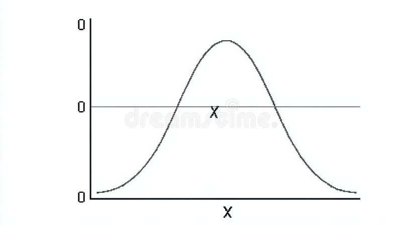
Free with trial A curve illustrates a symmetrical distribution, peaking at the x-axis center, representing the datas probability density. Variable density illustrations Graph Depicting a Symmetrical Distribution Curve Along the X-Axis Showcasing the Peak at the Center and Tapering off. A curve illustrates a symmetrical. A curve illustrates a symmetrical distribution, peaking at the x-axis center, representing the datas probability density.
Free with trial Cybersecurity Fluidity and Data Volatility - A Multi-Panel Study of Crimson Binary Sequences Illustrating Systematic Information Migration, Surveillance Leaks, and Variable Density Network Traffic within a Dark Digital Void. Variable density illustrations Digital Drift - Red Binary Fragmentation and Cyberpunk Security Breach Dynamics. Cybersecurity Fluidity and Data Volatility - A Multi-Panel Study of Crimson. Cybersecurity Fluidity and Data Volatility - A Multi-Panel Study of Crimson Binary Sequences Illustrating Systematic Information Migration, Surveillance Leaks, and Variable Density Network Traffic within a Dark Digital Void
Free with trial Cybersecurity Equilibrium and Data Instability - A Triptych Study of Crimson Binary Sequences Illustrating Controlled Surveillance, Systematic Information Leaks, and Variable Density Network Traffic within a Dark Digital Void. Variable density vectors Digital Asymmetry - Red Binary Fragmentation and Cyberpunk Security Breach Patterns. Cybersecurity Equilibrium and Data Instability - A Triptych Study of Crimson. Cybersecurity Equilibrium and Data Instability - A Triptych Study of Crimson Binary Sequences Illustrating Controlled Surveillance, Systematic Information Leaks, and Variable Density Network Traffic within a Dark Digital Void
Free with trial Cybersecurity Equilibrium and Data Instability - A Dual Study of Crimson Binary Sequences Illustrating Controlled Surveillance, Systematic Information Leaks, and Variable Density Network Traffic within a Dark Digital Void. Variable density illustrations Digital Asymmetry - Red Binary Fragmentation and Strategic Security Breach Patterns. Cybersecurity Equilibrium and Data Instability - A Dual Study of Crimson. Cybersecurity Equilibrium and Data Instability - A Dual Study of Crimson Binary Sequences Illustrating Controlled Surveillance, Systematic Information Leaks, and Variable Density Network Traffic within a Dark Digital Void
Free with trial Cybersecurity Equilibrium and Data Instability - A Dual Study of Crimson Binary Sequences Illustrating Controlled Surveillance, Systematic Information Leaks, and Variable Density Network Traffic within a Dark Digital Void. Variable density vectors Digital Asymmetry - Red Binary Fragmentation and Strategic Security Breach Patterns. Cybersecurity Equilibrium and Data Instability - A Dual Study of Crimson. Cybersecurity Equilibrium and Data Instability - A Dual Study of Crimson Binary Sequences Illustrating Controlled Surveillance, Systematic Information Leaks, and Variable Density Network Traffic within a Dark Digital Void
Free with trial Cybersecurity Decay and Information Flux - A Comprehensive Study of Red Binary Sequences Illustrating Systematic Data Erosion, Surveillance Log Dissipation, and Variable Density Network Traffic within a Dark Digital Void Environment. Variable density vectors Digital Drift - Crimson Binary Fragmentation and Cyberpunk System Vulnerability Patterns. Cybersecurity Decay and Information Flux - A Comprehensive Study of Red. Cybersecurity Decay and Information Flux - A Comprehensive Study of Red Binary Sequences Illustrating Systematic Data Erosion, Surveillance Log Dissipation, and Variable Density Network Traffic within a Dark Digital Void Environment
Free with trial Cybersecurity Decay and Information Flux - A Comprehensive Study of Red Binary Sequences Illustrating Systematic Data Erosion, Surveillance Log Dissipation, and Variable Density Network Traffic within a Dark Digital Void Environment. Variable density vectors Digital Drift - Crimson Binary Fragmentation and Cyberpunk System Vulnerability Patterns. Cybersecurity Decay and Information Flux - A Comprehensive Study of Red. Cybersecurity Decay and Information Flux - A Comprehensive Study of Red Binary Sequences Illustrating Systematic Data Erosion, Surveillance Log Dissipation, and Variable Density Network Traffic within a Dark Digital Void Environment
Free with trial Cybersecurity Decay and Information Flux - A Comprehensive Study of Red Binary Sequences Illustrating Systematic Data Erosion, Surveillance Log Dissipation, and Variable Density Network Traffic within a Dark Digital Void Environment. Variable density illustrations Digital Drift - Crimson Binary Fragmentation and Cyberpunk System Vulnerability Patterns. Cybersecurity Decay and Information Flux - A Comprehensive Study of Red. Cybersecurity Decay and Information Flux - A Comprehensive Study of Red Binary Sequences Illustrating Systematic Data Erosion, Surveillance Log Dissipation, and Variable Density Network Traffic within a Dark Digital Void Environment
Free with trial Cybersecurity Decay and Information Flux - A Comprehensive Study of Red Binary Sequences Illustrating Systematic Data Erosion, Surveillance Log Dissipation, and Variable Density Network Traffic within a Dark Digital Void Environment. Variable density illustrations Digital Drift - Crimson Binary Fragmentation and Cyberpunk System Vulnerability Patterns. Cybersecurity Decay and Information Flux - A Comprehensive Study of Red. Cybersecurity Decay and Information Flux - A Comprehensive Study of Red Binary Sequences Illustrating Systematic Data Erosion, Surveillance Log Dissipation, and Variable Density Network Traffic within a Dark Digital Void Environment
Free with trial Chart and graph set featuring data. Statistics analysis visualization diagram report dashboard business analytics metrics distribution histogram scatter column. Variable density vectors Chart and graph set featuring data. Statistics analysis visualization diagram report dashboard business analytics metrics distribution histogram scatter column
Free with trial Chart and graph set featuring data. Statistics analysis visualization diagram report dashboard business analytics metrics distribution histogram scatter column. Variable density vectors Chart and graph set featuring data. Statistics analysis visualization diagram report dashboard business analytics metrics distribution histogram scatter column
Free with trial Chart and graph set featuring data. Statistics analysis visualization diagram report dashboard business analytics metrics distribution histogram scatter column. Variable density vectors Chart and graph set featuring data. Statistics analysis visualization diagram report dashboard business analytics metrics distribution histogram scatter column
Free with trial Irregular ink splatters create scattered blot pattern with variable size and density. Variable density vectors Splattered Ink Texture. Irregular ink splatters create scattered blot pattern with variable size and density. Irregular ink splatters create scattered blot pattern with variable size and density.
Free with trial Study with okay tickness on white. Background. Variable density illustrations Study with okay tickness on white. Background
Free with trial A grid of olive green circles arranged on a transparent background. The dots vary in size, creating a radial gradient effect where larger circles are in the center and smaller ones at the edges. Variable density vectors Olive green halftone dot grid pattern with variable circle sizes. A grid of olive green circles arranged on a transparent background. The dots vary in size. A grid of olive green circles arranged on a transparent background. The dots vary in size, creating a radial gradient effect where larger circles are in the center and smaller ones at the edges
Free with trial Patterned background composed of densely packed black plus signs on a white surface. The arrangement creates an optical illusion with variable density and diagonal lines. The repetitive geometry forms a textured field of plus symbols, creating a visual interplay between light and dark regions. Variable density vectors Patterned background composed of densely packed black plus signs on a white surface. The arrangement creates an optical illusion with variable density and
Free with trial Abstract halftone vector illustration featuring a pattern of black triangles arranged with variable density on a transparent background for creative graphic design projects and textures. Variable density vectors Abstract halftone vector illustration with black triangle pattern on transparent backdrop. Abstract halftone vector illustration featuring a pattern of black. Abstract halftone vector illustration featuring a pattern of black triangles arranged with variable density on a transparent background for creative graphic design projects and textures
Free with trial Cepheid pulsating envelope illustration luminosity amplitude, instability oscillation, resonance convection cepheid pulsating envelope. Variable density illustrations Cepheid pulsating envelope. Illustration luminosity amplitude, instability oscillation, resonance convection AI generated. cepheid pulsating envelope illustration luminosity amplitude, instability oscillation, resonance convection cepheid pulsating envelope
Free with trial The image shows two vertical columns of abstract, grayscale patterns composed of varying shades of gray and white blocks. The patterns appear to represent data or information in a visual format, with dense clusters of darker shades on the left and more dispersed, lighter shades on the right. The arrangement suggests a comparison or contrast between two sets of data distributions. Variable density illustrations Abstract visualization of vertical data patterns in grayscale. The image shows two vertical columns of abstract, grayscale patterns composed of varying shades of. The image shows two vertical columns of abstract, grayscale patterns composed of varying shades of gray and white blocks. The patterns appear to represent data or information in a visual format, with dense clusters of darker shades on the left and more dispersed, lighter shades on the right. The arrangement suggests a comparison or contrast between two sets of data distributions
Free with trial The image displays four diagrams illustrating particle dispersion emanating from central points. Each diagram appears to show particles radiating outward in different patterns, likely representing variations in physical phenomena such as diffusion, electromagnetic fields, or fluid dynamics. The particles are color-coded, transitioning from green to yellow, possibly indicating changes in velocity,. Variable density illustrations Visualization of particle dispersion patterns from central points in four distinct scenarios. The image displays four diagrams illustrating particle dispersion. The image displays four diagrams illustrating particle dispersion emanating from central points. Each diagram appears to show particles radiating outward in different patterns, likely representing variations in physical phenomena such as diffusion, electromagnetic fields, or fluid dynamics. The particles are color-coded, transitioning from green to yellow, possibly indicating changes in velocity,
Free with trial Close-up of hands holding a transparent sheet displaying two statistical distribution graphs, one bell curve and one inverted. Generative AI. Variable density illustrations Hands Holding Transparent Sheet With Statistical Distribution Graphs. Close-up of hands holding a transparent sheet displaying two statistical distribution. Close-up of hands holding a transparent sheet displaying two statistical distribution graphs, one bell curve and one inverted. Generative AI
Free with trial Abstract Line Graph, Wavy Lines, Black and White, Waves. Abstract sound wave graphic (1. Variable density illustrations Abstract Line Graph, Wavy Lines, Black and White, Waves. Abstract sound wave graphic (1
Free with trial Abstract Monochrome Circle Pattern Background. AI Generative. Variable density illustrations Abstract Monochrome Circle Pattern Background. AI Generative
 Sign in