Free with trial The image depicts a graph with a downward trend, displaying both percentage and numerical values at various points. Analysis decrease illustrations Graph showing downward trend with percentage and numerical values. The image depicts a graph with a downward trend, displaying both percentage and numerical values at various points
Free with trial A flat style vector illustration showcasing a laptop displaying a colorful bar chart and a downward trending arrow indicating financial decline or loss. Analysis decrease illustrations Laptop Screen Displaying Colorful Bar Chart and Downward Trending Arrow Symbolizing Financial Loss. A flat style vector illustration showcasing a laptop displaying a colorful bar chart and a downward trending arrow indicating financial decline or loss.
Free with trial The image features a close-up view of a large, three-dimensional blue percentage symbol against a stark white background. The symbol is slightly tilted to the right, giving it a dynamic appearance. The blue color is vibrant and glossy, reflecting light and adding a sense of depth to the image. Analysis decrease illustrations A close-up view of a large blue percentage symbol on a white background. The image features a close-up view of a large, three-dimensional blue percentage symbol against a stark white background. The symbol is slightly tilted to the right, giving it a dynamic appearance. The blue color is vibrant and glossy, reflecting light and adding a sense of depth to the image
Free with trial This graph illustrates the trends in volume and not frequency over several quarters, with notable peaks observed in Q3. Analysis decrease illustrations Graph showing volume and not frequency over time with peaks in q3. This graph illustrates the trends in volume and not frequency over several quarters, with notable peaks observed in Q3
Free with trial The image shows a 3D bar chart with green bars of decreasing height, and a red downward arrow pointing from the tallest bar to the shortest one, indicating a decline in data or performance over time. Analysis decrease illustrations A 3d bar chart with a red downward arrow indicating a decline in data. The image shows a 3D bar chart with green bars of decreasing height, and a red downward arrow pointing from the tallest bar to the shortest one, indicating a decline in data or performance over time
Free with trial Hand showing hand pressing yellow arrow down on bar chart with gray background. resolution use. Clear details and vibrant colors enhance visual appeal. hand, yellow arrow, downward arrow. Analysis decrease illustrations Hand pressing yellow arrow down on bar chart with gray background
Free with trial A bright yellow 3D arrow is rendered pointing directly downwards. The arrow has a solid, geometric appearance with smooth edges. It is presented in isolation against a clean white background, making it highly visible and suitable for use as an icon or directional indicator. The image focuses on the simple form and clear direction of the arrow. Analysis decrease illustrations Yellow 3D Arrow Pointing Downward on a White Background direction. A bright yellow 3D arrow is rendered pointing directly downwards. The arrow has a solid, geometric appearance with smooth edges. It is presented in isolation against a clean white background, making it highly visible and suitable for use as an icon or directional indicator. The image focuses on the simple form and clear direction of the arrow
Free with trial Reduction chart icon Flat thin line vector illustration art outline set. Analysis decrease vectors Reduction chart icon linear logo isolated. Reduction chart icon Flat thin line vector illustration art outline set
Free with trial A sharp, red zigzag arrow points downwards, visually representing a significant decline or negative trend in financial markets, economic performance, or any data set showing a downward trajectory. Analysis decrease vectors Red downward trending arrow graphic, isolated on transparent background. A sharp, red zigzag arrow points downwards, visually representing a significant decline or negative trend in financial markets, economic performance, or any data set showing a downward trajectory
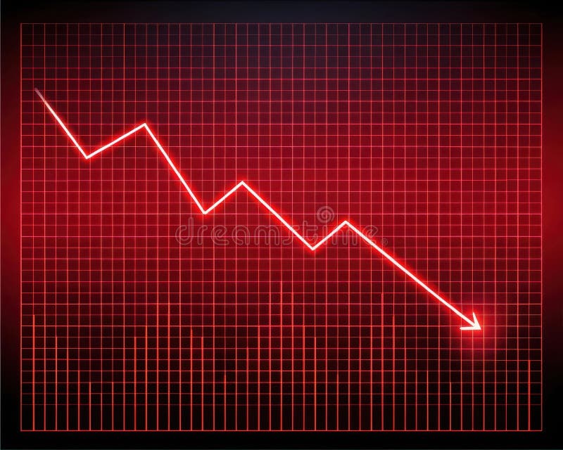
Free with trial A bright red line graph with a steep downward trend is displayed on a glowing red grid against a dark background. Analysis decrease illustrations Bright Red Digital Line Graph Showing Steep Decline on Grid image. A bright red line graph with a steep downward trend is displayed on a glowing red grid against a dark background
Free with trial Illustration of cost saving graph with coins, arrows, and text on a light blue background. Analysis decrease illustrations Cost saving graph with coins and arrows on light blue background. illustration of cost saving graph with coins, arrows, and text on a light blue background
Free with trial An detailed set of professional financial line graphs and business reporting icons for data visualization and statistics. Analysis decrease vectors Professional financial line graphs and business reporting icons
Free with trial This image represents a declining global economy with a dramatic drop in financial performance illustrated by a bright blue arrow pointing downwards. Analysis decrease illustrations Global economic downturn with financial chart on world map background. This image represents a declining global economy with a dramatic drop in financial performance illustrated by a bright blue arrow pointing downwards
Free with trial Person's hand points to stock market data displayed on laptop screen indicating analysis Use for finance or investment themes. Analysis decrease illustrations Analyzing Stock Market Data on Laptop Screen with Hand Pointing. Person's hand points to stock market data displayed on laptop screen indicating analysis Use for finance or investment themes
Free with trial A person in a suit points a finger at a percentage symbol. The symbol is surrounded by red and green arrows on a dark background. The composition is close-up. Analysis decrease illustrations Businessman pointing at percentage symbol with red and green arrows on a dark background finance. A person in a suit points a finger at a percentage symbol. The symbol is surrounded by red and green arrows on a dark background. The composition is close-up
Free with trial A bar graph with a red line showing a downward trend, indicating a consistent decrease in values over time. Analysis decrease illustrations Graph illustrating a steady decline in data over a period of time. A bar graph with a red line showing a downward trend, indicating a consistent decrease in values over time
Free with trial The image shows a close-up view of a yellow percentage symbol on a plain white background. The symbol is composed of two zeros with a slash in between, representing the mathematical percentage sign. Analysis decrease illustrations A close-up view of a yellow percentage symbol on a white background. The image shows a close-up view of a yellow percentage symbol on a plain white background. The symbol is composed of two zeros with a slash in between, representing the mathematical percentage sign
Free with trial A 3D representation shows a red downward arrow with a white percentage symbol and a green house shape pointing upwards also with a percentage symbol. This visually conveys changes in mortgage rates or housing market values. Analysis decrease illustrations Red down arrow with percent symbol and green up arrow shaped like house with percent symbol. A 3D representation shows a red downward arrow with a white percentage symbol and a green house shape pointing upwards also with a percentage symbol. This visually conveys changes in mortgage rates or housing market values
Free with trial This image captures a downward trend line, symbolizing a financial market decline and representing challenges faced by investors. Analysis decrease illustrations Downward Trend Line Representing Financial Market Decline and Loss. This image captures a downward trend line, symbolizing a financial market decline and representing challenges faced by investors
Free with trial A growth chart with a star signifies progress. It shows upward trends, success, and achievement in business or personal development, indicating positive results. Analysis decrease vectors Vector art of growth chart with star, representing progress, success, achievement, and upward trend in business or personal. A growth chart with a star signifies progress. It shows upward trends, success, and achievement in business or personal development, indicating positive results
Free with trial The image depicts a small yellow figure standing on a green circular platform. Above the figure, there are multiple red arrows pointing downwards, suggesting a downward trend or pressure. Analysis decrease illustrations Yellow figure standing under red downward arrows on green platform. The image depicts a small yellow figure standing on a green circular platform. Above the figure, there are multiple red arrows pointing downwards, suggesting a downward trend or pressure
Free with trial The image shows a stylized line graph with a bold upward arrow indicating growth or positive trend, followed by a downward arrow suggesting a dip or decline. The arrows are rendered in a teal color and have a modern, minimalist design. Analysis decrease illustrations Graphic depicting upward and downward trend with bold arrow design. The image shows a stylized line graph with a bold upward arrow indicating growth or positive trend, followed by a downward arrow suggesting a dip or decline. The arrows are rendered in a teal color and have a modern, minimalist design
Free with trial The image displays four distinct data visualizations. The top left and bottom left show bar charts with varying heights, indicating different data values. The top right presents a stacked bar chart, where each bar is divided into segments. The bottom right illustrates a line chart, showing data points connected by lines to depict trends over time. Analysis decrease illustrations Various types of data visualizations including bar and line charts. The image displays four distinct data visualizations. The top left and bottom left show bar charts with varying heights, indicating different data values. The top right presents a stacked bar chart, where each bar is divided into segments. The bottom right illustrates a line chart, showing data points connected by lines to depict trends over time
Free with trial Colorful infographic d "BundenigS" illustrating financial concepts like savings, budgeting, investments, and financial statements, using simple icons. Analysis decrease illustrations Colorful infographic d \'BundenigS\' illustrating financial concep. Colorful infographic d "BundenigS" illustrating financial concepts like savings, budgeting, investments, and financial statements, using simple icons .
Free with trial A businessman is shown from an elevated perspective, diligently typing on a laptop. Beside him, a 3D bar graph illustrates a downward trend, accompanied by a prominent green arrow and a COST sign, symbolizing cost reduction and financial efficiency. Analysis decrease illustrations Businessman working on laptop with decreasing cost graph and arrow. A businessman is shown from an elevated perspective, diligently typing on a laptop. Beside him, a 3D bar graph illustrates a downward trend, accompanied by a prominent green arrow and a COST sign, symbolizing cost reduction and financial efficiency
Free with trial Icons on a white background depict percentage symbols combined with arrows and bar graphs. The top row includes red, blue, and yellow arrows with percentage symbols. The middle row shows a multicolored bar graph, green percentage symbols, and a black percentage symbol with a black arrow. The bottom row contains a black bar graph, a downward arrow, and a large black percentage symbol. These elements visually represent data trends, growth, and decline. Analysis decrease vectors Percentage Growth and Decline Arrow Icon Set Multi Color and Silhouette. Icons on a white background depict percentage symbols combined with arrows and bar graphs. The top row includes red, blue, and yellow arrows with percentage symbols. The middle row shows a multicolored bar graph, green percentage symbols, and a black percentage symbol with a black arrow. The bottom row contains a black bar graph, a downward arrow, and a large black percentage symbol. These elements visually represent data trends, growth, and decline.
Free with trial Unemployment line icon of unemployed man on labor market, vector symbol. Economic crisis, global financial downturn and bankruptcy icon of economy recession and unemployment problem. Analysis decrease vectors Unemployment line icon, economic financial crisis. Unemployment line icon of unemployed man on labor market, vector symbol. Economic crisis, global financial downturn and bankruptcy icon of economy recession and unemployment problem
Free with trial A blue line drop-down with red bar chart on a white background. Businese concept. Analysis decrease vectors A blue line drop-down with red bar chart on white background. Business concept
Free with trial The image depicts a line graph with a purple line illustrating a fluctuating trend. The area under the line is shaded in light purple, indicating the cumulative value over time. The graph has a steady upward trend with several peaks and troughs, suggesting variability in the data. Analysis decrease illustrations A graph showing a fluctuating trend with a purple line and shaded area. The image depicts a line graph with a purple line illustrating a fluctuating trend. The area under the line is shaded in light purple, indicating the cumulative value over time. The graph has a steady upward trend with several peaks and troughs, suggesting variability in the data
Free with trial This image depicts a candlestick chart typically used in financial markets to illustrate the price movements of a cryptocurrency over time. The chart features green and red candles, where green indicates a price increase (bullish) and red indicates a price decrease (bearish). The chart shows a sequence of rising and falling prices, including sharp upward spikes and significant drops, which are. Analysis decrease illustrations Cryptocurrency price chart displaying bullish and bearish trends. This image depicts a candlestick chart typically used in financial markets to illustrate the. This image depicts a candlestick chart typically used in financial markets to illustrate the price movements of a cryptocurrency over time. The chart features green and red candles, where green indicates a price increase (bullish) and red indicates a price decrease (bearish). The chart shows a sequence of rising and falling prices, including sharp upward spikes and significant drops, which are
Free with trial A 3D rendered image of a red graph trending downwards with a large red arrow pointing down, set against a grey grid surface and a gradient grey background. Analysis decrease illustrations A 3d red graph showing a sharp decline in trend on a grey grid surface. A 3D rendered image of a red graph trending downwards with a large red arrow pointing down, set against a grey grid surface and a gradient grey background
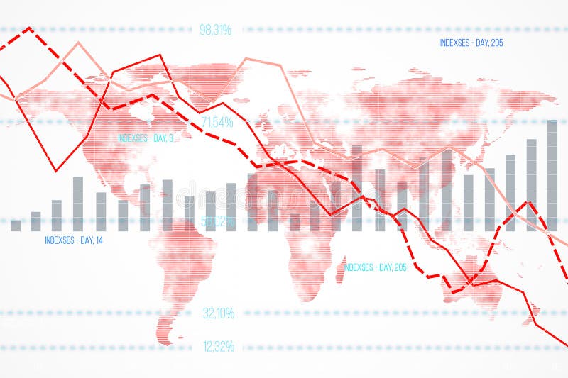
Free with trial Financial data chart featuring declining indexes and bar graphs overlaid on a world map background. Concept of global economic downturn. 3D Rendering. Analysis decrease illustrations Financial data chart with declining indexes on a world map background. 3D Rendering. Financial data chart featuring declining indexes and bar graphs overlaid on a world map background. Concept of global economic downturn. 3D Rendering
Free with trial Detailed statistics, a white background, and a downward arrow depicting a stock market crash. 3D rendering. Analysis decrease illustrations Detailed statistics, a white background, and a downward arrow depicting a stock market crash. 3D rendering.
Free with trial Hand-drawn graph of business progress, with upward and downward arrows. Analysis decrease vectors Hand-drawn graph of business progress, with upward and downward arrows
Free with trial A striking red umbrella stands over blue financial graphs, symbolizing risk management and the protection of money in this 3D illustration. Perfect for finance and business themes. Analysis decrease illustrations Red Umbrella Over Financial Graphs Representing Risk Management and Protection of Money in 3D Illustration. A striking red umbrella stands over blue financial graphs, symbolizing risk management and the protection of money in this 3D illustration. Perfect for finance and business themes
Free with trial Collection of various business and financial chart icons in a modern, flat style, set against a dark blue background. Perfect for infographics, presentations, and websites requiring data visualization elements. Analysis decrease illustrations Business and Financial Icons Set on Dark Blue Background for Design Elements. Collection of various business and financial chart icons in a modern, flat style, set against a dark blue background. Perfect for infographics, presentations, and websites requiring data visualization elements
Free with trial Stock market data with candlestick chart and declining arrow on a blurred light background. Concept of financial decline. 3D Rendering. Analysis decrease illustrations Abstract image of financial stock market data with declining arrow on light background. 3D Rendering. Stock market data with candlestick chart and declining arrow on a blurred light background. Concept of financial decline. 3D Rendering
Free with trial Laptop on desk shows red downward stock chart against light background, symbolizing global financial crisis, investment loss and market collapse. 3D Rendering. Analysis decrease illustrations Laptop displaying downward red stock chart on wooden desk with coffee and smartphone, symbolizing financial crisis and market. Laptop on desk shows red downward stock chart against light background, symbolizing global financial crisis, investment loss and market collapse. 3D Rendering
Free with trial A red arrow symbolizing decline rests on a wooden table, capturing the essence of financial downturn and negative trends in business environments and evaluations. Analysis decrease illustrations Red Declining Arrow on Wooden Table Representing Financial Downturn. A red arrow symbolizing decline rests on a wooden table, capturing the essence of financial downturn and negative trends in business environments and evaluations
Free with trial The image depicts a bar graph with a series of red vertical bars that decrease in height from left to right, indicating a downward trend. A large red arrow, outlined in white, points diagonally downward and to the right, emphasizing the decline. Analysis decrease illustrations A downward trend graph with a prominent red arrow indicating decline. The image depicts a bar graph with a series of red vertical bars that decrease in height from left to right, indicating a downward trend. A large red arrow, outlined in white, points diagonally downward and to the right, emphasizing the decline
Free with trial A series of colorful bars representing a graph, each with water droplets, illuminated by a spotlight against a dark background with blurred city lights. Analysis decrease illustrations Colorful bar graph with water droplets under a spotlight on a dark background with bokeh city lights. A series of colorful bars representing a graph, each with water droplets, illuminated by a spotlight against a dark background with blurred city lights
Free with trial This financial data illustration set features a stack of coins with a dollar sign alongside euro and pound currency stacks on the left, while the right side displays six analytical graphs including a blue downward trend graph, a green upward trend graph, a dual-color bar graph representing growth or decline, a bar graph with a green upward arrow indicating value increase, a pound coin illustration. Analysis decrease illustrations Set of four financial data illustrations showing currency stacks and business graphs with trends for investment analysis and. This financial data illustration set features a stack of coins with a dollar sign alongside euro and pound currency stacks on the left, while the right side displays six analytical graphs including a blue downward trend graph, a green upward trend graph, a dual-color bar graph representing growth or decline, a bar graph with a green upward arrow indicating value increase, a pound coin illustration
Free with trial A black magnifying glass is placed over a bar graph on a white background. Clear details and vibrant colors en. Analysis decrease illustrations Magnifying Glass Over Bar Graph Icon on White Background chart data. A black magnifying glass is placed over a bar graph on a white background. Clear details and vibrant colors en
Free with trial Black graph showing upward and downward trends with jagged peaks on white. Clear details and vibrant colors en. Analysis decrease illustrations Up and down trend graph with jagged peaks on white background chart. Black graph showing upward and downward trends with jagged peaks on white. Clear details and vibrant colors en
Free with trial This image illustrates business concepts such as profit growth and cost reduction using graphical representations on digital devices A businessman points a pen towards the graphics highlighting the importance of financial strategy and positive business outcomes It emphasizes the analytical aspect of monitoring progress. Analysis decrease illustrations Profit growth and cost reduction depicted with graphs and a businessman. This image illustrates business concepts such as profit growth and cost reduction using graphical representations on digital devices A businessman points a pen towards the graphics highlighting the importance of financial strategy and positive business outcomes It emphasizes the analytical aspect of monitoring progress
Free with trial This image depicts a financial graph illustrating net worth over time, featuring a teal shaded area and a line graph with data points. The graph is presented on a clean white background, making it easy to read and understand. The image is suitable for use in financial reports, presentations, and marketing materials, providing a clear and concise visual representation of financial data. The graph's design is simple, yet effective, allowing viewers to quickly grasp the trend and pattern of net worth changes over time. Analysis decrease vectors A financial graph showing net worth over time with a teal shaded area. This image depicts a financial graph illustrating net worth over time, featuring a teal shaded area and a line graph with data points. The graph is presented on a clean white background, making it easy to read and understand. The image is suitable for use in financial reports, presentations, and marketing materials, providing a clear and concise visual representation of financial data. The graph's design is simple, yet effective, allowing viewers to quickly grasp the trend and pattern of net worth changes over time.
Free with trial This image displays a sleek, modern icon featuring a blue percentage symbol (%) centered within a hexagonal shape. The design has a glossy, three-dimensional effect with subtle highlights and shadows, giving it a polished and professional appearance suitable for use in business, finance, or data-related contexts. Analysis decrease illustrations Stylized blue percentage symbol icon with a modern geometric design. This image displays a sleek, modern icon featuring a blue percentage symbol (%) centered within a hexagonal shape. The design has a glossy, three-dimensional effect with subtle highlights and shadows, giving it a polished and professional appearance suitable for use in business, finance, or data-related contexts
Free with trial A 3D bar chart with white bars and red bases shows a downward trend. A thick red arrow points downwards across the grid background. Isolated on white. Analysis decrease illustrations 3 D red arrow graph chart showing decline on white background image. A 3D bar chart with white bars and red bases shows a downward trend. A thick red arrow points downwards across the grid background. Isolated on white
Free with trial A red downward-pointing arrow sits atop a blue bar graph labeled GDP, with white financial data and numbers below on a dark background with a gradient light effect. red, down, arrow. Analysis decrease illustrations Red down arrow on blue bar graph with g d p text and financial data. A red downward-pointing arrow sits atop a blue bar graph labeled GDP, with white financial data and numbers below on a dark background with a gradient light effect. red, down, arrow
Free with trial An isometric bar chart illustrating a negative financial trend with a downward red arrow, isolated on a white background, representing economic decline and business challenges. Analysis decrease illustrations Bar chart with downward trending arrow isolated on white background. An isometric bar chart illustrating a negative financial trend with a downward red arrow, isolated on a white background, representing economic decline and business challenges
Free with trial This image shows a large, three-dimensional blue percentage symbol against a dark, textured background. The symbol is slightly tilted to the right and appears to be made of a shiny, metallic material. Analysis decrease illustrations A close-up view of a large blue percentage symbol on a dark background. This image shows a large, three-dimensional blue percentage symbol against a dark, textured background. The symbol is slightly tilted to the right and appears to be made of a shiny, metallic material
Free with trial This creative image features a tilted angle view of coins stacked to depict financial growth while a businessman rushes past, reflecting the dynamic nature of the economy. Analysis decrease illustrations Financial Growth Concept with Coins and Businessman on Tilted Angle. This creative image features a tilted angle view of coins stacked to depict financial growth while a businessman rushes past, reflecting the dynamic nature of the economy
Free with trial The image showcases a large, three-dimensional yellow percentage sign against a plain background. The sign is composed of two circles connected by a horizontal line, creating a bold and eye-catching symbol. Analysis decrease illustrations A close-up view of a large, three-dimensional yellow percentage sign. The image showcases a large, three-dimensional yellow percentage sign against a plain background. The sign is composed of two circles connected by a horizontal line, creating a bold and eye-catching symbol
Free with trial Falling Bar Graph with Downward Arrow Indicating Decline or Recession. Analysis decrease vectors Falling Bar Graph with Downward Arrow Indicating Decline or Recession
Free with trial A blue umbrella shelters from a downpour of red downward-pointing arrows forming a descending line graph, set against a stormy sky and dark water. The image depicts protection from economic decline. Analysis decrease illustrations Blue Umbrella Protecting from Red Downward Arrows and Graph. A blue umbrella shelters from a downpour of red downward-pointing arrows forming a descending line graph, set against a stormy sky and dark water. The image depicts protection from economic decline
Free with trial Miniature wooden house with a prominent red downward arrow amidst a group of similar houses. Generative AI. Analysis decrease illustrations Miniature wooden house with a prominent red downward arrow amidst a group of similar houses
Free with trial Abstract watercolor painting depicting a downward market trend, symbolized by red line graph over cityscape, representing financial instability, economic downturn, risk, and uncertainty. Spacious empty area designed for product displays and advertisements. Perfect for banners, branding, and marketing visuals. . Generative AI. Analysis decrease illustrations Watercolor Cityscape Market Trend Abstract watercolor painting depicting a downward market trend symbolized by red line graph. Abstract watercolor painting depicting a downward market trend, symbolized by red line graph over cityscape, representing financial instability, economic downturn, risk, and uncertainty. Spacious empty area designed for product displays and advertisements. Perfect for banners, branding, and marketing visuals. . Generative AI
Free with trial A stark downward trending graph against a white backdrop signifies economic downturn, financial losses, and negative market performance. It represents a period of decline. Analysis decrease vectors Vector art of downward trending graph, depicting economic decline, financial loss, market downturn, and negative performance. A stark downward trending graph against a white backdrop signifies economic downturn, financial losses, and negative market performance. It represents a period of decline
Free with trial Visualizing cost reduction with a declining graph held in a hand, symbolizing strategic expense management and improved profitability for business growth and financial success. A key concept. Analysis decrease illustrations Cost reduction strategies: how to lower expenses and improve profitability for your business growth. visualizing cost reduction with a declining graph held in a hand, symbolizing strategic expense management and improved profitability for business growth and financial success. A key concept.
Free with trial A visually appealing bar chart composed of colorful blocks arranged to represent fluctuating data and growth patterns. Analysis decrease illustrations Colorful bar graph showing upward and downward trends on a clean white surface. A visually appealing bar chart composed of colorful blocks arranged to represent fluctuating data and growth patterns
Free with trial A hand places a block on a decreasing bar graph, symbolizing cost reduction, with a magnifying glass highlighting the word COST. Analysis decrease illustrations Cost Reduction Strategy Illustrated with Blocks and Magnifying Glass. A hand places a block on a decreasing bar graph, symbolizing cost reduction, with a magnifying glass highlighting the word COST
Free with trial The image depicts a flip chart with a bar chart showing a downward trend in performance or data values. Overlaid on the bar chart is a red line graph that also trends downward, emphasizing a continuous decline. The chart is likely used to visually communicate negative trends or reductions in metrics over time, such as sales, productivity, or other measurable quantities. Analysis decrease illustrations Declining performance illustrated by a bar and line chart on a flip chart. The image depicts a flip chart with a bar chart showing a downward trend in performance or data values. Overlaid on the bar chart is a red line graph that also trends downward, emphasizing a continuous decline. The chart is likely used to visually communicate negative trends or reductions in metrics over time, such as sales, productivity, or other measurable quantities
Free with trial The image depicts a bar graph with a series of red vertical bars that decrease in height from left to right, indicating a downward trend. A large red arrow, outlined in white, points diagonally downward and to the right, emphasizing the decline. Analysis decrease illustrations A downward trend graph with a prominent red arrow indicating decline. The image depicts a bar graph with a series of red vertical bars that decrease in height from left to right, indicating a downward trend. A large red arrow, outlined in white, points diagonally downward and to the right, emphasizing the decline
Free with trial Illustration shows a man wearing a purple hoodie standing dejectedly with a red downward arrow graph behind him, symbolizing decline and loss, somber mood. Generative AI. Analysis decrease vectors Sad man with purple hoodie and red downward arrow graph expressing decline and disappointment vector illustration. Illustration shows a man wearing a purple hoodie standing dejectedly with a red downward arrow graph behind him, symbolizing decline and loss, somber mood. Generative AI
Free with trial A businessman in a suit is drawing a downward sloping graph illustrating the decline of profits against the rise of costs the image represents financial challenges business downturns and the need for cost reduction strategies for improved profitability. Analysis decrease illustrations Business person drawing a graph representing financial decline and reduced profits due to cost. A businessman in a suit is drawing a downward sloping graph illustrating the decline of profits against the rise of costs the image represents financial challenges business downturns and the need for cost reduction strategies for improved profitability
Free with trial The image shows a triangular grid filled with blue squares, with a downward-sloping line cutting diagonally across it. The line starts high on the left side and descends sharply towards the bottom right, indicating a decline or downward trend. The overall design is clean and modern, using a blue and white color scheme. Analysis decrease illustrations Graphic depicting a declining trend within a structured grid framework. The image shows a triangular grid filled with blue squares, with a downward-sloping line cutting diagonally across it. The line starts high on the left side and descends sharply towards the bottom right, indicating a decline or downward trend. The overall design is clean and modern, using a blue and white color scheme
Free with trial 3D bar chart illustrating decline, financial loss, or negative growth. Purple bars and arrow on white. Analysis decrease illustrations Purple bar graph showing downward trend with arrow, financial concept. 3D bar chart illustrating decline, financial loss, or negative growth. Purple bars and arrow on white
Free with trial The image depicts a 3D bar chart with bars in varying heights. The bars are colored in shades of green and blue, with the green bars being shorter and the blue bars being taller. The chart is set against a plain white background, which highlights the colors of the bars. Analysis decrease illustrations Colorful 3d bar chart with green and blue bars on a white background. The image depicts a 3D bar chart with bars in varying heights. The bars are colored in shades of green and blue, with the green bars being shorter and the blue bars being taller. The chart is set against a plain white background, which highlights the colors of the bars
Free with trial A red graph on a transparent background displaying a downward trend with bars and a prominent arrow indicating a sharp decline. Analysis decrease illustrations Graph showing a significant decline in trend with red bars and arrow. A red graph on a transparent background displaying a downward trend with bars and a prominent arrow indicating a sharp decline
Free with trial Conceptual image symbolizes a downward trend with golden arrow breaking through a silver line graph. This could represent economic decline, financial crisis, or a stock market crash. 3D rendering. Analysis decrease illustrations Downward Trend Arrow, Economic Decline, Stock Market Crash. Conceptual image symbolizes a downward trend with golden arrow breaking through a silver line graph. This could represent economic decline, financial crisis, or a stock market crash. 3D rendering.
Free with trial A group of people standing around a large red arrow pointing downwards created AI. Analysis decrease illustrations A group of people standing around a large red arrow pointing downwards
Free with trial A 3D bar chart with red, blue, and orange bars displayed on a white board with a red frame and easel legs. Isolated on a transparent background. Analysis decrease vectors 3 D Bar Chart on Easel isolated on a transparent background graph data. A 3D bar chart with red, blue, and orange bars displayed on a white board with a red frame and easel legs. Isolated on a transparent background
Free with trial Pink bar graph showing a downward trend on a pink background, financial concept. Analysis decrease illustrations Pink bar graph showing a downward trend on a pink background, financial concept
Free with trial Reduction chart icon set in thin line outline style and linear vector sign. Analysis decrease vectors Reduction chart icon Thin line art isolated. Reduction chart icon set in thin line outline style and linear vector sign
Free with trial This image shows a large, three-dimensional blue percentage symbol against a dark, textured background. The symbol is slightly tilted to the right and appears to be made of a shiny, metallic material. Analysis decrease illustrations A close-up view of a large blue percentage symbol on a dark background. This image shows a large, three-dimensional blue percentage symbol against a dark, textured background. The symbol is slightly tilted to the right and appears to be made of a shiny, metallic material
Free with trial A golden bar graph illustrates a downward financial trend, with each bar decreasing in height from left to right. A large, shiny golden coin with a dollar sign is positioned on top of the graph, and a golden arrow points downwards, signifying a loss or decline in value. The entire composition is set against a clean white background. Analysis decrease illustrations Golden Bar Graph Showing Downward Trend with Dollar Coin and Arrow on White Background finance. A golden bar graph illustrates a downward financial trend, with each bar decreasing in height from left to right. A large, shiny golden coin with a dollar sign is positioned on top of the graph, and a golden arrow points downwards, signifying a loss or decline in value. The entire composition is set against a clean white background
Free with trial A collection of monochrome icons representing various business and financial elements such as currency, people, documents, charts, and computer screens, all isolated on a clean white background. Analysis decrease vectors Set of business and finance icons including money, people, charts, and documents. A collection of monochrome icons representing various business and financial elements such as currency, people, documents, charts, and computer screens, all isolated on a clean white background
Free with trial An open notebook displays two pages of business data visualization with a vertical bar graph on the left page featuring green, red, and blue bars alongside a central pie chart divided into red, blue, and green segments showing 70% in red with upward and downward arrows indicating percentage changes, all set against a clean white background ideal for concepts of analytics, financial reporting,. Analysis decrease illustrations Business data analysis shown in an open notebook with colorful bar graph and pie chart illustrating statistics and percentages. An open notebook displays two pages of business data visualization with a vertical bar graph on the left page featuring green, red, and blue bars alongside a central pie chart divided into red, blue, and green segments showing 70% in red with upward and downward arrows indicating percentage changes, all set against a clean white background ideal for concepts of analytics, financial reporting,
Free with trial Blue pencil drawing a downward trending graph with yellow nodes on a dark gray background, illustrating financial decline or strategy planning. Analysis decrease illustrations Blue pencil drawing a downward trending graph with yellow nodes on a dark gray background, illustrating financial decline or