Free with trial A 3D green funnel diagram is presented against a white background. The funnel is composed of four distinct, stacked square layers that decrease in size as they descend, creating a tapering effect. The interior of the funnel is hollow, revealing the layered structure. This visual represents a process, such as sales or marketing, where elements are filtered or narrowed down through stages. Analysis decrease illustrations 3D Green Funnel Diagram with Multiple Layers on a White Background process marketing. A 3D green funnel diagram is presented against a white background. The funnel is composed of four distinct, stacked square layers that decrease in size as they descend, creating a tapering effect. The interior of the funnel is hollow, revealing the layered structure. This visual represents a process, such as sales or marketing, where elements are filtered or narrowed down through stages
Free with trial Colorful bar chart graph with long shadow in circular background represents data analytics. Analysis decrease vectors Colorful bar chart graph with long shadow in circular background represents data analytics
Free with trial The image displays a graph with a downward trending line that is colored in a fiery orange hue, set against a dark blue background with a visible grid pattern. Analysis decrease illustrations Graph showing a declining trend with a fiery orange line against a dark blue grid background. The image displays a graph with a downward trending line that is colored in a fiery orange hue, set against a dark blue background with a visible grid pattern
Free with trial This image is a line graph with a shaded area underneath the line. The x-axis is labeled 'Time' and the y-axis is labeled 'Value'. The data points show an overall upward trend with some fluctuations. The shaded area under the line is filled with a light purple color, and the line itself is a darker purple. Analysis decrease illustrations A graph displaying the upward trend of data points over a period of time with a shaded area. This image is a line graph with a shaded area underneath the line. The x-axis is labeled 'Time' and the y-axis is labeled 'Value'. The data points show an overall upward trend with some fluctuations. The shaded area under the line is filled with a light purple color, and the line itself is a darker purple
Free with trial Global Economic Downturn with Falling Graph and Red Arrow, Financial Recession Concept, illustration. Analysis decrease vectors Global Economic Downturn with Falling Graph and Red Arrow, Financial Recession Concept
Free with trial The image displays two waveforms side by side, representing audio signals with different modulation patterns. The top waveform shows a gradual increase and decrease in frequency amplitude, creating a smooth, oscillating pattern. The bottom waveform features more abrupt changes in amplitude and frequency, indicating a more complex or modulated signal. These visualizations are commonly used in audio. Analysis decrease illustrations Waveform visualization of two distinct audio signals with varying frequency patterns. The image displays two waveforms side by side, representing audio signals with different modulation patterns. The top waveform shows a gradual increase and decrease in frequency amplitude, creating a smooth, oscillating pattern. The bottom waveform features more abrupt changes in amplitude and frequency, indicating a more complex or modulated signal. These visualizations are commonly used in audio
Free with trial A magnifying glass focuses on a downward trend in stock market data displayed on a futuristic digital screen, analyzing market trends. Analysis decrease illustrations A magnifying glass focuses on a downward trend in stock market data displayed on a futuristic digital screen, analyzing market
Free with trial Downward Trend Bar Chart Illustration Indicating Decline Or Loss In Business Performance. Analysis decrease illustrations Downward Trend Bar Chart Illustration Indicating Decline Or Loss In Business Performance
Free with trial A simple line drawing illustration depicting a graph that features a prominent arrow pointing directly downward, indicating a downward trend or movement. Analysis decrease vectors A line drawing illustrating a graph with an arrow downward. A simple line drawing illustration depicting a graph that features a prominent arrow pointing directly downward, indicating a downward trend or movement
Free with trial Cartoon icon of the thai baht currency symbol dropping on a green candlestick chart. Analysis decrease vectors Thai baht currency symbol dropping on candlestick chart icon. Cartoon icon of the thai baht currency symbol dropping on a green candlestick chart
Free with trial A black bar graph icon illustrating a downward trend with a down arrow on a white background. Analysis decrease illustrations Black bar graph icon showing a downward trend with an arrow on white background chart. A black bar graph icon illustrating a downward trend with a down arrow on a white background
Free with trial Black silhouette graph depicting a downward trend with the text "Early Accumulation Zone" below. Analysis decrease illustrations Black Silhouette Graph Showing Downward Trend with Text Early Accumulation Zone chart. Black silhouette graph depicting a downward trend with the text "Early Accumulation Zone" below
Free with trial A white bar graph icon with a metallic silver rim is presented within a black circle on a dark gray background. Analysis decrease illustrations White bar graph icon with metallic rim inside a black circle on a dark background chart. A white bar graph icon with a metallic silver rim is presented within a black circle on a dark gray background
Free with trial The image features a striking red zigzag arrow that begins at the top left and extends downwards to the bottom right, set against a clean white background. The arrow's zigzag pattern adds a sense of dynamic movement and volatility to the otherwise straightforward indication of a downward trend. The use of red for the arrow emphasizes the negative direction, drawing immediate attention to the. Analysis decrease illustrations A red zigzag arrow pointing downwards indicates a significant decline or downward trend. The image features a striking red zigzag arrow that begins at the top left and extends downwards to the bottom right, set against a clean white background. The arrow's zigzag pattern adds a sense of dynamic movement and volatility to the otherwise straightforward indication of a downward trend. The use of red for the arrow emphasizes the negative direction, drawing immediate attention to the
Free with trial A bank is being squeezed by a clamp, with coins scattered around, representing the concept of economic tightening and financial pressure. Analysis decrease illustrations Economic Tightening: A Financial Institution Under Pressure with Decreasing Money Supply. A bank is being squeezed by a clamp, with coins scattered around, representing the concept of economic tightening and financial pressure
Free with trial This 3D illustration illustrates the decline of a financial stock market chart, with a red arrow pointing downwards. The. Analysis decrease illustrations This 3D illustration illustrates the decline of a financial stock market chart, with a red arrow pointing downwards. The
Free with trial A 3D rendered illustration showing a bar graph with bars decreasing in height, symbolizing a decline. Above the graph, a prominent red triangle with a white exclamation mark signifies a warning or alert. The background is a soft peach color, and the overall composition conveys a sense of financial or economic concern. Analysis decrease illustrations 3D Illustration of a Falling Bar Graph with a Red Exclamation Mark Warning Symbol chart. A 3D rendered illustration showing a bar graph with bars decreasing in height, symbolizing a decline. Above the graph, a prominent red triangle with a white exclamation mark signifies a warning or alert. The background is a soft peach color, and the overall composition conveys a sense of financial or economic concern
Free with trial Red 3D bar graph a downward trend with a red arrow indicating decline. graph, chart, bar. red bar graph with downward trending. Analysis decrease vectors Red bar graph with downward trending arrow isolated on a transparent background chart. Red 3D bar graph a downward trend with a red arrow indicating decline. graph, chart, bar. red bar graph with downward trending
Free with trial Wooden blocks spelling TAX with green downward arrows, placed against a light green minimalist background. Concept of tax reduction. 3D Rendering. Analysis decrease illustrations Wooden cubes spelling TAX with green arrows pointing down, illustrating tax reduction, on a minimal light green background. 3D. Wooden blocks spelling TAX with green downward arrows, placed against a light green minimalist background. Concept of tax reduction. 3D Rendering
Free with trial A chart with a growing trend. Financial Flat vector illustration isolated on white background. Analysis decrease illustrations A graph with a dollar sign. A chart with a growing trend. Financial Flat vector illustration isolated on white background.
Free with trial A graph with a dollar sign. A growing trend. Financial Flat vector illustration isolated on white background. Analysis decrease vectors A graph with a dollar sign
Free with trial Line chart decreae icon linear vector graphics sign or symbol set for web app ui. Analysis decrease vectors Line chart decreae icon Flat line illustration. Line chart decreae icon linear vector graphics sign or symbol set for web app ui
Free with trial A boy sits at his desk, staring at a pile of unpaid invoices and declining charts. His face reflects deep concern and stress as he grapples with a significant business loss. Analysis decrease illustrations A boy is worried after a loss in business. A boy sits at his desk, staring at a pile of unpaid invoices and declining charts. His face reflects deep concern and stress as he grapples with a significant business loss.
Free with trial Zoom out icon logo sign vector outline in black and white color. Analysis decrease vectors Zoom out logo sign set vector outline. Zoom out icon logo sign vector outline in black and white color
Free with trial Concept illustrating economic downturn. The image shows wooden blocks that spell out economy, partially collapsed and a red arrow pointing downwards, against a neutral backdrop. It conveys crisis, recession, financial challenges, and market decline. Useful for illustrating financial news, economic a. Analysis decrease illustrations Economy Downturn Concept, Wooden Blocks with Letters and Red Arrow. Business Crisis Illustration. Concept illustrating economic downturn. The image shows wooden blocks that spell out economy, partially collapsed and a red arrow pointing downwards, against a neutral backdrop. It conveys crisis, recession, financial challenges, and market decline. Useful for illustrating financial news, economic a
Free with trial Bar chart with decreasing arrow icon symbolizing recession downturn and business failure. Analysis decrease vectors Bar chart with decreasing arrow icon symbolizing recession downturn and business failure
Free with trial A black graph illustrating a steep downward trend with multiple curved lines and an arrow. Analysis decrease illustrations Black graph showing a steep downward trend with multiple lines and arrow chart decline. A black graph illustrating a steep downward trend with multiple curved lines and an arrow
Free with trial Minimalist black and white circular sign featuring a bold downward arrow, ideal for financial reports, market trends, business decline, or reduction concepts in presentations and infographics. Analysis decrease vectors Bold downward arrow in black and white circular sign for business decline or reduction. Minimalist black and white circular sign featuring a bold downward arrow, ideal for financial reports, market trends, business decline, or reduction concepts in presentations and infographics
Free with trial A graph showing a downward trend with a red line that peaks at the beginning and gradually decreases with fluctuations, ending with a downward arrow. Analysis decrease illustrations Graph illustrating a downward trend with fluctuations and a decreasing pattern over time. A graph showing a downward trend with a red line that peaks at the beginning and gradually decreases with fluctuations, ending with a downward arrow
Free with trial A businessman is shown analyzing financial documents and data on a laptop, with a prominent overlay indicating a -18. 5 MARKET CRASH RECESSION ALERT and downward-pointing arrows, symbolizing economic downturn and market instability. Analysis decrease illustrations Market Crash Recession Alert - Businessman Analyzing Financial Data with Downward Trends. A businessman is shown analyzing financial documents and data on a laptop, with a prominent overlay indicating a -18.5 MARKET CRASH RECESSION ALERT and downward-pointing arrows, symbolizing economic downturn and market instability
Free with trial Simple graphic illustration of a bar chart depicting a downward trend for business and finance. Analysis decrease vectors Simple graphic illustration of a bar chart depicting a downward trend for business and finance
Free with trial Vector illustration of a statistical bar graph, with a green arrow with an upward trend. Analysis decrease vectors Statistical bar graph
Free with trial Three-dimensional line graph with a metallic silver appearance, showing a decreasing trend in a zigzag pattern. The graph is set against a plain white background, with prominent vertical and horizontal axes, representing a financial or statistical decline. The lines are sleek and reflective, resembling metal tubing, enhancing the visual impact of a significant downturn. Analysis decrease vectors 3D line chart with decreasing trend and silver metallic effect representing financial losses. Three-dimensional line graph with a metallic silver appearance, showing a decreasing trend in a zigzag pattern. The graph is set against a plain white background, with prominent vertical and horizontal axes, representing a financial or statistical decline. The lines are sleek and reflective, resembling metal tubing, enhancing the visual impact of a significant downturn.
Free with trial A human hand places a wooden block featuring a percentage symbol with a downward arrow above a row of blocks spelling the word cost on a surface. Analysis decrease illustrations Hand placing wooden block with percentage down arrow over cost text aspect ratio 9 16. A human hand places a wooden block featuring a percentage symbol with a downward arrow above a row of blocks spelling the word cost on a surface.
Free with trial Wooden blocks arranged as a declining graph on a red background, representing financial loss. Analysis decrease illustrations Wooden blocks arranged as a declining graph on a red background, representing financial loss
Free with trial A 3D render of a gold coin with a textured edge. The coin's face features a black circular inlay displaying a golden bar graph with bars decreasing in height from left to right, symbolizing a financial decline or loss. The coin is presented against a clean white background. Analysis decrease illustrations Gold Coin with Falling Bar Graph Symbol on Black Circle Against White Background chart. A 3D render of a gold coin with a textured edge. The coin's face features a black circular inlay displaying a golden bar graph with bars decreasing in height from left to right, symbolizing a financial decline or loss. The coin is presented against a clean white background
Free with trial The image shows a bar chart with three bars of decreasing height in blue, representing a downward trend. A red diagonal arrow overlays the bars, emphasizing a sharp decline, often used to symbolize financial downturns, reduced performance, or negative market trends. Analysis decrease illustrations Graphic illustrating a decline in performance or market trend with bar and arrow chart. The image shows a bar chart with three bars of decreasing height in blue, representing a downward trend. A red diagonal arrow overlays the bars, emphasizing a sharp decline, often used to symbolize financial downturns, reduced performance, or negative market trends
Free with trial Black line graph showing a downward trend with an arrow on a white background Clear details and vibrant colors. Analysis decrease illustrations Black line graph showing a downward trend with arrow on white background Keywords: graph, chart. Black line graph showing a downward trend with an arrow on a white background Clear details and vibrant colors
Free with trial This image presents a simple visual showing a falling financial trend, using a red arrow that moves downward in a stepped motion to suggest a steady reduction over time. The arrow sits above the words financial decline, which reinforces the theme of reduced performance or weakening conditions. The pale background and central dividing line help keep the focus on the arrow and text, making the message clear without distraction. The overall layout communicates the idea of shrinking results, reduced revenue, or broader economic pressure. This type of visual is often used in reports, presentations, and articles that discuss downturns, risk, or negative outcomes in business or economic settings. The clean style makes it suitable for a wide range of professional uses where a direct and uncomplicated representation of loss or reduction is needed. The image can support topics such as market shifts, budget cuts, operational challenges, or general financial stress. It can also be used to highlight the impact of external factors that influence performance, helping viewers quickly understand the direction of change being described. Analysis decrease illustrations Red downward arrow chart showing financial decline trend with financial decline text on pale background. This image presents a simple visual showing a falling financial trend, using a red arrow that moves downward in a stepped motion to suggest a steady reduction over time. The arrow sits above the words financial decline, which reinforces the theme of reduced performance or weakening conditions. The pale background and central dividing line help keep the focus on the arrow and text, making the message clear without distraction. The overall layout communicates the idea of shrinking results, reduced revenue, or broader economic pressure. This type of visual is often used in reports, presentations, and articles that discuss downturns, risk, or negative outcomes in business or economic settings. The clean style makes it suitable for a wide range of professional uses where a direct and uncomplicated representation of loss or reduction is needed. The image can support topics such as market shifts, budget cuts, operational challenges, or general financial stress. It can also be used to highlight the impact of external factors that influence performance, helping viewers quickly understand the direction of change being described.
Free with trial The image shows two contrasting line graphs: one with a green upward-sloping line indicating growth or positive performance, and another with a red downward-sloping line representing decline or negative performance. Both lines are jagged, suggesting volatility or fluctuating trends in data, commonly used in financial, business, or economic contexts to depict market movements or performance changes. Analysis decrease illustrations Contrasting upward and downward trends in a financial or performance chart illustration. The image shows two contrasting line graphs: one with a green upward-sloping line indicating growth or positive performance, and another with a red downward-sloping line representing decline or negative performance. Both lines are jagged, suggesting volatility or fluctuating trends in data, commonly used in financial, business, or economic contexts to depict market movements or performance changes
Free with trial This image depicts a black and white bar graph illustrating financial growth over a period. The graph shows a steady upward trend with some fluctuations, indicating periods of growth and decline. The bars are arranged in a chronological order, with the height of each bar representing the financial value at a specific time. Analysis decrease illustrations A detailed black and white bar graph showing financial growth over time. This image depicts a black and white bar graph illustrating financial growth over a period. The graph shows a steady upward trend with some fluctuations, indicating periods of growth and decline. The bars are arranged in a chronological order, with the height of each bar representing the financial value at a specific time
Free with trial The image showcases a collection of visual representations of various business performance metrics, such as growth percentages, market shares, and financial gains. Each cube features different types of charts and graphs, including bar graphs, line graphs, pie charts, and target indicators, illustrating growth rates like 5%, 8%, 15%, and market share percentages. The visuals emphasize positive and. Analysis decrease illustrations Diverse business performance metrics and growth indicators isolated on white background. The image showcases a collection of visual representations of various. The image showcases a collection of visual representations of various business performance metrics, such as growth percentages, market shares, and financial gains. Each cube features different types of charts and graphs, including bar graphs, line graphs, pie charts, and target indicators, illustrating growth rates like 5%, 8%, 15%, and market share percentages. The visuals emphasize positive and
Free with trial Wooden blocks arranged in descending steps with red arrow indicating a decline on red backdrop. Analysis decrease illustrations Wooden blocks arranged in descending steps with red arrow indicating a decline on red backdrop
Free with trial Hand touching stock market chart changing from green growth to red downturn arrow concept. Generative AI. Analysis decrease illustrations Hand touching stock market chart changing from green growth to red downturn arrow concept
Free with trial Visualization helps you track embedding space similarity over time, identify when cosine similarity drops below a critical threshold, and take action before performance declines. Analysis decrease illustrations Embedding Drift Monitoring Dashboard Track Model Version Similarity & Auto Reindex Alerts. visualization helps you track embedding space similarity over time, identify when cosine similarity drops below a critical threshold, and take action before performance declines.
Free with trial Decreasing Bar Chart with Arrow: Business Decline, Negative Trend, Financial Loss and Downturn. Analysis decrease vectors Decreasing Bar Chart with Arrow: Business Decline, Negative Trend, Financial Loss and Downturn
Free with trial Orange bars show a decreasing trend with a bold red arrow pointing downwards. Isolated on a transparent background. Analysis decrease vectors Orange bar chart with red downward arrow isolated on a transparent background graph. Orange bars show a decreasing trend with a bold red arrow pointing downwards. Isolated on a transparent background
Free with trial A visually compelling downtrend chart against a grid background highlights a financial crisis or stock market crash a prominent white arrow emphasizes the dramatic downward trajectory of the red line, illustrating a significant loss and economic decline the image effectively communicates business risk and investment failure, generated by AI. Analysis decrease illustrations Dramatic downtrend chart with arrow illustrating financial crisis and stock market crash. a visually compelling downtrend chart against a grid background highlights a financial crisis or stock market crash a prominent white arrow emphasizes the dramatic downward trajectory of the red line, illustrating a significant loss and economic decline the image effectively communicates business risk and investment failure, generated by AI.
Free with trial The image depicts a bar chart with bars of varying heights and colors transitioning from tall red to shorter blue, overlaid with a downward sloping arrow. This combination suggests a trend of decreasing performance, possibly indicating a decline in growth, market share, or profitability despite initial strong performance. The visual metaphor emphasizes the transition from a high peak to a downward. Analysis decrease illustrations A visual representation of declining growth amidst rising competition or market shifts. The image depicts a bar chart with bars of varying heights and colors transitioning from tall red to shorter blue, overlaid with a downward sloping arrow. This combination suggests a trend of decreasing performance, possibly indicating a decline in growth, market share, or profitability despite initial strong performance. The visual metaphor emphasizes the transition from a high peak to a downward
Free with trial A businessman in a suit is intently working on a laptop, analyzing financial data displayed with charts and graphs, including a prominent red percentage symbol and a downward-pointing arrow, indicating a decline in performance or value. Analysis decrease illustrations Businessman Analyzing Financial Data with Decreasing Percentage and Bar Graphs on Laptop. A businessman in a suit is intently working on a laptop, analyzing financial data displayed with charts and graphs, including a prominent red percentage symbol and a downward-pointing arrow, indicating a decline in performance or value
Free with trial A purple analog alarm clock is positioned on a cylindrical pedestal in front of a stylized bar graph. The bars on the left are green and represent an upward growth trend, while the bars on the right are orange and red, depicting a downward trend with a red arrow pointing down to indicate a decrease. Analysis decrease illustrations A purple alarm clock sits in front of a bar graph showing a trend of growth followed by decline. A purple analog alarm clock is positioned on a cylindrical pedestal in front of a stylized bar graph. The bars on the left are green and represent an upward growth trend, while the bars on the right are orange and red, depicting a downward trend with a red arrow pointing down to indicate a decrease
Free with trial A 3D green featuring a downward pointing arrow overlaid with a white percentage symbol. percentage, symbol, down. green down arrow. Analysis decrease vectors Green down arrow with percentage symbol 3 D isolated on a transparent background. A 3D green featuring a downward pointing arrow overlaid with a white percentage symbol. percentage, symbol, down. green down arrow
Free with trial Red arrows and metallic percentage signs are falling down against white background. Good discounts, sales. Price go down. Header, 3D render. Analysis decrease illustrations Red arrows and metallic percentage signs are falling down against white background. Good discounts, sales. Price go down. Header
Free with trial A 3D illustration shows a business professional in a suit and cap pointing at a screen displaying a downward trend chart, a pie chart with a red cross, and a down arrow. Gold coins are scattered around the base of the stand, emphasizing financial or investment concerns. Analysis decrease illustrations Business professional presenting a declining financial performance chart with gold coins. A 3D illustration shows a business professional in a suit and cap pointing at a screen displaying a downward trend chart, a pie chart with a red cross, and a down arrow. Gold coins are scattered around the base of the stand, emphasizing financial or investment concerns
Free with trial 3D bar chart with red arrow pointing down and colorful gears on easel Clear details and vibrant c. Analysis decrease illustrations 3D Bar Chart Showing Downward Trend with Gears graph decline. 3D bar chart with red arrow pointing down and colorful gears on easel Clear details and vibrant c
Free with trial Laptop Displaying Decreasing Graph, Business Downturn Visualization, Economic Recession Concept. Analysis decrease vectors Laptop Displaying Decreasing Graph, Business Downturn Visualization, Economic Recession Concept
Free with trial The image shows a transparent screen displaying a graph with a red downward trend, placed on a desk in a dimly lit office environment with a laptop in the background. Analysis decrease illustrations A downward trending graph is displayed on a transparent screen in a dimly lit office setting. The image shows a transparent screen displaying a graph with a red downward trend, placed on a desk in a dimly lit office environment with a laptop in the background
Free with trial A businessman looking at financial charts on screen, dark background, cinematic lighting, success concept. Analysis decrease illustrations A businessman looking at financial charts on screen, dark background, cinematic lighting, success concept
Free with trial This is an detailed assembly of essential outline icons for business strategy, data visualization, and planning. Analysis decrease vectors Essential business strategy and data visualization tools in professional outline style. This is an detailed assembly of essential outline icons for business strategy, data visualization, and planning
Free with trial A simplistic graph illustration showing a downward trend with a water drop, conveying scarcity. Flat style with muted blue and red tones. Analysis decrease vectors Declining Graph with Water Drop: Illustrating Scarcity and Resource Depletion Trends. A simplistic graph illustration showing a downward trend with a water drop, conveying scarcity. Flat style with muted blue and red tones.
Free with trial A person's hands hover over a laptop displaying a vibrant green home energy efficiency graphic with a bar chart showing energy consumption levels A, B, and G. The overall tone is dark and moody. Analysis decrease illustrations Dark toned image of hands interacting with a glowing green home energy efficiency graphic. A person's hands hover over a laptop displaying a vibrant green home energy efficiency graphic with a bar chart showing energy consumption levels A, B, and G. The overall tone is dark and moody
Free with trial This vector illustration shows icons representing financial growth and decline concepts such as profits, losses, success, and failure using coins, arrows, and people with clear black shapes. The style is simple and effective, conveying economic mood. Generative AI. Analysis decrease vectors Financial growth decline icons economic success failure money coins profits losses vector illustration. This vector illustration shows icons representing financial growth and decline concepts such as profits, losses, success, and failure using coins, arrows, and people with clear black shapes. The style is simple and effective, conveying economic mood. Generative AI
Free with trial A 3D render of several red and green Japanese candlestick chart bars arranged in a staggered pattern against a white background. The red bars represent a decrease in value, while the green bars indicate an increase. This visual metaphor is commonly used in financial markets to depict price movements and trading trends. Analysis decrease illustrations Red and Green Japanese Candlestick Chart Bars Representing Financial Market Trends stock market. A 3D render of several red and green Japanese candlestick chart bars arranged in a staggered pattern against a white background. The red bars represent a decrease in value, while the green bars indicate an increase. This visual metaphor is commonly used in financial markets to depict price movements and trading trends
Free with trial Failure Text Over Laptop Screen with Red Stock Market Chart Showing Down Trend, Concept Image, Generated by AI. Analysis decrease illustrations Failure Text Over Laptop Screen with Red Stock Market Chart Showing Down Trend, Concept Image
Free with trial A black curved arrow points downwards towards a horizontal line on a white background. Analysis decrease illustrations Black curved arrow descending towards a horizontal line on white background down movement. A black curved arrow points downwards towards a horizontal line on a white background
Free with trial A person's hand is reaching out towards a holographic display that shows various financial data charts and an infinity symbol, representing continuous growth and success in the financial market. Analysis decrease illustrations Hand interacting with a holographic display showing financial data and an infinity symbol. A person's hand is reaching out towards a holographic display that shows various financial data charts and an infinity symbol, representing continuous growth and success in the financial market
Free with trial The image depicts a cityscape at dusk with a red downward trend arrow superimposed over a graph and chart, indicating a decline in financial market performance. The city skyline features several tall buildings with lit windows, and the sky transitions from dark blue to orange. The overall mood is one of economic downturn and financial uncertainty. Analysis decrease illustrations A red downward trend arrow indicates a decline in financial market performance at dusk in a city. The image depicts a cityscape at dusk with a red downward trend arrow superimposed over a graph and chart, indicating a decline in financial market performance. The city skyline features several tall buildings with lit windows, and the sky transitions from dark blue to orange. The overall mood is one of economic downturn and financial uncertainty.
Free with trial Teal bars show a decreasing trend with a red arrow pointing downwards. Isolated on a transparent background. Analysis decrease vectors Teal bar graph with red downward trending arrow isolated on a transparent background. Teal bars show a decreasing trend with a red arrow pointing downwards. Isolated on a transparent background
Free with trial An illustration of a bar graph showing a decline with descending arrow indicating business downturn and financial loss using flat style. Analysis decrease vectors Financial decline graph with a descending arrow showing losses and market downturns. An illustration of a bar graph showing a decline with descending arrow indicating business downturn and financial loss using flat style
Free with trial This image is a flat design showing a decreasing red bar graph on a black background. It symbolizes a decline or negative trend. Analysis decrease vectors Decreasing Red Bar Graph on Black Background Representing Decline or Negative Trends. This image is a flat design showing a decreasing red bar graph on a black background. It symbolizes a decline or negative trend.
Free with trial This image depicts a clear downward trend in statistics, signifying loss or poor results and illustrating economic challenges. Analysis decrease illustrations A dramatic decline in financial performance represented by a red arrow and decreasing bar graph. This image depicts a clear downward trend in statistics, signifying loss or poor results and illustrating economic challenges
Free with trial A striking image depicting a large red arrow pointing downwards dramatically superimposed on a stack of financial reports and charts This powerful visual metaphor represents a market downturn or economic crisis Ideal for illustrating articles or presentations on financial instability. Analysis decrease illustrations Financial Crisis Concept Red Arrow Falling on Stock Market Reports and Charts AI generated. A striking image depicting a large red arrow pointing downwards dramatically superimposed on a stack of financial reports and charts This powerful visual metaphor represents a market downturn or economic crisis Ideal for illustrating articles or presentations on financial instability
Free with trial Modern graphic business charts set featuring financial growth and decline for data visualization. Analysis decrease vectors Modern graphic business charts set featuring financial growth and decline for data visualization
Free with trial Hand drawing falling bar graph with down arrow on chalkboard for business decline concept. Generative AI. Analysis decrease illustrations Hand drawing falling bar graph with down arrow on chalkboard for business decline concept
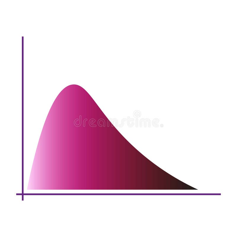
Free with trial Gradient curve chart. Pink color distribution. Graphical data visualization. Modern vector graphic. EPS 10. Analysis decrease vectors Gradient curve chart. Pink color distribution. Graphical data visualization. Modern vector graphic.
Free with trial Zoom out icon Black line art vector in black and white outline set collection sign. Analysis decrease vectors Zoom out icon Black line art vector logo. Zoom out icon Black line art vector in black and white outline set collection sign
Free with trial Crisis. Graphs and charts templates. Business infographics. Statistic and data, bankruptcy, financial crisis, money loss, down arrow, economy reduction. Financial chart. Vector illustration. Analysis decrease illustrations Crisis. Graphs and charts templates. Business infographics.