Free with trial Set line Dollar rate decrease, , Global economic crisis news and Burning dollar bill icon. Vector. Decrease business chart diagram vectors Set line Dollar rate decrease, , Global economic crisis news and Burning dollar bill icon. Vector
Free with trial The image is a digital illustration of a stock market chart. The chart is blue in color and has a line graph in the center. The line graph shows a downward trend, indicating a decrease in the stock market. On the top left corner of the chart, there is a white text that reads "10. 03570". The background of the image is made up of small white dots, which are scattered across the chart. Decrease business chart diagram illustrations The image is a digital illustration of a stock market chart. The chart is blue in color and has a line graph in the center.
Free with trial Set Dollar rate decrease, Gold bars, Shutdown of factory and Global economic crisis news icon. Vector. Decrease business chart diagram illustrations Set Dollar rate decrease, Gold bars, Shutdown of factory and Global economic crisis news icon. Vector
Free with trial Hand drawn bar chart with declining arrow showing economic recession and financial loss. Decrease business chart diagram vectors Hand drawn bar chart with declining arrow showing economic recession and financial loss
Free with trial A 3D rendered pink bar chart shows three bars of decreasing height, representing a downward trend. A vibrant red arrow curves downwards, starting above the tallest bar and pointing towards the right, further emphasizing the concept of decline. The entire graphic is set against a clean white background, making the pink and red elements stand out. Decrease business chart diagram illustrations Pink bar chart with a downward trending red arrow on a white background graph statistics. A 3D rendered pink bar chart shows three bars of decreasing height, representing a downward trend. A vibrant red arrow curves downwards, starting above the tallest bar and pointing towards the right, further emphasizing the concept of decline. The entire graphic is set against a clean white background, making the pink and red elements stand out
Free with trial Graph icon indicating growth and data analysis, perfect for business presentations and financial reports. visual representation of progress ,Generative ai. Decrease business chart diagram illustrations Graph icon, a comprehensive symbol of data analysis, growth, and business trends for effective presentations. Graph icon indicating growth and data analysis, perfect for business presentations and financial reports. visual representation of progress ,Generative ai
Free with trial Red bar chart displays performance metrics on a table ,Generative ai. Decrease business chart diagram illustrations Red bar chart illustrating performance metrics on a table, data analysis and visualization. Red bar chart displays performance metrics on a table ,Generative ai
Free with trial A stylized stock market chart showing a downward trend with blue and orange bars on white. Generative AI. Decrease business chart diagram illustrations A stylized stock market chart showing a downward trend with blue and orange bars on white
Free with trial Declining Bar Chart with Downward Arrow Representing Economic Downturn and Financial Loss. Decrease business chart diagram vectors Declining Bar Chart with Downward Arrow Representing Economic Downturn and Financial Loss
Free with trial Blue Toned Financial Chart With Pen, Showing Downward Trend, Illustrating Market Volatility. , Generated by AI. Decrease business chart diagram illustrations Blue Toned Financial Chart With Pen, Showing Downward Trend, Illustrating Market Volatility.
Free with trial A red bar graph with a descending arrow on a white plane. The graph shows a downward trend, visually representing loss or decline in areas such as finance, business, the economy, or the market. It is isolated on white. Decrease business chart diagram illustrations Red bar graph with arrow isolated on white background. use cases: finance, business, economy. A red bar graph with a descending arrow on a white plane. The graph shows a downward trend, visually representing loss or decline in areas such as finance, business, the economy, or the market. It is isolated on white
Free with trial Financial chart displaying a series of candlestick patterns on a digital screen, used for stock data analysis. The chart features vertical bars in orange against a blue background with grid lines. Each candlestick represents price movements within a specific time frame, showcasing market trends. The background includes a blurred assortment of lights and other graphical elements, indicating a financial data interface, likely used for investment portfolio analysis and trading activities. Decrease business chart diagram illustrations Financial Chart And Stock Data Analysis For Investment Portfolio. Candle Stick Graph For Trade. Financial chart displaying a series of candlestick patterns on a digital screen, used for stock data analysis. The chart features vertical bars in orange against a blue background with grid lines. Each candlestick represents price movements within a specific time frame, showcasing market trends. The background includes a blurred assortment of lights and other graphical elements, indicating a financial data interface, likely used for investment portfolio analysis and trading activities.
Free with trial Red textured arrows depict market fluctuations and business trends against a textured background symbolizes economic ups and downs, financial analysis, and investment opportunities with market statistics. Decrease business chart diagram illustrations Red arrows symbolizing fluctuations representing business trends on a textured background. red textured arrows depict market fluctuations and business trends against a textured background symbolizes economic ups and downs, financial analysis, and investment opportunities with market statistics
Free with trial A 3D rendered graphic depicts a bar chart with three vertical bars of varying heights: two blue bars flanking a taller yellow bar. At the top of the yellow bar, a central yellow sphere is connected by white rods to two smaller blue spheres, resembling a molecular structure or a network. The entire graphic is isolated on a white background, suggesting concepts of data analysis, growth, and. Decrease business chart diagram illustrations 3D Rendered Bar Chart with Connecting Spheres Representing Data Analysis graph statistics. A 3D rendered graphic depicts a bar chart with three vertical bars of varying heights: two blue bars flanking a taller yellow bar. At the top of the yellow bar, a central yellow sphere is connected by white rods to two smaller blue spheres, resembling a molecular structure or a network. The entire graphic is isolated on a white background, suggesting concepts of data analysis, growth, and
Free with trial The Red arrow Down on Business background 3d rendering. Decrease business chart diagram illustrations The Red arrow Down on Business background 3d rendering
Free with trial The Red arrow Down on Business background 3d rendering. Decrease business chart diagram illustrations The Red arrow Down on Business background 3d rendering
Free with trial The Red arrow Down on Business background 3d rendering. Decrease business chart diagram illustrations The Red arrow Down on Business background 3d rendering
Free with trial The Red arrow Down on Business background 3d rendering. Decrease business chart diagram illustrations The Red arrow Down on Business background 3d rendering
Free with trial The Red arrow Down on Business background 3d rendering. Decrease business chart diagram illustrations The Red arrow Down on Business background 3d rendering
Free with trial The Red arrow Down on Business background 3d rendering. Decrease business chart diagram illustrations The Red arrow Down on Business background 3d rendering
Free with trial The Red arrow Down on Business background 3d rendering. Decrease business chart diagram illustrations The Red arrow Down on Business background 3d rendering
Free with trial The Red arrow Down on Business background 3d rendering. Decrease business chart diagram illustrations The Red arrow Down on Business background 3d rendering
Free with trial Trend chart icon in black circle. Growth and decline symbol. Up and down arrow with bar graph illustration. Decrease business chart diagram vectors Trend chart icon in black circle. Growth and decline symbol. Up and down arrow with bar graph
Free with trial 3D Colorful Charts Magnifier Analysis, Data Visualization, Market Research ,chart,magnifying glass , This photo was created using generative AI. Decrease business chart diagram illustrations 3D Colorful Charts Magnifier Analysis, Data Visualization, Market Research ,chart,magnifying glass
Free with trial Set line Global economic crisis, Dollar rate decrease, Safe and Broken piggy bank icon. Vector. Decrease business chart diagram illustrations Set line Global economic crisis, Dollar rate decrease, Safe and Broken piggy bank icon. Vector
Free with trial Set line Worker, Credit card, Global economic crisis and. Business infographic template. Vector. Decrease business chart diagram vectors Set line Worker, Credit card, Global economic crisis and . Business infographic template. Vector
Free with trial Downward Chart: Declining bar graph with falling arrow indicates losses and economic downturn. Decrease business chart diagram vectors Downward Chart: Declining bar graph with falling arrow indicates losses and economic downturn
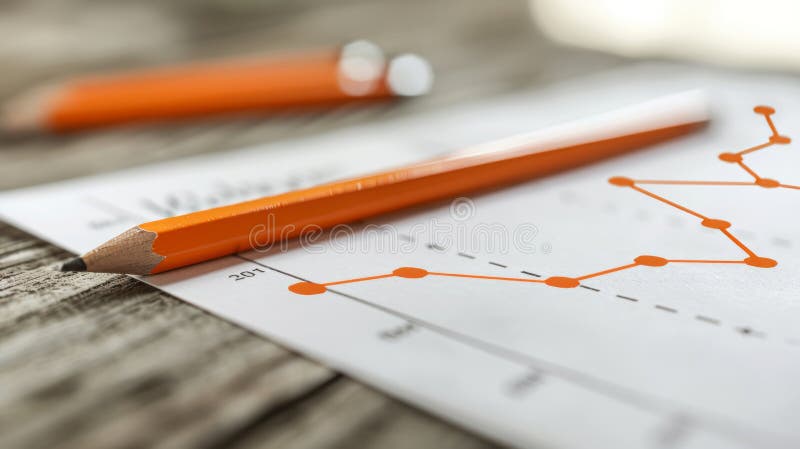
Free with trial Orange Pencil on Paper with Fluctuating Line Graph Representing Business Trends and Analysis, Generated by AI. Decrease business chart diagram illustrations Orange Pencil on Paper with Fluctuating Line Graph Representing Business Trends and Analysis
Free with trial Graph going Up and Down sign with blue arrows vector. Flat design vector illustration concept of sales bar chart symbol icon with arrow moving down and sales bar chart with arrow moving up. Decrease business chart diagram vectors Graph going Up and Down sign with blue arrows vector. Flat design vector illustration concept of sales bar chart symbol icon. Graph going Up and Down sign with blue arrows vector. Flat design vector illustration concept of sales bar chart symbol icon with arrow moving down and sales bar chart with arrow moving up.
Free with trial Set line Contract money and pen, Global economic crisis news, and Dollar rate decrease icon. Vector. Decrease business chart diagram vectors Set line Contract money and pen, Global economic crisis news, and Dollar rate decrease icon. Vector
Free with trial Set line Contract money and pen, Dollar rate decrease, Global economic crisis and Money bomb dollar icon. Vector. Decrease business chart diagram vectors Set line Contract money and pen, Dollar rate decrease, Global economic crisis and Money bomb dollar icon. Vector
Free with trial Set Isometric line Financial growth decrease, Coal mine trolley, and Data analysis icon. Vector. Decrease business chart diagram vectors Set Isometric line Financial growth decrease, Coal mine trolley, and Data analysis icon. Vector
Free with trial Declining bar chart with a downward arrow icon representing financial loss, crisis, and failure. Decrease business chart diagram vectors Declining bar chart with a downward arrow icon representing financial loss, crisis, and failure
Free with trial Concrete bar graph showing a decline with a downward arrow. Business loss and negative trend concept for financial downturn analysis. Decrease business chart diagram illustrations Concrete bar graph showing a decline with a downward arrow. Business loss and negative trend concept
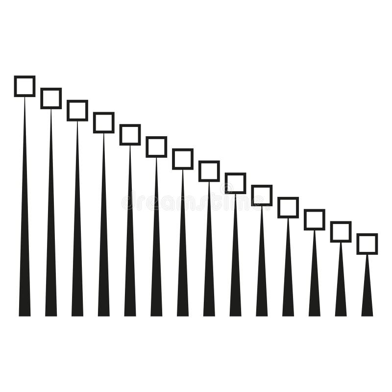
Free with trial Decreasing line graphic. Square point Vector. Minimalist progress chart. Data sequence illustration. EPS 10. Decrease business chart diagram vectors Decreasing line graphic. Square point Vector. Minimalist progress chart. Data sequence illustration.
Free with trial Business refers to the organized efforts and activities of individuals or groups to produce, buy, sell, and exchange goods or services for profit. Decrease business chart diagram illustrations The piggy bank and coins for Business concept 3d rendering. Business refers to the organized efforts and activities of individuals or groups to produce, buy, sell, and exchange goods or services for profit
Free with trial Business refers to the organized efforts and activities of individuals or groups to produce, buy, sell, and exchange goods or services for profit. Decrease business chart diagram illustrations The Arrow down and coins for Business concept 3d rendering. Business refers to the organized efforts and activities of individuals or groups to produce, buy, sell, and exchange goods or services for profit
Free with trial Business refers to the organized efforts and activities of individuals or groups to produce, buy, sell, and exchange goods or services for profit. Decrease business chart diagram illustrations The Arrow down and coins for Business concept 3d rendering. Business refers to the organized efforts and activities of individuals or groups to produce, buy, sell, and exchange goods or services for profit
Free with trial Business refers to the organized efforts and activities of individuals or groups to produce, buy, sell, and exchange goods or services for profit. Decrease business chart diagram illustrations The Arrow down and coins for Business concept 3d rendering. Business refers to the organized efforts and activities of individuals or groups to produce, buy, sell, and exchange goods or services for profit
Free with trial Business refers to the organized efforts and activities of individuals or groups to produce, buy, sell, and exchange goods or services for profit. Decrease business chart diagram illustrations The piggy bank and coins for Business concept 3d rendering. Business refers to the organized efforts and activities of individuals or groups to produce, buy, sell, and exchange goods or services for profit
Free with trial Business refers to the organized efforts and activities of individuals or groups to produce, buy, sell, and exchange goods or services for profit. Decrease business chart diagram illustrations The Arrow down and coins for Business concept 3d rendering. Business refers to the organized efforts and activities of individuals or groups to produce, buy, sell, and exchange goods or services for profit
Free with trial Business refers to the organized efforts and activities of individuals or groups to produce, buy, sell, and exchange goods or services for profit. Decrease business chart diagram illustrations The Arrow down and coins for Business concept 3d rendering. Business refers to the organized efforts and activities of individuals or groups to produce, buy, sell, and exchange goods or services for profit
Free with trial Business refers to the organized efforts and activities of individuals or groups to produce, buy, sell, and exchange goods or services for profit. Decrease business chart diagram illustrations The piggy bank and coins for Business concept 3d rendering. Business refers to the organized efforts and activities of individuals or groups to produce, buy, sell, and exchange goods or services for profit
Free with trial A financial illustration shows coins decreasing in size along a horizontal axis, representing devaluation. An upward-pointing arrow indicates increasing inflation percentages, with labels of "4%", "20%", and "50%". The chart is labeled "INFLATION" at the top, with percentages scattered around. Broken pieces from a large coin suggest fragmentation and loss of value. The background features a subtle line graph, reinforcing the economic theme. Decrease business chart diagram illustrations Inflation increasing and devaluing money, showing a financial chart with coins and an arrow going up. A financial illustration shows coins decreasing in size along a horizontal axis, representing devaluation. An upward-pointing arrow indicates increasing inflation percentages, with labels of "4%", "20%", and "50%". The chart is labeled "INFLATION" at the top, with percentages scattered around. Broken pieces from a large coin suggest fragmentation and loss of value. The background features a subtle line graph, reinforcing the economic theme.
Free with trial Business refers to the organized efforts and activities of individuals or groups to produce, buy, sell, and exchange goods or services for profit. Decrease business chart diagram illustrations The Arrow down and coins for Business concept 3d rendering. Business refers to the organized efforts and activities of individuals or groups to produce, buy, sell, and exchange goods or services for profit
Free with trial Business refers to the organized efforts and activities of individuals or groups to produce, buy, sell, and exchange goods or services for profit. Decrease business chart diagram illustrations The Arrow down and coins for Business concept 3d rendering. Business refers to the organized efforts and activities of individuals or groups to produce, buy, sell, and exchange goods or services for profit
Free with trial Business refers to the organized efforts and activities of individuals or groups to produce, buy, sell, and exchange goods or services for profit. Decrease business chart diagram illustrations The piggy bank and coins for Business concept 3d rendering. Business refers to the organized efforts and activities of individuals or groups to produce, buy, sell, and exchange goods or services for profit
Free with trial Business refers to the organized efforts and activities of individuals or groups to produce, buy, sell, and exchange goods or services for profit. Decrease business chart diagram illustrations The Arrow down and coins for Business concept 3d rendering. Business refers to the organized efforts and activities of individuals or groups to produce, buy, sell, and exchange goods or services for profit
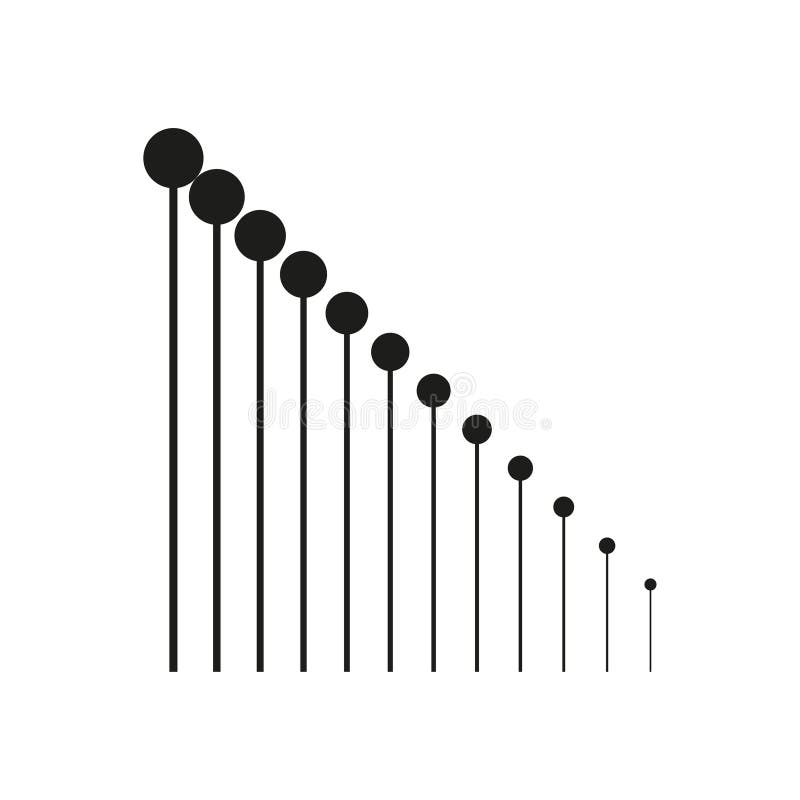
Free with trial Decreasing line graphic. Circle point Vector. Minimalist growth chart. Data progression illustration. EPS 10. Decrease business chart diagram vectors Decreasing line graphic. Circle point Vector. Minimalist growth chart. Data progression illustration.
Free with trial A man standing in front of a chart with an arrow pointing to it, analyzing sales growth data, Worker analyzes sales growth graph, Simple and minimalist flat Vector Illustration. Decrease business chart diagram vectors A man standing in front of a chart with an arrow pointing to it, analyzing sales growth data, Worker analyzes sales growth graph
Free with trial Colorful bar graph showing data and trends, perfect for business, finance, or analytics presentations. EPS 10. Decrease business chart diagram vectors Colorful bar graph showing data and trends, perfect for business, finance, or analytics presentations.
Free with trial Minimal set of Wholesale goods, Graph chart and Credit card line icons. Phone, cellphone ui interface mockup. Work home icons. For web development. Vector. Decrease business chart diagram vectors Minimal set of Wholesale goods, Graph chart and Credit card line icons. For web development. Vector. Minimal set of Wholesale goods, Graph chart and Credit card line icons. Phone, cellphone ui interface mockup. Work home icons. For web development. Vector
Free with trial This image shows a falling graph behind a diamond, representing the decrease in the value of precious stones. It's suitable for illustrating financial losses. Decrease business chart diagram vectors Illustration of a falling graph behind a diamond, symbolizing a decrease in the value of precious stones. This image shows a falling graph behind a diamond, representing the decrease in the value of precious stones. It's suitable for illustrating financial losses
Free with trial Tariffs word with downward arrows showing falling trade taxes decrease. Tariffs background. Decrease business chart diagram vectors Tariffs word with downward arrows showing falling trade taxes decrease. Green background. Tariffs word with downward arrows showing falling trade taxes decrease. Tariffs word with downward arrows showing falling trade taxes decrease. Tariffs background. Tariffs word with downward arrows showing falling trade taxes decrease. Tariffs background
Free with trial Smartphone displaying a falling bar chart icon, economic recession or financial crisis illustration. Decrease business chart diagram vectors Smartphone displaying a falling bar chart icon, economic recession or financial crisis illustration
Free with trial The Red Bear on Mother Board for Business concept 3d Rendering. Decrease business chart diagram illustrations The Red Bear on Mother Board for Business concept 3d Rendering
Free with trial Concrete blocks form a downward arrow graph. Business concept of decline, crisis, or falling market trend. Financial data visualization. Decrease business chart diagram illustrations Concrete blocks form a downward arrow graph. Business concept of decline, crisis, or falling market trend
Free with trial The Red Bear on Mother Board for Business concept 3d Rendering. Decrease business chart diagram illustrations The Red Bear on Mother Board for Business concept 3d Rendering
Free with trial Set Financial growth, decrease, Binary code, Cloud download and upload, Folder lock, Server and icon. Vector. Decrease business chart diagram illustrations Set Financial growth, decrease, Binary code, Cloud download and upload, Folder lock, Server and icon. Vector
Free with trial The Red Bear on Mother Board for Business concept 3d Rendering. Decrease business chart diagram illustrations The Red Bear on Mother Board for Business concept 3d Rendering
Free with trial The Red Bear on Mother Board for Business concept 3d Rendering. Decrease business chart diagram illustrations The Red Bear on Mother Board for Business concept 3d Rendering
Free with trial The Red Bear on Mother Board for Business concept 3d Rendering. Decrease business chart diagram illustrations The Red Bear on Mother Board for Business concept 3d Rendering
Free with trial The Red Bear on Mother Board for Business concept 3d Rendering. Decrease business chart diagram illustrations The Red Bear on Mother Board for Business concept 3d Rendering
Free with trial The Red Bear on Mother Board for Business concept 3d Rendering. Decrease business chart diagram illustrations The Red Bear on Mother Board for Business concept 3d Rendering
Free with trial Business bar graph with decreasing bars and a downward arrow representing economic loss and market fall. Decrease business chart diagram vectors Business bar graph with decreasing bars and a downward arrow representing economic loss and market fall
Free with trial 3D Hand is holding Diagram and dollar illustration. Dollar value rising. Exchange rate or financial report, economy or investment concept. Trendy and modern vector in 3d style. Decrease business chart diagram vectors 3D Hand is holding Diagram and dollar illustration. Dollar value rising. Exchange rate or financial report, economy
Free with trial Blue graph and arrow visualize declining market trends in business, finance, and investment. Decrease business chart diagram illustrations Declining Trends: Visualizing Market Downturn with Blue Graph & Arrow. Business, Finance, and Investment Concepts. Blue graph and arrow visualize declining market trends in business, finance, and investment
Free with trial Business Analytics And Data Visualization Line Icon Set. Financial Growth, Market Trends, And Performance Analysis Outline Symbol Collection. Editable Stroke. Isolated Vector Illustration. Decrease business chart diagram vectors Business Analytics And Data Visualization Line Icon Set. Financial Growth, Market Trends, And Performance Analysis
Free with trial Monochrome chart representing big data analysis with peaks and valleys, stock market theme for investment strategy and economic forecast using modern digital infographic. Decrease business chart diagram illustrations Abstract 3d graph with data blocks on white grid background, business analytics concept for financial report and corporate. Monochrome chart representing big data analysis with peaks and valleys, stock market theme for investment strategy and economic forecast using modern digital infographic
Free with trial Bar chart with illuminated bars showing an upward trend, depicted against a blurred cityscape at night. Bars increase in height from left to right, symbolizing growth. The glowing blue bars stand out against the dark background, visually representing a bullish financial trend. Various structures and faint lights in the defocused cityscape add context, highlighting the analytical and financial theme. Decrease business chart diagram illustrations Dynamic stock market chart showing bullish trend after downturn for financial analysis reports and presentations. Bar chart with illuminated bars showing an upward trend, depicted against a blurred cityscape at night. Bars increase in height from left to right, symbolizing growth. The glowing blue bars stand out against the dark background, visually representing a bullish financial trend. Various structures and faint lights in the defocused cityscape add context, highlighting the analytical and financial theme.
Free with trial Stock market chart displaying a transition from a downturn to a bullish trend. Red candlesticks indicate a declining phase, followed by green candlesticks showing upward movement. The grid and digital interface feature blue and orange function buttons surrounding the chart. The setup appears designed for financial analysis, illustrating market behavior for reports or presentations. Decrease business chart diagram illustrations Dynamic stock market chart showing bullish trend after downturn for financial analysis reports and presentations. Stock market chart displaying a transition from a downturn to a bullish trend. Red candlesticks indicate a declining phase, followed by green candlesticks showing upward movement. The grid and digital interface feature blue and orange function buttons surrounding the chart. The setup appears designed for financial analysis, illustrating market behavior for reports or presentations.
Free with trial Set line Worker, Dollar rate decrease, Global economic crisis news and Shutdown of factory icon. Vector. Decrease business chart diagram vectors Set line Worker, Dollar rate decrease, Global economic crisis news and Shutdown of factory icon. Vector
Free with trial Stock market forecast downfall, investor looks through a telescope to see a red bearish stock market chart. Decrease business chart diagram vectors Stock market forecast downfall, investor looks through a telescope to see a red bearish stock market chart
Free with trial A vivid image displays a bold red arrow sharply descending against a graph. This symbolizes financial downturn, economic recession, or business decline. The arrow's downward trajectory conveys loss and crisis. Decrease business chart diagram illustrations Red arrow pointing down isolated on white background, use cases: finance, economy, business, stock market. A vivid image displays a bold red arrow sharply descending against a graph. This symbolizes financial downturn, economic recession, or business decline. The arrow's downward trajectory conveys loss and crisis
Free with trial Set line Financial growth decrease, Binary code and icon. Vector. Decrease business chart diagram illustrations Set line Financial growth decrease, Binary code and icon. Vector
Free with trial Set Dollar rate decrease, Global economic crisis, Stop delivery cargo truck and Credit card icon. Vector. Decrease business chart diagram vectors Set Dollar rate decrease, Global economic crisis, Stop delivery cargo truck and Credit card icon. Vector
Free with trial Business person analyzes financial charts, market trends and investment strategies for economic growth ,Generative ai. Decrease business chart diagram illustrations Business person analyzes financial charts, market trends and investment strategies for economic growth
Free with trial A red stock market crash chart showing a significant financial downturn. This image represents a recession, bear market, and investment losses, highlighting a negative trend analysis. Decrease business chart diagram illustrations Stock market crash chart red background financial crisis recession bear market investment loss trend analysis. A red stock market crash chart showing a significant financial downturn. This image represents a recession, bear market, and investment losses, highlighting a negative trend analysis.
Free with trial Green Financial growth decrease icon isolated on green background. Increasing revenue. Long shadow style. Vector. Decrease business chart diagram vectors Green Financial growth decrease icon isolated on green background. Increasing revenue. Long shadow style. Vector
Free with trial Set line Bank building, Global economic crisis, Pie chart infographic and Shutdown of factory icon. Vector. Decrease business chart diagram vectors Set line Bank building, Global economic crisis, Pie chart infographic and Shutdown of factory icon. Vector