Free with trial Cost reduction. Cost increase icon. Price reduced, discount icon. Low total cost icon vector image. Vector illustration isolated on background. Decrease price vectors Cost reduction. Cost increase icon. Price reduced, discount icon. Low total cost icon vector image. Vector illustration isolated
Free with trial Colorful Dollar rate decrease icon isolated on white background. Cost reduction. Money symbol with down arrow. Business lost crisis decrease. Minimalism concept. 3D render illustration. Decrease price illustrations Colorful Dollar rate decrease icon isolated on white background. Cost reduction. Money symbol with down arrow. Business
Free with trial Money loss and economic crisis, money market crash and global financial downturn, vector line icons. Economic crisis icons of bankruptcy, price decrease with money inflation and unemployment growth. Decrease price vectors Money loss and economic crisis, money market crash
Free with trial Cost reduction. Cost increase icon. Price reduced, discount icon. Low total cost icon vector image. Vector illustration isolated on background. Decrease price vectors Cost reduction. Cost increase icon. Price reduced, discount icon. Low total cost icon vector image. Vector illustration isolated
Free with trial Cost reduction. Cost increase icon. Price reduced, discount icon. Low total cost icon vector image. Vector illustration isolated on background. Decrease price vectors Cost reduction. Cost increase icon. Price reduced, discount icon. Low total cost icon vector image. Vector illustration isolated
Free with trial Cost reduction. Cost increase icon. Price reduced, discount icon. Low total cost icon vector image. Vector illustration isolated on background. Decrease price vectors Cost reduction. Cost increase icon. Price reduced, discount icon. Low total cost icon vector image. Vector illustration isolated
Free with trial Up and down arrow icon in generic style. Increase and decrease sign symbol. Zigzag arrows illustration concept. Decrease price vectors Up and down arrow icon in generic style. Increase and decrease sign symbol. Zigzag arrows concept
Free with trial Determinants Of Supply in Economics for price, technology, number of sellers, input prices, government, weather vector. Decrease price vectors Determinants Of Supply in Economics for price, technology, number of sellers, input prices, government, weather
Free with trial Cost Reduction Vector Illustration featuring Decreasing Expenses, Price Minimization, and Falling Profit Rates in Business with a Flat Background. Decrease price vectors Cost Reduction Vector Illustration featuring Decreasing Expenses, Price Minimization, and Falling Profit Rates in Business
Free with trial Cost Reduction Vector Illustration featuring Decreasing Expenses, Price Minimization, and Falling Profit Rates in Business with a Flat Background. Decrease price vectors Cost Reduction Vector Illustration featuring Decreasing Expenses, Price Minimization, and Falling Profit Rates in Business
Free with trial Cost Reduction Vector Illustration featuring Decreasing Expenses, Price Minimization, and Falling Profit Rates in Business with a Flat Background. Decrease price vectors Cost Reduction Vector Illustration featuring Decreasing Expenses, Price Minimization, and Falling Profit Rates in Business
Free with trial Cost Reduction Vector Illustration featuring Decreasing Expenses, Price Minimization, and Falling Profit Rates in Business with a Flat Background. Decrease price vectors Cost Reduction Vector Illustration featuring Decreasing Expenses, Price Minimization, and Falling Profit Rates in Business
Free with trial Cost Reduction Vector Illustration featuring Decreasing Expenses, Price Minimization, and Falling Profit Rates in Business with a Flat Background. Decrease price vectors Cost Reduction Vector Illustration featuring Decreasing Expenses, Price Minimization, and Falling Profit Rates in Business
Free with trial Cost Reduction Vector Illustration featuring Decreasing Expenses, Price Minimization, and Falling Profit Rates in Business with a Flat Background. Decrease price vectors Cost Reduction Vector Illustration featuring Decreasing Expenses, Price Minimization, and Falling Profit Rates in Business
Free with trial Cost Reduction Vector Illustration featuring Decreasing Expenses, Price Minimization, and Falling Profit Rates in Business with a Flat Background. Decrease price vectors Cost Reduction Vector Illustration featuring Decreasing Expenses, Price Minimization, and Falling Profit Rates in Business
Free with trial Cost Reduction Vector Illustration featuring Decreasing Expenses, Price Minimization, and Falling Profit Rates in Business with a Flat Background. Decrease price vectors Cost Reduction Vector Illustration featuring Decreasing Expenses, Price Minimization, and Falling Profit Rates in Business
Free with trial Reverse Inflation and fix the cost of living conceptual image, price tags with arrow going up then down. Decrease price illustrations Price tags with arrow going up then down, reverse Inflation and fix the cost of living concept. reverse Inflation and fix the cost of living conceptual image, price tags with arrow going up then down
Free with trial White Dollar rate decrease icon isolated with long shadow background. Cost reduction. Money symbol with down arrow. Business lost crisis decrease. Pink hexagon button. Vector. Decrease price illustrations White Dollar rate decrease icon isolated with long shadow background. Cost reduction. Money symbol with down arrow
Free with trial Reverse Inflation and fix the cost of living conceptual image, price tags with arrows going up and down. Decrease price illustrations Price tags with arrows going up then down, reverse Inflation and fix the cost of living concept. reverse Inflation and fix the cost of living conceptual image, price tags with arrows going up and down
Free with trial Set of percentage arrows vector icons. Green and red percent arrow with up and down. Growth and decrease. Arrows with increase or reduce. Decrease price illustrations Set of percentage arrows vector icons. Green and red percent arrow with up and down. Growth and decrease.
Free with trial Anxious Trader Female Character Panics As Ethereum Cryptocurrency Price Decrease, Fearing Financial Loss And Uncertainty In Market, Exacerbating The Downward Trend. Cartoon People Vector Illustration. Decrease price vectors Anxious Trader Female Character Panics As Cryptocurrency Prices Decrease, Fearing Financial Loss And Uncertainty. Anxious Trader Female Character Panics As Ethereum Cryptocurrency Price Decrease, Fearing Financial Loss And Uncertainty In Market, Exacerbating The Downward Trend. Cartoon People Vector Illustration
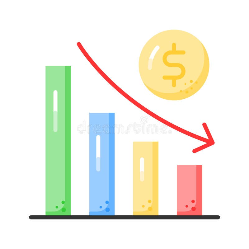
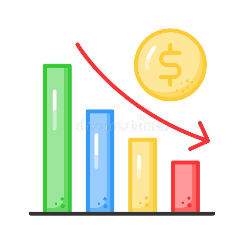
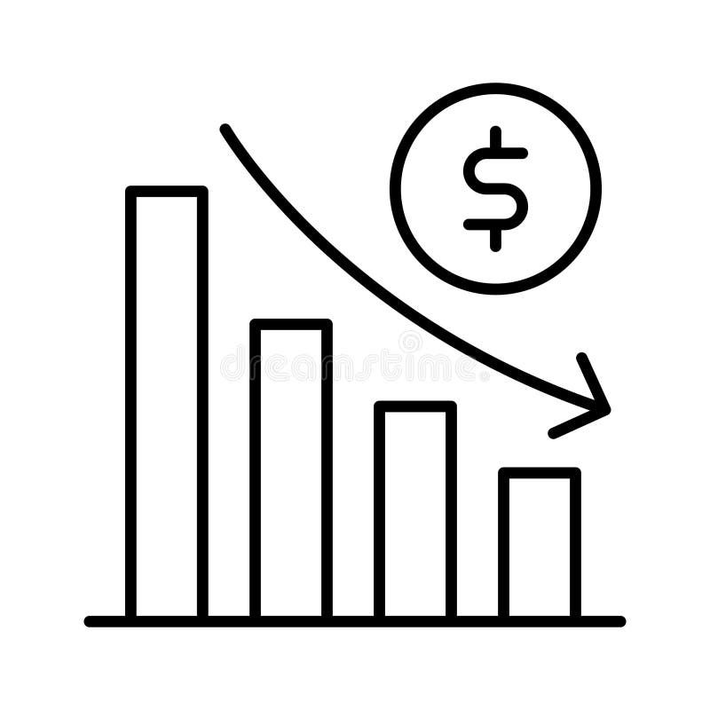
Free with trial The decline in the bar graph is due to the stock market falling, economic crash, investing failure or mistake, price drop, recession, investment risk concept, stock price decline concept flat design. Decrease price vectors The decline in the bar graph is due to the stock market falling, economic crash, investing failure or mistake, , price drop. The decline in the bar graph is due to the stock market falling, economic crash, investing failure or mistake, price drop, recession, investment risk concept, stock price decline concept flat design
Free with trial Modern house real estate price drop crisis concept home for sale with downward graph autumn background property market downturn banner Vector illustration. Decrease price vectors Modern house real estate price drop crisis concept home for sale with downward graph autumn background property market
Free with trial Creative design of Man hitting price message. Decrease price vectors Man hitting price message
Free with trial Price Drop concept image with text and shopping cart symbol. Decrease price illustrations Price Drop Pink Shopping Cart Squares Border Text. Price Drop concept image with text and shopping cart symbol.
Free with trial Creative design of Hammer blow and price message. Decrease price vectors Hammer blow and price message
Free with trial Reverse Inflation and fix the cost of living conceptual image, price tag with arrow going down over shopping basket. Decrease price illustrations Price tag with arrow going down over shopping basket, reverse Inflation and fix the cost of living concept. reverse Inflation and fix the cost of living conceptual image, price tag with arrow going down over shopping basket
Free with trial Bitcoin on broken circuit board. Bitcoin price crash concept. Virtual money asset. Decrease price illustrations Bitcoin on broken circuit board. Bitcoin price crash concept. Virtual money asset
Free with trial Down chart, financial loss, decrease chart vector design. Decrease price vectors Down chart, financial loss, decrease chart vector design
Free with trial Down chart, financial loss, decrease chart vector design. Decrease price vectors Down chart, financial loss, decrease chart vector design
Free with trial Down chart, financial loss, decrease chart vector design. Decrease price vectors Down chart, financial loss, decrease chart vector design
Free with trial Down chart, financial loss, decrease chart vector design. Decrease price vectors Down chart, financial loss, decrease chart vector design
Free with trial No interest rate decrease sign. Discount prohibition Vector icons. Financial regulation symbols. EPS 10. Decrease price vectors No interest rate decrease sign. Discount prohibition Vector icons. Financial regulation symbols.
Free with trial Gold coins and pink arrows pointing downward. Financial loss, currency drop, stock market decline, price reduction and economic downturn concept. 3d vector icon. Cartoon minimal style. Decrease price vectors Gold coins and pink arrows pointing downward. Financial loss, currency drop, stock market decline, price reduction and economic
Free with trial Carbon credit icon, co2 gas price, eps 10 file, easy to edit. Decrease price vectors Carbon credit icon, co2 gas price
Free with trial Glowing neon Dollar rate decrease icon isolated on brick wall background. Cost reduction. Money symbol with down arrow. Business lost crisis decrease. Neon light alphabet. Vector. Decrease price illustrations Glowing neon Dollar rate decrease icon isolated on brick wall background. Cost reduction. Money symbol with down arrow
Free with trial Blue line Dollar rate decrease icon isolated on white background. Cost reduction. Money symbol with down arrow. Business lost crisis decrease. Logo design template element. Vector. Decrease price vectors Blue line Dollar rate decrease icon isolated on white background. Cost reduction. Money symbol with down arrow. Business
Free with trial Reverse Inflation and fix the cost of living conceptual image, price tag with arrow going down. Decrease price illustrations Price tag with arrow going down, reverse Inflation and fix the cost of living concept. reverse Inflation and fix the cost of living conceptual image, price tag with arrow going down
Free with trial Reverse Inflation and fix the cost of living conceptual image, price tag with arrow going down. Decrease price illustrations Price tag with arrow going down, reverse Inflation and fix the cost of living concept. reverse Inflation and fix the cost of living conceptual image, price tag with arrow going down
Free with trial Cost meter RGB color icon. Money coin, price. Finance, economics. Increase and decrease arrows. Efficiency, performance. Isolated vector illustration. Simple filled line drawing. Editable stroke. Decrease price vectors Cost meter RGB color icon
Free with trial Woman think about stock down trend. Stock market crash, crypto price fall, loss money from financial crisis or wrong speculation of trading concept. Flat vector illustration isolated on white background. Decrease price vectors Woman think about stock down trend. Stock market crash, crypto price fall, loss money from financial crisis or wrong speculation
Free with trial Set line Contract money and pen, Gold bars, Dollar rate decrease and Stop delivery cargo truck icon. Vector. Decrease price vectors Set line Contract money and pen, Gold bars, Dollar rate decrease and Stop delivery cargo truck icon. Vector
Free with trial Set Fire in burning house, Debt ball chained to coin, Dollar rate decrease and Mobile stock trading icon. Vector. Decrease price vectors Set Fire in burning house, Debt ball chained to coin, Dollar rate decrease and Mobile stock trading icon. Vector
Free with trial High and Low Percent arrow icon set in black and white colors. EPS 10. Decrease price vectors High and Low Percent Arrow Icon Set. Increase Decrease and Price Vector symbol in a black filled and outlined style. Market. High and Low Percent arrow icon set in black and white colors. EPS 10
Free with trial A black and white line illustration features a speech bubble with a downward arrow and a dollar sign, indicating a decrease in value. Below, a stylized gold bar is depicted, flanked by two sparkles. The minimalistic design suggests an economic theme, likely related to changes in gold prices. Decrease price vectors Gold Price Down. A black and white line illustration features a speech bubble with a downward arrow and a dollar sign, indicating a decrease in value. Below, a stylized gold bar is depicted, flanked by two sparkles. The minimalistic design suggests an economic theme, likely related to changes in gold prices.
Free with trial Set Isometric Contract money and pen, Pie chart infographic, Mobile stock trading and Dollar rate decrease icon. Vector. Decrease price illustrations Set Isometric Contract money and pen, Pie chart infographic, Mobile stock trading and Dollar rate decrease icon. Vector
Free with trial Financial chart illustrating stock price trends with candlestick patterns. Vertical and horizontal axes display price and time, respectively. A prominent green upward arrow indicates profit, while a red 'Put tag suggests a potential decrease. Blue and red candlestick bars detail price movements. Curved lines highlight trend directions. Labels like Profit add contextual information. The overall theme suggests a focus on cryptocurrency or stock market analysis. Decrease price illustrations Option Trading Chart AI generated. Financial chart illustrating stock price trends with candlestick patterns. Vertical and horizontal axes display price and time, respectively. A prominent green upward arrow indicates profit, while a red 'Put tag suggests a potential decrease. Blue and red candlestick bars detail price movements. Curved lines highlight trend directions. Labels like Profit add contextual information. The overall theme suggests a focus on cryptocurrency or stock market analysis.
Free with trial Red 3D arrows pointing downward with white percentage signs (%) on each. The arrows vary in size, creating a dynamic visual suggesting a reduction or decrease, commonly associated with price drops, discounts, or economic decline. The background is plain white, emphasizing the bold, glossy red of the arrows, which have a smooth texture and a reflective surface. This imagery is frequently used in financial or marketing contexts to indicate downward trends or sales promotions. Decrease price illustrations Red 3D arrows pointing downward with white percentage signs (%) on each. The
Free with trial The image displays a candlestick chart, commonly used in financial markets to represent price movements of an asset over time. the chart features red and green candlesticks, where green indicates a price increase and red indicates a price decrease. a yellow line overlays the candlesticks, likely representing a moving average, which is a common technical indicator used to smooth out price data and identify trends. the chart is set against a dark blue background with grid lines, and time intervals are marked along the x-axis. a scale on the right side shows the price values. the overall impression is that of a tool used for technical analysis in trading or investment. Decrease price illustrations Stock market candlestick chart with moving average. the image displays a candlestick chart, commonly used in financial markets to represent price movements of an asset over time. the chart features red and green candlesticks, where green indicates a price increase and red indicates a price decrease. a yellow line overlays the candlesticks, likely representing a moving average, which is a common technical indicator used to smooth out price data and identify trends. the chart is set against a dark blue background with grid lines, and time intervals are marked along the x-axis. a scale on the right side shows the price values. the overall impression is that of a tool used for technical analysis in trading or investment.
Free with trial Oil gas refinery or petrochemical plant. Include arrow, graph or bar chart. Decrease trend or low of production, market price, demand, supply. Concept of business, industry, fuel, power energy. Decrease price illustrations Oil gas refinery or petrochemical plant with concept of business. Oil gas refinery or petrochemical plant. Include arrow, graph or bar chart. Decrease trend or low of production, market price, demand, supply. Concept of business, industry, fuel, power energy
Free with trial Colorful Dollar rate decrease icon isolated on white background. Cost reduction. Money symbol with down arrow. Business lost crisis decrease. Minimalism concept. 3D render illustration. Decrease price illustrations Colorful Dollar rate decrease icon isolated on white background. Cost reduction. Money symbol with down arrow. Business
Free with trial Colorful Dollar rate decrease icon isolated on white background. Cost reduction. Money symbol with down arrow. Business lost crisis decrease. Minimalism concept. 3D render illustration. Decrease price illustrations Colorful Dollar rate decrease icon isolated on white background. Cost reduction. Money symbol with down arrow. Business
Free with trial Colorful Dollar rate decrease icon isolated on white background. Cost reduction. Money symbol with down arrow. Business lost crisis decrease. Minimalism concept. 3D render illustration. Decrease price illustrations Colorful Dollar rate decrease icon isolated on white background. Cost reduction. Money symbol with down arrow. Business
Free with trial Stock crisis red price drop arrow down chart fall. Stock market exchange analysis or forex graph business and finance money losing moving economic inflation deflation investment loss crash. Illustration. Decrease price illustrations Stock crisis red price drop arrow down chart fall
Free with trial Stock crisis red price drop arrow down chart fall. Stock market exchange analysis or forex graph business and finance money losing moving economic inflation deflation investment loss crash. Illustration. Decrease price illustrations Stock crisis red price drop arrow down chart fall
Free with trial Stock crisis red price drop arrow down chart fall. Stock market exchange analysis or forex graph business and finance money losing moving economic inflation deflation investment loss crash. Illustration. Decrease price illustrations Stock crisis red price drop arrow down chart fall
Free with trial Stock crisis red price drop arrow down chart fall. Stock market exchange analysis or forex graph business and finance money losing moving economic inflation deflation investment loss crash. Illustration. Decrease price illustrations Stock crisis red price drop arrow down chart fall
Free with trial Carbon emissions cost icon, co2 gas price in pounds, eps 10 file, easy to edit. Decrease price vectors Carbon emissions cost icon, co2 price in pounds. carbon emissions cost icon, co2 gas price in pounds, eps 10 file, easy to edit
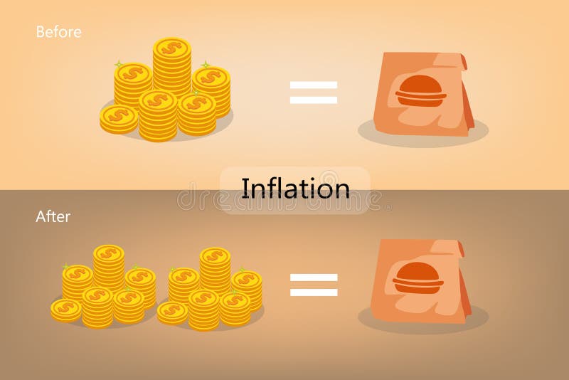
Free with trial Inflation situation is a decrease in the purchasing power of money. Decrease price illustrations Inflation situation is a decrease in the purchasing power of money
Free with trial Price low down and up icon concept. Interest low price 3d percent discount vector icon. Percentage with arrow up and down. 3D Web Vector Illustrations. Decrease price vectors 3D Price low down and up icon concept. Price low down and up icon concept. Interest low price 3d percent discount vector icon. Percentage with arrow up and down. 3D Web Vector Illustrations.
Free with trial Color megaphone icon with word decrease in white banner on blue background. Decrease price vectors Color megaphone with word decrease in white banner on blue background
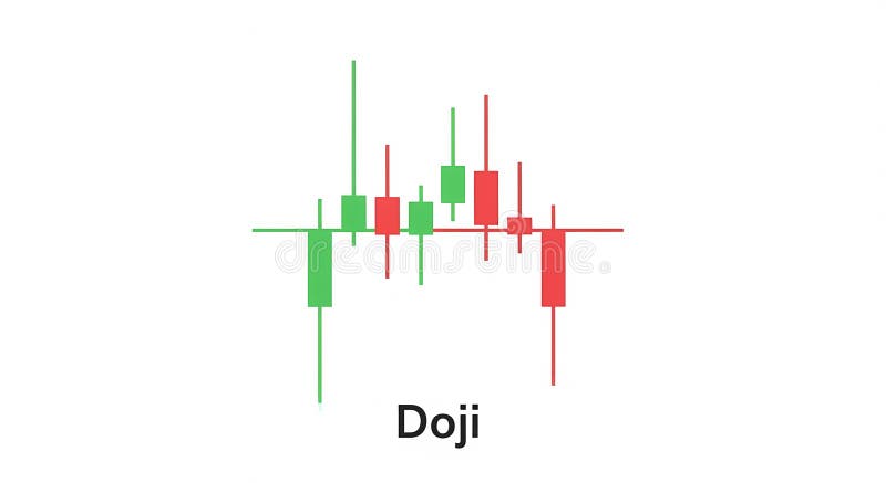
Free with trial The image depicts a candlestick chart pattern, specifically showcasing the "doji" formation. the chart consists of several candlesticks, some green (indicating a price increase) and some red (indicating a price decrease). a horizontal line runs through the center of the candlesticks, representing the opening and closing prices being nearly equal. the candlesticks have wicks or shadows extending above and below the body, showing the high and low prices for the period. the overall pattern suggests indecision in the market, where buyers and sellers are in equilibrium. Decrease price illustrations Candlestick chart pattern: doji formation. the image depicts a candlestick chart pattern, specifically showcasing the "doji" formation. the chart consists of several candlesticks, some green (indicating a price increase) and some red (indicating a price decrease). a horizontal line runs through the center of the candlesticks, representing the opening and closing prices being nearly equal. the candlesticks have wicks or shadows extending above and below the body, showing the high and low prices for the period. the overall pattern suggests indecision in the market, where buyers and sellers are in equilibrium.
Free with trial Inflation price tag surrounded by price tags with percentage increases, concept of cost of living and recession. Decrease price illustrations Inflation price tag surrounded by price tags with percentage increases
Free with trial Shopping bags surrounded by price tags with percentage increases, concept of cost of living and recession. Decrease price illustrations Shopping bags surrounded by price tags with percentage increases
Free with trial Economic crisis line icons of global financial downturn and business bankruptcy, vector banner. Money loss and banking crisis icons of depreciation, unemployment and price decrease of pandemic crisis. Decrease price vectors Economic crisis icons of global financial downturn. Economic crisis line icons of global financial downturn and business bankruptcy, vector banner. Money loss and banking crisis icons of depreciation, unemployment and price decrease of pandemic crisis
Free with trial A vibrant graphic announcing a special price drop sale with a colorful awning and leaf design. Decrease price illustrations Special Price Drop Sale Announcement Design. A vibrant graphic announcing a special price drop sale with a colorful awning and leaf design
Free with trial Decrease graph icon in generic style. Statistic illustration concept. Decrease price vectors Decrease graph icon in generic style. Statistic concept. Decrease graph icon in generic style. Statistic illustration concept
Free with trial Bank illustration surrounded by price tags with percentage increases, concept of cost of living and recession. Decrease price illustrations Bank illustration surrounded by price tags with percentage increases
Free with trial Cost low and loss. Decrease revenue. Crisis of economy. Icon of money inflation. Decrease price vectors Cost low and loss. Decrease revenue. Crisis of economy.
Free with trial Bear money down graph stock market concept Vector bull with Red arrow stock price decrease. Decrease price vectors Bear money up graph stock market concept Vector. bear money down graph stock market concept Vector bull with Red arrow stock price decrease
Free with trial Euro currency up down icon. Europe money increase and decrease sign symbol vector. Decrease price vectors Euro currency up down icon. Europe money increase and decrease sign symbol
Free with trial Decrease bar graph icon on black square. Statistic illustration concept. Decrease price vectors Decrease bar graph icon on black square. Statistic concept. Decrease bar graph icon on black square. Statistic illustration concept
Free with trial Inflation text with arrows surrounded by price tags with percentage increases, concept of cost of living and recession. Decrease price illustrations Inflation text with arrows surrounded by price tags with percentage increases
Free with trial Decrease bar graph icon on circle line. Market crash illustration concept. Decrease price vectors Decrease bar graph icon on circle line. Market crash concept. Decrease bar graph icon on circle line. Market crash illustration concept
Free with trial A minimalist black outline icon depicting a dollar sign with a downward arrow, indicating a decrease in value or price reduction. Decrease price vectors Simple Outline Dollar Downward Arrow Currency Icon. A minimalist black outline icon depicting a dollar sign with a downward arrow, indicating a decrease in value or price reduction.
Free with trial Percent arrow icon. Growth, increase, decrease arrow filled icons. Up arrows, down arrows. Vector. Decrease price illustrations Percent arrow icon. Growth, increase, decrease arrow filled icons.
Free with trial Money value decrease icon linear thin line icon graphics set black and white. Decrease price vectors Money value decrease icon vector set use for web ui or app. money value decrease icon linear thin line icon graphics set black and white
Free with trial Arrow percent icon vector on black square. Increase and decrease percentage sign symbol. Decrease price vectors Arrow percent icon on black square. Increase and decrease percentage sign symbol
Free with trial Cracked Tag with Lightning Bolts Indicates Price Break. AI generated. Decrease price vectors Cracked Tag with Lightning Bolts Indicates Price Break. AI generated