Free with trial A sharp, zig-zagging black arrow points downwards, symbolizing a significant decrease, loss, or negative trend. Data decrease vectors Jagged downward arrow indicating decline and loss. A sharp, zig-zagging black arrow points downwards, symbolizing a significant decrease, loss, or negative trend
Free with trial A black icon showing a downward trending arrow over three stacks of coins of decreasing size. Data decrease illustrations Black downward trending arrow over decreasing stacks of coins icon decrease decline. A black icon showing a downward trending arrow over three stacks of coins of decreasing size
Free with trial A simple bar chart illustrating data trends with predominantly green bars indicating positive performance and one red bar suggesting a negative outcome, isolated on white. Data decrease illustrations Bar chart with green and red bars isolated on white background. A simple bar chart illustrating data trends with predominantly green bars indicating positive performance and one red bar suggesting a negative outcome, isolated on white
Free with trial Black and white icon of a bar graph showing a downward trend with an arrow pointing down. Data decrease illustrations Downward trending bar graph with arrow indicating decrease bar chart decline. Black and white icon of a bar graph showing a downward trend with an arrow pointing down
Free with trial Displaying dashboard grid showing fluctuating blue and red line graphs with metallic green sphere. Analytics, investment, data visualization, technology, finance, bar chart, dashboard. Data decrease illustrations Displaying dashboard grid showing fluctuating blue and red line graphs with metallic green sphere
Free with trial A collage of nine distinct charts and graphs, primarily displaying financial data, growth trends, and economic indicators. The visuals feature line graphs, area charts, and bar charts with various colored lines and shaded areas representing different metrics over time. Accompanying text and labels suggest analysis of business performance, economic growth, and financial markets. This collection is ideal for presentations, reports, and articles related to finance, economics, and business analytics. Data decrease illustrations Collection of Financial and Business Growth Charts. A collage of nine distinct charts and graphs, primarily displaying financial data, growth trends, and economic indicators. The visuals feature line graphs, area charts, and bar charts with various colored lines and shaded areas representing different metrics over time. Accompanying text and labels suggest analysis of business performance, economic growth, and financial markets. This collection is ideal for presentations, reports, and articles related to finance, economics, and business analytics.
Free with trial A modern vector illustration of a line graph showing a clear decline, emphasized by a red downtrend arrow. Ideal for financial reports, business presentations, or data visualization projects illustrating negative trends or decreases. This graphic effectively communicates a downward movement in statistics, vector design Generative AI. Data decrease vectors Declining Line Graph with Red Downtrend Arrow, vector design Generative AI. A modern vector illustration of a line graph showing a clear decline, emphasized by a red downtrend arrow. Ideal for financial reports, business presentations, or data visualization projects illustrating negative trends or decreases. This graphic effectively communicates a downward movement in statistics, vector design Generative AI
Free with trial This image showcases colorful 3D charts and graphs, representing financial data, generated by AI. It includes bar graphs, pie charts, and other visual representations of financial performance, displayed on a tablet and printed reports. The image suggests growth and positive financial trends. Data decrease illustrations AI-Generated Financial Charts. This image showcases colorful 3D charts and graphs, representing financial data, generated by AI. It includes bar graphs, pie charts, and other visual representations of financial performance, displayed on a tablet and printed reports. The image suggests growth and positive financial trends.
Free with trial A glossy red arrow points downward, symbolizing a decrease or negative financial movement. Data decrease illustrations A vibrant red arrow curves downwards indicating a sharp decline or negative trend on a white background. A glossy red arrow points downward, symbolizing a decrease or negative financial movement
Free with trial Smartphone screen with password protection icon, downward sale arrow, and a chart depicting analytics. Ideal for cybersecurity, digital sales, ecommerce metrics, data protection, online safety. Data decrease vectors Mobile Security Features and Analytics Highlighting Sales Performance with Trend Insights. Smartphone screen with password protection icon, downward sale arrow, and a chart depicting analytics. Ideal for cybersecurity, digital sales, ecommerce metrics, data protection, online safety
Free with trial A 3D rendering shows a financial graph with a decreasing rate. The pink arrow points downwards, indicating a loss. The bars represent data points in a business or economic context. Data decrease illustrations Decreasing rate financial graph on white background. A 3D rendering shows a financial graph with a decreasing rate. The pink arrow points downwards, indicating a loss. The bars represent data points in a business or economic context
Free with trial A black percentage sign is followed by a horizontal line on a white background, suggesting a decrease. Data decrease illustrations Percentage sign and horizontal line on a white background symbol discount. A black percentage sign is followed by a horizontal line on a white background, suggesting a decrease
Free with trial This image presents a compelling visual representation of a global economic downturn. A prominent, three-dimensional white arrow dramatically plunges downward, superimposed on a world map rendered in dark, somber tones. The map serves as a backdrop to several red bar graphs, illustrating a decline in various economic indicators across different regions of the globe. The overall color scheme reinforces a sense of crisis and uncertainty. The arrow's sharp descent visually emphasizes the severity of the economic drop. Numerical data and graphical representations are included, further supporting the downward economic trend. Data decrease illustrations Global Economic Downturn Visualized with 3D Arrow and Charts. This image presents a compelling visual representation of a global economic downturn. A prominent, three-dimensional white arrow dramatically plunges downward, superimposed on a world map rendered in dark, somber tones. The map serves as a backdrop to several red bar graphs, illustrating a decline in various economic indicators across different regions of the globe. The overall color scheme reinforces a sense of crisis and uncertainty. The arrow's sharp descent visually emphasizes the severity of the economic drop. Numerical data and graphical representations are included, further supporting the downward economic trend.
Free with trial A vibrant and modern illustration of a bar graph, featuring four bars of varying heights and colors: blue, green, orange, and red. The bars are positioned on a gray horizontal line, creating a sense of data comparison and visual hierarchy. This image is ideal for representing data, statistics, business reports, financial analysis, or any concept requiring visual data representation. The clean design and bright colors make it suitable for presentations, websites, and marketing materials. Data decrease illustrations Colorful Bar Graph Illustration. A vibrant and modern illustration of a bar graph, featuring four bars of varying heights and colors: blue, green, orange, and red. The bars are positioned on a gray horizontal line, creating a sense of data comparison and visual hierarchy. This image is ideal for representing data, statistics, business reports, financial analysis, or any concept requiring visual data representation. The clean design and bright colors make it suitable for presentations, websites, and marketing materials.
Free with trial A red downward-trending arrow overlays a background of financial documents featuring colorful charts and graphs. A person in a suit is writing on one of the pages, indicating analysis or note-taking. The setting suggests a focus on market trends, possibly within a corporate or financial context. The grid pattern across the image adds a conceptual element of data analysis. a i generated. Data decrease illustrations Declining market trends analysis with a downward trending red arrow overlay. A red downward-trending arrow overlays a background of financial documents featuring colorful charts and graphs. A person in a suit is writing on one of the pages, indicating analysis or note-taking. The setting suggests a focus on market trends, possibly within a corporate or financial context. The grid pattern across the image adds a conceptual element of data analysis. a i generated
Free with trial A 3D blue bar chart and a dark blue line graph illustrate a significant downward trend, indicating a decline in data over time. Data decrease illustrations Blue bar chart and line graph showing downward trend. A 3D blue bar chart and a dark blue line graph illustrate a significant downward trend, indicating a decline in data over time.
Free with trial Business Meeting on Real Estate Market Analysis with Charts, Graphs, and Digital House Icon Showing Trends in Property Value Changes Sigmoid. Data decrease illustrations Professionals discuss real estate market trends using data and analytics. A digital house icon symbolizes value changes. Business Meeting on Real Estate Market Analysis with Charts, Graphs, and Digital House Icon Showing Trends in Property Value Changes Sigmoid
Free with trial A red downward arrow and a red bar chart showing a decline are presented on a white background. Data decrease illustrations Red Downward Arrow and Bar Chart Symbolizing Decrease and Decline Keywords: decrease, decline, down, arrow, bar. A red downward arrow and a red bar chart showing a decline are presented on a white background
Free with trial Blue sad face next to a declining line graph in a calendar frame under a cloud. Ideal for business loss, economic crisis, emotional impact, failure, disappointment, analytics, trends. Simple flat. Data decrease vectors Sad face and declining data chart representing failure, downturn, or negative outcome concept. Blue sad face next to a declining line graph in a calendar frame under a cloud. Ideal for business loss, economic crisis, emotional impact, failure, disappointment, analytics, trends. Simple flat
Free with trial Set Server Magnifying glass with check mark Digital speed meter Online play video Browser setting window Financial growth decrease and incognito icon. Vector. Data decrease vectors Set Server, Magnifying glass with check mark, Digital speed meter, Online play video, Browser setting, window, Financial. Set Server Magnifying glass with check. Set Server Magnifying glass with check mark Digital speed meter Online play video Browser setting window Financial growth decrease and incognito icon. Vector.
Free with trial A visual representation of a financial or business trend showing a steady decrease over time. The bar chart illustrates negative performance with a prominent downward arrow. Data decrease illustrations Declining bar chart showing downward trend with arrow. A visual representation of a financial or business trend showing a steady decrease over time. The bar chart illustrates negative performance with a prominent downward arrow
Free with trial Abstract 3D render of a financial growth chart. The image features a series of vertical bars, some in teal and others in orange, representing data points on a graph. The bars increase in height towards the right, suggesting positive growth or progress. The chart is set against a dark background with a subtle grid pattern and a reflective surface, adding depth and visual interest. Suitable for illustrating financial reports, market analysis, or business trends. Data decrease illustrations Abstract Financial Growth Chart. Abstract 3D render of a financial growth chart. The image features a series of vertical bars, some in teal and others in orange, representing data points on a graph. The bars increase in height towards the right, suggesting positive growth or progress. The chart is set against a dark background with a subtle grid pattern and a reflective surface, adding depth and visual interest. Suitable for illustrating financial reports, market analysis, or business trends.
Free with trial A single, glossy, bright green arrow pointing directly downwards is presented against a clean white background. The arrow has a smooth, rounded shape with a reflective surface, suggesting a 3D rendered object. Its simple and clear design makes it a versatile symbol for indicating direction, decrease, or negative trends. Data decrease illustrations Glossy Green Downward Arrow Symbol on White Background direction. A single, glossy, bright green arrow pointing directly downwards is presented against a clean white background. The arrow has a smooth, rounded shape with a reflective surface, suggesting a 3D rendered object. Its simple and clear design makes it a versatile symbol for indicating direction, decrease, or negative trends
Free with trial A magn magnifying glass hovering over a black surface. The background is blurred, but it is a cityscape with buildings and skyscrapers. In the center of the image, there is a red and orange line graph that appears to show a stock market data. The lines on the graph are in orange and yellow, indicating a decrease in the market. The image was taken from a close-up perspective, with the focus on the magnifying lens. Data decrease illustrations A magnifying glass with a stock market graph on it (ai generated). A magn magnifying glass hovering over a black surface. The background is blurred, but it is a cityscape with buildings and skyscrapers. In the center of the image, there is a red and orange line graph that appears to show a stock market data. The lines on the graph are in orange and yellow, indicating a decrease in the market. The image was taken from a close-up perspective, with the focus on the magnifying lens.
Free with trial A black silhouette of a bar chart with three bars of decreasing height, representing a downward trend on a white background. Data decrease illustrations Black Bar Chart Icon Showing Decreasing Values on White Background graph data. A black silhouette of a bar chart with three bars of decreasing height, representing a downward trend on a white background
Free with trial Black down arrows and horizontal bars arranged vertically on a white background. Clear details and vibrant col. Data decrease illustrations Black down arrows and horizontal bars on white background descending decrease. Black down arrows and horizontal bars arranged vertically on a white background. Clear details and vibrant col
Free with trial A black curved line graph showing a downward trend on a white background. Clear details and vibrant colors enh. Data decrease illustrations Black curved line graph showing decrease on white background chart decreasing. A black curved line graph showing a downward trend on a white background. Clear details and vibrant colors enh
Free with trial Downturn showing downward trending graph with arrow indicating decline keywords: graph, chart, decline. Data decrease illustrations Downward Trending Graph With Arrow Indicating Decline Keywords: graph, chart, decline, decrease. Downturn showing downward trending graph with arrow indicating decline keywords: graph, chart, decline
Free with trial Bar chart illustration showing a descending trend. Four vertical bars in gradient hues of orange and blue decrease in height from left to right. A line graph with circles marks the top of each bar, emphasizing the downward trend. The design is simple and uses soft pastel colors, against a white background, highlighting the decreasing business data concept. Data decrease vectors Decreasing Trend Graph: Business Data Chart Illustration. Bar chart illustration showing a descending trend. Four vertical bars in gradient hues of orange and blue decrease in height from left to right. A line graph with circles marks the top of each bar, emphasizing the downward trend. The design is simple and uses soft pastel colors, against a white background, highlighting the decreasing business data concept.
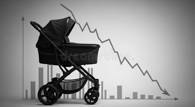
Free with trial A stark visual representation of demographic decline featuring a baby carriage silhouetted against a backdrop of a downward-trending graph and bar charts, symbolizing falling birth rates and. Data decrease illustrations Demographic Decline Baby Carriage with Downturn Graph and Population Decrease Concept. A stark visual representation of demographic decline featuring a baby carriage silhouetted against a backdrop of a downward-trending graph and bar charts, symbolizing falling birth rates and
Free with trial A collage of various hand-drawn charts and graphs in shades of blue, illustrating business growth, data analysis, and financial trends. The collection includes bar charts, line graphs, and pie charts, all rendered with a sketchy, artistic style. These visuals are perfect for presentations, reports, or any project requiring a dynamic and informative representation of data and progress. Data decrease illustrations Hand-Drawn Business Growth Charts and Graphs Collection. A collage of various hand-drawn charts and graphs in shades of blue, illustrating business growth, data analysis, and financial trends. The collection includes bar charts, line graphs, and pie charts, all rendered with a sketchy, artistic style. These visuals are perfect for presentations, reports, or any project requiring a dynamic and informative representation of data and progress.
Free with trial Two distinct 3D arrows are presented against a white background. One arrow points directly upwards, while the other points directly downwards, symbolizing opposing directions or concepts such as progress and decline, or growth and decrease. Both arrows feature a layered, chevron-like design, giving them a modern and geometric appearance. Data decrease illustrations Two 3D Arrows, One Pointing Up and One Pointing Down, with Layered Design on White Background. Two distinct 3D arrows are presented against a white background. One arrow points directly upwards, while the other points directly downwards, symbolizing opposing directions or concepts such as progress and decline, or growth and decrease. Both arrows feature a layered, chevron-like design, giving them a modern and geometric appearance
Free with trial Abstract illustration of business growth, featuring bar graphs and line graphs in shades of blue and grey. The image conveys concepts of data analysis, progress, and financial performance. Suitable for presentations, reports, and marketing materials related to business, finance, and technology. Data decrease illustrations Abstract Business Growth Chart. Abstract illustration of business growth, featuring bar graphs and line graphs in shades of blue and grey. The image conveys concepts of data analysis, progress, and financial performance. Suitable for presentations, reports, and marketing materials related to business, finance, and technology.
Free with trial Black and white graph showing a fluctuating trend line with an upward and a downward arrow. Data decrease illustrations Black and white graph showing fluctuating trend with up and down arrows chart data. Black and white graph showing a fluctuating trend line with an upward and a downward arrow
Free with trial Data Stats Board Display Line Icon Downward Down Trend Statistic Performance Market Decline Economy Downturn Bar Graph Progress Outline Presentation. Data decrease vectors Data Stats Board Display Line Icon Downward Down Trend Statistic Performance Market Decline Economy Downturn Bar Graph
Free with trial The image depicts a bar graph with a downward trend. The bars start high on the left and progressively decrease in height towards the right. A large red downward arrow further emphasizes the declining trend. Data decrease vectors Decreasing trend in bar graph. The image depicts a bar graph with a downward trend. The bars start high on the left and progressively decrease in height towards the right. A large red downward arrow further emphasizes the declining trend
Free with trial Three glossy green arrows, each featuring a white percentage symbol, are pointing downwards. The arrows are arranged side-by-side and have a slight 3D effect. They are presented against a black background, conveying a message of decrease, reduction, or a sale. Data decrease illustrations Three Green Arrows Pointing Down with Percentage Symbols. Three glossy green arrows, each featuring a white percentage symbol, are pointing downwards. The arrows are arranged side-by-side and have a slight 3D effect. They are presented against a black background, conveying a message of decrease, reduction, or a sale
Free with trial This vector illustration shows a set of black graph icons with rising and falling charts indicated by arrows showing trends in data with clear simple design and sharp edges calm. Generative AI. Data decrease vectors Black graph icons set rising and falling charts with arrows vector illustration simple design. This vector illustration shows a set of black graph icons with rising and falling charts indicated by arrows showing trends in data with clear simple design and sharp edges calm. Generative AI
Free with trial Three bright green arrows pointing downwards are displayed side-by-side. Each arrow has a white percentage sign (%) prominently featured on its surface. The arrows have a slightly glossy appearance and are presented against a stark black background, emphasizing their downward trajectory and the concept of reduction or decrease. Data decrease illustrations Three green downward arrows with percentage signs graphic. Three bright green arrows pointing downwards are displayed side-by-side. Each arrow has a white percentage sign (%) prominently featured on its surface. The arrows have a slightly glossy appearance and are presented against a stark black background, emphasizing their downward trajectory and the concept of reduction or decrease
Free with trial A downward trending chart line with an arrow shows negative movement against a dark background and can be used to represent concepts like loss or decrease. Data decrease illustrations Decreasing Chart with Downward Arrow. A downward trending chart line with an arrow shows negative movement against a dark background and can be used to represent concepts like loss or decrease
Free with trial A black bar graph icon with a downward arrow and trend line indicates a decline. Clear details and vibrant col. Data decrease illustrations Black Bar Graph Icon with Downward Arrow and Trend Line on White Background data. A black bar graph icon with a downward arrow and trend line indicates a decline. Clear details and vibrant col
Free with trial Red 3D zigzag arrow is trending downward on plain white background, casting faint shadow. Business decline, financial analysis, data visualization, modern design, digital marketing, growth reduction, minimalistic style. Data decrease illustrations Red 3D zigzag arrow is trending downward on plain white background, casting faint shadow
Free with trial A minimalist set of hand-drawn icons featuring a dynamic arrow indicating movement or progress and a line graph displaying data trends, perfect for illustrating concepts of growth, analysis, and chang. Data decrease vectors Arrow and graph icons set isolated on transparent background. A minimalist set of hand-drawn icons featuring a dynamic arrow indicating movement or progress and a line graph displaying data trends, perfect for illustrating concepts of growth, analysis, and chang
Free with trial Trading chart showing numbers increase and decrease on different globe areas. Financial market, investment, economy analyzing concept. Data decrease illustrations Trading chart showing numbers increase and decrease on globe areas. Trading chart showing numbers increase and decrease on different globe areas. Financial market, investment, economy analyzing concept
Free with trial This set contains business chart, magnifying glass. Good for market research and investment data collection concept design. Data decrease vectors Set of business chart statistic icon vector illustration on transparent background. This set contains business chart, magnifying glass. Good for market research and investment data collection concept design
Free with trial Modern collection of business and finance elements. Contains data, charts,diagrams. Use it for presentation, report and infographic projects. Data decrease vectors Set of Business and Finance Infographic Elements on Transparent Background Vectors. Modern collection of business and finance elements. Contains data, charts,diagrams. Use it for presentation, report and infographic projects
Free with trial Red 3D zigzag arrow line is rising then falling on white backdrop with shadow, copy space. Abstract, data visualization, minimalistic, motion, progress, decline, digital. Data decrease illustrations Red 3D zigzag arrow line is rising then falling on white backdrop with shadow, copy space
Free with trial A visual representation of data trends, highlighting both positive progress and areas of concern with distinct markers for clarity and decision-making. Data decrease illustrations Bar chart showing growth with red crosses indicating issues. A visual representation of data trends, highlighting both positive progress and areas of concern with distinct markers for clarity and decision-making
Free with trial A bold red arrow with a zigzag pattern points downwards, symbolizing a negative trend, loss, or decrease. Data decrease vectors Red arrow indicating downward trend or decline. A bold red arrow with a zigzag pattern points downwards, symbolizing a negative trend, loss, or decrease
Free with trial Data Stats Board Display Icon Downward Down Trend Statistic Performance Market Decline Economy Downturn Bar Graph Progress Sign Symbol Presentation. Data decrease vectors Data Stats Board Display Icon Downward Down Trend Statistic Performance Market Decline Economy Downturn Bar Graph Progress
Free with trial This futuristic dashboard, generated by AI, displays a comprehensive set of dynamic graphs and charts, ideal for visualizing complex datasets. The vibrant color scheme enhances readability, while the sleek design emphasizes efficiency and modern aesthetics. This is a perfect example of how AI can. Data decrease illustrations AI-Generated Data Visualization Dashboard. This futuristic dashboard, generated by AI, displays a comprehensive set of dynamic graphs and charts, ideal for visualizing complex datasets. The vibrant color scheme enhances readability, while the sleek design emphasizes efficiency and modern aesthetics. This is a perfect example of how AI can
Free with trial This image showcases a comprehensive collection of blue bar graphs and line graphs, presented in a grid format. Each graph depicts various data trends, including upward and downward movements, fluctuating patterns, and steady growth. The clean, modern design makes these icons ideal for representing financial data, market analysis, performance metrics, and business growth in presentations, reports, and websites. Data decrease illustrations Collection of Blue Bar and Line Graphs for Business Analytics. This image showcases a comprehensive collection of blue bar graphs and line graphs, presented in a grid format. Each graph depicts various data trends, including upward and downward movements, fluctuating patterns, and steady growth. The clean, modern design makes these icons ideal for representing financial data, market analysis, performance metrics, and business growth in presentations, reports, and websites.
Free with trial Sad face and falling graph with data points overlaid on a grid, soundwave, and musical note. Ideal for emotion analysis, music trends, negative data, audio, feedback statistics research. Simple. Data decrease vectors Declining Music Note Graph Representing Negative Sentiment and Audio Analysis. Sad face and falling graph with data points overlaid on a grid, soundwave, and musical note. Ideal for emotion analysis, music trends, negative data, audio, feedback statistics research. Simple
Free with trial A black silhouette of a bar chart with a vertical scale and grid lines, representing data analysis. Data decrease illustrations Black bar chart icon with grid lines and scale on white background graph statistics. A black silhouette of a bar chart with a vertical scale and grid lines, representing data analysis
Free with trial Green arrow pointing downward on financial graph. Business chart with falling trend line. Digital stock market data visualization for investment analysis. Data decrease illustrations Green arrow pointing downward on financial graph. Business chart with falling trend line
Free with trial An abstract and futuristic visualization of a financial trading chart on a dark, cosmic background. The image features a candlestick graph transitioning from a volatile red phase into a clear bullish, upward trend in blue. This dynamic concept represents stock market growth, forex trading, cryptocurrency investment, and financial success. It's an ideal background for topics related to fintech, data analysis, economic recovery, and modern investment strategies, symbolizing progress and profitability in the digital economy. Data decrease illustrations Futuristic Stock Market Trading Graph Background. An abstract and futuristic visualization of a financial trading chart on a dark, cosmic background. The image features a candlestick graph transitioning from a volatile red phase into a clear bullish, upward trend in blue. This dynamic concept represents stock market growth, forex trading, cryptocurrency investment, and financial success. It's an ideal background for topics related to fintech, data analysis, economic recovery, and modern investment strategies, symbolizing progress and profitability in the digital economy.
Free with trial Downward arrow, dollar coin, and bar chart showing data. Ideal for finance, economy, loss, budget, analysis statistics and crisis. Flat simple metaphor. Data decrease vectors Declining Financial Trends Represented by Down Arrow, Dollar Coin, and Bar Chart. Downward arrow, dollar coin, and bar chart showing data. Ideal for finance, economy, loss, budget, analysis statistics and crisis. Flat simple metaphor
Free with trial Simple black bar graph icon with bars of varying heights on a white background Clear details and vibrant color. Data decrease illustrations Simple black bar graph icon showing varying heights on a white background chart data. Simple black bar graph icon with bars of varying heights on a white background Clear details and vibrant color
Free with trial Four icons depict rising and falling percentage values with arrows and curved lines on a white background. Data decrease illustrations Arrows indicating percentage increase and decrease in finance. Four icons depict rising and falling percentage values with arrows and curved lines on a white background
Free with trial A 3D rendered bar chart illustrates a decreasing trend. The bars, colored in a gradient from yellow to purple, represent data points that are diminishing in value. Placed on a simple gray base, the chart is isolated against a white background. This image is suitable for illustrating concepts related to business, finance, statistics, and economic downturns. Data decrease illustrations 3D Bar Chart Decreasing Trend. A 3D rendered bar chart illustrates a decreasing trend. The bars, colored in a gradient from yellow to purple, represent data points that are diminishing in value. Placed on a simple gray base, the chart is isolated against a white background. This image is suitable for illustrating concepts related to business, finance, statistics, and economic downturns.
Free with trial A clean and modern digital illustration of a financial candlestick chart, displaying market trends and stock performance. The graph features blue candlesticks indicating price movements over time, accompanied by a solid blue line graph and subtle dashed trend lines. Set against a crisp white background with a clear grid, this visualization is ideal for illustrating concepts related to finance, investment, business analytics, economic forecasts, and data reporting. It conveys growth, volatility, and strategic decision-making in the stock market. Data decrease illustrations Financial Candlestick Chart with Trend Line on White Background. A clean and modern digital illustration of a financial candlestick chart, displaying market trends and stock performance. The graph features blue candlesticks indicating price movements over time, accompanied by a solid blue line graph and subtle dashed trend lines. Set against a crisp white background with a clear grid, this visualization is ideal for illustrating concepts related to finance, investment, business analytics, economic forecasts, and data reporting. It conveys growth, volatility, and strategic decision-making in the stock market.
Free with trial A medium shot shows a person's hands cupped together, palms up. Hovering above the hands are two glowing neon outlines of arrows, one pointing down and the other pointing up. Both arrows contain a percentage symbol. A blurred background features faint digital data and bar graphs, suggesting a financial or economic context. The overall mood is abstract and conceptual. Data decrease illustrations Hands holding glowing up and down percentage arrows. A medium shot shows a person's hands cupped together, palms up. Hovering above the hands are two glowing neon outlines of arrows, one pointing down and the other pointing up. Both arrows contain a percentage symbol. A blurred background features faint digital data and bar graphs, suggesting a financial or economic context. The overall mood is abstract and conceptual
Free with trial Displaying chart showing downward trend on gray hexagon grid, with gradient bars and red arrow. Data analytics, infographics, minimalist, technology, finance, business intelligence, dashboard. Data decrease illustrations Displaying chart showing downward trend on gray hexagon grid, with gradient bars and red arrow
Free with trial Red arrow pointing downward on financial graph. Business chart showing recession in economy. Digital stock market data visualization for investment analysis. Data decrease illustrations Red arrow pointing downward on financial graph. Business chart showing recession in economy
Free with trial A vibrant green arrow points upwards indicating progress or increase, while a glossy red arrow points downwards symbolizing decline or decrease, representing directional changes. Data decrease illustrations Green up arrow and red down arrow icons symbolizing directional movement and change white background. A vibrant green arrow points upwards indicating progress or increase, while a glossy red arrow points downwards symbolizing decline or decrease, representing directional changes
Free with trial The image shows a line graph illustrating the decline of carbon emissions. there are two lines on the graph, a green line and a grey line, both trending downwards. the green line, representing "carbon inteetiual emissions," shows a steeper decline compared to the grey line. the graph is set against a grid background, providing a visual reference for the rate of decrease in emissions over time. the downward trend suggests a positive change in reducing carbon output. Data decrease illustrations Carbon emissions decline graph illustration. the image shows a line graph illustrating the decline of carbon emissions. there are two lines on the graph, a green line and a grey line, both trending downwards. the green line, representing "carbon inteetiual emissions," shows a steeper decline compared to the grey line. the graph is set against a grid background, providing a visual reference for the rate of decrease in emissions over time. the downward trend suggests a positive change in reducing carbon output.
Free with trial A bright yellow arrow curves downwards indicating a downward trend, decrease, or decline. Ideal for presentations on finance, market analysis, or performance changes. Data decrease illustrations Yellow arrow pointing downward showing a decline or falling trend. A bright yellow arrow curves downwards indicating a downward trend, decrease, or decline. Ideal for presentations on finance, market analysis, or performance changes
Free with trial Two flat design icons with color. One depicts an upward bar chart with a blue arrow and percentage, the other a downward bar chart with a grey arrow and percentage. Data decrease vectors Color Bar Chart Icons for Increase and Decrease graph Ai-Generated. Two flat design icons with color. One depicts an upward bar chart with a blue arrow and percentage, the other a downward bar chart with a grey arrow and percentage
Free with trial A compelling visual representation of declining retail sales or consumer spending, featuring a large green shopping bag alongside three progressively smaller white shopping bags. A prominent red arrow graphically illustrates a downward trend, symbolizing a decrease in market demand, economic downturn, or business loss. This 3D rendered image on a clean white background is ideal for financial reports, economic analysis, business presentations, or articles discussing retail challenges, recession, or reduced purchasing power. Data decrease illustrations Retail Sales Decline Concept with Shopping Bags and Downward Arrow. A compelling visual representation of declining retail sales or consumer spending, featuring a large green shopping bag alongside three progressively smaller white shopping bags. A prominent red arrow graphically illustrates a downward trend, symbolizing a decrease in market demand, economic downturn, or business loss. This 3D rendered image on a clean white background is ideal for financial reports, economic analysis, business presentations, or articles discussing retail challenges, recession, or reduced purchasing power.
Free with trial A 3D icon features a blue pound sterling symbol within a white circle, which is bordered by a light blue ring. To the right of the circle, a small orange circle contains a white downward-pointing triangle, indicating a decrease or fall. The icon is presented on a clean white background with a subtle shadow. Data decrease illustrations 3D Icon with Pound Sterling Symbol and Downward Arrow on White Background currency money. A 3D icon features a blue pound sterling symbol within a white circle, which is bordered by a light blue ring. To the right of the circle, a small orange circle contains a white downward-pointing triangle, indicating a decrease or fall. The icon is presented on a clean white background with a subtle shadow
Free with trial Vibrant financial decisions shown through floating digital market charts --chaos 55 --ar 16:9 --profile 8vfa4lb --v 7 Job ID: 73c43520-d3ac-4d75-940e-9fab8db6f1ed. Generative AI. Data decrease illustrations Red Arrow Decrease on Stock Market Graph Showing Economic Downturn and Financial Decline. Vibrant financial decisions shown through floating digital market charts --chaos 55 --ar 16:9 --profile 8vfa4lb --v 7 Job ID: 73c43520-d3ac-4d75-940e-9fab8db6f1ed. Generative AI
Free with trial Isolated showing simple line graph showing downward trend on white background keywords: graph, chart, line graph, downward trend, decline, decrease. Data decrease illustrations Simple Line Graph Showing Downward Trend on White Background Keywords: graph, chart, line graph, downward trend
Free with trial Displaying jagged red line chart declining on trading screen, with numeric labels and lens-flare. Financial, technology, analytics, investment, data visualization, digital, modern. Data decrease illustrations Displaying jagged red line chart declining on trading screen, with numeric labels and lens-flare
Free with trial An isometric 3D bar chart composed of blue, gray, and orange blocks of varying heights is arranged on a white background. Data decrease illustrations Isometric 3D bar chart with blue, gray, and orange blocks on a white background graph data. An isometric 3D bar chart composed of blue, gray, and orange blocks of varying heights is arranged on a white background
Free with trial Displaying financial chart at digital interface, with blue bars, two line graphs, red decline arrow. Finance, data, analytics, dashboard, technology, investment, digital. Data decrease illustrations Displaying financial chart at digital interface, with blue bars, two line graphs, red decline arrow
Free with trial Displaying dashboard on screen showing red arrow trending down over bar chart and colorful lines. Analytics, visualization, data, performance, digital, insight, metrics. Data decrease illustrations Displaying dashboard on screen showing red arrow trending down over bar chart and colorful lines
Free with trial Loss Graph Neon Sign. Vector Illustration of Analytics Data Symbol. Data decrease vectors Loss Graph Neon Sign
Free with trial The image displays a financial trend chart superimposed on a modern office setting. the chart depicts a declining trend, indicated by a downward-sloping line with an arrow pointing downwards. the background features a blurred office environment with windows, a plant, and furniture, creating a sense of realism and context for the financial data. the overall composition suggests a reflection or projection of financial performance within a contemporary workspace. Data decrease illustrations Financial decline chart in modern office space. the image displays a financial trend chart superimposed on a modern office setting. the chart depicts a declining trend, indicated by a downward-sloping line with an arrow pointing downwards. the background features a blurred office environment with windows, a plant, and furniture, creating a sense of realism and context for the financial data. the overall composition suggests a reflection or projection of financial performance within a contemporary workspace.
Free with trial Line graph with downward trend, sad face for dissatisfaction, alert bell for warning, and magnifier symbolizing evaluation. Ideal for data analysis, performance tracking, decline, warning, failure. Data decrease vectors Declining Graph with Sad Face, Alert Bell, and Magnifier Indicating Negative Trends. Line graph with downward trend, sad face for dissatisfaction, alert bell for warning, and magnifier symbolizing evaluation. Ideal for data analysis, performance tracking, decline, warning, failure