Free with trial Computer screen displaying a webinar with a presenter explaining graphs and charts, recording indicators, audio, and HD video tags. Ideal for e-learning, remote work, business, analytics. Data decrease vectors Online Webinar on Business Metrics with Recording and Data Analytics Representation. Computer screen displaying a webinar with a presenter explaining graphs and charts, recording indicators, audio, and HD video tags. Ideal for e-learning, remote work, business, analytics
Free with trial Simple line art business icons set featuring a magnifying glass, minus symbol, pie chart, and rising bar graph for financial data analysis. Data decrease vectors Simple line art business icons set featuring a magnifying glass, minus symbol, pie chart, and rising bar graph for
Free with trial A diverse team of business professionals collaborating in a meeting. This vector illustration features five colleagues, men and women in corporate attire, gathered around a laptop and tablet, actively discussing a project. The scene, depicted in a clean, modern flat design style on a white background, is ideal for concepts like teamwork, data analysis, problem-solving, and strategic planning. The negative number shown can represent financial review, performance metrics, or tackling a business challenge, making it versatile for various corporate and financial themes. Data decrease illustrations Business Team Collaboration Analyzing Negative Results Vector Illustration. A diverse team of business professionals collaborating in a meeting. This vector illustration features five colleagues, men and women in corporate attire, gathered around a laptop and tablet, actively discussing a project. The scene, depicted in a clean, modern flat design style on a white background, is ideal for concepts like teamwork, data analysis, problem-solving, and strategic planning. The negative number shown can represent financial review, performance metrics, or tackling a business challenge, making it versatile for various corporate and financial themes.
Free with trial The Price-to-Earnings (P E) ratio, and how is it used in stock valuation. Data decrease illustrations Financial Market Data Display: Red Stock Market Trend. the Price-to-Earnings (P E) ratio, and how is it used in stock valuation
Free with trial This infographic shows business data with both an increasing chart with 20% growth and a decreasing chart with 10% decline, which can be used to illustrate business concepts. Data decrease illustrations Infographic Showing Business Growth and Decline. This infographic shows business data with both an increasing chart with 20% growth and a decreasing chart with 10% decline, which can be used to illustrate business concepts
Free with trial Displaying financial chart on dark grid screen, with red trend line and multicolored waveform lines. Analytics, financial, investment, stockmarket, data visualization, digital, technology. Data decrease illustrations Displaying financial chart on dark grid screen, with red trend line and multicolored waveform lines
Free with trial A simple red line graph showing a sharp downward trend with an arrow indicating a significant decrease, symbolizing loss or decline in performance. Data decrease illustrations Red downward trending graph isolated on white background. A simple red line graph showing a sharp downward trend with an arrow indicating a significant decrease, symbolizing loss or decline in performance
Free with trial A simple red line graph showing a sharp downward trend, indicating a significant decrease or loss in value, isolated against a clean white background for clarity. Data decrease illustrations Red downward trending graph isolated on white background. A simple red line graph showing a sharp downward trend, indicating a significant decrease or loss in value, isolated against a clean white background for clarity
Free with trial This graphic depicts a bar chart with a downward trending line, observed closely with a magnifying glass, symbolizing scrutiny, analysis, and potential performance decline or investigation of data. Data decrease vectors Declining Chart with Magnifying Glass: Analysis and Performance Review. This graphic depicts a bar chart with a downward trending line, observed closely with a magnifying glass, symbolizing scrutiny, analysis, and potential performance decline or investigation of data.
Free with trial A glossy, vibrant red arrow makes a sharp downward curve. This dynamic visual represents a negative trend, decrease, or a directional shift towards a lower point. Data decrease illustrations Shiny red arrow curves downward symbolizing decline or negative trend. A glossy, vibrant red arrow makes a sharp downward curve. This dynamic visual represents a negative trend, decrease, or a directional shift towards a lower point
Free with trial A graphic representing a 50 percent reduction or decline, depicted by a red arrow and percentage. Data decrease illustrations Red downward arrow indicating 50 percent decrease within a curved arc. A graphic representing a 50 percent reduction or decline, depicted by a red arrow and percentage
Free with trial This infographic-style image visually represents business growth and financial performance through various charts and graphs. A line graph illustrates revenue trends with percentage markers, a donut chart displays market share distribution, and a bar chart shows quarterly profit figures. Icons representing data, growth, and reports are subtly integrated into the background, creating a professional and informative visual for business and finance-related content. Data decrease illustrations Business Growth and Financial Performance Analytics. This infographic-style image visually represents business growth and financial performance through various charts and graphs. A line graph illustrates revenue trends with percentage markers, a donut chart displays market share distribution, and a bar chart shows quarterly profit figures. Icons representing data, growth, and reports are subtly integrated into the background, creating a professional and informative visual for business and finance-related content.
Free with trial Abstract stock market chart with red and green candlesticks illustrating financial data and trading trends. Perfect for representing economic analysis, investment strategies, or business reporting. Data decrease illustrations Dynamic Stock Market Chart Displaying Fluctuating Trends and Analytics. Abstract stock market chart with red and green candlesticks illustrating financial data and trading trends. Perfect for representing economic analysis, investment strategies, or business reporting
Free with trial Downward blue arrow, hand gesture, and declining bar graph. Ideal for business loss, negative trends, economy, failure, recession setback performance. Simple flat metaphor. Data decrease illustrations Downward Arrow with Hand and Declining Bar Graph Representing Business Loss or Decrease. Downward blue arrow, hand gesture, and declining bar graph. Ideal for business loss, negative trends, economy, failure, recession setback performance. Simple flat metaphor
Free with trial Downward arrow, spiral calendar, and bar graph signifying trend analysis, scheduling, and metrics. Ideal for time management, progress tracking, productivity, data analytics planning forecasting. Data decrease vectors Calendar, Downward Arrow, and Bar Graph Representing Time Management and Performance Analysis. Downward arrow, spiral calendar, and bar graph signifying trend analysis, scheduling, and metrics. Ideal for time management, progress tracking, productivity, data analytics planning forecasting
Free with trial A striking symbol featuring the word LOSS in white, set against a glossy black, starburst-like shape. This design evokes a sense of negative impact or data loss. Data decrease illustrations Glossy black loss indicator symbol with radial lines. A striking symbol featuring the word LOSS in white, set against a glossy black, starburst-like shape. This design evokes a sense of negative impact or data loss
Free with trial Visually represents the concept of model drift over time and the automated solution pipeline used by MLOps engineers, data scientists, and AI architects. Data decrease illustrations . visually represents the concept of model drift over time and the automated solution pipeline used by MLOps engineers, data scientists, and AI architects.
Free with trial This infographic displays a bar graph illustrating a sharp negative trend. The red line clearly depicts a significant decrease, showcasing concepts like downturn, recession, and loss within a business or financial context. Ideal for presentations, reports, and analyses highlighting negative market trends or economic decline, generated by AI. Data decrease illustrations Decreasing bar graph showing negative trend decline. This infographic displays a bar graph illustrating a sharp negative trend. The red line clearly depicts a significant decrease, showcasing concepts like downturn, recession, and loss within a business or financial context. Ideal for presentations, reports, and analyses highlighting negative market trends or economic decline, generated by AI.
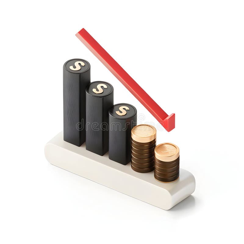
Free with trial A 3D illustration depicts a financial graph with a downward trend. Three black bars, each topped with a gold dollar sign, decrease in height from left to right. To the right of the bars, two stacks of gold coins are shown, also decreasing in height. A thick red arrow points downwards, crossing over the bars and coins, indicating a decline. The entire composition rests on a white base and is set. Data decrease illustrations Falling financial graph with stacked coins finance. A 3D illustration depicts a financial graph with a downward trend. Three black bars, each topped with a gold dollar sign, decrease in height from left to right. To the right of the bars, two stacks of gold coins are shown, also decreasing in height. A thick red arrow points downwards, crossing over the bars and coins, indicating a decline. The entire composition rests on a white base and is set
Free with trial This image showcases vibrant 3D bar and line charts, generated by AI, offering a dynamic visual representation of business data. The colorful design effectively communicates trends and comparisons across multiple data sets, providing a clear and engaging overview of key performance indicators. Data decrease illustrations AI-Generated 3D Business Charts. This image showcases vibrant 3D bar and line charts, generated by AI, offering a dynamic visual representation of business data. The colorful design effectively communicates trends and comparisons across multiple data sets, providing a clear and engaging overview of key performance indicators.
Free with trial A vibrant collection of hand-drawn business charts and graphs, rendered in blue tones. The set includes various types of visualizations like bar charts, line graphs, and a pie chart, all with a sketchy, illustrative style. These visuals are ideal for presentations, reports, and infographics related to finance, data analysis, growth, and business performance. Data decrease illustrations Hand-Drawn Business Charts and Graphs Collection. A vibrant collection of hand-drawn business charts and graphs, rendered in blue tones. The set includes various types of visualizations like bar charts, line graphs, and a pie chart, all with a sketchy, illustrative style. These visuals are ideal for presentations, reports, and infographics related to finance, data analysis, growth, and business performance.
Free with trial A bold, glossy red arrow curves downwards, signifying a decrease in business performance, economic downturn, or negative trend. Its sleek design conveys a clear message of decline. Data decrease illustrations Glossy red downward arrow symbolizing decline progress and business trends. A bold, glossy red arrow curves downwards, signifying a decrease in business performance, economic downturn, or negative trend. Its sleek design conveys a clear message of decline
Free with trial A sharp red arrow points downwards, illustrating a significant decrease or failure. This visual metaphor is commonly used to represent economic recession, stock market losses, or declining performance. Data decrease illustrations Red downward trend arrow symbolizing financial decline and market downturn. A sharp red arrow points downwards, illustrating a significant decrease or failure. This visual metaphor is commonly used to represent economic recession, stock market losses, or declining performance
Free with trial Displaying slanted turquoise banner showing bold pink HUGE SALE text in interface, with line charts. Digital, marketing, modern, technology, data, analytics, futuristic. Data decrease illustrations Displaying slanted turquoise banner showing bold pink HUGE SALE text in interface, with line charts
Free with trial 3d bar chart with orange and green bars on a blue grid background isolated on white. Data decrease illustrations 3d bar chart with orange and green bars on blue grid background graph data. 3d bar chart with orange and green bars on a blue grid background isolated on white
Free with trial A pair of hands holds a sheet of paper displaying a red line graph on a grid pattern the graph illustrates a downward trend, indicating a decline in business, finance or economy the image represents loss, failure, or a recession, generated by AI. Data decrease illustrations Hands holding paper showing a declining red business graph data. a pair of hands holds a sheet of paper displaying a red line graph on a grid pattern the graph illustrates a downward trend, indicating a decline in business, finance or economy the image represents loss, failure, or a recession, generated by AI.
Free with trial Women in technology concept. Analyzing cryptocurrency trends and market data. Collaboration in digital finance research. Vector illustration. Data decrease vectors Women In Technology. Flat Vector. Women in technology concept. Analyzing cryptocurrency trends and market data. Collaboration in digital finance research. Vector illustration.
Free with trial The image depicts a bar graph displayed on an easel, illustrating a downward trend over time. The bars start high on the left and progressively decrease in height towards the right, with a red arrow emphasizing the decline. The graph's y-axis appears to measure an unspecified metric, while the x-axis represents a timeline. Data decrease illustrations Graph showing decline over time. The image depicts a bar graph displayed on an easel, illustrating a downward trend over time. The bars start high on the left and progressively decrease in height towards the right, with a red arrow emphasizing the decline. The graph's y-axis appears to measure an unspecified metric, while the x-axis represents a timeline
Free with trial A bright blue 3D arrow pointing downwards. This modern icon signifies direction, download, or a decrease, perfect for user interfaces, infographics, and digital media. Data decrease illustrations Shiny blue 3d downward arrow icon isolated on white for digital interfaces and presentations white background. A bright blue 3D arrow pointing downwards. This modern icon signifies direction, download, or a decrease, perfect for user interfaces, infographics, and digital media
Free with trial Illustration of a hand holding a magnifying glass over a financial chart showing business growth and success. The image represents data analysis, investment strategy, and market trends in a visually appealing way. Data decrease illustrations Business Growth Analysis Magnifying Glass on Financial Chart. Illustration of a hand holding a magnifying glass over a financial chart showing business growth and success. The image represents data analysis, investment strategy, and market trends in a visually appealing way.
Free with trial A colorful bar graph with a line graph overlayed on a blue background. it shows data trends and market analysis in a simple visual format. Data decrease vectors Colorful bar graph with a line graph on a blue background. a colorful bar graph with a line graph overlayed on a blue background. it shows data trends and market analysis in a simple visual format
Free with trial A clean, minimalist icon depicting upward and downward arrows. Perfect for representing upload download, increase decrease, or input output in digital interfaces. Data decrease vectors Double Sided Up and Down Direction Icon. A clean, minimalist icon depicting upward and downward arrows. Perfect for representing upload download, increase decrease, or input output in digital interfaces
Free with trial An illuminated downward arrow with a jagged line signifies a decline, representing negative performance and can be used to illustrate a decrease in business or any downward trend. Data decrease illustrations Declining Arrow Shows Downtrend and Negative Performance. An illuminated downward arrow with a jagged line signifies a decline, representing negative performance and can be used to illustrate a decrease in business or any downward trend
Free with trial A businesswoman presents data graphs and charts on a whiteboard during a meeting in a modern office setting. The scene is minimalist and uses a dark blue color palette, emphasizing the data visualization. The image depicts a professional work environment. Data decrease illustrations Businesswoman Giving Presentation. A businesswoman presents data graphs and charts on a whiteboard during a meeting in a modern office setting. The scene is minimalist and uses a dark blue color palette, emphasizing the data visualization. The image depicts a professional work environment.
Free with trial White isometric icons representing various financial concepts, including money, transactions, and data management, are depicted against a black background. These clean, modern icons are ideal for financial applications, websites, or presentations. Data decrease illustrations Isometric Finance Icons. White isometric icons representing various financial concepts, including money, transactions, and data management, are depicted against a black background. These clean, modern icons are ideal for financial applications, websites, or presentations.
Free with trial Hand-drawn financial charts, graphs, and calculators perfect for business, finance, and accounting illustrations. These vector illustrations depict various tools used for data analysis and financial calculations. Data decrease vectors Collection of Hand Drawn Financial Charts and Calculators. Hand-drawn financial charts, graphs, and calculators perfect for business, finance, and accounting illustrations. These vector illustrations depict various tools used for data analysis and financial calculations.
Free with trial This image features two minimalist icons representing financial or data trends. The left icon is a white line graph with circular data points and directional arrows, set against a solid black shield shape. The right icon presents the same line graph and data points within a black outline of a shield, on a white background. Both icons depict fluctuating data, with one showing a downward trend and the other an upward trend, symbolizing market volatility, analysis, and security. Data decrease illustrations Line Graph Icon with Shield Symbol - Upward and Downward Trends. This image features two minimalist icons representing financial or data trends. The left icon is a white line graph with circular data points and directional arrows, set against a solid black shield shape. The right icon presents the same line graph and data points within a black outline of a shield, on a white background. Both icons depict fluctuating data, with one showing a downward trend and the other an upward trend, symbolizing market volatility, analysis, and security.
Free with trial Black silhouette of descending bar chart with arrow, isolated on white background. concept of financial decline, statistics, economic downturn, data analysis, business graph. Data decrease vectors Black silhouette of descending bar chart with arrow, isolated on white background. concept of financial decline, statistics
Free with trial Graph depiction on paper with a pencil ,Generative ai. Data decrease illustrations Pencil and paper, a detailed illustration of graph for data analysis visualization. Graph depiction on paper with a pencil ,Generative ai
Free with trial Red falling arrow and declining chart with stock market data overlay on office interior background, symbolizing global financial collapse impact. Data decrease illustrations Financial market crash with red downward arrow and stock graph lines descending sharply over modern office background during. Red falling arrow and declining chart with stock market data overlay on office interior background, symbolizing global financial collapse impact
Free with trial A high-tech illustration of a glowing blue -2% percentage symbol displayed in a sleek, modern office environment. Surrounded by digital data icons and futuristic charts, this image is perfect for representing concepts like small financial losses, minor discounts, data drops, business trends, or analytical reports. Ideal for presentations, websites, digital marketing, or economic graphics. Data decrease illustrations Glowing -2% Discount Graphic in Modern Office Environment. A high-tech illustration of a glowing blue -2% percentage symbol displayed in a sleek, modern office environment. Surrounded by digital data icons and futuristic charts, this image is perfect for representing concepts like small financial losses, minor discounts, data drops, business trends, or analytical reports. Ideal for presentations, websites, digital marketing, or economic graphics.
Free with trial Collection of various red infographic elements including charts, graphs, diagrams, and symbols, perfect for presentations and data visualization. Ideal for showcasing data trends, progress, and comparisons. Easily customizable and adaptable to diverse projects. Data decrease illustrations Red Infographic Elements
Free with trial A graph shows a downward trend. Green bars diminish in height along a timeline. A red arrow underscores the downward movement of the data on the timeline. Data decrease illustrations Decreasing graph showing green bars plunging downward with a red arrow indication. A graph shows a downward trend. Green bars diminish in height along a timeline. A red arrow underscores the downward movement of the data on the timeline
Free with trial This vibrant 3D bar chart illustrates strong business growth and upward progress. The colorful, glossy bars represent data points, clearly showing an increase. Ideal for presentations and reports. Data decrease illustrations Colorful 3D Bar Chart Showing Business Growth and Progress. This vibrant 3D bar chart illustrates strong business growth and upward progress. The colorful, glossy bars represent data points, clearly showing an increase. Ideal for presentations and reports.
Free with trial Interface displaying downward-trending bar chart and dotted line on dashboard, with ticker symbols. Finance, analytics, data visualization, investment, technological, corporate, digital. Data decrease illustrations Interface displaying downward-trending bar chart and dotted line on dashboard, with ticker symbols
Free with trial A conceptual vector illustration depicting business analysis and market research. A hand holds a magnifying glass, focusing on a colorful financial chart with bar and line graphs labeled 'Market Trends'. Surrounding icons represent key business metrics like growth, decline, market share, and innovation. This flat design graphic is ideal for presentations, reports, and web content related to data analytics, strategic planning, and financial performance evaluation, symbolizing the scrutiny of data to identify opportunities and understand market dynamics. Data decrease illustrations Business Analysis and Market Trends Concept with Magnifying Glass. A conceptual vector illustration depicting business analysis and market research. A hand holds a magnifying glass, focusing on a colorful financial chart with bar and line graphs labeled 'Market Trends'. Surrounding icons represent key business metrics like growth, decline, market share, and innovation. This flat design graphic is ideal for presentations, reports, and web content related to data analytics, strategic planning, and financial performance evaluation, symbolizing the scrutiny of data to identify opportunities and understand market dynamics.
Free with trial Laptop on desk showing red falling stock chart, digital graphic style, office background, concept of global financial market crash. 3D Rendering. Data decrease illustrations Red downward stock market chart on laptop screen showing financial crisis data in modern office with soft lighting and digital. Laptop on desk showing red falling stock chart, digital graphic style, office background, concept of global financial market crash. 3D Rendering
Free with trial This graph illustrates the fluctuation of interest rates over the last 12 months, ranging from 3. 5% to 7%. The line chart provides a visual representation of the trend, allowing for easy analysis and understanding of the data. The graph is a valuable resource for businesses, investors, and individuals looking to stay informed about the current state of the economy and make informed decisions about their financial planning and strategy. Data decrease illustrations A graph showing interest rate fluctuation over the last 12 months. This graph illustrates the fluctuation of interest rates over the last 12 months, ranging from 3.5% to 7%. The line chart provides a visual representation of the trend, allowing for easy analysis and understanding of the data. The graph is a valuable resource for businesses, investors, and individuals looking to stay informed about the current state of the economy and make informed decisions about their financial planning and strategy.
Free with trial A bold, black downward-pointing arrow rendered in a textured, hand-drawn brush stroke or grunge style. Isolated on a clean white background, this graphic element conveys direction, download, scroll, or decrease. Its rough, artistic edges give it a dynamic and authentic feel, making it suitable for various design projects, web interfaces, mobile applications, presentations, or any content requiring a clear and impactful directional indicator with a modern, edgy aesthetic. Data decrease vectors Hand Drawn Grunge Style Down Arrow Icon. A bold, black downward-pointing arrow rendered in a textured, hand-drawn brush stroke or grunge style. Isolated on a clean white background, this graphic element conveys direction, download, scroll, or decrease. Its rough, artistic edges give it a dynamic and authentic feel, making it suitable for various design projects, web interfaces, mobile applications, presentations, or any content requiring a clear and impactful directional indicator with a modern, edgy aesthetic.
Free with trial This futuristic visualization, generated by AI, depicts a global Bitcoin network, highlighting its worldwide reach and digital infrastructure. Data streams and interactive elements showcase the complex interplay of transactions and information flow within the cryptocurrency ecosystem. Data decrease illustrations Global Bitcoin Network
Free with trial A striking 3D rendering features an abstract bar graph composed of numerous translucent blue rectangular blocks against a dark, almost black, background. The varying heights of the blocks create a dynamic visual representation of data, statistics, or growth trends. This modern and futuristic design is ideal for illustrating concepts related to business, finance, technology, analytics, market research, or digital information in presentations, reports, websites, and corporate media. Data decrease illustrations Abstract 3D Blue Bar Graph Visualization. A striking 3D rendering features an abstract bar graph composed of numerous translucent blue rectangular blocks against a dark, almost black, background. The varying heights of the blocks create a dynamic visual representation of data, statistics, or growth trends. This modern and futuristic design is ideal for illustrating concepts related to business, finance, technology, analytics, market research, or digital information in presentations, reports, websites, and corporate media.
Free with trial A simple bar chart with a falling line, symbolizing financial decline, economic downturn, decreased profits, market loss, or negative business results. Ideal for illustrating risks, challenges, crisis situations, and economic analysis. Data decrease vectors Declining financial chart icon with downward trend showing loss, decrease and negative business performance. A simple bar chart with a falling line, symbolizing financial decline, economic downturn, decreased profits, market loss, or negative business results. Ideal for illustrating risks, challenges, crisis situations, and economic analysis.
Free with trial A vibrant circular chart displaying a twenty percent decrease with bright colors and clean design, ideal for business, finance, and analytics presentations. Data decrease illustrations Colorful Circular Chart with Percentage Reduction in Modern Data Visualization Style. A vibrant circular chart displaying a twenty percent decrease with bright colors and clean design, ideal for business, finance, and analytics presentations
Free with trial Graphs set with line charts, bar charts, and scatter plots illustrating upward and downward trends with arrows and data points. Data decrease vectors Graphs set with line charts, bar charts, and scatter plots illustrating upward and
Free with trial A 3D illustration of a statistic down icon isolated on a white background symbolizing decline in data or business performance. Data decrease illustrations Statistic down 3D illustration. A 3D illustration of a statistic down icon isolated on a white background symbolizing decline in data or business performance
Free with trial A 3D illustration of a statistic down icon isolated on a white background symbolizing decline in data or business performance. Data decrease illustrations Statistic down 3D illustration. A 3D illustration of a statistic down icon isolated on a white background symbolizing decline in data or business performance
Free with trial Brightly colored wooden blocks arranged as a bar graph with one block falling represents decline Use for financial or business illustrations. Data decrease illustrations Colorful Wooden Blocks Forming a Graph, One Falling, on Data Chart. Brightly colored wooden blocks arranged as a bar graph with one block falling represents decline Use for financial or business illustrations
Free with trial Dec fading line graph illustration data analysis, statistics visualization, slope axis dec fading line graph. Data decrease illustrations Dec fading line graph
Free with trial This image depicts a bar graph with a downward trend. The bars decrease in height from left to right, indicating a decline in the measured values. A red arrow at the top further emphasizes the downward direction. Data decrease illustrations Decreasing bar graph. This image depicts a bar graph with a downward trend. The bars decrease in height from left to right, indicating a decline in the measured values. A red arrow at the top further emphasizes the downward direction
Free with trial An eye-catching 3D bar graph illustration with yellow, blue, and red elements. It is designed to represent data or growth concepts. Data decrease vectors Colorful 3D bar graph illustration showing descending values on transparent background. An eye-catching 3D bar graph illustration with yellow, blue, and red elements. It is designed to represent data or growth concepts.
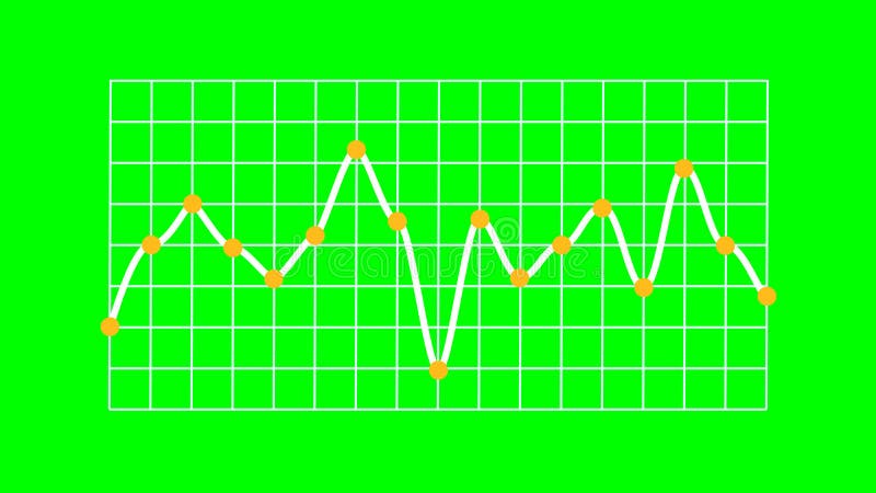
Free with trial Rendered line graph showing a single white line indicating data trends with distinct fluctuations. Yellow marker points animate vertically from the X-axis, and each plotted value features an orange circular dot. The white line runs over a structured white grid on a bright green screen background, enabling chroma keying. No axis values or units are present, emphasizing visual representation of abstract data and business trends. Data decrease illustrations Business Trend Line Graph Showing Trading on Green Screen. Rendered line graph showing a single white line indicating data trends with distinct fluctuations. Yellow marker points animate vertically from the X-axis, and each plotted value features an orange circular dot. The white line runs over a structured white grid on a bright green screen background, enabling chroma keying. No axis values or units are present, emphasizing visual representation of abstract data and business trends.
Free with trial The image depicts a bar graph with three bars of varying heights. The first bar is the tallest, followed by a shorter blue bar, and the third bar is the shortest. A large red downward arrow is pointing from the top of the tallest bar to the shortest bar, indicating a downward trend or decrease. Data decrease illustrations Decreasing bar graph. The image depicts a bar graph with three bars of varying heights. The first bar is the tallest, followed by a shorter blue bar, and the third bar is the shortest. A large red downward arrow is pointing from the top of the tallest bar to the shortest bar, indicating a downward trend or decrease
Free with trial An optical illusion featuring a geometric, 3D tunneling effect created with a red and white checkered pattern. The squares decrease in size toward the center, enhancing the illusion of depth and perspective. The design is framed by thin red lines, emphasizing the rectangular shape. Clean lines and contrasting colors contribute to the visual impact of the artwork. Data decrease vectors Vector art of data analysis and business analytics concept, business people analyzing financial graph and chart. An optical illusion featuring a geometric, 3D tunneling effect created with a red and white checkered pattern. The squares decrease in size toward the center, enhancing the illusion of depth and perspective. The design is framed by thin red lines, emphasizing the rectangular shape. Clean lines and contrasting colors contribute to the visual impact of the artwork.
Free with trial This image depicts a computer screen displaying a sharply declining stock market graph, generated by AI. The red line dramatically illustrates a significant market downturn, accompanied by numerous data points and financial indicators. The dark aesthetic enhances the sense of urgency and potential. Data decrease illustrations AI-Generated Stock Market Decline. This image depicts a computer screen displaying a sharply declining stock market graph, generated by AI. The red line dramatically illustrates a significant market downturn, accompanied by numerous data points and financial indicators. The dark aesthetic enhances the sense of urgency and potential
Free with trial Trend melting line graph illustration analysis visualization, ice decrease, plot statistics trend melting line graph. Data decrease illustrations Trend melting line graph
Free with trial Flat design business icons depict various charts, percentage signs, targets, hierarchical diagrams, and coin stacks representing financial growth and data analysis in monochrome. Generative AI. Data decrease vectors Black and white flat design business icons including charts percentage target and money stacks illustrating financial growth and. Flat design business icons depict various charts, percentage signs, targets, hierarchical diagrams, and coin stacks representing financial growth and data analysis in monochrome. Generative AI
Free with trial A minimalist, black and white vector icon representing a bar chart or graph. The icon features a series of vertical bars of varying heights, set against a base of horizontal lines. This clean and modern design is ideal for representing data, statistics, progress, growth, or financial information in digital and print media. Its simple aesthetic makes it versatile for use in presentations, websites, apps, and infographics. Data decrease vectors Abstract Bar Chart Icon. A minimalist, black and white vector icon representing a bar chart or graph. The icon features a series of vertical bars of varying heights, set against a base of horizontal lines. This clean and modern design is ideal for representing data, statistics, progress, growth, or financial information in digital and print media. Its simple aesthetic makes it versatile for use in presentations, websites, apps, and infographics.
Free with trial A bold, three-dimensional red arrow is prominently displayed, pointing directly downwards. The arrow is cast against a textured, light-colored wall, creating a stark contrast. A dramatic shadow of the arrow is cast on the wall to its left, adding depth and visual interest. The lighting suggests a single light source, casting sharp shadows and highlighting the arrow's form. This image effectively symbolizes decline, decrease, failure, or a downward trend in various contexts, such as finance, business, or performance. Data decrease illustrations Red Arrow Pointing Downward Against Textured Wall. A bold, three-dimensional red arrow is prominently displayed, pointing directly downwards. The arrow is cast. A bold, three-dimensional red arrow is prominently displayed, pointing directly downwards. The arrow is cast against a textured, light-colored wall, creating a stark contrast. A dramatic shadow of the arrow is cast on the wall to its left, adding depth and visual interest. The lighting suggests a single light source, casting sharp shadows and highlighting the arrow's form. This image effectively symbolizes decline, decrease, failure, or a downward trend in various contexts, such as finance, business, or performance.
Free with trial This image showcases a person using a tablet to interact with business analytics data, generated by AI. The visualization includes graphs and charts, providing real-time insights into key performance indicators. This technology streamlines business decision-making. Data decrease illustrations AI-Powered Business Analytics. This image showcases a person using a tablet to interact with business analytics data, generated by AI. The visualization includes graphs and charts, providing real-time insights into key performance indicators. This technology streamlines business decision-making.
Free with trial This image shows a downward-trending red arrow graph, generated by AI, illustrating a significant decline. The visual representation is clear and effective in communicating a negative trend, potentially in stock prices, sales figures, or other quantifiable data. Data decrease illustrations Downward Trending Graph. This image shows a downward-trending red arrow graph, generated by AI, illustrating a significant decline. The visual representation is clear and effective in communicating a negative trend, potentially in stock prices, sales figures, or other quantifiable data.
Free with trial Clear graphic illustration showing a downward trend or progression with a red arrow pointing into a smaller contained space, ideal for business or data analysis. Data decrease vectors Red arrow shows downward progress into smaller box. Clear graphic illustration showing a downward trend or progression with a red arrow pointing into a smaller contained space, ideal for business or data analysis
Free with trial A person's hand hovers over a digital representation of a cube, with a downward-pointing arrow and chemical symbols, suggesting a decrease in kilogram value. Data decrease illustrations Hand Holding a Digital Representation of a Decreasing Kilogram Value. A person's hand hovers over a digital representation of a cube, with a downward-pointing arrow and chemical symbols, suggesting a decrease in kilogram value
Free with trial This isometric illustration shows a delicious breakfast plate alongside a stock market graph, representing the connection between food trends and market data. The visual, generated by AI, is perfect for illustrating articles about food market analysis or investment opportunities in the food industr. Data decrease illustrations Breakfast Market Trends. This isometric illustration shows a delicious breakfast plate alongside a stock market graph, representing the connection between food trends and market data. The visual, generated by AI, is perfect for illustrating articles about food market analysis or investment opportunities in the food industr
Free with trial A cartoon illustration of a man interacting with a bar chart. The man is depicted in a simple, clean style, wearing a blue shirt and brown pants. He is holding a green bar, seemingly adjusting or interacting with the colorful bars displayed on a table. The illustration is suitable for conveying concepts related to data analysis, business, finance, and presentation. Data decrease illustrations Cartoon Man and Bar Chart. A cartoon illustration of a man interacting with a bar chart. The man is depicted in a simple, clean style, wearing a blue shirt and brown pants. He is holding a green bar, seemingly adjusting or interacting with the colorful bars displayed on a table. The illustration is suitable for conveying concepts related to data analysis, business, finance, and presentation.
Free with trial Computer screen displaying detailed candlestick charts used for stock market analysis and investment decisions Perfect for illustrating finance and technology concepts. Data decrease illustrations Analyzing Stock Market Data on Computer Screen with Candlestick Chart. Computer screen displaying detailed candlestick charts used for stock market analysis and investment decisions Perfect for illustrating finance and technology concepts
Free with trial A visual representation of market fluctuations and business performance, with a red downward arrow indicating a decrease and a green upward arrow signifying growth and positive trends. Data decrease illustrations Red down arrow and green up arrow symbols representing financial market trends and business growth. A visual representation of market fluctuations and business performance, with a red downward arrow indicating a decrease and a green upward arrow signifying growth and positive trends
Free with trial This image displays a bar graph visualizing a clear downward trend. Nine vertical blue bars gradually decrease in height from left to right, signifying a consistent decline in values. A white arrowed line diagonally descends across the graph, reinforcing the negative trend. Blue horizontal and vertical grid lines aid in alignment. The background is green screen, allowing for chroma key use. This chart effectively communicates decline in areas like business, finance, or performance. Data decrease illustrations Downward Bar Graph Showing Financial Decline on Green Screen. This image displays a bar graph visualizing a clear downward trend. Nine vertical blue bars gradually decrease in height from left to right, signifying a consistent decline in values. A white arrowed line diagonally descends across the graph, reinforcing the negative trend. Blue horizontal and vertical grid lines aid in alignment. The background is green screen, allowing for chroma key use. This chart effectively communicates decline in areas like business, finance, or performance.
Free with trial A minimalist black and white icon depicting a document or file with a circular 'minus' sign overlaying its bottom right corner. This clear graphic symbolizes the action of removing, deleting, or excluding a file or record. Ideal for user interface designs, web applications, software development, or any project requiring a visual representation of file management operations, data removal, or a negative action. Its simple, flat design ensures versatility and easy integration into various digital and print media. Data decrease vectors Remove Document File Icon. A minimalist black and white icon depicting a document or file with a circular 'minus' sign overlaying its bottom right corner. This clear graphic symbolizes the action of removing, deleting, or excluding a file or record. Ideal for user interface designs, web applications, software development, or any project requiring a visual representation of file management operations, data removal, or a negative action. Its simple, flat design ensures versatility and easy integration into various digital and print media.
Free with trial Candlestick chart with red and white bars representing stock price changes over time. Red candles indicate price decrease, while white suggest price increase. Vertical lines, or "wicks," show high and low prices. A white line, possibly a moving average, intersects the candles, offering a smooth trend indication. The background is dark blue with faint grid lines and circular elements, enhancing the financial data visualization aspect. Data decrease illustrations Candlestick chart showing stock market trends and financial analysis. Candlestick chart with red and white bars representing stock price changes over time. Red candles indicate price decrease, while white suggest price increase. Vertical lines, or "wicks," show high and low prices. A white line, possibly a moving average, intersects the candles, offering a smooth trend indication. The background is dark blue with faint grid lines and circular elements, enhancing the financial data visualization aspect.
Free with trial A vibrant red, three-dimensional zigzag arrow sharply points downwards and to the right, set against a transparent background. This striking graphic effectively symbolizes decline, loss, and negative trends across various sectors. It is ideal for illustrating financial downturns, market crashes, economic recessions, falling stock prices, or any situation depicting a decrease in performance. Perfect for business presentations, financial reports, infographics, and news articles requiring a clear visual representation of a downward trajectory or crisis. Data decrease illustrations Red Downward Zigzag Arrow on Transparent Background. A vibrant red, three-dimensional zigzag arrow sharply points downwards and to the right, set against a transparent background. This striking graphic effectively symbolizes decline, loss, and negative trends across various sectors. It is ideal for illustrating financial downturns, market crashes, economic recessions, falling stock prices, or any situation depicting a decrease in performance. Perfect for business presentations, financial reports, infographics, and news articles requiring a clear visual representation of a downward trajectory or crisis.