Free with trial A bold, three-dimensional red arrow depicted in a downward curve, signifying a negative trend, decline, or decrease, isolated against a clean white background for clear visual emphasis. Data decrease illustrations Red arrow curving downwards isolated on white background. A bold, three-dimensional red arrow depicted in a downward curve, signifying a negative trend, decline, or decrease, isolated against a clean white background for clear visual emphasis
Free with trial This image features an abstract illustration of a bar graph against a dark gray background. The graph consists of three vertical bars of varying heights, each with horizontal rectangles inside. The bars are shades of white and gray, creating a minimalist and modern design. This image can be used to represent data, growth, statistics, or business performance in a visually appealing manner. Data decrease vectors Abstract Bar Graph Illustration. This image features an abstract illustration of a bar graph against a dark gray background. The graph consists of three vertical bars of varying heights, each with horizontal rectangles inside. The bars are shades of white and gray, creating a minimalist and modern design. This image can be used to represent data, growth, statistics, or business performance in a visually appealing manner.
Free with trial Vector illustration showing oil price decrease with dollar sign drop barrel fuel pump and declining graph representing economic impact and market trends in black and white style calm. Generative AI. Data decrease vectors Oil price drop concept with dollar sign barrel pump and graph vector illustration. Vector illustration showing oil price decrease with dollar sign drop barrel fuel pump and declining graph representing economic impact and market trends in black and white style calm. Generative AI
Free with trial A simple hand-drawn illustration of a bar chart or graph. The chart is rendered in black lines on a white background, with the lower portions of the bars filled with diagonal hatching. This image can be used to represent data, statistics, growth, progress, or analysis in a visually appealing and informal way. Suitable for presentations, reports, or website graphics. Data decrease illustrations Hand-Drawn Bar Chart Illustration. A simple hand-drawn illustration of a bar chart or graph. The chart is rendered in black lines on a white background, with the lower portions of the bars filled with diagonal hatching. This image can be used to represent data, statistics, growth, progress, or analysis in a visually appealing and informal way. Suitable for presentations, reports, or website graphics.
Free with trial A dynamic digital illustration of a financial chart on a dark, high-tech background. The image features two contrasting lines: a vibrant green line trending upwards with an arrow, symbolizing growth, profit, and success, and a blue line moving downwards with an arrow, representing decline, loss, and risk. Glowing data points and a network grid enhance the futuristic feel. This versatile graphic is perfect for concepts related to stock market analysis, business performance, investment volatility, economic forecasting, big data, and financial technology (fintech). Data decrease illustrations Futuristic Financial Graph with Growth and Decline Arrows. A dynamic digital illustration of a financial chart on a dark, high-tech background. The image features two contrasting lines: a vibrant green line trending upwards with an arrow, symbolizing growth, profit, and success, and a blue line moving downwards with an arrow, representing decline, loss, and risk. Glowing data points and a network grid enhance the futuristic feel. This versatile graphic is perfect for concepts related to stock market analysis, business performance, investment volatility, economic forecasting, big data, and financial technology (fintech).
Free with trial Sales performance, data analysis, business strategy, financial downturn, decision making, marketing insights. Arrow pointing down with sale text, charts check mark. Sales performance and data. Data decrease vectors Sales Analytics and Performance Metrics with Downward Trends and Checkmark. Sales performance, data analysis, business strategy, financial downturn, decision making, marketing insights. Arrow pointing down with sale text, charts check mark. Sales performance and data
Free with trial A 3D illustration of a financial chart showing a dramatic downward trend. A large red arrow points sharply down over a series of declining blue bar graphs, symbolizing a stock market crash, economic recession, or business failure. The background features complex data and grids, representing financial analysis and market data. This image is perfect for concepts related to economic crisis, investment loss, financial risk, bankruptcy, and negative business reports. Data decrease illustrations Stock Market Crash Financial Graph. A 3D illustration of a financial chart showing a dramatic downward trend. A large red arrow points sharply down over a series of declining blue bar graphs, symbolizing a stock market crash, economic recession, or business failure. The background features complex data and grids, representing financial analysis and market data. This image is perfect for concepts related to economic crisis, investment loss, financial risk, bankruptcy, and negative business reports.
Free with trial Bitcoin icon within circular outline, large downward arrow, and stack of blue documents. Ideal for cryptocurrency, finance, blockchain, decreasing trends, data transfer, document management simple. Data decrease vectors Bitcoin Logo with Downward Arrow and Document Stack in Minimalistic Style. Bitcoin icon within circular outline, large downward arrow, and stack of blue documents. Ideal for cryptocurrency, finance, blockchain, decreasing trends, data transfer, document management simple
Free with trial An illustration featuring two contrasting arrows against a plain white background. The red arrow shows a wavy upward trend, symbolizing growth, increase, or positive performance with fluctuation. The black arrow shows a wavy downward trend, symbolizing decline, decrease, or negative performance with fluctuation. This visual concept is often used to represent financial market volatility, business. Data decrease vectors Dynamic business trends illustrated by contrasting red upward and black downward arrows Vector. An illustration featuring two contrasting arrows against a plain white background. The red arrow shows a wavy upward trend, symbolizing growth, increase, or positive performance with fluctuation. The black arrow shows a wavy downward trend, symbolizing decline, decrease, or negative performance with fluctuation. This visual concept is often used to represent financial market volatility, business
Free with trial An abstract 3D rendering visually representing the concept of 'LOSS'. The prominent white text 'LOSS' is superimposed over a stack of dark, metallic, fluid-like shapes that appear to be collapsing or compressing under pressure. A powerful red, glowing energy beam erupts from beneath this structure, symbolizing impact, crisis, or a significant downturn. Small, dark, reflective cubes float in the dark grey background, adding to the abstract, digital aesthetic. This image effectively conveys themes of financial decline, business failure, data loss, or any form of significant reduction and negative consequence. Data decrease illustrations Loss Concept with Abstract Energy and Collapsing Structure. An abstract 3D rendering visually representing the concept of 'LOSS'. The prominent white text 'LOSS' is superimposed over a stack of dark, metallic, fluid-like shapes that appear to be collapsing or compressing under pressure. A powerful red, glowing energy beam erupts from beneath this structure, symbolizing impact, crisis, or a significant downturn. Small, dark, reflective cubes float in the dark grey background, adding to the abstract, digital aesthetic. This image effectively conveys themes of financial decline, business failure, data loss, or any form of significant reduction and negative consequence.
Free with trial A 3D icon depicts a financial graph. The icon features a rounded purple square with a lighter purple top edge. Inside, a yellow line chart with circular data points shows an upward trend, overlaid on a series of yellow vertical bars representing a bar chart. The overall design is clean and modern, symbolizing data analysis, business growth, and financial performance. Data decrease illustrations 3D icon representing a financial graph with bars and a line chart on a purple background. A 3D icon depicts a financial graph. The icon features a rounded purple square with a lighter purple top edge. Inside, a yellow line chart with circular data points shows an upward trend, overlaid on a series of yellow vertical bars representing a bar chart. The overall design is clean and modern, symbolizing data analysis, business growth, and financial performance
Free with trial This image showcases a diverse collection of downward-pointing arrows, presented in a clean, graphic style against a white background. The arrows are arranged in three rows and six columns, featuring both solid black and outline designs. Variations include standard arrow shapes, rounded tops, and arrows enclosed in boxes or with unique arrowhead designs. This versatile set is ideal for representing concepts like download, decrease, decline, navigation, or direction in digital interfaces, presentations, and infographics. Data decrease vectors Collection of Downward Arrows in Various Styles. This image showcases a diverse collection of downward-pointing arrows, presented in a clean, graphic style against a white background. The arrows are arranged in three rows and six columns, featuring both solid black and outline designs. Variations include standard arrow shapes, rounded tops, and arrows enclosed in boxes or with unique arrowhead designs. This versatile set is ideal for representing concepts like download, decrease, decline, navigation, or direction in digital interfaces, presentations, and infographics.
Free with trial A 3D illustration of a red arrow pointing downward on a graph, indicating a decline or negative trend in business, finance, or economy. The image represents a decrease or loss in value, and can be used to symbolize a crisis, recession, or failure. Data decrease illustrations A red arrow pointing downward on a graph indicating a decline. A 3D illustration of a red arrow pointing downward on a graph, indicating a decline or negative trend in business, finance, or economy. The image represents a decrease or loss in value, and can be used to symbolize a crisis, recession, or failure.
Free with trial Trend melting line graph illustration analysis visualization, ice decrease, plot statistics trend melting line graph. Data decrease illustrations Trend melting line graph
Free with trial Two bold, three-dimensional red arrows are positioned vertically side-by-side against a clean white background. The left arrow points upwards, signifying increase, progress, or ascent. The right arrow points downwards, representing decrease, decline, or descent. Their contrasting directions and vibrant color make them a strong visual metaphor for opposing forces, change, or directional choices. Data decrease illustrations Red Up and Down Arrows Symbolizing Direction and Contrast on White Background image photo. Two bold, three-dimensional red arrows are positioned vertically side-by-side against a clean white background. The left arrow points upwards, signifying increase, progress, or ascent. The right arrow points downwards, representing decrease, decline, or descent. Their contrasting directions and vibrant color make them a strong visual metaphor for opposing forces, change, or directional choices
Free with trial A hand-drawn bar chart shows a downward trend with a line graph indicating a significant decrease in value over time. Data decrease vectors Downturn graph illustrating declining trends and financial loss. A hand-drawn bar chart shows a downward trend with a line graph indicating a significant decrease in value over time
Free with trial The word 'TRENDS' is displayed prominently in blue, overlaid by a sharp, downward-pointing red arrow, visually communicating a negative trend or decline in data or performance. Data decrease illustrations Word trends with a downward red arrow. The word 'TRENDS' is displayed prominently in blue, overlaid by a sharp, downward-pointing red arrow, visually communicating a negative trend or decline in data or performance
Free with trial A 3D rendered graphic depicts a simplified bar chart with pastel colored bars in pink, yellow, and blue. A line graph with white lines and orange and yellow nodes crosses diagonally above the bars. The elements are set against a light blue background with a light tan border, all isolated on a white background. Data decrease vectors 3 D cartoon bar chart with line graph on blue background data. A 3D rendered graphic depicts a simplified bar chart with pastel colored bars in pink, yellow, and blue. A line graph with white lines and orange and yellow nodes crosses diagonally above the bars. The elements are set against a light blue background with a light tan border, all isolated on a white background
Free with trial Close-up of neatly stacked coins, arranged in an ascending and descending pattern, symbolizing financial growth, savings, and investment progress. The blurred background features a dynamic financial market chart with glowing lines, representing stock market trends, economic data, or cryptocurrency fluctuations. This image effectively illustrates concepts of wealth management, business success, risk, and the fluctuating nature of the global economy. It's ideal for financial articles, presentations, and advertisements related to banking, investment, budgeting, and economic analysis. Data decrease illustrations Financial Growth Concept with Stacks of Coins and Stock Market Chart. Close-up of neatly stacked coins, arranged in an ascending and descending pattern, symbolizing financial growth, savings, and investment progress. The blurred background features a dynamic financial market chart with glowing lines, representing stock market trends, economic data, or cryptocurrency fluctuations. This image effectively illustrates concepts of wealth management, business success, risk, and the fluctuating nature of the global economy. It's ideal for financial articles, presentations, and advertisements related to banking, investment, budgeting, and economic analysis.
Free with trial The chart shows falling oil prices with an oil rig visible in the background. Data highlights market changes. Data decrease illustrations Oil price trends show decline near oil extraction site in industry setting Generative AI. The chart shows falling oil prices with an oil rig visible in the background. Data highlights market changes
Free with trial This image features a decreasing bar graph with a red downward arrow, isolated on a white background. The graph illustrates a downward trend in data, with blue bars progressively getting shorter. The white background provides a clean and clear contrast, emphasizing the visual elements of the graph. Data decrease illustrations Decreasing bar graph arrow down isolated on white background. This image features a decreasing bar graph with a red downward arrow, isolated on a white background. The graph illustrates a downward trend in data, with blue bars progressively getting shorter. The white background provides a clean and clear contrast, emphasizing the visual elements of the graph
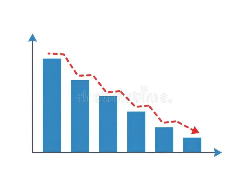
Free with trial This image features a bar chart with a decreasing trend isolated on a white background. The chart displays blue bars that progressively decrease in height from left to right, with a red dashed line indicating the downward trend. The horizontal axis represents different categories, while the vertical axis shows the corresponding values. The image is clear and SEO-friendly, highlighting data. Data decrease illustrations Bar chart with decreasing trend isolated on white background. This image features a bar chart with a decreasing trend isolated on a white background. The chart displays blue bars that progressively decrease in height from left to right, with a red dashed line indicating the downward trend. The horizontal axis represents different categories, while the vertical axis shows the corresponding values. The image is clear and SEO-friendly, highlighting data
Free with trial A 3D golden bar chart is arranged in a descending sequence, illustrating a downward trend. The bars are polished and reflective, casting subtle shadows on the pure white background. This visual represents a decline in data or financial performance. Data decrease illustrations Golden Bar Chart Showing Downward Trend on White Background graph metallic. A 3D golden bar chart is arranged in a descending sequence, illustrating a downward trend. The bars are polished and reflective, casting subtle shadows on the pure white background. This visual represents a decline in data or financial performance
Free with trial A striking 3D render showcases the numbers '638' in a brushed gold metallic finish. The numbers have a substantial, three-dimensional quality with subtle highlights and shadows that emphasize their form. They are positioned against a soft, out-of-focus background of deep blue and purple hues, creating a sense of depth and sophistication. This image is ideal for representing data, statistics, financial figures, achievements, or any concept related to numerical value and success. Data decrease illustrations Golden 3D Numbers 638 with Metallic Texture and Soft Bokeh Background. A striking 3D render showcases the numbers '638' in a brushed gold metallic finish. The numbers have a substantial, three-dimensional quality with subtle highlights and shadows that emphasize their form. They are positioned against a soft, out-of-focus background of deep blue and purple hues, creating a sense of depth and sophistication. This image is ideal for representing data, statistics, financial figures, achievements, or any concept related to numerical value and success.
Free with trial A visual representation of a stock market candlestick chart is depicted with a downward trend. The chart features alternating red and green candlesticks, indicating price fluctuations. A subtle shadow is cast on the white background, adding depth to the financial data visualization. Data decrease illustrations Downward Trending Stock Market Candlestick Chart with Red and Green Bars and Shadow finance. A visual representation of a stock market candlestick chart is depicted with a downward trend. The chart features alternating red and green candlesticks, indicating price fluctuations. A subtle shadow is cast on the white background, adding depth to the financial data visualization
Free with trial A horizontal layout of multiple data visualizations illustrates key trends in HIV treatment and diagnosis, featuring line and bar graphs with upward and downward trajectories indicating changes in patient numbers, diagnosis percentages, and global infection rates, where a blue line graph shows increasing patient counts, a second bar chart reflects diagnosed case percentages, a third displays. Data decrease illustrations HIV treatment progress dashboard with statistical graphs showing patient growth, diagnosis rates, and global trends. A horizontal layout of multiple data visualizations illustrates key trends in HIV treatment and diagnosis, featuring line and bar graphs with upward and downward trajectories indicating changes in patient numbers, diagnosis percentages, and global infection rates, where a blue line graph shows increasing patient counts, a second bar chart reflects diagnosed case percentages, a third displays
Free with trial Orange bar chart with downward arrow vector illustration. Financial loss, economic recession, market crash, business failure, negative growth, data analysis. Declining graph with falling trend. Data decrease vectors Decreasing bar chart with downward arrow showing financial loss and economic recession vector illustration. Orange bar chart with downward arrow vector. Orange bar chart with downward arrow vector illustration. Financial loss, economic recession, market crash, business failure, negative growth, data analysis. Declining graph with falling trend
Free with trial An abstract representation of a stock market decline is illustrated through a sharply descending red line graph against a dark, grid-like background. The red hues emphasize the severity of the drop, suggesting financial loss. Numerical data points faintly accompany the visual. This image was generat. Data decrease illustrations Red Stock Decline. An abstract representation of a stock market decline is illustrated through a sharply descending red line graph against a dark, grid-like background. The red hues emphasize the severity of the drop, suggesting financial loss. Numerical data points faintly accompany the visual. This image was generat
Free with trial A stylized, flat design illustration of a bar chart depicting a downward trend. The bars are colored red, yellow, and blue, arranged in decreasing height from left to right. A prominent red arrow points downwards across the chart, emphasizing the decline. The graphic is set against a clean white background, making it ideal for presentations, reports, and financial concepts related to loss, decrease, or negative performance. Data decrease illustrations Declining Bar Chart with Downward Arrow. A stylized, flat design illustration of a bar chart depicting a downward trend. The bars are colored red, yellow, and blue, arranged in decreasing height from left to right. A prominent red arrow points downwards across the chart, emphasizing the decline. The graphic is set against a clean white background, making it ideal for presentations, reports, and financial concepts related to loss, decrease, or negative performance.
Free with trial A pair of three-dimensional arrows, rendered in shades of gray, are presented against a white background. One arrow points upwards, signifying growth or progress, while the other points downwards, indicating decline or a decrease. The arrows are constructed from layered chevron shapes, creating a textured and modern appearance. Data decrease illustrations 3D rendering of an upward and downward pointing chevron arrow pair on a white background. A pair of three-dimensional arrows, rendered in shades of gray, are presented against a white background. One arrow points upwards, signifying growth or progress, while the other points downwards, indicating decline or a decrease. The arrows are constructed from layered chevron shapes, creating a textured and modern appearance
Free with trial A clean, minimalist graphic featuring two black circles side-by-side against a white background. The left circle contains a prominent white plus symbol, representing addition, increase, or positive aspects. The right circle displays a white minus symbol, signifying subtraction, decrease, or negative aspects. This versatile image is ideal for illustrating concepts of choice, comparison, opposites, data manipulation, or user interface elements. Data decrease illustrations Plus and Minus Symbols in Black Circles. A clean, minimalist graphic featuring two black circles side-by-side against a white background. The left circle contains a prominent white plus symbol, representing addition, increase, or positive aspects. The right circle displays a white minus symbol, signifying subtraction, decrease, or negative aspects. This versatile image is ideal for illustrating concepts of choice, comparison, opposites, data manipulation, or user interface elements.
Free with trial A detailed view of gold bars and coins under a magnifying glass, set against a backdrop of financial charts and data streams. The image evokes a sense of careful scrutiny and investment analysis in the financial markets. The shiny gold textures contrast with the digital screens, creating a blend of. Data decrease illustrations Golden Investment Analysis. A detailed view of gold bars and coins under a magnifying glass, set against a backdrop of financial charts and data streams. The image evokes a sense of careful scrutiny and investment analysis in the financial markets. The shiny gold textures contrast with the digital screens, creating a blend of
Free with trial This visually striking image depicts a futuristic financial concept. Scattered coins on a dark surface are illuminated by glowing neon percentages (1%, 10%, 20%, 30%, 50%, 100%). A subtle network of lines and lights in the background suggests a digital or abstract representation of data and growth. The composition evokes themes of investment, progress, and financial targets, suitable for business, finance, and technology-related content. Data decrease illustrations Digital Growth and Financial Percentages. This visually striking image depicts a futuristic financial concept. Scattered coins on a dark surface are illuminated by glowing neon percentages (1%, 10%, 20%, 30%, 50%, 100%). A subtle network of lines and lights in the background suggests a digital or abstract representation of data and growth. The composition evokes themes of investment, progress, and financial targets, suitable for business, finance, and technology-related content.
Free with trial A striking digital illustration features a bold red and white bullseye target with a prominent red percentage symbol at its precise center, set against a stark black background and surrounded by a constellation of smaller white and red percentage signs that radiate outward, creating a modern and minimalist visual metaphor for goals, accuracy, metrics, business growth, and data-driven success. Data decrease illustrations A digital illustration of a red and white target with a percentage sign in the center, surrounded by smaller percentage symbols on. A striking digital illustration features a bold red and white bullseye target with a prominent red percentage symbol at its precise center, set against a stark black background and surrounded by a constellation of smaller white and red percentage signs that radiate outward, creating a modern and minimalist visual metaphor for goals, accuracy, metrics, business growth, and data-driven success
Free with trial Three red arrows, each featuring a white percentage sign, are depicted pointing downwards against a neutral grey background. The arrows are arranged in a staggered formation, suggesting a trend or movement. This visual metaphor strongly represents concepts such as financial loss, economic downturn, price reduction, or a decrease in value. The stark contrast between the red arrows and the white. Data decrease illustrations Red arrows pointing down with percentage signs symbolizing financial decline. Three red arrows, each featuring a white percentage sign, are depicted pointing downwards against a neutral grey background. The arrows are arranged in a staggered formation, suggesting a trend or movement. This visual metaphor strongly represents concepts such as financial loss, economic downturn, price reduction, or a decrease in value. The stark contrast between the red arrows and the white
Free with trial A striking 3D rendering illustrates a significant decline in consumer spending or retail sales. The image features a large green shopping bag followed by three progressively smaller white shopping bags, visually representing a reduction. A prominent red arrow, shaped like a downward trend graph, effectively symbolizes a market downturn, economic recession, or decrease in purchasing power. Set against a clean white background, this conceptual image is ideal for financial reports, business presentations, and articles discussing economic challenges, retail struggles, or market analysis. Data decrease illustrations Retail Sales Decline and Economic Downturn. A striking 3D rendering illustrates a significant decline in consumer spending or retail sales. The image features a large green shopping bag followed by three progressively smaller white shopping bags, visually representing a reduction. A prominent red arrow, shaped like a downward trend graph, effectively symbolizes a market downturn, economic recession, or decrease in purchasing power. Set against a clean white background, this conceptual image is ideal for financial reports, business presentations, and articles discussing economic challenges, retail struggles, or market analysis.
Free with trial A series of golden, metallic bars are arranged in a descending order, forming a bar chart that clearly illustrates a downward trend. The bars decrease in height from left to right, with the leftmost bar being the tallest and the rightmost bar being the shortest and widest. The reflective golden surface of the bars catches the light, highlighting their three-dimensional form. The chart is presented. Data decrease illustrations Golden Bar Chart Showing A Downward Trend On A White Background graph financial. A series of golden, metallic bars are arranged in a descending order, forming a bar chart that clearly illustrates a downward trend. The bars decrease in height from left to right, with the leftmost bar being the tallest and the rightmost bar being the shortest and widest. The reflective golden surface of the bars catches the light, highlighting their three-dimensional form. The chart is presented
Free with trial A businessman interacts with a digital graph showcasing cost reduction through a declining trend. It symbolizes modern financial strategies and data-driven decision-making. XDMCP. Data decrease illustrations Businessman Presenting Digital Graph with Cost Reduction Concept, Showing Declining Trend in Expenses with Iconic. A businessman interacts with a digital graph showcasing cost reduction through a declining trend. It symbolizes modern financial strategies and data-driven decision-making. XDMCP
Free with trial A clean and minimalist black outline icon of a percentage symbol, isolated on a pure white background. This versatile graphic represents discounts, sales, interest rates, financial calculations, and statistical data. Ideal for web design, mobile applications, business presentations, marketing materials, infographics, and educational content. Its simple, modern aesthetic makes it perfect for conveying concepts of proportion, growth, and change in a clear and concise manner. Data decrease illustrations Minimalist Percentage Symbol Outline Icon. A clean and minimalist black outline icon of a percentage symbol, isolated on a pure white background. This versatile graphic represents discounts, sales, interest rates, financial calculations, and statistical data. Ideal for web design, mobile applications, business presentations, marketing materials, infographics, and educational content. Its simple, modern aesthetic makes it perfect for conveying concepts of proportion, growth, and change in a clear and concise manner.
Free with trial Clean magnifying glass icon featuring minus symbol representing zoom out function, search reduction, content minimization, scaling down view, and simplified data visualization. Data decrease vectors Magnifying Glass Icon with Minus Symbol for Zoom Out Search Reduction and Content Minimization Concept. Clean magnifying glass icon featuring minus symbol representing zoom out function, search reduction, content minimization, scaling down view, and simplified data visualization
Free with trial A thick black arrow pointing downwards at an angle, indicating a decline on a white background. Data decrease illustrations Downward trending arrow indicating a sharp decline fall decrease. A thick black arrow pointing downwards at an angle, indicating a decline on a white background
Free with trial A dynamic image of a digital stock market ticker screen displaying financial data. The background is filled with red, downward-pointing arrows and negative numbers, symbolizing a bearish market, recession, or economic downturn. In stark contrast, a single, large, bright green arrow points upwards, representing growth, success, profit, and recovery. This powerful visual metaphor illustrates a single stock's success or a broader economic turnaround amidst widespread losses. It's perfect for concepts related to investment strategy, financial analysis, market volatility, and economic hope. Data decrease illustrations Stock Market Recovery and Growth Concept. A dynamic image of a digital stock market ticker screen displaying financial data. The background is filled with red, downward-pointing arrows and negative numbers, symbolizing a bearish market, recession, or economic downturn. In stark contrast, a single, large, bright green arrow points upwards, representing growth, success, profit, and recovery. This powerful visual metaphor illustrates a single stock's success or a broader economic turnaround amidst widespread losses. It's perfect for concepts related to investment strategy, financial analysis, market volatility, and economic hope.
Free with trial A 3D rendered image features two glossy, red arrows in a dynamic, circular arrangement. One arrow points upwards, signifying growth or increase, while the other points downwards, representing decline or decrease. The arrows are highly reflective and are presented against a clean white background, emphasizing their form and the concept of opposing directions or change. Data decrease illustrations Glossy Red Arrows Pointing Up and Down in a Circular Motion on a White Background image photo. A 3D rendered image features two glossy, red arrows in a dynamic, circular arrangement. One arrow points upwards, signifying growth or increase, while the other points downwards, representing decline or decrease. The arrows are highly reflective and are presented against a clean white background, emphasizing their form and the concept of opposing directions or change
Free with trial This image features a clear financial chart on a plain white background, illustrating a significant downward trend. A bold red line with an arrow points sharply downwards, symbolizing decline, loss, or a crisis. A grey line, possibly representing historical data or another metric, also shows a general downward movement. This visual effectively conveys concepts of economic recession, market crash, poor business performance, or financial distress. It's ideal for presentations, reports, news articles, or any content discussing negative economic indicators, investment risks, or strategic challenges. Data decrease vectors Financial Chart Illustrating Economic Decline and Market Downturn. This image features a clear financial chart on a plain white background, illustrating a significant downward trend. A bold red line with an arrow points sharply downwards, symbolizing decline, loss, or a crisis. A grey line, possibly representing historical data or another metric, also shows a general downward movement. This visual effectively conveys concepts of economic recession, market crash, poor business performance, or financial distress. It's ideal for presentations, reports, news articles, or any content discussing negative economic indicators, investment risks, or strategic challenges.
Free with trial A dramatic visual representation of a stock market crash, featuring a downward trending red candlestick chart against a dark, grid-like background. Numbers and financial data are subtly visible, emphasizing the financial context. This image evokes feelings of loss, recession, and economic downturn, making it ideal for illustrating financial crises, market volatility, and investment risks. Data decrease illustrations Red Stock Market Crash Chart. A dramatic visual representation of a stock market crash, featuring a downward trending red candlestick chart against a dark, grid-like background. Numbers and financial data are subtly visible, emphasizing the financial context. This image evokes feelings of loss, recession, and economic downturn, making it ideal for illustrating financial crises, market volatility, and investment risks.
Free with trial A 3D render illustrating a concept of financial decline and economic recession. The image features a red bar chart with progressively shorter bars, indicating a downward trend. A bold, red arrow follows this negative trajectory, pointing sharply downwards. Set against a clean, neutral gray background, this graphic powerfully symbolizes concepts like business failure, stock market crash, investment loss, sales decrease, and economic crisis. It's a perfect visual for presentations, reports, and articles discussing financial downturns, poor performance, and negative growth. Data decrease illustrations Financial Decline Graph with Red Arrow Down. A 3D render illustrating a concept of financial decline and economic recession. The image features a red bar chart with progressively shorter bars, indicating a downward trend. A bold, red arrow follows this negative trajectory, pointing sharply downwards. Set against a clean, neutral gray background, this graphic powerfully symbolizes concepts like business failure, stock market crash, investment loss, sales decrease, and economic crisis. It's a perfect visual for presentations, reports, and articles discussing financial downturns, poor performance, and negative growth.
Free with trial This infographic features a collection of colorful charts and graphs on a white background, surrounded by arrows pointing in different directions. The image represents business and finance concepts, such as data analysis, statistics, and trends. The vibrant colors and dynamic design make it visually appealing and engaging. Data decrease vectors A colorful infographic with arrows and charts on a white background. This infographic features a collection of colorful charts and graphs on a white background, surrounded by arrows pointing in different directions. The image represents business and finance concepts, such as data analysis, statistics, and trends. The vibrant colors and dynamic design make it visually appealing and engaging.
Free with trial Blue bar chart with a black arrow bouncing backward vector illustration. Economic recession, financial loss, market crash, business failure, negative growth, setback. Data graph with falling pointer. Data decrease vectors Financial bar chart with a bouncing arrow pointing down economic recession and market loss vector illustration. Blue bar chart with a black arrow bouncing backward vector illustration. Economic recession, financial loss, market crash, business failure, negative growth, setback. Data graph with falling pointer
Free with trial A 3D bar chart illustrates a downward trend against a white background. The bars, colored red, yellow, green, and blue, decrease in height from left to right. A thick black arrow curves downwards, pointing towards the shortest bar, visually reinforcing the concept of decline or loss. Data decrease illustrations Downward Trend Bar Chart with Red Yellow Green Blue Bars and Black Arrow on White Background. A 3D bar chart illustrates a downward trend against a white background. The bars, colored red, yellow, green, and blue, decrease in height from left to right. A thick black arrow curves downwards, pointing towards the shortest bar, visually reinforcing the concept of decline or loss
Free with trial Digital Transformation in Real Estate Market with Laptop and House Icon Illustrating Decrease in Property Value Represented by Percent Symbol Sigmoid. Data decrease illustrations A modern workspace with a laptop and digital house icon, showcasing the decline in property value with a percent symbol. Digital Transformation in Real Estate Market with Laptop and House Icon Illustrating Decrease in Property Value Represented by Percent Symbol Sigmoid
Free with trial This image depicts a bar graph on an easel showing a clear downward trend. The bars are blue, and a large red arrow points downward, indicating a decline. Data decrease illustrations Decline in data represented by a descending bar graph on an easel. This image depicts a bar graph on an easel showing a clear downward trend. The bars are blue, and a large red arrow points downward, indicating a decline
Free with trial Black line graph showing upward and downward trends with arrows on a white background. Data decrease illustrations Black line graph with upward and downward trends and arrows chart data. Black line graph showing upward and downward trends with arrows on a white background
Free with trial Showing digital numeric ticker scrolling on trading dashboard, with bubbles and green or red triangles. Market, display, data, analytics, trends, signals, neon. Data decrease illustrations Showing digital numeric ticker scrolling on trading dashboard, with bubbles and green or red triangl
Free with trial A striking 3D rendering depicts a significant financial market decline, symbolized by a bold red arrow sharply pointing downwards across a dark grey background. The scene includes a subtle line graph and bar charts in shades of red and grey, illustrating a negative trend in data. This image effectively conveys concepts of economic recession, stock market crash, business losses, and financial crisis. Ideal for articles, presentations, and reports discussing market downturns, investment risks, or economic challenges. Data decrease illustrations Financial Market Decline with Red Arrow Chart. A striking 3D rendering depicts a significant financial market decline, symbolized by a bold red arrow sharply pointing downwards across a dark grey background. The scene includes a subtle line graph and bar charts in shades of red and grey, illustrating a negative trend in data. This image effectively conveys concepts of economic recession, stock market crash, business losses, and financial crisis. Ideal for articles, presentations, and reports discussing market downturns, investment risks, or economic challenges.
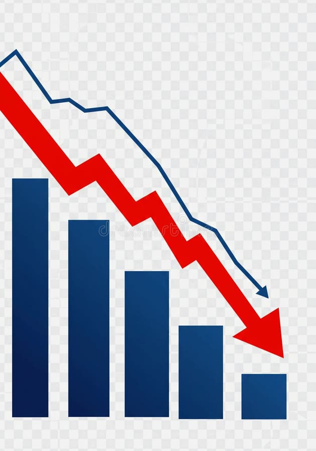
Free with trial This image depicts a bar graph with a clear downward trend. Blue bars decrease in height from left to right, representing a decline in value. A bold red arrow overlays the bars, visually emphasizing the negative trend. A blue line also shows a downward trend. The image conveys a sense of loss, recession, or negative performance and is suitable for illustrating financial or economic concepts. Data decrease illustrations Declining Bar Graph with Downward Trend Lines. This image depicts a bar graph with a clear downward trend. Blue bars decrease in height from left to right, representing a decline in value. A bold red arrow overlays the bars, visually emphasizing the negative trend. A blue line also shows a downward trend. The image conveys a sense of loss, recession, or negative performance and is suitable for illustrating financial or economic concepts.
Free with trial A 3D golden bar chart illustrates a declining trend, with a sharp downward arrow indicating a significant decrease in performance or value. Isolated on a white background. Data decrease illustrations Golden downward trending bar chart with arrow. A 3D golden bar chart illustrates a declining trend, with a sharp downward arrow indicating a significant decrease in performance or value. Isolated on a white background
Free with trial A visual representation of a declining trend, depicted by a blue bar chart with a prominent downward-pointing arrow, indicating a decrease in performance or value. Data decrease illustrations Blue bar chart with a downward trending arrow. A visual representation of a declining trend, depicted by a blue bar chart with a prominent downward-pointing arrow, indicating a decrease in performance or value
Free with trial An illustration of a simple line graph showing a decline or decrease, accompanied by an exclamation mark inside a triangle, indicating a warning, danger or risk. Suitable for topics like financial loss, market crash, or economic downturn. Data decrease vectors Simple Line Decline Graph with Exclamation Mark Attention Icon Design. An illustration of a simple line graph showing a decline or decrease, accompanied by an exclamation mark inside a triangle, indicating a warning, danger or risk. Suitable for topics like financial loss, market crash, or economic downturn.
Free with trial This 3D rendered image features two distinct icons on a clean white background. On the left is a blue thermometer with a white column indicating a low temperature, marked with Celsius degrees. To its right is an orange rounded square icon containing a white downward-pointing arrow, signifying a decrease or reduction. The overall design is simple, modern, and visually clear, suitable for. Data decrease illustrations 3D Icon of a Thermometer Showing Low Temperature Next to a Down Arrow Symbol on White Background. This 3D rendered image features two distinct icons on a clean white background. On the left is a blue thermometer with a white column indicating a low temperature, marked with Celsius degrees. To its right is an orange rounded square icon containing a white downward-pointing arrow, signifying a decrease or reduction. The overall design is simple, modern, and visually clear, suitable for
Free with trial Two glossy, 3D arrows are presented against a white background. The left arrow is red and curves downwards, indicating a decrease or negative direction. The right arrow is orange and curves upwards, signifying an increase or positive direction. The arrows have rounded edges and a smooth, reflective surface. Data decrease illustrations Red downward arrow and orange upward arrow on a white background direction. Two glossy, 3D arrows are presented against a white background. The left arrow is red and curves downwards, indicating a decrease or negative direction. The right arrow is orange and curves upwards, signifying an increase or positive direction. The arrows have rounded edges and a smooth, reflective surface
Free with trial This graphic illustration depicts a stark representation of declining business performance. It features a bar chart with three colorful bars (yellow, orange, green) suggesting varying data points, overlaid with three distinct lines in yellow, blue, and orange, all sharply descending downwards. A prominent red arrow points downwards, emphasizing the negative trend. A small yellow plus sign is also visible, potentially signifying a point of reference or a contrasting element. The clean white background isolates the graphical elements, making them ideal for conveying concepts of loss, recession, or negative growth. Data decrease illustrations Declining Business Graph with Downward Arrows. This graphic illustration depicts a stark representation of declining business performance. It features a bar chart with three colorful bars (yellow, orange, green) suggesting varying data points, overlaid with three distinct lines in yellow, blue, and orange, all sharply descending downwards. A prominent red arrow points downwards, emphasizing the negative trend. A small yellow plus sign is also visible, potentially signifying a point of reference or a contrasting element. The clean white background isolates the graphical elements, making them ideal for conveying concepts of loss, recession, or negative growth.
Free with trial This image depicts a visual representation of financial or business growth and decline using a series of ascending and descending three-dimensional bar charts, where the left side shows smaller bars gradually increasing in height, transitioning through a central flat bar, and shifting to taller bars on the right side that progressively decrease, all set against a plain white background to. Data decrease illustrations Growth and progress concept with ascending and descending bar charts illustrating business success and financial improvement over. This image depicts a visual representation of financial or business growth and decline using a series of ascending and descending three-dimensional bar charts, where the left side shows smaller bars gradually increasing in height, transitioning through a central flat bar, and shifting to taller bars on the right side that progressively decrease, all set against a plain white background to
Free with trial A magnifying glass focuses on a declining bar graph and a file folder, symbolizing a decrease in sales and the need for. Data decrease illustrations Declining Sales Analysis Magnifying Glass, Downward Graph. A magnifying glass focuses on a declining bar graph and a file folder, symbolizing a decrease in sales and the need for.
Free with trial Two sets of simple flat design charts showing bar graphs with line graphs and three-segment pie charts in red, green, and blue. Data decrease vectors Two bar charts with line graphs and two pie charts data visualization statistics. Two sets of simple flat design charts showing bar graphs with line graphs and three-segment pie charts in red, green, and blue
Free with trial An isometric 3D bar graph with three descending steps, made of a glossy, reflective material with a blue and purple gradient. This illustrates a decrease or decline. Concept of financial loss or reduced metrics. Data decrease vectors Blue and Purple Isometric Bar Graph Showing a Downtrend. An isometric 3D bar graph with three descending steps, made of a glossy, reflective material with a blue and purple gradient. This illustrates a decrease or decline. Concept of financial loss or reduced metrics
Free with trial A professional office setting showcasing teamwork in data analysis, emphasizing a digital graph reflecting cost reduction trends over time. Perfect for business concepts. Raster. Data decrease illustrations Business Analysis with Transparent Graph Showing Cost Decrease Over Time with Team Collaborating on Digital Devices in. A professional office setting showcasing teamwork in data analysis, emphasizing a digital graph reflecting cost reduction trends over time. Perfect for business concepts. Raster
Free with trial A collection of nine simple, solid black icons on a white background, illustrating concepts of decline, loss, and negative trends using various charts like bar graphs, line graphs, and pie charts with downward pointing arrows. Data decrease vectors Set of black icons representing financial decrease and downward trends. A collection of nine simple, solid black icons on a white background, illustrating concepts of decline, loss, and negative trends using various charts like bar graphs, line graphs, and pie charts with downward pointing arrows
Free with trial Line art icon featuring a magnifying glass positioned over a vertical bar chart. The design is simple and minimalistic, using grey lines. The bar chart consists of three bars of varying heights, and the magnifying glass is centered over the middle bar, suggesting examination or analysis of data. This icon is likely used to symbolize data analysis, inspection, or detailed observation in a graphical representation. Data decrease vectors Line art icon of magnifying glass over bar chart. Line art icon featuring a magnifying glass positioned over a vertical bar chart. The design is simple and minimalistic, using grey lines. The bar chart consists of three bars of varying heights, and the magnifying glass is centered over the middle bar, suggesting examination or analysis of data. This icon is likely used to symbolize data analysis, inspection, or detailed observation in a graphical representation.
Free with trial A green line graph illustrating data points over time, with the y-axis labeled 'Value' and the x-axis labeled 'Time', showcasing significant ups and downs in the data. Data decrease illustrations Line graph showing fluctuating values over time. A green line graph illustrating data points over time, with the y-axis labeled 'Value' and the x-axis labeled 'Time', showcasing significant ups and downs in the data
Free with trial A comprehensive collection of hand-drawn business and data visualization icons. This doodle-style set features a variety of essential elements, including different types of arrows, bar graphs, line charts, and pie charts. The sketchy, black and white illustrations are perfect for infographics, presentations, financial reports, and marketing materials. Each icon is isolated on a white background, representing concepts like growth, statistics, process flow, and direction. This versatile vector set is ideal for adding a creative, hand-made touch to any project related to analytics, finance, or strategy. Data decrease illustrations Hand Drawn Business and Finance Doodle Icon Set. A comprehensive collection of hand-drawn business and data visualization icons. This doodle-style set features a variety of essential elements, including different types of arrows, bar graphs, line charts, and pie charts. The sketchy, black and white illustrations are perfect for infographics, presentations, financial reports, and marketing materials. Each icon is isolated on a white background, representing concepts like growth, statistics, process flow, and direction. This versatile vector set is ideal for adding a creative, hand-made touch to any project related to analytics, finance, or strategy.
Free with trial An isometric 3D bar chart with four descending bars, made of a clear glass with a modern, holographic, and iridescent finish in pink and blue. Concept of financial decline or decreasing data trends. Data decrease vectors Isometric Bar Chart Showing Decline with Iridescent Bars. An isometric 3D bar chart with four descending bars, made of a clear glass with a modern, holographic, and iridescent finish in pink and blue. Concept of financial decline or decreasing data trends
Free with trial Combining love growth and decline charts, symbolizing relationship ups and downs. Perfect for dating, counseling, and emotional data visualization projects. Data decrease vectors Combining love growth and decline charts, symbolizing relationship ups and downs. Perfect for dating, counseling, and emotional
Free with trial A vibrant red arrow curves downwards, symbolizing a decrease, loss, or negative trajectory in a business or financial context. Data decrease illustrations Red arrow indicating downward trend and decline. A vibrant red arrow curves downwards, symbolizing a decrease, loss, or negative trajectory in a business or financial context
Free with trial Black and white icon of a bar graph with short bars and a downward pointing arrow. Data decrease illustrations Bar graph with short bars and a downward pointing arrow bar chart decrease. Black and white icon of a bar graph with short bars and a downward pointing arrow
Free with trial Three black rectangular bars of decreasing height arranged horizontally on a white background. Data decrease illustrations Three Descending Black Bar Chart Blocks on White Background graph data. Three black rectangular bars of decreasing height arranged horizontally on a white background
Free with trial Black icon of a fluctuating graph with a downward trend arrow on a white background. Data decrease illustrations Black icon of a fluctuating graph with downward trend arrow chart data. Black icon of a fluctuating graph with a downward trend arrow on a white background
Free with trial A vibrant, glossy 3D red arrow points directly downwards, rendered with smooth, rounded edges. The clear, transparent background makes this versatile graphic ideal for various design applications. It effectively symbolizes concepts like decrease, download, decline, navigation, or drawing attention to content below. Perfect for web interfaces, mobile apps, presentations, infographics, and marketing materials requiring a clear directional indicator or a visual representation of downward trends. Data decrease illustrations 3D Red Down Arrow Icon on Transparent Background. A vibrant, glossy 3D red arrow points directly downwards, rendered with smooth, rounded edges. The clear, transparent background makes this versatile graphic ideal for various design applications. It effectively symbolizes concepts like decrease, download, decline, navigation, or drawing attention to content below. Perfect for web interfaces, mobile apps, presentations, infographics, and marketing materials requiring a clear directional indicator or a visual representation of downward trends.
Free with trial A vibrant, bold red arrow points directly downwards, presented in a clean, modern flat design style with a subtle shadow effect giving it a slight three-dimensional appearance. The arrow features a rectangular shaft and a triangular head, making it a clear and universally recognizable symbol. Isolated on a crisp white background, this versatile graphic element is ideal for conveying concepts such as download, scroll down, decrease, navigation, or indicating a downward trend. Perfect for web design, mobile applications, presentations, infographics, and any project requiring a clear directional or action-oriented icon. Data decrease illustrations Red Down Arrow Icon Isolated on White Background. A vibrant, bold red arrow points directly downwards, presented in a clean, modern flat design style with a subtle shadow effect giving it a slight three-dimensional appearance. The arrow features a rectangular shaft and a triangular head, making it a clear and universally recognizable symbol. Isolated on a crisp white background, this versatile graphic element is ideal for conveying concepts such as download, scroll down, decrease, navigation, or indicating a downward trend. Perfect for web design, mobile applications, presentations, infographics, and any project requiring a clear directional or action-oriented icon.
Free with trial A 3D red bar chart shows a declining trend against a white grid background. The bars decrease in height from left to right, with a red line graph following the downward trajectory. Data decrease illustrations Red 3 D bar chart with downward trend line on white grid background graph line graph. A 3D red bar chart shows a declining trend against a white grid background. The bars decrease in height from left to right, with a red line graph following the downward trajectory
Free with trial A visual representation of financial decline, economic downturn, or falling percentages. Three green arrows, shaped like a ribbon, are shown descending, each marked with a percentage symbol. The background is a clean, neutral gray, emphasizing the downward trend. Data decrease illustrations Green arrows with percentage signs pointing downwards symbolizing a decrease in value. A visual representation of financial decline, economic downturn, or falling percentages. Three green arrows, shaped like a ribbon, are shown descending, each marked with a percentage symbol. The background is a clean, neutral gray, emphasizing the downward trend