Free with trial Businessman on percentage sign with falling down. Investor run away from risk collapsing box. Businesswoman presenting idea with graph and visual data on board. Success talent concept. Data decrease vectors Profit Fall in Economic Recession. Avoid Risk. Presenting Visual Data On Board. Businessman on percentage sign with falling down. Investor run away from risk collapsing box. Businesswoman presenting idea with graph and visual data on board. Success talent concept
Free with trial The image shows a striking three-dimensional representation of the number 60 with a percent sign, rendered in a vibrant red color against a plain background. This type of visual is often used to indicate a discount, completion percentage, or statistical data in marketing, presentations, or data visualization. Data decrease illustrations Bold three-dimensional display showing sixty percent discount or completion rate. The image shows a striking three-dimensional representation of the number 60 with a percent sign, rendered in a vibrant red color against a plain background. This type of visual is often used to indicate a discount, completion percentage, or statistical data in marketing, presentations, or data visualization
Free with trial This image depicts a central golden dollar sign symbolizing financial aspects, flanked by a red downward arrow indicating a decline and a green upward arrow showing growth. Additionally, a pie chart with three segments in different colors suggests analysis or distribution of financial data. Data decrease illustrations Visual representation of economic fluctuations and financial performance metrics. This image depicts a central golden dollar sign symbolizing financial aspects, flanked by a red downward arrow indicating a decline and a green upward arrow showing growth. Additionally, a pie chart with three segments in different colors suggests analysis or distribution of financial data
Free with trial A minimalist vertical bar graph on a gray background visually represents the alarming eighty percent decline in Arctic ice volume, with labeled x-axis stating '80% Decline' and y-axis titled 'Arctic Ice Volume', where bars decrease from bottom to top to illustrate dramatic reduction over time for environmental reports, scientific presentations, climate change articles, educational materials, and. Data decrease illustrations Vertical bar graph showing an eighty percent decline in Arctic ice volume with minimalist design on gray background for climate. A minimalist vertical bar graph on a gray background visually represents the alarming eighty percent decline in Arctic ice volume, with labeled x-axis stating '80% Decline' and y-axis titled 'Arctic Ice Volume', where bars decrease from bottom to top to illustrate dramatic reduction over time for environmental reports, scientific presentations, climate change articles, educational materials, and
Free with trial This 3D rendered image presents a simple bar chart composed of four colored cubes: blue, yellow, red, and white. The cubes are arranged in ascending order of height from left to right, with the red cube being the tallest. They stand on a plain white surface, creating a clean and minimalist visual. The image is isolated on a white background. Data decrease illustrations 3D Bar Chart with Blue Yellow Red and White Cubes on White Background graph data. This 3D rendered image presents a simple bar chart composed of four colored cubes: blue, yellow, red, and white. The cubes are arranged in ascending order of height from left to right, with the red cube being the tallest. They stand on a plain white surface, creating a clean and minimalist visual. The image is isolated on a white background
Free with trial Line chart with bars and a red arrow going downwards to signify a financial decrease. Data decrease vectors Declining stock market chart with red arrow indicating loss, economy crisis. Line chart with bars and a red arrow going downwards to signify a financial decrease.
Free with trial A red arrow graph is trending downwards on a dark background, suggesting a decline or decrease in a particular metric or value. Data decrease illustrations Red arrow graph trending downwards on a dark background indicating decline. A red arrow graph is trending downwards on a dark background, suggesting a decline or decrease in a particular metric or value
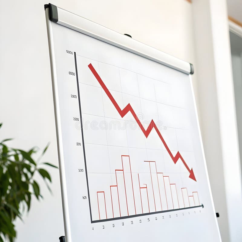
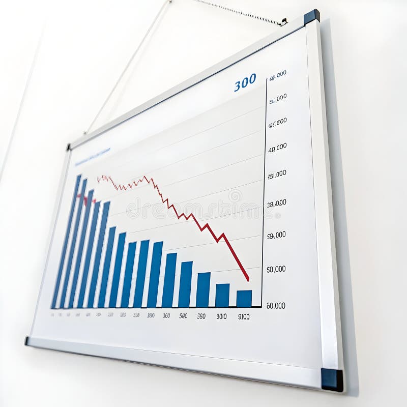
Free with trial The image illustrates a combination of bar and line graphs to represent business performance trends. The bars show an overall upward trend in growth, while the red line indicates a recent decline after a period of increase. This visualization is often used in financial reports, market analysis, or business presentations to depict fluctuations in data over time, such as revenue, market share, or. Data decrease illustrations Growth and decline in business performance visualized with bar and line graphs. The image illustrates a combination of bar and line graphs to represent business performance trends. The bars show an overall upward trend in growth, while the red line indicates a recent decline after a period of increase. This visualization is often used in financial reports, market analysis, or business presentations to depict fluctuations in data over time, such as revenue, market share, or
Free with trial A circular icon with a golden border features a golden DNA double helix on the left and a golden downward-trending graph on the right, set against a black background. The icon represents scientific data or genetic analysis with a negative trend. Data decrease illustrations Golden DNA helix and downward trending graph icon on black circle dna helix genetic. A circular icon with a golden border features a golden DNA double helix on the left and a golden downward-trending graph on the right, set against a black background. The icon represents scientific data or genetic analysis with a negative trend
Free with trial The image shows two large arrows pointing in opposite directions, one red arrow pointing downward with a percent symbol indicating a decrease, and one green arrow pointing upward with a percent symbol indicating an increase. This visual metaphor is often used to represent contrasting financial or statistical trends, such as growth versus decline. Data decrease vectors Graphic illustration of opposing percentage trends with directional arrows. The image shows two large arrows pointing in opposite directions, one red arrow pointing downward with a percent symbol indicating a decrease, and one green arrow pointing upward with a percent symbol indicating an increase. This visual metaphor is often used to represent contrasting financial or statistical trends, such as growth versus decline
Free with trial This image depicts a bar chart with progressively shorter bars from left to right, indicating a downward trend. A large blue arrow points diagonally from the top left to the bottom right, emphasizing the decline. The visual is often used to represent a decrease in values, performance, or market trends. Data decrease illustrations Graphic illustration showing a declining trend with a downward arrow. This image depicts a bar chart with progressively shorter bars from left to right, indicating a downward trend. A large blue arrow points diagonally from the top left to the bottom right, emphasizing the decline. The visual is often used to represent a decrease in values, performance, or market trends
Free with trial The image displays a thick, solid red zigzag arrow that initially trends downward with a sharp angle, then reverses direction and trends upward with another sharp angle. The arrow is filled in solid red and has a bold, thick outline, giving it a strong visual impact. This type of arrow is often used to symbolize fluctuations or volatility in trends, such as in financial charts or data. Data decrease illustrations A bold red zigzag arrow pointing downward and then upward in a sharp angle. The image displays a thick, solid red zigzag arrow that initially trends downward. The image displays a thick, solid red zigzag arrow that initially trends downward with a sharp angle, then reverses direction and trends upward with another sharp angle. The arrow is filled in solid red and has a bold, thick outline, giving it a strong visual impact. This type of arrow is often used to symbolize fluctuations or volatility in trends, such as in financial charts or data
Free with trial Finance concept with blue arrows pointing down and plus symbol representing decrease and increase in business finance abstract symbols. Data decrease vectors Blue 3d arrows down and plus symbol showing growth down and increase finance concept. Finance concept with blue arrows pointing down and plus symbol representing decrease and increase in business finance abstract symbols
Free with trial This image depicts a candlestick chart, a type of financial chart used to describe price movements of securities, derivatives, or currencies. The chart shows a series of green and red vertical bars, with each bar representing a specific time period. The green bars indicate a price increase, while the red bars indicate a price decrease. Each bar has a rectangular body and thin lines, or wicks,. Data decrease illustrations Candlestick chart showing the rise and fall of stock prices over time. This image depicts a candlestick chart, a type of financial chart used to describe price movements of securities, derivatives, or currencies. The chart shows a series of green and red vertical bars, with each bar representing a specific time period. The green bars indicate a price increase, while the red bars indicate a price decrease. Each bar has a rectangular body and thin lines, or wicks,
Free with trial A sophisticated 3D rendered spherical object composed of an intricate network of interconnected lines and evenly spaced dots creates a complex geometric pattern with perfect symmetry, where the center elements are largest and gradually decrease toward the outer edges, all presented against a stark black background that makes the detailed white structure stand out prominently for maximum visual. Data decrease illustrations Abstract 3D rendered spherical network with interconnected lines and dots forming a complex geometric pattern on dark background. A sophisticated 3D rendered spherical object composed of an intricate network of interconnected lines and evenly spaced dots creates a complex geometric pattern with perfect symmetry, where the center elements are largest and gradually decrease toward the outer edges, all presented against a stark black background that makes the detailed white structure stand out prominently for maximum visual
Free with trial An image of a wooden easel holding a whiteboard with a bar graph and a red arrow indicating a downward trend, symbolizing a decrease or decline. Data decrease illustrations A graph on an easel showing a decline in values over time with a downward trend. An image of a wooden easel holding a whiteboard with a bar graph and a red arrow indicating a downward trend, symbolizing a decrease or decline
Free with trial Three bright green arrows with percentage symbols pointing downwards, symbolizing a reduction or discount, isolated on a transparent background. Data decrease vectors Three green downward pointing arrows with percentage symbols indicating a decrease in rates or prices isolated on transparent. Three bright green arrows with percentage symbols pointing downwards, symbolizing a reduction or discount, isolated on a transparent background
Free with trial This image shows a series of five vertical bars that gradually decrease in height and intensity. The bars transition smoothly from a bright orange at the top to a vibrant pink at the bottom, creating a visually appealing gradient effect. The design appears to be three-dimensional with a slight shadow, giving it a modern and polished look. This type of visual representation is often used in data. Data decrease illustrations Graduated color bars descending in height and intensity from orange to pink. This image shows a series of five vertical bars that gradually decrease in height and intensity. The bars transition smoothly from a bright orange at the top to a vibrant pink at the bottom, creating a visually appealing gradient effect. The design appears to be three-dimensional with a slight shadow, giving it a modern and polished look. This type of visual representation is often used in data
Free with trial Bar chart with downward trending arrow, representing loss, decrease, or recession. Data decrease vectors Bar chart with downward trending arrow, representing loss, decrease, or recession
Free with trial Black silhouette of a jagged line graph showing a decrease over time on a white background. Data decrease illustrations Black silhouette of a jagged line graph decreasing over time chart economics. Black silhouette of a jagged line graph showing a decrease over time on a white background
Free with trial Black icon of a bar graph with a downward arrow on a computer monitor screen. Clear details and vibrant colors. Data decrease illustrations Black icon of bar graph with downward arrow on a computer monitor chart data. Black icon of a bar graph with a downward arrow on a computer monitor screen. Clear details and vibrant colors
Free with trial The image depicts a stock chart with a blue background, displaying the fluctuations of a stock's value over a period. The chart includes various data points, such as the opening, closing, high, and low prices, represented by different candlestick patterns. The x-axis represents time, while the y-axis represents the stock price. The chart shows an overall upward trend with some periods of decline. Data decrease illustrations A detailed stock chart showing the rise and fall of a stock\'s value over time. The image depicts a stock chart with a blue background, displaying the fluctuations of a stock's value over a period. The chart includes various data points, such as the opening, closing, high, and low prices, represented by different candlestick patterns. The x-axis represents time, while the y-axis represents the stock price. The chart shows an overall upward trend with some periods of decline
Free with trial A businessman examines a declining cost graph on a laptop, indicating financial analysis and planning Generative AI. Data decrease illustrations Businessman analyzing cost graph on laptop with financial data visualization. A businessman examines a declining cost graph on a laptop, indicating financial analysis and planning Generative AI
Free with trial A business professional analyzes a cost reduction strategy presented as a decreasing bar graph pointing downwards indicating financial efficiency improvement and effective planning He is using a digital pen to examine the data and implement solutions while utilizing a laptop suggesting technological integration for business growth. Data decrease illustrations Cost Reduction Strategy Analysis with Decreasing Bar Graph and Executive Action Plan Showing Efficiency Improvement and Financial. A business professional analyzes a cost reduction strategy presented as a decreasing bar graph pointing downwards indicating financial efficiency improvement and effective planning He is using a digital pen to examine the data and implement solutions while utilizing a laptop suggesting technological integration for business growth
Free with trial Burning candle with oil rigs seeing falling stock market data. Data decrease illustrations Global energy crisis impacting oil prices financial markets. Burning candle with oil rigs seeing falling stock market data
Free with trial Black arrow pointing down with two curved lines on a white background Clear details and vibrant colors enhance. Data decrease illustrations Black downward arrow with curved lines indicating decline or decrease falling. Black arrow pointing down with two curved lines on a white background Clear details and vibrant colors enhance
Free with trial The image depicts a 3D rendering of a green percent sign accompanied by a downward-pointing arrow, symbolizing a reduction or decline in percentage. The objects are set against a dark background with a subtle gradient, highlighting their vibrant green color. Data decrease illustrations A 3d green percent sign with a downward arrow indicating a decrease in percentage. The image depicts a 3D rendering of a green percent sign accompanied by a downward-pointing arrow, symbolizing a reduction or decline in percentage. The objects are set against a dark background with a subtle gradient, highlighting their vibrant green color
Free with trial The image shows a whiteboard with a red bar chart that initially rises and then sharply declines, accompanied by a downward-sloping red arrow. The chart is set against a white background and is placed on a wooden easel stand, indicating a visual representation of a downward trend or decline in data. Data decrease illustrations Whiteboard displaying a declining trend with a red bar chart and downward arrow. The image shows a whiteboard with a red bar chart that initially rises and then sharply declines, accompanied by a downward-sloping red arrow. The chart is set against a white background and is placed on a wooden easel stand, indicating a visual representation of a downward trend or decline in data
Free with trial The image shows four separate bar charts, each with bars of different colors and heights. The first chart features a gradient from orange to red, showing an increasing trend. The second chart has blue bars that increase and then decrease slightly. The third chart uses green bars with a steady upward trend. The fourth chart combines purple and blue bars, showing a fluctuating pattern with an. Data decrease illustrations Colorful bar charts displaying varying data trends across four distinct sets. The image shows four separate bar charts, each with bars of different colors and heights. The first chart features a gradient from orange to red, showing an increasing trend. The second chart has blue bars that increase and then decrease slightly. The third chart uses green bars with a steady upward trend. The fourth chart combines purple and blue bars, showing a fluctuating pattern with an
Free with trial Red Bar Chart on Grunge Background Data Visualization Concept, data analysis, chart , This photo was created using generative AI. design. Data decrease illustrations Red Bar Chart on Grunge Background Data Visualization Concept, data analysis, chart design. Red Bar Chart on Grunge Background Data Visualization Concept, data analysis, chart , This photo was created using generative AI. design
Free with trial This image depicts a bar chart with a symmetrical, bell-shaped distribution. The bars increase in height from the left, peak in the center with the highest bar, and then decrease symmetrically towards the right. This type of chart is often used to represent normal distributions or central tendencies in data sets. Data decrease illustrations A bar chart displaying a distribution with a peak in the middle and tapering ends. This image depicts a bar chart with a symmetrical, bell-shaped distribution. The bars increase in height from the left, peak in the center with the highest bar, and then decrease symmetrically towards the right. This type of chart is often used to represent normal distributions or central tendencies in data sets
Free with trial Wooden numbers representing 96% are placed on a dark wooden surface, with a red downward-pointing arrow positioned beside them. Data decrease illustrations 96% Decrease Shown with Wooden Numbers and Arrow. Wooden numbers representing 96% are placed on a dark wooden surface, with a red downward-pointing arrow positioned beside them.
Free with trial The image shows a central upward-pointing red arrow with a percent sign, indicating an increase, flanked by two downward-pointing red arrows on either side, symbolizing decreases or fluctuations in percentage values. This visual metaphor is often used to represent changes in metrics, financial trends, or statistical variations. Data decrease illustrations Graphic illustrating percentage increase and decrease with directional arrows. The image shows a central upward-pointing red arrow with a percent sign, indicating an increase, flanked by two downward-pointing red arrows on either side, symbolizing decreases or fluctuations in percentage values. This visual metaphor is often used to represent changes in metrics, financial trends, or statistical variations
Free with trial The image shows a bar graph with three bars of decreasing height, representing a downward trend. A red arrow is pointing downwards, emphasizing the decline in values over time. Data decrease illustrations A downward trend graph with a red arrow indicating a decrease in values over time. The image shows a bar graph with three bars of decreasing height, representing a downward trend. A red arrow is pointing downwards, emphasizing the decline in values over time
Free with trial A black graph illustrates valuation extreme low with a downward arrow on a white background. Data decrease illustrations Black graph showing valuation extreme low with downward arrow decline decrease. A black graph illustrates valuation extreme low with a downward arrow on a white background
Free with trial A professional three-dimensional blue arrow icon pointing downwards, set against a clean white background. This glossy graphic is ideal for use in business presentations, web design, and financial reports to represent concepts like download, decrease, or direction. Data decrease illustrations Glossy blue three dimensional down arrow icon for web and presentation graphic. A professional three-dimensional blue arrow icon pointing downwards, set against a clean white background. This glossy graphic is ideal for use in business presentations, web design, and financial reports to represent concepts like download, decrease, or direction
Free with trial Red arrow declining on bar graph, business finance chart, downward trend, recession, financial data, blue background. Data decrease illustrations Red arrow graph showing decline, business finance chart, downward trend, recession. Red arrow declining on bar graph, business finance chart, downward trend, recession, financial data, blue background
Free with trial The image depicts a set of turquoise bars progressively decreasing in height from left to right, accompanied by a large red downward-pointing arrow, symbolizing a downward trend or decline in data. Data decrease illustrations Declining trend represented by a series of descending bars and a downward arrow. The image depicts a set of turquoise bars progressively decreasing in height from left to right, accompanied by a large red downward-pointing arrow, symbolizing a downward trend or decline in data
Free with trial The image shows a whiteboard with a red bar chart that initially rises and then sharply declines, accompanied by a downward-sloping red arrow. The chart is set against a white background and is placed on a wooden easel stand, indicating a visual representation of a downward trend or decline in data. Data decrease illustrations Whiteboard displaying a declining trend with a red bar chart and downward arrow. The image shows a whiteboard with a red bar chart that initially rises and then sharply declines, accompanied by a downward-sloping red arrow. The chart is set against a white background and is placed on a wooden easel stand, indicating a visual representation of a downward trend or decline in data
Free with trial This stylized bar graph shows a downward trending line, representing decrease or loss in a flat graphic style with blue and gray hues. Data decrease vectors Downward trend graph indicating loss or decline in a modern simple style. This stylized bar graph shows a downward trending line, representing decrease or loss in a flat graphic style with blue and gray hues.
Free with trial A stylized black and white illustration shows a bar chart with bars of decreasing height, leading to a sharp downward-pointing arrow. Data decrease vectors Decreasing bar chart with downward arrow decrease downward recession statistics negative. A stylized black and white illustration shows a bar chart with bars of decreasing height, leading to a sharp downward-pointing arrow
Free with trial A 3D rendering of a vibrant red arrow pointing upwards and a bright green arrow pointing downwards, representing market fluctuations, economic changes, and data trends. Data decrease illustrations Red up arrow and green down arrow symbolizing financial market trends growth decline. A 3D rendering of a vibrant red arrow pointing upwards and a bright green arrow pointing downwards, representing market fluctuations, economic changes, and data trends
Free with trial Financial decline: Falling profits, decreasing percentages in economy (yellow down arrow. Data decrease illustrations Declining percentage decrease in percentage and economy with a yellow down arrow, showing a financial decrease, and falling. Financial decline: Falling profits, decreasing percentages in economy (yellow down arrow
Free with trial A visual representation of a steep financial or performance decrease, indicated by a series of descending bars and directional arrows. Data decrease illustrations 3D bar chart showing a significant decline from 100% to 10% with downward arrows. A visual representation of a steep financial or performance decrease, indicated by a series of descending bars and directional arrows
Free with trial A red graph with a downward trend, indicating a decline or decrease, set against a grid background with a prominent red arrow pointing downwards, symbolizing a significant drop or loss. Data decrease illustrations Financial downturn indicated by red graph and downward arrow on grid background. A red graph with a downward trend, indicating a decline or decrease, set against a grid background with a prominent red arrow pointing downwards, symbolizing a significant drop or loss
Free with trial The image shows three bold red downward-pointing arrows, each containing a percent sign, indicating a trend of declining percentages, commonly used in financial or data contexts to represent drops in value, rates, or performance metrics. Data decrease illustrations Three downward arrows symbolizing percentage decreases or reductions in value. The image shows three bold red downward-pointing arrows, each containing a percent sign, indicating a trend of declining percentages, commonly used in financial or data contexts to represent drops in value, rates, or performance metrics
Free with trial A close-up captures a digital tablet displaying vital progress in carbon emission reduction, visualized through dynamic graphs and charts. This image powerfully represents the critical journey toward achieving Net Zero goals. The data, likely analyzing CO2 emissions and the carbon footprint, emphasizes climate change mitigation through renewable energy sources like wind turbines and solar panels. Data decrease illustrations Carbon emission reduction progress displayed on digital tablet illustrating net zero goals sustainability. A close-up captures a digital tablet displaying vital progress in carbon emission reduction, visualized through dynamic graphs and charts. This image powerfully represents the critical journey toward achieving Net Zero goals. The data, likely analyzing CO2 emissions and the carbon footprint, emphasizes climate change mitigation through renewable energy sources like wind turbines and solar panels.
Free with trial A 3D bar chart visually represents a financial or performance decline. The bars decrease in height from left to right, labeled with percentages indicating a downward trend. This graphic signifies loss or reduction. Data decrease illustrations Declining blue bar chart showing percentage decrease from 100 percent downwards. A 3D bar chart visually represents a financial or performance decline. The bars decrease in height from left to right, labeled with percentages indicating a downward trend. This graphic signifies loss or reduction
Free with trial A computer screen shows a graph with red and blue lines. The graph is showing a downward trend, which could indicate a decrease in value or a negative outcome. Scene is somewhat ominous. Data decrease illustrations A computer screen shows a graph with red and blue lines
Free with trial A simple line graph two colored lines, blue and green, with circular data points indicating trends against a white background. Data decrease illustrations Two distinct colored lines with circular markers charting upward and downward trends on a white background. A simple line graph two colored lines, blue and green, with circular data points indicating trends against a white background
Free with trial The image shows a bar graph with a series of decreasing bars, each bar shorter than the previous one, indicating a downward trend. A red arrow extends diagonally from the top left to the bottom right, emphasizing the decline. The graph suggests a significant decrease in value or performance over time. Data decrease illustrations A downward trending graph with a red arrow indicating a significant decline in value. The image shows a bar graph with a series of decreasing bars, each bar shorter than the previous one, indicating a downward trend. A red arrow extends diagonally from the top left to the bottom right, emphasizing the decline. The graph suggests a significant decrease in value or performance over time
Free with trial The image shows two large arrows pointing in opposite directions. The left arrow is red with a downward direction and labeled with a negative percentage sign, indicating a decrease. The right arrow is green with an upward direction and labeled with a positive percentage sign, indicating an increase. The arrows are visually contrasting to represent opposing trends or changes in percentage values. Data decrease vectors Arrows indicating negative and positive percentage changes in contrasting colors. The image shows two large arrows pointing in opposite directions. The left arrow is red with a downward direction and labeled with a negative percentage sign, indicating a decrease. The right arrow is green with an upward direction and labeled with a positive percentage sign, indicating an increase. The arrows are visually contrasting to represent opposing trends or changes in percentage values
Free with trial This image features four graphical elements that symbolize financial growth and decline. The top row displays two percentage signs with arrows indicating upward and downward trends. The bottom row shows two bar graphs, one with an upward trend and the other with a downward trend. These visuals are commonly used in finance to represent changes in data over time. Data decrease illustrations Graphical representation of financial growth and decline. This image features four graphical elements that symbolize financial growth and decline. The top row displays two percentage signs with arrows indicating upward and downward trends. The bottom row shows two bar graphs, one with an upward trend and the other with a downward trend. These visuals are commonly used in finance to represent changes in data over time
Free with trial Financial chart shows falling market data with red and green candlesticks against a dark background, creating a dramatic effect suitable for investment and economic themed visuals. Data decrease illustrations Dramatic Financial Chart with Green and Red Candlesticks on Black Background. Financial chart shows falling market data with red and green candlesticks against a dark background, creating a dramatic effect suitable for investment and economic themed visuals
Free with trial The image depicts a graph with a downward trend, featuring a red arrow that points to a substantial decrease in value. The graph is set against a red gradient background, which adds to the overall sense of decline. Data decrease illustrations A downward trending graph with a red arrow indicating a significant decline in value. The image depicts a graph with a downward trend, featuring a red arrow that points to a substantial decrease in value. The graph is set against a red gradient background, which adds to the overall sense of decline
Free with trial The image depicts five transparent cylindrical bars arranged in ascending order of height. The first four bars increase progressively in height, while the fifth bar, which is the tallest, has a red downward-pointing arrow indicating a decline or decrease. This visual often represents a concept of growth followed by a downturn or setback. Data decrease illustrations A graphical illustration showing a declining trend in ascending cylindrical bars. The image depicts five transparent cylindrical bars arranged in ascending order of height. The first four bars increase progressively in height, while the fifth bar, which is the tallest, has a red downward-pointing arrow indicating a decline or decrease. This visual often represents a concept of growth followed by a downturn or setback
Free with trial A person analyzes a pie chart representing different aspects of the music industry with currency symbols and icons for digital media streaming and content management while a pair of scissors cuts into a segment labeled DECREASE symbolizing financial review and cost cutting measures. Data decrease vectors Business Analysis Evaluating Music Industry Finances and Identifying Cost Reductions. A person analyzes a pie chart representing different aspects of the music industry with currency symbols and icons for digital media streaming and content management while a pair of scissors cuts into a segment labeled DECREASE symbolizing financial review and cost cutting measures
Free with trial Black bars illustrate a decreasing reserve with a downward arrow labeled "burn" on a white background. Data decrease illustrations Black bars showing reserve depletion with burn arrow on white background decrease. Black bars illustrate a decreasing reserve with a downward arrow labeled "burn" on a white background
Free with trial Heights showing black bar chart icon with varying heights on white background keywords: bar chart, graph. Data decrease illustrations Black bar chart icon with varying heights on white background Keywords: bar chart, graph, data. Heights showing black bar chart icon with varying heights on white background keywords: bar chart, graph
Free with trial The image displays a three-dimensional, golden-colored percentage symbol prominently centered against a plain white background. The symbol appears to be slightly raised, giving it a tactile and eye-catching appearance, which emphasizes its importance and significance in contexts like finance, statistics, or data representation. Data decrease illustrations A bold three-dimensional percentage symbol in golden hue against a plain background. The image displays a three-dimensional, golden-colored percentage symbol prominently centered against a plain white background. The symbol appears to be slightly raised, giving it a tactile and eye-catching appearance, which emphasizes its importance and significance in contexts like finance, statistics, or data representation
Free with trial The image displays a stylized percentage symbol (%) with a downward red arrow and an upward green arrow intersecting it. The design suggests a contrast between a decrease and an increase in percentage values, possibly representing financial or statistical fluctuations, trends, or changes over time. The arrows are bold and clearly indicate opposing directions of movement. Data decrease vectors Percentage symbol with downward and upward arrows indicating fluctuation in value. The image displays a stylized percentage symbol (%) with a downward red arrow and an upward green arrow intersecting it. The design suggests a contrast between a decrease and an increase in percentage values, possibly representing financial or statistical fluctuations, trends, or changes over time. The arrows are bold and clearly indicate opposing directions of movement
Free with trial The image depicts a stylized 3D bar chart with alternating red and blue bars representing fluctuations in data trends. The bars ascend and descend, symbolizing periods of growth and decline. The chart has a modern, gradient design with a clear upward trajectory at the end, suggesting recovery or improvement after a period of instability. The visual representation emphasizes the variability and. Data decrease illustrations Dynamic 3d bar chart illustrating fluctuating growth and decline trends over time. The image depicts a stylized 3D bar chart with alternating red and blue bars representing fluctuations in data trends. The bars ascend and descend, symbolizing periods of growth and decline. The chart has a modern, gradient design with a clear upward trajectory at the end, suggesting recovery or improvement after a period of instability. The visual representation emphasizes the variability and
Free with trial Burning candle with oil rigs seeing falling stock market data. Data decrease illustrations Global energy crisis impacting oil prices financial markets. Burning candle with oil rigs seeing falling stock market data
Free with trial The image shows a white easel holding a canvas with a red bar and line graph depicting a declining trend. The graph starts with high bars that gradually decrease in height, transitioning into a downward-sloping line. Beside the easel, there is a small golden trophy, possibly symbolizing achievement or competition. The overall scene suggests a representation of decreasing performance or results. Data decrease illustrations A downward trend graph displayed on an easel with a small golden trophy beside it. The image shows a white easel holding a canvas with a red bar and line graph depicting a declining trend. The graph starts with high bars that gradually decrease in height, transitioning into a downward-sloping line. Beside the easel, there is a small golden trophy, possibly symbolizing achievement or competition. The overall scene suggests a representation of decreasing performance or results
Free with trial Red arrow pointing downward on a light background. Financial graph with falling trend line. Digital stock market data visualization for investment analysis. Data decrease illustrations Red arrow pointing downward on a light background. Financial graph with falling trend line
Free with trial A minimalist black line graph with circular data points and vertical bars is depicted on a white background. Data decrease illustrations Simple black line graph with bars and circles on white background chart statistics. A minimalist black line graph with circular data points and vertical bars is depicted on a white background
Free with trial A blue downward arrow with water droplets appears to be falling onto a transparent podium, symbolizing a drop or decline. Data decrease illustrations Blue downward arrow with water droplets on a transparent podium direction decrease. A blue downward arrow with water droplets appears to be falling onto a transparent podium, symbolizing a drop or decline
Free with trial A stark visual representation of fluctuating interest rates and housing market dynamics. A red arrow points downward, symbolizing a decrease, while a green house features a percentage symbol suggesting a change. Data decrease illustrations Red down arrow and green house with percentage symbols indicating financial trends. A stark visual representation of fluctuating interest rates and housing market dynamics. A red arrow points downward, symbolizing a decrease, while a green house features a percentage symbol suggesting a change
Free with trial A 3D rendered bar chart illustrates a downward trend. Two tall green bars are followed by two shorter pink bars, representing a decrease in value. A bright yellow arrow sharply descends from right to left, crossing over the bars and emphasizing the decline. The composition is set against a solid light blue background. Data decrease illustrations 3D Bar Chart with Falling Yellow Arrow Indicating Decline on Blue Background graph. A 3D rendered bar chart illustrates a downward trend. Two tall green bars are followed by two shorter pink bars, representing a decrease in value. A bright yellow arrow sharply descends from right to left, crossing over the bars and emphasizing the decline. The composition is set against a solid light blue background
Free with trial The image shows a wooden easel holding a whiteboard with a declining trend chart. The chart features a combination of red vertical bars and a downward-sloping red line, indicating a decrease in values over time. The easel stands on a light gray surface, and the chart appears to be used for visual presentations or data analysis. Data decrease illustrations Declining trend chart displayed on an easel with red bar and line graph elements. The image shows a wooden easel holding a whiteboard with a declining trend chart. The chart features a combination of red vertical bars and a downward-sloping red line, indicating a decrease in values over time. The easel stands on a light gray surface, and the chart appears to be used for visual presentations or data analysis
Free with trial This image features a contemporary design of a wifi symbol in a vibrant yellow color. The symbol consists of three curved lines that gradually decrease in size, with a small yellow dot at the bottom. Data decrease illustrations Modern yellow wifi symbol with three curved lines and a dot at the bottom. This image features a contemporary design of a wifi symbol in a vibrant yellow color. The symbol consists of three curved lines that gradually decrease in size, with a small yellow dot at the bottom
Free with trial A downward graph chart showing a decrease, isolated on a white background, perfect for business and financial presentations. Data decrease illustrations Downward graph chart isolated on white background. A downward graph chart showing a decrease, isolated on a white background, perfect for business and financial presentations
Free with trial A downward graph chart showing a decrease, isolated on a white background, perfect for business and financial presentations. Data decrease illustrations Downward graph chart isolated on white background. A downward graph chart showing a decrease, isolated on a white background, perfect for business and financial presentations
Free with trial A 3D bar chart made of red and blue cubes arranged in ascending and descending steps against a white background. Data decrease illustrations 3D Red and Blue Cubes Arranged in Ascending Bar Chart Formation on White graph data. A 3D bar chart made of red and blue cubes arranged in ascending and descending steps against a white background
Free with trial This image displays a series of vertical bars arranged in a gradient color spectrum from green to red. Each bar varies in height, suggesting a comparison of different values or quantities. The bars start tall on the left in green, gradually decrease in height towards the center, and then increase again towards the right, ending with the tallest bar on the far right in red. The gradient color. Data decrease illustrations Colorful bar chart showing varying heights in a gradient spectrum from green to red. This image displays a series of vertical bars arranged in a gradient color spectrum from green to red. Each bar varies in height, suggesting a comparison of different values or quantities. The bars start tall on the left in green, gradually decrease in height towards the center, and then increase again towards the right, ending with the tallest bar on the far right in red. The gradient color
Free with trial A 3D bar chart shows a significant downward trend with a prominent red arrow indicating a steep financial decline and market drop. Data decrease illustrations Financial downturn declining bar chart with red arrow symbolizing loss and decrease. A 3D bar chart shows a significant downward trend with a prominent red arrow indicating a steep financial decline and market drop
Free with trial A 3D rendering shows a bar graph of five columns in pink, blue, and yellow hues illustrating decrease or loss, set against a transparent background. Data decrease vectors Colorful bar graph illustration presenting downward trend on transparent background. A 3D rendering shows a bar graph of five columns in pink, blue, and yellow hues illustrating decrease or loss, set against a transparent background.
Free with trial A bar graph depicting a significant decrease in value or performance, highlighted by a prominent red arrow pointing downwards, indicating a negative trend. Data decrease illustrations Bar graph illustrating a downward trend with a red arrow isolated on white background. A bar graph depicting a significant decrease in value or performance, highlighted by a prominent red arrow pointing downwards, indicating a negative trend