Free with trial Where the price will go up or down. Increase or decrease of the indicator. Market uncertainty and price speculation trends. Forecasting challenges and investor sentiment shifts. Data decrease illustrations Where the price will go up or down. Increase or decrease of the indicator. Market uncertainty and price speculation trends
Free with trial Finance percentage sign hand drawn. statistics increase, decrease ratio, proportion interest finance percentage sign vector sketch. isolated color illustration. Data decrease illustrations Finance percentage sign sketch hand drawn vector. finance percentage sign hand drawn. statistics increase, decrease ratio, proportion interest finance percentage sign vector sketch. isolated color illustration
Free with trial Statistics percentage sign hand drawn. increase decrease, ratio proportion, interest profit statistics percentage sign vector sketch. isolated black illustration. Data decrease vectors Statistics percentage sign sketch hand drawn vector. statistics percentage sign hand drawn. increase decrease, ratio proportion, interest profit statistics percentage sign vector sketch. isolated black illustration
Free with trial Where the price will go up or down. Increase or decrease of the indicator. Market uncertainty and price speculation trends. Forecasting challenges and investor sentiment shifts. Data decrease illustrations Where the price will go up or down. Increase or decrease of the indicator. Market uncertainty and price speculation trends
Free with trial Where the price will go up or down. Increase or decrease of the indicator. Market uncertainty and price speculation trends. Forecasting challenges and investor sentiment shifts. Data decrease illustrations Where the price will go up or down. Increase or decrease of the indicator. Market uncertainty and price speculation trends
Free with trial Where the price will go up or down. Increase or decrease of the indicator. Market uncertainty and price speculation trends. Forecasting challenges and investor sentiment shifts. Data decrease illustrations Where the price will go up or down. Increase or decrease of the indicator. Market uncertainty and price speculation trends
Free with trial Visualizing india's economic downturn with a declining graph on the country's map. it represents a financial crisis, market crash, and recession, showing a downward trend and economic challenges ahead. Data decrease illustrations India economy recession concept showing financial crisis and market crash with declining graph chart data. visualizing india's economic downturn with a declining graph on the country's map. it represents a financial crisis, market crash, and recession, showing a downward trend and economic challenges ahead.
Free with trial This captivating abstract image showcases a glowing digital graph illustrating financial trends and statistical patterns, ideal for technology and business themes. Data decrease illustrations Abstract Digital Financial Graph with Glowing Lines and Data Points Representing Statistics and Market Trends. This captivating abstract image showcases a glowing digital graph illustrating financial trends and statistical patterns, ideal for technology and business themes
Free with trial A red stock market chart displayed on a laptop screen, indicating a crash. The keyboard is visible, suggesting active trading during the downturn. Data decrease illustrations Red stock market crash data finance graph chart keyboard computer technology business investment loss risk. A red stock market chart displayed on a laptop screen, indicating a crash. The keyboard is visible, suggesting active trading during the downturn.
Free with trial Abstract financial background with arrows going down. Concept decrease. Vector illustration. Abstract background with white paper arrows. Data decrease vectors Abstract financial background with arrows Concept decrease. Vector illustration. Abstract financial background with arrows going down. Concept decrease. Vector illustration. Abstract background with white paper arrows.
Free with trial A red financial graph with a descending trend indicates a stock market decline and bearish trends. The digital chart displays negative data, symbolizing loss and potential economic crisis. Data decrease illustrations Red Stock Market Financial Graph Demonstrating Bearish Market Decline and Negative Trends. A red financial graph with a descending trend indicates a stock market decline and bearish trends. The digital chart displays negative data, symbolizing loss and potential economic crisis
Free with trial Contactless credit card payment via NFC wireless technology. Financial graph shows decrease. Digital payment and banking concept. Data decrease vectors Contactless credit card payment with NFC wireless technology and decreasing financial graph chart. Contactless credit card payment via NFC wireless technology. Financial graph shows decrease. Digital payment and banking concept
Free with trial The image showcases a dynamic circular arrangement of percentage symbols in varying sizes and colors. Each symbol includes a positive or negative indicator, emphasizing the duality of increases and decreases. The design is visually striking, with black and red colors dominating the composition, and it appears to be used for illustrating financial metrics, statistical data, or performance. Data decrease illustrations Creative illustration of percentage signs in a circular arrangement with positive and negative indicators. The image showcases a dynamic circular arrangement of percentage symbols in varying sizes and colors. Each symbol includes a positive or negative indicator, emphasizing the duality of increases and decreases. The design is visually striking, with black and red colors dominating the composition, and it appears to be used for illustrating financial metrics, statistical data, or performance
Free with trial A red graph with a downward trend and a large red arrow pointing down. Data decrease illustrations A red graph showing a downward trend with a large red arrow pointing down indicating a decrease or loss. the graph has a jagged. A red graph with a downward trend and a large red arrow pointing down
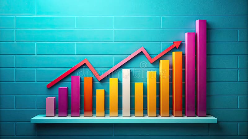
Free with trial Graphic showing 3d bar chart with pink blue and yellow bars on a white card against white background. Data decrease illustrations 3D Bar Chart with Pink Blue and Yellow Bars on a White Card Against White Background Keywords: bar chart, graph, data, statistics. Graphic showing 3d bar chart with pink blue and yellow bars on a white card against white background
Free with trial A series of wooden cylinders with percentage signs on them, arranged in descending order of height, accompanied by a red arrow trending downwards, indicating a decline in percentage values. Data decrease illustrations A visual representation of decreasing percentage values over time, symbolizing a downward trend in financial data. A series of wooden cylinders with percentage signs on them, arranged in descending order of height, accompanied by a red arrow trending downwards, indicating a decline in percentage values
Free with trial The worldwide market is currently facing a financial slowdown, marked by a decrease in currency value, increasing inflation rates, and an economic recession that is moving in a negative direction. Data decrease vectors Global market experiencing financial downturn, showing a currency decline, rising inflation, and economic recession with a. The worldwide market is currently facing a financial slowdown, marked by a decrease in currency value, increasing inflation rates, and an economic recession that is moving in a negative direction
Free with trial A set of twenty-two black chart icons, illustrating various graph types on a white background. The icons feature line graphs, bar graphs, and pie charts, each depicting trends such as growth, decline, and fluctuations. Magnifying glass icons are used to represent analysis. The charts convey concepts of data visualization, statistical analysis, and business metrics tracking. The minimalistic design is characterized by simple, clean lines and solid fill, suitable for use in reports, presentations, or digital interfaces. Data decrease vectors Increase and decrease glyph solid icons collection. A set of twenty-two black chart icons, illustrating various graph types on a white background. The icons feature line graphs, bar graphs, and pie charts, each depicting trends such as growth, decline, and fluctuations. Magnifying glass icons are used to represent analysis. The charts convey concepts of data visualization, statistical analysis, and business metrics tracking. The minimalistic design is characterized by simple, clean lines and solid fill, suitable for use in reports, presentations, or digital interfaces.
Free with trial Cold temperature thermometer, low reading, down arrow icon, claymation style, weather symbol, temperature decrease. Data decrease vectors Thermometer with red mercury indicating low temperature and down arrow icon, claymation style, cold weather concept. Cold temperature thermometer, low reading. Cold temperature thermometer, low reading, down arrow icon, claymation style, weather symbol, temperature decrease
Free with trial A circular heat map showing population density in an urban area, with warmer colors (reds and oranges) representing higher density and cooler colors (yellows and whites) indicating lower density. The map highlights population concentration in the city center with a gradual decrease toward the outskirts, and includes subtle grid lines for spatial reference. Data decrease illustrations Heat map visualization of urban population density distribution isolated on transparent background, isolated on white background. A circular heat map showing population density in an urban area, with warmer colors (reds and oranges) representing higher density and cooler colors (yellows and whites) indicating lower density. The map highlights population concentration in the city center with a gradual decrease toward the outskirts, and includes subtle grid lines for spatial reference
Free with trial Document is being analyzed with a bar graph and pie chart representing market data. Data decrease vectors Document with charts showing market analysis and financial report. Document is being analyzed with a bar graph and pie chart representing market data
Free with trial The graph of the growth and fall of valuable assets is black, three-dimensional, in a modern digital style. Exchange, trading, decrease, increase concept. Generative Ai. Data decrease illustrations The graph of the growth and fall of valuable assets is black, three-dimensional, in a modern digital style. Exchange, trading
Free with trial Laptop screen with two graphs showing opposite trends. Perfect for illustrating financial data, market analysis, business statistics in presentations. Data decrease illustrations Laptop screen with two graphs showing opposite trends.
Free with trial This striking image features a world globe adorned with a red downward arrow, symbolizing global decline. The dark backdrop enhances the impact of the design. Data decrease illustrations Dark Globe with Red Arrow Pointing Downward Symbolizing Decline and Decrease in Global Context on Black Background. This striking image features a world globe adorned with a red downward arrow, symbolizing global decline. The dark backdrop enhances the impact of the design
Free with trial Black and white line icons depicting currency devaluation, falling stocks, and market data analysis. Data decrease vectors Financial downturn and market analysis icons. Black and white line icons depicting currency devaluation, falling stocks, and market data analysis
Free with trial This compelling macro photography showcases a stark decline in investment fund values. The blue cubes, transitioning to red arrows pointing downward, vividly illustrate the negative trends in the stock market. This visual representation of investment data highlights the critical need for in-depth financial analysis and proactive investment strategies. The chart, created using advanced AI. Data decrease illustrations Macro Financial Chart Depicts Declining Investment Funds A Visual Analysis of Market Trends and Potential Risks. This compelling macro photography showcases a stark decline in investment fund values. The blue cubes, transitioning to red arrows pointing downward, vividly illustrate the negative trends in the stock market. This visual representation of investment data highlights the critical need for in-depth financial analysis and proactive investment strategies. The chart, created using advanced AI
Free with trial The image portrays a downward graph representing deflation, symbolizing a period of economic decline and reduced consumer spending , timeless background beauty. Data decrease illustrations Economic Downturn. Deflation is a decrease in the general price level in an economy. The image portrays a downward graph representing deflation, symbolizing a period of economic decline and reduced consumer spending , timeless background beauty
Free with trial Minus 5 percent decrease red arrow. Plus 10 percent increase green arrow. Economic indicators. Financial statistics. Business performance. Market fluctuations shown. Data decrease illustrations Red down arrow with minus 5 percent and green up arrow with plus 10 percent on white background. Minus 5 percent decrease red arrow. Plus 10 percent increase green arrow. Economic indicators. Financial statistics. Business performance. Market fluctuations shown
Free with trial Red downward and green upward percentage-marked arrows. Three-dimensional visual graphs for discounts, interest rates, stock market changes, and economic data. Data decrease illustrations Red downward and green upward percentage-marked arrows. Three-dimensional visual graphs for discounts, interest rates, stock
Free with trial Colorful pie chart is showing positive statistics and business growth, target and financial analysis and marketing report, data with copy space. Data decrease illustrations Colorful pie chart is showing positive statistics and business growth, target and financial analysis and marketing
Free with trial This image showcases a businessman illustrating the concept of cost reduction and profit growth holding graphic elements that represent financial data analysis market performance and strategic planning The composition suggests a focus on improving business outcomes through careful financial management and investment decisions leading to increased profitability and overall success in competitive. Data decrease illustrations Cost reduction and profit growth strategy depicted by businessman with graphic elements indicating financial performance and. This image showcases a businessman illustrating the concept of cost reduction and profit growth holding graphic elements that represent financial data analysis market performance and strategic planning The composition suggests a focus on improving business outcomes through careful financial management and investment decisions leading to increased profitability and overall success in competitive
Free with trial A close-up view of a financial candlestick chart displaying an overall upward trend. The chart features numerous blue and white candlesticks, which represent price movements over specific periods. Blue candlesticks typically indicate a price increase, while white ones suggest a decrease. Overlaying the candlesticks are two smooth lines, one green and one light blue, which are likely moving. Data decrease illustrations Uptrending candlestick chart illustrating financial market growth and stock trading analysis isolated on white background. A close-up view of a financial candlestick chart displaying an overall upward trend. The chart features numerous blue and white candlesticks, which represent price movements over specific periods. Blue candlesticks typically indicate a price increase, while white ones suggest a decrease. Overlaying the candlesticks are two smooth lines, one green and one light blue, which are likely moving
Free with trial Professional vector illustration of downward sloping bar graph and connected dots line represents decreasing profits market loss economic recession data analysis results reduction in growth levels and monthly revenue falling. Data decrease illustrations Descending bar chart icon with line graph showing negative business trends and financial decline on transparent background. Professional vector illustration of downward sloping bar graph and connected dots line represents decreasing profits market loss economic recession data analysis results reduction in growth levels and monthly revenue falling
Free with trial This is a conceptual image showing a persons hand holding a digital graphic with arrows and percentages representing quality cost This image illustrates the dynamic nature of business finance performance and metrics with the potential for both increases and decreases in quality and costs in the modern business landscape. Data decrease illustrations Conceptual Hand Holding Quality Cost Graphic Depicting Increase and Decrease Percentages Representing Business Performance and. This is a conceptual image showing a persons hand holding a digital graphic with arrows and percentages representing quality cost This image illustrates the dynamic nature of business finance performance and metrics with the potential for both increases and decreases in quality and costs in the modern business landscape
Free with trial Blue calculator and gold coins near downward trending blue graph. Financial loss and budget, calculation concept. Business analytics data. Economic recession illustration. Digital accounting. Data decrease illustrations Blue calculator and gold coins near downward trending blue graph. Financial loss and budget calculation concept. Business. Blue calculator and gold coins near downward trending blue graph. Financial loss and budget, calculation concept. Business analytics data. Economic recession illustration. Digital accounting
Free with trial Striking AI-generated visualization of a sharp financial crisis. This 3D render, featuring a bar chart and a glowing downward arrow, clearly communicates economic distress and market volatility, providing essential data imagery for investors and businesses tracking performance decline. Data decrease illustrations Conceptual 3D bar chart illustrating drastic market collapse and financial loss with a glowing downward arrow on a neutral backgro. Striking AI-generated visualization of a sharp financial crisis. This 3D render, featuring a bar chart and a glowing downward arrow, clearly communicates economic distress and market volatility, providing essential data imagery for investors and businesses tracking performance decline.
Free with trial Curved red down arrow and green up arrow icons for visualizing growth, decline, trends, performance metrics, charts, and financial data. Data decrease vectors Curved red down and green up arrows for growth and decline indicators. Curved red down arrow and green up arrow icons for visualizing growth, decline, trends, performance metrics, charts, and financial data
Free with trial Graphic representation of declining business. Bar chart shows falling trend. Arrow points downwards. Silhouettes of people signify workforce reduction. Concept for economic downturn, negative growth, or company challenges. Data decrease illustrations Declining bar chart with downward arrow and silhouettes of people representing decrease in workforce or business performance loss. Graphic representation of declining business. Bar chart shows falling trend. Arrow points downwards. Silhouettes of people signify workforce reduction. Concept for economic downturn, negative growth, or company challenges
Free with trial This vibrant line chart illustrates growth and decline trends with colored circles, making it suitable for business presentations, reports, and educational material. Data decrease illustrations Colorful Line Chart Showing Growth and Decline Trends with Green, Yellow, and Red Circles Representing Data Points over Time. This vibrant line chart illustrates growth and decline trends with colored circles, making it suitable for business presentations, reports, and educational material
Free with trial Elevate your financial presentations and data visualizations with these captivating vintage-style arrow graphics. Perfect for illustrating price fluctuations, interest rate movements, and market trends, these retro-inspired up and down arrow designs are a visually engaging way to convey complex information. The sepia tone and textured background add a touch of vintage charm, bringing a classic. Data decrease illustrations Vintage-Inspired Arrow Graphics for Illustrating Price & Interest Rate Trends: A Retro Style Design Element. Elevate your financial presentations and data visualizations with these captivating vintage-style arrow graphics. Perfect for illustrating price fluctuations, interest rate movements, and market trends, these retro-inspired up and down arrow designs are a visually engaging way to convey complex information. The sepia tone and textured background add a touch of vintage charm, bringing a classic
Free with trial Percentage sign set hand drawn. math calculation, finance statistics, increase decrease percentage sign vector sketch. isolated black illustration. Data decrease vectors Percentage sign set sketch hand drawn vector. percentage sign set hand drawn. math calculation, finance statistics, increase decrease percentage sign vector sketch. isolated black illustration
Free with trial Percentage sign set hand drawn. math calculation, finance statistics, increase decrease percentage sign vector sketch. isolated color illustration. Data decrease illustrations Percentage sign set sketch hand drawn vector. percentage sign set hand drawn. math calculation, finance statistics, increase decrease percentage sign vector sketch. isolated color illustration
Free with trial Percentage sign set hand drawn. math calculation, finance statistics, increase decrease percentage sign vector sketch. isolated color illustration. Data decrease vectors Percentage sign set sketch hand drawn vector. percentage sign set hand drawn. math calculation, finance statistics, increase decrease percentage sign vector sketch. isolated color illustration
Free with trial Percentage sign set hand drawn. math calculation, finance statistics, increase decrease percentage sign vector sketch. isolated black illustration. Data decrease illustrations Percentage sign set sketch hand drawn vector. percentage sign set hand drawn. math calculation, finance statistics, increase decrease percentage sign vector sketch. isolated black illustration
Free with trial Math percentage sign hand drawn. calculation finance, statistics increase, decrease ratio math percentage sign vector sketch. isolated color illustration. Data decrease illustrations Math percentage sign sketch hand drawn vector. math percentage sign hand drawn. calculation finance, statistics increase, decrease ratio math percentage sign vector sketch. isolated color illustration
Free with trial Math percentage sign hand drawn. calculation finance, statistics increase, decrease ratio math percentage sign vector sketch. isolated color illustration. Data decrease vectors Math percentage sign sketch hand drawn vector. math percentage sign hand drawn. calculation finance, statistics increase, decrease ratio math percentage sign vector sketch. isolated color illustration
Free with trial Math percentage sign hand drawn. calculation finance, statistics increase, decrease ratio math percentage sign vector sketch. isolated black illustration. Data decrease illustrations Math percentage sign sketch hand drawn vector. math percentage sign hand drawn. calculation finance, statistics increase, decrease ratio math percentage sign vector sketch. isolated black illustration
Free with trial Featuring four vibrant business charts illustrating increasing, decreasing, fluctuating, and peaking trends, perfect for enhancing presentations and reports with clear visual data analysis. Data decrease vectors Featuring four vibrant business charts illustrating increasing, decreasing, fluctuating, and peaking trends, perfect for
Free with trial Three dimensional bright green arrows pointing downwards with white percentage symbols symbolizing a reduction or sale isolated on a transparent background. Data decrease vectors Three bright green downward pointing arrows with percentage symbols indicating a decrease or discount isolated on transparent. Three dimensional bright green arrows pointing downwards with white percentage symbols symbolizing a reduction or sale isolated on a transparent background
Free with trial A high-quality, hand-drawn vector graphic of a simple red arrow pointing downwards. This versatile image is ideal for various applications, including presentations, websites, social media posts, and infographics. The clean and minimalist style ensures seamless integration into any design project. Perfect for visually representing concepts such as decrease, decline, negative trends, or reduction. Download this royalty-free vector today!. Data decrease illustrations Hand-drawn Red Down Arrow: Simple, Clean Vector Graphic for Presentations, Websites, and Social Media. Perfect for. A high-quality, hand-drawn vector graphic of a simple red arrow pointing downwards. This versatile image is ideal for various applications, including presentations, websites, social media posts, and infographics. The clean and minimalist style ensures seamless integration into any design project. Perfect for visually representing concepts such as decrease, decline, negative trends, or reduction. Download this royalty-free vector today!
Free with trial Symbol percentage sign hand drawn. math calculation, finance statistics, increase decrease symbol percentage sign vector sketch. isolated color illustration. Data decrease illustrations Symbol percentage sign sketch hand drawn vector. symbol percentage sign hand drawn. math calculation, finance statistics, increase decrease symbol percentage sign vector sketch. isolated color illustration
Free with trial Symbol percentage sign hand drawn. math calculation, finance statistics, increase decrease symbol percentage sign vector sketch. isolated black illustration. Data decrease vectors Symbol percentage sign sketch hand drawn vector. symbol percentage sign hand drawn. math calculation, finance statistics, increase decrease symbol percentage sign vector sketch. isolated black illustration
Free with trial This compelling image depicts a visual representation of the current state of the real estate market. Wooden houses, symbolic of residential properties, are nestled within an empty shopping cart. A red downward-trending chart, overlaid with a soft bokeh effect, graphically illustrates the negative market trend. This visual narrative conveys a significant drop in sales, a decrease in property. Data decrease illustrations Wooden Homes in Shopping Cart A Visual Representation of the Declining Real Estate Market and Reduced Demand. This compelling image depicts a visual representation of the current state of the real estate market. Wooden houses, symbolic of residential properties, are nestled within an empty shopping cart. A red downward-trending chart, overlaid with a soft bokeh effect, graphically illustrates the negative market trend. This visual narrative conveys a significant drop in sales, a decrease in property
Free with trial Finance percentage sign hand drawn. statistics increase, decrease ratio, proportion interest finance percentage sign vector sketch. isolated black illustration. Data decrease illustrations Finance percentage sign sketch hand drawn vector. finance percentage sign hand drawn. statistics increase, decrease ratio, proportion interest finance percentage sign vector sketch. isolated black illustration
Free with trial Finance percentage sign hand drawn. statistics increase, decrease ratio, proportion interest finance percentage sign vector sketch. isolated color illustration. Data decrease illustrations Finance percentage sign sketch hand drawn vector. finance percentage sign hand drawn. statistics increase, decrease ratio, proportion interest finance percentage sign vector sketch. isolated color illustration
Free with trial Featuring four vibrant business charts illustrating increasing, decreasing, fluctuating, and peaking trends, perfect for enhancing presentations and reports with clear visual data analysis. Data decrease illustrations Featuring four vibrant business charts illustrating increasing, decreasing, fluctuating, and peaking trends, perfect for
Free with trial This high-quality vector graphic features a simple, hand-drawn red arrow pointing downwards. It's perfect for illustrating decline, decrease, or negative trends in presentations, reports, websites, and infographics. The clean and minimalist style ensures versatility across various design projects. Easily scalable and editable, this vector graphic is a valuable addition to any designer's toolkit. Its simple design makes it suitable for a wide range of applications and audiences. Data decrease illustrations Hand-Drawn Red Down Arrow: Simple, Clean, and Versatile Vector Graphic for Presentations, Websites, and More. Perfect. This high-quality vector graphic features a simple, hand-drawn red arrow pointing downwards. It's perfect for illustrating decline, decrease, or negative trends in presentations, reports, websites, and infographics. The clean and minimalist style ensures versatility across various design projects. Easily scalable and editable, this vector graphic is a valuable addition to any designer's toolkit. Its simple design makes it suitable for a wide range of applications and audiences.
Free with trial Three red arrows with percentage signs pointing down, symbolizing a financial decline or reduction, isolated on a transparent background. Data decrease vectors Three bright red downward pointing arrows with white percentage symbols signifying a decrease in value or interest rates isolated. Three red arrows with percentage signs pointing down, symbolizing a financial decline or reduction, isolated on a transparent background
Free with trial This sleek, minimalist linear bar graph is perfect for showcasing downward trends in your business data. Ideal for presentations, reports, and dashboards, this editable graphic allows you to easily customize stroke width and colors to match your brand. The clean design and simple layout make complex data easily digestible, highlighting key performance indicators and areas needing attention. Data decrease illustrations Editable Linear Bar Graph Visualize Downward Trends for Powerful Business Analytics Reports and Presentations. This sleek, minimalist linear bar graph is perfect for showcasing downward trends in your business data. Ideal for presentations, reports, and dashboards, this editable graphic allows you to easily customize stroke width and colors to match your brand. The clean design and simple layout make complex data easily digestible, highlighting key performance indicators and areas needing attention.
Free with trial Statistics percentage sign hand drawn. increase decrease, ratio proportion, interest profit statistics percentage sign vector sketch. isolated black illustration. Data decrease illustrations Statistics percentage sign sketch hand drawn vector. statistics percentage sign hand drawn. increase decrease, ratio proportion, interest profit statistics percentage sign vector sketch. isolated black illustration
Free with trial Statistics percentage sign hand drawn. increase decrease, ratio proportion, interest profit statistics percentage sign vector sketch. isolated color illustration. Data decrease vectors Statistics percentage sign sketch hand drawn vector. statistics percentage sign hand drawn. increase decrease, ratio proportion, interest profit statistics percentage sign vector sketch. isolated color illustration
Free with trial Statistics percentage sign hand drawn. increase decrease, ratio proportion, interest profit statistics percentage sign vector sketch. isolated black illustration. Data decrease illustrations Statistics percentage sign sketch hand drawn vector. statistics percentage sign hand drawn. increase decrease, ratio proportion, interest profit statistics percentage sign vector sketch. isolated black illustration
Free with trial Calculation percentage sign hand drawn. finance statistics, increase decrease, ratio proportion calculation percentage sign vector sketch. isolated color illustration. Data decrease illustrations Calculation percentage sign sketch hand drawn vector. calculation percentage sign hand drawn. finance statistics, increase decrease, ratio proportion calculation percentage sign vector sketch. isolated color illustration
Free with trial Calculation percentage sign hand drawn. finance statistics, increase decrease, ratio proportion calculation percentage sign vector sketch. isolated color illustration. Data decrease vectors Calculation percentage sign sketch hand drawn vector. calculation percentage sign hand drawn. finance statistics, increase decrease, ratio proportion calculation percentage sign vector sketch. isolated color illustration
Free with trial Calculation percentage sign hand drawn. finance statistics, increase decrease, ratio proportion calculation percentage sign vector sketch. isolated black illustration. Data decrease illustrations Calculation percentage sign sketch hand drawn vector. calculation percentage sign hand drawn. finance statistics, increase decrease, ratio proportion calculation percentage sign vector sketch. isolated black illustration
Free with trial Calculation percentage sign hand drawn. finance statistics, increase decrease, ratio proportion calculation percentage sign vector sketch. isolated color illustration. Data decrease illustrations Calculation percentage sign sketch hand drawn vector. calculation percentage sign hand drawn. finance statistics, increase decrease, ratio proportion calculation percentage sign vector sketch. isolated color illustration
Free with trial Set line Mobile phone Magnifying glass with check mark Laptop browser window Secure your site HTTPS SSL Financial growth decrease Browser shield and Online shopping screen icon. Vector. Data decrease illustrations Set line Mobile phone, Magnifying glass with check mark, Laptop browser window, Secure your site HTTPS, SSL, Financial. Set line Mobile phone Magnifying glass with check mark Laptop browser window Secure your site HTTPS SSL Financial growth decrease Browser shield and Online shopping screen icon. Vector.
Free with trial Decrease icon or logo isolated sign symbol vector illustration - Collection of high quality black style vector icons, seles chart icon isolated sign symbol vector illustration - Collection of high quality. Data decrease vectors Decrease icon or logo isolated sign symbol vector illustration
Free with trial Graphical depiction of declining gold prices Three labeled gold bars on line graph showing downturn trend Red arrow indicates decrease against grid patterned background, suggesting financial or economic analysis related to gold markets For Social Media Post Size. Data decrease illustrations Declining gold prices depicted with red arrow, gold bars, downturn trend. Graphical depiction of declining gold prices Three labeled gold bars on line graph showing downturn trend Red arrow indicates decrease against grid patterned background, suggesting financial or economic analysis related to gold markets For Social Media Post Size
Free with trial Graphical depiction of declining gold prices Three labeled gold bars on line graph showing downturn trend Red arrow indicates decrease against grid patterned background, suggesting financial or economic analysis related to gold markets. Data decrease illustrations Declining gold prices depicted with red arrow, gold bars, downturn trend. Graphical depiction of declining gold prices Three labeled gold bars on line graph showing downturn trend Red arrow indicates decrease against grid patterned background, suggesting financial or economic analysis related to gold markets
Free with trial This graphic illustrates stable bank withdrawals alongside a rising financial trend with coins and bars, Bank withdrawals are currently stable and not showing any significant increase or decrease. Data decrease vectors This graphic illustrates stable bank withdrawals alongside a rising financial trend with coins and bars, Bank withdrawals are
Free with trial A wooden arrow pointing down is on top of a stack of wooden blocks. The arrow represents a downward trend or a decrease in something generated by AI. Data decrease vectors A wooden arrow pointing down is on top of a stack of wooden blocks generated by AI. A wooden arrow pointing down is on top of a stack of wooden blocks. The arrow represents a downward trend or a decrease in something generated by AI
Free with trial Sad businessman trader on stock index chart falling and investor finance loss banner concept. Stressed business man broker on exchange market trading decreasing data fall down graph. Economic crash. Data decrease vectors Sad businessman trader on stock index chart falling and investor finance loss banner concept. Stressed business man
Free with trial Reduction chart icon Vector symbol or sign set collection in black and white outline. Data decrease vectors Decline Chart Icon Illustrating Decrease in Performance, Economic Downturn, and Analytical Data. Reduction chart icon Vector symbol or sign set collection in black and white outline
Free with trial Clean animated bar chart visualizing rising and falling market trends with green bars representing growth, profit, and positive performance, and red bars indicating decline, loss, and negative movement. Symbolizes financial volatility, stock market cycles, economic fluctuations, investment performance, and business analytics. Ideal for illustrating bullish and bearish phases, economic indicators, trading activity, and financial data visualization. Data decrease illustrations Financial Market Trend Animation Showing Upturn and Downturn Phases. Clean animated bar chart visualizing rising and falling market trends with green bars representing growth, profit, and positive performance, and red bars indicating decline, loss, and negative movement. Symbolizes financial volatility, stock market cycles, economic fluctuations, investment performance, and business analytics. Ideal for illustrating bullish and bearish phases, economic indicators, trading activity, and financial data visualization.
Free with trial Declining bar graph with trend line symbolizing financial loss or business decrease. Data decrease illustrations Declining Bar Chart with Downward Trend Line Illustration. Declining bar graph with trend line symbolizing financial loss or business decrease.
Free with trial Bear Market, bearish market trend in stocks. Trade exchange background, down arrow graph for decrease in rates. Global economy crash. Data decrease vectors Bear Market
Free with trial Graph table graphs illustration data variables, time precision, connection interpret graph table graphs. Data decrease illustrations Graph table graphs
Free with trial A 3D icon depicting an orange arrow pointing downwards in a zigzag pattern. The icon suggests downward movement, decline, decrease, or negative progress. It's commonly used to represent falling trends, negative changes, or downward movement in data or statistics. Data decrease vectors Arrow Chart Down 3D Icon. A 3D icon depicting an orange arrow pointing downwards in a zigzag pattern. The icon suggests downward movement, decline, decrease, or negative progress. It's commonly used to represent falling trends, negative changes, or downward movement in data or statistics.
Free with trial A vibrant pink graph line ascends diagonally against a dark background, representing upward growth. The image evokes a sense of dynamic increase. The style is reminiscent of a modern, technological aesthetic. The subtle grid pattern in the background adds depth, created to simulate a data visualizat. Data decrease illustrations Uptrend. A vibrant pink graph line ascends diagonally against a dark background, representing upward growth. The image evokes a sense of dynamic increase. The style is reminiscent of a modern, technological aesthetic. The subtle grid pattern in the background adds depth, created to simulate a data visualizat