Free with trial Red stock market graph plummets on a laptop keyboard, indicating financial loss and market decline, great for business and finance themes. Data decrease illustrations Stock market crash data on laptop keyboard. Red stock market graph plummets on a laptop keyboard, indicating financial loss and market decline, great for business and finance themes
Free with trial A bold, jagged red arrow points downwards, symbolizing a significant decrease or negative trend in a graph or chart. Data decrease illustrations Sharp red arrow indicating downward trend and decline. A bold, jagged red arrow points downwards, symbolizing a significant decrease or negative trend in a graph or chart
Free with trial A collection of eight black and white, hand-drawn or doodle style icons. Each square icon features a different line graph, representing data, analytics, statistics, or financial trends. Data decrease illustrations Set of hand drawn financial chart line graph icons isolated on white. A collection of eight black and white, hand-drawn or doodle style icons. Each square icon features a different line graph, representing data, analytics, statistics, or financial trends
Free with trial The image shows a futuristic analytics display with a stock market graph. the graph, rendered in bright green, shows a sharp downward trend, culminating in a large arrow pointing downwards, indicating a significant crash. the graph is overlaid on a grid of orange lines. the background is dark, with several screens displaying data in the distance. the word "analytics" is visible in the upper right corner, suggesting the image represents a visualization of market data and analysis during a downturn. Data decrease illustrations Stock market crash analytics display scene. the image shows a futuristic analytics display with a stock market graph. the graph, rendered in bright green, shows a sharp downward trend, culminating in a large arrow pointing downwards, indicating a significant crash. the graph is overlaid on a grid of orange lines. the background is dark, with several screens displaying data in the distance. the word "analytics" is visible in the upper right corner, suggesting the image represents a visualization of market data and analysis during a downturn.
Free with trial A vibrant, 3D bar graph with colorful blocks rises against a white background. This modern infographic uses geometric shapes to represent data trends, making it a perfect visual for presentations, rep. Data decrease illustrations Colorful Bar Graph. A vibrant, 3D bar graph with colorful blocks rises against a white background. This modern infographic uses geometric shapes to represent data trends, making it a perfect visual for presentations, rep
Free with trial A vibrant, glossy red 3D percentage symbol stands prominently on a clean white background, casting a subtle shadow. This eye-catching graphic is perfect for conveying concepts of discounts, sales, interest rates, financial growth, or statistical data. Its bold, modern design makes it ideal for marketing campaigns, business presentations, retail promotions, economic reports, or any project requiring a clear and impactful representation of percentages, savings, or performance metrics. Data decrease illustrations Red 3D Percentage Symbol on White Background. A vibrant, glossy red 3D percentage symbol stands prominently on a clean white background, casting a subtle shadow. This eye-catching graphic is perfect for conveying concepts of discounts, sales, interest rates, financial growth, or statistical data. Its bold, modern design makes it ideal for marketing campaigns, business presentations, retail promotions, economic reports, or any project requiring a clear and impactful representation of percentages, savings, or performance metrics.
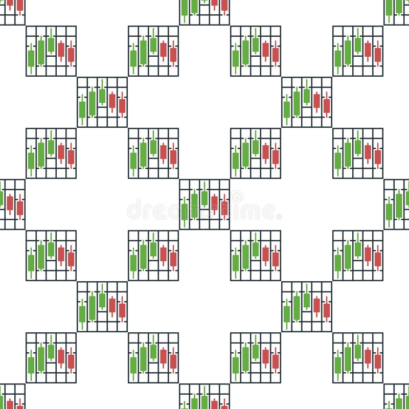
Free with trial Stock Market Data Visualization vector Cryptocurrency Candlestick Chart concept seamless pattern. Data decrease vectors Stock Market Data Visualization vector Cryptocurrency Candlestick Chart seamless pattern
Free with trial A clean, minimalist bar chart illustration set against a solid green background. The chart features three white vertical bars of different heights, representing data points or progress over time. A simple white grid and axes are visible, indicating a clear visual representation of statistics. This versatile graphic is ideal for conveying concepts of business growth, financial analysis, market trends, statistical reporting, or educational content in a modern, easy-to-understand format. Perfect for presentations, infographics, websites, and applications. Data decrease vectors Minimalist Bar Chart Icon on Green Background. A clean, minimalist bar chart illustration set against a solid green background. The chart features three white vertical bars of different heights, representing data points or progress over time. A simple white grid and axes are visible, indicating a clear visual representation of statistics. This versatile graphic is ideal for conveying concepts of business growth, financial analysis, market trends, statistical reporting, or educational content in a modern, easy-to-understand format. Perfect for presentations, infographics, websites, and applications.
Free with trial A minimalist line drawing of a bar chart, representing data, statistics and growth. Simple, bold and clean graphic icon. Data decrease vectors Simple Line Chart Bar Statistic Graphic Icon. A minimalist line drawing of a bar chart, representing data, statistics and growth. Simple, bold and clean graphic icon.
Free with trial A simple and bold black curved arrow icon, isolated on a clean white background. This minimalist graphic element points downwards and to the right, symbolizing direction, movement, and flow. It can represent concepts such as decline, decrease, or a downward trend in business charts and infographics. This versatile vector-style illustration is perfect for use as a pointer, a navigation symbol in web design and user interfaces, or to guide attention in presentations and documents. The high contrast and clean design make it easy to integrate into any project. Data decrease vectors Curved Black Arrow Pointing Down and Right Icon. A simple and bold black curved arrow icon, isolated on a clean white background. This minimalist graphic element points downwards and to the right, symbolizing direction, movement, and flow. It can represent concepts such as decline, decrease, or a downward trend in business charts and infographics. This versatile vector-style illustration is perfect for use as a pointer, a navigation symbol in web design and user interfaces, or to guide attention in presentations and documents. The high contrast and clean design make it easy to integrate into any project.
Free with trial Black outline icon of a stack of papers with a downward arrow, representing data loss or reduction. Data decrease illustrations Arrow pointing down at decreasing stack of documents icon. Black outline icon of a stack of papers with a downward arrow, representing data loss or reduction
Free with trial A comprehensive collection of black and white icons representing various financial and business charts, including bar, line, and pie graphs, for data visualization. Data decrease vectors Assortment of financial and business chart icons. A comprehensive collection of black and white icons representing various financial and business charts, including bar, line, and pie graphs, for data visualization
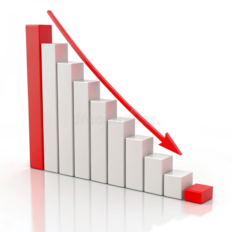
Free with trial This 3D bar graph, generated by AI, visually represents a significant downward trend. The red bars show a decrease in value over time, culminating in a sharp drop indicated by the prominent red arrow. This image is ideal for illustrating economic downturns, market crashes, or any scenario depicting. Data decrease illustrations Declining Bar Graph. This 3D bar graph, generated by AI, visually represents a significant downward trend. The red bars show a decrease in value over time, culminating in a sharp drop indicated by the prominent red arrow. This image is ideal for illustrating economic downturns, market crashes, or any scenario depicting
Free with trial Sad face, downward trend line on graph, atom model, and HTML tag. Ideal for data analysis, failure, decline, coding, education emotions technology as simple flat metaphor. Data decrease vectors Declining Trend Chart with Sad Face and Web Development Symbol. Sad face, downward trend line on graph, atom model, and HTML tag. Ideal for data analysis, failure, decline, coding, education emotions technology as simple flat metaphor
Free with trial A bold, stylized arrow rendered in shades of blue with a smooth gradient, curving downwards and to the right. The arrow features a thick black outline, giving it a graphic and modern appearance. Its dynamic shape suggests movement, direction, or a downward trend. This versatile graphic is perfect for illustrating concepts like decline, progress, navigation, or data flow in presentations, websites, and marketing materials. Data decrease vectors Dynamic Blue Downward Arrow with Gradient Effect. A bold, stylized arrow rendered in shades of blue with a smooth gradient, curving downwards and to the right. The arrow features a thick black outline, giving it a graphic and modern appearance. Its dynamic shape suggests movement, direction, or a downward trend. This versatile graphic is perfect for illustrating concepts like decline, progress, navigation, or data flow in presentations, websites, and marketing materials.
Free with trial A clear and prominent red arrow indicating a downward and rightward direction. Its stark contrast against a clean white backdrop makes it suitable for various data visualization and directional communication needs. Data decrease illustrations Bold red arrow points downward and to the right with a white background. A clear and prominent red arrow indicating a downward and rightward direction. Its stark contrast against a clean white backdrop makes it suitable for various data visualization and directional communication needs
Free with trial A 3D illustration of a downwards statistic chart, isolated on white background, symbolizing decline, loss, or decrease in trends. Data decrease illustrations Statistic down 3D illustration isolated on white background. A 3D illustration of a downwards statistic chart, isolated on white background, symbolizing decline, loss, or decrease in trends
Free with trial A 3D illustration of a downwards statistic chart, isolated on white background, symbolizing decline, loss, or decrease in trends. Data decrease illustrations Statistic down 3D illustration isolated on white background. A 3D illustration of a downwards statistic chart, isolated on white background, symbolizing decline, loss, or decrease in trends
Free with trial Chorgic radiant sales chart in an organic style illustration growth trend, alysis data, performce metrics chorgic radiant sales chart in an organic style. Data decrease illustrations Chorgic radiant sales chart in an organic style
Free with trial A close-up view of a laptop screen showing a stock market crash with candlestick charts and financial data, highlighting market volatility and investment risks - generated AI. Data decrease illustrations Stock market decline displayed on laptop with financial charts. A close-up view of a laptop screen showing a stock market crash with candlestick charts and financial data, highlighting market volatility and investment risks - generated AI
Free with trial A simple graphic depicting a downward trend with four circular data points and a prominent red arrow indicating the direction. Data decrease illustrations Red downward trend line with circles and arrow. A simple graphic depicting a downward trend with four circular data points and a prominent red arrow indicating the direction
Free with trial A simple graphic showing a downward trend with a red line graph and several vertical bars of varying heights and colors. Data decrease vectors Downward trending bar and line graph chart data. A simple graphic showing a downward trend with a red line graph and several vertical bars of varying heights and colors
Free with trial Digital graph showing significant drop in stock prices. Background includes various financial data and email icons, indicating a business or financial context. Data decrease illustrations Digital graph showing significant drop in stock prices
Free with trial Stock Market Data Visualization vector Cryptocurrency Candlestick Chart concept icon or logo element. Data decrease vectors Stock Market Data Visualization vector Cryptocurrency Candlestick Chart icon or logo element
Free with trial A vibrant collection of hand-drawn business charts and graphs, rendered in shades of blue with a sketch-like aesthetic. The set includes various types of visualizations like bar charts, line graphs, pie charts, and donut charts, representing data, growth, and analysis. This versatile illustration is perfect for presentations, reports, infographics, and any project requiring a visual representation of financial or statistical information with a creative, hand-crafted feel. Data decrease illustrations Hand-Drawn Business Charts and Graphs Collection. A vibrant collection of hand-drawn business charts and graphs, rendered in shades of blue with a sketch-like aesthetic. The set includes various types of visualizations like bar charts, line graphs, pie charts, and donut charts, representing data, growth, and analysis. This versatile illustration is perfect for presentations, reports, infographics, and any project requiring a visual representation of financial or statistical information with a creative, hand-crafted feel.
Free with trial 3D colorful pie chart and bar graph on a stack of documents illustrating business data and financial analysis. Perfect for presentations or reports. Data decrease illustrations Colorful 3D Pie Chart and Bar Graph on Documents. 3D colorful pie chart and bar graph on a stack of documents illustrating business data and financial analysis. Perfect for presentations or reports.
Free with trial Business growth presentation with charts and graphs showing progress, statistics, and performance. The image showcases key financial indicators in a clear, concise format. Data decrease vectors Financial Data Analysis Report on Screen Display. Business growth presentation with charts and graphs showing progress, statistics, and performance. The image showcases key financial indicators in a clear, concise format.
Free with trial A striking minimalist geometric design featuring two bold black arrow-like or chevron shapes on a clean white background. The top shape points upwards, while the bottom shape points downwards, separated by a crisp white horizontal band. This abstract symbol creates a sense of direction, movement, and balance. Ideal for use as an icon, logo element, infographic component, or to represent concepts like progress, opposition, flow, or data trends in various design projects, presentations, and digital interfaces. Data decrease vectors Abstract Black Up and Down Chevron Arrows Symbol. A striking minimalist geometric design featuring two bold black arrow-like or chevron shapes on a clean white background. The top shape points upwards, while the bottom shape points downwards, separated by a crisp white horizontal band. This abstract symbol creates a sense of direction, movement, and balance. Ideal for use as an icon, logo element, infographic component, or to represent concepts like progress, opposition, flow, or data trends in various design projects, presentations, and digital interfaces.
Free with trial Futuristic digital illustration of glowing blue arrow pointing downwards. Geometric wireframe design with polygonal facets on dark gradient background representing business trends and data loss. Data decrease vectors Abstract low poly blue arrow pointing down on dark background. Futuristic digital illustration of glowing blue arrow pointing downwards. Geometric wireframe. Futuristic digital illustration of glowing blue arrow pointing downwards. Geometric wireframe design with polygonal facets on dark gradient background representing business trends and data loss
Free with trial The image shows a vibrant orange graph plotted against a dark, abstract background. the graph displays a curve that initially decreases, reaches a minimum, and then increases again. the background features a grid-like structure with vertical and diagonal blue glowing lines, creating a futuristic or technological feel. the overall impression is one of data visualization in a modern, stylized setting. Data decrease illustrations Glowing orange graph on dark abstract background. the image shows a vibrant orange graph plotted against a dark, abstract background. the graph displays a curve that initially decreases, reaches a minimum, and then increases again. the background features a grid-like structure with vertical and diagonal blue glowing lines, creating a futuristic or technological feel. the overall impression is one of data visualization in a modern, stylized setting.
Free with trial The image displays a downward trending blue line with a neon glow, set against a dark, brushed metallic background. the line is jagged, suggesting fluctuations or volatility in the data it represents. spotlights from above illuminate the scene, adding depth and emphasizing the downward direction of the line. the overall impression is one of decline or loss, potentially related to financial markets, performance metrics, or other data sets where a downward trend is significant. Data decrease illustrations Decreasing blue line on dark metallic background. the image displays a downward trending blue line with a neon glow, set against a dark, brushed metallic background. the line is jagged, suggesting fluctuations or volatility in the data it represents. spotlights from above illuminate the scene, adding depth and emphasizing the downward direction of the line. the overall impression is one of decline or loss, potentially related to financial markets, performance metrics, or other data sets where a downward trend is significant.
Free with trial Strategic Decisions: Integrating Business Analytics with Strategic Thinking. This visual portrays the dynamic interaction between business analytics and strategic thinking, showcasing how analytical insights drive strategic planning and decision-making. It emphasizes the synergy between data analysis and strategic foresight in achieving business goals. --chaos 10 --ar 16:9 --style raw --stylize, aesthetic wallpaper background. Data decrease illustrations Colorful Pie Charts and Bar Graphs on a White Paper. Strategic Decisions: Integrating Business Analytics with Strategic Thinking. This visual portrays the dynamic interaction between business analytics and strategic thinking, showcasing how analytical insights drive strategic planning and decision-making. It emphasizes the synergy between data analysis and strategic foresight in achieving business goals. --chaos 10 --ar 16:9 --style raw --stylize, aesthetic wallpaper background
Free with trial A group of the red bar and the line graph shows feelings that fall down, lower, losing, downward, and bear stock market. Background for the economy and data analysis. Data decrease vectors Red Bar Chart and Graph downtrend abstract background. A group of the red bar and the line graph shows feelings that fall down, lower, losing, downward, and bear stock market. Background for the economy and data analysis
Free with trial Close-up of a stock market crash highlighted on a digital screen displaying declining financial data and red trendlines, emphasizing volatility and economic downturn - generated AI. Data decrease illustrations Stock market crash depicted on financial graph with red trendline. Close-up of a stock market crash highlighted on a digital screen displaying declining financial data and red trendlines, emphasizing volatility and economic downturn - generated AI
Free with trial A gleaming golden arrow points downwards in a sharp, angular zigzag shape. The metallic symbol is rendered in 3D and isolated on a clean white background, casting a subtle shadow. This icon represents concepts of decline, loss, or a downward trend in finance, business, or data. Data decrease illustrations Golden Downward Trend Arrow Symbol Isolated on White Background image photo. A gleaming golden arrow points downwards in a sharp, angular zigzag shape. The metallic symbol is rendered in 3D and isolated on a clean white background, casting a subtle shadow. This icon represents concepts of decline, loss, or a downward trend in finance, business, or data
Free with trial A 3D white bar chart shows a significant downward trend indicated by a sharp, angled arrow pointing downwards. The bars decrease in height from left to right, illustrating a concept of decline or loss. The clean white background emphasizes the minimalist design and the stark visual representation of negative growth. Data decrease illustrations 3D White Bar Chart with Downward Trending Arrow on White Background graph decline. A 3D white bar chart shows a significant downward trend indicated by a sharp, angled arrow pointing downwards. The bars decrease in height from left to right, illustrating a concept of decline or loss. The clean white background emphasizes the minimalist design and the stark visual representation of negative growth
Free with trial Contrast exploded view of property value chart high contrast illustration real estate, analysis graph, data visualization contrast exploded view of property value chart high contrast. Data decrease illustrations Contrast exploded view of property value chart high contrast
Free with trial A girl stands confidently, pointing at a finance chart displayed on a large screen. Her expression is focused and determined, highlighting key trends and data that drive her presentation. Data decrease illustrations The girl is pointing at the finance chart. A girl stands confidently, pointing at a finance chart displayed on a large screen. Her expression is focused and determined, highlighting key trends and data that drive her presentation.
Free with trial An infographic illustrates a sharp decline during the winter season. Data decrease vectors Winter Temperature Decrease Chart with Thermometer. An infographic illustrates a sharp decline during the winter season
Free with trial An abstract, three-dimensional white graph line is depicted against a stark white background. The line features sharp, jagged peaks and valleys, clearly illustrating a significant downward trend or decline. The geometric form casts a subtle shadow, adding depth to the minimalist composition. This visual represents concepts of loss, negative performance, or economic downturn. Data decrease illustrations Abstract 3D White Graph Line Showing Downward Trend on White Background chart data. An abstract, three-dimensional white graph line is depicted against a stark white background. The line features sharp, jagged peaks and valleys, clearly illustrating a significant downward trend or decline. The geometric form casts a subtle shadow, adding depth to the minimalist composition. This visual represents concepts of loss, negative performance, or economic downturn
Free with trial Cheerful cartoon businessman reviewing positive financial data upward trending graph. Data decrease illustrations Happy Businessman Analyzing Financial Growth Charts. Cheerful cartoon businessman reviewing positive financial data upward trending graph.
Free with trial This simple vector icon shows a round chart with a bar graph that is decreasing. Data decrease illustrations Round chart icon showing decreasing bar graph for data analysis. This simple vector icon shows a round chart with a bar graph that is decreasing
Free with trial Businessman stick figure character looking bad result presentation chart with red crisis arrow down. failed diagram, bankruptcy, decrease financial problem. hand drawn style doodle illustration. Data decrease vectors Businessman stick figure character looking bad result presentation chart with red crisis arrow down. failed diagram, bankruptcy
Free with trial Red oil barrel with a large red downward arrow beside it, indicating a decrease or decline in oil prices or production. The barrel is metallic with a label indicating 'oil'. The image is digitally created and has a clean background AI generative. Data decrease illustrations Red Oil Barrel and Downward Arrow Decline in Oil Prices. Red oil barrel with a large red downward arrow beside it, indicating a decrease or decline in oil prices or production. The barrel is metallic with a label indicating 'oil'. The image is digitally created and has a clean background AI generative
Free with trial A 3D rendered icon featuring a golden bar graph with a downward trend line and a red arrow indicating a decrease. The graph is set on a black circular background with a prominent gold rim. This symbol represents financial decline, loss, or negative performance. Data decrease illustrations Golden Graph with Downward Trend Arrow on Black Circle with Gold Rim chart falling. A 3D rendered icon featuring a golden bar graph with a downward trend line and a red arrow indicating a decrease. The graph is set on a black circular background with a prominent gold rim. This symbol represents financial decline, loss, or negative performance
Free with trial This abstract 3D rendered image showcases three prominent white candlestick-like objects, symbolizing financial growth and market trends. Positioned against a dark, gridded background, a subtle financial chart with smaller red and white candlesticks and wicks extends into the distance, reinforcing the theme of data analysis and investment. The clean, modern aesthetic makes it ideal for illustrating concepts related to stock market performance, cryptocurrency trading, economic growth, financial planning, and digital business strategies. It effectively conveys ideas of progress, success, and the dynamic nature of global markets. Data decrease illustrations 3D Financial Candlestick Chart Representing Market Growth. This abstract 3D rendered image showcases three prominent white candlestick-like objects, symbolizing financial growth and market trends. Positioned against a dark, gridded background, a subtle financial chart with smaller red and white candlesticks and wicks extends into the distance, reinforcing the theme of data analysis and investment. The clean, modern aesthetic makes it ideal for illustrating concepts related to stock market performance, cryptocurrency trading, economic growth, financial planning, and digital business strategies. It effectively conveys ideas of progress, success, and the dynamic nature of global markets.
Free with trial A vector illustration showing a magnifying glass focused on a bar graph and line chart indicating growth. The magnifying glass has a blue frame and red handle. The chart depicts an upward trend, suggesting positive business performance. This image is suitable for illustrating data analysis, business strategy, market research, and financial growth concepts. Data decrease vectors Analyzing Growth: Magnifying Glass on Business Chart. A vector illustration showing a magnifying glass focused on a bar graph and line chart indicating growth. The magnifying glass has a blue frame and red handle. The chart depicts an upward trend, suggesting positive business performance. This image is suitable for illustrating data analysis, business strategy, market research, and financial growth concepts.
Free with trial Beige mailbox on wooden post with a declining bar graph, suggesting a decrease in mail volume or economic downturn. Image is digitally rendered. Data decrease illustrations Beige Mailbox and Declining Bar Graph on Wooden Post. Beige mailbox on wooden post with a declining bar graph, suggesting a decrease in mail volume or economic downturn. Image is digitally rendered
Free with trial Angled downward arrow with jagged design suggests a declining trend in metallic tones against a clean background Great for illustrating concepts of decrease and downturn. Data decrease illustrations Downward Arrow Graphic Showing Zigzag Trend on White. Angled downward arrow with jagged design suggests a declining trend in metallic tones against a clean background Great for illustrating concepts of decrease and downturn
Free with trial A futuristic concept of financial trading and data analysis. A glowing holographic stock market chart, with candlesticks and graphs, is projected onto a modern office desk. The scene includes a laptop and coffee, set against a large window with a blurry night city skyline. This image represents concepts like fintech, investment, big data, economic growth, and innovative business technology. Ideal for illustrating topics on digital finance, stock exchange, forex trading, and corporate strategy in a high-tech world. Data decrease illustrations Futuristic Financial Trading Hologram on Office Desk. A futuristic concept of financial trading and data analysis. A glowing holographic stock market chart, with candlesticks and graphs, is projected onto a modern office desk. The scene includes a laptop and coffee, set against a large window with a blurry night city skyline. This image represents concepts like fintech, investment, big data, economic growth, and innovative business technology. Ideal for illustrating topics on digital finance, stock exchange, forex trading, and corporate strategy in a high-tech world.
Free with trial This abstract chart, generated by AI, displays a downward trend using a bold red line against a backdrop of scattered points and scribbles. The image suggests a decline or negative correlation, possibly representing economic data or a conceptual illustration. The style is reminiscent of a hand-draw. Data decrease illustrations AI-Generated Abstract Chart. This abstract chart, generated by AI, displays a downward trend using a bold red line against a backdrop of scattered points and scribbles. The image suggests a decline or negative correlation, possibly representing economic data or a conceptual illustration. The style is reminiscent of a hand-draw
Free with trial A hand draws a downward-trending line graph on a chalkboard using chalk, illustrating a negative market trend or decline. This visual representation, generated by AI, is often used to symbolize economic recession, stock market crashes, or other forms of decrease. Data decrease illustrations Downward Trend. A hand draws a downward-trending line graph on a chalkboard using chalk, illustrating a negative market trend or decline. This visual representation, generated by AI, is often used to symbolize economic recession, stock market crashes, or other forms of decrease.
Free with trial A vibrant 3D representation of a business graph and chart, showcasing data analysis and financial trends with colorful bars and a dynamic line, isolated on a clean white background. Data decrease illustrations 3d graph and chart icons isolated on white background. A vibrant 3D representation of a business graph and chart, showcasing data analysis and financial trends with colorful bars and a dynamic line, isolated on a clean white background
Free with trial A blackboard with a graph on it and a potted plant next to it. The graph shows a downward trend, which could represent a decrease in sales or a decline in a particular stock. Data decrease illustrations A blackboard with a graph on it and a potted plant next to it
Free with trial A stylized digital graph depicts fluctuating market trends using bar columns and a connected line with bright orange data points. Data decrease illustrations Abstract digital graph showing financial market trends. A stylized digital graph depicts fluctuating market trends using bar columns and a connected line with bright orange data points
Free with trial Several blue arrows are pointing down, representing a decrease or negative trend. Data decrease vectors Blue arrows pointing down representing negative trend. Several blue arrows are pointing down, representing a decrease or negative trend
Free with trial A stylized chart with bars and a line graph is displayed in a soft speech bubble against a simple background great for business or infographic presentations. Data decrease illustrations Analyzing Data Chart in Speech Bubble for Presentation. A stylized chart with bars and a line graph is displayed in a soft speech bubble against a simple background great for business or infographic presentations
Free with trial Cartoon robot analyzing financial data with a pencil, displayed on a chart and a clipboard, suggesting automation in data analysis and reporting Use for illustrative purposes. Data decrease illustrations Robot Analyzing Business Graph with Pencil on Clipboard. Cartoon robot analyzing financial data with a pencil, displayed on a chart and a clipboard, suggesting automation in data analysis and reporting Use for illustrative purposes
Free with trial A collection of eight black and white, hand-drawn or doodle style icons. Each square icon features a different line graph, representing data, analytics, statistics, or financial trends. Data decrease illustrations Set of hand drawn financial chart line graph icons isolated on white. A collection of eight black and white, hand-drawn or doodle style icons. Each square icon features a different line graph, representing data, analytics, statistics, or financial trends
Free with trial A 3D rendered bar chart displaying a downward trend. The bars, colored black, blue, green, yellow, and orange, decrease in height from left to right. A bold red arrow points downwards, diagonally across the bars, indicating a decline or loss. The chart is presented on a white background. Data decrease illustrations 3D Bar Chart with Red Downward Arrow on White Background. A 3D rendered bar chart displaying a downward trend. The bars, colored black, blue, green, yellow, and orange, decrease in height from left to right. A bold red arrow points downwards, diagonally across the bars, indicating a decline or loss. The chart is presented on a white background
Free with trial A detailed financial chart is presented with numerous vertical bars and multiple overlapping line graphs in blue, white, and orange. Red and green arrows indicate downward and upward movements, respectively, with specific numerical data points displayed. The overall trend shows fluctuations but a general upward trajectory towards the right. Data decrease illustrations Detailed Financial Chart with Upward and Downward Trends. A detailed financial chart is presented with numerous vertical bars and multiple overlapping line graphs in blue, white, and orange. Red and green arrows indicate downward and upward movements, respectively, with specific numerical data points displayed. The overall trend shows fluctuations but a general upward trajectory towards the right
Free with trial A magnifying glass focuses on a digital graph featuring red and orange declining bars and lines, indicating stock market trends. The surrounding environment is filled with digital screens displaying similar financial data, creating an intense, analytical atmosphere. The image highlights the detailed examination of market fluctuations, with vibrant colors contrasting against a computerized background to emphasize the importance of precision in financial analysis. Data decrease illustrations Stock Market Analysis: Magnifying Glass On Declining Graph. A magnifying glass focuses on a digital graph featuring red and orange declining bars and lines, indicating stock market trends. The surrounding environment is filled with digital screens displaying similar financial data, creating an intense, analytical atmosphere. The image highlights the detailed examination of market fluctuations, with vibrant colors contrasting against a computerized background to emphasize the importance of precision in financial analysis.
Free with trial A glowing red arrow depicting a downward trend rests on a blue digital data background illustrating market decline. Data decrease illustrations Illuminated Red Downward Trend Graph Shows Market Decline. A glowing red arrow depicting a downward trend rests on a blue digital data background illustrating market decline
Free with trial Red graph falling down representing stock market crash with data and numbers on dark background. Data decrease illustrations Stock market crashing down with red graph and numbers on dark background. Red graph falling down representing stock market crash with data and numbers on dark background
Free with trial This 3D rendered bar graph, generated by AI, visually represents a downward trend. The red bars progressively decrease in height, illustrating a clear decline. Perfect for illustrating concepts related to loss, decrease, or decline in presentations and reports. Data decrease illustrations Declining Bar Graph. This 3D rendered bar graph, generated by AI, visually represents a downward trend. The red bars progressively decrease in height, illustrating a clear decline. Perfect for illustrating concepts related to loss, decrease, or decline in presentations and reports.
Free with trial Blue downward arrow, circular user avatar, abstract line, and curve visuals. Ideal for analytics, statistics, loss, user activity disengagement performance digital trends. Clean flat metaphor. Data decrease illustrations Downward Arrow and User Avatar Representing Decline or Decrease in User Activity. Blue downward arrow, circular user avatar, abstract line, and curve visuals. Ideal for analytics, statistics, loss, user activity disengagement performance digital trends. Clean flat metaphor
Free with trial A close-up, angled perspective of several printed business reports displaying a variety of financial data. The documents feature colorful pie charts, blue bar graphs, and line graphs tracking performance and statistics. This image is perfect for illustrating concepts such as data analysis, market research, financial planning, investment strategy, and corporate performance review. The detailed charts and figures represent the core of business analytics, accounting, and economic forecasting, making it a versatile background for financial presentations and articles. Data decrease illustrations Business Analytics Report with Financial Charts and Graphs. A close-up, angled perspective of several printed business reports displaying a variety of financial data. The documents feature colorful pie charts, blue bar graphs, and line graphs tracking performance and statistics. This image is perfect for illustrating concepts such as data analysis, market research, financial planning, investment strategy, and corporate performance review. The detailed charts and figures represent the core of business analytics, accounting, and economic forecasting, making it a versatile background for financial presentations and articles.
Free with trial A vibrant 3D rendered image featuring a large, stylized arrow pointing downwards, outlined with bright blue and pink neon lights. The arrow stands on a dark, textured floor, from which glowing parallel lines of similar neon hues extend into the distance, creating a sense of depth and direction. This modern and futuristic graphic is ideal for concepts related to download, direction, data flow, decline, or digital navigation. Generated by AI. Data decrease illustrations Neon Down Arrow and Glowing Lines on Dark Textured Surface. A vibrant 3D rendered image featuring a large, stylized arrow pointing downwards, outlined with bright blue and pink neon lights. The arrow stands on a dark, textured floor, from which glowing parallel lines of similar neon hues extend into the distance, creating a sense of depth and direction. This modern and futuristic graphic is ideal for concepts related to download, direction, data flow, decline, or digital navigation. Generated by AI
Free with trial A bold blue arrow points downwards, indicating a decrease or decline. Attached to the shaft of the arrow is a pink circular icon with a scalloped edge, featuring a white percentage symbol (%) in the center. The graphic is presented on a clean white background, suggesting a concept related to sales, discounts, price reduction, or a negative market trend. Data decrease illustrations Blue Downward Arrow with Pink Percentage Discount Icon on White Background direction. A bold blue arrow points downwards, indicating a decrease or decline. Attached to the shaft of the arrow is a pink circular icon with a scalloped edge, featuring a white percentage symbol (%) in the center. The graphic is presented on a clean white background, suggesting a concept related to sales, discounts, price reduction, or a negative market trend
Free with trial A 3D render of a bar chart displaying a significant downward trend. Blue bars of varying heights represent data points, intersected by a sharp orange line that clearly illustrates a decline over time. The dark, reflective surface below the chart suggests a digital display or a futuristic interface. This image is ideal for representing financial losses, market crashes, performance decline, or negative trends in various industries. Data decrease illustrations Downtrending Bar Chart with Orange Line on Dark Background. A 3D render of a bar chart displaying a significant downward trend. Blue bars of varying heights represent data points, intersected by a sharp orange line that clearly illustrates a decline over time. The dark, reflective surface below the chart suggests a digital display or a futuristic interface. This image is ideal for representing financial losses, market crashes, performance decline, or negative trends in various industries.
Free with trial A 3D figure sits on a platform reviewing financial data, using a laptop to analyze bar graphs, pie charts and line graphs representing business performance and growth. Data decrease illustrations 3D Character Analyzing Business Charts and Graphs on Laptop. A 3D figure sits on a platform reviewing financial data, using a laptop to analyze bar graphs, pie charts and line graphs representing business performance and growth.
Free with trial Three identical green downward-pointing arrows are displayed side-by-side against a black background. Each arrow features a white percent symbol (%) prominently displayed on its surface. The visual suggests a decrease in percentage, a sale, or a financial reduction. Data decrease illustrations Three green downward arrows with percent symbols percentage. Three identical green downward-pointing arrows are displayed side-by-side against a black background. Each arrow features a white percent symbol (%) prominently displayed on its surface. The visual suggests a decrease in percentage, a sale, or a financial reduction
Free with trial Downward arrow with SALE, analytics dashboard, and a cloud icon. Ideal for ecommerce, marketing, analysis, cloud services, business strategy, financial review simple landing page. Data decrease vectors Sales Decline with Data Analytics and Cloud Connectivity for Business Insights. Downward arrow with SALE, analytics dashboard, and a cloud icon. Ideal for ecommerce, marketing, analysis, cloud services, business strategy, financial review simple landing page
Free with trial Thermometer and falling bar chart with a directional arrow symbolizing temperature drop, analysis, and reduction. Ideal for climate change, trends, progress, energy, analytics, business metrics. Data decrease illustrations Thermometer and Declining Bar Chart Representing Cooling Trends and Data Insights. Thermometer and falling bar chart with a directional arrow symbolizing temperature drop, analysis, and reduction. Ideal for climate change, trends, progress, energy, analytics, business metrics
Free with trial A bold red arrow zigzags downwards, symbolizing a significant decrease, loss, or negative trend. Data decrease vectors Red arrow indicating downward trend and decline. A bold red arrow zigzags downwards, symbolizing a significant decrease, loss, or negative trend
Free with trial This image shows a bar graph depicting a downward trend. A red arrow highlights the decrease in quarterly sales from Q1 to Q4, indicating negative growth and financial loss. Data decrease illustrations Declining Bar Graph with Red Arrow Depicts Sales Performance. This image shows a bar graph depicting a downward trend. A red arrow highlights the decrease in quarterly sales from Q1 to Q4, indicating negative growth and financial loss.
Free with trial Downward trend graph with data points, sad face icon, and user profile silhouette. Ideal for business, economy, performance, analytics, customer satisfaction, decision-making simple flat metaphor. Data decrease vectors Declining Business Performance Represented by Graph, Sad Face, and User Profile. Downward trend graph with data points, sad face icon, and user profile silhouette. Ideal for business, economy, performance, analytics, customer satisfaction, decision-making simple flat metaphor
Free with trial Down Downward Trend Chart Drop Line Bar Trending Data Statistic Graph Market Share Stock Line Outline Black White Vector Icon Sign Symbol Graphic Artwork. Data decrease vectors Down Downward Trend Chart Drop Line Bar Trending Data Statistic Graph Market Share Stock Line Outline Black White Vector Icon
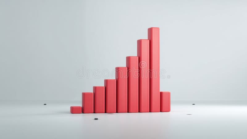
Free with trial A 3D isometric bar chart displaying colorful bars of varying heights on a blue grid base, representing data analysis and business growth, isolated on white. Data decrease illustrations 3d bar chart with colorful bars isolated on white background. A 3D isometric bar chart displaying colorful bars of varying heights on a blue grid base, representing data analysis and business growth, isolated on white
Free with trial This image displays a dynamic business analytics dashboard featuring both bar and line graphs. The bar chart illustrates varying percentages (15%, 50%, 75%, 85%), suggesting performance metrics or growth stages. The line chart, with its intersecting blue lines and data points, represents trends, fluctuations, and comparisons over time or across different categories. The clean, modern design makes it ideal for financial reports, business presentations, and data visualization concepts. Data decrease illustrations Business Growth and Performance Analysis with Bar and Line Charts. This image displays a dynamic business analytics dashboard featuring both bar and line graphs. The bar chart illustrates varying percentages (15%, 50%, 75%, 85%), suggesting performance metrics or growth stages. The line chart, with its intersecting blue lines and data points, represents trends, fluctuations, and comparisons over time or across different categories. The clean, modern design makes it ideal for financial reports, business presentations, and data visualization concepts.