Free with trial A downward arrow made from smoke represents a decline, while bar graphs show reduced economic performance. Decrease performance illustrations Downward arrow made of smoke symbolizes economic loss in dim setting Generative AI. A downward arrow made from smoke represents a decline, while bar graphs show reduced economic performance
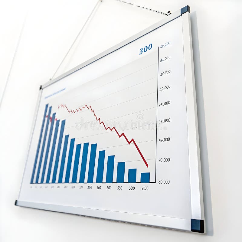
Free with trial A downward trending red arrow crosses a series of blue bars, visually representing a sharp financial decline and negative business performance. Decrease performance illustrations Red arrow declining over blue bar chart symbolizing financial loss and downturn isolated on white background. A downward trending red arrow crosses a series of blue bars, visually representing a sharp financial decline and negative business performance
Free with trial Bar chart showing decreasing bars, with silhouetted heads and a downward arrow. Represents decline, loss, negative trend, recession, or drop in performance. Useful for financial reports, business analysis, or social trends. Decrease performance illustrations Downward trending bar chart with silhouette heads and arrow signifying decline in economy or popularity vector graphic. Bar chart showing decreasing bars, with silhouetted heads and a downward arrow. Represents decline, loss, negative trend, recession, or drop in performance. Useful for financial reports, business analysis, or social trends
Free with trial A 3D rendered bar chart illustrates a downward trend. Two tall green bars are followed by two shorter pink bars, representing a decrease in value. A bright yellow arrow sharply descends from right to left, crossing over the bars and emphasizing the decline. The composition is set against a solid light blue background. Decrease performance illustrations 3D Bar Chart with Falling Yellow Arrow Indicating Decline on Blue Background graph. A 3D rendered bar chart illustrates a downward trend. Two tall green bars are followed by two shorter pink bars, representing a decrease in value. A bright yellow arrow sharply descends from right to left, crossing over the bars and emphasizing the decline. The composition is set against a solid light blue background
Free with trial Colorful bar chart analysis: growth, trends, and data visualization on a wooden table ,Generative ai. Decrease performance illustrations Colorful bar chart data analysis, visualizing growth trends and performance on a wooden table. Colorful bar chart analysis: growth, trends, and data visualization on a wooden table ,Generative ai
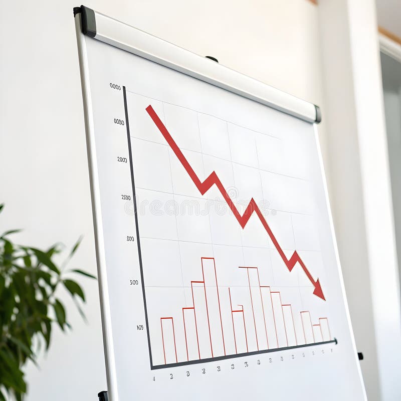
Free with trial The image depicts a bar chart with a superimposed red line showing a clear downward trend. Each bar represents a progressively smaller value, indicating a consistent decrease in data over time. The chart uses a gradient from taller to shorter bars, suggesting a significant drop in the measured quantity, which is reinforced by the downward-sloping line connecting the tops of the bars. Decrease performance illustrations Declining bar chart graph illustrating a downward trend in data values over time. The image depicts a bar chart with a superimposed red line showing a clear downward trend. Each bar represents a progressively smaller value, indicating a consistent decrease in data over time. The chart uses a gradient from taller to shorter bars, suggesting a significant drop in the measured quantity, which is reinforced by the downward-sloping line connecting the tops of the bars
Free with trial A downward trending graph chart isolated on a white background representing decline or negative performance. Decrease performance illustrations Downward graph chart isolated on white background. A downward trending graph chart isolated on a white background representing decline or negative performance
Free with trial A downward graph chart showing a decrease, isolated on a white background, perfect for business and financial presentations. Decrease performance illustrations Downward graph chart isolated on white background. A downward graph chart showing a decrease, isolated on a white background, perfect for business and financial presentations
Free with trial A downward graph chart showing a decrease, isolated on a white background, perfect for business and financial presentations. Decrease performance illustrations Downward graph chart isolated on white background. A downward graph chart showing a decrease, isolated on a white background, perfect for business and financial presentations
Free with trial The image shows a financial dashboard with a stock price chart, a significant upward trend arrow, and various metrics. The chart indicates a stock price of 1,219 with. Decrease performance illustrations Financial dashboard displaying stock market performance with upward trend indicator. The image shows a financial dashboard with a stock price chart, a significant upward trend arrow, and various metrics. The chart indicates a stock price of 1,219 with
Free with trial A 3D bar chart shows a significant downward trend with a prominent red arrow indicating a steep financial decline and market drop. Decrease performance illustrations Financial downturn declining bar chart with red arrow symbolizing loss and decrease. A 3D bar chart shows a significant downward trend with a prominent red arrow indicating a steep financial decline and market drop
Free with trial This image shows a sharp red arrow pointing downward across a financial style chart, suggesting a rapid drop in performance or a sudden shift in economic conditions. The arrow cuts through the center of the layout, drawing attention to the idea of instability or pressure within a financial setting. Behind the chart is a muted city skyline that adds context by hinting at broader urban or corporate environments affected by the decline. The word critical appears at the bottom in bold letters, reinforcing the seriousness of the situation being represented. The combination of the arrow, chart, and city outline creates a clear message about financial stress, market volatility, or urgent business challenges. The overall composition is direct and functional, making it suitable for use in presentations, reports, or articles that discuss downturns, risk exposure, or sudden changes in economic performance. The image can support topics such as market corrections, operational strain, or external events that influence financial outcomes. Its straightforward design helps viewers quickly understand the theme without unnecessary detail. Decrease performance illustrations Red crisis arrow over falling financial chart with critical text and city backdrop. This image shows a sharp red arrow pointing downward across a financial style chart, suggesting a rapid drop in performance or a sudden shift in economic conditions. The arrow cuts through the center of the layout, drawing attention to the idea of instability or pressure within a financial setting. Behind the chart is a muted city skyline that adds context by hinting at broader urban or corporate environments affected by the decline. The word critical appears at the bottom in bold letters, reinforcing the seriousness of the situation being represented. The combination of the arrow, chart, and city outline creates a clear message about financial stress, market volatility, or urgent business challenges. The overall composition is direct and functional, making it suitable for use in presentations, reports, or articles that discuss downturns, risk exposure, or sudden changes in economic performance. The image can support topics such as market corrections, operational strain, or external events that influence financial outcomes. Its straightforward design helps viewers quickly understand the theme without unnecessary detail.
Free with trial The image features declining business graphs illustrated with pie charts and falling arrow indicators, representing financial analysis and reports on downward trends, decreases in performance metrics, and economic risks. It effectively visualizes key data related to investment and marketing losses. This representation has been created using AI. Decrease performance vectors Declining Business Graphs Falling Arrow Chart and Pie Chart for Financial Analysis and Reports. The image features declining business graphs illustrated with pie charts and falling arrow indicators, representing financial analysis and reports on downward trends, decreases in performance metrics, and economic risks. It effectively visualizes key data related to investment and marketing losses. This representation has been created using AI.
Free with trial The a hand with a ring on the ring finger interacting with a digital dashboard displayed on a smartphone, tablet, and laptop screen. The dashboard various analytics charts including bar graphs, line graphs, and pie charts. The data metrics include percentages, numbers, and performance indicators. The screens are set against a dark, blurred background with a glowing, futuristic interface. The color. Decrease performance illustrations Hand interacting with digital dashboard displaying analytics charts and data metrics. The a hand with a ring on the ring finger interacting with a digital dashboard displayed on a smartphone, tablet, and laptop screen. The dashboard various analytics charts including bar graphs, line graphs, and pie charts. The data metrics include percentages, numbers, and performance indicators. The screens are set against a dark, blurred background with a glowing, futuristic interface. The color
Free with trial 3D bar and line chart showing stock market performance with percentage gains and candlestick patterns. Decrease performance vectors Financial stock market growth chart with percentage gains and candlestick indicators. 3D bar and line chart showing stock market performance with percentage gains and candlestick patterns
Free with trial Line Graph Chart Line And Solid Icon Set. Data Analysis, Trend Visualization, And Business Growth Symbol Collection. Statistical Representation And Performance Tracking. Isolated Vector Illustration. Decrease performance vectors Line Graph Chart Line And Solid Icon Set. Data Analysis, Trend Visualization, And Business Growth Symbol Collection
Free with trial The image displays three bold red arrows pointing downward, each containing a percentage symbol. This visual metaphor typically represents a decline, reduction, or drop in percentage-based metrics, often used in financial contexts to indicate decreases in stocks, interest rates, or other economic indicators. Decrease performance illustrations Three downward arrows symbolizing a decrease in percentage values or financial decline. The image displays three bold red arrows pointing downward, each containing a percentage symbol. This visual metaphor typically represents a decline, reduction, or drop in percentage-based metrics, often used in financial contexts to indicate decreases in stocks, interest rates, or other economic indicators
Free with trial This image presents a simple visual showing a falling financial trend, using a red arrow that moves downward in a stepped motion to suggest a steady reduction over time. The arrow sits above the words financial decline, which reinforces the theme of reduced performance or weakening conditions. The pale background and central dividing line help keep the focus on the arrow and text, making the message clear without distraction. The overall layout communicates the idea of shrinking results, reduced revenue, or broader economic pressure. This type of visual is often used in reports, presentations, and articles that discuss downturns, risk, or negative outcomes in business or economic settings. The clean style makes it suitable for a wide range of professional uses where a direct and uncomplicated representation of loss or reduction is needed. The image can support topics such as market shifts, budget cuts, operational challenges, or general financial stress. It can also be used to highlight the impact of external factors that influence performance, helping viewers quickly understand the direction of change being described. Decrease performance illustrations Red downward arrow chart showing financial decline trend with financial decline text on pale background. This image presents a simple visual showing a falling financial trend, using a red arrow that moves downward in a stepped motion to suggest a steady reduction over time. The arrow sits above the words financial decline, which reinforces the theme of reduced performance or weakening conditions. The pale background and central dividing line help keep the focus on the arrow and text, making the message clear without distraction. The overall layout communicates the idea of shrinking results, reduced revenue, or broader economic pressure. This type of visual is often used in reports, presentations, and articles that discuss downturns, risk, or negative outcomes in business or economic settings. The clean style makes it suitable for a wide range of professional uses where a direct and uncomplicated representation of loss or reduction is needed. The image can support topics such as market shifts, budget cuts, operational challenges, or general financial stress. It can also be used to highlight the impact of external factors that influence performance, helping viewers quickly understand the direction of change being described.
Free with trial This image depicts a bar chart transitioning from green to red bars, representing a shift from positive growth to decline. Overlaid green and red line graphs emphasize the upward trend followed by a downward trend, symbolizing financial success turning into loss, often seen in market analysis or business performance evaluations. Decrease performance vectors Graphic illustration of financial growth and subsequent decline using bar and line charts. This image depicts a bar chart transitioning from green to red bars, representing a shift from positive growth to decline. Overlaid green and red line graphs emphasize the upward trend followed by a downward trend, symbolizing financial success turning into loss, often seen in market analysis or business performance evaluations
Free with trial The image displays two sets of vertical bars, one in green and one in red, each accompanied by arrows indicating trends. The green bars show an initial decrease followed by an increase, while the red bars show an initial increase followed by a decrease. The visual is labeled 'Word 100' at the bottom right, potentially indicating a specific data point or category. Decrease performance illustrations Comparison of increasing and decreasing bar trends in a visual chart labeled word 100. The image displays two sets of vertical bars, one in green and one in red, each accompanied by arrows indicating trends. The green bars show an initial decrease followed by an increase, while the red bars show an initial increase followed by a decrease. The visual is labeled 'Word 100' at the bottom right, potentially indicating a specific data point or category
Free with trial The image shows a person holding a tablet displaying a bar chart with two distinct data sets, one in red and one in blue, indicating a comparison of metrics or trends. The person appears to be in an office environment, possibly analyzing financial or business data, suggesting a focus on performance metrics or market analysis. Decrease performance illustrations Professional analyzing financial growth trends on a digital tablet in an office setting. The image shows a person holding a tablet displaying a bar chart with two distinct data sets, one in red and one in blue, indicating a comparison of metrics or trends. The person appears to be in an office environment, possibly analyzing financial or business data, suggesting a focus on performance metrics or market analysis
Free with trial The image displays two contrasting zigzag arrows, one green ascending arrow and one red descending arrow, symbolizing opposing trends or market movements. The green arrow indicates growth, increase, or positive progression, while the red arrow signifies decline, decrease, or negative progression. This visual is often used in financial contexts to represent bullish and bearish market trends,. Decrease performance illustrations Contrasting upward and downward zigzag arrows representing market or trend fluctuations. The image displays two contrasting zigzag arrows, one green ascending arrow and one red descending arrow, symbolizing opposing trends or market movements. The green arrow indicates growth, increase, or positive progression, while the red arrow signifies decline, decrease, or negative progression. This visual is often used in financial contexts to represent bullish and bearish market trends,
Free with trial Visualization helps you track embedding space similarity over time, identify when cosine similarity drops below a critical threshold, and take action before performance declines. Decrease performance illustrations Embedding Drift Monitoring Dashboard Track Model Version Similarity & Auto Reindex Alerts. visualization helps you track embedding space similarity over time, identify when cosine similarity drops below a critical threshold, and take action before performance declines.
Free with trial The image depicts a bar chart with bars of varying heights and colors transitioning from tall red to shorter blue, overlaid with a downward sloping arrow. This combination suggests a trend of decreasing performance, possibly indicating a decline in growth, market share, or profitability despite initial strong performance. The visual metaphor emphasizes the transition from a high peak to a downward. Decrease performance illustrations A visual representation of declining growth amidst rising competition or market shifts. The image depicts a bar chart with bars of varying heights and colors transitioning from tall red to shorter blue, overlaid with a downward sloping arrow. This combination suggests a trend of decreasing performance, possibly indicating a decline in growth, market share, or profitability despite initial strong performance. The visual metaphor emphasizes the transition from a high peak to a downward
Free with trial A businessman in a suit is intently working on a laptop, analyzing financial data displayed with charts and graphs, including a prominent red percentage symbol and a downward-pointing arrow, indicating a decline in performance or value. Decrease performance illustrations Businessman Analyzing Financial Data with Decreasing Percentage and Bar Graphs on Laptop. A businessman in a suit is intently working on a laptop, analyzing financial data displayed with charts and graphs, including a prominent red percentage symbol and a downward-pointing arrow, indicating a decline in performance or value
Free with trial A 3D illustration shows a business professional in a suit and cap pointing at a screen displaying a downward trend chart, a pie chart with a red cross, and a down arrow. Gold coins are scattered around the base of the stand, emphasizing financial or investment concerns. Decrease performance illustrations Business professional presenting a declining financial performance chart with gold coins. A 3D illustration shows a business professional in a suit and cap pointing at a screen displaying a downward trend chart, a pie chart with a red cross, and a down arrow. Gold coins are scattered around the base of the stand, emphasizing financial or investment concerns
Free with trial The image depicts a series of cryptocurrency logos, including Bitcoin and others, arranged along a bold red downward-sloping arrow. This visual metaphor suggests a decline or drop in cryptocurrency values or market performance, emphasizing a downward trend in prices. Decrease performance illustrations Cryptocurrency coins descending along a downward sloping arrow indicating market decline. The image depicts a series of cryptocurrency logos, including Bitcoin and others, arranged along a bold red downward-sloping arrow. This visual metaphor suggests a decline or drop in cryptocurrency values or market performance, emphasizing a downward trend in prices
Free with trial The image depicts a cityscape at dusk with a red downward trend arrow superimposed over a graph and chart, indicating a decline in financial market performance. The city skyline features several tall buildings with lit windows, and the sky transitions from dark blue to orange. The overall mood is one of economic downturn and financial uncertainty. Decrease performance illustrations A red downward trend arrow indicates a decline in financial market performance at dusk in a city. The image depicts a cityscape at dusk with a red downward trend arrow superimposed over a graph and chart, indicating a decline in financial market performance. The city skyline features several tall buildings with lit windows, and the sky transitions from dark blue to orange. The overall mood is one of economic downturn and financial uncertainty.
Free with trial The image depicts a red bar graph on a transparent background with a downward trend, indicating a decrease in values. The graph features a series of red bars of varying heights, with a red arrow pointing downwards to emphasize the decline. Decrease performance illustrations A red bar graph showing a significant decline in values over time with a downward trend arrow. The image depicts a red bar graph on a transparent background with a downward trend, indicating a decrease in values. The graph features a series of red bars of varying heights, with a red arrow pointing downwards to emphasize the decline
Free with trial A bar graph depicting a downward trend with a red arrow overlay, indicating a substantial decrease. Decrease performance illustrations Graph showing a significant decline in values over time with a red arrow pointing downwards. A bar graph depicting a downward trend with a red arrow overlay, indicating a substantial decrease
Free with trial This image depicts a clear downward trend in statistics, signifying loss or poor results and illustrating economic challenges. Decrease performance illustrations A dramatic decline in financial performance represented by a red arrow and decreasing bar graph. This image depicts a clear downward trend in statistics, signifying loss or poor results and illustrating economic challenges
Free with trial A businessman analyzes a declining business showing financial loss. He uses a laptop to study financial data charts illustrating a downward trend and falling figures. This image effectively conveys concepts of failure, risk, and economic decline, suitable for business and finance publications. Decrease performance illustrations Businessman analyzing declining business performance using laptop and financial data charts. A businessman analyzes a declining business showing financial loss. He uses a laptop to study financial data charts illustrating a downward trend and falling figures. This image effectively conveys concepts of failure, risk, and economic decline, suitable for business and finance publications
Free with trial Green line graph on a pink background with a downward arrow. Business trend showing decline and fall. Financial analysis and performance concept. Decrease performance illustrations Green line graph on a pink background with a downward arrow. Business trend showing decline and fall
Free with trial A digital illustration of a bar graph with yellow bars decreasing in height from left to right, overlaid with a jagged red line connecting the top of each bar and ending in a downward-pointing arrow, symbolizing a negative trend or loss. Decrease performance illustrations A downward trending bar chart showing a consistent decline in performance metrics over a period. A digital illustration of a bar graph with yellow bars decreasing in height from left to right, overlaid with a jagged red line connecting the top of each bar and ending in a downward-pointing arrow, symbolizing a negative trend or loss
Free with trial A digital illustration of a bar graph with yellow bars decreasing in height from left to right, overlaid with a jagged red line connecting the top of each bar and ending in a downward-pointing arrow, symbolizing a negative trend or loss. Decrease performance illustrations A downward trending bar chart showing a consistent decline in performance metrics over a period. A digital illustration of a bar graph with yellow bars decreasing in height from left to right, overlaid with a jagged red line connecting the top of each bar and ending in a downward-pointing arrow, symbolizing a negative trend or loss
Free with trial A 3D rendered red arrow points downward across a white grid background with blue bar graph elements. The bars decrease in height from left to right, indicating a downward trend. Decrease performance illustrations Red arrow graph chart showing decline on white grid background with blue bars downward trend. A 3D rendered red arrow points downward across a white grid background with blue bar graph elements. The bars decrease in height from left to right, indicating a downward trend
Free with trial The image shows a three-dimensional bar chart with alternating red and green bars, each varying in height. The bars are arranged on a green circular base, suggesting a comparison of data points, possibly financial metrics like stock prices, market performance, or growth analysis. The red bars indicate a decline or negative value, while the green bars suggest an increase or positive value. Decrease performance illustrations Colorful 3d bar chart illustration depicting financial market trends or growth metrics. The image shows a three-dimensional bar chart with alternating red and green bars, each varying in height. The bars are arranged on a green circular base, suggesting a comparison of data points, possibly financial metrics like stock prices, market performance, or growth analysis. The red bars indicate a decline or negative value, while the green bars suggest an increase or positive value
Free with trial This is a minimalist, high-contrast black icon depicting a bar chart with an overlaying arrow pointing downwards, symbolizing a decline, recession, loss, or negative financial performance. Decrease performance vectors A black and white icon representing a downward trend in a financial bar chart or business analysis. This is a minimalist, high-contrast black icon depicting a bar chart with an overlaying arrow pointing downwards, symbolizing a decline, recession, loss, or negative financial performance
Free with trial A clean, vector-style icon featuring a bar chart that displays a clear downward trend, symbolizing economic decline, financial loss, or diminishing performance metrics in a professional or digital context. Decrease performance vectors A minimalist black and white icon showing a downward trend bar chart representing financial loss. A clean, vector-style icon featuring a bar chart that displays a clear downward trend, symbolizing economic decline, financial loss, or diminishing performance metrics in a professional or digital context
Free with trial Performance showing colorful graph with magnifying glass and pie chart on white background keywords: graph, chart, data, analytics, statistics. Decrease performance illustrations Colorful graph with magnifying glass and pie chart on white background Keywords: graph, chart, data, analytics
Free with trial The image depicts a series of stacks of gold coins progressively decreasing in height from left to right, accompanied by a large red downward arrow. This visual metaphorically represents a decline in financial growth, savings, or economic performance over time. Decrease performance illustrations Declining financial growth represented by diminishing stacks of gold coins and downward arrow. The image depicts a series of stacks of gold coins progressively decreasing in height from left to right, accompanied by a large red downward arrow. This visual metaphorically represents a decline in financial growth, savings, or economic performance over time
Free with trial A striking red downward arrow is prominently placed on a chart highlighting a notable decrease in financial metrics over time suggesting a troubling trend in market analysis. Decrease performance illustrations A striking red downward arrow is prominently placed on a chart highlighting a notable decrease in financial metrics over time
Free with trial Green screen chart analysis, data visualization, metrics tracking, business growth ,Generative ai. Decrease performance illustrations Green screen chart analysis, datadriven insights for business growth and performance tracking. Green screen chart analysis, data visualization, metrics tracking, business growth ,Generative ai
Free with trial Bar chart illustrates financial decline. Dollar coin and downward arrow indicate loss and economic downturn. Represents decreasing revenue, poor performance and market slump. Decrease performance illustrations Declining bar chart with dollar coin and downward arrow showing financial loss and economic downturn. Bar chart illustrates financial decline. Dollar coin and downward arrow indicate loss and economic downturn. Represents decreasing revenue, poor performance and market slump
Free with trial Close up of a business professional in a blue suit presenting a digital graphic with arrows showing increase in quality and decrease in cost with percentage signs for business efficiency financial planning and effective strategies. Decrease performance illustrations Hand presenting digital arrows pointing up for quality and down for cost in business strategy concept. Close up of a business professional in a blue suit presenting a digital graphic with arrows showing increase in quality and decrease in cost with percentage signs for business efficiency financial planning and effective strategies
Free with trial This image shows several stacks of coins arranged from low to high, with a red arrow moving downward across the scene to indicate a drop in financial value. The coins are placed in a clean layout that highlights the contrast between growth and decline, creating a clear message about shifting economic conditions. The soft background helps keep attention on the arrow and the stacks, making the theme easy to understand. The downward motion suggests reduced performance, shrinking returns, or pressure within a financial setting. The combination of metal coins and a bold arrow gives the image a practical feel that can be used in discussions about budgeting, investment changes, or market adjustments. It can also support topics related to planning, forecasting, or understanding how external factors influence financial outcomes. The simple structure makes the message direct without adding unnecessary detail, allowing viewers to quickly grasp the idea of a downward trend. Decrease performance illustrations Descending red arrow over stacked coins showing market value decline on soft gradient background. This image shows several stacks of coins arranged from low to high, with a red arrow moving downward across the scene to indicate a drop in financial value. The coins are placed in a clean layout that highlights the contrast between growth and decline, creating a clear message about shifting economic conditions. The soft background helps keep attention on the arrow and the stacks, making the theme easy to understand. The downward motion suggests reduced performance, shrinking returns, or pressure within a financial setting. The combination of metal coins and a bold arrow gives the image a practical feel that can be used in discussions about budgeting, investment changes, or market adjustments. It can also support topics related to planning, forecasting, or understanding how external factors influence financial outcomes. The simple structure makes the message direct without adding unnecessary detail, allowing viewers to quickly grasp the idea of a downward trend.
Free with trial The image depicts a downward trend using a combination of bar and line chart elements. The yellow bars gradually decrease in height from left to right, indicating a consistent decline. A red line overlays the bars, further emphasizing the downward trajectory, ending with a large red arrow pointing downwards to signify a significant drop. This visual representation is often used to show reductions. Decrease performance illustrations Declining trend illustrated through bar and line chart visualization isolated on white background. The image depicts a downward trend using a combination of bar. The image depicts a downward trend using a combination of bar and line chart elements. The yellow bars gradually decrease in height from left to right, indicating a consistent decline. A red line overlays the bars, further emphasizing the downward trajectory, ending with a large red arrow pointing downwards to signify a significant drop. This visual representation is often used to show reductions
Free with trial This image depicts various financial concepts using graphical icons on mobile devices. It includes illustrations of rising and falling trends, balanced scales, growth, and investment themes, possibly representing market analysis, stock performance, investment growth, and financial balance. Decrease performance illustrations Financial trends and investment concepts illustrated with modern icons isolated on white background. This image depicts various financial concepts using graphical icons on mobile devices. It includes illustrations of rising and falling trends, balanced scales, growth, and investment themes, possibly representing market analysis, stock performance, investment growth, and financial balance
Free with trial A minimalist illustration showing a decreasing bar graph with an arrow, and a magnifying glass over a dollar sign. Flat style with grey and orange. Decrease performance vectors Economic Downturn and Financial Analysis: Decrease Graph with Magnifying Glass Over Dollar Sign. A minimalist illustration showing a decreasing bar graph with an arrow, and a magnifying glass over a dollar sign. Flat style with grey and orange.
Free with trial Market crash concept neon 3d decreasing sign negative business trend failure trading bad statistics poor performance risk danger diagram screen display global recession virtual data. Decrease performance illustrations Glowing red downward zigzag arrow glass square button blurred financial stock market graph chart background economic crisis. Market crash concept neon 3d decreasing sign negative business trend failure trading bad statistics poor performance risk danger diagram screen display global recession virtual data
Free with trial The image showcases a dynamic circular arrangement of percentage symbols in varying sizes and colors. Each symbol includes a positive or negative indicator, emphasizing the duality of increases and decreases. The design is visually striking, with black and red colors dominating the composition, and it appears to be used for illustrating financial metrics, statistical data, or performance. Decrease performance illustrations Creative illustration of percentage signs in a circular arrangement with positive and negative indicators. The image showcases a dynamic circular arrangement of percentage symbols in varying sizes and colors. Each symbol includes a positive or negative indicator, emphasizing the duality of increases and decreases. The design is visually striking, with black and red colors dominating the composition, and it appears to be used for illustrating financial metrics, statistical data, or performance
Free with trial Flat style 2D illustration A diverse team collaborates to analyze a large screen displaying a Bounce Rate chart with a downward trend indicating successful performance improvement efforts. Decrease performance vectors Business Team Analyzing Decreasing Bounce Rate Chart for Website Optimization Strategy Flat style 2D illustration. Flat style 2D illustration A diverse team collaborates to analyze a large screen displaying a Bounce Rate chart with a downward trend indicating successful performance improvement efforts.
Free with trial Smartphone is displaying a simple line graph that is decreasing, suggesting negative performance. Decrease performance vectors Smartphone showing decreasing bar graph icon vector outline. Smartphone is displaying a simple line graph that is decreasing, suggesting negative performance
Free with trial Visualize complex market trends and strategy using this metallic, AI-generated bar chart illustration. Perfect for financial reports, planning presentations, and investor materials that require a sophisticated, high-impact visual representation of business growth, decline, and future success. Decrease performance illustrations Conceptual 3D business bar chart illustrating market performance, showing initial decline followed by upward growth. Visualize complex market trends and strategy using this metallic, AI-generated bar chart illustration. Perfect for financial reports, planning presentations, and investor materials that require a sophisticated, high-impact visual representation of business growth, decline, and future success.
Free with trial A prominent red arrow dramatically descends diagonally across a textured gray backdrop, visually representing a sharp decline in market performance, economic downturn, or financial losses. Decrease performance illustrations Sharp red downward arrow graph symbolizing financial decline and economic recession trends. A prominent red arrow dramatically descends diagonally across a textured gray backdrop, visually representing a sharp decline in market performance, economic downturn, or financial losses
Free with trial Colorful bar chart displayed on a polished wooden table, representing data analysis and visualization ,Generative ai. Decrease performance illustrations Colorful bar chart on wooden table, visualizing data analysis, trends, and performance metrics for business insights. Colorful bar chart displayed on a polished wooden table, representing data analysis and visualization ,Generative ai
Free with trial A glowing red zigzag arrow points downward, representing a decline on a digital financial chart. The surface is gridded and dark, highlighting the red of the arrow. The arrow has a neon-like appearance and reflects off the glossy surface, signaling a decrease in value. The surrounding chart includes descending graphical elements indicating fluctuating data, conveying a downturn in financial performance or market trends. Decrease performance illustrations A large red arrow points downwards over a gridded financial chart showing a sharp decline in value. A glowing red zigzag arrow points downward, representing a decline on a digital financial chart. The surface is gridded and dark, highlighting the red of the arrow. The arrow has a neon-like appearance and reflects off the glossy surface, signaling a decrease in value. The surrounding chart includes descending graphical elements indicating fluctuating data, conveying a downturn in financial performance or market trends.
Free with trial A glowing red zigzag arrow points downward, representing a decline on a digital financial chart. The surface is gridded and dark, highlighting the red of the arrow. The arrow has a neon-like appearance and reflects off the glossy surface, signaling a decrease in value. The surrounding chart includes descending graphical elements indicating fluctuating data, conveying a downturn in financial performance or market trends. Decrease performance illustrations A large red arrow points downwards over a gridded financial chart showing a sharp decline in value. A glowing red zigzag arrow points downward, representing a decline on a digital financial chart. The surface is gridded and dark, highlighting the red of the arrow. The arrow has a neon-like appearance and reflects off the glossy surface, signaling a decrease in value. The surrounding chart includes descending graphical elements indicating fluctuating data, conveying a downturn in financial performance or market trends.
Free with trial A glowing red zigzag arrow points downward, representing a decline on a digital financial chart. The surface is gridded and dark, highlighting the red of the arrow. The arrow has a neon-like appearance and reflects off the glossy surface, signaling a decrease in value. The surrounding chart includes descending graphical elements indicating fluctuating data, conveying a downturn in financial performance or market trends. Decrease performance illustrations A large red arrow points downwards over a gridded financial chart showing a sharp decline in value. A glowing red zigzag arrow points downward, representing a decline on a digital financial chart. The surface is gridded and dark, highlighting the red of the arrow. The arrow has a neon-like appearance and reflects off the glossy surface, signaling a decrease in value. The surrounding chart includes descending graphical elements indicating fluctuating data, conveying a downturn in financial performance or market trends.
Free with trial A vibrant illustration of a bar graph with arrows, representing financial trends and market analysis. The image conveys economic performance and business insights. Decrease performance vectors Vector art of colorful bar graph with arrows indicating growth and decline, symbolizing financial trends, market analysis, and. A vibrant illustration of a bar graph with arrows, representing financial trends and market analysis. The image conveys economic performance and business insights
Free with trial Businessman Hunting Pink Piggy Bank with Red Downward Trend Arrow Spear Representing Financial Loss Economic Crisis Investment Risk Inflation and Negative Savings Performance. Decrease performance vectors Businessman Hunting Pink Piggy Bank with Red Downward Trend Arrow Spear Representing Financial Loss Economic Crisis Investment
Free with trial Two lines are representing increasing and declining trends over a grid background, symbolizing market analysis, financial performance, or business progress. Decrease performance illustrations Two lines are representing increasing and declining trends over a grid background, symbolizing market analysis
Free with trial A businessman presents a glowing holographic bar and line graph displaying a peak followed by a sharp financial downturn and market decline. This visual represents economic challenges and risk. Decrease performance illustrations Business professional holding a glowing financial chart showing a significant market downturn and economic decline in performance. A businessman presents a glowing holographic bar and line graph displaying a peak followed by a sharp financial downturn and market decline. This visual represents economic challenges and risk.
Free with trial Minimalistic animated red bar chart visualizing steady decline and downward performance. Represents business losses, market downturn, economic slowdown, financial risk, crisis scenarios, and negative growth in a modern digital style. Decrease performance illustrations Declining Business Chart Showing Negative Market Trend. Minimalistic animated red bar chart visualizing steady decline and downward performance. Represents business losses, market downturn, economic slowdown, financial risk, crisis scenarios, and negative growth in a modern digital style.
Free with trial Striking AI-generated visualization of a sharp financial crisis. This 3D render, featuring a bar chart and a glowing downward arrow, clearly communicates economic distress and market volatility, providing essential data imagery for investors and businesses tracking performance decline. Decrease performance illustrations Conceptual 3D bar chart illustrating drastic market collapse and financial loss with a glowing downward arrow on a neutral backgro. Striking AI-generated visualization of a sharp financial crisis. This 3D render, featuring a bar chart and a glowing downward arrow, clearly communicates economic distress and market volatility, providing essential data imagery for investors and businesses tracking performance decline.
Free with trial Curved red down arrow and green up arrow icons for visualizing growth, decline, trends, performance metrics, charts, and financial data. Decrease performance vectors Curved red down and green up arrows for growth and decline indicators. Curved red down arrow and green up arrow icons for visualizing growth, decline, trends, performance metrics, charts, and financial data
Free with trial A modern data visualization featuring a line graph and bar chart, ideal for illustrating business trends and performance metrics in reports and presentations. Decrease performance illustrations Data visualization with a line graph and bar chart representing trends and comparisons in a clear and modern style for business. A modern data visualization featuring a line graph and bar chart, ideal for illustrating business trends and performance metrics in reports and presentations
Free with trial This monochromatic bar graph illustrates data trends over time, showcasing variations in performance and metrics, ideal for presentations and business reports. Decrease performance illustrations Black and White Bar Graph with Trend Line Showing Data Variations Over Time for Analysis and Reporting Purposes in Business. This monochromatic bar graph illustrates data trends over time, showcasing variations in performance and metrics, ideal for presentations and business reports
Free with trial Colorful bar charts illustrating positive and negative business trends from january to may provide a clear visual representation of performance. Decrease performance vectors Colorful bar charts illustrating positive and negative business trends from january to may provide a clear visual
Free with trial Percentage sign set hand drawn. math calculation, finance statistics, increase decrease percentage sign vector sketch. isolated black illustration. Decrease performance vectors Percentage sign set sketch hand drawn vector. percentage sign set hand drawn. math calculation, finance statistics, increase decrease percentage sign vector sketch. isolated black illustration
Free with trial Percentage sign set hand drawn. math calculation, finance statistics, increase decrease percentage sign vector sketch. isolated color illustration. Decrease performance illustrations Percentage sign set sketch hand drawn vector. percentage sign set hand drawn. math calculation, finance statistics, increase decrease percentage sign vector sketch. isolated color illustration
Free with trial Percentage sign set hand drawn. math calculation, finance statistics, increase decrease percentage sign vector sketch. isolated color illustration. Decrease performance vectors Percentage sign set sketch hand drawn vector. percentage sign set hand drawn. math calculation, finance statistics, increase decrease percentage sign vector sketch. isolated color illustration
Free with trial Percentage sign set hand drawn. math calculation, finance statistics, increase decrease percentage sign vector sketch. isolated black illustration. Decrease performance illustrations Percentage sign set sketch hand drawn vector. percentage sign set hand drawn. math calculation, finance statistics, increase decrease percentage sign vector sketch. isolated black illustration
Free with trial Intersecting colorful lines trending up and down across a graph illustrate weekly progress from monday to sunday, capturing fluctuations in performance over time. Decrease performance illustrations Intersecting colorful lines trending up and down across a graph illustrate weekly progress from monday to sunday
Free with trial A layered arrangement of dark wooden blocks displaying decreasing red and tan bars, with a downward arrow illustrating a downturn in financial or market performance. Decrease performance illustrations Stacked black wooden cubes with red and tan descending bar charts and downward arrow symbolizing financial or business decline. A layered arrangement of dark wooden blocks displaying decreasing red and tan bars, with a downward arrow illustrating a downturn in financial or market performance
Free with trial A vibrant 3D bar graph illustration shows financial growth trends with colorful bars. Perfect for business presentations, analytics, and creative projects. Decrease performance illustrations Colorful 3D bar graph illustration depicting financial growth and performance trends with vibrant hues and clean modern design for. A vibrant 3D bar graph illustration shows financial growth trends with colorful bars. Perfect for business presentations, analytics, and creative projects
Free with trial Math percentage sign hand drawn. calculation finance, statistics increase, decrease ratio math percentage sign vector sketch. isolated color illustration. Decrease performance illustrations Math percentage sign sketch hand drawn vector. math percentage sign hand drawn. calculation finance, statistics increase, decrease ratio math percentage sign vector sketch. isolated color illustration