Free with trial This minimalist vector illustration features two identical line graphs, presented in contrasting black and white themes. The left graph displays a black line on a white background, while the right shows a white line on a black background. Both graphs depict a clear downward trend with jagged fluctuations, symbolizing decline, loss, or negative growth over time. This versatile icon set is ideal for illustrating concepts such as economic downturns, financial losses, market crashes, business failures, or any data showing a significant decrease. Perfect for presentations, reports, infographics, and web design. Decrease performance vectors Declining Line Graph Icon Set - Black and White. This minimalist vector illustration features two identical line graphs, presented in contrasting black and white themes. The left graph displays a black line on a white background, while the right shows a white line on a black background. Both graphs depict a clear downward trend with jagged fluctuations, symbolizing decline, loss, or negative growth over time. This versatile icon set is ideal for illustrating concepts such as economic downturns, financial losses, market crashes, business failures, or any data showing a significant decrease. Perfect for presentations, reports, infographics, and web design.
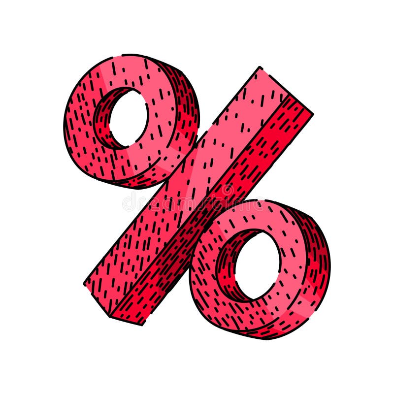
Free with trial Finance percentage sign hand drawn. statistics increase, decrease ratio, proportion interest finance percentage sign vector sketch. isolated color illustration. Decrease performance vectors Finance percentage sign sketch hand drawn vector. finance percentage sign hand drawn. statistics increase, decrease ratio, proportion interest finance percentage sign vector sketch. isolated color illustration
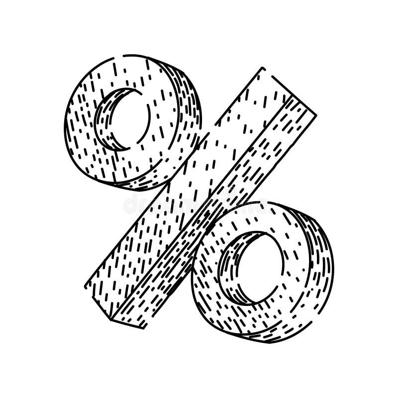
Free with trial Statistics percentage sign hand drawn. increase decrease, ratio proportion, interest profit statistics percentage sign vector sketch. isolated color illustration. Decrease performance illustrations Statistics percentage sign sketch hand drawn vector. statistics percentage sign hand drawn. increase decrease, ratio proportion, interest profit statistics percentage sign vector sketch. isolated color illustration
Free with trial A bold red arrow illustrates a downward trend, symbolizing financial decline, market loss, or economic recession. This visual cue effectively communicates negative performance and challenges. Decrease performance illustrations Red arrow charting decline on white background. A bold red arrow illustrates a downward trend, symbolizing financial decline, market loss, or economic recession. This visual cue effectively communicates negative performance and challenges
Free with trial Sad face near a line graph showing a downward trend, a cloud, and a pencil. Ideal for business loss, analytics challenges, emotional impact, strategy planning, education, performance review simple. Decrease performance vectors Declining Trend Indicated by Sad Face, Line Graph, Cloud, and Pencil. Sad face near a line graph showing a downward trend, a cloud, and a pencil. Ideal for business loss, analytics challenges, emotional impact, strategy planning, education, performance review simple
Free with trial The image displays a downward trending blue line with a neon glow, set against a dark, brushed metallic background. the line is jagged, suggesting fluctuations or volatility in the data it represents. spotlights from above illuminate the scene, adding depth and emphasizing the downward direction of the line. the overall impression is one of decline or loss, potentially related to financial markets, performance metrics, or other data sets where a downward trend is significant. Decrease performance illustrations Decreasing blue line on dark metallic background. the image displays a downward trending blue line with a neon glow, set against a dark, brushed metallic background. the line is jagged, suggesting fluctuations or volatility in the data it represents. spotlights from above illuminate the scene, adding depth and emphasizing the downward direction of the line. the overall impression is one of decline or loss, potentially related to financial markets, performance metrics, or other data sets where a downward trend is significant.
Free with trial An abstract, three-dimensional white graph line is depicted against a stark white background. The line features sharp, jagged peaks and valleys, clearly illustrating a significant downward trend or decline. The geometric form casts a subtle shadow, adding depth to the minimalist composition. This visual represents concepts of loss, negative performance, or economic downturn. Decrease performance illustrations Abstract 3D White Graph Line Showing Downward Trend on White Background chart data. An abstract, three-dimensional white graph line is depicted against a stark white background. The line features sharp, jagged peaks and valleys, clearly illustrating a significant downward trend or decline. The geometric form casts a subtle shadow, adding depth to the minimalist composition. This visual represents concepts of loss, negative performance, or economic downturn
Free with trial A clean and simple vector illustration of a bar chart isolated on a white background. This minimalist graphic features three vertical bars in varying shades of blue, representing data, statistics, or progress. Ideal for business reports, financial presentations, infographics, websites, and educational materials. The flat design symbolizes concepts like growth, analysis, market research, and performance comparison, offering a modern and clear way to visualize information. Ample copy space is available. Decrease performance illustrations Simple Blue Bar Chart Vector Icon for Business Data. A clean and simple vector illustration of a bar chart isolated on a white background. This minimalist graphic features three vertical bars in varying shades of blue, representing data, statistics, or progress. Ideal for business reports, financial presentations, infographics, websites, and educational materials. The flat design symbolizes concepts like growth, analysis, market research, and performance comparison, offering a modern and clear way to visualize information. Ample copy space is available.
Free with trial A bar chart made of wooden blocks sits on an open book in a classic library, symbolizing a decline in business performance, economic recession, or falling educational standards. Decrease performance illustrations Economic Decline Graph on an Open Book in a Library. A bar chart made of wooden blocks sits on an open book in a classic library, symbolizing a decline in business performance, economic recession, or falling educational standards
Free with trial A vector illustration showing a magnifying glass focused on a bar graph and line chart indicating growth. The magnifying glass has a blue frame and red handle. The chart depicts an upward trend, suggesting positive business performance. This image is suitable for illustrating data analysis, business strategy, market research, and financial growth concepts. Decrease performance vectors Analyzing Growth: Magnifying Glass on Business Chart. A vector illustration showing a magnifying glass focused on a bar graph and line chart indicating growth. The magnifying glass has a blue frame and red handle. The chart depicts an upward trend, suggesting positive business performance. This image is suitable for illustrating data analysis, business strategy, market research, and financial growth concepts.
Free with trial A collection of red and green arrows, some pointing up and others down, symbolizing market fluctuations and financial performance. Decrease performance illustrations Upward and downward arrows representing market trends. A collection of red and green arrows, some pointing up and others down, symbolizing market fluctuations and financial performance
Free with trial Dollar coin beside a bar graph showing downward trend under a cloud. Ideal for finance, economy, investment, loss, analytics, business performance, global market. Simple flat metaphor. Decrease performance vectors Dollar Coin and Declining Bar Graph Representing Financial Loss Concept. Dollar coin beside a bar graph showing downward trend under a cloud. Ideal for finance, economy, investment, loss, analytics, business performance, global market. Simple flat metaphor
Free with trial Bar chart showing declining performance and negative trend. Decrease performance vectors Bar chart showing declining performance and negative trend
Free with trial A 3D rendered bar chart displaying a downward trend. The bars, colored black, blue, green, yellow, and orange, decrease in height from left to right. A bold red arrow points downwards, diagonally across the bars, indicating a decline or loss. The chart is presented on a white background. Decrease performance illustrations 3D Bar Chart with Red Downward Arrow on White Background. A 3D rendered bar chart displaying a downward trend. The bars, colored black, blue, green, yellow, and orange, decrease in height from left to right. A bold red arrow points downwards, diagonally across the bars, indicating a decline or loss. The chart is presented on a white background
Free with trial This dynamic graphic depicts a sharp downward trend, visualized by a bold red arrow dramatically descending across a grey, jagged line graph. The graph itself shows significant fluctuations, but the overarching movement is a steep decline, symbolizing losses, negative growth, or a crisis. The clean white background isolates the data representation, making it ideal for conveying financial downturns, market crashes, or any situation involving a significant decrease. Decrease performance illustrations Sharp Decline: Red Arrow Graph Illustrating Downward Trend. This dynamic graphic depicts a sharp downward trend, visualized by a bold red arrow dramatically descending across a grey, jagged line graph. The graph itself shows significant fluctuations, but the overarching movement is a steep decline, symbolizing losses, negative growth, or a crisis. The clean white background isolates the data representation, making it ideal for conveying financial downturns, market crashes, or any situation involving a significant decrease.
Free with trial A close-up, angled perspective of several printed business reports displaying a variety of financial data. The documents feature colorful pie charts, blue bar graphs, and line graphs tracking performance and statistics. This image is perfect for illustrating concepts such as data analysis, market research, financial planning, investment strategy, and corporate performance review. The detailed charts and figures represent the core of business analytics, accounting, and economic forecasting, making it a versatile background for financial presentations and articles. Decrease performance illustrations Business Analytics Report with Financial Charts and Graphs. A close-up, angled perspective of several printed business reports displaying a variety of financial data. The documents feature colorful pie charts, blue bar graphs, and line graphs tracking performance and statistics. This image is perfect for illustrating concepts such as data analysis, market research, financial planning, investment strategy, and corporate performance review. The detailed charts and figures represent the core of business analytics, accounting, and economic forecasting, making it a versatile background for financial presentations and articles.
Free with trial Snowflake connected to decreasing bar chart indicating winter themes, seasonal decline, or data trends. Ideal for weather, climate change, business analytics, forecasting, cold storage, performance. Decrease performance illustrations Snowflake and Bar Chart Representing Seasonal Trends and Data Analysis Concepts. Snowflake connected to decreasing bar chart indicating winter themes, seasonal decline, or data trends. Ideal for weather, climate change, business analytics, forecasting, cold storage, performance
Free with trial A 3D render of a bar chart displaying a significant downward trend. Blue bars of varying heights represent data points, intersected by a sharp orange line that clearly illustrates a decline over time. The dark, reflective surface below the chart suggests a digital display or a futuristic interface. This image is ideal for representing financial losses, market crashes, performance decline, or negative trends in various industries. Decrease performance illustrations Downtrending Bar Chart with Orange Line on Dark Background. A 3D render of a bar chart displaying a significant downward trend. Blue bars of varying heights represent data points, intersected by a sharp orange line that clearly illustrates a decline over time. The dark, reflective surface below the chart suggests a digital display or a futuristic interface. This image is ideal for representing financial losses, market crashes, performance decline, or negative trends in various industries.
Free with trial A 3D figure sits on a platform reviewing financial data, using a laptop to analyze bar graphs, pie charts and line graphs representing business performance and growth. Decrease performance illustrations 3D Character Analyzing Business Charts and Graphs on Laptop. A 3D figure sits on a platform reviewing financial data, using a laptop to analyze bar graphs, pie charts and line graphs representing business performance and growth.
Free with trial Conceptual graphic of a productivity decline. A blue bar chart shows decreasing values with a downward arrow indicating failure, crisis, and poor business performance. Decrease performance illustrations Decreasing Productivity Bar Chart with Downward Trend Arrow. Conceptual graphic of a productivity decline. A blue bar chart shows decreasing values with a downward arrow indicating failure, crisis, and poor business performance
Free with trial This image shows a bar graph depicting a downward trend. A red arrow highlights the decrease in quarterly sales from Q1 to Q4, indicating negative growth and financial loss. Decrease performance illustrations Declining Bar Graph with Red Arrow Depicts Sales Performance. This image shows a bar graph depicting a downward trend. A red arrow highlights the decrease in quarterly sales from Q1 to Q4, indicating negative growth and financial loss.
Free with trial This dynamic 3D render visualizes financial growth and market trends. A series of green bars represents increasing values, overlaid by a prominent green arrow pointing upwards, symbolizing success and positive performance. Contrasting this, a red arrow also indicates a trend, though its path suggests volatility or a different metric. Below, a complex network graph with interconnected nodes and lines adds a layer of data analysis and interconnectedness, suitable for concepts like investment, analytics, and economic forecasting. Decrease performance illustrations Upward Trend: Green and Red Arrows Over Bar Chart and Network Graph. This dynamic 3D render visualizes financial growth and market trends. A series of green bars represents increasing values, overlaid by a prominent green arrow pointing upwards, symbolizing success and positive performance. Contrasting this, a red arrow also indicates a trend, though its path suggests volatility or a different metric. Below, a complex network graph with interconnected nodes and lines adds a layer of data analysis and interconnectedness, suitable for concepts like investment, analytics, and economic forecasting.
Free with trial A 3D bar graph with a red line graph indicating a significant decrease, isolated on a clean white background. Decrease performance illustrations Bar graph showing downward trend isolated on white background. A 3D bar graph with a red line graph indicating a significant decrease, isolated on a clean white background
Free with trial A visual representation of negative financial performance, illustrating a declining trend in business or market data with a prominent red arrow indicating a downward movement. Decrease performance illustrations Bar chart showing a downward trend with a red arrow. A visual representation of negative financial performance, illustrating a declining trend in business or market data with a prominent red arrow indicating a downward movement
Free with trial A simple outline icon illustration of a bar chart diagram, used to display data analysis and performance metrics. Ideal for presentations, infographics, and dashboards. Decrease performance vectors Outline Simple Bar Chart Diagram Icon Graphic for Data Analysis. A simple outline icon illustration of a bar chart diagram, used to display data analysis and performance metrics. Ideal for presentations, infographics, and dashboards.
Free with trial A vibrant red arrow drawn with a dashed line and a solid tip, clearly indicating a downward trajectory or negative trend, perfect for financial or performance analysis. Decrease performance illustrations Red arrow symbol pointing downward indicating decline or trend. A vibrant red arrow drawn with a dashed line and a solid tip, clearly indicating a downward trajectory or negative trend, perfect for financial or performance analysis
Free with trial A 3D rendered icon depicting a downward trend, symbolizing financial decrease and economic challenges. Decrease performance illustrations Financial decline icon representing economic downturn and losses. A 3D rendered icon depicting a downward trend, symbolizing financial decrease and economic challenges
Free with trial This cheerful 3D rendered illustration depicts a friendly cartoon businessman confidently presenting positive business growth charts and data, showcasing key performance indicators and financial success. The image is ideal for business, finance, and marketing concepts. Decrease performance illustrations Charming 3D Cartoon Businessman Presenting Growth Charts and Data. This cheerful 3D rendered illustration depicts a friendly cartoon businessman confidently presenting positive business growth charts and data, showcasing key performance indicators and financial success. The image is ideal for business, finance, and marketing concepts.
Free with trial Sad businessman standing in front of a declining red graph. Symbolizes financial downturn, recession, loss, and business failure. Great for economic crisis and poor performance concepts. Decrease performance vectors Sad businessman standing in front of a declining red graph. Symbolizes financial downturn, recession, loss, and business failure.
Free with trial A digital screen displays a stark red line graph showing a significant downward trend. The graph is set against a grid background, emphasizing the sharp decline. The image conveys a sense of financial loss, economic downturn, or negative performance. Generated by AI. Decrease performance illustrations Digital screen displaying a sharp downward trending red line graph. A digital screen displays a stark red line graph showing a significant downward trend. The graph is set against a grid background, emphasizing the sharp decline. The image conveys a sense of financial loss, economic downturn, or negative performance. Generated by AI.
Free with trial Parking lot full of many cars with a large red arrow pointing downward. Declining business, sales, or economic performance concept for vehicle industry report. Decrease performance illustrations Parking lot full of many cars with a large red arrow pointing downward
Free with trial A glowing green bar chart with a data line and grid on a black background, representing financial performance. Decrease performance illustrations Glowing Green Bar Chart with Data Line on photo Black graph finance. A glowing green bar chart with a data line and grid on a black background, representing financial performance
Free with trial Bar graph and line chart showing performance decline, icons of person and movement, and a sad face symbol. Ideal for data trends, business analysis, failure, mood, feedback, decision-making. Decrease performance illustrations Declining Trends in Data Analysis with Emotional Impact Represented by Sad Face Icon. Bar graph and line chart showing performance decline, icons of person and movement, and a sad face symbol. Ideal for data trends, business analysis, failure, mood, feedback, decision-making
Free with trial Bar chart with upward trend, sad face, and analytics dashboard highlights challenges in progress or data performance. Ideal for financial difficulty, business risk, loss assessment, data analysis. Decrease performance vectors Rising Bar Graph with Sad Face Symbolizing Negative Growth or Challenges in Analytics. Bar chart with upward trend, sad face, and analytics dashboard highlights challenges in progress or data performance. Ideal for financial difficulty, business risk, loss assessment, data analysis
Free with trial A businessman in a suit analyzes financial data with a laptop. The concept represents improving quality while reducing costs to optimize business performance and increase profitability. Decrease performance illustrations Businessman analyzing data with cost and quality improvement concept. A businessman in a suit analyzes financial data with a laptop. The concept represents improving quality while reducing costs to optimize business performance and increase profitability
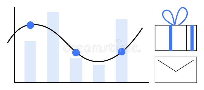
Free with trial Graph with decreasing bar chart and line graph noting key points beside a gift box and envelope. Ideal for business analysis, performance tracking, rewards programs, marketing, sales targets, client. Decrease performance vectors Bar Graph with Line Chart, Gift Box, and Envelope Representing Business Metrics and Rewards. Graph with decreasing bar chart and line graph noting key points beside a gift box and envelope. Ideal for business analysis, performance tracking, rewards programs, marketing, sales targets, client
Free with trial Two distinct lines illustrate a decrease and an increase, creating a dynamic contrast in shades of orange that captures attention and represents change. Decrease performance illustrations Visual Representation of Contrasting Trends With Realistic Orange Hues. Two distinct lines illustrate a decrease and an increase, creating a dynamic contrast in shades of orange that captures attention and represents change
Free with trial A 3D bar chart with a red arrow showing a downward trend. This image symbolizes economic decline, financial issues, and negative business performance. Decrease performance illustrations Red arrow showing downward trend on a 3D bar chart representing economic decline. A 3D bar chart with a red arrow showing a downward trend. This image symbolizes economic decline, financial issues, and negative business performance.
Free with trial Percentage sign set hand drawn. math calculation, finance statistics, increase decrease percentage sign vector sketch. isolated black illustration. Decrease performance illustrations Percentage sign set sketch hand drawn vector. percentage sign set hand drawn. math calculation, finance statistics, increase decrease percentage sign vector sketch. isolated black illustration
Free with trial Downward-sloping line graph on grid, sad face expressing disappointment, person running away. Ideal for business failure, loss, decline, negative growth, setback, challenge simple flat metaphor. Decrease performance illustrations Declining Performance Chart with Sad Face and Running Figure Symbolizing Loss or Failure. Downward-sloping line graph on grid, sad face expressing disappointment, person running away. Ideal for business failure, loss, decline, negative growth, setback, challenge simple flat metaphor
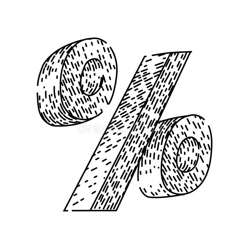
Free with trial Math percentage sign hand drawn. calculation finance, statistics increase, decrease ratio math percentage sign vector sketch. isolated black illustration. Decrease performance vectors Math percentage sign sketch hand drawn vector. math percentage sign hand drawn. calculation finance, statistics increase, decrease ratio math percentage sign vector sketch. isolated black illustration
Free with trial Math percentage sign hand drawn. calculation finance, statistics increase, decrease ratio math percentage sign vector sketch. isolated black illustration. Decrease performance illustrations Math percentage sign sketch hand drawn vector. math percentage sign hand drawn. calculation finance, statistics increase, decrease ratio math percentage sign vector sketch. isolated black illustration
Free with trial Math percentage sign hand drawn. calculation finance, statistics increase, decrease ratio math percentage sign vector sketch. isolated color illustration. Decrease performance illustrations Math percentage sign sketch hand drawn vector. math percentage sign hand drawn. calculation finance, statistics increase, decrease ratio math percentage sign vector sketch. isolated color illustration
Free with trial A hand is drawing a decreasing graph with a red pen over a sketch of a city skyline, symbolizing a decline in economic or business performance. Decrease performance illustrations Hand drawing decreasing graph with red pen over a sketch of a city skyline. A hand is drawing a decreasing graph with a red pen over a sketch of a city skyline, symbolizing a decline in economic or business performance
Free with trial A visual representation of data showing a decline over a period. The blue bars are arranged in descending order of height, each marked with numerical indicators, suggesting a decrease in value or quantity. Decrease performance illustrations Blue bar chart showing decreasing trend over time with numerical labels. A visual representation of data showing a decline over a period. The blue bars are arranged in descending order of height, each marked with numerical indicators, suggesting a decrease in value or quantity
Free with trial Symbol percentage sign hand drawn. math calculation, finance statistics, increase decrease symbol percentage sign vector sketch. isolated black illustration. Decrease performance illustrations Symbol percentage sign sketch hand drawn vector. symbol percentage sign hand drawn. math calculation, finance statistics, increase decrease symbol percentage sign vector sketch. isolated black illustration
Free with trial Symbol percentage sign hand drawn. math calculation, finance statistics, increase decrease symbol percentage sign vector sketch. isolated color illustration. Decrease performance illustrations Symbol percentage sign sketch hand drawn vector. symbol percentage sign hand drawn. math calculation, finance statistics, increase decrease symbol percentage sign vector sketch. isolated color illustration
Free with trial Symbol percentage sign hand drawn. math calculation, finance statistics, increase decrease symbol percentage sign vector sketch. isolated color illustration. Decrease performance vectors Symbol percentage sign sketch hand drawn vector. symbol percentage sign hand drawn. math calculation, finance statistics, increase decrease symbol percentage sign vector sketch. isolated color illustration
Free with trial Symbol percentage sign hand drawn. math calculation, finance statistics, increase decrease symbol percentage sign vector sketch. isolated black illustration. Decrease performance illustrations Symbol percentage sign sketch hand drawn vector. symbol percentage sign hand drawn. math calculation, finance statistics, increase decrease symbol percentage sign vector sketch. isolated black illustration
Free with trial A 3D illustration featuring a bar chart with four ascending blue bars of varying heights, representing data growth. To the right of the chart are two white arrows, one pointing upwards and the other downwards, symbolizing increase and decrease respectively. The entire graphic is presented on a clean white background. Decrease performance illustrations 3D Bar Chart with Up and Down Arrows on White Background graph statistics. A 3D illustration featuring a bar chart with four ascending blue bars of varying heights, representing data growth. To the right of the chart are two white arrows, one pointing upwards and the other downwards, symbolizing increase and decrease respectively. The entire graphic is presented on a clean white background
Free with trial A bright red arrow points upwards symbolizing growth and profit, while a vibrant green arrow points downwards signifying a decrease or loss. Ideal for finance and business concepts. Decrease performance vectors Red up arrow and green down arrow symbols representing financial growth and decline. A bright red arrow points upwards symbolizing growth and profit, while a vibrant green arrow points downwards signifying a decrease or loss. Ideal for finance and business concepts
Free with trial A hand uses a stylus to draw a glowing bar graph. The graph illustrates increasing income and decreasing expenses, symbolizing financial management and growth. Decrease performance illustrations Hand drawing a financial graph showing income growth and expense decrease. A hand uses a stylus to draw a glowing bar graph. The graph illustrates increasing income and decreasing expenses, symbolizing financial management and growth
Free with trial Finance percentage sign hand drawn. statistics increase, decrease ratio, proportion interest finance percentage sign vector sketch. isolated black illustration. Decrease performance vectors Finance percentage sign sketch hand drawn vector. finance percentage sign hand drawn. statistics increase, decrease ratio, proportion interest finance percentage sign vector sketch. isolated black illustration
Free with trial Finance percentage sign hand drawn. statistics increase, decrease ratio, proportion interest finance percentage sign vector sketch. isolated black illustration. Decrease performance illustrations Finance percentage sign sketch hand drawn vector. finance percentage sign hand drawn. statistics increase, decrease ratio, proportion interest finance percentage sign vector sketch. isolated black illustration
Free with trial A person's open palm supports a glowing blue graph illustrating a downward trend for cost and an upward trend for quality against a dark background. Decrease performance illustrations Hand holding graph showing decreasing cost and increasing quality decrease. A person's open palm supports a glowing blue graph illustrating a downward trend for cost and an upward trend for quality against a dark background
Free with trial A three-dimensional line graph depicts a significant decrease in market value over a period of four months, indicated by a sharp downward trend. Decrease performance illustrations Sharp market value decline over time illustrated by a downward trend graph. A three-dimensional line graph depicts a significant decrease in market value over a period of four months, indicated by a sharp downward trend
Free with trial This visually striking graph displays two contrasting trends one line shows a sharp decrease while the other illustrates a significant increase in an engaging orange palette. Decrease performance illustrations Dynamic Trends of Change Illustrated Through Contrasting Lines in Orange Hues. This visually striking graph displays two contrasting trends one line shows a sharp decrease while the other illustrates a significant increase in an engaging orange palette
Free with trial Elevate your everyday style with Abu Taher's collection of Typography T-Shirt Designs, where words meet artistry. Decrease performance vectors Collection of 32 icons representing increase and decrease in business and finance. Elevate your everyday style with Abu Taher's collection of Typography T-Shirt Designs, where words meet artistry
Free with trial Statistics percentage sign hand drawn. increase decrease, ratio proportion, interest profit statistics percentage sign vector sketch. isolated color illustration. Decrease performance illustrations Statistics percentage sign sketch hand drawn vector. statistics percentage sign hand drawn. increase decrease, ratio proportion, interest profit statistics percentage sign vector sketch. isolated color illustration
Free with trial A striking red arrow plunges downwards, symbolizing a significant drop in data trends. This representation highlights a negative change in performance or market activity. Decrease performance illustrations A red downward arrow indicating a sharp decline in numbers during market analysis. A striking red arrow plunges downwards, symbolizing a significant drop in data trends. This representation highlights a negative change in performance or market activity.
Free with trial Calculation percentage sign hand drawn. finance statistics, increase decrease, ratio proportion calculation percentage sign vector sketch. isolated black illustration. Decrease performance vectors Calculation percentage sign sketch hand drawn vector. calculation percentage sign hand drawn. finance statistics, increase decrease, ratio proportion calculation percentage sign vector sketch. isolated black illustration
Free with trial Calculation percentage sign hand drawn. finance statistics, increase decrease, ratio proportion calculation percentage sign vector sketch. isolated black illustration. Decrease performance illustrations Calculation percentage sign sketch hand drawn vector. calculation percentage sign hand drawn. finance statistics, increase decrease, ratio proportion calculation percentage sign vector sketch. isolated black illustration
Free with trial A character stands alone holding a big red arrow pointing downwards, symbolizing a decrease or decline, against a plain white backdrop. Decrease performance illustrations Character Holds Large Red Downward Arrow Representing Decline on White Background. A character stands alone holding a big red arrow pointing downwards, symbolizing a decrease or decline, against a plain white backdrop
Free with trial Global RAM Shortage Crisis Impacting Computer Hardware Market and Semiconductor Supply Chain with Declining Performance Trend. Decrease performance vectors Global RAM Shortage Crisis Impacting Computer Hardware Market and Semiconductor Supply Chain
Free with trial Chess king symbolizing leadership beside a declining bar graph for strategy, business performance. Ideal for growth analysis, planning, decision-making, leadership vision, competition, management. Decrease performance illustrations Strategic planning concept with chess king and declining bar chart for business analysis insights. Chess king symbolizing leadership beside a declining bar graph for strategy, business performance. Ideal for growth analysis, planning, decision-making, leadership vision, competition, management
Free with trial A character runs while holding a significant red downward arrow, representing a decrease or decline concept clearly against a white background. Decrease performance illustrations Character Holds Large Red Downward Arrow Symbolizing Decline on a White Background. A character runs while holding a significant red downward arrow, representing a decrease or decline concept clearly against a white background
Free with trial A businessman in a suit analyzes financial data with a laptop. The concept represents improving quality while reducing costs to optimize business performance and increase profitability. Decrease performance illustrations Businessman analyzing data with cost and quality improvement concept. A businessman in a suit analyzes financial data with a laptop. The concept represents improving quality while reducing costs to optimize business performance and increase profitability
Free with trial A 3D rendered graph displays a downward trend. Two tall green bars are followed by two shorter pink bars, indicating a decrease in value. A thick yellow arrow with a sharp point descends diagonally across the bars, emphasizing the decline. The background is a solid, light blue color. Decrease performance illustrations Falling graph with green and pink bars and a yellow arrow pointing down chart decline. A 3D rendered graph displays a downward trend. Two tall green bars are followed by two shorter pink bars, indicating a decrease in value. A thick yellow arrow with a sharp point descends diagonally across the bars, emphasizing the decline. The background is a solid, light blue color
Free with trial This 3D rendering showcases a vibrant bar chart illustrating business growth and financial performance. The colorful cylinders represent data points, rising to show increasing success. A line graph adds additional information about trends over time. Decrease performance illustrations Colorful 3D Bar Chart with Growth Graph Showing Business Success and Financial Data. This 3D rendering showcases a vibrant bar chart illustrating business growth and financial performance. The colorful cylinders represent data points, rising to show increasing success. A line graph adds additional information about trends over time.
Free with trial A person's open palm supports a glowing digital graph illustrating a decrease in cost and an increase in quality, set against a dark background. Decrease performance illustrations Hand holding glowing graph showing cost decreasing and quality increasing palm open. A person's open palm supports a glowing digital graph illustrating a decrease in cost and an increase in quality, set against a dark background
Free with trial A character stands isolated on a white background, holding a large red arrow pointing downward, symbolizing decline or decrease. Decrease performance illustrations Character Holding a Large Red Downward Arrow Representing Decline on a White Background. A character stands isolated on a white background, holding a large red arrow pointing downward, symbolizing decline or decrease
Free with trial A stark pink line graph shows a dramatic downward trend against a dark green grid, symbolizing a significant loss or decrease. Decrease performance illustrations Sharp decline illustrated by a jagged pink line graph on a dark green grid background. A stark pink line graph shows a dramatic downward trend against a dark green grid, symbolizing a significant loss or decrease
Free with trial This image features a bar graph representing an economic recession, highlighted by a red downward arrow indicating a decline. The visualization illustrates the negative trend in financial performance and the risks associated with an economic downturn. The background is transparent, making it suitable for various presentations. This image has been created using AI. Decrease performance vectors Economic Recession Concept Bar Graph With Red Downward Arrow On Transparent Background. This image features a bar graph representing an economic recession, highlighted by a red downward arrow indicating a decline. The visualization illustrates the negative trend in financial performance and the risks associated with an economic downturn. The background is transparent, making it suitable for various presentations. This image has been created using AI.
Free with trial A minimalist 3D white bar chart displays a clear downward trend. Four bars of decreasing height are shown, with a sharp white arrow pointing downwards from the top of the second bar, indicating a significant decline. The chart is presented in isolation against a clean white background, emphasizing the concept of financial or economic downturn. Decrease performance illustrations 3D White Bar Chart with a Downward Trending Arrow Symbolizing Decline graph decrease. A minimalist 3D white bar chart displays a clear downward trend. Four bars of decreasing height are shown, with a sharp white arrow pointing downwards from the top of the second bar, indicating a significant decline. The chart is presented in isolation against a clean white background, emphasizing the concept of financial or economic downturn
Free with trial A 3D bar chart with teal and tan bars shows a pink arrow pointing downwards, representing a decline or negative trend. Clear details and vibrant colors enhance visual appeal. Decrease performance illustrations 3D Bar Chart With Teal Bars And Pink Downward Arrow Indicating Decline graph decrease. A 3D bar chart with teal and tan bars shows a pink arrow pointing. A 3D bar chart with teal and tan bars shows a pink arrow pointing downwards, representing a decline or negative trend. Clear details and vibrant colors enhance visual appeal
Free with trial A close-up view of a hand holding a magnifying glass over a business graph, emphasizing the analysis of data trends and performance insights. Decrease performance illustrations Analysis of Data Trends with Magnifying Glass on Business Graph for Detailed Observation. A close-up view of a hand holding a magnifying glass over a business graph, emphasizing the analysis of data trends and performance insights
Free with trial Colorful growth chart with red and teal bars showing upward and downward arrows on a light background representing data trends progress decline business performance and financial analytics visual. Decrease performance illustrations Colorful growth chart with red and teal bars and upward and downward arrows on light background. colorful growth chart with red and teal bars showing upward and downward arrows on a light background representing data trends progress decline business performance and financial analytics visual
Free with trial This illustration depicts upward and downward trending arrows on a grid, symbolizing market fluctuations, business trends, and financial performance analysis. Decrease performance vectors Illustration of upward and downward trending arrows on a grid isolated on white background. This illustration depicts upward and downward trending arrows on a grid, symbolizing market fluctuations, business trends, and financial performance analysis
Free with trial A stylized 3D business growth chart depicted against a light blue background. The chart features a blue mountain-like shape representing a peak, with two intersecting lines. One line, marked with pink nodes, shows fluctuations, while another line with green nodes indicates a general upward trend. This visual metaphor conveys concepts of business performance, market trends, and financial analysis. Decrease performance illustrations 3D Stylized Business Growth Chart with Red and Green Nodes on Blue Background graph data. A stylized 3D business growth chart depicted against a light blue background. The chart features a blue mountain-like shape representing a peak, with two intersecting lines. One line, marked with pink nodes, shows fluctuations, while another line with green nodes indicates a general upward trend. This visual metaphor conveys concepts of business performance, market trends, and financial analysis