Free with trial The Price-to-Earnings (P E) ratio, and how is it used in stock valuation. Decrease performance illustrations Financial Market Data Display: Red Stock Market Trend. the Price-to-Earnings (P E) ratio, and how is it used in stock valuation
Free with trial The image shows a visual representation of a downward trend using a bar chart and a bold red arrow pointing downward. The chart is displayed on a light-colored easel with a small figure standing behind it, suggesting a presentation or analysis of decreasing values over time, possibly in a business or financial context. Decrease performance illustrations Declining trend illustrated with bar chart and arrow on easel. The image shows a visual representation of a downward trend using a bar chart and a bold red arrow. The image shows a visual representation of a downward trend using a bar chart and a bold red arrow pointing downward. The chart is displayed on a light-colored easel with a small figure standing behind it, suggesting a presentation or analysis of decreasing values over time, possibly in a business or financial context
Free with trial A visual representation of a declining stock market trend, depicted by a bold red arrow descending across a financial graph, symbolizing economic downturn and investment loss. Decrease performance illustrations A red arrow pointing downwards on a stock market graph, isolated on white background. A visual representation of a declining stock market trend, depicted by a bold red arrow descending across a financial graph, symbolizing economic downturn and investment loss
Free with trial The image shows a downward trending line graph, rendered in a bright, neon blue. the line is composed of many small dots, giving it a somewhat ethereal appearance. the background resembles a stage or auditorium, with rows of seats and stage lighting. the overall impression is one of decline or loss, perhaps representing a financial downturn or a negative trend in some other area. the lighting adds a sense of drama and importance to the image. Decrease performance illustrations Stock market crash with dramatic stage lighting. the image shows a downward trending line graph, rendered in a bright, neon blue. the line is composed of many small dots, giving it a somewhat ethereal appearance. the background resembles a stage or auditorium, with rows of seats and stage lighting. the overall impression is one of decline or loss, perhaps representing a financial downturn or a negative trend in some other area. the lighting adds a sense of drama and importance to the image.
Free with trial The image shows a neon pink graph descending sharply against a dark blue, grid-patterned background. the graph starts high on the left, then plummets downwards with some zigzags before leveling out near the bottom. an arrow at the end of the line points downwards, emphasizing the decline. the overall effect is a visual representation of a significant drop or loss. Decrease performance illustrations Descending neon graph on a dark blue background. the image shows a neon pink graph descending sharply against a dark blue, grid-patterned background. the graph starts high on the left, then plummets downwards with some zigzags before leveling out near the bottom. an arrow at the end of the line points downwards, emphasizing the decline. the overall effect is a visual representation of a significant drop or loss.
Free with trial The image depicts a neon purple graph trending downwards against a dark, digital-themed background. the graph is the focal point, with its sharp angles and bright color drawing the eye. the background features a grid pattern and various digital elements, creating a futuristic and technological feel. the overall impression is one of economic downturn or decline, conveyed through the visual representation of a falling graph. Decrease performance illustrations Declining neon graph on dark digital background. the image depicts a neon purple graph trending downwards against a dark, digital-themed background. the graph is the focal point, with its sharp angles and bright color drawing the eye. the background features a grid pattern and various digital elements, creating a futuristic and technological feel. the overall impression is one of economic downturn or decline, conveyed through the visual representation of a falling graph.
Free with trial Blue flat visualization showing bar chart and downward arrow over data grid with world map overlay. Analytics, finance, data analysis, digital, infographic, corporate, trend. Decrease performance illustrations Blue flat visualization showing bar chart and downward arrow over data grid with world map overlay
Free with trial A set of nine minimalist vector icons depicting various types of charts and graphs including bar charts, progress bars, and trend lines for data visualization and analytics. Decrease performance vectors Collection of simple black glyph icons representing business charts graphs and data analysis. A set of nine minimalist vector icons depicting various types of charts and graphs including bar charts, progress bars, and trend lines for data visualization and analytics
Free with trial A visual representation of a financial downturn, depicted by a bar chart with bars decreasing in height and a prominent red arrow pointing downwards, signifying a negative trend. Decrease performance illustrations Bar chart with red arrow showing decline isolated on white background. A visual representation of a financial downturn, depicted by a bar chart with bars decreasing in height and a prominent red arrow pointing downwards, signifying a negative trend
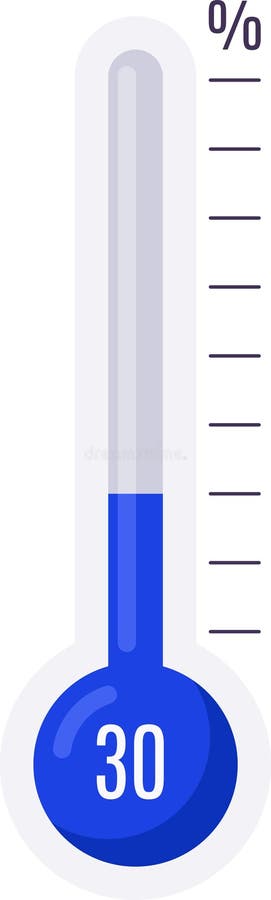
Free with trial Thermometer indicating 30 percent, symbolizing progress, achievement, temperature measurement, or goal completion within a specific range. Decrease performance vectors Thermometer indicating 30 percent, symbolizing progress, achievement, temperature measurement, or goal completion within
Free with trial A futuristic digital infographic showcasing business strategy and growth. The scene features glowing charts, bar graphs, circular progress indicators with percentages, and stacks of gold coins, symbolizing financial success. A prominent neon arrow curves upwards, indicating a positive trend and progress. The dark, high-tech background enhances the visual impact, making it ideal for presentations on finance, business, technology, and data analysis. Decrease performance illustrations Digital Growth Infographic with Financial Data and Upward Trend Arrow. A futuristic digital infographic showcasing business strategy and growth. The scene features glowing charts, bar graphs, circular progress indicators with percentages, and stacks of gold coins, symbolizing financial success. A prominent neon arrow curves upwards, indicating a positive trend and progress. The dark, high-tech background enhances the visual impact, making it ideal for presentations on finance, business, technology, and data analysis.
Free with trial A simple black and white illustration of a bar chart and a line graph showing business growth trends, isolated on a white background. Decrease performance vectors Business growth bar chart and line graph isolated on white background. A simple black and white illustration of a bar chart and a line graph showing business growth trends, isolated on a white background
Free with trial Loss Arrow 3D Icon, Isolated on White Background. Decrease performance illustrations Loss Arrow 3D Icon
Free with trial Week over week on white paper background. Decrease performance illustrations Week over week on white paper
Free with trial Year over year on white paper background. Decrease performance illustrations Year over year on white paper
Free with trial A visual representation of opposing forces, illustrating concepts such as growth versus decline, positive versus negative trends, or upward and downward movement in various contexts like finance or pe. Decrease performance illustrations Red down arrow and green up arrow isolated on white background. A visual representation of opposing forces, illustrating concepts such as growth versus decline, positive versus negative trends, or upward and downward movement in various contexts like finance or pe
Free with trial Business bar graph with upward and downward arrow. Trend analysis icon vector. Decrease performance vectors Business bar graph with upward and downward arrow. Trend analysis icon
Free with trial Financial Downtrend Visualization Showcasing Red Stock Market Analysis and Trading Fluctuations, Generated by AI. Decrease performance illustrations Financial Downtrend Visualization Showcasing Red Stock Market Analysis and Trading Fluctuations
Free with trial A bar chart illustrating a significant decline or failure, marked by a red cross, signifying negative business outcomes and economic setbacks. Decrease performance illustrations Bar chart with red cross indicating failure isolated on white background. A bar chart illustrating a significant decline or failure, marked by a red cross, signifying negative business outcomes and economic setbacks
Free with trial Business bar graph icon with upward and downward arrow. Trend analysis symbol vector in circular outline. Decrease performance vectors Business bar graph icon with upward and downward arrow. Trend analysis symbol in circular outline
Free with trial This image visualizes business strategy, featuring a businessman pointing towards interactive displays of "QUALITY" with an upward arrow and "COST" with a downward arrow, representing optimization goals. Decrease performance illustrations A businessman points towards holographic indicators for increasing quality and decreasing cost. This image visualizes business strategy, featuring a businessman pointing towards interactive displays of "QUALITY" with an upward arrow and "COST" with a downward arrow, representing optimization goals.
Free with trial Visually represents the concept of model drift over time and the automated solution pipeline used by MLOps engineers, data scientists, and AI architects. Decrease performance illustrations . visually represents the concept of model drift over time and the automated solution pipeline used by MLOps engineers, data scientists, and AI architects.
Free with trial Illustration showing declining sales after initial product launch and strategic recovery using drip promotions, seasonal marketing refreshes, and bundle offers. Decrease performance illustrations . illustration showing declining sales after initial product launch and strategic recovery using drip promotions, seasonal marketing refreshes, and bundle offers.
Free with trial White Bar Graph Decreasing on Light Blue Background. Decrease performance illustrations White Bar Graph Decreasing on Light Blue Background
Free with trial Percent word block on white background. Decrease performance illustrations Percent word block on white
Free with trial Annual growth rate on white paper background. Decrease performance illustrations Annual growth rate on white paper
Free with trial Conceptual financial downturn graphic representing bankruptcy, market volatility, economic recession, investment collapse, negative financial cycles, declining stability uncertain economic conditions. Decrease performance illustrations Conceptual financial downturn graphic representing bankruptcy, market volatility, economic recession, investment collapse
Free with trial A black bar chart showing a downward trend with an arrow on a white background. Clear details and vibrant colo. Decrease performance illustrations Black downward trending bar chart with arrow on white background graph. A black bar chart showing a downward trend with an arrow on a white background. Clear details and vibrant colo
Free with trial Analyze Data with Graphs on Tablet, Business Growth Concept and Wood Background , subtle gradient. Decrease performance illustrations Analyze Data with Graphs on Tablet, Business Growth Concept and Wood Background
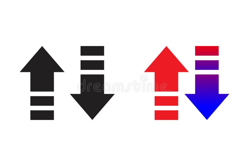
Free with trial This image features a set of up and down arrows in three color variations (black, red, and a gradient from red to blue). Decrease performance vectors Up and Down Arrows in Black, Red, and Blue. This image features a set of up and down arrows in three color variations (black, red, and a gradient from red to blue).
Free with trial Reinforcement button on white background. Decrease performance illustrations Reinforcement button on white
Free with trial A stark red bar graph illustrates a sharp downward trend with a prominent arrow, visually representing financial decline, economic recession, or business failure. Decrease performance illustrations Red bar graph with downward arrow isolated on white background. A stark red bar graph illustrates a sharp downward trend with a prominent arrow, visually representing financial decline, economic recession, or business failure
Free with trial Abstract 3D Bar Chart Showing Data Growth. Decrease performance illustrations Abstract 3D Bar Chart Showing Data Growth
Free with trial 3d bar chart with orange and green bars on a blue grid background isolated on white. Decrease performance illustrations 3d bar chart with orange and green bars on blue grid background graph data. 3d bar chart with orange and green bars on a blue grid background isolated on white
Free with trial A glossy red arrow curves downwards, symbolizing a decrease or negative progression. This striking visual effectively communicates concepts of falling, loss, or a downward trend in a clear and impactful manner. Decrease performance illustrations Dynamic red arrow points downward indicating decline loss or negative trend. A glossy red arrow curves downwards, symbolizing a decrease or negative progression. This striking visual effectively communicates concepts of falling, loss, or a downward trend in a clear and impactful manner
Free with trial A shiny red arrow curves downwards, indicating a downward trend or negative growth. This image visually represents concepts like financial decline market crash or falling stock prices. Decrease performance illustrations Red arrow points downward showing decline trend and negative growth concept. A shiny red arrow curves downwards, indicating a downward trend or negative growth. This image visually represents concepts like financial decline market crash or falling stock prices
Free with trial An icon representing financial downturn, featuring a stack of coins and a line graph with a downward arrow, indicating a decrease in value or performance. This visual signifies economic hardship or in. Decrease performance vectors Graph showing financial decline with coins isolated on transparent background. An icon representing financial downturn, featuring a stack of coins and a line graph with a downward arrow, indicating a decrease in value or performance. This visual signifies economic hardship or in
Free with trial Modern smartphone displaying financial data generative ai image. Decrease performance illustrations Modern smartphone displaying financial data
Free with trial A 3D bar chart with a red arrow indicating a significant downward trend, symbolizing financial loss or economic decline. Isolated on a white background. Decrease performance illustrations Bar chart showing a downward trend isolated on white background. A 3D bar chart with a red arrow indicating a significant downward trend, symbolizing financial loss or economic decline. Isolated on a white background
Free with trial Bar chart showing a steep downward trend with a large arrow indicating decline. Decrease performance vectors Bar chart showing a steep downward trend with a large arrow indicating decline
Free with trial This 3D rendering showcases stacks of Bitcoin-like coins alongside a rising bar graph, illustrating cryptocurrency market growth. The image is generated by AI and ideal for illustrating financial concepts related to digital currencies. Decrease performance illustrations Cryptocurrency Growth Chart. This 3D rendering showcases stacks of Bitcoin-like coins alongside a rising bar graph, illustrating cryptocurrency market growth. The image is generated by AI and ideal for illustrating financial concepts related to digital currencies.
Free with trial Colorful bar graph with stacked segments illustrating growth and data analysis. Decrease performance vectors Colorful bar graph with stacked segments illustrating growth and data analysis
Free with trial Rate showing extensive set of dark gray illustrating financial graphs charts and data analysis symbols keywords: financial, graphs, charts, data. Decrease performance illustrations Extensive Set of Dark Gray Illustrating Financial Graphs Charts and Data Analysis Symbols Keywords: financial
Free with trial Analytics graph line icon. Neumorphic, Flat shadow, 3d buttons. Column chart sign. Growth diagram symbol. Line analytics graph icon. Social media icons. Vector. Decrease performance vectors Analytics graph line icon. Column chart sign. Neumorphic buttons. Vector. Analytics graph line icon. Neumorphic, Flat shadow, 3d buttons. Column chart sign. Growth diagram symbol. Line analytics graph icon. Social media icons. Vector
Free with trial A colorful bar graph with a line graph overlayed on a blue background. it shows data trends and market analysis in a simple visual format. Decrease performance vectors Colorful bar graph with a line graph on a blue background. a colorful bar graph with a line graph overlayed on a blue background. it shows data trends and market analysis in a simple visual format
Free with trial Versus prior year on white paper background. Decrease performance illustrations Versus prior year on white paper
Free with trial An isometric view of a bar chart with five blue bars of decreasing height, representing a downward trend. A red arrow points downwards, indicating a negative trajectory. Decrease performance illustrations Bar chart showing a downward trend with a red arrow isolated on white background. An isometric view of a bar chart with five blue bars of decreasing height, representing a downward trend. A red arrow points downwards, indicating a negative trajectory
Free with trial Black outline of descending bar chart with downward arrow, isolated on white background. concept of economic decline, data analysis, financial crisis, statistics. Decrease performance vectors Black outline of descending bar chart with downward arrow, isolated on white background. concept of economic decline, data
Free with trial This image shows two bar graphs. One shows an upward trend with an arrow pointing up. The other shows a downward trend with an arrow pointing down. Black and white. Decrease performance illustrations Black and white illustration showing upward and downward trending bar graphs with arrows pointing up down. This image shows two bar graphs. One shows an upward trend with an arrow pointing up. The other shows a downward trend with an arrow pointing down. Black and white.
Free with trial A neon glowing graph with blue bars and pink zigzag arrow showing fluctuating growth on black background. Generative AI. Decrease performance illustrations Neon glowing graph with blue bars and pink zigzag arrow showing fluctuating growth on black background
Free with trial This chart depicts a significant downward trend in stock value over a period. The red line graphically represents the declining prices, indicating a bearish market or a stock facing substantial losses. Decrease performance illustrations Stock market downturn visualized red line chart showing price decline over time. This chart depicts a significant downward trend in stock value over a period. The red line graphically represents the declining prices, indicating a bearish market or a stock facing substantial losses
Free with trial Graphic element displays contrasting financial indicators featuring a jagged green arrow pointing up signifying growth alongside a similar red arrow pointing sharply down representing decline or market correction. Decrease performance vectors Graphic representation contrasting upward trending market growth with sharp downward trending financial decline. Graphic element displays contrasting financial indicators featuring a jagged green arrow pointing up signifying growth alongside a similar red arrow pointing sharply down representing decline or market correction
Free with trial This image features two minimalist icons representing financial or data trends. The left icon is a white line graph with circular data points and directional arrows, set against a solid black shield shape. The right icon presents the same line graph and data points within a black outline of a shield, on a white background. Both icons depict fluctuating data, with one showing a downward trend and the other an upward trend, symbolizing market volatility, analysis, and security. Decrease performance illustrations Line Graph Icon with Shield Symbol - Upward and Downward Trends. This image features two minimalist icons representing financial or data trends. The left icon is a white line graph with circular data points and directional arrows, set against a solid black shield shape. The right icon presents the same line graph and data points within a black outline of a shield, on a white background. Both icons depict fluctuating data, with one showing a downward trend and the other an upward trend, symbolizing market volatility, analysis, and security.
Free with trial Black silhouette of descending bar chart with arrow, isolated on white background. concept of financial decline, statistics, economic downturn, data analysis, business graph. Decrease performance vectors Black silhouette of descending bar chart with arrow, isolated on white background. concept of financial decline, statistics
Free with trial Falling bar chart with up and right arrows illustrating declining business trends. Decrease performance vectors Falling bar chart with up and right arrows illustrating declining business trends
Free with trial Bar chart collapse icon with downward arrow. Decline and negative trend sign symbol vector. Decrease performance vectors Bar chart collapse icon with downward arrow. Decline and negative trend sign symbol
Free with trial Graph depiction on paper with a pencil ,Generative ai. Decrease performance illustrations Pencil and paper, a detailed illustration of graph for data analysis visualization. Graph depiction on paper with a pencil ,Generative ai
Free with trial Digital illustration depicting a financial decline with red downward-trending graphs, coin stacks, and scattered currency symbols. Set against a dark grid background with neon highlights, this image conveys themes of market loss, economic recession, and financial analysis�ideal for business, editorial, and presentation use. Decrease performance illustrations Economic Downturn Illustration Red Decline Graph with Coin Stacks on Digital Grid. Digital illustration depicting a financial decline with red downward-trending graphs, coin stacks, and scattered currency symbols. Set against a dark grid background with neon highlights, this image conveys themes of market loss, economic recession, and financial analysis�ideal for business, editorial, and presentation use.
Free with trial A stark red arrow zigzags downwards, powerfully representing economic downturns, market crashes, and negative financial trends. This visual signifies a crisis or significant drop. Decrease performance illustrations Red downward arrow symbolizing financial decline and economic recession trends. A stark red arrow zigzags downwards, powerfully representing economic downturns, market crashes, and negative financial trends. This visual signifies a crisis or significant drop
Free with trial Collection of various red infographic elements including charts, graphs, diagrams, and symbols, perfect for presentations and data visualization. Ideal for showcasing data trends, progress, and comparisons. Easily customizable and adaptable to diverse projects. Decrease performance illustrations Red Infographic Elements
Free with trial A graph shows a downward trend. Green bars diminish in height along a timeline. A red arrow underscores the downward movement of the data on the timeline. Decrease performance illustrations Decreasing graph showing green bars plunging downward with a red arrow indication. A graph shows a downward trend. Green bars diminish in height along a timeline. A red arrow underscores the downward movement of the data on the timeline
Free with trial A collection of black and white icons representing financial concepts such as growth charts, decline arrows, and money symbols, all presented clearly on a plain white background for easy integration i. Decrease performance vectors Financial growth and decline icons isolated on transparent background. A collection of black and white icons representing financial concepts such as growth charts, decline arrows, and money symbols, all presented clearly on a plain white background for easy integration i
Free with trial Interface displaying downward-trending bar chart and dotted line on dashboard, with ticker symbols. Finance, analytics, data visualization, investment, technological, corporate, digital. Decrease performance illustrations Interface displaying downward-trending bar chart and dotted line on dashboard, with ticker symbols
Free with trial Businessman on percentage sign with falling down. Depicts Inflation, decline, falling profits in an economic recession and falling stock market values. Success talent concept. Decrease performance vectors Profit Fall in Economic Recession. Businessman on Percentage Sign with Falling Down. Businessman on percentage sign with falling down. Depicts Inflation, decline, falling profits in an economic recession and falling stock market values. Success talent concept
Free with trial A currency icon with downward arrows represents loss and declining financial value. This graphic suits risk reports, business dashboards, accounting materials, and market analysis presentations. Decrease performance vectors Loss Finance Downward Currency Symbol. A currency icon with downward arrows represents loss and declining financial value. This graphic suits risk reports, business dashboards, accounting materials, and market analysis presentations
Free with trial Up and down arrow on bar chart icon set. Growth and decline graph symbol illustration. Financial trend concept. Decrease performance vectors Up and down arrow on bar chart icon set. Growth and decline graph symbol. Financial trend concept
Free with trial Year to year on white paper background. Decrease performance illustrations Year to year on white paper
Free with trial Revenue turnover word block on white background. Decrease performance illustrations Revenue turnover word block on white
Free with trial A snarling brown bear symbolizes a bear market, with a declining stock chart and red candlestick graph, illustrating financial downturn and investment losses against a dark red background. Decrease performance illustrations Bear Market Snarl: Stock Chart Downtrend, Candlestick Graph Plunge. A snarling brown bear symbolizes a bear market, with a declining stock chart and red candlestick graph, illustrating financial downturn and investment losses against a dark red background
Free with trial Red downward arrows symbolize a decline in financial markets or economic downturn. The background features blurred lights, enhancing the dramatic effect. Decrease performance illustrations Red downward arrows symbolize a decline in financial markets or economic downturn.
Free with trial This futuristic visualization, generated by AI, depicts a global Bitcoin network, highlighting its worldwide reach and digital infrastructure. Data streams and interactive elements showcase the complex interplay of transactions and information flow within the cryptocurrency ecosystem. Decrease performance illustrations Global Bitcoin Network
Free with trial This conceptual illustration depicts the relationship between productivity signals and cognitive flow lines in human brains. The image features two stylized human heads, one with a red and orange network representing a decrease in productivity, and the other with a blue and green network representing an increase in productivity. The illustration highlights the importance of understanding mental states and optimizing workflow to achieve success and improve overall well-being. Decrease performance vectors Mental health A conceptual illustration of productivity signals and cognitive flow lines in human brains. This conceptual illustration depicts the relationship between productivity signals and cognitive flow lines in human brains. The image features two stylized human heads, one with a red and orange network representing a decrease in productivity, and the other with a blue and green network representing an increase in productivity. The illustration highlights the importance of understanding mental states and optimizing workflow to achieve success and improve overall well-being.
Free with trial Set of twelve black and white icons representing business and finance concepts such as graphs charts analysis tools and targets isolated on transparent background. Decrease performance vectors Collection of business and finance icons including graphs charts and analysis tools for presentations and reports. Set of twelve black and white icons representing business and finance concepts such as graphs charts analysis tools and targets isolated on transparent background
Free with trial Calendar graph line icon. Halftone dotted pattern. Gradient icon with grain shadow. Column chart sign. Growth diagram symbol. Line calendar graph icon. Various designs. Vector. Decrease performance vectors Calendar graph line icon. Column chart sign. Halftone dotted pattern. Vector. Calendar graph line icon. Halftone dotted pattern. Gradient icon with grain shadow. Column chart sign. Growth diagram symbol. Line calendar graph icon. Various designs. Vector
Free with trial A striking 3D rendering features an abstract bar graph composed of numerous translucent blue rectangular blocks against a dark, almost black, background. The varying heights of the blocks create a dynamic visual representation of data, statistics, or growth trends. This modern and futuristic design is ideal for illustrating concepts related to business, finance, technology, analytics, market research, or digital information in presentations, reports, websites, and corporate media. Decrease performance illustrations Abstract 3D Blue Bar Graph Visualization. A striking 3D rendering features an abstract bar graph composed of numerous translucent blue rectangular blocks against a dark, almost black, background. The varying heights of the blocks create a dynamic visual representation of data, statistics, or growth trends. This modern and futuristic design is ideal for illustrating concepts related to business, finance, technology, analytics, market research, or digital information in presentations, reports, websites, and corporate media.
Free with trial A glowing neon blue line graph depicts a steep downward trend with an arrow indicating a significant fall. Decrease performance illustrations Neon blue graph illustrating a sharp decline and downward trend on a dark background. A glowing neon blue line graph depicts a steep downward trend with an arrow indicating a significant fall
Free with trial Travel industry decline, concept. Colorful suitcases with downward red arrow. 3D rendering isolated on white background. Decrease performance illustrations Travel industry decline, concept. Colorful suitcases with downward red arrow. 3D rendering
Free with trial Red line graph showing a sharp decline overlays a world map, symbolizing a global financial crisis and market downturn. The graph, illuminated in red, sharply contrasts the dark background, highlighting volatility and economic instability. The map features continents in a subdued light, enhancing the focus on the graph's fluctuating line. This visual concept emphasizes the widespread impact of economic recession. Decrease performance illustrations Glowing red graph showing a stock market crash and economic recession over a world map. Red line graph showing a sharp decline overlays a world map, symbolizing a global financial crisis and market downturn. The graph, illuminated in red, sharply contrasts the dark background, highlighting volatility and economic instability. The map features continents in a subdued light, enhancing the focus on the graph's fluctuating line. This visual concept emphasizes the widespread impact of economic recession.
Free with trial Viewing Progress Icon Line Design Style Finance and Business Symbol Vector Illustrations. Decrease performance vectors Viewing Progress Icon Line Design Style Finance and Business Symbol
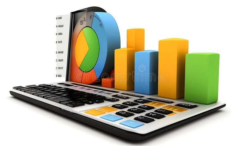
Free with trial Colorful Charts on a Calculator Keyboard. Decrease performance illustrations Colorful Charts on a Calculator Keyboard