Free with trial A minimalist icon showing a computer monitor displaying a user profile next to a declining bar chart. Decrease performance vectors User Data Decline on Computer Monitor Icon. A minimalist icon showing a computer monitor displaying a user profile next to a declining bar chart
Free with trial This graphic features a dynamic composition of overlapping line charts and arrows representing fluctuating economic data. Vibrant green and red lines indicate upward and downward trends, while blue nodes highlight specific data points. A stylized building icon and currency symbol are integrated into the design to signify banking and monetary concepts. The clean, flat aesthetic provides a clear. Decrease performance vectors A colorful illustration showing financial growth and market decline trends. This graphic features a dynamic composition of overlapping line charts and arrows representing fluctuating economic data. Vibrant green and red lines indicate upward and downward trends, while blue nodes highlight specific data points. A stylized building icon and currency symbol are integrated into the design to signify banking and monetary concepts. The clean, flat aesthetic provides a clear
Free with trial Interest rates are coming down in the form of a percentage symbol being pulled and pushed down from a mountain summit. This is a 3-d illustration about falling interest rates. Decrease performance illustrations Interest rates are coming down in the form of a percentage symbol being pulled and pushed down from a mountain summit.
Free with trial Positive business graph arrow. Wide red arrow icon financial graph. Decrease performance illustrations Positive business graph arrow. Wide red arrow icon financial graph
Free with trial Business decline bar graph concept drawn with chalk on a dark blackboard, illustrating decreasing performance and strategic reduction. Features a bright yellow downward arrow, white chalk elements, and ample copy space. Decrease performance illustrations Business Decline Bar Graph Chalk Drawing Downward Yellow Arrow Strategy Concept Dark Background. Business decline bar graph concept drawn with chalk on a dark blackboard, illustrating decreasing performance and strategic reduction. Features a bright yellow downward arrow, white chalk elements, and ample copy space.
Free with trial Red arrow graph showing a downward trend on a grid background with a sharp decline at the end. Decrease performance illustrations Red downward arrow graph on grid background. Red arrow graph showing a downward trend on a grid background with a sharp decline at the end
Free with trial Business chart showing decline, red arrow down indicates financial loss, crisis, or failure. Decrease performance illustrations Business graph with red arrow pointing down showing financial decline. Business chart showing decline, red arrow down indicates financial loss, crisis, or failure
Free with trial This vibrant 3D bar graph features various colorful bars with an upward arrow, symbolizing growth and success in financial and business metrics Generative Ai. Decrease performance illustrations Colorful 3D Bar Graph Showing Growth with Upward Arrow Design. This vibrant 3D bar graph features various colorful bars with an upward arrow, symbolizing growth and success in financial and business metrics Generative Ai
Free with trial A bold dollar rate down sign icon, isolated on a white background. Perfect for economic, financial, and business-themed designs. Decrease performance illustrations Dollar Rate Down Sign Icon Isolated on White. A bold dollar rate down sign icon, isolated on a white background. Perfect for economic, financial, and business-themed designs.
Free with trial Illustration of children with descending graphs. Decrease performance vectors Children with descending graphs
Free with trial Four blue square icons with arrows indicating percentage changes, two with upward green arrows and two with downward red arrows. Decrease performance illustrations Set of four icons showing percentage changes. Four blue square icons with arrows indicating percentage changes, two with upward green arrows and two with downward red arrows
Free with trial This graphic features a bold, vibrant red zigzag arrow oriented in a downward direction. The design utilizes clean lines and a simple aesthetic, making it ideal for representing decline, loss, or negative trends in data visualization. The stark contrast against the plain white background ensures high visibility and versatility for various professional presentations or digital interfaces. Decrease performance vectors A bright red zigzag arrow pointing downwards on a clean white background. This graphic features a bold, vibrant red zigzag arrow oriented in a downward direction. The design utilizes clean lines and a simple aesthetic, making it ideal for representing decline, loss, or negative trends in data visualization. The stark contrast against the plain white background ensures high visibility and versatility for various professional presentations or digital interfaces
Free with trial A professional bar chart visualization featuring multiple colorful vertical bars of varying heights, representing statistical data, growth, or financial analysis in a clean minimalist style. Created AI. Decrease performance illustrations A colorful bar graph showing financial data trends on white background. A professional bar chart visualization featuring multiple colorful vertical bars of varying heights, representing statistical data, growth, or financial analysis in a clean minimalist style.Created AI
Free with trial A 3D rendered image of a tall cylindrical structure composed of stainless steel vertical bars arranged in descending order from tallest at the top to shortest at the bottom, creating a minimalist bar chart visualization that rests on a rectangular base of the same metallic material, evoking a modern and sleek aesthetic suitable for presentations about data analysis, financial growth, business. Decrease performance illustrations Modern stainless steel 3D bar graph rendering with minimalist design and sleek vertical structure. A 3D rendered image of a tall cylindrical structure composed of stainless steel vertical bars arranged in descending order from tallest at the top to shortest at the bottom, creating a minimalist bar chart visualization that rests on a rectangular base of the same metallic material, evoking a modern and sleek aesthetic suitable for presentations about data analysis, financial growth, business
Free with trial A 3D bar chart with a green bar showing an upward trend and a red bar showing a downward trend on a blue base. Decrease performance illustrations Bar chart showing upward and downward trends. A 3D bar chart with a green bar showing an upward trend and a red bar showing a downward trend on a blue base
Free with trial A creative, hand-drawn bar chart illustrates a downward trend in data. Decrease performance vectors HandDrawn Business Bar Chart Showing Decline. A creative, hand-drawn bar chart illustrates a downward trend in data
Free with trial An isometric bar chart displays a series of rectangular bars arranged in a descending line. The bars transition in color from blue at the tallest end to orange at the shortest end, set against a light, neutral background. Decrease performance illustrations Isometric Bar Chart with Decreasing Bars in Gradient Colors graph data. An isometric bar chart displays a series of rectangular bars arranged in a descending line. The bars transition in color from blue at the tallest end to orange at the shortest end, set against a light, neutral background
Free with trial A hand presents a cost reduction graph with a downward trend, symbolizing financial efficiency and savings Used for business and economic presentations. Decrease performance illustrations Showing Cost Reduction Graph on Hand for Financial Efficiency. A hand presents a cost reduction graph with a downward trend, symbolizing financial efficiency and savings Used for business and economic presentations
Free with trial A dynamic financial chart illustrating market fluctuations with percentage changes and various currency coins. Ideal for illustrating economic trends, investment analysis, or financial reports. Decrease performance illustrations Financial Growth Chart with Currency Symbols. A dynamic financial chart illustrating market fluctuations with percentage changes and various currency coins. Ideal for illustrating economic trends, investment analysis, or financial reports
Free with trial Stacks of coins rise against a backdrop of financial charts and a blurred global map, illustrating financial growth and global investment. This image, generated by AI, depicts the complex interplay between monetary value and market trends, suggesting success and potential. Decrease performance illustrations AI-Generated Financial Growth Visualization. Stacks of coins rise against a backdrop of financial charts and a blurred global map, illustrating financial growth and global investment. This image, generated by AI, depicts the complex interplay between monetary value and market trends, suggesting success and potential.
Free with trial Decreasing bar graph with downward arrow icon representing financial loss, recession, and business failure. Decrease performance vectors Decreasing bar graph with downward arrow icon representing financial loss, recession, and business failure
Free with trial A minimalist, flat design illustration featuring a simple line graph. The graph has a blue, curved line representing data that initially dips and then rises, with a prominent blue dot marking a key point. It is presented against a clean white background with a black coordinate system, including axes labeled with 'x' and tick marks. This graphic is ideal for representing concepts related to data analysis, growth, trends, statistics, and mathematical functions. Decrease performance vectors Abstract Graph Curve with Axes and Data Point. A minimalist, flat design illustration featuring a simple line graph. The graph has a blue, curved line representing data that initially dips and then rises, with a prominent blue dot marking a key point. It is presented against a clean white background with a black coordinate system, including axes labeled with 'x' and tick marks. This graphic is ideal for representing concepts related to data analysis, growth, trends, statistics, and mathematical functions.
Free with trial A computer screen displaying a stock market graph with red and green bars. the graph shows the stock's performance over time, with the x-axis representing time and the y-axis representing price. the red and green bars indicate the stock's price movements, with red indicating a decrease in price and green indicating an increase. the graph also includes several lines that represent different moving. This image was generated using artificial intelligence. Decrease performance illustrations A computer screen displaying a stock market graph with red and green bars
Free with trial Business decline icon with downward arrow. Loss, failure, or economic crisis symbol vector. Decrease performance vectors Business decline icon with downward arrow. Loss, failure, or economic crisis symbol
Free with trial A 3D bar chart with purple translucent bars illustrates a declining trend, with a purple arrow pointing downwards. Decrease performance illustrations 3D Bar Chart Showing Downward Trend with Arrow. A 3D bar chart with purple translucent bars illustrates a declining trend, with a purple arrow pointing downwards
Free with trial Declining Bar Graph with Downward Trend Arrow Illustrating Economic Loss, Financial Issues, and Market Crash. Decrease performance vectors Declining Bar Graph with Downward Trend Arrow Illustrating Economic Loss, Financial Issues, and Market Crash
Free with trial A 3D rendered image displays a collection of business charts on a document. A colorful pie chart with six segments sits to the left of a bar graph with five vertical bars of varying heights and colors. A line graph with multiple colored lines is visible on the document below. The composition is set against a white background. Decrease performance illustrations 3D Rendered Pie Chart Bar Graph and Line Graph on a Document data statistics. A 3D rendered image displays a collection of business charts on a document. A colorful pie chart with six segments sits to the left of a bar graph with five vertical bars of varying heights and colors. A line graph with multiple colored lines is visible on the document below. The composition is set against a white background
Free with trial The image depicts a magnifying glass closely inspecting a graph that shows a rising trend. The graph is set against a blue circular background with white radial lines extending outward. A yellow upward-pointing arrow signifies growth, while a downward-pointing yellow arrow indicates a decline. The magnifying glass emphasizes the importance of detailed analysis in monitoring market trends. Decrease performance illustrations Examining market growth with magnifying glass. The image depicts a magnifying glass closely inspecting a graph that shows a rising trend. The graph is set against a blue circular background with white radial lines extending outward. A yellow upward-pointing arrow signifies growth, while a downward-pointing yellow arrow indicates a decline. The magnifying glass emphasizes the importance of detailed analysis in monitoring market trends
Free with trial A hand interacts with luminous digital charts and graphs representing financial data. The scene conveys trends and growth in a modern business context. Scalp. Decrease performance illustrations Hand Interacting with Digital Charts and Graphs Displaying Financial Data in a Dark Background with Global Map for. A hand interacts with luminous digital charts and graphs representing financial data. The scene conveys trends and growth in a modern business context. Scalp
Free with trial This visually compelling chart illustrates a significant reduction in carbon dioxide emissions over time, showcasing a -45% decrease, emphasizing the importance of environmental sustainability and progress. Decrease performance illustrations Chart Showing Significant Reduction in Carbon Dioxide Emissions Over Time with Green Design. This visually compelling chart illustrates a significant reduction in carbon dioxide emissions over time, showcasing a -45% decrease, emphasizing the importance of environmental sustainability and progress
Free with trial This image depicts a graph with fluctuating data trends over time, represented by both a line chart and bar chart. Decrease performance illustrations Graph showing fluctuating data trends over time. This image depicts a graph with fluctuating data trends over time, represented by both a line chart and bar chart
Free with trial Upward arrows with different heights on blue wooden background. Business cycle, strategic planning, new opportunities concepts. Decrease performance illustrations Upward arrows with different heights on blue wooden background
Free with trial Collection of eight minimalist line icons representing various types of data visualization, including bar charts, line graphs, pie charts, and progress indicators. Ideal for websites, apps, or presentations needing a clean and modern aesthetic. Decrease performance illustrations Data Visualization Icons. Collection of eight minimalist line icons representing various types of data visualization, including bar charts, line graphs, pie charts, and progress indicators. Ideal for websites, apps, or presentations needing a clean and modern aesthetic.
Free with trial A man holds a chalkboard with a hand-drawn graph showing a sharp decline. This image, generated by AI, symbolizes economic downturn, financial crisis, and market instability. It can be used to represent various concepts related to economic hardship and uncertainty. Decrease performance illustrations Declining Market Trend. A man holds a chalkboard with a hand-drawn graph showing a sharp decline. This image, generated by AI, symbolizes economic downturn, financial crisis, and market instability. It can be used to represent various concepts related to economic hardship and uncertainty.
Free with trial CGI shows how trade deficits influence import export markets and economics. Decrease performance illustrations CGI visuals illustrating how trade deficits influence import and export market dynamics. CGI shows how trade deficits influence import export markets and economics
Free with trial Declining chart icon. Negative trend graphic. Falling bar symbol. Vector diagram shape. EPS 10. Decrease performance vectors Declining chart icon. Negative trend graphic. Falling bar symbol. Vector diagram shape.
Free with trial Hand is pointing towards a descending bar chart with bars in shades of red, orange, and yellow on a white background. Decrease performance illustrations The hand points to the bar chart showing a downtrend. hand is pointing towards a descending bar chart with bars in shades of red, orange, and yellow on a white background.
Free with trial This illustration features a minimalist hand-drawn line graph depicting a clear downward trajectory. The blue line connects several circular data points, ending in a distinct red circle that highlights a final decline. The background is clean and white, emphasizing the simple sketch style used to represent financial or statistical loss. Decrease performance vectors A simple hand drawn line graph showing a downward trend on a white background. This illustration features a minimalist hand-drawn line graph depicting a clear downward trajectory. The blue line connects several circular data points, ending in a distinct red circle that highlights a final decline. The background is clean and white, emphasizing the simple sketch style used to represent financial or statistical loss
Free with trial Finger Pressing Red Down Arrow Market Indicator. Decrease performance illustrations Finger Pressing Red Down Arrow Market Indicator
Free with trial This icon features a simple black and white representation of a bar graph with bars decreasing in height from left to right. A bold black arrow points downwards, indicating a decline or negative trend. The entire graphic is enclosed within a black circle and presented on a white background, making it a clear and concise symbol for financial or economic downturn. Decrease performance illustrations Icon of a Falling Bar Graph with Downward Arrow Symbolizing Decline chart. This icon features a simple black and white representation of a bar graph with bars decreasing in height from left to right. A bold black arrow points downwards, indicating a decline or negative trend. The entire graphic is enclosed within a black circle and presented on a white background, making it a clear and concise symbol for financial or economic downturn
Free with trial A 3D visualization of financial data, featuring a colorful pie chart and a series of bar graphs placed on top of a financial report document. The document also includes line graphs, illustrating various data trends and analyses. The composition is set against a white background. Decrease performance illustrations 3D Bar Chart and Pie Chart on Financial Report with Line Graphs data statistics. A 3D visualization of financial data, featuring a colorful pie chart and a series of bar graphs placed on top of a financial report document. The document also includes line graphs, illustrating various data trends and analyses. The composition is set against a white background
Free with trial This abstract image features a silhouette of a bar graph against a clean white background. The bars vary in height and width, creating a dynamic, wave-like pattern that rises towards the center and then gradually descends. The overall impression is one of growth, progress, or data visualization. This versatile graphic can be used for concepts related to business, finance, technology, statistics, or any subject requiring a visual representation of change and trends. Decrease performance vectors Abstract Silhouette Bar Graph with Rising Trend. This abstract image features a silhouette of a bar graph against a clean white background. The bars vary in height and width, creating a dynamic, wave-like pattern that rises towards the center and then gradually descends. The overall impression is one of growth, progress, or data visualization. This versatile graphic can be used for concepts related to business, finance, technology, statistics, or any subject requiring a visual representation of change and trends.
Free with trial An illustrative bar chart where each increasing column features a sad or frowning emoticon. Decrease performance vectors Sad Emoticon Bar Chart Showing Negative Results. An illustrative bar chart where each increasing column features a sad or frowning emoticon
Free with trial This image showcases twelve diverse data visualization icons, including bar charts, pie charts, line graphs, and other visual representations of data. These icons are ideal for presentations, reports, or digital interfaces needing a modern and aesthetically pleasing design. The color palette is co. Decrease performance illustrations Data Visualization Icons
Free with trial This image contains a collection of 16 line icons representing various data visualization and time-related concepts. The icons are circular and use a consistent color scheme, making them suitable for use in presentations, reports, or websites. The style is clean and modern. Decrease performance illustrations Data Visualization Icons. This image contains a collection of 16 line icons representing various data visualization and time-related concepts. The icons are circular and use a consistent color scheme, making them suitable for use in presentations, reports, or websites. The style is clean and modern.
Free with trial Data charts and tables illustration sales bar, colorful categories, figures trends data charts and tables. Decrease performance illustrations Data charts and tables
Free with trial Illustration of a growing budget efficiency with a simple money bag closing tightly, a stylized downward-pointing cost arrow, and a stream of saved coins. Vector flat icon design on a white background for a cost control illustration --chaos 30 --ar 16:9 --v 7 Job ID: 35adf769-e45b-43cf-a8e7-0b2af69479b3. Decrease performance illustrations Money Bag Downward Arrow, Financial Crisis, Economic Downturn, Falling Value. Illustration of a growing budget efficiency with a simple money bag closing tightly, a stylized downward-pointing cost arrow, and a stream of saved coins. Vector flat icon design on a white background for a cost control illustration --chaos 30 --ar 16:9 --v 7 Job ID: 35adf769-e45b-43cf-a8e7-0b2af69479b3
Free with trial A set of twelve colorful icons representing various data visualization methods, including bar charts, pie charts, line graphs, and other visual representations of data analysis. Perfect for presentations, reports, and websites needing clear data insights. Decrease performance illustrations Data Visualization Icons. A set of twelve colorful icons representing various data visualization methods, including bar charts, pie charts, line graphs, and other visual representations of data analysis. Perfect for presentations, reports, and websites needing clear data insights.
Free with trial Set of 16 line icons representing various types of charts, graphs, clocks, and data-related symbols. Perfect for business presentations, reports, or website design. Clean and modern style. Decrease performance illustrations Data Visualization Icons. Set of 16 line icons representing various types of charts, graphs, clocks, and data-related symbols. Perfect for business presentations, reports, or website design. Clean and modern style.
Free with trial A visually striking representation of financial decline, featuring a red arrow pointing downward on a sleek graph. Ideal for illustrating market trends and economic analysis. Decrease performance illustrations Red Arrow Graph Depicting Financial Decline and Market Trends. A visually striking representation of financial decline, featuring a red arrow pointing downward on a sleek graph. Ideal for illustrating market trends and economic analysis
Free with trial Red percentage symbol and downward arrow with graph line, minimalist style, white background, concept of decline or economic drop. 3D Rendering. Decrease performance illustrations Red percentage symbol with downward arrow and graph line on white background. 3D Rendering. Red percentage symbol and downward arrow with graph line, minimalist style, white background, concept of decline or economic drop. 3D Rendering
Free with trial A blue arrow pointing upwards next to a bar graph, some bars are broken, symbolizing growth and decline in a business or market. Decrease performance illustrations Blue Arrow and Bar Graph Showing Growth and Decline. A blue arrow pointing upwards next to a bar graph, some bars are broken, symbolizing growth and decline in a business or market
Free with trial An abstract graphic featuring a series of vertical bars with rounded tops, arranged in varying heights along a horizontal base. The bars display a smooth gradient color transition, starting with blue on the left and shifting to purple and pink on the right. Set against a clean white background, this modern and minimalist design evokes concepts of data visualization, statistical analysis, or an audio equalizer. It's ideal for illustrating growth, progress, or comparative data in presentations, infographics, web design, or technology-related content. Decrease performance vectors Abstract Gradient Bar Chart or Equalizer Graphic. An abstract graphic featuring a series of vertical bars with rounded tops, arranged in varying heights along a horizontal base. The bars display a smooth gradient color transition, starting with blue on the left and shifting to purple and pink on the right. Set against a clean white background, this modern and minimalist design evokes concepts of data visualization, statistical analysis, or an audio equalizer. It's ideal for illustrating growth, progress, or comparative data in presentations, infographics, web design, or technology-related content.
Free with trial Downward trend financial graph sketch illustration. Decrease performance vectors Downward trend financial graph sketch illustration
Free with trial Bar chart with downward arrow icon vector. Financial crisis concept. Economy downturn and loss symbol in black circle. Decrease performance vectors Bar chart with downward arrow icon. Financial crisis concept. Economy downturn and loss symbol in black circle
Free with trial This image shows colorful financial charts and graphs, generated by AI, illustrating various data points and percentages. The overlaid arrows suggest a downward trend, potentially indicating a negative market shift or economic decline. The visual representation aids in quick understanding of compl. Decrease performance illustrations Financial Data Analysis. This image shows colorful financial charts and graphs, generated by AI, illustrating various data points and percentages. The overlaid arrows suggest a downward trend, potentially indicating a negative market shift or economic decline. The visual representation aids in quick understanding of compl
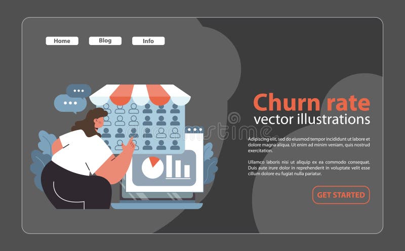
Free with trial Churn rate analytics concept. Woman studying customer retention metrics on a computer screen. Business analysis, graph visualization, and feedback tracking. Flat vector illustration. Decrease performance vectors Churn rate analytics concept. Flat. Churn rate analytics concept. Woman studying customer retention metrics on a computer screen. Business analysis, graph visualization, and feedback tracking. Flat vector illustration
Free with trial A simple yet effective visualization showing data via a pie chart and bar graph Ideal for presentations and reports. Decrease performance illustrations Colorful Pie Chart and Bar Graph Data Visualization. A simple yet effective visualization showing data via a pie chart and bar graph Ideal for presentations and reports
Free with trial Financial business graph with bars decreasing and red arrow pointing down. Concept for economic recession or stock market decline. Decrease performance vectors Financial graph showing downward trend with arrow. Financial business graph with bars decreasing and red arrow pointing down. Concept for economic recession or stock market decline
Free with trial A conceptual 3D illustration of cybersecurity and digital safety. Three blocks represent key components of a security strategy: a glowing shield for protection, a padlock for defense, and a chart showing risk reduction. This image symbolizes the implementation of robust defense mechanisms to mitigate online threats and protect sensitive data. The technological background with network lines and graphs highlights the context of information technology, data analysis, and modern security challenges. Ideal for illustrating topics on internet security, data privacy, and risk management. Decrease performance illustrations Cybersecurity Defense and Risk Management Concept. A conceptual 3D illustration of cybersecurity and digital safety. Three blocks represent key components of a security strategy: a glowing shield for protection, a padlock for defense, and a chart showing risk reduction. This image symbolizes the implementation of robust defense mechanisms to mitigate online threats and protect sensitive data. The technological background with network lines and graphs highlights the context of information technology, data analysis, and modern security challenges. Ideal for illustrating topics on internet security, data privacy, and risk management.
Free with trial Bar chart showing decline, red arrow points down, financial crisis, recession, negative growth. Decrease performance illustrations Downward trend graph with white bars and red arrow. Bar chart showing decline, red arrow points down, financial crisis, recession, negative growth
Free with trial Businessman holding magnifying glass with word COST and downward arrows for cost reduction of financial strategy and budget management for business efficiency with savings improvement concept. Decrease performance illustrations Businessman holding magnifying glass with word COST and downward arrows for cost reduction of financial strategy and budget
Free with trial A 3D isometric bar chart with a gradient color scheme from blue to red and orange, depicting a downward trend. The bars are arranged in descending order of height, set against a clean white background. This visual represents data analysis, financial decline, or a negative trend. Decrease performance illustrations Isometric Gradient Bar Chart Showing Decline on White Background graph data. A 3D isometric bar chart with a gradient color scheme from blue to red and orange. A 3D isometric bar chart with a gradient color scheme from blue to red and orange, depicting a downward trend. The bars are arranged in descending order of height, set against a clean white background. This visual represents data analysis, financial decline, or a negative trend
Free with trial A 3d rendered clock icon with a red downward arrow, isolated on black background. Decrease performance vectors Clock icon with downward arrow blue red 3d render. a 3d rendered clock icon with a red downward arrow, isolated on black background
Free with trial A captivating arrangement of white blocks displaying percentage values, symbolizing statistical data analysis. Perfect for business and finance projects. Decrease performance illustrations White Percentage Blocks Representing Statistical Data and Trends. A captivating arrangement of white blocks displaying percentage values, symbolizing statistical data analysis. Perfect for business and finance projects
Free with trial A collection of colorful 3D financial graphics on a white background. This includes a rising candlestick chart with red and green bars, a segmented pie chart with four colors, and a circular segmented chart with five colors. Decrease performance illustrations Colorful 3D Financial Charts and Graphs on White Background finance business. A collection of colorful 3D financial graphics on a white background. This includes a rising candlestick chart with red and green bars, a segmented pie chart with four colors, and a circular segmented chart with five colors
Free with trial Set of black and white vector icons featuring downward trending bar graphs, magnifying glass analysis, and presentation charts illustrating data decline. Generative AI. Decrease performance vectors Black and white icons of declining bar graph data and analysis. Set of black and white vector icons featuring downward trending bar graphs, magnifying glass analysis, and presentation charts illustrating data decline. Generative AI
Free with trial Abstract 3D render of a colorful descending bar chart with cubes. Perfect for data visualization, business presentations, or illustrating trends. Representing financial, statistical or marketing information. Decrease performance illustrations Colorful 3D Bar Chart, Data Visualization Concept. Abstract 3D render of a colorful descending bar chart with cubes. Perfect for data visualization, business presentations, or illustrating trends. Representing financial, statistical or marketing information.
Free with trial Graph line icon. Neumorphic, Flat shadow, 3d buttons. Column chart sign. Growth diagram symbol. Line graph chart icon. Social media icons. Vector. Decrease performance vectors Graph line icon. Column chart sign. Neumorphic buttons. Vector. Graph line icon. Neumorphic, Flat shadow, 3d buttons. Column chart sign. Growth diagram symbol. Line graph chart icon. Social media icons. Vector
Free with trial A clean, flat design illustration of a bar graph depicting a significant downward trend, highlighted by a bold blue arrow pointing downwards. Decrease performance illustrations A bar graph showing a downward trend with a blue arrow. A clean, flat design illustration of a bar graph depicting a significant downward trend, highlighted by a bold blue arrow pointing downwards
Free with trial A modern computer monitor displays a detailed stock market candlestick chart on its screen, showing a downward trend with red and green candles and moving averages. The chart is set against a softly lit office or home office background, with a potted snake plant and pens in a holder adding a touch of life and organization to the scene. This image evokes themes of financial analysis, trading, investment, market volatility, and economic downturns, suitable for business, finance, and technology-related content. Decrease performance illustrations Computer Screen Displaying Stock Market Candlestick Chart with Falling Trend. A modern computer monitor displays a detailed stock market candlestick chart on its screen, showing a downward trend with red and green candles and moving averages. The chart is set against a softly lit office or home office background, with a potted snake plant and pens in a holder adding a touch of life and organization to the scene. This image evokes themes of financial analysis, trading, investment, market volatility, and economic downturns, suitable for business, finance, and technology-related content.
Free with trial This 3D illustration features a series of vertical bars arranged in a descending sequence, representing a decline in data. A smooth, continuous line graph follows the top of the bars, emphasizing the negative trajectory. The color palette uses shades of blue and light gray against a clean white background, creating a professional and minimalist aesthetic suitable for financial or analytical. Decrease performance vectors A three dimensional bar chart showing a downward trend with a line graph overlay. This 3D illustration features a series of vertical bars arranged in a descending sequence, representing a decline in data. A smooth, continuous line graph follows the top of the bars, emphasizing the negative trajectory. The color palette uses shades of blue and light gray against a clean white background, creating a professional and minimalist aesthetic suitable for financial or analytical
Free with trial Hand drawing a yellow downward trend chart on a black chalkboard depicting financial decline economic downturn or business losses. Illustrating concept of falling sales and decreasing profits. Decrease performance illustrations Hand Drawn Yellow Downward Trend Chart on Black Chalkboard Depicting Financial Decline. Hand drawing a yellow downward trend chart on a black chalkboard depicting financial decline economic downturn or business losses. Illustrating concept of falling sales and decreasing profits
Free with trial Financial decision and interest rate change concept, wooden blocks showing percentage symbol with green upward and red downward arrows. Decrease performance illustrations Financial decision and interest rate change concept
Free with trial Financial decision and interest rate change concept, wooden blocks showing percentage symbol with green upward and red downward arrows. Decrease performance illustrations Financial decision and interest rate change concept
Free with trial Financial decision and interest rate change concept, wooden blocks showing percentage symbol with green upward and red downward arrows. Decrease performance illustrations Financial decision and interest rate change concept
Free with trial Financial decision and interest rate change concept, wooden blocks showing percentage symbol with green upward and red downward arrows. Decrease performance illustrations Financial decision and interest rate change concept
Free with trial Close-up view of financial charts in shades of blue with two pens resting on the document. The charts display various lines and bar graphs indicating data trends. The image has a cool tone and a shallow depth of field. Decrease performance illustrations Closeup Blue Financial Charts Two Pens Business Data Analysis Report Graphs Statistics business report. Close-up view of financial charts in shades of blue with two pens resting on the document. The charts display various lines and bar graphs indicating data trends. The image has a cool tone and a shallow depth of field
Free with trial A visual representation of sound level using a colorful bar graph, with a sound wave and a speaker icon indicating audio. Decrease performance illustrations Volume Bar Graph with Sound Wave and Speaker Icon. A visual representation of sound level using a colorful bar graph, with a sound wave and a speaker icon indicating audio
Free with trial Financial percentage reduction cycle icon with downward arrow showing decreased value and continuous process. Decrease performance vectors Financial percentage reduction cycle icon with downward arrow showing decreased value and continuous process