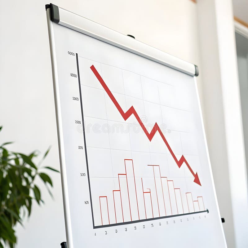
Free with trial The image shows an easel holding a white poster with a blue bar and line chart. The chart depicts a series of vertical bars that gradually decrease in height, accompanied by a line graph that rises initially and then declines. The easel is positioned on a plain, light-colored background, emphasizing the visual data presentation on the poster. Decrease statistics illustrations Easel displaying a bar and line chart illustrating financial or data trends. The image shows an easel holding a white poster with a blue bar and line chart. The chart depicts a series of vertical bars that gradually decrease in height, accompanied by a line graph that rises initially and then declines. The easel is positioned on a plain, light-colored background, emphasizing the visual data presentation on the poster
Free with trial A 3D rendered red arrow points downward across a white grid background with blue bar graph elements. The bars decrease in height from left to right, indicating a downward trend. Decrease statistics illustrations Red arrow graph chart showing decline on white grid background with blue bars downward trend. A 3D rendered red arrow points downward across a white grid background with blue bar graph elements. The bars decrease in height from left to right, indicating a downward trend
Free with trial A striking red downward arrow is prominently placed on a chart highlighting a notable decrease in financial metrics over time suggesting a troubling trend in market analysis. Decrease statistics illustrations A striking red downward arrow is prominently placed on a chart highlighting a notable decrease in financial metrics over time
Free with trial The image shows a central upward-pointing red arrow with a percent sign, indicating an increase, flanked by two downward-pointing red arrows on either side, symbolizing decreases or fluctuations in percentage values. This visual metaphor is often used to represent changes in metrics, financial trends, or statistical variations. Decrease statistics illustrations Graphic illustrating percentage increase and decrease with directional arrows. The image shows a central upward-pointing red arrow with a percent sign, indicating an increase, flanked by two downward-pointing red arrows on either side, symbolizing decreases or fluctuations in percentage values. This visual metaphor is often used to represent changes in metrics, financial trends, or statistical variations
Free with trial The image shows a bar graph with three bars of decreasing height, representing a downward trend. A red arrow is pointing downwards, emphasizing the decline in values over time. Decrease statistics illustrations A downward trend graph with a red arrow indicating a decrease in values over time. The image shows a bar graph with three bars of decreasing height, representing a downward trend. A red arrow is pointing downwards, emphasizing the decline in values over time
Free with trial A black graph illustrates valuation extreme low with a downward arrow on a white background. Decrease statistics illustrations Black graph showing valuation extreme low with downward arrow decline decrease. A black graph illustrates valuation extreme low with a downward arrow on a white background
Free with trial Three dimensional red bar chart graphic illustrating a continuous downward trend in business statistics or performance indicators. Decrease statistics vectors Three dimensional red bar chart showing decreasing metrics on white background. Three dimensional red bar chart graphic illustrating a continuous downward trend in business statistics or performance indicators.
Free with trial This stylized bar graph shows a downward trending line, representing decrease or loss in a flat graphic style with blue and gray hues. Decrease statistics vectors Downward trend graph indicating loss or decline in a modern simple style. This stylized bar graph shows a downward trending line, representing decrease or loss in a flat graphic style with blue and gray hues.
Free with trial A visual representation of a steep financial or performance decrease, indicated by a series of descending bars and directional arrows. Decrease statistics illustrations 3D bar chart showing a significant decline from 100% to 10% with downward arrows. A visual representation of a steep financial or performance decrease, indicated by a series of descending bars and directional arrows
Free with trial A red graph with a downward trend, indicating a decline or decrease, set against a grid background with a prominent red arrow pointing downwards, symbolizing a significant drop or loss. Decrease statistics illustrations Financial downturn indicated by red graph and downward arrow on grid background. A red graph with a downward trend, indicating a decline or decrease, set against a grid background with a prominent red arrow pointing downwards, symbolizing a significant drop or loss
Free with trial A 3D bar chart visually represents a financial or performance decline. The bars decrease in height from left to right, labeled with percentages indicating a downward trend. This graphic signifies loss or reduction. Decrease statistics illustrations Declining blue bar chart showing percentage decrease from 100 percent downwards. A 3D bar chart visually represents a financial or performance decline. The bars decrease in height from left to right, labeled with percentages indicating a downward trend. This graphic signifies loss or reduction
Free with trial The image shows a bar graph with a series of decreasing bars, each bar shorter than the previous one, indicating a downward trend. A red arrow extends diagonally from the top left to the bottom right, emphasizing the decline. The graph suggests a significant decrease in value or performance over time. Decrease statistics illustrations A downward trending graph with a red arrow indicating a significant decline in value. The image shows a bar graph with a series of decreasing bars, each bar shorter than the previous one, indicating a downward trend. A red arrow extends diagonally from the top left to the bottom right, emphasizing the decline. The graph suggests a significant decrease in value or performance over time
Free with trial A detailed graph illustrating the decrease in federal reserve rate cuts, with a prominent red line indicating a downward trend and various colored bars representing different data points. Decrease statistics illustrations Graph showing decline in federal reserve rate cuts over time with downward trend. A detailed graph illustrating the decrease in federal reserve rate cuts, with a prominent red line indicating a downward trend and various colored bars representing different data points
Free with trial The image shows a bar graph with a red line trending downward, indicating a significant decline in data points over time. The bars start tall on the left and gradually decrease in height towards the right, with the red line sharply descending, emphasizing the negative trend. Decrease statistics illustrations A downward trend graph illustrating a significant decline in data points over time. The image shows a bar graph with a red line trending downward, indicating a significant decline in data points over time. The bars start tall on the left and gradually decrease in height towards the right, with the red line sharply descending, emphasizing the negative trend
Free with trial A 3D bar graph with red bars of decreasing height from left to right, accompanied by a red arrow that trends downward, indicating a decline or decrease in the represented data over a certain period. Decrease statistics illustrations A bar graph showing a decline in values over time with a red arrow trending downward. A 3D bar graph with red bars of decreasing height from left to right, accompanied by a red arrow that trends downward, indicating a decline or decrease in the represented data over a certain period
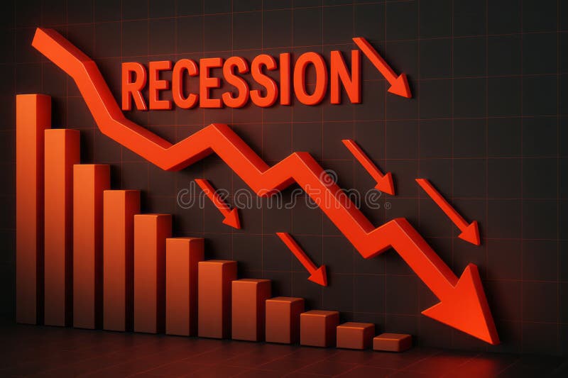
Free with trial This image visually represents an economic recession through downward trends and statistics. The vibrant red arrows emphasize the significant decline in growth, making it an impactful visual for financial analysis. Decrease statistics illustrations Dramatic Decline in Economic Growth with Recession Indicator and Downward Arrows in Red. This image visually represents an economic recession through downward trends and statistics. The vibrant red arrows emphasize the significant decline in growth, making it an impactful visual for financial analysis
Free with trial The image depicts five transparent cylindrical bars arranged in ascending order of height. The first four bars increase progressively in height, while the fifth bar, which is the tallest, has a red downward-pointing arrow indicating a decline or decrease. This visual often represents a concept of growth followed by a downturn or setback. Decrease statistics illustrations A graphical illustration showing a declining trend in ascending cylindrical bars. The image depicts five transparent cylindrical bars arranged in ascending order of height. The first four bars increase progressively in height, while the fifth bar, which is the tallest, has a red downward-pointing arrow indicating a decline or decrease. This visual often represents a concept of growth followed by a downturn or setback
Free with trial This image depicts a 3D bar chart with red and gray bars arranged in a pyramid shape. The bars gradually decrease in height from the center to the edges, creating a symmetrical and visually appealing data distribution. The red bars represent one data set, while the gray bars represent another, providing a clear comparison between the two. Decrease statistics illustrations A 3d bar chart with red and gray bars showing data distribution in a pyramid shape. This image depicts a 3D bar chart with red and gray bars arranged in a pyramid shape. The bars gradually decrease in height from the center to the edges, creating a symmetrical and visually appealing data distribution. The red bars represent one data set, while the gray bars represent another, providing a clear comparison between the two
Free with trial Conceptual image illustrating the idea of risk reduction or mitigation. The word 'RISK' is shown in a textured, fragmented font, with a prominent red arrow pointing downwards beneath it, symbolizing a decrease or management of potential dangers and uncertainties. Decrease statistics illustrations Risk Reduction Concept with Downward Arrow. Conceptual image illustrating the idea of risk reduction or mitigation. The word 'RISK' is shown in a textured, fragmented font, with a prominent red arrow pointing downwards beneath it, symbolizing a decrease or management of potential dangers and uncertainties
Free with trial A 3D rendering depicting a financial chart with a downward arrow, detailed statistics, and digital effects on a white. Decrease statistics illustrations A 3D rendering depicting a financial chart with a downward arrow, detailed statistics, and digital effects on a white
Free with trial The image displays a three-dimensional, golden-colored percentage symbol prominently centered against a plain white background. The symbol appears to be slightly raised, giving it a tactile and eye-catching appearance, which emphasizes its importance and significance in contexts like finance, statistics, or data representation. Decrease statistics illustrations A bold three-dimensional percentage symbol in golden hue against a plain background. The image displays a three-dimensional, golden-colored percentage symbol prominently centered against a plain white background. The symbol appears to be slightly raised, giving it a tactile and eye-catching appearance, which emphasizes its importance and significance in contexts like finance, statistics, or data representation
Free with trial The image displays a stylized percentage symbol (%) with a downward red arrow and an upward green arrow intersecting it. The design suggests a contrast between a decrease and an increase in percentage values, possibly representing financial or statistical fluctuations, trends, or changes over time. The arrows are bold and clearly indicate opposing directions of movement. Decrease statistics vectors Percentage symbol with downward and upward arrows indicating fluctuation in value. The image displays a stylized percentage symbol (%) with a downward red arrow and an upward green arrow intersecting it. The design suggests a contrast between a decrease and an increase in percentage values, possibly representing financial or statistical fluctuations, trends, or changes over time. The arrows are bold and clearly indicate opposing directions of movement
Free with trial The image shows a white easel holding a canvas with a red bar and line graph depicting a declining trend. The graph starts with high bars that gradually decrease in height, transitioning into a downward-sloping line. Beside the easel, there is a small golden trophy, possibly symbolizing achievement or competition. The overall scene suggests a representation of decreasing performance or results. Decrease statistics illustrations A downward trend graph displayed on an easel with a small golden trophy beside it. The image shows a white easel holding a canvas with a red bar and line graph depicting a declining trend. The graph starts with high bars that gradually decrease in height, transitioning into a downward-sloping line. Beside the easel, there is a small golden trophy, possibly symbolizing achievement or competition. The overall scene suggests a representation of decreasing performance or results
Free with trial A minimalist black line graph with circular data points and vertical bars is depicted on a white background. Decrease statistics illustrations Simple black line graph with bars and circles on white background chart statistics. A minimalist black line graph with circular data points and vertical bars is depicted on a white background
Free with trial The image features a glossy, three-dimensional green arrow pointing downwards. In the center of the arrow, there is a prominent white percentage symbol, indicating a decrease or reduction in percentage. Decrease statistics illustrations A vibrant green arrow pointing downward with a white percentage symbol in the center. The image features a glossy, three-dimensional green arrow pointing downwards. In the center of the arrow, there is a prominent white percentage symbol, indicating a decrease or reduction in percentage
Free with trial A 3D rendered bar chart illustrates a downward trend. Two tall green bars are followed by two shorter pink bars, representing a decrease in value. A bright yellow arrow sharply descends from right to left, crossing over the bars and emphasizing the decline. The composition is set against a solid light blue background. Decrease statistics illustrations 3D Bar Chart with Falling Yellow Arrow Indicating Decline on Blue Background graph. A 3D rendered bar chart illustrates a downward trend. Two tall green bars are followed by two shorter pink bars, representing a decrease in value. A bright yellow arrow sharply descends from right to left, crossing over the bars and emphasizing the decline. The composition is set against a solid light blue background
Free with trial The image depicts a bar chart with a superimposed red line showing a clear downward trend. Each bar represents a progressively smaller value, indicating a consistent decrease in data over time. The chart uses a gradient from taller to shorter bars, suggesting a significant drop in the measured quantity, which is reinforced by the downward-sloping line connecting the tops of the bars. Decrease statistics illustrations Declining bar chart graph illustrating a downward trend in data values over time. The image depicts a bar chart with a superimposed red line showing a clear downward trend. Each bar represents a progressively smaller value, indicating a consistent decrease in data over time. The chart uses a gradient from taller to shorter bars, suggesting a significant drop in the measured quantity, which is reinforced by the downward-sloping line connecting the tops of the bars
Free with trial A downward graph chart showing a decrease, isolated on a white background, perfect for business and financial presentations. Decrease statistics illustrations Downward graph chart isolated on white background. A downward graph chart showing a decrease, isolated on a white background, perfect for business and financial presentations
Free with trial A downward graph chart showing a decrease, isolated on a white background, perfect for business and financial presentations. Decrease statistics illustrations Downward graph chart isolated on white background. A downward graph chart showing a decrease, isolated on a white background, perfect for business and financial presentations
Free with trial This image displays a series of vertical bars arranged in a gradient color spectrum from green to red. Each bar varies in height, suggesting a comparison of different values or quantities. The bars start tall on the left in green, gradually decrease in height towards the center, and then increase again towards the right, ending with the tallest bar on the far right in red. The gradient color. Decrease statistics illustrations Colorful bar chart showing varying heights in a gradient spectrum from green to red. This image displays a series of vertical bars arranged in a gradient color spectrum from green to red. Each bar varies in height, suggesting a comparison of different values or quantities. The bars start tall on the left in green, gradually decrease in height towards the center, and then increase again towards the right, ending with the tallest bar on the far right in red. The gradient color
Free with trial A 3D bar chart shows a significant downward trend with a prominent red arrow indicating a steep financial decline and market drop. Decrease statistics illustrations Financial downturn declining bar chart with red arrow symbolizing loss and decrease. A 3D bar chart shows a significant downward trend with a prominent red arrow indicating a steep financial decline and market drop
Free with trial A bar graph depicting a significant decrease in value or performance, highlighted by a prominent red arrow pointing downwards, indicating a negative trend. Decrease statistics illustrations Bar graph illustrating a downward trend with a red arrow isolated on white background. A bar graph depicting a significant decrease in value or performance, highlighted by a prominent red arrow pointing downwards, indicating a negative trend
Free with trial The image shows a bar graph with green bars decreasing in height from left to right. A red arrow is superimposed over the bars, pointing downward, indicating a decline in value or performance. Decrease statistics illustrations A downward trending bar graph with a red arrow indicating a decrease in value. The image shows a bar graph with green bars decreasing in height from left to right. A red arrow is superimposed over the bars, pointing downward, indicating a decline in value or performance
Free with trial The image shows a 3D-rendered easel holding a canvas with a bar and line chart. The bar chart illustrates a declining trend in growth, with the first bar being the tallest and each subsequent bar progressively shorter. Overlaid on the bars is a red downward-sloping line, emphasizing the decrease. The scene is set against a plain white background, highlighting the chart's elements clearly. Decrease statistics illustrations Easing economic growth depicted through a declining bar and line chart on an easel. The image shows a 3D-rendered easel holding a canvas with a bar and line chart. The bar chart illustrates a declining trend in growth, with the first bar being the tallest and each subsequent bar progressively shorter. Overlaid on the bars is a red downward-sloping line, emphasizing the decrease. The scene is set against a plain white background, highlighting the chart's elements clearly
Free with trial The image depicts a combination of bar and line charts. The bar chart shows three descending bars in orange, yellow, and a lighter shade, indicating a decline in values. Overlaid on this is a downward-sloping line chart, reinforcing the trend of decrease. The overall design suggests a visual representation of a downward market trend or decline in performance metrics over time. Decrease statistics illustrations Graphic illustration of declining market trends with bar and line chart combination. The image depicts a combination of bar and line charts. The bar chart shows three descending bars in orange, yellow, and a lighter shade, indicating a decline in values. Overlaid on this is a downward-sloping line chart, reinforcing the trend of decrease. The overall design suggests a visual representation of a downward market trend or decline in performance metrics over time
Free with trial A white bar graph icon with bars of different heights is displayed within a black circle, representing data and analytics. Decrease statistics illustrations White bar graph icon with varying height bars inside a black circle chart statistics. A white bar graph icon with bars of different heights is displayed within a black circle, representing data and analytics
Free with trial Demographic percentage symbol created by crowd of small people. Statistics concept, population rate, financial interest. Decrease statistics illustrations Human crowd forms large percentage symbol on light blue background representing data. Demographic percentage symbol created by crowd of small people. Statistics concept, population rate, financial interest
Free with trial Two hospital bed icons paired with downward trend graphs, symbolizing a decrease in healthcare metrics or patient occupancy. Decrease statistics vectors Hospital Bed Icons with Downward Trend Graphs and Medical Cross healthcare. Two hospital bed icons paired with downward trend graphs, symbolizing a decrease in healthcare metrics or patient occupancy
Free with trial A 3D bar chart and a partial pie chart illustrating data and growth, with percentage labels, on a white background. Decrease statistics illustrations 3D Bar Chart and Pie Chart Showing Growth and Data Analysis on White Background graph statistics. A 3D bar chart and a partial pie chart illustrating data and growth, with percentage labels, on a white background
Free with trial The image displays two sets of vertical bars, one in green and one in red, each accompanied by arrows indicating trends. The green bars show an initial decrease followed by an increase, while the red bars show an initial increase followed by a decrease. The visual is labeled 'Word 100' at the bottom right, potentially indicating a specific data point or category. Decrease statistics illustrations Comparison of increasing and decreasing bar trends in a visual chart labeled word 100. The image displays two sets of vertical bars, one in green and one in red, each accompanied by arrows indicating trends. The green bars show an initial decrease followed by an increase, while the red bars show an initial increase followed by a decrease. The visual is labeled 'Word 100' at the bottom right, potentially indicating a specific data point or category
Free with trial The image features a small house model with a large percent sign on it, symbolizing interest rates or property values. Next to the house is a red bar graph with a downward trend, indicating a decrease in whatever the graph is measuring. Decrease statistics illustrations A small house model with a percent sign on it next to a red bar graph showing a downward trend. The image features a small house model with a large percent sign on it, symbolizing interest rates or property values. Next to the house is a red bar graph with a downward trend, indicating a decrease in whatever the graph is measuring
Free with trial The image shows a series of red bars of varying heights, each with an arrow pointing downwards, illustrating a decline in values. The bars represent data points that decrease over time, with the arrows emphasizing the downward trend. Decrease statistics illustrations A visual representation of fluctuating data trends with arrows indicating changes. The image shows a series of red bars of varying heights, each with an arrow pointing downwards, illustrating a decline in values. The bars represent data points that decrease over time, with the arrows emphasizing the downward trend
Free with trial The image depicts a red bar graph on a transparent background with a downward trend, indicating a decrease in values. The graph features a series of red bars of varying heights, with a red arrow pointing downwards to emphasize the decline. Decrease statistics illustrations A red bar graph showing a significant decline in values over time with a downward trend arrow. The image depicts a red bar graph on a transparent background with a downward trend, indicating a decrease in values. The graph features a series of red bars of varying heights, with a red arrow pointing downwards to emphasize the decline
Free with trial A bar graph depicting a downward trend with a red arrow overlay, indicating a substantial decrease. Decrease statistics illustrations Graph showing a significant decline in values over time with a red arrow pointing downwards. A bar graph depicting a downward trend with a red arrow overlay, indicating a substantial decrease
Free with trial Isolated showing simple line graph showing a downward trend on white background keywords: graph, chart, line, trend, data, decline, decrease. Decrease statistics illustrations Simple line graph showing a downward trend on white background Keywords: graph, chart, line, trend, data, decline
Free with trial Collection of icons showing different types of charts graphs and data analysis tools isolated on transparent background. Decrease statistics vectors Set of various icons representing business data analysis and statistics with charts and graphs. Collection of icons showing different types of charts graphs and data analysis tools isolated on transparent background
Free with trial A 3D illustration depicts a bar chart with bars of varying colors (blue, grey, yellow) showing a downward trend. Above the chart, a red triangular warning sign with a white exclamation mark signifies an alert or danger. The composition is set against a soft pink background, conveying a message of financial or business decline and risk. Decrease statistics illustrations 3D Bar Chart Showing Decline with a Red Exclamation Mark Warning Sign Above graph decrease. A 3D illustration depicts a bar chart with bars of varying colors (blue, grey, yellow) showing a downward trend. Above the chart, a red triangular warning sign with a white exclamation mark signifies an alert or danger. The composition is set against a soft pink background, conveying a message of financial or business decline and risk
Free with trial This image features a bar chart with orange bars representing performance metrics that steadily decrease over time, accompanied by a downward-sloping line graph that tracks the same trend against a blurred office background. Decrease statistics illustrations A bar chart showing a steady decline in performance metrics over a series of sequential periods. This image features a bar chart with orange bars representing performance metrics that steadily decrease over time, accompanied by a downward-sloping line graph that tracks the same trend against a blurred office background
Free with trial This is an detailed series of analytical icons for data visualization and statistical reporting in a clean line style. Decrease statistics vectors Comprehensive analytical data and statistics symbols for corporate business presentations. This is an detailed series of analytical icons for data visualization and statistical reporting in a clean line style
Free with trial A black and white icon set showing a bed with a nightstand and a large downward arrow, suggesting a decline or decrease in a related concept. Decrease statistics vectors Bed and Nightstand Icon with Downward Arrow Indicating Decline furniture bedroom. A black and white icon set showing a bed with a nightstand and a large downward arrow, suggesting a decline or decrease in a related concept
Free with trial The image depicts a bar graph with blue bars that increase in height initially, then gradually decrease, symbolizing growth followed by decline. An upward-pointing arrow overlays the graph, indicating an overall upward trend or potential future growth despite the current decline in the bars' heights. This visual is often used in business, finance, and analytics to illustrate performance trends. Decrease statistics illustrations Growth trend represented by increasing and then decreasing blue bar graph with upward arrow. The image depicts a bar graph with blue bars that increase in height initially, then gradually decrease, symbolizing growth followed by decline. An upward-pointing arrow overlays the graph, indicating an overall upward trend or potential future growth despite the current decline in the bars' heights. This visual is often used in business, finance, and analytics to illustrate performance trends
Free with trial Performance showing colorful graph with magnifying glass and pie chart on white background keywords: graph, chart, data, analytics, statistics. Decrease statistics illustrations Colorful graph with magnifying glass and pie chart on white background Keywords: graph, chart, data, analytics
Free with trial This infographic showcases a variety of graphs and charts, including bar graphs, line graphs, and pie charts, in a range of colors such as blue, green, and red. The image represents business data analysis, with arrows indicating growth, increase, and decrease trends. The infographic is a visual representation of market research, economy indicators, and metrics, making it a useful tool for business strategy and planning. Decrease statistics vectors A colorful infographic featuring various graphs and charts to represent business data analysis. This infographic showcases a variety of graphs and charts, including bar graphs, line graphs, and pie charts, in a range of colors such as blue, green, and red. The image represents business data analysis, with arrows indicating growth, increase, and decrease trends. The infographic is a visual representation of market research, economy indicators, and metrics, making it a useful tool for business strategy and planning.
Free with trial A 3D bar graph displays a downward trend represented by a red arrow. The bars are composed of orange, green, and red cubes, illustrating fluctuating data points. The overall mood is one of decline or setback. Decrease statistics illustrations Red Arrow Downward Trend Chart Showing Decreasing Business Growth Statistics with Green Orange. A 3D bar graph displays a downward trend represented by a red arrow. The bars are composed of orange, green, and red cubes, illustrating fluctuating data points. The overall mood is one of decline or setback
Free with trial The image shows a 3D bar graph with blue bars of varying heights. Two large red arrows cross over the graph: one pointing upward to the right, symbolizing growth or increase, and the other pointing downward to the right, symbolizing decline or decrease. This visual metaphor emphasizes conflicting trends or mixed signals in data. Decrease statistics illustrations Contradictory growth and decline indicators represented by a bar graph with crossed arrows. The image shows a 3D bar graph with blue bars of varying heights. Two large red arrows cross over the graph: one pointing upward to the right, symbolizing growth or increase, and the other pointing downward to the right, symbolizing decline or decrease. This visual metaphor emphasizes conflicting trends or mixed signals in data
Free with trial The image shows two arrows, one red pointing downward and the other green pointing upward, each accompanied by a percentage symbol. This visual metaphor typically represents a decrease and an increase in percentage values, respectively. Such symbols are often used in financial, statistical, or performance contexts to indicate trends or changes over time. Decrease statistics illustrations Visual representation of increasing and decreasing percentage trends with directional arrows. The image shows two arrows, one red pointing downward and the other green pointing upward, each accompanied by a percentage symbol. This visual metaphor typically represents a decrease and an increase in percentage values, respectively. Such symbols are often used in financial, statistical, or performance contexts to indicate trends or changes over time
Free with trial Iconographic display of economic downturn and business challenges. A black bar graph accompanied by a descending arrow, representing loss, decrease, and negative market trends. Useful for financial reports and risk analysis. Decrease statistics illustrations Black bar chart with downward arrow signifying financial decline and negative market performance. Iconographic display of economic downturn and business challenges. A black bar graph accompanied by a descending arrow, representing loss, decrease, and negative market trends. Useful for financial reports and risk analysis
Free with trial A striking 3D percentage symbol rendered in an intricate wireframe or mesh design, showcasing a vibrant rainbow gradient. The colors transition smoothly from cool blues and greens to warm reds and purples, creating a dynamic and modern visual. Set against a clean, pure white background, the symbol casts a subtle shadow, adding depth. This eye-catching graphic is ideal for conveying concepts of discounts, sales, growth, statistics, data analysis, financial progress, or any topic requiring a modern, dynamic, and colorful representation of percentages. Perfect for business, marketing, technology, or educational designs. Decrease statistics illustrations Vibrant Rainbow Wireframe Percentage Symbol on White. A striking 3D percentage symbol rendered in an intricate wireframe or mesh design, showcasing a vibrant rainbow gradient. The colors transition smoothly from cool blues and greens to warm reds and purples, creating a dynamic and modern visual. Set against a clean, pure white background, the symbol casts a subtle shadow, adding depth. This eye-catching graphic is ideal for conveying concepts of discounts, sales, growth, statistics, data analysis, financial progress, or any topic requiring a modern, dynamic, and colorful representation of percentages. Perfect for business, marketing, technology, or educational designs.
Free with trial Bar graph descends on blue background 3d render. Visualizes negative trend, economic downfall, failure, crisis, statistics, market analysis, budget deficit, bankruptcy. Perfect for marketing finance. Decrease statistics illustrations Bar graph descends on blue background 3d render. Visualizes negative trend, economic downfall, failure, crisis, statistics, market
Free with trial The image depicts a downward trend using a combination of bar and line chart elements. The yellow bars gradually decrease in height from left to right, indicating a consistent decline. A red line overlays the bars, further emphasizing the downward trajectory, ending with a large red arrow pointing downwards to signify a significant drop. This visual representation is often used to show reductions. Decrease statistics illustrations Declining trend illustrated through bar and line chart visualization isolated on white background. The image depicts a downward trend using a combination of bar. The image depicts a downward trend using a combination of bar and line chart elements. The yellow bars gradually decrease in height from left to right, indicating a consistent decline. A red line overlays the bars, further emphasizing the downward trajectory, ending with a large red arrow pointing downwards to signify a significant drop. This visual representation is often used to show reductions
Free with trial Financial difficulties, decrease in value of business or company shares, stock market crash, economic crisis, business failure, loss of cash, lose investments, a man is shackled in crisis. Decrease statistics vectors Man is shackled in crisis
Free with trial A stylized icon depicting a global economic downturn with a gradient color scheme, set against a black background in a flat design. Decrease statistics vectors Global economic downturn icon with gradient design representing financial market decrease and loss. A stylized icon depicting a global economic downturn with a gradient color scheme, set against a black background in a flat design.
Free with trial Close-up view of computer screen with colorful graphs, charts, representing financial, economic data visualization. Stock market analysis, business statistics investment data displayed. Decrease statistics illustrations Close-up view of computer screen with colorful graphs, charts, representing financial, economic data visualization. Stock market
Free with trial Market crash concept neon 3d decreasing sign negative business trend failure trading bad statistics poor performance risk danger diagram screen display global recession virtual data. Decrease statistics illustrations Glowing red downward zigzag arrow glass square button blurred financial stock market graph chart background economic crisis. Market crash concept neon 3d decreasing sign negative business trend failure trading bad statistics poor performance risk danger diagram screen display global recession virtual data
Free with trial This captivating abstract image showcases a glowing digital graph illustrating financial trends and statistical patterns, ideal for technology and business themes. Decrease statistics illustrations Abstract Digital Financial Graph with Glowing Lines and Data Points Representing Statistics and Market Trends. This captivating abstract image showcases a glowing digital graph illustrating financial trends and statistical patterns, ideal for technology and business themes
Free with trial Financial difficulties, decrease in value of business or company shares, stock market crash, economic crisis, business failure, loss of cash, lose investments, a man stops a crisis ball on a cliff. Decrease statistics vectors Man stops crisis ball on cliff. Financial difficulties, decrease in value of business or company shares, stock market crash, economic crisis, business failure, loss of cash, lose investments, a man stops a crisis ball on a cliff
Free with trial Financial difficulties, decrease in value of business or company shares, stock market crash, economic crisis, business failure, loss of cash, lose investments, man falls from the word crisis. Decrease statistics vectors Man falls from the word crisis
Free with trial Graphic showing 3d bar chart with pink blue and yellow bars on a white card against white background. Decrease statistics illustrations 3D Bar Chart with Pink Blue and Yellow Bars on a White Card Against White Background Keywords: bar chart, graph, data, statistics. Graphic showing 3d bar chart with pink blue and yellow bars on a white card against white background
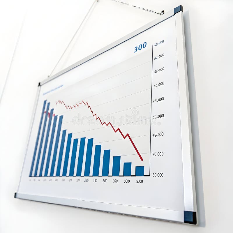
Free with trial Financial report with a declining bar graph, suggesting a negative trend in business performance. Decrease statistics vectors Financial report showing declining bar graph and statistics. Financial report with a declining bar graph, suggesting a negative trend in business performance
Free with trial The worldwide market is currently facing a financial slowdown, marked by a decrease in currency value, increasing inflation rates, and an economic recession that is moving in a negative direction. Decrease statistics vectors Global market experiencing financial downturn, showing a currency decline, rising inflation, and economic recession with a. The worldwide market is currently facing a financial slowdown, marked by a decrease in currency value, increasing inflation rates, and an economic recession that is moving in a negative direction
Free with trial This image shows a gradient heatmap with varying colors representing different intensities of data or values. The top section contains a solid blue band indicating high intensity or values, while the lower section displays a smooth gradient transitioning from pink and orange at the top to dark tones at the bottom. The gradient suggests a gradual decrease in intensity or value from the top to the. Decrease statistics illustrations Gradient heatmap representing data intensity across a rectangular area. isolated on transparent background, isolated on white. This image shows a gradient heatmap with varying colors representing different intensities of data or values. The top section contains a solid blue band indicating high intensity or values, while the lower section displays a smooth gradient transitioning from pink and orange at the top to dark tones at the bottom. The gradient suggests a gradual decrease in intensity or value from the top to the
Free with trial A professional set of icons depicting various data chart types, including exponential growth, volatility, and linear trends for business analytics and reporting. Decrease statistics illustrations Collection of professional data graph icons illustrating different growth patterns and financial statistics trends. a professional set of icons depicting various data chart types, including exponential growth, volatility, and linear trends for business analytics and reporting
Free with trial Laptop screen with two graphs showing opposite trends. Perfect for illustrating financial data, market analysis, business statistics in presentations. Decrease statistics illustrations Laptop screen with two graphs showing opposite trends.
Free with trial This striking image features a world globe adorned with a red downward arrow, symbolizing global decline. The dark backdrop enhances the impact of the design. Decrease statistics illustrations Dark Globe with Red Arrow Pointing Downward Symbolizing Decline and Decrease in Global Context on Black Background. This striking image features a world globe adorned with a red downward arrow, symbolizing global decline. The dark backdrop enhances the impact of the design
Free with trial The image portrays a downward graph representing deflation, symbolizing a period of economic decline and reduced consumer spending , timeless background beauty. Decrease statistics illustrations Economic Downturn. Deflation is a decrease in the general price level in an economy. The image portrays a downward graph representing deflation, symbolizing a period of economic decline and reduced consumer spending , timeless background beauty
Free with trial Line art icon of a whiteboard with graphs and charts being used for a business presentation. Decrease statistics vectors Businessman analyzing statistics on whiteboard with graphs and charts. Line art icon of a whiteboard with graphs and charts being used for a business presentation