Free with trial Cost reduction icon with dollar sign and downward arrow in circle. Financial symbol for, saving money. Economy and budget concept. Decrease expense logo. Decrease statistics illustrations Cost reduction icon with dollar sign and downward arrow in circle. Financial symbol for saving money. Economy and budget concept. Cost reduction icon with dollar sign and downward arrow in circle. Financial symbol for, saving money. Economy and budget concept. Decrease expense logo.
Free with trial A hand draws a downward-trending line graph on a chalkboard using chalk, illustrating a negative market trend or decline. This visual representation, generated by AI, is often used to symbolize economic recession, stock market crashes, or other forms of decrease. Decrease statistics illustrations Downward Trend. A hand draws a downward-trending line graph on a chalkboard using chalk, illustrating a negative market trend or decline. This visual representation, generated by AI, is often used to symbolize economic recession, stock market crashes, or other forms of decrease.
Free with trial Wooden blocks spelling out decreasing interest rates against a backdrop of falling coins and a downward-trending graph. Illustrates the impact of lower interest rates during an economic downturn or financial crisis, symbolizing investment risk, market instability, and potential budget concerns, generated by AI. Decrease statistics illustrations Interest rate decrease financial crisis economic downturn. Wooden blocks spelling out decreasing interest rates against a backdrop of falling coins and a downward-trending graph. Illustrates the impact of lower interest rates during an economic downturn or financial crisis, symbolizing investment risk, market instability, and potential budget concerns, generated by AI.
Free with trial Colorful pie chart is showing positive statistics and business growth, target and financial analysis and marketing report, data with copy space. Decrease statistics illustrations Colorful pie chart is showing positive statistics and business growth, target and financial analysis and marketing
Free with trial Business graph icon. Flat design. Vector illustration, EPS 10. Decrease statistics vectors Recession statistics financial failure concept. Business graph icon. Flat design. Vector illustration, EPS 10.
Free with trial Graphic representation of declining business. Bar chart shows falling trend. Arrow points downwards. Silhouettes of people signify workforce reduction. Concept for economic downturn, negative growth, or company challenges. Decrease statistics illustrations Declining bar chart with downward arrow and silhouettes of people representing decrease in workforce or business performance loss. Graphic representation of declining business. Bar chart shows falling trend. Arrow points downwards. Silhouettes of people signify workforce reduction. Concept for economic downturn, negative growth, or company challenges
Free with trial A high-quality, hand-drawn vector graphic of a simple red arrow pointing downwards. This versatile image is ideal for various applications, including presentations, websites, social media posts, and infographics. The clean and minimalist style ensures seamless integration into any design project. Perfect for visually representing concepts such as decrease, decline, negative trends, or reduction. Download this royalty-free vector today!. Decrease statistics illustrations Hand-drawn Red Down Arrow: Simple, Clean Vector Graphic for Presentations, Websites, and Social Media. Perfect for. A high-quality, hand-drawn vector graphic of a simple red arrow pointing downwards. This versatile image is ideal for various applications, including presentations, websites, social media posts, and infographics. The clean and minimalist style ensures seamless integration into any design project. Perfect for visually representing concepts such as decrease, decline, negative trends, or reduction. Download this royalty-free vector today!
Free with trial Graphical depiction of declining gold prices Three labeled gold bars on line graph showing downturn trend Red arrow indicates decrease against grid patterned background, suggesting financial or economic analysis related to gold markets For Social Media Post Size. Decrease statistics illustrations Declining gold prices depicted with red arrow, gold bars, downturn trend. Graphical depiction of declining gold prices Three labeled gold bars on line graph showing downturn trend Red arrow indicates decrease against grid patterned background, suggesting financial or economic analysis related to gold markets For Social Media Post Size
Free with trial Graphical depiction of declining gold prices Three labeled gold bars on line graph showing downturn trend Red arrow indicates decrease against grid patterned background, suggesting financial or economic analysis related to gold markets. Decrease statistics illustrations Declining gold prices depicted with red arrow, gold bars, downturn trend. Graphical depiction of declining gold prices Three labeled gold bars on line graph showing downturn trend Red arrow indicates decrease against grid patterned background, suggesting financial or economic analysis related to gold markets
Free with trial This graphic illustrates stable bank withdrawals alongside a rising financial trend with coins and bars, Bank withdrawals are currently stable and not showing any significant increase or decrease. Decrease statistics vectors This graphic illustrates stable bank withdrawals alongside a rising financial trend with coins and bars, Bank withdrawals are
Free with trial Declining bar graph with trend line symbolizing financial loss or business decrease. Decrease statistics illustrations Declining Bar Chart with Downward Trend Line Illustration. Declining bar graph with trend line symbolizing financial loss or business decrease.
Free with trial Statistics and analysis concept with bottom view on graphs and stats indicators on dark squared background. 3D rendering. Decrease statistics illustrations Statistics and analysis concept
Free with trial A 3D icon depicting an orange arrow pointing downwards in a zigzag pattern. The icon suggests downward movement, decline, decrease, or negative progress. It's commonly used to represent falling trends, negative changes, or downward movement in data or statistics. Decrease statistics vectors Arrow Chart Down 3D Icon. A 3D icon depicting an orange arrow pointing downwards in a zigzag pattern. The icon suggests downward movement, decline, decrease, or negative progress. It's commonly used to represent falling trends, negative changes, or downward movement in data or statistics.
Free with trial Downward trend line color icon. Statistical chart, metric analysis. Performance decrease, data visualization. Isolated vector illustration. Flat colorful symbol design. Editable stroke. Decrease statistics vectors Downward trend line color icon
Free with trial A vibrant 3D bar chart icon isolated on a clean white background. This minimalist data visualization features five colorful bars in a soft, pastel palette of yellow, pink, and purple, arranged in descending order. The clean, modern render is perfect for illustrating concepts like business statistics, financial reports, market analysis, and performance metrics. An ideal graphic element for presentations, infographics, websites, and educational materials, symbolizing data, comparison, and analytics in a visually appealing way. 3D illustration. Decrease statistics illustrations 3D Colorful Bar Chart for Business and Data Analysis. A vibrant 3D bar chart icon isolated on a clean white background. This minimalist data visualization features five colorful bars in a soft, pastel palette of yellow, pink, and purple, arranged in descending order. The clean, modern render is perfect for illustrating concepts like business statistics, financial reports, market analysis, and performance metrics. An ideal graphic element for presentations, infographics, websites, and educational materials, symbolizing data, comparison, and analytics in a visually appealing way. 3D illustration.
Free with trial A person is analyzing a bar graph with a downward trend line, indicating a decrease in stock value. Vector art design using ai tool. Decrease statistics vectors Sell Stock Graph Illustration. A person is analyzing a bar graph with a downward trend line, indicating a decrease in stock value. Vector art design using ai tool.
Free with trial Financial difficulties, decrease in value of business or company shares, stock market crash, economic crisis, business failure and loss of cash, lose investments, a man falls off the chart. Decrease statistics vectors Man falls off the chart
Free with trial Financial difficulties, decrease in value of business or company shares, stock market crash, economic crisis, business failure, loss of cash, lose investments, man points a magnifier to broken arrow. Decrease statistics vectors Man points to broken arrow. Financial difficulties, decrease in value of business or company shares, stock market crash, economic crisis, business failure, loss of cash, lose investments, man points a magnifier to broken arrow
Free with trial Three red, 3D arrows curving downwards, generated by AI, symbolize decline, decrease, or downturn. The image offers a visual representation of negative trends or a downward trajectory, suitable for presentations or reports. Decrease statistics illustrations Red Arrows Pointing Down. Three red, 3D arrows curving downwards, generated by AI, symbolize decline, decrease, or downturn. The image offers a visual representation of negative trends or a downward trajectory, suitable for presentations or reports.
Free with trial Flat design vector of a dollar coin and a falling bar chart. Perfect for finance, business, and loss themes. Isolated on white. Decrease statistics vectors Dollar Decrease Bar Chart Icon. Flat design vector of a dollar coin and a falling bar chart. Perfect for finance, business, and loss themes. Isolated on white
Free with trial 3D illustration of a bar graph showing a declining trend. Red bars of decreasing height are set against a backdrop of a light gray frame. The image is perfect for presentations, reports, or any visual representation of negative growth, decline, or decrease in data. Suitable for use in business, finance, and educational contexts. Decrease statistics vectors Declining Trend Bar Graph. 3D illustration of a bar graph showing a declining trend. Red bars of decreasing height are set against a backdrop of a light gray frame. The image is perfect for presentations, reports, or any visual representation of negative growth, decline, or decrease in data. Suitable for use in business, finance, and educational contexts.
Free with trial Loss of money, profit from investments and deposits, decrease in business value, financial or economic collapse, defeat or failure in the foreign exchange market, man falls from a broken dollar. Decrease statistics vectors Man falls from a broken dollar
Free with trial Financial difficulties, decrease in value of business or company shares, stock market crash, economic crisis, business failure and loss of cash, lose investments, a man falls off the broken arrow. Decrease statistics vectors Man falls off the broken arrow
Free with trial A 3D icon featuring a red downward arrow, commonly representing a decline, decrease, or negative trend in financial and business metrics. Decrease statistics vectors 3D Red Downward Trend Arrow Icon. A 3D icon featuring a red downward arrow, commonly representing a decline, decrease, or negative trend in financial and business metrics
Free with trial A simple line graph illustration showing fluctuations and an upward trend. The graph is drawn on a grid with a black line and red data points, indicating a period of increase, followed by a decrease, and then a final increase. This image can be used to represent business trends, financial analysis, stock market data, or any data that shows changes over time. Decrease statistics vectors Line Graph with Fluctuations. A simple line graph illustration showing fluctuations and an upward trend. The graph is drawn on a grid with a black line and red data points, indicating a period of increase, followed by a decrease, and then a final increase. This image can be used to represent business trends, financial analysis, stock market data, or any data that shows changes over time.
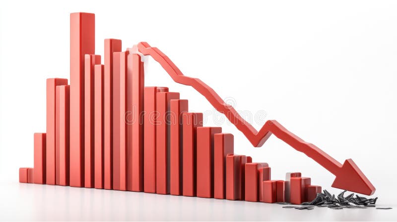
Free with trial A 3D rendering of a bar graph depicting a sharp decline in values. The red bars decrease in size, culminating in a large downward red arrow, symbolizing a significant economic downturn or market crash. The broken pieces at the bottom represent the loss or damage incurred. Decrease statistics illustrations Red Bar Graph Showing Decline. A 3D rendering of a bar graph depicting a sharp decline in values. The red bars decrease in size, culminating in a large downward red arrow, symbolizing a significant economic downturn or market crash. The broken pieces at the bottom represent the loss or damage incurred.
Free with trial Data disintegrating line graph illustration trend dec, decrease fall, analysis visualization data disintegrating line graph. Decrease statistics illustrations Data disintegrating line graph
Free with trial A graph with a red line and a green line. This could represent a decrease in one variable and an increase in another. Decrease statistics illustrations A graph with a red line and a green line
Free with trial A minimalist white 3D bar graph illustrates a significant downward trend. The bars decrease in height from left to right, connected by a dashed line that forms a descending path, culminating in an arrow pointing downwards. The graphic is rendered in an isometric perspective on a white background, representing decline, loss, or negative performance. Decrease statistics illustrations White 3D Bar Graph Showing a Downward Trend chart decline. A minimalist white 3D bar graph illustrates a significant downward trend. The bars decrease in height from left to right, connected by a dashed line that forms a descending path, culminating in an arrow pointing downwards. The graphic is rendered in an isometric perspective on a white background, representing decline, loss, or negative performance
Free with trial This 3D bar graph, generated by AI, visually represents a sharp market decline. The red bars show a dramatic decrease in value, culminating in a broken arrow symbolizing a complete market crash. The image powerfully illustrates economic downturn. Decrease statistics illustrations Declining Bar Graph: Market Crash. This 3D bar graph, generated by AI, visually represents a sharp market decline. The red bars show a dramatic decrease in value, culminating in a broken arrow symbolizing a complete market crash. The image powerfully illustrates economic downturn.
Free with trial A clean, minimalist 3D render of a blue bar chart with a blue trend line connecting circular data points. The bars vary in height, illustrating growth and fluctuations. The background is a bright, clean white, emphasizing the chart's elements. This graphic is ideal for representing financial data, business growth, market trends, statistics, and performance analysis in a modern and professional style. Decrease statistics illustrations 3D Blue Bar Chart with Trend Line. A clean, minimalist 3D render of a blue bar chart with a blue trend line connecting circular data points. The bars vary in height, illustrating growth and fluctuations. The background is a bright, clean white, emphasizing the chart's elements. This graphic is ideal for representing financial data, business growth, market trends, statistics, and performance analysis in a modern and professional style.
Free with trial A captivating image featuring a descending bar graph composed of miniature candy canes against a bokeh background of twinkling Christmas lights and miniature snow-covered evergreen trees. The candy canes, in classic red and white stripes, visually represent a declining trend or decrease. The scene evokes a festive yet subtly concerning mood, ideal for illustrating concepts related to holiday. Decrease statistics illustrations Christmas Candy Cane Graph Decline. A captivating image featuring a descending bar graph composed of miniature candy canes against a bokeh background of twinkling Christmas lights and miniature snow-covered evergreen trees. The candy canes, in classic red and white stripes, visually represent a declining trend or decrease. The scene evokes a festive yet subtly concerning mood, ideal for illustrating concepts related to holiday
Free with trial A stylish 3D rendering of a percentage symbol, crafted with a sleek, metallic design. The deep purple and silver color scheme lends a modern and sophisticated feel. This image is perfect for illustrating concepts related to discounts, sales, interest rates, finance, statistics, and more. Its clean background ensures versatility for various design applications. Decrease statistics illustrations 3D Render of Modern Percentage Symbol. A stylish 3D rendering of a percentage symbol, crafted with a sleek, metallic design. The deep purple and silver color scheme lends a modern and sophisticated feel. This image is perfect for illustrating concepts related to discounts, sales, interest rates, finance, statistics, and more. Its clean background ensures versatility for various design applications.
Free with trial A modern flat design icon representing financial data analysis and market trends. This vector illustration features a combination of a green bar chart and a dark grey line graph, showing fluctuations in performance. An upward arrow indicates initial growth, followed by a volatile trend line symbolizing concepts like market instability, economic changes, profit and loss, or business analytics. This versatile graphic is perfect for infographics, financial reports, presentations, websites, and applications related to business, finance, statistics, and economics. Isolated on a white background for easy use. Decrease statistics vectors Financial Market Fluctuation Graph Icon. A modern flat design icon representing financial data analysis and market trends. This vector illustration features a combination of a green bar chart and a dark grey line graph, showing fluctuations in performance. An upward arrow indicates initial growth, followed by a volatile trend line symbolizing concepts like market instability, economic changes, profit and loss, or business analytics. This versatile graphic is perfect for infographics, financial reports, presentations, websites, and applications related to business, finance, statistics, and economics. Isolated on a white background for easy use.
Free with trial A clean and modern vector illustration of a percentage sign, featuring two pale yellow circles with maroon outlines and a light blue diagonal bar also outlined in maroon. This simple graphic is set against a crisp white background, making it versatile for various design projects. It effectively conveys concepts of discounts, sales, financial rates, statistics, and promotions. Ideal for use in business presentations, marketing materials, educational content, websites, and mobile applications to highlight numerical data or special offers. Decrease statistics vectors Percentage Sign Vector Icon Illustration. A clean and modern vector illustration of a percentage sign, featuring two pale yellow circles with maroon outlines and a light blue diagonal bar also outlined in maroon. This simple graphic is set against a crisp white background, making it versatile for various design projects. It effectively conveys concepts of discounts, sales, financial rates, statistics, and promotions. Ideal for use in business presentations, marketing materials, educational content, websites, and mobile applications to highlight numerical data or special offers.
Free with trial Decreasing bar graph isolated on white background. Investment statistics. Economic data. Financial report. Interest rate. Business concept. Top view. 3d render. Decrease statistics illustrations Decreasing bar graph isolated on white background
Free with trial A vibrant 3D bar chart featuring multiple colorful columns, including red, blue, green, yellow, and purple, set against a clean white background. The bars vary in height, representing different data points or categories, and are displayed on a reflective surface, adding depth to the visualization. Grid lines provide a clear scale for interpretation. This modern graphic is ideal for illustrating statistics, business growth, financial performance, market analysis, and educational concepts in presentations, reports, and digital media. Decrease statistics illustrations Colorful 3D Bar Chart on White Background. A vibrant 3D bar chart featuring multiple colorful columns, including red, blue, green, yellow, and purple, set against a clean white background. The bars vary in height, representing different data points or categories, and are displayed on a reflective surface, adding depth to the visualization. Grid lines provide a clear scale for interpretation. This modern graphic is ideal for illustrating statistics, business growth, financial performance, market analysis, and educational concepts in presentations, reports, and digital media.
Free with trial Red decreasing bar graph on light gray background. Investment statistics. Economic data. Financial report. Interest rate. Business concept. Top view. 3d render. Decrease statistics illustrations Red decreasing bar graph on light gray background
Free with trial 3D rendering of a dynamic presentation stand showcasing financial data. Colorful, geometric shapes and infographics present market statistics, including percentages, dollar amounts, and bar graphs. Stacks of coins and various data elements are displayed on a dark blue platform with orange accents. Suitable for illustrating financial reports, market analysis, investment strategies, or business presentations. Decrease statistics illustrations Modern Financial Data Visualization Display. 3D rendering of a dynamic presentation stand showcasing financial data. Colorful, geometric shapes and infographics present market statistics, including percentages, dollar amounts, and bar graphs. Stacks of coins and various data elements are displayed on a dark blue platform with orange accents. Suitable for illustrating financial reports, market analysis, investment strategies, or business presentations.
Free with trial Trend hand drawn style declining sales graph illustration decrease arrow, data analytics, visual report trend hand drawn style declining sales graph. Decrease statistics illustrations Trend hand drawn style declining sales graph
Free with trial This minimalist vector illustration features two identical line graphs, presented in contrasting black and white themes. The left graph displays a black line on a white background, while the right shows a white line on a black background. Both graphs depict a clear downward trend with jagged fluctuations, symbolizing decline, loss, or negative growth over time. This versatile icon set is ideal for illustrating concepts such as economic downturns, financial losses, market crashes, business failures, or any data showing a significant decrease. Perfect for presentations, reports, infographics, and web design. Decrease statistics vectors Declining Line Graph Icon Set - Black and White. This minimalist vector illustration features two identical line graphs, presented in contrasting black and white themes. The left graph displays a black line on a white background, while the right shows a white line on a black background. Both graphs depict a clear downward trend with jagged fluctuations, symbolizing decline, loss, or negative growth over time. This versatile icon set is ideal for illustrating concepts such as economic downturns, financial losses, market crashes, business failures, or any data showing a significant decrease. Perfect for presentations, reports, infographics, and web design.
Free with trial A clean, minimalist bar chart illustration set against a solid green background. The chart features three white vertical bars of different heights, representing data points or progress over time. A simple white grid and axes are visible, indicating a clear visual representation of statistics. This versatile graphic is ideal for conveying concepts of business growth, financial analysis, market trends, statistical reporting, or educational content in a modern, easy-to-understand format. Perfect for presentations, infographics, websites, and applications. Decrease statistics vectors Minimalist Bar Chart Icon on Green Background. A clean, minimalist bar chart illustration set against a solid green background. The chart features three white vertical bars of different heights, representing data points or progress over time. A simple white grid and axes are visible, indicating a clear visual representation of statistics. This versatile graphic is ideal for conveying concepts of business growth, financial analysis, market trends, statistical reporting, or educational content in a modern, easy-to-understand format. Perfect for presentations, infographics, websites, and applications.
Free with trial A simple and bold black curved arrow icon, isolated on a clean white background. This minimalist graphic element points downwards and to the right, symbolizing direction, movement, and flow. It can represent concepts such as decline, decrease, or a downward trend in business charts and infographics. This versatile vector-style illustration is perfect for use as a pointer, a navigation symbol in web design and user interfaces, or to guide attention in presentations and documents. The high contrast and clean design make it easy to integrate into any project. Decrease statistics vectors Curved Black Arrow Pointing Down and Right Icon. A simple and bold black curved arrow icon, isolated on a clean white background. This minimalist graphic element points downwards and to the right, symbolizing direction, movement, and flow. It can represent concepts such as decline, decrease, or a downward trend in business charts and infographics. This versatile vector-style illustration is perfect for use as a pointer, a navigation symbol in web design and user interfaces, or to guide attention in presentations and documents. The high contrast and clean design make it easy to integrate into any project.
Free with trial This 3D bar graph, generated by AI, visually represents a significant downward trend. The red bars show a decrease in value over time, culminating in a sharp drop indicated by the prominent red arrow. This image is ideal for illustrating economic downturns, market crashes, or any scenario depicting. Decrease statistics illustrations Declining Bar Graph. This 3D bar graph, generated by AI, visually represents a significant downward trend. The red bars show a decrease in value over time, culminating in a sharp drop indicated by the prominent red arrow. This image is ideal for illustrating economic downturns, market crashes, or any scenario depicting
Free with trial A 3D illustration of a downwards statistic chart, isolated on white background, symbolizing decline, loss, or decrease in trends. Decrease statistics illustrations Statistic down 3D illustration isolated on white background. A 3D illustration of a downwards statistic chart, isolated on white background, symbolizing decline, loss, or decrease in trends
Free with trial A 3D illustration of a downwards statistic chart, isolated on white background, symbolizing decline, loss, or decrease in trends. Decrease statistics illustrations Statistic down 3D illustration isolated on white background. A 3D illustration of a downwards statistic chart, isolated on white background, symbolizing decline, loss, or decrease in trends
Free with trial Business growth presentation with charts and graphs showing progress, statistics, and performance. The image showcases key financial indicators in a clear, concise format. Decrease statistics vectors Financial Data Analysis Report on Screen Display. Business growth presentation with charts and graphs showing progress, statistics, and performance. The image showcases key financial indicators in a clear, concise format.
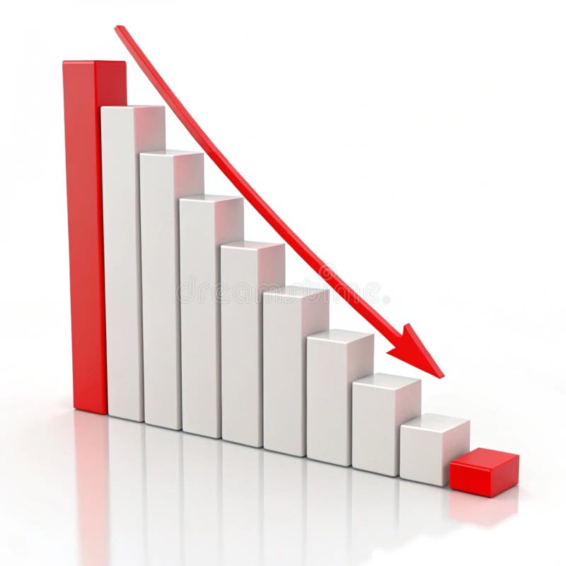
Free with trial A 3D white bar chart shows a significant downward trend indicated by a sharp, angled arrow pointing downwards. The bars decrease in height from left to right, illustrating a concept of decline or loss. The clean white background emphasizes the minimalist design and the stark visual representation of negative growth. Decrease statistics illustrations 3D White Bar Chart with Downward Trending Arrow on White Background graph decline. A 3D white bar chart shows a significant downward trend indicated by a sharp, angled arrow pointing downwards. The bars decrease in height from left to right, illustrating a concept of decline or loss. The clean white background emphasizes the minimalist design and the stark visual representation of negative growth
Free with trial An infographic illustrates a sharp decline during the winter season. Decrease statistics vectors Winter Temperature Decrease Chart with Thermometer. An infographic illustrates a sharp decline during the winter season
Free with trial A clean and simple vector illustration of a bar chart isolated on a white background. This minimalist graphic features three vertical bars in varying shades of blue, representing data, statistics, or progress. Ideal for business reports, financial presentations, infographics, websites, and educational materials. The flat design symbolizes concepts like growth, analysis, market research, and performance comparison, offering a modern and clear way to visualize information. Ample copy space is available. Decrease statistics illustrations Simple Blue Bar Chart Vector Icon for Business Data. A clean and simple vector illustration of a bar chart isolated on a white background. This minimalist graphic features three vertical bars in varying shades of blue, representing data, statistics, or progress. Ideal for business reports, financial presentations, infographics, websites, and educational materials. The flat design symbolizes concepts like growth, analysis, market research, and performance comparison, offering a modern and clear way to visualize information. Ample copy space is available.
Free with trial A 3D rendered icon featuring a golden bar graph with a downward trend line and a red arrow indicating a decrease. The graph is set on a black circular background with a prominent gold rim. This symbol represents financial decline, loss, or negative performance. Decrease statistics illustrations Golden Graph with Downward Trend Arrow on Black Circle with Gold Rim chart falling. A 3D rendered icon featuring a golden bar graph with a downward trend line and a red arrow indicating a decrease. The graph is set on a black circular background with a prominent gold rim. This symbol represents financial decline, loss, or negative performance
Free with trial Beige mailbox on wooden post with a declining bar graph, suggesting a decrease in mail volume or economic downturn. Image is digitally rendered. Decrease statistics illustrations Beige Mailbox and Declining Bar Graph on Wooden Post. Beige mailbox on wooden post with a declining bar graph, suggesting a decrease in mail volume or economic downturn. Image is digitally rendered
Free with trial Several blue arrows are pointing down, representing a decrease or negative trend. Decrease statistics vectors Blue arrows pointing down representing negative trend. Several blue arrows are pointing down, representing a decrease or negative trend
Free with trial A series of black bar graphs are shown with downward-pointing arrows. Some arrows are green, indicating a slight decline, while others are red, signifying a more significant drop. The visual represents financial or data trends of decrease. Decrease statistics illustrations Bar Graphs with Downward Arrows in Green and Red downward trend. A series of black bar graphs are shown with downward-pointing arrows. Some arrows are green, indicating a slight decline, while others are red, signifying a more significant drop. The visual represents financial or data trends of decrease
Free with trial A 3D rendered bar chart composed of four colored blocks of varying heights. The blocks are blue, yellow, red, and white, arranged from shortest to tallest from left to right. The chart is presented on a clean white background, with subtle shadows beneath the blocks. Decrease statistics illustrations Colorful 3D Bar Chart with Varying Heights on a White Background graph statistics. A 3D rendered bar chart composed of four colored blocks of varying heights. The blocks are blue, yellow, red, and white, arranged from shortest to tallest from left to right. The chart is presented on a clean white background, with subtle shadows beneath the blocks
Free with trial A collection of eight black and white, hand-drawn or doodle style icons. Each square icon features a different line graph, representing data, analytics, statistics, or financial trends. Decrease statistics illustrations Set of hand drawn financial chart line graph icons isolated on white. A collection of eight black and white, hand-drawn or doodle style icons. Each square icon features a different line graph, representing data, analytics, statistics, or financial trends
Free with trial A collection of eight black and white, hand-drawn or doodle style icons. Each square icon features a different line graph, representing data, analytics, statistics, or financial trends. Decrease statistics illustrations Set of hand drawn financial chart line graph icons isolated on white. A collection of eight black and white, hand-drawn or doodle style icons. Each square icon features a different line graph, representing data, analytics, statistics, or financial trends
Free with trial A 3D rendered bar chart displaying a downward trend. The bars, colored black, blue, green, yellow, and orange, decrease in height from left to right. A bold red arrow points downwards, diagonally across the bars, indicating a decline or loss. The chart is presented on a white background. Decrease statistics illustrations 3D Bar Chart with Red Downward Arrow on White Background. A 3D rendered bar chart displaying a downward trend. The bars, colored black, blue, green, yellow, and orange, decrease in height from left to right. A bold red arrow points downwards, diagonally across the bars, indicating a decline or loss. The chart is presented on a white background
Free with trial This dynamic graphic depicts a sharp downward trend, visualized by a bold red arrow dramatically descending across a grey, jagged line graph. The graph itself shows significant fluctuations, but the overarching movement is a steep decline, symbolizing losses, negative growth, or a crisis. The clean white background isolates the data representation, making it ideal for conveying financial downturns, market crashes, or any situation involving a significant decrease. Decrease statistics illustrations Sharp Decline: Red Arrow Graph Illustrating Downward Trend. This dynamic graphic depicts a sharp downward trend, visualized by a bold red arrow dramatically descending across a grey, jagged line graph. The graph itself shows significant fluctuations, but the overarching movement is a steep decline, symbolizing losses, negative growth, or a crisis. The clean white background isolates the data representation, making it ideal for conveying financial downturns, market crashes, or any situation involving a significant decrease.
Free with trial This 3D rendered bar graph, generated by AI, visually represents a downward trend. The red bars progressively decrease in height, illustrating a clear decline. Perfect for illustrating concepts related to loss, decrease, or decline in presentations and reports. Decrease statistics illustrations Declining Bar Graph. This 3D rendered bar graph, generated by AI, visually represents a downward trend. The red bars progressively decrease in height, illustrating a clear decline. Perfect for illustrating concepts related to loss, decrease, or decline in presentations and reports.
Free with trial A close-up, angled perspective of several printed business reports displaying a variety of financial data. The documents feature colorful pie charts, blue bar graphs, and line graphs tracking performance and statistics. This image is perfect for illustrating concepts such as data analysis, market research, financial planning, investment strategy, and corporate performance review. The detailed charts and figures represent the core of business analytics, accounting, and economic forecasting, making it a versatile background for financial presentations and articles. Decrease statistics illustrations Business Analytics Report with Financial Charts and Graphs. A close-up, angled perspective of several printed business reports displaying a variety of financial data. The documents feature colorful pie charts, blue bar graphs, and line graphs tracking performance and statistics. This image is perfect for illustrating concepts such as data analysis, market research, financial planning, investment strategy, and corporate performance review. The detailed charts and figures represent the core of business analytics, accounting, and economic forecasting, making it a versatile background for financial presentations and articles.
Free with trial A bold red arrow zigzags downwards, symbolizing a significant decrease, loss, or negative trend. Decrease statistics vectors Red arrow indicating downward trend and decline. A bold red arrow zigzags downwards, symbolizing a significant decrease, loss, or negative trend
Free with trial Bar graph with weather icons and rising line chart on grid backdrop. Ideal for analytics, statistics, weather data, trend analysis, business forecasting, seasonal planning. A simple flat metaphor. Decrease statistics illustrations Seasonal Data Trends Displayed on Bar Graph with Line Chart and Weather Icons. Bar graph with weather icons and rising line chart on grid backdrop. Ideal for analytics, statistics, weather data, trend analysis, business forecasting, seasonal planning. A simple flat metaphor
Free with trial Dynamic visualization of financial market data showcasing trends and statistics. Ideal for essays, reports, and presentations on economic analysis and investment strategies. Decrease statistics illustrations Financial Market Analysis with Data Chart Display and Trends. Dynamic visualization of financial market data showcasing trends and statistics. Ideal for essays, reports, and presentations on economic analysis and investment strategies
Free with trial A person holds a graph showing a sharp market downturn, illustrating a significant decrease in value. The red line highlights the negative trend, generated by AI for illustrative purposes. This image is perfect for representing financial losses or economic instability. Decrease statistics illustrations Declining Market Trend. A person holds a graph showing a sharp market downturn, illustrating a significant decrease in value. The red line highlights the negative trend, generated by AI for illustrative purposes. This image is perfect for representing financial losses or economic instability.
Free with trial A 3D bar graph with a red line graph indicating a significant decrease, isolated on a clean white background. Decrease statistics illustrations Bar graph showing downward trend isolated on white background. A 3D bar graph with a red line graph indicating a significant decrease, isolated on a clean white background
Free with trial A 3D rendered icon depicting a downward trend, symbolizing financial decrease and economic challenges. Decrease statistics illustrations Financial decline icon representing economic downturn and losses. A 3D rendered icon depicting a downward trend, symbolizing financial decrease and economic challenges
Free with trial A clear vector illustration of a red downward trending line graph, symbolizing a decrease, decline, or negative performance. This icon is essential for financial reports, business presentations, data visualization, or any context indicating a reduction. Its simple, sharp design effectively communicates a downward trend in various metrics, vector design Generative AI. Decrease statistics vectors Red Downward Trending Graph Line Icon, vector design Generative AI. A clear vector illustration of a red downward trending line graph, symbolizing a decrease, decline, or negative performance. This icon is essential for financial reports, business presentations, data visualization, or any context indicating a reduction. Its simple, sharp design effectively communicates a downward trend in various metrics, vector design Generative AI
Free with trial This image features a bold threedimensional red arrow pointing downwards set against a clean white background The arrow is centrally positioned creating a strong focal point The simple design lends itself to conveying themes of direction decrease or downward trends It could be used to illustrate concepts like loss decline or a need to move forward or downward depending on context The clean lines. Decrease statistics illustrations Bright Red Arrow Pointing Down on a White Background Illustration. This image features a bold threedimensional red arrow pointing downwards set against a clean white background The arrow is centrally positioned creating a strong focal point The simple design lends itself to conveying themes of direction decrease or downward trends It could be used to illustrate concepts like loss decline or a need to move forward or downward depending on context The clean lines
Free with trial A simple, 3D rendered blue arrow points directly downwards against a stark white background. The arrow has rounded edges and a smooth finish, conveying a clear sense of direction or a decrease. The isolated graphic is ideal for representing negative trends, movement, or commands. Decrease statistics illustrations Single Blue Downward Arrow Icon on White Background direction move. A simple, 3D rendered blue arrow points directly downwards against a stark white background. The arrow has rounded edges and a smooth finish, conveying a clear sense of direction or a decrease. The isolated graphic is ideal for representing negative trends, movement, or commands
Free with trial A minimalist graphic depicting a bar chart with falling bars and a downward-pointing arrow, symbolizing a negative trend, economic downturn, or performance decline. Clean and clear representation of loss. Decrease statistics illustrations Simple downward trend bar chart icon indicating decline or decrease. A minimalist graphic depicting a bar chart with falling bars and a downward-pointing arrow, symbolizing a negative trend, economic downturn, or performance decline. Clean and clear representation of loss
Free with trial Two distinct lines illustrate a decrease and an increase, creating a dynamic contrast in shades of orange that captures attention and represents change. Decrease statistics illustrations Visual Representation of Contrasting Trends With Realistic Orange Hues. Two distinct lines illustrate a decrease and an increase, creating a dynamic contrast in shades of orange that captures attention and represents change
Free with trial A crisp vector illustration of an orange downward trending line graph, signifying a fall, loss, or negative economic movement. This versatile icon is perfect for financial dashboards, business analysis, or reporting on declining statistics. Its clear visual representation quickly conveys a reduction in values, making it highly effective, vector design Generative AI. Decrease statistics vectors Orange Downward Trending Financial Graph, vector design Generative AI. A crisp vector illustration of an orange downward trending line graph, signifying a fall, loss, or negative economic movement. This versatile icon is perfect for financial dashboards, business analysis, or reporting on declining statistics. Its clear visual representation quickly conveys a reduction in values, making it highly effective, vector design Generative AI
Free with trial A visual representation of data showing a decline over a period. The blue bars are arranged in descending order of height, each marked with numerical indicators, suggesting a decrease in value or quantity. Decrease statistics illustrations Blue bar chart showing decreasing trend over time with numerical labels. A visual representation of data showing a decline over a period. The blue bars are arranged in descending order of height, each marked with numerical indicators, suggesting a decrease in value or quantity
Free with trial Downward arrow with SALE, bar chart displaying data trends, and dynamic stick figure. Ideal for business, marketing, analysis, economics, sales, growth statistics simple flat metaphor. Decrease statistics illustrations Arrow pointing downward labeled SALE with bar chart and dynamic figure symbolizing action. Downward arrow with SALE, bar chart displaying data trends, and dynamic stick figure. Ideal for business, marketing, analysis, economics, sales, growth statistics simple flat metaphor
Free with trial Abstract vector illustration of colorful bar graphs for business analysis and trends. Decrease statistics vectors Multiple colorful bar charts abstractly representing data and statistics. Abstract vector illustration of colorful bar graphs for business analysis and trends.
Free with trial A bold red arrow curves downwards and points to the right, clearly symbolizing a trend of falling prices, negative growth, or a decline in performance. Ideal for financial or business contexts. Decrease statistics illustrations Bright red downward arrow symbol indicating decline or decrease on white. A bold red arrow curves downwards and points to the right, clearly symbolizing a trend of falling prices, negative growth, or a decline in performance. Ideal for financial or business contexts
Free with trial Profit increase and decrease graph, coin icon. Decrease statistics vectors Profit increase and decrease graph
Free with trial Profit increase and decrease graph, coin icon. Decrease statistics vectors Profit increase and decrease graph