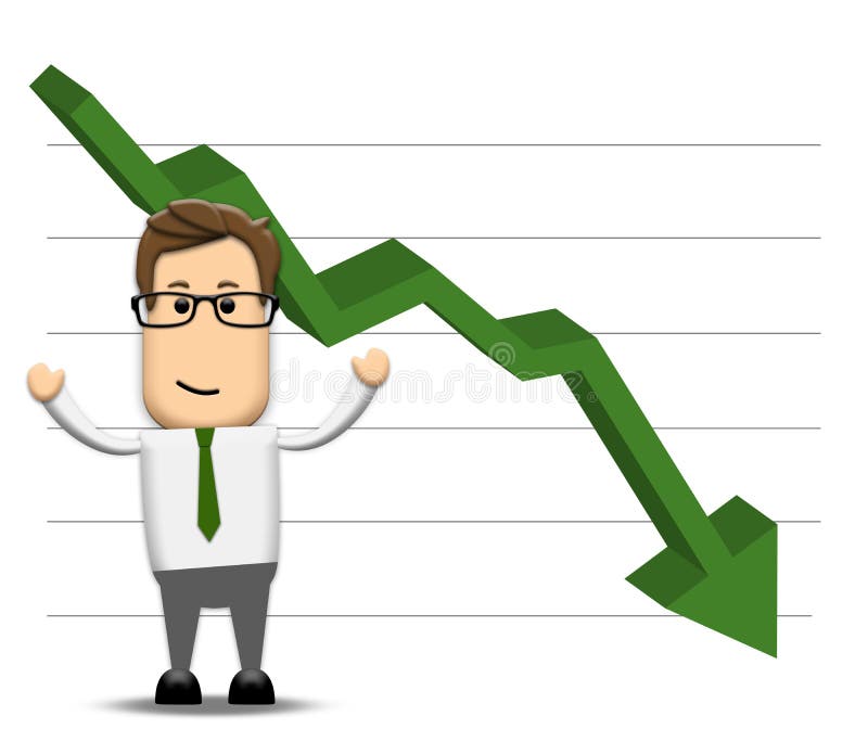
Free with trial A graph showing a negative decrease. Graphic showing decrease illustrations Graph negatively decreasing. A graph showing a negative decrease
Free with trial Hand showing small value, or use it to put some small object between the fingers, detailed black and white vector illustration. Graphic showing decrease vectors Hand showing small value, or use it to put some small object bet
Free with trial 3d rendering of two white and orange arrows showing different directions. Business concept. Graphic showing decrease illustrations Up and down arrows. 3d rendering of two white and orange arrows showing different directions. Business concept.
Free with trial A graph showing a positive decrease. Graphic showing decrease illustrations Graph postively decreasing. A graph showing a positive decrease
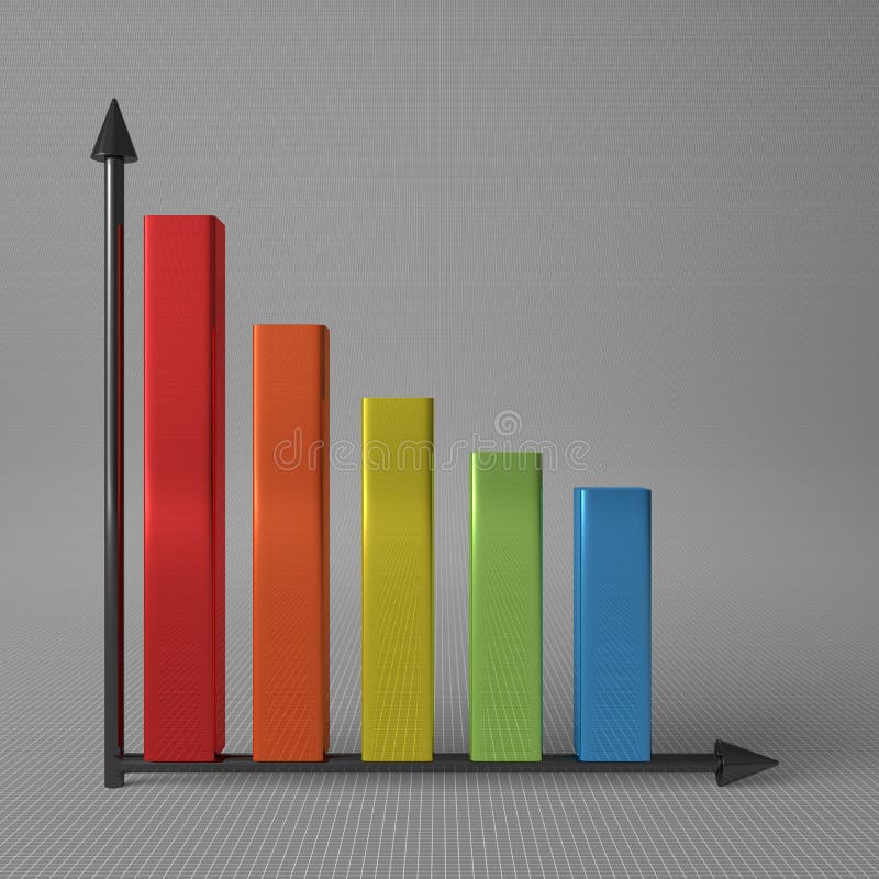
Free with trial A colorful bar chart showing a decrease or reduction by a red line and arrow above the bars. Graphic showing decrease illustrations Colorful bar chart
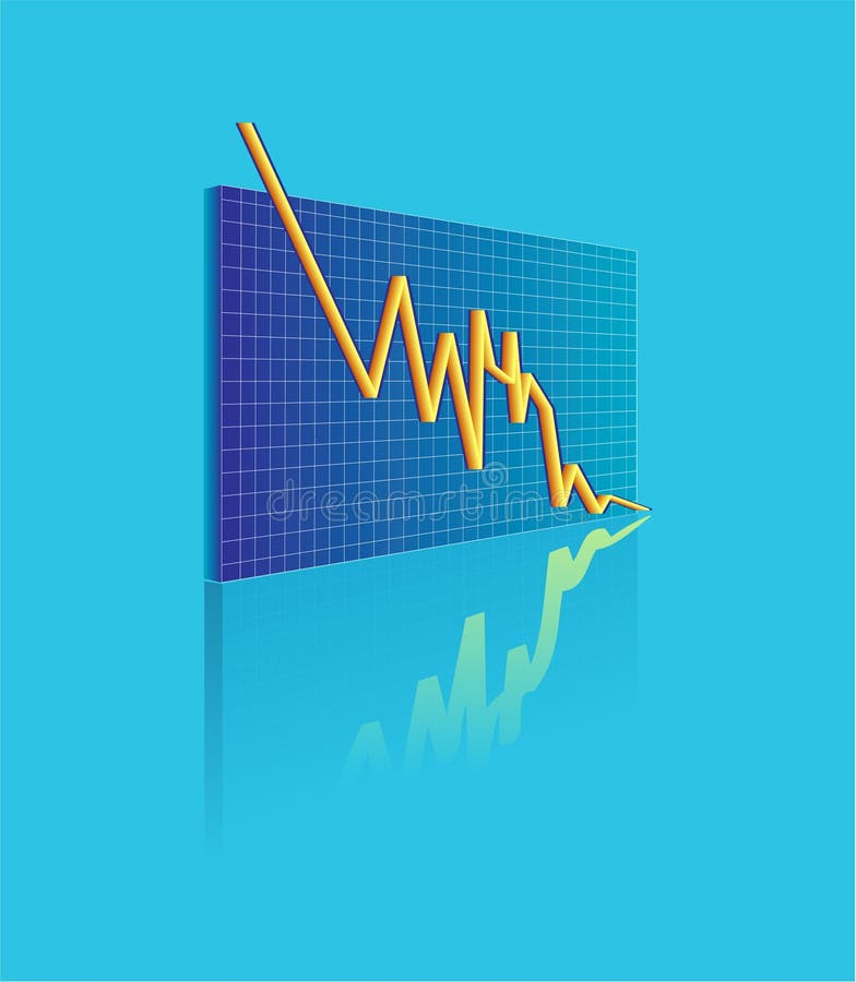
Free with trial An illustration showing financial fluctuation. Graphic showing decrease vectors Vector financial. An illustration showing financial fluctuation
Free with trial An illustration showing financial fluctuation. Graphic showing decrease vectors Vector financial. An illustration showing financial fluctuation
Free with trial An illustration showing financial fluctuation in Glass snow globe. Graphic showing decrease vectors Vector financial. An illustration showing financial fluctuation in Glass snow globe
Free with trial Magnifying glass showing falling bar graph on the screen of a computer. Graphic showing decrease vectors Bar Graph
Free with trial Falling red arrow down design. Web icon. Chart showing reduction of parameters. Graphic showing decrease vectors Decrease arrow down. Falling red arrow down design. Web icon. Chart showing reduction of parameters
Free with trial Silhouette of a man with the different sizes clouds above his head. Each cloud contains a blue graph indicating economic growth The red graph is showing the economic decrease. All is on a blue gradient background. Graphic showing decrease vectors Economy decrease concept. Silhouette of a man with the different sizes clouds above his head. Each cloud contains a blue graph indicating economic growth The red graph is showing the economic decrease. All is on a blue gradient background.
Free with trial Hand showing small value, or use it to put some small object between the fingers, African ethnicity detailed illustration. Graphic showing decrease vectors Hand showing small value, or use it to put small object. Hand showing small value, or use it to put some small object between the fingers, African ethnicity detailed illustration.
Free with trial Hand showing small value, or use it to put some small object between the fingers, detailed vector illustration. Graphic showing decrease vectors Hand showing small value, or use it to put some small object
Free with trial 3d image of lcd on wall showing decrease financial stat. Graphic showing decrease illustrations Financial stat decrease. 3d image of lcd on wall showing decrease financial stat
Free with trial Stat bars and falling arrow showing a downward trend. 3D illustration. Graphic showing decrease illustrations Stat bars and falling arrow showing a downward trend. 3D illustration
Free with trial Multicolor glossy bar chart showing decrease, with two black axis, standing on gray background, front view. Graphic showing decrease illustrations Bar chart with axis. Multicolor glossy bar chart showing decrease, with two black axis, standing on gray background, front view
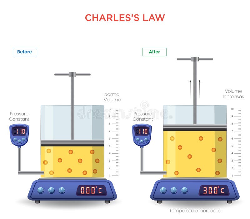
Free with trial Charles's Law states that the volume of a gas increases with temperature, provided pressure is constant, showing a direct relationship between volume and temperature. Graphic showing decrease vectors Understanding Charles\'s Law The Relationship Between Gas Volume and Temperature. Charles's Law states that the volume of a gas increases with temperature, provided pressure is constant, showing a direct relationship between volume and temperature
Free with trial Creative vector illustration of revenue, profit, expenses diagram showing infographic isolated on transparent background. Art design business planning template. Abstract concept graphic element. Graphic showing decrease vectors Creative vector illustration of revenue, profit, expenses diagram showing infographic isolated on transparent background
Free with trial Creative vector illustration of revenue, profit, expenses diagram showing infographic isolated on transparent background. Art design business planning template. Abstract concept graphic element. Graphic showing decrease vectors Creative vector illustration of revenue, profit, expenses diagram showing infographic isolated on transparent background
Free with trial Creative vector illustration of revenue, profit, expenses diagram showing infographic isolated on transparent background. Art design business planning template. Abstract concept graphic element. Graphic showing decrease vectors Creative vector illustration of revenue, profit, expenses diagram showing infographic isolated on transparent background
Free with trial Currency collapse. Digitally generated dollar, euro and yen signs against futuristic screen showing virus growing. Graphic showing decrease illustrations Digitally generated dollar, euro and yen signs against futuristic screen showing virus growing.
Free with trial Dropping arrows showing decreasing trend in economy in global crisis or downtrend of stocks on the stock exchange in USA. Graphic showing decrease illustrations Dropping arrows showing decreasing trend in economy or downtrend on the stock exchange in USA. Dropping arrows showing decreasing trend in economy in global crisis or downtrend of stocks on the stock exchange in USA.
Free with trial Dropping arrows showing decreasing trend in economy in global crisis or downtrend of stocks on the stock exchange in Spain. March 2022, San Francisco, USA. Graphic showing decrease illustrations Dropping arrows showing decreasing trend in economy or downtrend on the stock exchange in Spain. Dropping arrows showing decreasing trend in economy in global crisis or downtrend of stocks on the stock exchange in Spain. March 2022, San Francisco, USA
Free with trial Glossy illustration showing three price tags representing three different price levels, from cheapest to most expensive. Graphic showing decrease vectors Price tags
Free with trial Easy to edit vector illustration of loss arrow hitting businessman showing financial crisis. Graphic showing decrease vectors Loss arrow hitting Businessman
Free with trial An illustration showing financial fluctuation on a board. Graphic showing decrease vectors Vector statistics. An illustration showing financial fluctuation on a board.
Free with trial Easy to edit vector illustration of businessman holding loss arrow showing financial crisis. Graphic showing decrease vectors Depressed Businessman holding loss arrow. Easy to edit vector illustration of businessman holding loss arrow showing financial crisis
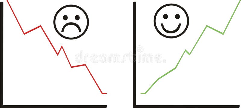
Free with trial Statistics image. Good and bad business. Graphic showing decrease vectors Statistic set and smile. Statistics image. Good and bad business.
Free with trial A colourful illustration showing financial fluctuation on a board. Graphic showing decrease vectors Vector Istatistik. A colourful illustration showing financial fluctuation on a board.
Free with trial Cute bird businessman showing different graph stats from success to failure. Graphic showing decrease vectors Bird Business Concept. Cute bird businessman showing different graph stats from success to failure
Free with trial Graph of vertical British Sterling Pound notes, showing a decrease in value over time. Graphic showing decrease illustrations British Sterling Pound decreasing. Graph of vertical British Sterling Pound notes, showing a decrease in value over time.
Free with trial Cartoon illustration showing a couple of graphs made up of coins, one going up and the other going down. Graphic showing decrease vectors Coin graph. Cartoon illustration showing a couple of graphs made up of coins, one going up and the other going down
Free with trial A colourful illustration showing financial fluctuation on a board. Graphic showing decrease vectors Vector Istatistik. A colourful illustration showing financial fluctuation on a board.
Free with trial Web buttons showing the ups and downs of finance. Graphic showing decrease vectors Rising and falling currency values. Web buttons showing the ups and downs of finance
Free with trial A 3d illustration showing arrows indicating the increasing or decreasing value of a Euro, isolated on a white background. Graphic showing decrease vectors Euro Value Indicators. A 3d illustration showing arrows indicating the increasing or decreasing value of a Euro, isolated on a white background.
Free with trial Businessmen Show Finance Crisis Negative Graph Red Arrow Down, Business Hands Point Finger on Desk Flat Vector Illustration. Graphic showing decrease vectors Businessmen Show Finance Crisis Negative Graph Red
Free with trial Flat style image showing business deadline, stress and angry boss. Graphic showing decrease vectors Hurry up objects. Flat style image showing business deadline, stress and angry boss
Free with trial Financial crisis. Depressed woman watching marker fall. Company bankruptcy or budget recession concept. Chart with falling arrow showing economy collapse vector. Employee losing money. Graphic showing decrease vectors Financial crisis. Depressed woman watching marker fall. Company bankruptcy or budget recession concept
Free with trial Generated with the use of AI. 3D graphic bar graph showing a declining trend, where the bars gradually decrease in height. The graph's surface is metallic, reflecting a somber environment. DEFLATION emphasizing economic downturn. Graphic showing decrease illustrations 3D graphic bar graph showing a declining trend where the bars gradually decrease in height. The graphs surface is metallic. Generated with the use of AI. 3D graphic bar graph showing a declining trend, where the bars gradually decrease in height. The graph's surface is metallic, reflecting a somber environment. DEFLATION emphasizing economic downturn
Free with trial Arrow pointing down, straight downward direction. Indicator, decrease pointer, showing reduction. Decline falling symbol. Navigation element. Flat vector illustration isolated on white background. Graphic showing decrease vectors Arrow pointing down, straight downward direction. Indicator, decrease pointer, showing reduction. Decline falling symbol
Free with trial Vector icon showing a diagonal arrow pointing down and to the right. Represents direction, decrease, trend, or movement. Simple graphic suitable for charts, diagrams, or interface navigation, vector design Generative AI. Graphic showing decrease vectors Down Right Diagonal Arrow Vector Icon Graphic, vector design Generative AI. Vector icon showing a diagonal arrow pointing down and to the right. Represents direction, decrease, trend, or movement. Simple graphic suitable for charts, diagrams, or interface navigation, vector design Generative AI
Free with trial A vector graphic of a line graph showing a downward trend. Represents decrease, decline, loss, or negative performance. In automotive context, could symbolize falling sales, decreasing fuel efficiency, or a system performance drop. A clear visual for illustrating negative trends, vector design Generative AI. Graphic showing decrease vectors Downtrend graph icon, decrease decline loss symbol, vector design Generative AI. A vector graphic of a line graph showing a downward trend. Represents decrease, decline, loss, or negative performance. In automotive context, could symbolize falling sales, decreasing fuel efficiency, or a system performance drop. A clear visual for illustrating negative trends, vector design Generative AI
Free with trial A vector graphic of a line graph showing a downward trend with an arrow. Represents decline, loss, decrease, negative progress, or recession. Useful graphic for financial reports, statistics, or negative outcomes. Illustrating a drop in value, vector design Generative AI. Graphic showing decrease vectors Downward Trend Arrow Vector Graphic, Decline and Loss Icon, vector design Generative AI. A vector graphic of a line graph showing a downward trend with an arrow. Represents decline, loss, decrease, negative progress, or recession. Useful graphic for financial reports, statistics, or negative outcomes. Illustrating a drop in value, vector design Generative AI
Free with trial This clean vector graphic depicts a vertical thermometer with a red liquid column indicating a downward trend. A red arrow points toward a snowflake icon, symbolizing cooling weather or a decrease in thermal energy. The design uses a minimalist style with clear numerical markings against a plain white background, suitable for weather reports or climate data visualization. Graphic showing decrease vectors A graphic illustration of a thermometer showing a drop in temperature levels. This clean vector graphic depicts a vertical thermometer with a red liquid column indicating a downward trend. A red arrow points toward a snowflake icon, symbolizing cooling weather or a decrease in thermal energy. The design uses a minimalist style with clear numerical markings against a plain white background, suitable for weather reports or climate data visualization
Free with trial Bar chart graphic showing a downward trend with an orange arrow indicating decrease. Graphic showing decrease vectors Bar chart graphic showing a downward trend with an orange arrow indicating decrease
Free with trial This graphic illustrates stable bank withdrawals alongside a rising financial trend with coins and bars, Bank withdrawals are currently stable and not showing any significant increase or decrease. Graphic showing decrease vectors This graphic illustrates stable bank withdrawals alongside a rising financial trend with coins and bars, Bank withdrawals are
Free with trial A simple yet impactful vector illustration of an orange line graph showing a downward trend, representing a decrease or negative performance. This graphic is perfect for financial dashboards, stock market analysis, business presentations, or statistical reports. It clearly conveys declining metrics and critical data points, vector design Generative AI. Graphic showing decrease vectors Orange Decreasing Line Graph Vector. Financial Market Drop Graphic, vector design Generative AI. A simple yet impactful vector illustration of an orange line graph showing a downward trend, representing a decrease or negative performance. This graphic is perfect for financial dashboards, stock market analysis, business presentations, or statistical reports. It clearly conveys declining metrics and critical data points, vector design Generative AI
Free with trial The graphic illustrates stable bank withdrawals alongside a growing financial trend with upward movement, Bank withdrawals are currently stable and not showing any significant increase or decrease. Graphic showing decrease vectors The graphic illustrates stable bank withdrawals alongside a growing financial trend with upward movement, Bank withdrawals are
Free with trial A simple line graph icon showing a downward trend with two arrows and the words "DECREASE DECLINE. Graphic showing decrease illustrations Downward Trend Graph Icon with Decrease Decline Text chart. A simple line graph icon showing a downward trend with two arrows and the words "DECREASE DECLINE
Free with trial A minimalist vector graphic showing a plus and minus symbol within a rounded rectangle. This UI element is used for functions like zoom in, zoom out, increase, or decrease. Graphic showing decrease vectors Plus and minus line icon for increase and decrease control button. A minimalist vector graphic showing a plus and minus symbol within a rounded rectangle. This UI element is used for functions like zoom in, zoom out, increase, or decrease
Free with trial A black curved line graph showing a downward trend on a white background. Clear details and vibrant colors enh. Graphic showing decrease illustrations Black curved line graph showing decrease on white background chart decreasing. A black curved line graph showing a downward trend on a white background. Clear details and vibrant colors enh
Free with trial A simple graphic showing a percent sign with two down arrows. This icon represents a decrease in percentage, decline, or reduction. Perfect for financial or business concepts. Graphic showing decrease vectors Percent sign with down arrows icon for decrease and decline. A simple graphic showing a percent sign with two down arrows. This icon represents a decrease in percentage, decline, or reduction. Perfect for financial or business concepts.
Free with trial A clear vector icon showing a downward arrow on a line graph, symbolizing downturn, decline, or negative statistics. Ideal for financial reports, economic trends, and business analysis. This graphic effectively visualizes a decrease or setback, vector design Generative AI. Graphic showing decrease vectors Downturn Decline Graph Arrow Statistic Icon, vector design Generative AI. A clear vector icon showing a downward arrow on a line graph, symbolizing downturn, decline, or negative statistics. Ideal for financial reports, economic trends, and business analysis. This graphic effectively visualizes a decrease or setback, vector design Generative AI
Free with trial A vivid red arrow signifies a downward trend or negative movement. This impactful graphic represents decline loss decrease and is ideal for illustrating financial reports or data trends. Graphic showing decrease illustrations Bold red arrow points downward showing decline loss decrease trend direction. A vivid red arrow signifies a downward trend or negative movement. This impactful graphic represents decline loss decrease and is ideal for illustrating financial reports or data trends
Free with trial A vector graphic showing a scooter moving down a slope, guided by a large curved arrow. It can illustrate concepts like descent, downhill riding, or even a decrease in metrics. Useful for traffic signs and instructional guides, vector design Generative AI. Graphic showing decrease vectors Scooter Going Downhill with a Curved Arrow, Slope Navigation Vector Art, vector design Generative AI. A vector graphic showing a scooter moving down a slope, guided by a large curved arrow. It can illustrate concepts like descent, downhill riding, or even a decrease in metrics. Useful for traffic signs and instructional guides, vector design Generative AI
Free with trial Percentage with up and down arrows line icon. Percent symbol showing increase and decrease. Financial analytics sign for banking, credit, interest rates, statistics, and economic trends. Graphic showing decrease vectors Percentage with up and down arrows line icon. Percent symbol showing increase and decrease. Financial analytics sign for banking
Free with trial Modern vector icon showing a downward arrow over a bar chart with progressively smaller bars indicating decline or decrease. Graphic showing decrease illustrations Downward arrow with decreasing bar chart graphic. Modern vector icon showing a downward arrow over a bar chart with progressively smaller bars indicating decline or decrease
Free with trial This graphic depicts a bar chart showing a progressive decline in values. Four vertical bars, rendered in shades of blue, decrease in height from left to right, symbolizing a reduction. Each bar is accompanied by a dark grey downward-pointing arrow, reinforcing the concept of a negative trend or decrease. The clean, minimalist composition on a white background provides a clear and easily. Graphic showing decrease vectors A bar chart illustrates a clear downward trend with multiple decreasing values. This graphic depicts a bar chart showing a progressive decline in values. Four vertical bars, rendered in shades of blue, decrease in height from left to right, symbolizing a reduction. Each bar is accompanied by a dark grey downward-pointing arrow, reinforcing the concept of a negative trend or decrease. The clean, minimalist composition on a white background provides a clear and easily
Free with trial This minimalist graphic illustration features a stylized thermometer centered on a plain background. A bold red arrow curves downward next to the instrument, clearly symbolizing a decrease in temperature or a cooling process. The clean lines and simple color palette make this an effective visual representation for weather reports, climate control systems, or scientific data visualization. Graphic showing decrease vectors A flat vector icon showing a thermometer with a downward arrow indicating cooling. This minimalist graphic illustration features a stylized thermometer centered on a plain background. A bold red arrow curves downward next to the instrument, clearly symbolizing a decrease in temperature or a cooling process. The clean lines and simple color palette make this an effective visual representation for weather reports, climate control systems, or scientific data visualization
Free with trial A graphic illustration of a fluctuating line chart showing economic trends. Generative AI. Graphic showing decrease illustrations A graphic illustration of a fluctuating line chart showing economic trends
Free with trial This scientific infographic presents astrophysical data visualization on a dark blue background with elegant gold border, featuring a prominent black hole labeled Galaxy Mass with 10X Decrease notation on the left side, accompanied by two smaller black holes below labeled Black Hole Mass and 100x Decrease respectively, while the right side displays analytical graphs including a bar graph showing. Graphic showing decrease illustrations Scientific infographic showing galaxy mass decreasing tenfold with black hole mass decreasing one hundred times on dark blue. This scientific infographic presents astrophysical data visualization on a dark blue background with elegant gold border, featuring a prominent black hole labeled Galaxy Mass with 10X Decrease notation on the left side, accompanied by two smaller black holes below labeled Black Hole Mass and 100x Decrease respectively, while the right side displays analytical graphs including a bar graph showing
Free with trial This minimalist graphic design features a bold red arrow pointing downward to symbolize a decrease in spending. A colorful gauge meter is positioned in the upper right corner to represent varying levels of expenditure. The clean composition uses a professional color palette against a plain white background to convey efficiency and economic management. Graphic showing decrease vectors A flat vector illustration showing a downward arrow indicating reduced financial expenses. This minimalist graphic design features a bold red arrow pointing downward to symbolize a decrease in spending. A colorful gauge meter is positioned in the upper right corner to represent varying levels of expenditure. The clean composition uses a professional color palette against a plain white background to convey efficiency and economic management
Free with trial Declining Bar Graph with Downward Arrow Showing Loss or Decrease. Graphic showing decrease vectors Declining Bar Graph with Downward Arrow Showing Loss or Decrease
Free with trial This graphic features a stylized pair of scissors actively cutting through a dark line, symbolizing a reduction in financial costs. A bright green arrow curves downward to emphasize the decrease in rates, set against a clean white background. The overall aesthetic is professional and minimalist, designed to communicate economic concepts clearly and effectively for business presentations. Graphic showing decrease vectors A conceptual illustration showing a pair of scissors cutting down financial interest rates. This graphic features a stylized pair of scissors actively cutting. This graphic features a stylized pair of scissors actively cutting through a dark line, symbolizing a reduction in financial costs. A bright green arrow curves downward to emphasize the decrease in rates, set against a clean white background. The overall aesthetic is professional and minimalist, designed to communicate economic concepts clearly and effectively for business presentations
Free with trial This conceptual scientific illustration features a dramatic black hole on the left, rendered with a deep blue cosmic background and radiant rays of light emanating from its center, visually paired with a clean, modern bar graph on the right that charts a significant decrease in mass drop events over time, directly comparing a 10x mass decrease against a 100x mass drop with clear white data labels. Graphic showing decrease illustrations An illustration of a black hole with a tenfold mass decrease and hundredfold mass drop alongside a comparative bar graph showing. This conceptual scientific illustration features a dramatic black hole on the left, rendered with a deep blue cosmic background and radiant rays of light emanating from its center, visually paired with a clean, modern bar graph on the right that charts a significant decrease in mass drop events over time, directly comparing a 10x mass decrease against a 100x mass drop with clear white data labels
Free with trial A vertical bar graph displays monthly service reach statistics with six colored sections representing different months, showing service growth from approximately $20,000 to $30,000 in the first quarter, fluctuations between 1,500 and 2,500 in the second quarter, a decrease followed by slight recovery in service requests during the third quarter, and a significant increase from around 3,500 to 4,. Graphic showing decrease illustrations Business growth bar chart showing monthly service reach statistics with colorful data visualization and performance metrics. A vertical bar graph displays monthly service reach statistics with six colored sections representing different months, showing service growth from approximately $20,000 to $30,000 in the first quarter, fluctuations between 1,500 and 2,500 in the second quarter, a decrease followed by slight recovery in service requests during the third quarter, and a significant increase from around 3,500 to 4,
Free with trial Isolated showing simple line graph showing a downward trend on white background keywords: graph, chart, line, trend, data, decline, decrease. Graphic showing decrease illustrations Simple line graph showing a downward trend on white background Keywords: graph, chart, line, trend, data, decline
Free with trial This is a conceptual image showing a persons hand holding a digital graphic with arrows and percentages representing quality cost This image illustrates the dynamic nature of business finance performance and metrics with the potential for both increases and decreases in quality and costs in the modern business landscape. Graphic showing decrease illustrations Conceptual Hand Holding Quality Cost Graphic Depicting Increase and Decrease Percentages Representing Business Performance and. This is a conceptual image showing a persons hand holding a digital graphic with arrows and percentages representing quality cost This image illustrates the dynamic nature of business finance performance and metrics with the potential for both increases and decreases in quality and costs in the modern business landscape
Free with trial A dynamic vector icon of a curved arrow pointing down and to the right. This graphic is useful for indicating direction, showing a decrease or downward trend, or as a navigational element in user interfaces. vector design Generative AI. Graphic showing decrease vectors Curved Arrow Pointing Downward Vector Icon, vector design Generative AI. A dynamic vector icon of a curved arrow pointing down and to the right. This graphic is useful for indicating direction, showing a decrease or downward trend, or as a navigational element in user interfaces. vector design Generative AI
Free with trial Visualize the sharp downturn in cryptocurrency markets with this dynamic graphic showing falling prices, a sell button, and a downward arrow. Perfect for financial news and investment analysis. Graphic showing decrease vectors Cryptocurrency market crash graphic with sell button and falling arrow. Visualize the sharp downturn in cryptocurrency markets with this dynamic graphic showing falling prices, a sell button, and a downward arrow. Perfect for financial news and investment analysis
Free with trial Abstract graphic showing currency symbols and arrows to visually represent financial market changes and exchange rate fluctuations Ideal for illustrating finance topics. Graphic showing decrease illustrations Currency Exchange Rate Fluctuations Abstract Graphic. Abstract graphic showing currency symbols and arrows to visually represent financial market changes and exchange rate fluctuations Ideal for illustrating finance topics
Free with trial Financial taxation system graphic showing tax increase and decrease options with percentage coin element for economic policy planning and analysis. Graphic showing decrease illustrations Tax management concept icon with percentage symbol and directional green arrows on blue background. Financial taxation system graphic showing tax increase and decrease options with percentage coin element for economic policy planning and analysis
Free with trial 3D Red down arrow showing declining trend. Business stock market decrease symbol. Economic crisis concept. Vector illustration. Graphic showing decrease vectors 3D Red down arrow showing declining trend
Free with trial This striking graphic illustrates a significant economic downturn or market crash with a bold red arrow plunging downwards. Rendered by Ai, the image uses simple colors to maximize impact setting the alarming decline against subtle background charts. It effectively communicates concepts of loss decrease and a strong negative trend in business metrics. Graphic showing decrease illustrations Red arrow showing sharp financial market decline. This striking graphic illustrates a significant economic downturn or market crash with a bold red arrow plunging downwards. Rendered by Ai, the image uses simple colors to maximize impact setting the alarming decline against subtle background charts. It effectively communicates concepts of loss decrease and a strong negative trend in business metrics
Free with trial A modern flat design graphic set featuring two icons: opposing arrows indicating increase decrease and a bar chart showing financial growth or decline, perfect for business concepts. Graphic showing decrease vectors Increase and decrease arrows with bar chart icon. A modern flat design graphic set featuring two icons: opposing arrows indicating increase decrease and a bar chart showing financial growth or decline, perfect for business concepts
Free with trial Bankruptcy showing red 3d percentage symbol with downward arrow indicating decrease. Graphic showing decrease illustrations Red 3D Percentage Symbol with Downward Arrow Indicating Decrease
Free with trial A versatile collection of colorful down arrow icons, presented in a modern flat design style. This set features a variety of arrow shapes and styles in vibrant shades of blue, green, yellow, and red, all pointing downwards on a light background. These clean, vector graphic elements are perfect for user interface (UI) design, web buttons, download symbols, infographics showing a decrease or negative trend, and navigation indicators in apps or presentations. An essential toolkit for any graphic designer's collection. Graphic showing decrease vectors Colorful Flat Design Down Arrow Icon Set. A versatile collection of colorful down arrow icons, presented in a modern flat design style. This set features a variety of arrow shapes and styles in vibrant shades of blue, green, yellow, and red, all pointing downwards on a light background. These clean, vector graphic elements are perfect for user interface (UI) design, web buttons, download symbols, infographics showing a decrease or negative trend, and navigation indicators in apps or presentations. An essential toolkit for any graphic designer's collection.
Free with trial Flat graphic showing a dollar coin with arrows illustrating market fluctuation and volatility, styled as flat cartoon icon. Graphic showing decrease vectors Investment Fluctuation Illustration Showing Increase and Decrease of Capital. Flat graphic showing a dollar coin with arrows illustrating market fluctuation and volatility, styled as flat cartoon icon.
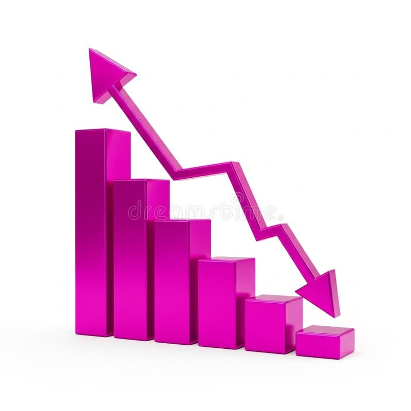
Free with trial A 3D bar chart rendered in a vibrant pink color illustrates a significant downward trend. The bars decrease in height from left to right, culminating in a very short bar. A bold pink arrow, also in 3D, starts high on the left and sharply descends to the right, mirroring the decline shown by the bars. The entire graphic is isolated on a clean white background. Graphic showing decrease illustrations Pink 3D Bar Chart Showing a Downward Trend with an Arrow graph decline. A 3D bar chart rendered in a vibrant pink color illustrates a significant downward trend. The bars decrease in height from left to right, culminating in a very short bar. A bold pink arrow, also in 3D, starts high on the left and sharply descends to the right, mirroring the decline shown by the bars. The entire graphic is isolated on a clean white background