Free with trial People are stressed by a financial chart with falling indicators, showing a loss of money and investments due to a market downturn. Graphic showing decrease vectors People stressed by a financial chart with falling indicators. people are stressed by a financial chart with falling indicators, showing a loss of money and investments due to a market downturn.
Free with trial A 3D rendered representation of a bar chart displayed within a simplified interface window. The chart features ascending bars in shades of green and a single pink bar at the end, suggesting data and growth. The window has a purple top bar with three colored dots and the text "ISO 1600". The entire graphic floats against a light purple background. Graphic showing decrease illustrations 3D Bar Chart with Green and Pink Bars Showing Growth and Data on a Purple Background with ISO 1600 Label. A 3D rendered representation of a bar chart displayed within a simplified interface window. The chart features ascending bars in shades of green and a single pink bar at the end, suggesting data and growth. The window has a purple top bar with three colored dots and the text "ISO 1600". The entire graphic floats against a light purple background
Free with trial A stylized document showing dollar symbols and a downward arrow, conveying financial loss or decline. Graphic style with a flat design and simple composition. Graphic showing decrease vectors Financial Report with Dollar Symbols and Downward Arrows Indicating Loss. A stylized document showing dollar symbols and a downward arrow, conveying financial loss or decline. Graphic style with a flat design and simple composition.
Free with trial An isometric view of a bar chart with five blue bars of decreasing height, representing a downward trend. A red arrow points downwards, indicating a negative trajectory. Graphic showing decrease illustrations Bar chart showing a downward trend with a red arrow isolated on white background. An isometric view of a bar chart with five blue bars of decreasing height, representing a downward trend. A red arrow points downwards, indicating a negative trajectory
Free with trial This image features two minimalist icons representing financial or data trends. The left icon is a white line graph with circular data points and directional arrows, set against a solid black shield shape. The right icon presents the same line graph and data points within a black outline of a shield, on a white background. Both icons depict fluctuating data, with one showing a downward trend and the other an upward trend, symbolizing market volatility, analysis, and security. Graphic showing decrease illustrations Line Graph Icon with Shield Symbol - Upward and Downward Trends. This image features two minimalist icons representing financial or data trends. The left icon is a white line graph with circular data points and directional arrows, set against a solid black shield shape. The right icon presents the same line graph and data points within a black outline of a shield, on a white background. Both icons depict fluctuating data, with one showing a downward trend and the other an upward trend, symbolizing market volatility, analysis, and security.
Free with trial A striking red arrow curves downwards, symbolizing a financial downturn economic recession or declining performance. This graphic conveys a clear message of loss, regression, or negative trends. Graphic showing decrease illustrations Red downward arrow symbol showing decline and negative trend in business and finance. A striking red arrow curves downwards, symbolizing a financial downturn economic recession or declining performance. This graphic conveys a clear message of loss, regression, or negative trends
Free with trial A simple bar chart and line graph with a downward arrow illustrates a negative trend like recession or business failure ideal for financial reports about crisis or loss. Graphic showing decrease illustrations Declining Blue Bar Chart and Line Graph Showing Financial Loss on Gray Background. A simple bar chart and line graph with a downward arrow illustrates a negative trend like recession or business failure ideal for financial reports about crisis or loss
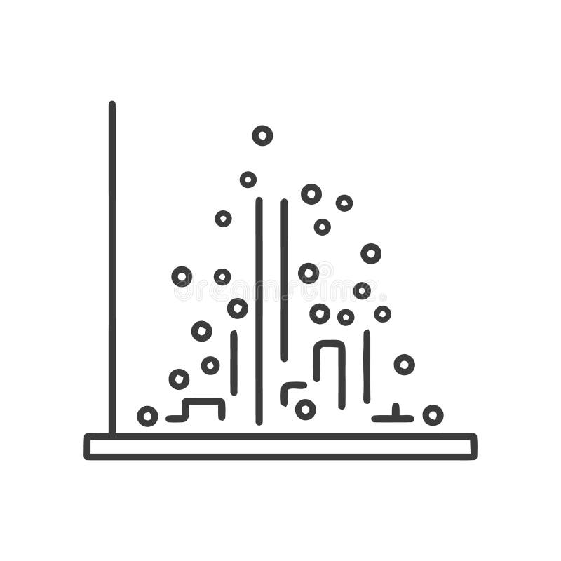
Free with trial Description: Simple line art illustration of a scatter plot graph showing an uneven distribution of data points. Perfect for presentations or reports. Graphic showing decrease vectors Abstract Data Visualization: Scatter Plot Chart with Irregular Data Points. Description: Simple line art illustration of a scatter plot graph showing an uneven distribution of data points. Perfect for presentations or reports.
Free with trial A vibrant 3D bar chart, featuring glossy blue and orange rectangular segments, illustrates data progression or comparison. The varying bar heights convey growth or statistical analysis. This modern graphic is ideal for business, finance, and analytical concepts, presented cleanly isolated on a transparent background. Graphic showing decrease vectors Glossy 3D bar chart showing data growth and statistics with blue and orange segments, perfect for business and finance presentatio. A vibrant 3D bar chart, featuring glossy blue and orange rectangular segments, illustrates data progression or comparison. The varying bar heights convey growth or statistical analysis. This modern graphic is ideal for business, finance, and analytical concepts, presented cleanly isolated on a transparent background.
Free with trial Black and white vector logo of a simple house outline with stylized upward arrow and a small dollar sign icon, simple design, on a solid background, simple shapes, flat illustration style, simple lines, no shadows or gradients, symmetrical composition, centered, no text, high contrast, no color, high resolution, very detailed, high definition --chaos 30 --ar 16:9 --v 7 Job ID: cfd6ce0d-9e1a-412b-. Graphic showing decrease illustrations Dollar Sign with Arrows Showing Income and Expenses Under a Roof. black and white vector logo of a simple house outline with stylized upward arrow and a small dollar sign icon, simple design, on a solid background, simple shapes, flat illustration style, simple lines, no shadows or gradients, symmetrical composition, centered, no text, high contrast, no color, high resolution, very detailed, high definition --chaos 30 --ar 16:9 --v 7 Job ID: cfd6ce0d-9e1a-412b-
Free with trial Flat vector illustration of a chart depicting a negative trend, accompanied by a sad face icon, suggesting business decline or failure. Graphic showing decrease vectors A chart showing a negative trend with a sad face icon, indicating a decline in business. Flat vector illustration of a chart depicting a negative trend, accompanied by a sad face icon, suggesting business decline or failure.
Free with trial Icon showing two green downward arrows of different sizes on a white background. Graphic showing decrease illustrations Two Green Downward Arrows of Different Sizes on a White Background
Free with trial Graphic showing a downward trend with blue bars and red line chart. Bars decrease in size from left to right. Graphic showing decrease illustrations Declining bar and line chart illustration. Graphic showing a downward trend with blue bars and red line chart. Bars decrease in size from left to right
Free with trial A bright green zigzag arrow pointing downwards, symbolizing a significant drop or negative trend on a light gray background. Graphic showing decrease illustrations Green zigzag arrow showing a sharp decline. A bright green zigzag arrow pointing downwards, symbolizing a significant drop or negative trend on a light gray background
Free with trial This image presents a clean, minimalist graphic illustrating economic trends. It features two distinct charts: a line graph on the left showing fluctuating data points over time, and a bar chart on the right comparing values across categories. The charts use a simple black and white color scheme with grayscale elements, making them versatile for various business and financial contexts. Labels like 'ECONOMIC', 'PARCTIRUM', and 'PLACTIRUM' suggest analysis of economic performance and market data. The overall design emphasizes clarity and data visualization. Graphic showing decrease vectors Economic Growth Trends: Line and Bar Charts. This image presents a clean, minimalist graphic illustrating economic trends. It features two distinct charts: a line graph on the left showing fluctuating data points over time, and a bar chart on the right comparing values across categories. The charts use a simple black and white color scheme with grayscale elements, making them versatile for various business and financial contexts. Labels like 'ECONOMIC', 'PARCTIRUM', and 'PLACTIRUM' suggest analysis of economic performance and market data. The overall design emphasizes clarity and data visualization.
Free with trial This vibrant 3D bar graph features various colorful bars with an upward arrow, symbolizing growth and success in financial and business metrics Generative Ai. Graphic showing decrease illustrations Colorful 3D Bar Graph Showing Growth with Upward Arrow Design. This vibrant 3D bar graph features various colorful bars with an upward arrow, symbolizing growth and success in financial and business metrics Generative Ai
Free with trial A professional bar chart visualization featuring multiple colorful vertical bars of varying heights, representing statistical data, growth, or financial analysis in a clean minimalist style. Created AI. Graphic showing decrease illustrations A colorful bar graph showing financial data trends on white background. A professional bar chart visualization featuring multiple colorful vertical bars of varying heights, representing statistical data, growth, or financial analysis in a clean minimalist style.Created AI
Free with trial Illustration shows a stock market decline with candlestick charts and downward trending arrow. The design features a light blue background and a simple layout. Useful for financial articles, reports, or any material illustrating loss, recession, or negative trends in commercial sector. Graphic showing decrease illustrations Falling stock market chart showing economic downturn and financial loss. Illustration shows a stock market decline with candlestick charts and downward trending arrow. The design features a light blue background and a simple layout. Useful for financial articles, reports, or any material illustrating loss, recession, or negative trends in commercial sector
Free with trial Illustrative graphic showing a declining financial graph with a downward arrow alongside stacks of coins representing a fall in interest rates and market value. Graphic showing decrease illustrations Financial Crisis: Decreasing Interest Rates and Market Decline. Illustrative graphic showing a declining financial graph with a downward arrow alongside stacks of coins representing a fall in interest rates and market value
Free with trial Simple vector illustration of a download button with a timer countdown inside. Perfect for websites or applications showing progress. Graphic showing decrease vectors Download Button Icon: Timer Countdown, Circle Arrow. Simple vector illustration of a download button with a timer countdown inside. Perfect for websites or applications showing progress.
Free with trial Financial decision and interest rate change concept, wooden blocks showing percentage symbol with green upward and red downward arrows. Graphic showing decrease illustrations Financial decision and interest rate change concept
Free with trial Financial decision and interest rate change concept, wooden blocks showing percentage symbol with green upward and red downward arrows. Graphic showing decrease illustrations Financial decision and interest rate change concept
Free with trial Financial decision and interest rate change concept, wooden blocks showing percentage symbol with green upward and red downward arrows. Graphic showing decrease illustrations Financial decision and interest rate change concept
Free with trial Financial decision and interest rate change concept, wooden blocks showing percentage symbol with green upward and red downward arrows. Graphic showing decrease illustrations Financial decision and interest rate change concept
Free with trial Financial data chart, glowing lines, digital display. Stock image showing trends. Graphic showing decrease illustrations Digital financial graph with candlestick chart, data analytics, stock market trend, technology concept. Financial data chart, glowing lines, digital display. Stock image showing trends
Free with trial Bright vector icons showing downward arrows with percentage symbols, ideal for financial, statistics, or data presentations. Graphic showing decrease illustrations Set of colorful downward arrows with percentage signs. Bright vector icons showing downward arrows with percentage symbols, ideal for financial, statistics, or. Bright vector icons showing downward arrows with percentage symbols, ideal for financial, statistics, or data presentations
Free with trial A graphic showing a downward trend with a Bitcoin symbol inside a prohibition sign. Graphic showing decrease illustrations Declining bitcoin symbol isolated on white background. A graphic showing a downward trend with a Bitcoin symbol inside a prohibition sign
Free with trial Flat design vector showing a gear with a coin inside and an arrow pointing down, representing optimization or decreasing expenses. Graphic showing decrease vectors Financial Optimization Icon: Gear, Coin, and Arrow Representing Decreasing Costs or Investment. Flat design vector showing a gear with a coin inside and an arrow pointing down, representing optimization or decreasing expenses.
Free with trial This image depicts a vibrant and modern representation of financial success, featuring 3D bar graphs, pie charts, and a calculator, all set against a clean white background. The upward-trending graph showcases growth and progress. Graphic showing decrease illustrations Colorful 3D Financial Charts and Calculator Showing Business Growth. This image depicts a vibrant and modern representation of financial success, featuring 3D bar graphs, pie charts, and a calculator, all set against a clean white background. The upward-trending graph showcases growth and progress.
Free with trial Set of six black and white vector icons showing downward arrows with flames and percentage values from ten to sixty percent in bold numbers. Generative AI. Graphic showing decrease vectors Black and white fire percentage down arrows set of six vector icons. Set of six black and white vector icons showing downward arrows with flames and percentage values from ten to sixty percent in bold numbers. Generative AI
Free with trial Illustration of an angry boy holding a graph showing declining performance, representing business failure and loss. The image conveys frustration and disappointment with negative financial results and market downturns. Graphic showing decrease vectors Angry Boy with Falling Graph Business Failure, Loss Concept. Illustration of an angry boy holding a graph showing declining performance, representing business failure and loss. The image conveys frustration and disappointment with negative financial results and market downturns.
Free with trial The image displays a bright red sale tag with a string attached at the top, indicating a ten percent discount offer. The tag has bold white text that reads '10% OFF' and is designed to be hung on merchandise to attract buyers with a promotional deal. Graphic showing decrease illustrations A red discount tag showing a ten percent off sale promotion. The image displays a bright red sale tag with a string attached at the top, indicating a ten percent discount offer. The tag has bold white text that reads '10% OFF' and is designed to be hung on merchandise to attract buyers with a promotional deal
Free with trial A simple outline graphic showing a magnifying glass over a chart with a pie chart and bar graph, with a downward. Graphic showing decrease illustrations Declining Sales Analysis Magnifying Glass, Chart, Arrow Down. A simple outline graphic showing a magnifying glass over a chart with a pie chart and bar graph, with a downward.
Free with trial Red upward arrow icon with crossed downward line and bar chart showing growth and decline contrast. Graphic showing decrease illustrations Red upward arrow with crossed down trend icon and bar chart. Red upward arrow icon with crossed downward line and bar chart showing growth and decline contrast
Free with trial A 3D rendered image depicts a colorful bar graph with bars in red, yellow, green, and blue. A thick black arrow curves downwards from the top left, pointing towards the right and indicating a negative trend or decline. The bars are arranged in descending order of height from left to right, further emphasizing the downward trajectory. The image is set against a clean white background, making the. Graphic showing decrease illustrations Colorful Bar Graph Showing Downward Trend with Black Arrow on White Background chart. A 3D rendered image depicts a colorful bar graph with bars in red, yellow, green, and blue. A thick black arrow curves downwards from the top left, pointing towards the right and indicating a negative trend or decline. The bars are arranged in descending order of height from left to right, further emphasizing the downward trajectory. The image is set against a clean white background, making the
Free with trial This vibrant 3D rendering displays a dynamic bar chart alongside a detailed pie chart, illustrating impressive business growth and financial success. The colorful segments and bars clearly present data, making it perfect for presentations or reports. Graphic showing decrease illustrations Colorful 3D Bar and Pie Chart Showing Business Growth and Financial Success. This vibrant 3D rendering displays a dynamic bar chart alongside a detailed pie chart, illustrating impressive business growth and financial success. The colorful segments and bars clearly present data, making it perfect for presentations or reports.
Free with trial This image displays a bright red sale tag with a white border, prominently featuring the number 15% in bold white font. The tag is designed to attract attention and is typically used in retail environments to indicate a discount or special offer on products. Graphic showing decrease illustrations Eye-catching red discount tag showing fifteen percent off sale. This image displays a bright red sale tag with a white border, prominently featuring the number 15% in bold white font. The tag is designed to attract attention and is typically used in retail environments to indicate a discount or special offer on products
Free with trial Black and white line drawing showing a decline in sales data inside an email envelope being examined with a magnifying. Graphic showing decrease illustrations Email Marketing Analysis Declining Sales Under Magnifying Glass. Black and white line drawing showing a decline in sales data inside an email envelope being examined with a magnifying.
Free with trial A clean flat design icon showing a zero percent change with a green upward arrow and a red downward arrow, perfect for illustrating neutral or balanced data trends in presentations or reports. Graphic showing decrease illustrations Flat design percentage change zero with up and down arrows icon. A clean flat design icon showing a zero percent change with a green upward arrow and a red downward arrow, perfect for illustrating neutral or balanced data trends in presentations or reports
Free with trial Image showing a pair of hands holding two plain white paper bags. One bag has a large black upward-pointing arrow symbol drawn on it, while the other has a large black downward-pointing arrow symbol. The hands are in a relaxed position with palms facing slightly outward. The paper bags appear empty and the arrows suggest comparison, growth, or direction. Graphic showing decrease illustrations Hands holding white paper bags with arrows pointing up and down. Image showing a pair of hands holding two plain white paper bags. One bag has a large black upward-pointing arrow symbol drawn on it, while the other has a large black downward-pointing arrow symbol. The hands are in a relaxed position with palms facing slightly outward. The paper bags appear empty and the arrows suggest comparison, growth, or direction
Free with trial Circular arrow icon showing download progress. Simple and modern design, perfect for website and app interfaces. Graphic showing decrease vectors Download Icon, Progress Indicator, Loading Symbol, Data Transfer, Circular Arrow, Process Completion. Circular arrow icon showing download progress. Simple and modern design, perfect for website and app interfaces.
Free with trial Red neon arrows moving down, financial loss abstract vector background. Modern downward graphic, negative market trend, stock recession metrics, and business decrease concept 4k background. Graphic showing decrease illustrations Red neon arrows moving down, financial loss business background. Red neon arrows moving down, financial loss abstract vector background. Modern downward graphic, negative market trend, stock recession metrics, and business decrease concept 4k background
Free with trial A minimalist, high-detail 8K icon showing an isometric 3D view of a growing coin stack next to a simple money bag. Represents investment, financial growth and modern finance on a clean background. Graphic showing decrease illustrations Isometric Coin Stack and Money Bag Icon for Investment and Growth. 8K Render. A minimalist, high-detail 8K icon showing an isometric 3D view of a growing coin stack next to a simple money bag. Represents investment, financial growth and modern finance on a clean background
Free with trial 3D render of a bar chart with descending bars on blue circular base. Concept of negative trend, decline, or loss in business. Graphic showing decrease vectors Decreasing bar chart on blue base showing decline in performance. 3D render of a bar chart with descending bars on blue circular base. Concept of negative trend, decline, or loss in business
Free with trial A sharp, red zigzag arrow points downwards, visually representing a significant decline or negative trend in financial markets, economic performance, or any data set showing a downward trajectory. Graphic showing decrease vectors Red downward trending arrow graphic, isolated on transparent background. A sharp, red zigzag arrow points downwards, visually representing a significant decline or negative trend in financial markets, economic performance, or any data set showing a downward trajectory
Free with trial This compelling 3D illustration visualizes the challenging concept of a bear market, ideal for illustrating economic and financial topics. The image prominently features a bear alongside a significant downward arrow, symbolizing declining stock prices and a potential economic downturn. Representing a bearish sentiment, it highlights the risks inherent in investment and trading. Relevant to finance. Graphic showing decrease illustrations Bear market concept illustration showing a bear with a downward arrow representing declining stock prices and economic downturn. This compelling 3D illustration visualizes the challenging concept of a bear market, ideal for illustrating economic and financial topics. The image prominently features a bear alongside a significant downward arrow, symbolizing declining stock prices and a potential economic downturn. Representing a bearish sentiment, it highlights the risks inherent in investment and trading. Relevant to finance
Free with trial Icon set showing hand depositing money into container representing financial savings cost reduction. Graphic showing decrease vectors Hand putting dollar coin into box with down arrow for savings budget. Icon set showing hand depositing money into container representing financial savings cost reduction
Free with trial Abstract red chart illustrating data trends and fluctuations in finance. This graphic represents market analysis, ideal for professional reports and presentations. Graphic showing decrease vectors Red Chart Illustration Showing Data Trends and Variations in Finance. Abstract red chart illustrating data trends and fluctuations in finance. This graphic represents market analysis, ideal for professional reports and presentations
Free with trial The visual features a black line graph illustration showing a downward trend. Positioned on a light blue backdrop, the minimalist design may represent decline, loss or negative progression. The image suits presentations, reports, or articles related to finance, statistics, business, or economic subjects, for editorial or commercial use. Graphic showing decrease illustrations Decreasing trend line graph on blue background finance visual concept. The visual features a black line graph illustration showing a downward trend. Positioned on a light blue backdrop, the minimalist design may represent decline, loss or negative progression. The image suits presentations, reports, or articles related to finance, statistics, business, or economic subjects, for editorial or commercial use
Free with trial A blue zigzag arrow transforms into red, pointing sharply downwards. The composition uses flat style and presents visual of business decline. Graphic showing decrease vectors Blue and Red Downward Trend Arrow on Black Background Showing Decline. A blue zigzag arrow transforms into red, pointing sharply downwards. The composition uses flat style and presents visual of business decline.
Free with trial A simple 3D render features four bars of decreasing height, in pink, blue and yellow, on a transparent backdrop. Depicts descending data. Graphic showing decrease vectors Colorful 3D bar graph showing declining data on transparent background. A simple 3D render features four bars of decreasing height, in pink, blue and yellow, on a transparent backdrop. Depicts descending data.
Free with trial Red neon arrows moving down, financial loss abstract vector background. Modern downward graphic, negative market trend, stock recession metrics, and business decrease concept 4k background. Graphic showing decrease illustrations Red neon arrows moving down, financial loss abstract vector background
Free with trial Minimalist shrink icon illustration showing arrows converging towards the center, representing resize or minimize functionality. Graphic showing decrease vectors Shrink Icon Illustration on Black Background - Resize or Minimize Concept. Minimalist shrink icon illustration showing arrows converging towards the center, representing resize or minimize functionality.
Free with trial Dollar coin burning on stack of coins is representing the concept of inflation. Graphic showing decrease illustrations Dollar coin burning on stack of coins showing inflation. Dollar coin burning on stack of coins is representing the concept of inflation
Free with trial A visual representation of a sales funnel with distinct colored stages, each indicating a percentage drop from 20% down to 1. Graphic showing decrease illustrations Colorful sales funnel diagram showing decreasing percentages from 20% to 1. A visual representation of a sales funnel with distinct colored stages, each indicating a percentage drop from 20% down to 1
Free with trial A red bar chart illustrating a significant downward trend, labeled 'Loss', indicating financial decline or business failure. Isolated on a white background. Graphic showing decrease illustrations Red Bar Chart Graph Showing Downward Trend with Loss Text, Business Decline. A red bar chart illustrating a significant downward trend, labeled 'Loss', indicating financial decline or business failure. Isolated on a white background
Free with trial Illustration showing file compression icon with a downward arrow suggesting a download and extraction process. Graphic showing decrease vectors Archive Download Icon - Compressed File with Arrow on Black Background. Illustration showing file compression icon with a downward arrow suggesting a download and extraction process.
Free with trial A series of five megaphone icons presented horizontally. Each megaphone visually represents increasing sound volume with emanating sound waves, symbolizing announcement and communication progression. Graphic showing decrease illustrations Five megaphone icons showing sound waves from small to large volume levels. A series of five megaphone icons presented horizontally. Each megaphone visually represents increasing sound volume with emanating sound waves, symbolizing announcement and communication progression
Free with trial A stark white 3D representation of a jagged line graph is depicted against a clean white background. The graph's peaks and valleys form a distinct downward trend, suggesting a decline or loss. The sharp angles and minimalist design emphasize the concept of a negative trajectory. The object casts a subtle shadow, adding depth and dimension to the isolated graphic. Graphic showing decrease illustrations White 3D Jagged Line Graph Showing Downward Trend on White Background chart decline. A stark white 3D representation of a jagged line graph is depicted against a clean white background. The graph's peaks and valleys form a distinct downward trend, suggesting a decline or loss. The sharp angles and minimalist design emphasize the concept of a negative trajectory. The object casts a subtle shadow, adding depth and dimension to the isolated graphic
Free with trial This image shows a simple 3D bar graph made up of four colorful bars, decreasing in height. The colors are purple, blue, and green. Graphic showing decrease vectors Colorful stylized bar graph showing decreasing trends on transparent background. This image shows a simple 3D bar graph made up of four colorful bars, decreasing in height. The colors are purple, blue, and green.
Free with trial A flat illustration showing a financial decline with a bar graph, falling line, and arrow pointing down. It is in a colorful style. Graphic showing decrease vectors Financial Downturn Graphic: Stock Chart with Decreasing Value and Falling Arrow. A flat illustration showing a financial decline with a bar graph, falling line, and arrow pointing down. It is in a colorful style.
Free with trial The image shows a striking three-dimensional representation of the number 60 with a percent sign, rendered in a vibrant red color against a plain background. This type of visual is often used to indicate a discount, completion percentage, or statistical data in marketing, presentations, or data visualization. Graphic showing decrease illustrations Bold three-dimensional display showing sixty percent discount or completion rate. The image shows a striking three-dimensional representation of the number 60 with a percent sign, rendered in a vibrant red color against a plain background. This type of visual is often used to indicate a discount, completion percentage, or statistical data in marketing, presentations, or data visualization
Free with trial Illustration of a dollar symbol surrounded by arrows showing financial movement, investment, and economic flow. Graphic showing decrease vectors Financial Flow: Dollar Symbol with Arrows Indicating Money Movement and Investment. Illustration of a dollar symbol surrounded by arrows showing financial movement, investment, and economic flow.
Free with trial Money bag with a dollar sign is losing value, as indicated by the red minus sign. Graphic showing decrease illustrations Money bag losing value with minus sign showing negative trend. Money bag with a dollar sign is losing value, as indicated by the red minus sign
Free with trial Mental health icon showing human head with lightning bolt and downward arrows. Graphic showing decrease vectors Human head profile icon with lightning bolt and downward arrows representing fatigue. Mental health icon showing human head with lightning bolt and downward arrows
Free with trial Minimalist line art illustration of weighing scale showing footprints and arrows indicating weight reduction. Graphic showing decrease vectors Bathroom scale icon with downward arrows representing weight loss progress and fitness. Minimalist line art illustration of weighing scale showing footprints and arrows indicating weight reduction
Free with trial The image depicts a bar chart showing a progressive increase in values, likely representing investments or costs, while a red downward-sloping line indicates a decrease in profits or returns over the same period. A green dollar sign emphasizes the financial theme. Graphic showing decrease vectors Graphic illustration of declining profits despite increasing investments or costs. The image depicts a bar chart showing a progressive increase in values, likely representing investments or costs, while a red downward-sloping line indicates a decrease in profits or returns over the same period. A green dollar sign emphasizes the financial theme
Free with trial A flat-style graphic displaying falling stock values, shown by arrows and a graph on a monitor with dollar coins. Graphic showing decrease vectors Stock market decline: Arrows showing a downward trend displayed on a screen with coins. A flat-style graphic displaying falling stock values, shown by arrows and a graph on a monitor with dollar coins.
Free with trial This image is a flat design showing a decreasing red bar graph on a black background. It symbolizes a decline or negative trend. Graphic showing decrease vectors Decreasing Red Bar Graph on Black Background Representing Decline or Negative Trends. This image is a flat design showing a decreasing red bar graph on a black background. It symbolizes a decline or negative trend.
Free with trial A grid of thin line icons illustrating business growth and financial concepts, featuring charts, graphs, money symbols, and people. Graphic showing decrease illustrations Business Growth and Financial Analytics Icon Collection with Charts and Money Keywords: business, growth, finance, analytics. A grid of thin line icons illustrating business growth and financial concepts, featuring charts, graphs, money symbols, and people
Free with trial A digital illustration of a bar graph with yellow bars decreasing in height from left to right, overlaid with a jagged red line connecting the top of each bar and ending in a downward-pointing arrow, symbolizing a negative trend or loss. Graphic showing decrease illustrations A downward trending bar chart showing a consistent decline in performance metrics over a period. A digital illustration of a bar graph with yellow bars decreasing in height from left to right, overlaid with a jagged red line connecting the top of each bar and ending in a downward-pointing arrow, symbolizing a negative trend or loss
Free with trial A digital illustration of a bar graph with yellow bars decreasing in height from left to right, overlaid with a jagged red line connecting the top of each bar and ending in a downward-pointing arrow, symbolizing a negative trend or loss. Graphic showing decrease illustrations A downward trending bar chart showing a consistent decline in performance metrics over a period. A digital illustration of a bar graph with yellow bars decreasing in height from left to right, overlaid with a jagged red line connecting the top of each bar and ending in a downward-pointing arrow, symbolizing a negative trend or loss
Free with trial A flat style illustration of market trend with upward and downward arrows and wavy lines against black background. Graphic showing decrease vectors Stock market trend illustration showing upward and downward direction in financial trading. A flat style illustration of market trend with upward and downward arrows and wavy lines against black background.
Free with trial Bar chart illustrates financial decline. Dollar coin and downward arrow indicate loss and economic downturn. Represents decreasing revenue, poor performance and market slump. Graphic showing decrease illustrations Declining bar chart with dollar coin and downward arrow showing financial loss and economic downturn. Bar chart illustrates financial decline. Dollar coin and downward arrow indicate loss and economic downturn. Represents decreasing revenue, poor performance and market slump
Free with trial This dramatic AI-generated visualization features a prominent 3D red decline arrow falling sharply against a shadowed, professional gray backdrop. Perfect for business professionals and marketers seeking to illustrate financial loss, negative trends, or economic recession data with a powerful, metaphorical image. Graphic showing decrease illustrations Curved 3D red arrow pointing downward on a dark background showing financial or economic decline. This dramatic AI-generated visualization features a prominent 3D red decline arrow falling sharply against a shadowed, professional gray backdrop. Perfect for business professionals and marketers seeking to illustrate financial loss, negative trends, or economic recession data with a powerful, metaphorical image.
Free with trial Line drawing of a dollar coin being eaten representing the concept of inflation. Graphic showing decrease vectors Dollar coin being eaten showing inflation concept. Line drawing of a dollar coin being eaten representing the concept of inflation
Free with trial Golden coin with a bite taken out of it, symbolizing the concept of inflation. Graphic showing decrease illustrations Golden coin being eaten showing inflation concept. Golden coin with a bite taken out of it, symbolizing the concept of inflation
Free with trial Businessman with minus sign representing a decline in business or an unsuccessful deal. Graphic showing decrease illustrations Businessman with minus sign showing unsuccessful deal. Businessman with minus sign representing a decline in business or an unsuccessful deal
Free with trial Simple icon representing a population pyramid with a decreasing birth rate. Graphic showing decrease illustrations Population pyramid showing decreasing birth rate icon. Simple icon representing a population pyramid with a decreasing birth rate
Free with trial The image displays two contrasting arrows: a green upward-pointing arrow with a jagged pattern indicating a rising or bullish trend, and a red downward-pointing arrow with a jagged pattern showing a falling or bearish trend. These arrows are commonly used in finance and economics to represent market movements, stock prices, or economic growth and decline respectively. Graphic showing decrease illustrations Visual representation of upward and downward market trends with contrasting arrows. The image displays two contrasting arrows: a green upward-pointing arrow with a jagged pattern indicating a rising or bullish trend, and a red downward-pointing arrow with a jagged pattern showing a falling or bearish trend. These arrows are commonly used in finance and economics to represent market movements, stock prices, or economic growth and decline respectively