Free with trial Red to green arrow represents both positive and negative trends within one visual element Perfect for illustrating financial or economic concepts. Illustrating decrease illustrations Directional Arrow Showing Up and Down Growth in Red and Green. Red to green arrow represents both positive and negative trends within one visual element Perfect for illustrating financial or economic concepts
Free with trial This image showcases colorful 3D rendered charts and graphs displayed on a digital tablet, perfect for business presentations or reports illustrating growth and data analysis. The vibrant colors and clean design make it visually appealing and easy to understand. Illustrating decrease illustrations Colorful 3D Charts and Graphs on Digital Tablet for Business Presentation. This image showcases colorful 3D rendered charts and graphs displayed on a digital tablet, perfect for business presentations or reports illustrating growth and data analysis. The vibrant colors and clean design make it visually appealing and easy to understand.
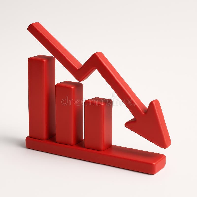
Free with trial A striking red arrow diagonally points downwards, visually representing a significant drop or negative trend. This impactful graphic is perfect for conveying concepts of loss profit or falling stock. Illustrating decrease illustrations Bold red arrow points downward illustrating decline and negative trends in business white background. A striking red arrow diagonally points downwards, visually representing a significant drop or negative trend. This impactful graphic is perfect for conveying concepts of loss profit or falling stock
Free with trial A close-up, angled perspective of several printed business reports displaying a variety of financial data. The documents feature colorful pie charts, blue bar graphs, and line graphs tracking performance and statistics. This image is perfect for illustrating concepts such as data analysis, market research, financial planning, investment strategy, and corporate performance review. The detailed charts and figures represent the core of business analytics, accounting, and economic forecasting, making it a versatile background for financial presentations and articles. Illustrating decrease illustrations Business Analytics Report with Financial Charts and Graphs. A close-up, angled perspective of several printed business reports displaying a variety of financial data. The documents feature colorful pie charts, blue bar graphs, and line graphs tracking performance and statistics. This image is perfect for illustrating concepts such as data analysis, market research, financial planning, investment strategy, and corporate performance review. The detailed charts and figures represent the core of business analytics, accounting, and economic forecasting, making it a versatile background for financial presentations and articles.
Free with trial A financial chart illustrating a bearish stock market trend, depicted by a series of red and green candlesticks forming a downward pattern, indicating a potential price decline. Illustrating decrease illustrations Bearish stock market trend with red and green candlesticks. A financial chart illustrating a bearish stock market trend, depicted by a series of red and green candlesticks forming a downward pattern, indicating a potential price decline
Free with trial This 3D rendering shows a red pie chart broken into numerous pieces, one segment clearly separated. Illustrates concepts of division, fragmentation, or a disrupted system. Ideal for presentations. Illustrating decrease illustrations Broken Red Pie Chart: 3D Render of a Cracked Circular Diagram. This 3D rendering shows a red pie chart broken into numerous pieces, one segment clearly separated. Illustrates concepts of division, fragmentation, or a disrupted system. Ideal for presentations.
Free with trial An abstract and futuristic digital visualization of financial data, featuring glowing blue bar charts and candlestick patterns reflecting on a sleek, dark surface. The dynamic composition, set against a deep blue background with subtle grid lines, evokes concepts of technology, business growth, and market analysis. Ideal for illustrating topics related to stock market trends, investment strategies, economic reports, big data analytics, and the future of finance in a modern, high-tech context. Illustrating decrease illustrations Futuristic Digital Finance Chart with Glowing Blue Data Bars. An abstract and futuristic digital visualization of financial data, featuring glowing blue bar charts and candlestick patterns reflecting on a sleek, dark surface. The dynamic composition, set against a deep blue background with subtle grid lines, evokes concepts of technology, business growth, and market analysis. Ideal for illustrating topics related to stock market trends, investment strategies, economic reports, big data analytics, and the future of finance in a modern, high-tech context.
Free with trial A whiteboard displays a hand-drawn graph depicting a sharp downward trend in a market or economic indicator. Red markers highlight significant drops, illustrating a period of substantial decline. The graph suggests a potential crisis or recession. Illustrating decrease illustrations Declining Market Trend. A whiteboard displays a hand-drawn graph depicting a sharp downward trend in a market or economic indicator. Red markers highlight significant drops, illustrating a period of substantial decline. The graph suggests a potential crisis or recession.
Free with trial A hand manipulates a red arrow pointing downwards, superimposed on a bar graph, illustrating a market downturn. This image, generated by AI, symbolizes economic recession, financial crisis, or business failure, showcasing the impact of negative trends. Illustrating decrease illustrations Declining Market Trend. A hand manipulates a red arrow pointing downwards, superimposed on a bar graph, illustrating a market downturn. This image, generated by AI, symbolizes economic recession, financial crisis, or business failure, showcasing the impact of negative trends.
Free with trial This 3D rendering shows a downward trending graph, illustrating a market decline. The red arrows and translucent grid highlight the severity of the fall, generated by AI for visual representation of economic downturn. Illustrating decrease illustrations Declining Market Trend. This 3D rendering shows a downward trending graph, illustrating a market decline. The red arrows and translucent grid highlight the severity of the fall, generated by AI for visual representation of economic downturn.
Free with trial A visually striking representation of financial decline, featuring a red arrow pointing downward on a sleek graph. Ideal for illustrating market trends and economic analysis. Illustrating decrease illustrations Red Arrow Graph Depicting Financial Decline and Market Trends. A visually striking representation of financial decline, featuring a red arrow pointing downward on a sleek graph. Ideal for illustrating market trends and economic analysis
Free with trial Red descending arrow signifies a negative trend or decrease against a clean white backdrop Use it for economic or statistical presentations. Illustrating decrease illustrations Red Arrow Illustrating a Decreasing Trend on a White Background. Red descending arrow signifies a negative trend or decrease against a clean white backdrop Use it for economic or statistical presentations
Free with trial This image shows colorful financial charts and graphs, generated by AI, illustrating various data points and percentages. The overlaid arrows suggest a downward trend, potentially indicating a negative market shift or economic decline. The visual representation aids in quick understanding of compl. Illustrating decrease illustrations Financial Data Analysis. This image shows colorful financial charts and graphs, generated by AI, illustrating various data points and percentages. The overlaid arrows suggest a downward trend, potentially indicating a negative market shift or economic decline. The visual representation aids in quick understanding of compl
Free with trial Three miniature apartment building models are shown against a backdrop of a stock market graph illustrating real estate trends. Illustrating decrease illustrations Apartment Building Models Illustrate Real Estate Market Trends. Three miniature apartment building models are shown against a backdrop of a stock market graph illustrating real estate trends
Free with trial The image depicts two stacks of coins, one silver and one copper, each with downward pointing arrows illustrating a decline in value. Illustrating decrease illustrations Decreasing Currency Values Shown With Stacked Coins and Arrows. The image depicts two stacks of coins, one silver and one copper, each with downward pointing arrows illustrating a decline in value
Free with trial Bright light source emits radiance in darkness, creating a series of circular lens flares. The flares decrease in size as they move diagonally across the image, gradually fading out. The circles have a warm, golden hue with varying transparency, illustrating the optical phenomena of light scattering through a lens. The effect produces a striking contrast against the surrounding dark background, highlighting the interplay between light and shadow. A i Generated. Illustrating decrease illustrations Optical Light Scattering with Circular Lens Flares in Darkness. Bright light source emits radiance in darkness, creating a series of circular lens flares. The flares decrease in size as they move diagonally across the image, gradually fading out. The circles have a warm, golden hue with varying transparency, illustrating the optical phenomena of light scattering through a lens. The effect produces a striking contrast against the surrounding dark background, highlighting the interplay between light and shadow. A i Generated
Free with trial A visual representation of negative financial performance, illustrating a declining trend in business or market data with a prominent red arrow indicating a downward movement. Illustrating decrease illustrations Bar chart showing a downward trend with a red arrow. A visual representation of negative financial performance, illustrating a declining trend in business or market data with a prominent red arrow indicating a downward movement
Free with trial A clean and modern set of financial icons, perfect for illustrating business concepts. The image features icons representing profit growth, expense management, tax documents, and investment summaries. The illustrations use a simple, flat design with a limited color palette, making them versatile for various applications. Ideal for presentations, websites, infographics, and financial reports. The set highlights key financial aspects in an easily understandable visual format. Illustrating decrease illustrations Financial Icons Set: Profit, Expenses, Tax, and Investment Analysis. A clean and modern set of financial icons, perfect for illustrating business concepts. The image features icons representing profit growth, expense management, tax documents, and investment summaries. The illustrations use a simple, flat design with a limited color palette, making them versatile for various applications. Ideal for presentations, websites, infographics, and financial reports. The set highlights key financial aspects in an easily understandable visual format.
Free with trial The image showcases solar panels installed on the roof of a residential building in a city, illustrating the integration of renewable energy solutions in urban living. These photovoltaic panels capture sunlight and convert it into electricity, providing a sustainable and eco-friendly power source for the building's residents. By reducing reliance on traditional energy sources, these solar panels help lower electricity bills and decrease carbon footprints, contributing to environmental sustainability. This rooftop installation reflects a growing trend towards adopting green energy in urban areas, promoting energy independence and demonstrating a commitment to combating climate change through innovative technology. Illustrating decrease illustrations Solar panels installed on the roof of a residential building in the city. The image showcases solar panels installed on the roof of a residential building in a city, illustrating the integration of renewable energy solutions in urban living. These photovoltaic panels capture sunlight and convert it into electricity, providing a sustainable and eco-friendly power source for the building's residents. By reducing reliance on traditional energy sources, these solar panels help lower electricity bills and decrease carbon footprints, contributing to environmental sustainability. This rooftop installation reflects a growing trend towards adopting green energy in urban areas, promoting energy independence and demonstrating a commitment to combating climate change through innovative technology.
Free with trial A hand draws a downward trending graph on a whiteboard, illustrating a market decline. This image, generated by AI, is perfect for illustrating concepts like economic downturn, market analysis, or financial forecasting. The simple yet effective visual communicates the message instantly. Illustrating decrease illustrations AI-Generated Market Trend. A hand draws a downward trending graph on a whiteboard, illustrating a market decline. This image, generated by AI, is perfect for illustrating concepts like economic downturn, market analysis, or financial forecasting. The simple yet effective visual communicates the message instantly.
Free with trial Abstract digital illustration depicting two contrasting glowing line graphs. A vibrant blue/cyan line trends steeply upwards with an arrow, while a bright red line trends downwards with its arrow, crossing over the blue line mid-way. Subtle dotted lines and sparkling light effects add detail against the dark, moody background. This dynamic image conveys energy and volatility, suitable for representing concepts like market fluctuations, contrasting financial trends (growth vs. decline), stock market analysis, competition, data comparison, economic divergence, risk assessment, and critical crossover points. Ideal for financial reports, articles on market volatility, illustrating competitive analysis, or business strategy presentations. Illustrating decrease illustrations Contrasting red downward and blue upward glowing graph arrows crossing. Abstract digital illustration depicting two contrasting glowing line graphs. A vibrant blue/cyan line trends steeply upwards with an arrow, while a bright red line trends downwards with its arrow, crossing over the blue line mid-way. Subtle dotted lines and sparkling light effects add detail against the dark, moody background. This dynamic image conveys energy and volatility, suitable for representing concepts like market fluctuations, contrasting financial trends (growth vs. decline), stock market analysis, competition, data comparison, economic divergence, risk assessment, and critical crossover points. Ideal for financial reports, articles on market volatility, illustrating competitive analysis, or business strategy presentations.
Free with trial Image depicting a satisfaction dip alert with a warning sign and a chart showing a decline in satisfaction levels. Illustrating decrease vectors Satisfaction Dip Alert - Warning Sign and Chart Illustrating Decline. Image depicting a satisfaction dip alert with a warning sign and a chart showing a decline in satisfaction levels
Free with trial Financial concept image featuring a blue bar chart with a red downward arrow, illustrating decline, recession, or loss over time. Ideal for presentations, reports, infographics, economic forecasts, and business documentation. Clean, clear, and professional visual, created ai. Illustrating decrease illustrations Business bar chart showing financial decline with downward arrow. Financial concept image featuring a blue bar chart with a red downward arrow, illustrating decline, recession, or loss over time. Ideal for presentations, reports, infographics, economic forecasts, and business documentation. Clean, clear, and professional visual, created ai.
Free with trial Stack of gold dollar coins with a big green arrow pointing down, illustrating the concept of a market crash. Illustrating decrease vectors Big green arrow pointing down next to stack of golden coins indicating market crash. Stack of gold dollar coins with a big green arrow pointing down, illustrating the concept of a market crash
Free with trial Digita blue bar charts descend steadily across a digital grid, illustrating a decline in financial performance and market trends. Downward arrows emphasize loss, negative growth, and economic challenges, while smooth transitions and a tech-inspired layout enhance the visual impact of the data downturn. Illustrating decrease illustrations Digital blue bar chart with decreasing business concept. Digita blue bar charts descend steadily across a digital grid, illustrating a decline in financial performance and market trends. Downward arrows emphasize loss, negative growth, and economic challenges, while smooth transitions and a tech-inspired layout enhance the visual impact of the data downturn.
Free with trial This image shows a graph depicting a sharp market downturn, generated by AI. The downward trend is emphasized by large black arrows, illustrating a significant and rapid decline. The rolled-up paper suggests the ongoing nature of the crisis, implying further potential losses. Illustrating decrease illustrations Market Crash Visualization. This image shows a graph depicting a sharp market downturn, generated by AI. The downward trend is emphasized by large black arrows, illustrating a significant and rapid decline. The rolled-up paper suggests the ongoing nature of the crisis, implying further potential losses.
Free with trial Illustration representing the concept of economic recession with a red arrow and a money bag. Illustrating decrease vectors Red arrow pointing down next to money bag with dollar sign illustrating market crash. Illustration representing the concept of economic recession with a red arrow and a money bag
Free with trial Bar graph depicts a downward trend in data, using various colors to illustrate the decline effectively. Illustrating decrease illustrations Graph illustrating data trends showing a steady decline over time. Bar graph depicts a downward trend in data, using various colors to illustrate the decline effectively.
Free with trial Businessman falling alongside a descending graph, illustrating the impact of financial crisis and economic downturn. Visual metaphor for loss, risk, and business challenges in the market. Illustrating decrease illustrations Businessman falling down with a descending graph, financial crisis concept. Businessman falling alongside a descending graph, illustrating the impact of financial crisis and economic downturn. Visual metaphor for loss, risk, and business challenges in the market
Free with trial The image depicts a vector graphic illustrating the concept of an economic recession, characterized by a stack of coins and a downward arrow symbolizing financial loss and market decline. This representation conveys themes of negativity associated with economic downturns, impacting savings and investments. The graphic is rendered in a black and white design, emphasizing its serious tone. Created with AI, it serves as a visual warning about the risks involved in financial decisions during a recession. Illustrating decrease vectors Economic Recession Vector Graphic with Coin Stack and Downward Arrow. The image depicts a vector graphic illustrating the concept of an economic recession, characterized by a stack of coins and a downward arrow symbolizing financial loss and market decline. This representation conveys themes of negativity associated with economic downturns, impacting savings and investments. The graphic is rendered in a black and white design, emphasizing its serious tone. Created with AI, it serves as a visual warning about the risks involved in financial decisions during a recession.
Free with trial A striking 3D render visualizes economic decline with a vibrant red bar graph against a clean white background. This impactful image vividly represents a financial crisis and recession, showcasing a clear downward trend through its falling bars and an implied arrow. It symbolizes loss, failure, and potential bankruptcy within the business and finance sectors. Ideal for illustrating articles on the. Illustrating decrease illustrations Red economic decline bar graph depicting financial downfall and negative trends on white background. A striking 3D render visualizes economic decline with a vibrant red bar graph against a clean white background. This impactful image vividly represents a financial crisis and recession, showcasing a clear downward trend through its falling bars and an implied arrow. It symbolizes loss, failure, and potential bankruptcy within the business and finance sectors. Ideal for illustrating articles on the
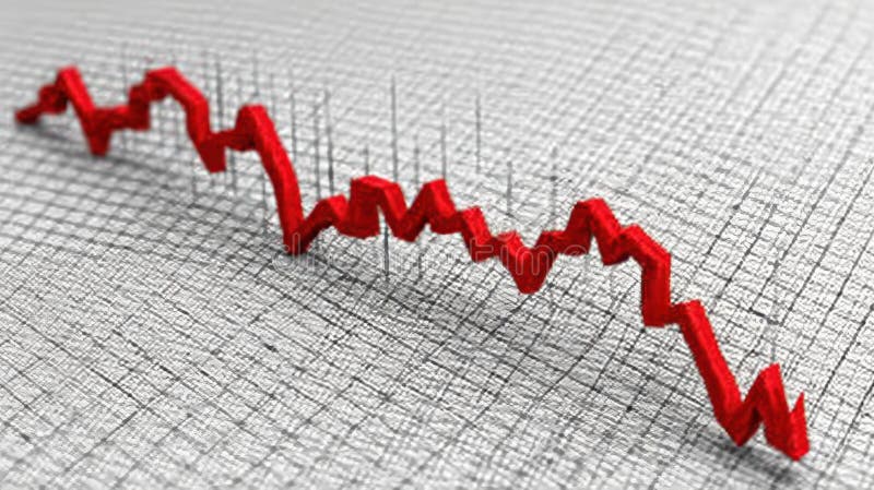
Free with trial Red financial chart with a sharp downward trend indicating a market crash or economic decline. The graph features jagged, descending lines with timestamps labeled on the x-axis as 06 231 and 08 231. The dark background enhances the focus on the bright red line, making the steep drop in value evident. Occasional data points are highlighted with small glowing dots, emphasizing key moments. The overall design conveys a sense of urgency and loss in financial markets. Illustrating decrease illustrations Dramatic downward trend financial chart illustrating market crash, economic decline, and losses. Red financial chart with a sharp downward trend indicating a market crash or economic decline. The graph features jagged, descending lines with timestamps labeled on the x-axis as 06 231 and 08 231. The dark background enhances the focus on the bright red line, making the steep drop in value evident. Occasional data points are highlighted with small glowing dots, emphasizing key moments. The overall design conveys a sense of urgency and loss in financial markets.
Free with trial Three-dimensional pie charts and cylinder graphs in orange and blue, perfect for business presentations illustrating data analysis and market trends. Illustrating decrease illustrations 3D Colorful Pie Charts and Cylinder Graphs for Business Presentation. Three-dimensional pie charts and cylinder graphs in orange and blue, perfect for business presentations illustrating data analysis and market trends.
Free with trial A golden percentage sign stands amidst stacks of coins on a dark background. This image represents finance, investment, interest rates, and financial growth. Ideal for illustrating economic concepts and investment opportunities. Illustrating decrease illustrations Golden Percentage Sign with Coins on Black Background Finance Concept. A golden percentage sign stands amidst stacks of coins on a dark background. This image represents finance, investment, interest rates, and financial growth. Ideal for illustrating economic concepts and investment opportunities
Free with trial This 3D rendering showcases stacks of coins alongside a positive growth chart, generated by AI. It visually represents financial success and investment growth, ideal for illustrating financial concepts. Illustrating decrease illustrations AI-Generated Financial Growth. This 3D rendering showcases stacks of coins alongside a positive growth chart, generated by AI. It visually represents financial success and investment growth, ideal for illustrating financial concepts.
Free with trial Stock exchange screen showing falling prices impacting coins, illustrating financial crisis and market crash. Illustrating decrease illustrations Stock market crashing, showing red numbers and falling graph on a screen with coins. Stock exchange screen showing falling prices impacting coins, illustrating financial crisis and market crash
Free with trial This image depicts a vibrant blue calculator positioned next to a colorful bar graph and stack of gold coins, symbolizing financial success and growth. The scene is clean and bright, perfect for illustrating financial concepts. Illustrating decrease illustrations Colorful Calculator, Bar Graph, and Coins Representing Financial Growth. This image depicts a vibrant blue calculator positioned next to a colorful bar graph and stack of gold coins, symbolizing financial success and growth. The scene is clean and bright, perfect for illustrating financial concepts.
Free with trial This 3D rendering depicts financial growth, showcasing stacks of gold coins and black bars representing a rising graph. A golden pen rests on a sleek base, symbolizing the precision and detail involved in financial planning. This image was generated by AI and is perfect for illustrating financial s. Illustrating decrease illustrations Financial Growth Visualization. This 3D rendering depicts financial growth, showcasing stacks of gold coins and black bars representing a rising graph. A golden pen rests on a sleek base, symbolizing the precision and detail involved in financial planning. This image was generated by AI and is perfect for illustrating financial s
Free with trial This image shows a calculator next to colorful 3D bar charts and pie charts illustrating business growth and financial success. The vibrant colors and upward-trending graph create a visually appealing representation of positive financial results. Illustrating decrease illustrations Colorful Calculator and 3D Charts Showing Business Growth. This image shows a calculator next to colorful 3D bar charts and pie charts illustrating business growth and financial success. The vibrant colors and upward-trending graph create a visually appealing representation of positive financial results.
Free with trial Set of nine linear icons illustrating various aspects of business strategy, planning, and progress. The icons feature minimalist line art depicting concepts like mountain peaks symbolizing achievement, graphs showing growth, light bulbs representing ideas, and other business related symbols. Ideal. Illustrating decrease vectors Collection of Linear Icons Representing Business Strategy and Progress. Set of nine linear icons illustrating various aspects of business strategy, planning, and progress. The icons feature minimalist line art depicting concepts like mountain peaks symbolizing achievement, graphs showing growth, light bulbs representing ideas, and other business related symbols. Ideal
Free with trial A financial market graph on a blue background illustrating investment trends, this is a visual representation of market fluctuations and volume, reflecting economic movements, investment strategies and business performance analysis. Generative AI. Illustrating decrease illustrations Financial markets graph on a blue background showing investment trends. A financial market graph on a blue background illustrating investment trends, this is a visual representation of market fluctuations and volume, reflecting economic movements, investment strategies and business performance analysis. Generative AI
Free with trial Dollar coin next to declining bar graph and directional arrow illustrating financial downturn. Ideal for finance, economics, investment, stock market, loss, budget analysis, simple flat metaphor. Illustrating decrease illustrations Dollar Sign Coin and Declining Bar Chart with Arrow Indicating Financial Downward Trend. Dollar coin next to declining bar graph and directional arrow illustrating financial downturn. Ideal for finance, economics, investment, stock market, loss, budget analysis, simple flat metaphor
Free with trial A set of minimalist, outline icons representing unemployment, economic crisis, job loss, and related issues. Perfect for illustrating financial hardship, career challenges, and economic downturn. Illustrating decrease vectors Minimalist Outline Unemployment and Crisis Related Sign Icon Collection. A set of minimalist, outline icons representing unemployment, economic crisis, job loss, and related issues. Perfect for illustrating financial hardship, career challenges, and economic downturn.
Free with trial Interest growth icon Black line art vector in black and white outline set collection sign. Illustrating decrease vectors Financial Icon Illustrating Growth, Investment Success, and Economic Prosperity. Interest growth icon Black line art vector in black and white outline set collection sign
Free with trial A close-up shot of a laptop screen displaying a business analytics dashboard. The screen showcases various charts and graphs, including bar graphs, line graphs, and pie charts, illustrating data related to revenue, sales performance, customer growth, and market share. The data visualizations are presented in a clean, modern design with a dark background, highlighting the key performance indicators (KPIs) and trends. This image is suitable for illustrating concepts of data analysis, business intelligence, financial reporting, and technology. Illustrating decrease illustrations Business Analytics Dashboard on Laptop Screen. A close-up shot of a laptop screen displaying a business analytics dashboard. The screen showcases various charts and graphs, including bar graphs, line graphs, and pie charts, illustrating data related to revenue, sales performance, customer growth, and market share. The data visualizations are presented in a clean, modern design with a dark background, highlighting the key performance indicators (KPIs) and trends. This image is suitable for illustrating concepts of data analysis, business intelligence, financial reporting, and technology.
Free with trial Bitcoin digital currency symbol burning in flames and smoke representing cryptocurrency market crash, loss of investment, inflation or cyber attack. Illustrating decrease illustrations Bitcoin burning in inferno flames and smoke illustrating cryptocurrency crash. Bitcoin digital currency symbol burning in flames and smoke representing cryptocurrency market crash, loss of investment, inflation or cyber attack
Free with trial A bar chart with a clear downward trend, illustrating a decline. The isolated object is presented on a clean white background. Illustrating decrease illustrations Declining bar chart showing downward trend isolated on white background. A bar chart with a clear downward trend, illustrating a decline. The isolated object is presented on a clean white background
Free with trial This image shows a downward trending stock market graph generated by AI, illustrating a period of significant decline. The detailed chart provides a visual representation of financial instability and potential losses. This AI-generated visualization is useful for understanding market trends and vol. Illustrating decrease illustrations AI-Generated Stock Market Decline. This image shows a downward trending stock market graph generated by AI, illustrating a period of significant decline. The detailed chart provides a visual representation of financial instability and potential losses. This AI-generated visualization is useful for understanding market trends and vol
Free with trial A detailed blue candlestick chart depicting stock market price fluctuations and trends over time Ideal for illustrating financial concepts market analysis and investment strategies The graphic is clean modern and visually engaging. Illustrating decrease illustrations Blue Financial Chart Candlestick Graph Showing Stock Market Trend Analysis. A detailed blue candlestick chart depicting stock market price fluctuations and trends over time Ideal for illustrating financial concepts market analysis and investment strategies The graphic is clean modern and visually engaging
Free with trial A graphic representation of financial data, prominently featuring a downward trending graph in shades of red. The visuals convey a sense of market decline and financial risk, suitable for illustrating economic downturn or cautionary business forecasts. Illustrating decrease illustrations Abstract Financial Data Representation with a Dominant Red Color Palette. A graphic representation of financial data, prominently featuring a downward trending graph in shades of red. The visuals convey a sense of market decline and financial risk, suitable for illustrating economic downturn or cautionary business forecasts
Free with trial Image shows wooden blocks forming a chart. It graphically represents a market decline or economic downturn, suitable for illustrating business graphs and financial crisis concepts. Illustrating decrease illustrations Wooden Blocks Graph Depicting Market Decline Good Resolution Stock Photo. Image shows wooden blocks forming a chart. It graphically represents a market decline or economic downturn, suitable for illustrating business graphs and financial crisis concepts.
Free with trial This 3D rendering shows vibrant bar and pie charts illustrating business growth, data analysis, and statistical visualization. Perfect for presentations, reports, or marketing materials. Illustrating decrease illustrations Colorful 3D Bar and Pie Charts Representing Business Growth and Data Analysis. This 3D rendering shows vibrant bar and pie charts illustrating business growth, data analysis, and statistical visualization. Perfect for presentations, reports, or marketing materials.
Free with trial This 3D rendering showcases a vibrant bar graph and pie chart, ideal for visualizing business growth, financial reports, and data analysis. The colorful design makes it visually engaging and easy to understand. Illustrating decrease illustrations Colorful 3D Bar and Pie Chart Illustrating Business Growth and Financial Data. This 3D rendering showcases a vibrant bar graph and pie chart, ideal for visualizing business growth, financial reports, and data analysis. The colorful design makes it visually engaging and easy to understand.
Free with trial A human hand is shown presenting a vivid, glowing yellow percentage symbol, radiating light and prominence. In the background, a digital bar chart visually represents growth and data analysis, set against a dark, abstract backdrop with subtle bokeh lights. This image powerfully conveys concepts related to finance, interest rates, discounts, business growth, profit, and investment. It's perfect for illustrating financial reports, economic articles, banking promotions, or investment strategy presentations. Illustrating decrease illustrations Financial Growth and Interest Rates Concept with Glowing Percentage Symbol. A human hand is shown presenting a vivid, glowing yellow percentage symbol, radiating light and prominence. In the background, a digital bar chart visually represents growth and data analysis, set against a dark, abstract backdrop with subtle bokeh lights. This image powerfully conveys concepts related to finance, interest rates, discounts, business growth, profit, and investment. It's perfect for illustrating financial reports, economic articles, banking promotions, or investment strategy presentations.
Free with trial A bold red arrow trends downwards, symbolizing financial loss or market decline, set against a somber gradient background Perfect for illustrating business failures. Illustrating decrease illustrations Red Arrow Graph Symbolizing Economic Downturn or Market Crash. A bold red arrow trends downwards, symbolizing financial loss or market decline, set against a somber gradient background Perfect for illustrating business failures
Free with trial A bold red arrow trends downwards, symbolizing financial loss or market decline, set against a somber gradient background Perfect for illustrating business failures. Illustrating decrease illustrations Red Arrow Graph Symbolizing Economic Downturn or Market Crash. A bold red arrow trends downwards, symbolizing financial loss or market decline, set against a somber gradient background Perfect for illustrating business failures
Free with trial Line chart illustrating an upward trend, featuring candlestick patterns and glowing dots against a dark background. The arrangement indicates a positive movement in data, reflecting investment and financial growth. Blue and orange tones highlight data points and lines, providing a visual contrast that enhances readability. The abstract style conveys a modern financial theme, emphasizing success and progress in stock markets. Illustrating decrease illustrations Dynamic stock market chart showing upward trend for investment and financial growth success concept. Line chart illustrating an upward trend, featuring candlestick patterns and glowing dots against a dark background. The arrangement indicates a positive movement in data, reflecting investment and financial growth. Blue and orange tones highlight data points and lines, providing a visual contrast that enhances readability. The abstract style conveys a modern financial theme, emphasizing success and progress in stock markets.
Free with trial Wooden house model sits beside three percentage blocks on a light wooden table against a dark background, illustrating financial concepts. Illustrating decrease illustrations Wooden House Model and Percentage Blocks Representing Real Estate Interest. Wooden house model sits beside three percentage blocks on a light wooden table against a dark background, illustrating financial concepts
Free with trial Area chart illustrating trends in Sareorplojicam and S�snpavai across years. Shows variations over time. Illustrating decrease illustrations . Area chart illustrating trends in Sareorplojicam and S�snpavai across years. Shows variations over time
Free with trial Stock market chart displaying investment trends with red and blue candlesticks on a dark background. The chart features a timeline labeled by months at the top and numbers at the bottom, illustrating dynamic financial data. Candlesticks show market fluctuations, with red indicating a decrease and blue an increase in value. A faint blue line overlays the candles, representing the moving average. The scene is likely within a financial or trading setting, emphasizing the analysis of market activity. Illustrating decrease illustrations Dynamic stock market chart with vibrant red and blue candles showing investment trends and financial data. Stock market chart displaying investment trends with red and blue candlesticks on a dark background. The chart features a timeline labeled by months at the top and numbers at the bottom, illustrating dynamic financial data. Candlesticks show market fluctuations, with red indicating a decrease and blue an increase in value. A faint blue line overlays the candles, representing the moving average. The scene is likely within a financial or trading setting, emphasizing the analysis of market activity.
Free with trial Candlestick chart with buy and sell signals over digital world map and city skyline on dark background, symbolizing global market and forex trading. Illustrating decrease illustrations Global financial chart with buy and sell indicators over world map and cityscape background, illustrating stock market and forex. Candlestick chart with buy and sell signals over digital world map and city skyline on dark background, symbolizing global market and forex trading
Free with trial 3D rendering of a cute cartoon house model, a calculator, and stacks of coins, illustrating the concept of home buying expenses and financial planning. A great image for articles, websites, or presentations related to real estate, mortgages, and financial planning. Illustrating decrease illustrations Cartoon House Model with Calculator and Coins: Home Purchase Cost Calculation. 3D rendering of a cute cartoon house model, a calculator, and stacks of coins, illustrating the concept of home buying expenses and financial planning. A great image for articles, websites, or presentations related to real estate, mortgages, and financial planning.
Free with trial This 3D render shows a calculator with a colorful bar chart made of cubes illustrating growth and success in business and finance. Perfect for presentations and infographics. Illustrating decrease illustrations Colorful 3D Calculator with Growing Bar Chart Cubes for Business and Finance. This 3D render shows a calculator with a colorful bar chart made of cubes illustrating growth and success in business and finance. Perfect for presentations and infographics.
Free with trial A hand-drawn sketch of a business chart illustrating a significant decline, with a small, subtle sign of potential recovery at the far right. The chart is simply illustrated in black ink on a white background. Illustrating decrease illustrations Hand-drawn business chart showing decline followed by a very slight recovery. A hand-drawn sketch of a business chart illustrating a significant decline, with a small, subtle sign of potential recovery at the far right. The chart is simply illustrated in black ink on a white background
Free with trial Circular buttons labeled "BUY" and "SELL" sit on a surface with a glowing stock market chart in the background. The chart features fluctuating orange lines on a dark grid, illustrating price movements and market volatility. The buttons are shiny and metallic, with embossed text, suggesting a dynamic financial environment. The composition emphasizes themes of trading and investment in the stock market. Illustrating decrease illustrations Buy and sell buttons with stock market chart in background, financial concept. Circular buttons labeled "BUY" and "SELL" sit on a surface with a glowing stock market chart in the background. The chart features fluctuating orange lines on a dark grid, illustrating price movements and market volatility. The buttons are shiny and metallic, with embossed text, suggesting a dynamic financial environment. The composition emphasizes themes of trading and investment in the stock market.
Free with trial Modern abstract blue bars illustrating business statistics, trends, and analytics. Illustrating decrease vectors Digital data analysis bars in blue hues, conceptualizing statistics and trends. Modern abstract blue bars illustrating business statistics, trends, and analytics.
Free with trial A rustic burlap money bag is presented with a series of decreasing coin stacks, illustrating a financial decline or negative economic trend, isolated on white. Illustrating decrease illustrations Burlap money bag with decreasing stacks of coins isolated on white background. A rustic burlap money bag is presented with a series of decreasing coin stacks, illustrating a financial decline or negative economic trend, isolated on white
Free with trial Red arrow points down on a financial chart signaling market decline representing losses, and recession Use for illustrating economic downturns and financial instability. Illustrating decrease illustrations Downward Stock Market Trend Red Arrow and Chart Decline Indicator. Red arrow points down on a financial chart signaling market decline representing losses, and recession Use for illustrating economic downturns and financial instability
Free with trial Red arrow points down on a financial chart signaling market decline representing losses, and recession Use for illustrating economic downturns and financial instability. Illustrating decrease illustrations Downward Stock Market Trend Red Arrow and Chart Decline Indicator. Red arrow points down on a financial chart signaling market decline representing losses, and recession Use for illustrating economic downturns and financial instability
Free with trial This 3D graph, generated by AI, depicts a sharp market downturn. The red line dramatically falls, illustrating significant financial losses and economic instability. The textured background enhances the visual impact, conveying a sense of crisis. Illustrating decrease illustrations AI-Generated Market Crash Visualization. This 3D graph, generated by AI, depicts a sharp market downturn. The red line dramatically falls, illustrating significant financial losses and economic instability. The textured background enhances the visual impact, conveying a sense of crisis.
Free with trial A textured golden fifty-seven percent symbol rests on a peach background ideal for illustrating sales, discounts, or financial data. Illustrating decrease illustrations Golden Fifty-seven Percent Symbol on Peach Background for Sales and Promotions. A textured golden fifty-seven percent symbol rests on a peach background ideal for illustrating sales, discounts, or financial data
Free with trial A simple vector illustration of a graph showing a sharp downward trend, representing a financial crisis or market decline. Perfect for illustrating economic downturn concepts. Illustrating decrease vectors Trending Downward Graph Financial Crisis Icon Stock Market Decline Illustration. A simple vector illustration of a graph showing a sharp downward trend, representing a financial crisis or market decline. Perfect for illustrating economic downturn concepts.
Free with trial Candlestick chart on a dark blue background illustrating stock market trends. Light blue and white candlesticks represent price fluctuations, with wicks indicating high and low values. The chart shows an upward trend, suggesting potential financial growth or investment opportunities. Candlestick charts are commonly used in financial analysis to depict market movements, assisting in forecasting stock behaviors for strategic decision-making. Illustrating decrease illustrations Rising stock market analysis chart for smart investment decisions and financial growth in modern business. Candlestick chart on a dark blue background. Candlestick chart on a dark blue background illustrating stock market trends. Light blue and white candlesticks represent price fluctuations, with wicks indicating high and low values. The chart shows an upward trend, suggesting potential financial growth or investment opportunities. Candlestick charts are commonly used in financial analysis to depict market movements, assisting in forecasting stock behaviors for strategic decision-making.
Free with trial Colorful bar chart on a blue background illustrating data trends ,Generative ai. Illustrating decrease illustrations Vibrant bar chart on blue background, visualizing data trends and insights colorful. Colorful bar chart on a blue background illustrating data trends ,Generative ai
Free with trial A collection of minimalist outline icons depicting economic recession, financial crisis, and downturn related concepts. Perfect for illustrating articles, presentations, or websites focused on economic issues and market trends. Illustrating decrease vectors Minimalist Outline Economic Recession And Financial Crisis Icon Set Illustration. A collection of minimalist outline icons depicting economic recession, financial crisis, and downturn related concepts. Perfect for illustrating articles, presentations, or websites focused on economic issues and market trends.
Free with trial A close-up, shallow depth of field shot of a digital stock market ticker board. The screen displays rows of stock symbols and their corresponding prices in bright red and green LED lights against a dark background. Some numbers are in green, indicating gains, while others are in red, signifying losses or negative trends. The bokeh effect from out-of-focus lights adds a dynamic and professional feel, perfect for illustrating financial concepts. Illustrating decrease illustrations Stock Market Ticker Display with Red and Green Numbers. A close-up, shallow depth of field shot of a digital stock market ticker board. The screen displays rows of stock symbols and their corresponding prices in bright red and green LED lights against a dark background. Some numbers are in green, indicating gains, while others are in red, signifying losses or negative trends. The bokeh effect from out-of-focus lights adds a dynamic and professional feel, perfect for illustrating financial concepts.
Free with trial A stark warning of an impending economic crisis is conveyed by this impactful image. A prominent red, downtrending financial market chart dominates the scene, visualized on a yellow road sign for emphasis. This powerful visual symbolizes a potential market crash and financial downturn, highlighting risk and loss in business and investment. Ideal for illustrating concepts related to recession,. Illustrating decrease illustrations Economic crisis ahead warning sign with a red downtrending financial market chart. A stark warning of an impending economic crisis is conveyed by this impactful image. A prominent red, downtrending financial market chart dominates the scene, visualized on a yellow road sign for emphasis. This powerful visual symbolizes a potential market crash and financial downturn, highlighting risk and loss in business and investment. Ideal for illustrating concepts related to recession,
Free with trial Visualize decreasing business performance with this striking image. A pink 3D bar chart graphically represents a decline in financial data, highlighting loss and reduction. The falling graph is juxtaposed with a healthy green plant in a pot, emphasizing the contrast between success and setbacks. Ideal for illustrating economic concepts, investment challenges, or business performance issues, Created AI. Illustrating decrease illustrations Decreasing business performance represented by pink graphic and potted green plant. Visualize decreasing business performance with this striking image. A pink 3D bar chart graphically represents a decline in financial data, highlighting loss and reduction. The falling graph is juxtaposed with a healthy green plant in a pot, emphasizing the contrast between success and setbacks. Ideal for illustrating economic concepts, investment challenges, or business performance issues, Created AI
Free with trial A red arrow graph sharply descends across a series of stacked white coins, illustrating a significant financial decline. The coins are arranged in decreasing height from left to right, emphasizing the downward trend. The image is set against a clean white background, isolating the visual representation of economic loss. Illustrating decrease illustrations Red Arrow Graph Showing Financial Decline with Stacks of White Coins on White Background. A red arrow graph sharply descends across a series of stacked white coins, illustrating a significant financial decline. The coins are arranged in decreasing height from left to right, emphasizing the downward trend. The image is set against a clean white background, isolating the visual representation of economic loss