Free with trial A percentage symbol stands beside a question mark, illustrating the questioning of whether a certain interest percent rate is best or if more comparisons and searching should be done. Illustrating decrease illustrations Percentage Sign Quesiton Mark Search for Best Rate. A percentage symbol stands beside a question mark, illustrating the questioning of whether a certain interest percent rate is best or if more comparisons and searching should be done
Free with trial Debt word man wrapped in tape illustrating budget trouble, bankruptcy or financial shortfall trapping someone from achieving money riches or security. Illustrating decrease illustrations Debt Man Wrapped in Tape Budget Deficit. Debt word man wrapped in tape illustrating budget trouble, bankruptcy or financial shortfall trapping someone from achieving money riches or security
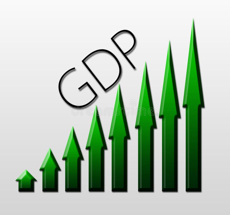
Free with trial Chart illustrating Gross Domestic Product growth, macroeconomic concept. Illustrating decrease illustrations Chart illustrating GDP growth, macroeconomic indicator concept. Chart illustrating Gross Domestic Product growth, macroeconomic concept
Free with trial Chart illustrating Gross Domestic Product drop, macroeconomic concept. Illustrating decrease illustrations Chart illustrating GDP drop, macroeconomic indicator concept. Chart illustrating Gross Domestic Product drop, macroeconomic concept
Free with trial Chart illustrating export trade growth, macroeconomic concept. Illustrating decrease illustrations Chart illustrating export growth, macroeconomic concept
Free with trial Chart illustrating export trade drop, macroeconomic indicator concept. Illustrating decrease illustrations Chart illustrating export trade drop, macroeconomic concept
Free with trial This 3D rendering showcases a downward trending red arrow overlaid on a staircase, visually representing a declining market. The bar graph at the bottom further emphasizes the decrease. This image was generated by AI, ideal for illustrating financial news or presentations. Illustrating decrease illustrations Falling Market Trend. This 3D rendering showcases a downward trending red arrow overlaid on a staircase, visually representing a declining market. The bar graph at the bottom further emphasizes the decrease. This image was generated by AI, ideal for illustrating financial news or presentations.
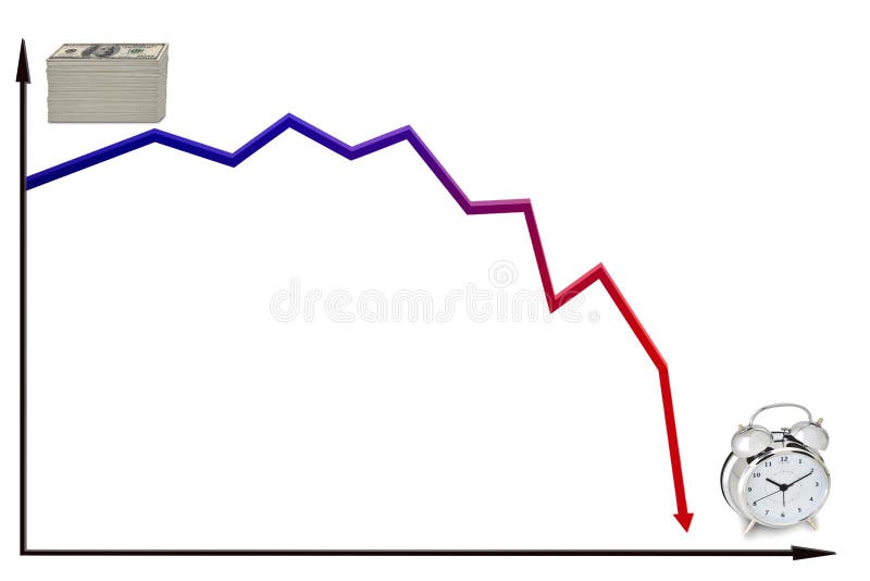
Free with trial Line graph illustrating the trend of decreasing value of money over time. Illustrating decrease illustrations Decreasing money over time. Line graph illustrating the trend of decreasing value of money over time.
Free with trial An arrow pointing downward drawn on yellow and red sticky notes, illustrating failure, negative movement, loss of money or assets and unsuccessful efforts. Illustrating decrease illustrations Arrow Down Tracking Failure Loss Sticky Notes. An arrow pointing downward drawn on yellow and red sticky notes, illustrating failure, negative movement, loss of money or assets and unsuccessful efforts
Free with trial A striking image depicting a struggling cocoa plant with withered leaves beside a sharply declining graph. This visual metaphor represents the challenges faced by cocoa farmers, including climate change, market fluctuations, and economic hardship. Ideal for illustrating articles or reports on agricultural economics, sustainability, and global food security. Illustrating decrease illustrations Cocoa Plant and Declining Graph: Symbol of Agricultural Crisis. A striking image depicting a struggling cocoa plant with withered leaves beside a sharply declining graph. This visual metaphor represents the challenges faced by cocoa farmers, including climate change, market fluctuations, and economic hardship. Ideal for illustrating articles or reports on agricultural economics, sustainability, and global food security.
Free with trial A striking red line graph against a dark backdrop, illustrating a stock market crash and highlighting a financial crisis. The image conveys a sense of loss and economic downturn. Illustrating decrease illustrations Stock market crash illustration with red line graph on a dark background depicting financial crisis concept. A striking red line graph against a dark backdrop, illustrating a stock market crash and highlighting a financial crisis. The image conveys a sense of loss and economic downturn
Free with trial A red graph with arrows illustrating decrease and increase, representing data analysis and performance evaluation in business. Suitable for reports and presentations. Illustrating decrease vectors Vector art of red graph with arrow, illustrating decrease and increase, representing data analysis and performance evaluation in. A red graph with arrows illustrating decrease and increase, representing data analysis and performance evaluation in business. Suitable for reports and presentations
Free with trial A pie chart illustrating the percentage of decrease in different crop yields with factors such as drought pests and soil degradation represented in different slices.. Vector illustration. Illustrating decrease vectors A pie chart illustrating the percentage of decrease in different crop yields with factors such as drought pests and soil
Free with trial A bar graph illustrating the decrease in the use of traditional antidepressant medications in a patient with treatmentresistant depression after. Illustrating decrease vectors A bar graph illustrating the decrease in the use of traditional antidepressant medications in a patient with
Free with trial A graph illustrating the consequences of a recession with a downward slope representing a decrease in overall productivity.. Vector illustration. Illustrating decrease vectors A graph illustrating the consequences of a recession with a downward slope representing a decrease in overall
Free with trial A vector graphic of a line graph showing a downward trend. Represents decrease, decline, loss, or negative performance. In automotive context, could symbolize falling sales, decreasing fuel efficiency, or a system performance drop. A clear visual for illustrating negative trends, vector design Generative AI. Illustrating decrease vectors Downtrend graph icon, decrease decline loss symbol, vector design Generative AI. A vector graphic of a line graph showing a downward trend. Represents decrease, decline, loss, or negative performance. In automotive context, could symbolize falling sales, decreasing fuel efficiency, or a system performance drop. A clear visual for illustrating negative trends, vector design Generative AI
Free with trial A vibrant blue percentage sign with a downward-pointing arrow visually represents a decrease or discount. This image is perfect for illustrating financial loss or reduction. Illustrating decrease vectors Vector art of blue percentage sign with arrow pointing down, indicating decrease, discount, or financial loss in a visually. A vibrant blue percentage sign with a downward-pointing arrow visually represents a decrease or discount. This image is perfect for illustrating financial loss or reduction
Free with trial A declining bar graph with a downward arrow symbolizes a negative trend, indicating a decrease in business performance, economic downturn, and potential market challenges. Illustrating decrease vectors Vector art of declining bar graph with downward arrow, illustrating negative trend, decrease, and economic downturn in business. A declining bar graph with a downward arrow symbolizes a negative trend, indicating a decrease in business performance, economic downturn, and potential market challenges
Free with trial The image depicts a 3D bar graph with red bars, showing a clear downward trend. The bars decrease in height from left to right, indicating a significant decline in the measured data. An arrow points downwards, emphasizing the negative trend. Illustrating decrease illustrations A downward trending graph illustrating a significant decrease in data points over time. The image depicts a 3D bar graph with red bars, showing a clear downward trend. The bars decrease in height from left to right, indicating a significant decline in the measured data. An arrow points downwards, emphasizing the negative trend
Free with trial Stacks of coins decrease in height alongside a red arrow pointing downwards, illustrating financial loss or market downturn, for use in business or economic content. Illustrating decrease illustrations Coin Decrease with Red Arrow Showing Loss. Stacks of coins decrease in height alongside a red arrow pointing downwards, illustrating financial loss or market downturn, for use in business or economic content
Free with trial Three stacks of coins with downward pointing arrows illustrating decrease or cost. Illustrating decrease vectors Three stacks of coins with downward pointing arrows illustrating decrease or cost
Free with trial This image shows a falling graph behind a diamond, representing the decrease in the value of precious stones. It's suitable for illustrating financial losses. Illustrating decrease vectors Illustration of a falling graph behind a diamond, symbolizing a decrease in the value of precious stones. This image shows a falling graph behind a diamond, representing the decrease in the value of precious stones. It's suitable for illustrating financial losses
Free with trial A set of isometric icons featuring coins, a mushroom, money decrease, and global decrease, ideal for illustrating finance, environmental concerns, and global issues. Illustrating decrease vectors Vector art of isometric icons of coins, mushroom, money decrease, and global decrease, representing finance, nature, and global. A set of isometric icons featuring coins, a mushroom, money decrease, and global decrease, ideal for illustrating finance, environmental concerns, and global issues
Free with trial Oil barrels and red arrow illustrating economic decline with coins in focus on industrial background. Generative AI. Illustrating decrease illustrations Oil barrels and red arrow illustrating economic decline with coins in focus on industrial background
Free with trial Monochrome Graphic Illustrating a Financial Decline or Discount. Illustrating decrease vectors Percentage Rate Decrease Symbolized by a Downward Arrow Icon. Monochrome Graphic Illustrating a Financial Decline or Discount.
Free with trial This image depicts sound waves emanating from a central point and spreading outwards in a symmetrical pattern. The waves are represented by concentric circles that gradually decrease in size as they move away from the source, illustrating the propagation of sound through a medium. Illustrating decrease illustrations Sound waves propagating through space. This image depicts sound waves emanating from a central point and spreading outwards in a symmetrical pattern. The waves are represented by concentric circles that gradually decrease in size as they move away from the source, illustrating the propagation of sound through a medium
Free with trial Red bar graph with downward trend line and arrow. Four vertical bars decrease in height from left to right, illustrating a declining pattern. Bold, simple vector style on a white background, emphasizing financial or statistical downward movement. Illustrating decrease illustrations Graph down or scale down vector art illustration. Red bar graph with downward trend line and arrow. Four vertical bars decrease in height from left to right, illustrating a declining pattern. Bold, simple vector style on a white background, emphasizing financial or statistical downward movement.
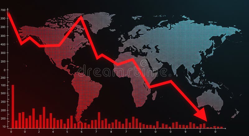
Free with trial World map with a red declining line graph overlay, illustrating a decrease or economic downturn. The graph features sharp declines across various data points, reflecting a downward trend. Red bar chart at the bottom represents additional numerical data against a black background. The map uses a dotted pattern for continents, highlighting regions globally. The image conveys financial analysis, market trends, or economic statistics. Illustrating decrease illustrations World map with a red declining line graph overlay
Free with trial A conceptual image depicting low dopamine levels. Wooden letter blocks spell DOPAMINE, accompanied by a sad face and a downward arrow, illustrating a decrease in this crucial neurotransmitter. (AI-Generated Content). Illustrating decrease illustrations Dopamine word blocks showing low levels and sad mood health concept. A conceptual image depicting low dopamine levels. Wooden letter blocks spell DOPAMINE, accompanied by a sad face and a downward arrow, illustrating a decrease in this crucial neurotransmitter. (AI-Generated Content)
Free with trial A collection of four icons featuring downward pointing arrows with percentage symbols, illustrating concepts of discount and decrease. Illustrating decrease illustrations Percentage down arrow icons representing discount and decrease. A collection of four icons featuring downward pointing arrows with percentage symbols, illustrating concepts of discount and decrease
Free with trial The image shows a line graph illustrating the decline of carbon emissions. there are two lines on the graph, a green line and a grey line, both trending downwards. the green line, representing "carbon inteetiual emissions," shows a steeper decline compared to the grey line. the graph is set against a grid background, providing a visual reference for the rate of decrease in emissions over time. the downward trend suggests a positive change in reducing carbon output. Illustrating decrease illustrations Carbon emissions decline graph illustration. the image shows a line graph illustrating the decline of carbon emissions. there are two lines on the graph, a green line and a grey line, both trending downwards. the green line, representing "carbon inteetiual emissions," shows a steeper decline compared to the grey line. the graph is set against a grid background, providing a visual reference for the rate of decrease in emissions over time. the downward trend suggests a positive change in reducing carbon output.
Free with trial A vector icon of a descending line graph on a green base, illustrating a downward trend, decrease, or decline in data. Represents financial loss, reduced performance, or negative growth. Suitable for business reports, statistical analysis, and economic presentations, vector design Generative AI. Illustrating decrease vectors Descending Line Graph Decline Trend Chart Icon, vector design Generative AI. A vector icon of a descending line graph on a green base, illustrating a downward trend, decrease, or decline in data. Represents financial loss, reduced performance, or negative growth. Suitable for business reports, statistical analysis, and economic presentations, vector design Generative AI
Free with trial This infographic displays a bar graph illustrating a sharp negative trend. The red line clearly depicts a significant decrease, showcasing concepts like downturn, recession, and loss within a business or financial context. Ideal for presentations, reports, and analyses highlighting negative market trends or economic decline, generated by AI. Illustrating decrease illustrations Decreasing bar graph showing negative trend decline. This infographic displays a bar graph illustrating a sharp negative trend. The red line clearly depicts a significant decrease, showcasing concepts like downturn, recession, and loss within a business or financial context. Ideal for presentations, reports, and analyses highlighting negative market trends or economic decline, generated by AI.
Free with trial A vector graphic of a line graph showing a downward trend with an arrow. Represents decline, loss, decrease, negative progress, or recession. Useful graphic for financial reports, statistics, or negative outcomes. Illustrating a drop in value, vector design Generative AI. Illustrating decrease vectors Downward Trend Arrow Vector Graphic, Decline and Loss Icon, vector design Generative AI. A vector graphic of a line graph showing a downward trend with an arrow. Represents decline, loss, decrease, negative progress, or recession. Useful graphic for financial reports, statistics, or negative outcomes. Illustrating a drop in value, vector design Generative AI
Free with trial Rate showing extensive set of dark gray illustrating financial graphs charts and data analysis symbols keywords: financial, graphs, charts, data. Illustrating decrease illustrations Extensive Set of Dark Gray Illustrating Financial Graphs Charts and Data Analysis Symbols Keywords: financial
Free with trial A vivid red arrow signifies a downward trend or negative movement. This impactful graphic represents decline loss decrease and is ideal for illustrating financial reports or data trends. Illustrating decrease illustrations Bold red arrow points downward showing decline loss decrease trend direction. A vivid red arrow signifies a downward trend or negative movement. This impactful graphic represents decline loss decrease and is ideal for illustrating financial reports or data trends
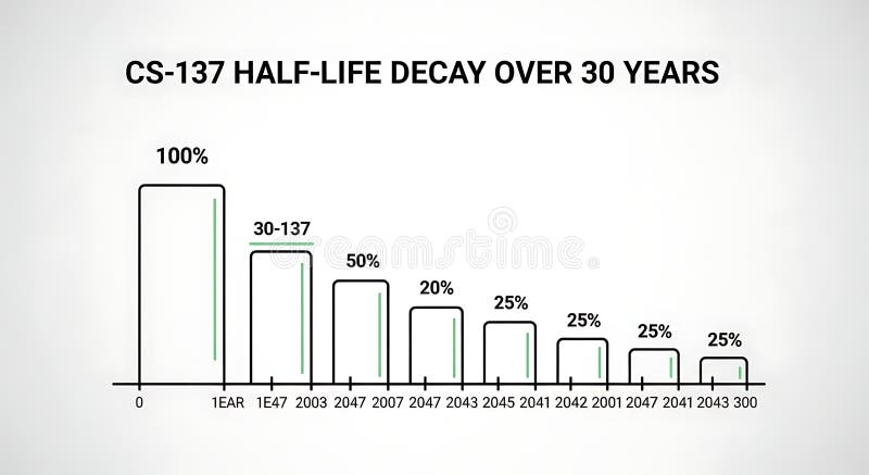
Free with trial A line graph illustrating the decrease in half-life over 30 years with bars representing percentage decay at different years, demonstrating long-term decline suitable for scientific, educational, or research presentations. Illustrating decrease illustrations Half-life Decay Over 30 Years Chart Showing Decrease in Value or Effectiveness. A line graph illustrating the decrease in half-life over 30 years with bars representing percentage decay at different years, demonstrating long-term decline suitable for scientific, educational, or research presentations
Free with trial Intricate fractal design featuring spirals composed of leaf-like elements in shades of green and blue. The pattern displays symmetry and mathematical precision, resembling natural plant forms. Set against a white background, the spirals decrease in size as they extend outward, creating a visually dynamic effect. The artwork combines organic shapes with geometric repetition, illustrating principles of fractal geometry and nature-inspired design. Illustrating decrease illustrations Pattern displays symmetry and mathematical precision, resembling
Free with trial A flat vector icon of a line graph showing a downward trend. Represents financial loss, market decline, negative statistics, or decreasing performance. Suitable for business reports, financial news, or graphics illustrating economic downturns, vector design Generative AI. Illustrating decrease vectors Downward trending line graph icon financial market decrease, vector design Generative AI. A flat vector icon of a line graph showing a downward trend. Represents financial loss, market decline, negative statistics, or decreasing performance. Suitable for business reports, financial news, or graphics illustrating economic downturns, vector design Generative AI
Free with trial A flat vector icon showing a line graph with a distinct downward trend. Represents decline, decrease, negative growth, or falling performance. Suitable for business analysis, financial reports, or graphics illustrating negative progress or statistics, vector design Generative AI. Illustrating decrease vectors Downward line graph icon representing negative trend decline, vector design Generative AI. A flat vector icon showing a line graph with a distinct downward trend. Represents decline, decrease, negative growth, or falling performance. Suitable for business analysis, financial reports, or graphics illustrating negative progress or statistics, vector design Generative AI
Free with trial Outline vector icon of a line graph showing a downward trend. Represents decline, loss, decrease, failure, or negative performance in line art. Suitable for financial reports, data analysis, business presentations, and illustrating negative change, vector design Generative AI. Illustrating decrease vectors Downward Trend Graph Icon Outline, Decline Loss Failure Symbol, vector design Generative AI. Outline vector icon of a line graph showing a downward trend. Represents decline, loss, decrease, failure, or negative performance in line art. Suitable for financial reports, data analysis, business presentations, and illustrating negative change, vector design Generative AI
Free with trial A minimalist icon illustrating the concept of a housing market downturn. Illustrating decrease vectors Property Value Decrease Graphic Icon. A minimalist icon illustrating the concept of a housing market downturn
Free with trial This graphic depicts a simple bar chart with two vertical bars. The left bar, colored blue, is shorter and labeled 'QUALITY' with an upward-pointing arrow, suggesting an increase. The right bar, colored green, is taller and labeled 'COST' with downward-pointing arrows, indicating a decrease. A diagonal arrow connects the top of the quality bar to the bottom of the cost bar, visually representing. Illustrating decrease vectors Bar chart illustrating the inverse relationship between quality and cost. This graphic depicts a simple bar chart with two vertical bars. The left bar, colored. This graphic depicts a simple bar chart with two vertical bars. The left bar, colored blue, is shorter and labeled 'QUALITY' with an upward-pointing arrow, suggesting an increase. The right bar, colored green, is taller and labeled 'COST' with downward-pointing arrows, indicating a decrease. A diagonal arrow connects the top of the quality bar to the bottom of the cost bar, visually representing
Free with trial This vibrant image features a white cube with a prominent black percentage symbol, seemingly floating above a row of five identical white cubes, each displaying a clear black downward arrow. Set against a bright yellow background, the composition powerfully symbolizes a concept of reduction, decline, or decrease. It's ideal for illustrating topics such as falling interest rates, economic downturns, sales reductions, discounts, negative trends, or any financial or business concept involving a downward movement in percentages. The clean, minimalist design offers versatility for various editorial and commercial uses. Illustrating decrease illustrations Percentage Decrease Concept with Downward Arrows. This vibrant image features a white cube with a prominent black percentage symbol, seemingly floating above a row of five identical white cubes, each displaying a clear black downward arrow. Set against a bright yellow background, the composition powerfully symbolizes a concept of reduction, decline, or decrease. It's ideal for illustrating topics such as falling interest rates, economic downturns, sales reductions, discounts, negative trends, or any financial or business concept involving a downward movement in percentages. The clean, minimalist design offers versatility for various editorial and commercial uses.
Free with trial Man pictogram morphing into a downward arrow on white background, illustrating decline, decrease, falling trend or negative direction for finance, economy, data, business and social metrics. Illustrating decrease illustrations Man icon showing data decrease or downward direction. Man pictogram morphing into a downward arrow on white background, illustrating decline, decrease, falling trend or negative direction for finance, economy, data, business and social metrics
Free with trial A series of circles and discs of varying sizes form a linear arrangement against a black background. The shapes increase in size towards the center and then decrease symmetrically. They display different shades of gray, illustrating a gradient from dark to light and back to dark, creating a sense of geometric progression and light variation. The configuration suggests a balanced and symmetrical pattern, emphasizing visual contrast. ai generative. Illustrating decrease illustrations A Series of Circles and Discs Demonstrating Geometric Progression and Light Variation. A series of circles and discs of varying sizes form a linear arrangement against a black background. The shapes increase in size towards the center and then decrease symmetrically. They display different shades of gray, illustrating a gradient from dark to light and back to dark, creating a sense of geometric progression and light variation. The configuration suggests a balanced and symmetrical pattern, emphasizing visual contrast. ai generative
Free with trial Stacks of shiny gold coins decrease in height with a downward pointing red arrow, illustrating financial loss or economic recession on a beige background, perfect for business or finance visuals. Illustrating decrease illustrations Gold Coins Stack with Red Arrow Showing Financial Decline. Stacks of shiny gold coins decrease in height with a downward pointing red arrow, illustrating financial loss or economic recession on a beige background, perfect for business or finance visuals