Free with trial E-commerce Sales Decline Visualization , elegant style. Performance decrease illustrations E-commerce Sales Decline Visualization
Free with trial A black icon representing a bar chart with bars decreasing in height Clear details and vibrant colors enhance. Performance decrease illustrations Black descending bar chart icon on white background graph decline. A black icon representing a bar chart with bars decreasing in height Clear details and vibrant colors enhance
Free with trial A conceptual vector illustration depicting a severe economic downturn. The image features a grey bar chart with progressively shorter bars, symbolizing declining profits or performance. A bold red arrow points sharply downwards, representing a crash or significant loss, alongside a blue line graph also showing a negative trend. This graphic is ideal for illustrating concepts such as financial crisis, recession, stock market crash, business failure, bankruptcy, and negative growth. Perfect for financial reports, business presentations, news articles, and economic analysis infographics. Performance decrease illustrations Economic Downturn and Financial Crisis Graph. A conceptual vector illustration depicting a severe economic downturn. The image features a grey bar chart with progressively shorter bars, symbolizing declining profits or performance. A bold red arrow points sharply downwards, representing a crash or significant loss, alongside a blue line graph also showing a negative trend. This graphic is ideal for illustrating concepts such as financial crisis, recession, stock market crash, business failure, bankruptcy, and negative growth. Perfect for financial reports, business presentations, news articles, and economic analysis infographics.
Free with trial Bull vs bear global stock volatility background with dollar sign vector. Performance decrease vectors Bull vs bear global stock volatility background with dollar sign
Free with trial A simple and bold icon illustration of a bar graph. This can be used to represent data, statistics, growth, or trends. The icon is designed in a clean and minimalist style, making it versatile for various applications. Performance decrease vectors Simple Bold Bar Graph Sign Shape Icon for Data Presentation. A simple and bold icon illustration of a bar graph. This can be used to represent data, statistics, growth, or trends. The icon is designed in a clean and minimalist style, making it versatile for various applications.
Free with trial Data analytics dashboard illustrating a mix of line graphs, bar charts, and data summaries, representing business growth, financial trends, and statistical insights for market analysis. Performance decrease vectors Data analytics dashboard showing business growth and decline. Data analytics dashboard illustrating a mix of line graphs, bar charts, and data summaries, representing business growth, financial trends, and statistical insights for market analysis
Free with trial A businessman's open palm displays a blue upward arrow labeled Quality and a red downward arrow labeled Cost with glowing particles. Performance decrease illustrations Businessman\'s hand holding upward quality arrow and downward cost arrow image. A businessman's open palm displays a blue upward arrow labeled Quality and a red downward arrow labeled Cost with glowing particles
Free with trial 3D chart illustration showing a red arrow and decreasing blue bars on a light background, representing loss, decline or negative trend. Performance decrease illustrations . 3D chart illustration showing a red arrow and decreasing blue bars on a light background, representing loss, decline or negative trend
Free with trial Two simple arrows on a white background. The red arrow points diagonally downward to the left, while the green arrow points diagonally upward to the right. Both arrows have a clean design with bold lines and sharp arrowheads, indicating contrast or opposing directions. Performance decrease vectors Up and Down Growth Arrows - Stock Market Trend Vector Symbols. Two simple arrows on a white background. The red arrow points diagonally downward to the left, while the green arrow points diagonally upward to the right. Both arrows have a clean design with bold lines and sharp arrowheads, indicating contrast or opposing directions.
Free with trial A red and yellow financial chart depicts a steep downward trend. Red candlestick bars form the base, with yellow lines showing price fluctuations. A large yellow arrow clearly indicates a sharp decline, suggesting a significant market drop. Performance decrease illustrations Red and Yellow Stock Market Chart with Steep Downward Trend. A red and yellow financial chart depicts a steep downward trend. Red candlestick bars form the base, with yellow lines showing price fluctuations. A large yellow arrow clearly indicates a sharp decline, suggesting a significant market drop
Free with trial Orange bar chart showing progressive data decline paired with a sad face icon suggesting disappointment. Ideal for business loss, failure, negative feedback, underperformance, worry, challenges. Performance decrease vectors Bar Chart with Declining Data and Sad Face Icon Representing Negative Trends. Orange bar chart showing progressive data decline paired with a sad face icon suggesting disappointment. Ideal for business loss, failure, negative feedback, underperformance, worry, challenges
Free with trial A straightforward and clear vector graphic of a bar chart illustrating a negative trend. The solid black bars steadily decrease in height from left to right. A thick diagonal arrow points downward, connecting the top of the first bar to the end of the chart, visually emphasizing the decline. This minimalist design is perfect for representing losses, financial downturns, or decreasing statistics. Performance decrease illustrations Declining Bar Chart Icon, AI Generated. A straightforward and clear vector graphic of a bar chart illustrating a negative trend. The solid black bars steadily decrease in height from left to right. A thick diagonal arrow points downward, connecting the top of the first bar to the end of the chart, visually emphasizing the decline. This minimalist design is perfect for representing losses, financial downturns, or decreasing statistics.
Free with trial Conceptual line art depicting business analysis and market trends. Performance decrease illustrations Business Analysis Magnifying Glass, Thumbs Up, Declining Graph. Conceptual line art depicting business analysis and market trends.
Free with trial A 3D rendered cartoon hand with a black cuff and white shirt sleeve points its index finger downwards towards a red bar chart. The chart displays a clear downward trend with bars of decreasing height in green, yellow, orange, and red, set on a dark gray base against a white background. Performance decrease illustrations 3D Cartoon Hand Pointing Down at Declining Bar Chart on White Background graph decline. A 3D rendered cartoon hand with a black cuff and white shirt sleeve points its index finger downwards towards a red bar chart. The chart displays a clear downward trend with bars of decreasing height in green, yellow, orange, and red, set on a dark gray base against a white background
Free with trial A 3D rendered graphic depicts a simplified bar chart with pastel colored bars in pink, yellow, and blue. A line graph with white lines and orange and yellow nodes crosses diagonally above the bars. The elements are set against a light blue background with a light tan border, all isolated on a white background. Performance decrease vectors 3 D cartoon bar chart with line graph on blue background data. A 3D rendered graphic depicts a simplified bar chart with pastel colored bars in pink, yellow, and blue. A line graph with white lines and orange and yellow nodes crosses diagonally above the bars. The elements are set against a light blue background with a light tan border, all isolated on a white background
Free with trial A simple black and red bar chart displays data with varying heights on a white background. Performance decrease illustrations Simple Bar Chart with One Red Bar on White Background graph data. A simple black and red bar chart displays data with varying heights on a white background
Free with trial Collection of simple black vector icons representing financial charts, data analysis graphs, and business statistics. Includes trend arrows, magnifier, and settings symbols. Performance decrease vectors Set of black business graph and chart icons for data analysis. Collection of simple black vector icons representing financial charts, data analysis graphs, and business statistics. Includes trend arrows, magnifier, and settings symbols
Free with trial This image illustrates a bar graph showing an upward trend in financial growth, accompanied by a line graph depicting market fluctuations over time. Performance decrease illustrations Graphical representation of financial growth and fluctuation. This image illustrates a bar graph showing an upward trend in financial growth, accompanied by a line graph depicting market fluctuations over time
Free with trial This image depicts a combination of line and bar graphs showing comparative data analysis over a period of time. Performance decrease illustrations Comparative data analysis over time with line and bar graphs. This image depicts a combination of line and bar graphs showing comparative data analysis over a period of time
Free with trial A businessman wearing a suit analyzes cost reduction versus quality improvement He uses both a laptop and a tablet computer to look at the data and see how these two factors interact to produce the best result for his company and business dealings shown with a graph of numbers going up and down. Performance decrease illustrations Cost reduction and quality improvement shown with businessman analyzing data on devices. A businessman wearing a suit analyzes cost reduction versus quality improvement He uses both a laptop and a tablet computer to look at the data and see how these two factors interact to produce the best result for his company and business dealings shown with a graph of numbers going up and down
Free with trial A symbolic representation of financial decline, this image features four stacks of gold coins, decreasing in height from left to right, symbolizing a reduction in wealth or value. A prominent red arrow, sharply descending, overlays the scene, reinforcing the concept of a market crash, economic recession, or financial loss. The clean white background and reflective surface emphasize the starkness of the downturn. Performance decrease vectors Financial Downturn: Stacks of Gold Coins and Red Downward Arrow. A symbolic representation of financial decline, this image features four stacks of gold coins, decreasing in height from left to right, symbolizing a reduction in wealth or value. A prominent red arrow, sharply descending, overlays the scene, reinforcing the concept of a market crash, economic recession, or financial loss. The clean white background and reflective surface emphasize the starkness of the downturn.
Free with trial Orange bar chart with downward arrow vector illustration. Financial loss, economic recession, market crash, business failure, negative growth, data analysis. Declining graph with falling trend. Performance decrease vectors Decreasing bar chart with downward arrow showing financial loss and economic recession vector illustration. Orange bar chart with downward arrow vector. Orange bar chart with downward arrow vector illustration. Financial loss, economic recession, market crash, business failure, negative growth, data analysis. Declining graph with falling trend
Free with trial This image shows a simple line graph with increasing and decreasing trends, ideal for visualizing data analysis and presenting key findings. The graph uses a clean, minimalist design to highlight the data points and overall trend. Perfect for presentations and reports. Performance decrease illustrations Analyze Your Data. This image shows a simple line graph with increasing and decreasing trends, ideal for visualizing data analysis and presenting key findings. The graph uses a clean, minimalist design to highlight the data points and overall trend. Perfect for presentations and reports.
Free with trial A circular icon containing a stylized representation of financial data. The icon features a series of black vertical bars of varying heights, suggesting a bar chart. Overlaid on the bars are two thin lines, one black and one grey, depicting line graphs with peaks and troughs, indicating fluctuating trends. The overall design is minimalist and symbolic, suitable for representing business analytics. Performance decrease illustrations Circular Graph Icon with Bar and Line Charts Representing Financial Data and Trends business. A circular icon containing a stylized representation of financial data. The icon features a series of black vertical bars of varying heights, suggesting a bar chart. Overlaid on the bars are two thin lines, one black and one grey, depicting line graphs with peaks and troughs, indicating fluctuating trends. The overall design is minimalist and symbolic, suitable for representing business analytics
Free with trial Economic growth and decline. Profit and loss. Trading on stock exchanges and markets. Bring your business into profit. Performance decrease illustrations Economic growth and decline. Profit and loss.
Free with trial This visually striking image depicts a futuristic financial concept. Scattered coins on a dark surface are illuminated by glowing neon percentages (1%, 10%, 20%, 30%, 50%, 100%). A subtle network of lines and lights in the background suggests a digital or abstract representation of data and growth. The composition evokes themes of investment, progress, and financial targets, suitable for business, finance, and technology-related content. Performance decrease illustrations Digital Growth and Financial Percentages. This visually striking image depicts a futuristic financial concept. Scattered coins on a dark surface are illuminated by glowing neon percentages (1%, 10%, 20%, 30%, 50%, 100%). A subtle network of lines and lights in the background suggests a digital or abstract representation of data and growth. The composition evokes themes of investment, progress, and financial targets, suitable for business, finance, and technology-related content.
Free with trial Bar chart icon representing data visualization, financial growth, business analytics, and market trends, indicating increasing and decreasing values for decision making. Performance decrease vectors Bar chart icon showing data analysis and statistics. Bar chart icon representing data visualization, financial growth, business analytics, and market trends, indicating increasing and decreasing values for decision making
Free with trial A striking digital illustration features a bold red and white bullseye target with a prominent red percentage symbol at its precise center, set against a stark black background and surrounded by a constellation of smaller white and red percentage signs that radiate outward, creating a modern and minimalist visual metaphor for goals, accuracy, metrics, business growth, and data-driven success. Performance decrease illustrations A digital illustration of a red and white target with a percentage sign in the center, surrounded by smaller percentage symbols on. A striking digital illustration features a bold red and white bullseye target with a prominent red percentage symbol at its precise center, set against a stark black background and surrounded by a constellation of smaller white and red percentage signs that radiate outward, creating a modern and minimalist visual metaphor for goals, accuracy, metrics, business growth, and data-driven success
Free with trial A blue holographic graph showing a downward trend with bars and a line chart is projected over a dark conference table and chairs. Performance decrease illustrations Holographic graph displaying insurance reimbursement delays over a conference table chart. A blue holographic graph showing a downward trend with bars and a line chart is projected over a dark conference table and chairs
Free with trial A red line graph showing a significant downward trend, indicating a decline or loss, set against a subtle white background with small, scattered grid points. Performance decrease illustrations Red downward trend line on a white background with grid points. A red line graph showing a significant downward trend, indicating a decline or loss, set against a subtle white background with small, scattered grid points
Free with trial An artistic creation that reflects beauty in simplicity. The design highlights precision, clean details, and a harmonious flow, resulting in a versatile and professional visual outcome. Performance decrease vectors Business lion Presenting bar graph chart. An artistic creation that reflects beauty in simplicity. The design highlights precision, clean details, and a harmonious flow, resulting in a versatile and professional visual outcome
Free with trial A prominent 3D metallic US dollar sign stands against a dynamic digital background featuring various financial charts and graphs. The background displays a fluctuating line graph and a colorful bar chart, symbolizing market trends, economic data, and investment performance. This image powerfully conveys concepts of finance, global economy, currency strength, stock market analysis, and wealth management in a modern, digital context. Ideal for illustrating reports, presentations, or articles related to business, banking, and financial growth. Performance decrease illustrations US Dollar Symbol with Digital Financial Charts and Market Data. A prominent 3D metallic US dollar sign stands against a dynamic digital background featuring various financial charts and graphs. The background displays a fluctuating line graph and a colorful bar chart, symbolizing market trends, economic data, and investment performance. This image powerfully conveys concepts of finance, global economy, currency strength, stock market analysis, and wealth management in a modern, digital context. Ideal for illustrating reports, presentations, or articles related to business, banking, and financial growth.
Free with trial Professional business man holding pie chart showing negative trend with loss. Economic crisis, recession, market crash, financial planning. Performance decrease illustrations Business man holding pie chart showing negative trend with loss
Free with trial This image displays four icons representing changes in percentage, with two showing an upward green arrow for positive changes and two showing a downward red arrow for negative changes. Performance decrease illustrations Set of four icons indicating positive and negative percentages. This image displays four icons representing changes in percentage, with two showing an upward green arrow for positive changes and two showing a downward red arrow for negative changes
Free with trial A black graph displays a downward curving line within a rectangular frame. Clear details and vibrant colors en. Performance decrease illustrations Black graph showing a downward curve within a frame chart decline. A black graph displays a downward curving line within a rectangular frame. Clear details and vibrant colors en
Free with trial Blue heart with heartbeat line, upward and downward arrows suggesting change. Ideal for health tracking, fitness, wellness, analytics, growth, decline, and simple landing page. Performance decrease vectors Heartbeat and Arrows Indicating Increase and Decrease in Health and Wellness Indicators. Blue heart with heartbeat line, upward and downward arrows suggesting change. Ideal for health tracking, fitness, wellness, analytics, growth, decline, and simple landing page
Free with trial Businessman pushing a downward arrow with dollar sign representing financial pressure, loss, and economic decline. Ideal for crisis, debt, and business downturn visuals. Performance decrease vectors Financial pressure concept with businessman pushing down arrow and dollar symbol showing loss decline. Businessman pushing a downward arrow with dollar sign representing financial pressure, loss, and economic decline. Ideal for crisis, debt, and business downturn visuals
Free with trial A businessman interacts with a digital graph showcasing cost reduction through a declining trend. It symbolizes modern financial strategies and data-driven decision-making. XDMCP. Performance decrease illustrations Businessman Presenting Digital Graph with Cost Reduction Concept, Showing Declining Trend in Expenses with Iconic. A businessman interacts with a digital graph showcasing cost reduction through a declining trend. It symbolizes modern financial strategies and data-driven decision-making. XDMCP
Free with trial A clean, minimalist line art icon representing settings and configuration. The central element is a gear, symbolizing mechanics, operations, or system adjustments. Encircling the gear are three distinct symbols: a plus sign (+) for adding or increasing, a minus sign (-) for subtracting or decreasing, and an information icon (i) for help or details. This graphic is ideal for representing user interface controls, technical configurations, or operational adjustments in digital or mechanical contexts. Performance decrease illustrations Gear Settings Icon with Plus, Minus, and Info Symbols. A clean, minimalist line art icon representing settings and configuration. The central element is a gear, symbolizing mechanics, operations, or system adjustments. Encircling the gear are three distinct symbols: a plus sign (+) for adding or increasing, a minus sign (-) for subtracting or decreasing, and an information icon (i) for help or details. This graphic is ideal for representing user interface controls, technical configurations, or operational adjustments in digital or mechanical contexts.
Free with trial A clean, minimalist line art illustration featuring a central gear or cogwheel. Encircling the gear are three distinct icons: a plus sign (+), a minus sign (-), and an information symbol (i). These elements are arranged around the gear within curved lines, suggesting a system of controls, adjustments, or settings. The design is monochromatic, using black lines on a white background, making it versatile for various applications. Performance decrease illustrations Gear Settings Icon with Plus, Minus, and Info Symbols. A clean, minimalist line art illustration featuring a central gear or cogwheel. Encircling the gear are three distinct icons: a plus sign (+), a minus sign (-), and an information symbol (i). These elements are arranged around the gear within curved lines, suggesting a system of controls, adjustments, or settings. The design is monochromatic, using black lines on a white background, making it versatile for various applications.
Free with trial This image features a clear financial chart on a plain white background, illustrating a significant downward trend. A bold red line with an arrow points sharply downwards, symbolizing decline, loss, or a crisis. A grey line, possibly representing historical data or another metric, also shows a general downward movement. This visual effectively conveys concepts of economic recession, market crash, poor business performance, or financial distress. It's ideal for presentations, reports, news articles, or any content discussing negative economic indicators, investment risks, or strategic challenges. Performance decrease vectors Financial Chart Illustrating Economic Decline and Market Downturn. This image features a clear financial chart on a plain white background, illustrating a significant downward trend. A bold red line with an arrow points sharply downwards, symbolizing decline, loss, or a crisis. A grey line, possibly representing historical data or another metric, also shows a general downward movement. This visual effectively conveys concepts of economic recession, market crash, poor business performance, or financial distress. It's ideal for presentations, reports, news articles, or any content discussing negative economic indicators, investment risks, or strategic challenges.
Free with trial Futuristic Robotic Hand Pointing Towards Computer Display with Cost Analysis Concept and Digital Connections Representing Innovation and Technology Quark. Performance decrease illustrations Futuristic Robotic Hand Pointing Towards Computer Display with Cost Analysis Concept and Digital Connections
Free with trial Arrow Direction and Percentage Icons for Business Growth Concept. Performance decrease illustrations Arrow Direction and Percentage Icons for Business Growth Concept
Free with trial A 3D rendered icon depicting a blue document with a raised bar graph. The bar graph features alternating blue, orange, and yellow bars of varying heights. White lines and a circular orange and white element are also present on the blue document surface. The icon is isolated on a white background. Performance decrease vectors 3 D blue document icon with orange and blue bar graph and white lines image. A 3D rendered icon depicting a blue document with a raised bar graph. The bar graph features alternating blue, orange, and yellow bars of varying heights. White lines and a circular orange and white element are also present on the blue document surface. The icon is isolated on a white background
Free with trial A 3D rendered red bar chart and line graph show a downward trend against a white grid background. The graph reflects a decline with a red arrow pointing down. Performance decrease illustrations Red downward trending bar chart and line graph on white grid image. A 3D rendered red bar chart and line graph show a downward trend against a white grid background. The graph reflects a decline with a red arrow pointing down
Free with trial A dramatic visual representation of a stock market crash, featuring a downward trending red candlestick chart against a dark, grid-like background. Numbers and financial data are subtly visible, emphasizing the financial context. This image evokes feelings of loss, recession, and economic downturn, making it ideal for illustrating financial crises, market volatility, and investment risks. Performance decrease illustrations Red Stock Market Crash Chart. A dramatic visual representation of a stock market crash, featuring a downward trending red candlestick chart against a dark, grid-like background. Numbers and financial data are subtly visible, emphasizing the financial context. This image evokes feelings of loss, recession, and economic downturn, making it ideal for illustrating financial crises, market volatility, and investment risks.
Free with trial A person in a suit holding a magnifying glass showing blue upward and red downward percentage arrows. Performance decrease illustrations Person holding magnifying glass with percentage arrows hand blue. A person in a suit holding a magnifying glass showing blue upward and red downward percentage arrows.
Free with trial Black and white icon of a bar graph with a diagonal arrow indicating a sharp decline. Performance decrease illustrations Falling bar graph with diagonal arrow showing sharp decline bar chart. Black and white icon of a bar graph with a diagonal arrow indicating a sharp decline
Free with trial Conceptual Illustration of Cost Analysis and Research Strategy with a Computer Screen and Hand Gestures in a Modern Digital Environment Quark. Performance decrease illustrations Conceptual Illustration of Cost Analysis and Research Strategy with a Computer Screen and Hand Gestures in a Modern
Free with trial Purple glassmorphism downward arrow chart icon, representing business loss, market drop, or negative metrics, 3d rendering. Performance decrease vectors Purple glassmorphism downward arrow chart icon, representing business loss, market drop, or negative metrics, 3d rendering
Free with trial A 3D render of a shiny red arrow curving downwards, indicating a negative trend or decline. Isolated on a clean white background for clarity. Performance decrease illustrations A glossy red arrow pointing downwards, isolated on white background. A 3D render of a shiny red arrow curving downwards, indicating a negative trend or decline. Isolated on a clean white background for clarity
Free with trial A bar chart displays four vertical bars in red, yellow, green, and blue, arranged in descending height from left to right. A thick, black arrow curves downwards from the top right, pointing towards the bars and indicating a downward trend or decline. The chart is presented on a plain white background. Performance decrease illustrations Downward Trending Bar Chart with Red Yellow Green Blue Bars and Black Arrow graph statistics. A bar chart displays four vertical bars in red, yellow, green, and blue, arranged in descending height from left to right. A thick, black arrow curves downwards from the top right, pointing towards the bars and indicating a downward trend or decline. The chart is presented on a plain white background
Free with trial Businessman with downward graph indicating financial decline, recession, and negative growth. Ideal for economic analysis, loss reporting, and business downturn visuals. Performance decrease vectors Business decline graph with downward arrow showing financial loss recession and negative growth concept. Businessman with downward graph indicating financial decline, recession, and negative growth. Ideal for economic analysis, loss reporting, and business downturn visuals
Free with trial This image depicts a bar graph on an easel showing a clear downward trend. The bars are blue, and a large red arrow points downward, indicating a decline. Performance decrease illustrations Decline in data represented by a descending bar graph on an easel. This image depicts a bar graph on an easel showing a clear downward trend. The bars are blue, and a large red arrow points downward, indicating a decline
Free with trial Red bar graph with a descending line and arrow on a white background. The graph features four bars of varying heights, depicting a decline in values from left to right. The red line starts at the top of the first bar, dips below the second, rises over the third, then slopes downward with a pronounced arrow pointing to the right, indicating a decrease in data or performance. The image suggests themes of loss or negative financial trends. Performance decrease vectors Red bar graph with a descending line and arrow on a white background.
Free with trial Vibrant 3D red bar chart illustrating declining growth trends for business analytics, finance reports, and data visualization projects. Performance decrease vectors 3D red bar chart decreasing growth business data analysis concept. Vibrant 3D red bar chart illustrating declining growth trends for business analytics, finance reports, and data visualization projects
Free with trial Black line graph showing upward and downward trends with arrows on a white background. Performance decrease illustrations Black line graph with upward and downward trends and arrows chart data. Black line graph showing upward and downward trends with arrows on a white background
Free with trial A striking 3D rendering depicts a significant financial market decline, symbolized by a bold red arrow sharply pointing downwards across a dark grey background. The scene includes a subtle line graph and bar charts in shades of red and grey, illustrating a negative trend in data. This image effectively conveys concepts of economic recession, stock market crash, business losses, and financial crisis. Ideal for articles, presentations, and reports discussing market downturns, investment risks, or economic challenges. Performance decrease illustrations Financial Market Decline with Red Arrow Chart. A striking 3D rendering depicts a significant financial market decline, symbolized by a bold red arrow sharply pointing downwards across a dark grey background. The scene includes a subtle line graph and bar charts in shades of red and grey, illustrating a negative trend in data. This image effectively conveys concepts of economic recession, stock market crash, business losses, and financial crisis. Ideal for articles, presentations, and reports discussing market downturns, investment risks, or economic challenges.
Free with trial Bar chart representation of data increase growth and finance. Data analysis. Performance decrease vectors Bar chart representation of data increase growth and finance. Data analysis
Free with trial A 3D rendered candlestick stock market chart displays a downward trend. Green bars, indicating upward movement, are followed by red bars, signifying a decline. The chart is angled diagonally across a white background, with a subtle shadow cast beneath it, emphasizing the concept of financial loss or market downturn. Performance decrease illustrations Downward Trending Stock Market Candlestick Chart with Red and Green Bars on a White Background. A 3D rendered candlestick stock market chart displays a downward trend. Green bars, indicating upward movement, are followed by red bars, signifying a decline. The chart is angled diagonally across a white background, with a subtle shadow cast beneath it, emphasizing the concept of financial loss or market downturn
Free with trial Line art depicting a magnifying glass focused on a declining sales graph and a thumbs-down gesture. Performance decrease illustrations Declining Sales Analysis Magnifying Glass, Downward Trend, Thumbs Down. Line art depicting a magnifying glass focused on a declining sales graph and a thumbs-down gesture.
Free with trial A 3D rendered illustration of a stock market candlestick chart is shown against a light blue background. The chart displays a mix of red and green candlesticks, indicating price fluctuations. A prominent red arrow points downwards, signifying a market decline. A white zigzag line also charts a downward trend. To the right, a red exclamation mark and a red dot serve as a warning or alert symbol. Performance decrease illustrations 3D Rendered Stock Market Candlestick Chart with Falling Red Arrow and Exclamation Mark finance. A 3D rendered illustration of a stock market candlestick chart is shown against a light blue background. The chart displays a mix of red and green candlesticks, indicating price fluctuations. A prominent red arrow points downwards, signifying a market decline. A white zigzag line also charts a downward trend. To the right, a red exclamation mark and a red dot serve as a warning or alert symbol
Free with trial A businessman presents a tablet with glowing arrows symbolizing the interplay of quality improvement and cost reduction, showcasing concepts of business optimization and success. Qubit. Performance decrease illustrations Businessman Holding Tablet with Neon Arrows Indicating Quality Increase and Cost Decrease, Concept of Optimizing. A businessman presents a tablet with glowing arrows symbolizing the interplay of quality improvement and cost reduction, showcasing concepts of business optimization and success. Qubit
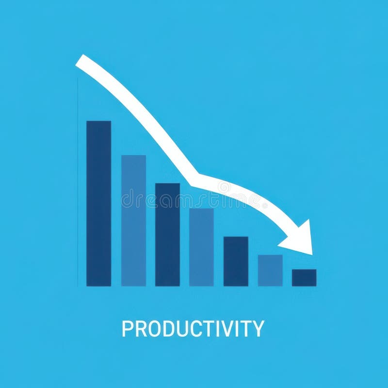
Free with trial A bar graph visually represents a downward trend in productivity over time, indicating a decline in efficiency or output. Performance decrease illustrations Decreasing Productivity Graph Showing Decline. A bar graph visually represents a downward trend in productivity over time, indicating a decline in efficiency or output
Free with trial A close-up shot of a smartphone displaying a stock market chart, showing fluctuating prices. The dark theme enhances the visual impact of the pink graph line, generated by AI for a modern and sleek aesthetic. This image is perfect for illustrating financial technology, mobile trading, and investmen. Performance decrease illustrations Mobile Stock Market Chart. A close-up shot of a smartphone displaying a stock market chart, showing fluctuating prices. The dark theme enhances the visual impact of the pink graph line, generated by AI for a modern and sleek aesthetic. This image is perfect for illustrating financial technology, mobile trading, and investmen
Free with trial A sophisticated 3D rendered bar graph composed of multiple vertical blue glass bars arranged in a line with varying heights, where the tallest bar appears at the bottom right side and the shortest bars are positioned at the top left, creating a visually striking data visualization against a clean white background that emphasizes the transparent glass-like material and realistic lighting effects. Performance decrease illustrations 3D rendered blue glass bar graph showing data visualization with vertical columns of varying heights on white background. A sophisticated 3D rendered bar graph composed of multiple vertical blue glass bars arranged in a line with varying heights, where the tallest bar appears at the bottom right side and the shortest bars are positioned at the top left, creating a visually striking data visualization against a clean white background that emphasizes the transparent glass-like material and realistic lighting effects
Free with trial Two bar graphs, one green showing growth and one red showing decline, with trend lines indicating opposite directions. Performance decrease illustrations Bar graphs showing upward and downward trends. Two bar graphs, one green showing growth and one red showing decline, with trend lines indicating opposite directions
Free with trial This image features three bold, three-dimensional arrows pointing sharply downward, each rendered in distinct vibrant colors�'blue, yellow, and red�'symbolizing a significant market downturn, financial loss, or economic decline, set against a clean, minimalist white background that enhances their striking visual impact and conveys urgency and negative momentum in business, trading, or investment. Performance decrease illustrations Colorful downward trending financial arrows in blue yellow and red illustrating market decline and economic downturn concepts. This image features three bold, three-dimensional arrows pointing sharply downward, each rendered in distinct vibrant colors�'blue, yellow, and red�'symbolizing a significant market downturn, financial loss, or economic decline, set against a clean, minimalist white background that enhances their striking visual impact and conveys urgency and negative momentum in business, trading, or investment
Free with trial Futuristic Robot Hand Displaying Download Icon for Cost Reduction Strategy in Digital Business Environment Quark. Performance decrease illustrations Futuristic Robot Hand Displaying Download Icon for Cost Reduction Strategy in Digital Business Environment Quark
Free with trial Businessman presenting falling chart indicating financial decline and loss. Ideal for analytics, reporting, and economic downturn presentations. Performance decrease vectors Business decline presentation with downward chart representing financial loss analysis and negative growth. Businessman presenting falling chart indicating financial decline and loss. Ideal for analytics, reporting, and economic downturn presentations
Free with trial A professional hand gesture overlays a dynamic financial graph, representing market trends and data analysis essential for effective investment strategies. Scalp. Performance decrease illustrations Professional Hand Gesture Over Financial Graph Displaying Market Trends and Data Analysis for Investment and Trading. A professional hand gesture overlays a dynamic financial graph, representing market trends and data analysis essential for effective investment strategies. Scalp
Free with trial 3d illustration of red decreasing graph on stand, financial presentation representing negative results or economic downturn. Performance decrease vectors 3d illustration of red decreasing graph on stand, financial presentation representing negative results
Free with trial A black upward arrow merges into a downward curving line graph on a white background. Performance decrease illustrations Black upward arrow and downward curve graph on white background chart. A black upward arrow merges into a downward curving line graph on a white background