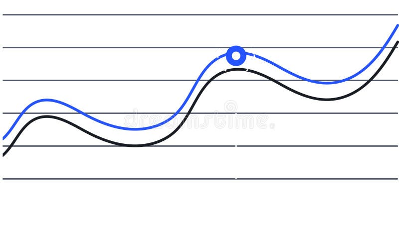
Free with trial Two lines are representing data progression over time, one blue and one black, creating a visual representation of trends and a key intersection point is marked with a blue circle. Sales decrease illustrations Two lines are representing data progression over time, one blue and one black, creating a visual representation of
Free with trial Reduction chart icon isolated on white background. Eps 10. Sales decrease vectors Reduction Chart Icon Set. Downward graph vector symbol in a black filled and outlined style. Decline Trend Sign. Reduction chart icon isolated on white background. Eps 10
Free with trial Reduction chart icon isolated on white background. Eps 10. Sales decrease vectors Reduction Chart Icon Set. Downward graph vector symbol in a black filled and outlined style. Decline Trend Sign. Reduction chart icon isolated on white background. Eps 10
Free with trial Two lines are representing data progression over time, one blue and one black, creating a visual representation of trends and a key intersection point is marked with a blue circle. Sales decrease vectors Two lines are representing data progression over time, one blue and one black, creating a visual representation of
Free with trial Two lines are representing increasing and declining trends over a grid background, symbolizing market analysis, financial performance, or business progress. Sales decrease illustrations Two lines are representing increasing and declining trends over a grid background, symbolizing market analysis
Free with trial Decreasing bar chart icon in generic style. Market crash sign symbol illustration. Sales decrease vectors Decreasing bar chart icon in generic style. Market crash sign symbol
Free with trial Decline Visualization Dark Blue Background, Vibrant Pink Zigzags, and Yellow Bars Shown as Decreasing ThreeDimensional Cubes with Arrows Indicating the Trend by SD. Sales decrease illustrations Decline Visualization Dark Blue Background, Vibrant Pink Zigzags, and Yellow Bars Shown as Decreasing ThreeDimensional Cubes with
Free with trial Decline Curve A Visual Representation of Increasing Trends Curving Downward and Overcoming Previous Bars Against a Dark Blue Background by SD. Sales decrease illustrations Decline Curve A Visual Representation of Increasing Trends Curving Downward and Overcoming Previous Bars Against a Dark Blue Backg
Free with trial Percentage symbol displayed on a wooden block represents discounts sales offers promotions finance interest rates savings investments returns growth market value profit margins gains losses and reduc. Sales decrease illustrations Percentage discount sale offer promotion finance interest rate savings investment return growth market value profit margin gain lo. Percentage symbol displayed on a wooden block represents discounts sales offers promotions finance interest rates savings investments returns growth market value profit margins gains losses and reduc
Free with trial In this 3D rendered image, a group of cartoon businessmen can be seen holding a downward red arrow on a white background. The image conveys the theme of teamwork in business decline, highlighting the challenges that businesses face in trying to maintain their success. The downward arrow represents a decrease in profits, sales or productivity, and the businessmen are working together to try and prevent further decline. This image can be used in various business contexts, such as in presentations, reports, or articles about teamwork, business challenges or economic downturns. Sales decrease illustrations Teamwork in Business Decline: Cartoon Businessmen Holding Downward Red Arrow on White Background - 3D Render. In this 3D rendered image, a group of cartoon businessmen can be seen holding a downward red arrow on a white background. The image conveys the theme of teamwork in business decline, highlighting the challenges that businesses face in trying to maintain their success. The downward arrow represents a decrease in profits, sales or productivity, and the businessmen are working together to try and prevent further decline. This image can be used in various business contexts, such as in presentations, reports, or articles about teamwork, business challenges or economic downturns.
Free with trial Colorful bar charts are presenting statistical trends and business performance data across different time periods. Possibly days of the week. Using a vibrant color scheme of blue. Purple. And orange. Sales decrease illustrations Colorful bar charts are presenting statistical trends and business performance data across different time periods
Free with trial Four colorful bar charts are displayed on a graph, representing trends, statistics, and timeline data, with a potential focus on business infographics elements. Sales decrease illustrations Four colorful bar charts are displayed on a graph, representing trends, statistics, and timeline data, with a potential
Free with trial Intersecting colorful lines trending up and down across a graph illustrate weekly progress from monday to sunday, capturing fluctuations in performance over time. Sales decrease illustrations Intersecting colorful lines trending up and down across a graph illustrate weekly progress from monday to sunday
Free with trial Man in blue shirt analyzing colorful bar chart, business performance review and data analysis,Generative AI. Sales decrease illustrations Man in blue shirt analyzing colorful bar chart, business performance review and data analysis
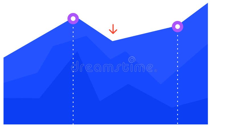
Free with trial Blue graph chart is visually representing growth, decline, and subsequent recovery, with two key points highlighted by purple circles and a red arrow indicating a temporary dip. Sales decrease vectors Blue graph chart is visually representing growth, decline, and subsequent recovery, with two key points highlighted by
Free with trial Blue graph chart is visually representing growth, decline, and subsequent recovery, with two key points highlighted by purple circles and a red arrow indicating a temporary dip. Sales decrease illustrations Blue graph chart is visually representing growth, decline, and subsequent recovery, with two key points highlighted by
Free with trial Red arrow going down stock icon on white background. Bankruptcy, financial market crash icon for your web site design, logo, app, UI. graph chart down trend symbol. chart going down sign. Sales decrease vectors Red arrow going down stock icon on white background. Bankruptcy, financial market crash icon for your web site design
Free with trial Vector illustration stacked coins and arrow trending down, decreasing statistical graphic concept. Sales decrease vectors Vector illustration stack coin arrow downup trend. vector illustration stacked coins and arrow trending down, decreasing statistical graphic concept
Free with trial Featuring four vibrant business charts illustrating increasing, decreasing, fluctuating, and peaking trends, perfect for enhancing presentations and reports with clear visual data analysis. Sales decrease vectors Featuring four vibrant business charts illustrating increasing, decreasing, fluctuating, and peaking trends, perfect for
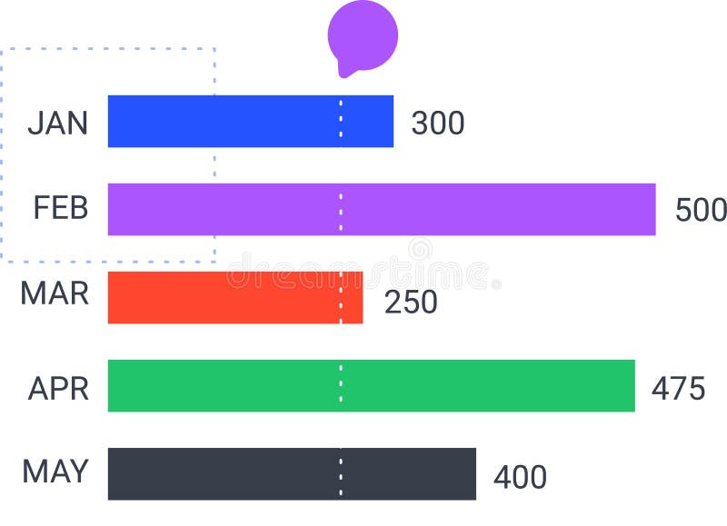
Free with trial Colorful horizontal bar chart is displaying monthly statistics from january to may, indicating trends and performance with a speech bubble above. Sales decrease vectors Colorful horizontal bar chart is displaying monthly statistics from january to may, indicating trends and performance
Free with trial Two colorful lines are representing data points over time, creating a visual representation of trends and fluctuations, with a highlighted period marked in red. Sales decrease vectors Two colorful lines are representing data points over time, creating a visual representation of trends and fluctuations
Free with trial Wood cube block with TSA, tax sheltered annuary text. Financial, Management, Economic. close up of wooden elements,Business Concept. 3D rendering on blue background. Sales decrease illustrations Wood cube block with TSA, tax sheltered annuary text. Financial, Management, Economic.
Free with trial Wood cube block with TSA, tax sheltered annuary text. Financial, Management, Economic. close up of wooden elements,Business Concept. 3D rendering on red background. Sales decrease illustrations Wood cube block with TSA, tax sheltered annuary text. Financial, Management, Economic.
Free with trial Wood cube block with TSA, tax sheltered annuary text. Financial, Management, Economic. close up of wooden elements,Business Concept. 3D rendering on black background. Sales decrease illustrations Wood cube block with TSA, tax sheltered annuary text. Financial, Management, Economic.
Free with trial Colorful horizontal bar chart is displaying monthly statistics from january to may, indicating trends and performance with a speech bubble above. Sales decrease vectors Colorful horizontal bar chart is displaying monthly statistics from january to may, indicating trends and performance
Free with trial Featuring four vibrant business charts illustrating increasing, decreasing, fluctuating, and peaking trends, perfect for enhancing presentations and reports with clear visual data analysis. Sales decrease illustrations Featuring four vibrant business charts illustrating increasing, decreasing, fluctuating, and peaking trends, perfect for
Free with trial Two colorful lines are representing data points over time, creating a visual representation of trends and fluctuations, with a highlighted period marked in red. Sales decrease illustrations Two colorful lines are representing data points over time, creating a visual representation of trends and fluctuations
Free with trial This sleek, minimalist linear bar graph is perfect for showcasing downward trends in your business data. Ideal for presentations, reports, and dashboards, this editable graphic allows you to easily customize stroke width and colors to match your brand. The clean design and simple layout make complex data easily digestible, highlighting key performance indicators and areas needing attention. Sales decrease illustrations Editable Linear Bar Graph Visualize Downward Trends for Powerful Business Analytics Reports and Presentations. This sleek, minimalist linear bar graph is perfect for showcasing downward trends in your business data. Ideal for presentations, reports, and dashboards, this editable graphic allows you to easily customize stroke width and colors to match your brand. The clean design and simple layout make complex data easily digestible, highlighting key performance indicators and areas needing attention.
Free with trial Red 3d arrow going down stock icon on white background. Bankruptcy, financial market crash icon for your web site design, logo, app, UI. graph chart downtrend symbol. chart going down sign. Sales decrease vectors Red 3d arrow going down stock icon on white background. Bankruptcy, financial market crash icon
Free with trial Close-up view of a graph with vibrant blue background. detailed analysis of data trends, insights, and patterns ,Generative AI. Sales decrease illustrations Detailed analysis, exploring data trends and patterns in vibrant blue graph. closeup view of business performance market insights. Close-up view of a graph with vibrant blue background. detailed analysis of data trends, insights, and patterns ,Generative AI
Free with trial Multicolored graph trending downward icon. Sales decrease illustrations Wfh140125. Multicolored graph trending downward icon
Free with trial Red 3d arrow going down stock icon on white background. Bankruptcy, financial market crash icon for your web site design, logo, app, UI. graph chart downtrend symbol. chart going down sign. Sales decrease vectors Red 3d arrow going down stock icon on white background. Bankruptcy, financial market crash icon for your web
Free with trial Reduction chart icon vector icon on white background. EPS10. Sales decrease vectors Reduction chartline in Thin line black color. flat simple vector symbols illustration. Reduction chart icon vector icon on white background. EPS10
Free with trial Reduction chart icon vector icon on white background. EPS10. Sales decrease vectors Reduction chartline in Thin line black color. flat simple vector symbols illustration. Reduction chart icon vector icon on white background. EPS10
Free with trial Reduction chart icon vector icon on white background. EPS10. Sales decrease vectors Reduction chartline in Thin line black color. flat simple vector symbols illustration. Reduction chart icon vector icon on white background. EPS10
Free with trial Reduction chart icon vector icon on white background. EPS10. Sales decrease vectors Reduction chartline in Thin line black color. flat simple vector symbols illustration. Reduction chart icon vector icon on white background. EPS10
Free with trial Reduction chart icon vector icon on white background. EPS10. Sales decrease vectors Reduction chartline in Thin line black color. flat simple vector symbols illustration. Reduction chart icon vector icon on white background. EPS10
Free with trial Reduction chart icon vector icon on white background. EPS10. Sales decrease vectors Reduction chartline in Thin line black color. flat simple vector symbols illustration. Reduction chart icon vector icon on white background. EPS10
Free with trial Reduction chart icon vector icon on white background. EPS10. Sales decrease vectors Reduction chartline in Thin line black color. flat simple vector symbols illustration. Reduction chart icon vector icon on white background. EPS10
Free with trial Reduction chart icon vector icon on white background. EPS10. Sales decrease vectors Reduction chartline in Thin line black color. flat simple vector symbols illustration. Reduction chart icon vector icon on white background. EPS10
Free with trial Reduction chart icon vector icon on white background. EPS10. Sales decrease vectors Reduction chartline in Thin line black color. flat simple vector symbols illustration. Reduction chart icon vector icon on white background. EPS10
Free with trial Reduction chart icon vector icon on white background. EPS10. Sales decrease vectors Reduction chartline in Thin line black color. flat simple vector symbols illustration. Reduction chart icon vector icon on white background. EPS10
Free with trial Goods boxes with dollar symbol and down arrow, indicating revenue drop Generative AI. Sales decrease illustrations Goods boxes with dollar symbol and down arrow, indicating revenue drop
Free with trial Goods boxes with dollar symbol and down arrow, indicating revenue drop Generative AI. Sales decrease illustrations Goods boxes with dollar symbol and down arrow, indicating revenue drop
Free with trial Reduction chart icon vector icon on white background. EPS10. Sales decrease vectors Reduction chartline in Thin line black color. flat simple vector symbols illustration. Reduction chart icon vector icon on white background. EPS10
Free with trial Reduction chart icon vector icon on white background. EPS10. Sales decrease vectors Reduction chartline in Thin line black color. flat simple vector symbols illustration. Reduction chart icon vector icon on white background. EPS10
Free with trial Reduction chart icon vector icon on white background. EPS10. Sales decrease vectors Reduction chartline in Thin line black color. flat simple vector symbols illustration. Reduction chart icon vector icon on white background. EPS10
Free with trial Professional monitoring business expenses. Woman at desk, assessing financial charts with declining trends and dollar signs. Cost management and reduction focus. Flat vector illustration. Sales decrease vectors Professional monitoring business expenses. Woman
Free with trial Economic downturn shown with large red arrow pointing down, financial decline and recession graph concept. Sales decrease illustrations Economic downturn shown with large red arrow pointing down
Free with trial Professional monitoring business expenses. Woman at desk, assessing financial charts with declining trends and dollar signs. Cost management and reduction focus. Flat vector illustration. Sales decrease vectors Professional monitoring business expenses. Woman at desk, assessing
Free with trial A man is writing in a notebook while looking at a graph. The graph shows a downward trend, which may indicate a decrease in sales or a negative outcome. Sales decrease illustrations A man is writing in a notebook while looking at a graph
Free with trial Bull Market, Bull or bullish run Bear or bearish market trend in stocks. Trade exchange, green up or red down arrows graph. Cryptocurrency price chart. Global economy crash or boom. Sales decrease vectors Bull Market
Free with trial Businessman analyzing declining graph, worried about financial loss. Office setting with a plant and documents. Corporate challenges vector illustration. Sales decrease vectors Businessman analyzing declining graph, worried about financial loss. Office setting with a plant and documents
Free with trial Reduction chart icon isolated on white background. Eps 10. Sales decrease vectors Reduction Chart Icon Set. Downward graph vector symbol in a black filled and outlined style. Decline Trend Sign. Reduction chart icon isolated on white background. Eps 10
Free with trial Reduction chart icon isolated on white background. Eps 10. Sales decrease vectors Reduction Chart Icon Set. Downward graph vector symbol in a black filled and outlined style. Decline Trend Sign. Reduction chart icon isolated on white background. Eps 10
Free with trial Reduction chart icon isolated on white background. Eps 10. Sales decrease vectors Reduction Chart Icon Set. Downward graph vector symbol in a black filled and outlined style. Decline Trend Sign. Reduction chart icon isolated on white background. Eps 10
Free with trial Graph chart going up and down sign arrows flat design vector illustration on white background. Sales decrease vectors Graph chart going up and down sign arrows flat design vector illustration
Free with trial This image shows a 3D bar graph, generated by AI, depicting a rise and subsequent fall in values. The red bars illustrate a peak, followed by a sharp decline, possibly representing a trend in data or market fluctuations. The visual is clean and easy to understand, highlighting the dramatic change i. Sales decrease illustrations Red 3D Bar Graph. This image shows a 3D bar graph, generated by AI, depicting a rise and subsequent fall in values. The red bars illustrate a peak, followed by a sharp decline, possibly representing a trend in data or market fluctuations. The visual is clean and easy to understand, highlighting the dramatic change i
Free with trial A vibrant 3D bar chart icon isolated on a clean white background. This minimalist data visualization features five colorful bars in a soft, pastel palette of yellow, pink, and purple, arranged in descending order. The clean, modern render is perfect for illustrating concepts like business statistics, financial reports, market analysis, and performance metrics. An ideal graphic element for presentations, infographics, websites, and educational materials, symbolizing data, comparison, and analytics in a visually appealing way. 3D illustration. Sales decrease illustrations 3D Colorful Bar Chart for Business and Data Analysis. A vibrant 3D bar chart icon isolated on a clean white background. This minimalist data visualization. A vibrant 3D bar chart icon isolated on a clean white background. This minimalist data visualization features five colorful bars in a soft, pastel palette of yellow, pink, and purple, arranged in descending order. The clean, modern render is perfect for illustrating concepts like business statistics, financial reports, market analysis, and performance metrics. An ideal graphic element for presentations, infographics, websites, and educational materials, symbolizing data, comparison, and analytics in a visually appealing way. 3D illustration.
Free with trial Growth layering revenue chart illustration profit income, forecast trends, metrics visualization growth layering revenue chart. Sales decrease illustrations Growth layering revenue chart
Free with trial Reduction chart icon isolated on white background. Eps 10. Sales decrease vectors Reduction Chart Icon Set. Downward graph vector symbol in a black filled and outlined style. Decline Trend Sign. Reduction chart icon isolated on white background. Eps 10
Free with trial Vector Illustration. Stock Price Fall. Arrow On Chart Pointing Down. Bear Head. Stock Market Concept. Sales decrease vectors Bear Market Icon Color. Vector Illustration. Stock Price Fall. Arrow On Chart Pointing Down. Bear Head. Stock Market Concept
Free with trial Analysis dissolving revenue chart illustration data trends, visualization metrics, performance financials analysis dissolving revenue chart. Sales decrease illustrations Analysis dissolving revenue chart
Free with trial Analyzing the business failure and decline. White magnifying glass analyzing a growth chart on a blue background, representing market analysis and business growth. 3D render. Sales decrease illustrations Magnifying glass analyzing growth chart on blue background. Analyzing the business failure and decline. White magnifying glass analyzing a growth chart on a blue background, representing market analysis and business growth. 3D render
Free with trial A 3D rendered illustration depicting business growth. The image showcases two upward-trending arrow charts, one in gold and the other in blue, representing positive trends, progress, and success. The charts are set against a clean, light background, emphasizing the upward movement and potential for financial gain. Suitable for illustrating economic growth, investment strategies, and business performance. Sales decrease illustrations Growth Chart with Arrows. A 3D rendered illustration depicting business growth. The image showcases two upward-trending arrow charts, one in gold and the other in blue, representing positive trends, progress, and success. The charts are set against a clean, light background, emphasizing the upward movement and potential for financial gain. Suitable for illustrating economic growth, investment strategies, and business performance.
Free with trial Chdissolve dissolving revenue chart illustration analysis data, trends visualization, metrics performance chdissolve dissolving revenue chart. Sales decrease illustrations Chdissolve dissolving revenue chart
Free with trial Red downward arrow graph isolated on transparent background. Sales decrease illustrations Red downward arrow graph
Free with trial Illustration of a cashier explaining to a customer about the price of a product that may increase or decrease, to help the customer understand better. Sales decrease vectors Flat illustration of a cashier explaining to a customer. Illustration of a cashier explaining to a customer about the price of a product that may increase or decrease, to help the customer understand better
Free with trial Graph Down glyph vector icon isolated. Graph Down stock vector icon for web, mobile app and ui design. Sales decrease vectors Graph Down glyph vector icon
Free with trial A simple illustration depicting flat business growth. A horizontal arrow points to the right, indicating stagnation or no significant increase. The chart is clean and minimalist, suitable for presentations, reports, and articles discussing economic challenges or business performance. The image can be used to represent a lack of progress, a plateau in growth, or a need for strategic change. Sales decrease illustrations Flat Business Growth Chart. A simple illustration depicting flat business growth. A horizontal arrow points to the right, indicating stagnation or no significant increase. The chart is clean and minimalist, suitable for presentations, reports, and articles discussing economic challenges or business performance. The image can be used to represent a lack of progress, a plateau in growth, or a need for strategic change.
Free with trial A simple graphic illustration of a bar chart. The chart features four bars of varying heights, indicating growth or progress. The design is clean and minimalist, making it suitable for a wide range of applications such as presentations, reports, and infographics. The black bars stand out against the white background, providing a clear visual representation of data. Sales decrease illustrations Bar Chart Icon. A simple graphic illustration of a bar chart. The chart features four bars of varying heights, indicating growth or progress. The design is clean and minimalist, making it suitable for a wide range of applications such as presentations, reports, and infographics. The black bars stand out against the white background, providing a clear visual representation of data.
Free with trial Three orange bar graphs illustrating different data patterns increasing, decreasing, and varied. Ideal for presentations or data visualization. Simple and visually appealing design. Sales decrease illustrations Orange Bar Graph Variations. Three orange bar graphs illustrating different data patterns increasing, decreasing, and varied. Ideal for presentations or data visualization. Simple and visually appealing design.
Free with trial Chart down on a background of cars. A symbol of the crisis in the automotive industry. Sales decrease illustrations Chart down on a background of cars. A symbol of the crisis in the automotive industry
Free with trial Chart down on a background of cars. A symbol of the crisis in the automotive industry. Sales decrease illustrations Chart down on a background of cars. A symbol of the crisis in the automotive industry
Free with trial A collection of hand-drawn, black and white icons representing growth, decline, and financial concepts. The set includes upward and downward arrows, percentage symbols, and a bar graph illustrating trends. The simple line art style makes these icons versatile for various applications, including presentations, infographics, and website design. They convey concepts of progress, success, loss, and market fluctuations. Sales decrease illustrations Growth and Decline Icons Set. A collection of hand-drawn, black and white icons representing growth, decline, and financial concepts. The set includes upward and downward arrows, percentage symbols, and a bar graph illustrating trends. The simple line art style makes these icons versatile for various applications, including presentations, infographics, and website design. They convey concepts of progress, success, loss, and market fluctuations.
Free with trial This image showcases a colorful bar graph with a downward-pointing arrow, generated by AI, illustrating a negative trend or decline. The vibrant colors and simplistic design make the message clear and easily understood. The image is perfect for representing economic downturns, market dips, or any s. Sales decrease illustrations Downward Trend Visualization. This image showcases a colorful bar graph with a downward-pointing arrow, generated by AI, illustrating a negative trend or decline. The vibrant colors and simplistic design make the message clear and easily understood. The image is perfect for representing economic downturns, market dips, or any s
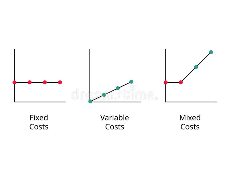
Free with trial Graph of Fixed cost, variable costs, mixed cost to compare vector. Sales decrease vectors Graph of Fixed cost, variable costs, mixed cost to compare
Free with trial Bar graphs data illustration company year, color performance, categories trend bar graphs data. Sales decrease illustrations Bar graphs data
Free with trial A red price tag prominently displaying a "50% off" discount, representing sales, special offers, and significant price reductions for shopping and promotions. Sales decrease illustrations Bold red fifty percent off tag. A red price tag prominently displaying a "50% off" discount, representing sales, special offers, and significant price reductions for shopping and promotions