Free with trial PhotoStock Boxes and container with red down arrow, decrease in industrial production Generative AI. Trend decrease illustrations PhotoStock Boxes and container with red down arrow, decrease in industrial production
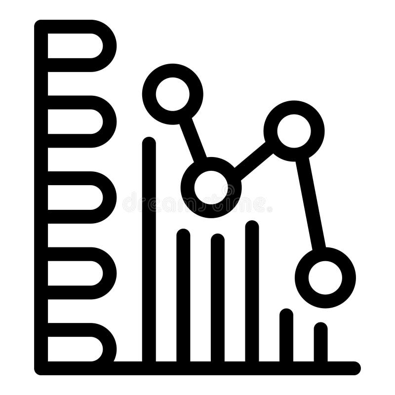
Free with trial A simple and modern black silhouette icon of a business graph, isolated on a white background. This flat vector illustration combines a bar chart with an overlaid line graph, showing a fluctuating trend with a general decline. The graphic symbolizes concepts such as data analysis, financial reporting, market statistics, economic downturn, and business performance metrics. It's an ideal visual element for presentations, infographics, websites, and applications related to finance, economics, and analytics, representing concepts of decrease, loss, or market volatility. Trend decrease vectors Business Data Analytics Chart Icon. A simple and modern black silhouette icon of a business graph, isolated on a white background. This flat vector illustration combines a bar chart with an overlaid line graph, showing a fluctuating trend with a general decline. The graphic symbolizes concepts such as data analysis, financial reporting, market statistics, economic downturn, and business performance metrics. It's an ideal visual element for presentations, infographics, websites, and applications related to finance, economics, and analytics, representing concepts of decrease, loss, or market volatility.
Free with trial A speed arrow pointing down, isolated on a white background, representing a decrease in speed, performance, or quantity. Trend decrease illustrations Speed Arrow Down Isolated on White Background - Symbol of Decrease. A speed arrow pointing down, isolated on a white background, representing a decrease in speed, performance, or quantity.
Free with trial Falling red arrow financial crisis economic recession graph coins stacks world map grid background downward trend Vector illustration. Trend decrease vectors Falling red arrow financial crisis economic recession graph coins stacks world map grid background downward trend
Free with trial Falling red arrow financial crisis economic recession graph coins stacks world map grid background downward trend Vector illustration. Trend decrease vectors Falling red arrow financial crisis economic recession graph coins stacks world map grid background downward trend
Free with trial Bear Market, bearish market trend in stocks. Trade exchange background, down arrow graph for decrease in rates. Global economy crash. Trend decrease vectors Bear Market
Free with trial A simple line chart illustrates a decreasing trend with distinct dot markers representing data points. The design emphasizes the shift in values over time and aids in visualizing performance. Trend decrease vectors Chart Displaying a Downward Trend in Data Analysis. A simple line chart illustrates a decreasing trend with distinct dot markers representing data points. The design emphasizes the shift in values over time and aids in visualizing performance.
Free with trial Generative AI, This 3D rendered image depicts a concept of financial decline, showcasing a descending trend of stacked gold coins against a blue background. The image features multiple stacks of gold coins, decreasing in height from left to right, symbolizing a decline in value or profit. A gold arrow graph follows the descending trend, visually representing the downward trajectory. The blue background with a. Trend decrease illustrations Financial decline concept - gold coins stacked in a descending trend with a falling arrow graph on blue background. Generative AI, This 3D rendered image depicts a concept of financial decline, showcasing a descending trend of stacked gold coins against a blue background. The image features multiple stacks of gold coins, decreasing in height from left to right, symbolizing a decline in value or profit. A gold arrow graph follows the descending trend, visually representing the downward trajectory. The blue background with a
Free with trial Illustration of a red downward trend arrow with falling money on a dark red background. Concept of financial loss and stock market decline. 3D Rendering. Trend decrease illustrations Downward trend with falling money illustration. 3D Rendering. Illustration of a red downward trend arrow with falling money on a dark red background. Concept of financial loss and stock market decline. 3D Rendering
Free with trial Neon sign depicts a downward-sloping line graph with a descending arrow, symbolizing a decrease or loss. The graph is outlined in bright white and orange neon against a black background, creating a stark, eye-catching contrast. The zigzag line moves downward from left to right, suggesting a trend of decline. Trend decrease illustrations Neon graph arrow going down showing decrease and loss. Neon sign depicts a downward-sloping line graph with a descending arrow, symbolizing a decrease or loss. The graph is outlined in bright white and orange neon against a black background, creating a stark, eye-catching contrast. The zigzag line moves downward from left to right, suggesting a trend of decline.
Free with trial Trend red down arrow illustration negative direction, bold photo, wall painted trend red down arrow. Trend decrease illustrations Trend red down arrow
Free with trial Red downward trend graph with white falling blocks and coins on a dark red background. Concept of financial loss. 3D Rendering. Trend decrease illustrations Red downward trend graph with falling blocks and coins. 3D Rendering. Red downward trend graph with white falling blocks and coins on a dark red background. Concept of financial loss. 3D Rendering
Free with trial Woman think about stock down trend. Stock market crash, crypto price fall, loss money from financial crisis or wrong speculation of trading concept. Flat vector illustration isolated on white background. Trend decrease vectors Woman think about stock down trend. Stock market crash, crypto price fall, loss money from financial crisis or wrong speculation
Free with trial Blue upward arrow and red downward arrow on a light gray background. Both arrows are three-dimensional with a smooth, glossy texture. The blue arrow points upwards, indicating an increase or upward trend, while the red arrow points downwards, suggesting a decrease or downward trend. The background is minimalistic, providing a clear contrast to the colored arrows. The image conveys concepts such as growth and decline or positive and negative directions. Trend decrease illustrations Blue upward arrow and red downward arrow on a light gray background. Both
Free with trial Trend stretching line chart illustration axis graph, scale plot, point x trend stretching line chart. Trend decrease illustrations Trend stretching line chart
Free with trial Three red percentage symbols are shown with arrows pointing downward, representing a decline. Each symbol is positioned above words: "Economy," "Growth," and "Stocks," indicating a decrease in these areas. The arrows are bold and the symbols feature a glossy finish, emphasizing the visual concept of reduction or negative trend. The overall design highlights financial or economic themes. Trend decrease illustrations Three red percentage symbols are shown with arrows pointing downward
Free with trial Tree illustration with bar graph displaying decrease in carbon emissions from wood pellets, Generated by AI. Trend decrease illustrations Tree illustration with bar graph displaying decrease in carbon emissions from wood pellets
Free with trial A dynamic 3D illustration of a glossy red arrow pointing downwards in a jagged, volatile path. Isolated on a white background, this graphic icon is a powerful symbol for negative concepts. It represents decline, decrease, failure, loss, and crisis. This visual is perfect for illustrating stock market crashes, economic recession, financial downturns, poor business performance, or any downward trend in data and statistics. An ideal element for reports, presentations, and financial news, with ample copy space. Trend decrease illustrations Red Jagged Arrow of Decline - Financial Crisis Concept. A dynamic 3D illustration of a glossy red arrow pointing downwards in a jagged, volatile path. Isolated. A dynamic 3D illustration of a glossy red arrow pointing downwards in a jagged, volatile path. Isolated on a white background, this graphic icon is a powerful symbol for negative concepts. It represents decline, decrease, failure, loss, and crisis. This visual is perfect for illustrating stock market crashes, economic recession, financial downturns, poor business performance, or any downward trend in data and statistics. An ideal element for reports, presentations, and financial news, with ample copy space.
Free with trial Red downward trend in digital abstract futuristic tech background. Generative AI. Trend decrease illustrations Red downward trend in digital abstract futuristic tech background
Free with trial Red downward trend in digital abstract futuristic tech background. Generative AI. Trend decrease illustrations Red downward trend in digital abstract futuristic tech background
Free with trial Red trend arrow dropping digital tech abstract futuristic backdrop. Generative AI. Trend decrease illustrations Red trend arrow dropping digital tech abstract futuristic backdrop
Free with trial Red trend arrow dropping digital tech abstract futuristic backdrop. Generative AI. Trend decrease illustrations Red trend arrow dropping digital tech abstract futuristic backdrop
Free with trial A person is analyzing a bar graph with a downward trend line, indicating a decrease in stock value. Vector art design using ai tool. Trend decrease vectors Sell Stock Graph Illustration. A person is analyzing a bar graph with a downward trend line, indicating a decrease in stock value. Vector art design using ai tool.
Free with trial Financial chart illustrating stock price trends with candlestick patterns. Vertical and horizontal axes display price and time, respectively. A prominent green upward arrow indicates profit, while a red 'Put tag suggests a potential decrease. Blue and red candlestick bars detail price movements. Curved lines highlight trend directions. Labels like Profit add contextual information. The overall theme suggests a focus on cryptocurrency or stock market analysis. Trend decrease illustrations Option Trading Chart AI generated. Financial chart illustrating stock price trends with candlestick patterns. Vertical and horizontal axes display price and time, respectively. A prominent green upward arrow indicates profit, while a red 'Put tag suggests a potential decrease. Blue and red candlestick bars detail price movements. Curved lines highlight trend directions. Labels like Profit add contextual information. The overall theme suggests a focus on cryptocurrency or stock market analysis.
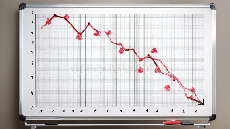
Free with trial A whiteboard displays a hand-drawn graph depicting a significant downward trend, marked by red triangles indicating decreasing values. This visual representation of a negative trend was generated by AI for illustrative purposes, possibly showcasing market decline or economic downturn. Trend decrease illustrations Downward Trend Graph. A whiteboard displays a hand-drawn graph depicting a significant downward trend, marked by red triangles indicating decreasing values. This visual representation of a negative trend was generated by AI for illustrative purposes, possibly showcasing market decline or economic downturn.
Free with trial A blue line chart illustrates a downward trend, suggesting decline and loss and can be used to show financial or business performance. Trend decrease illustrations Downward Trend Chart. A blue line chart illustrates a downward trend, suggesting decline and loss and can be used to show financial or business performance
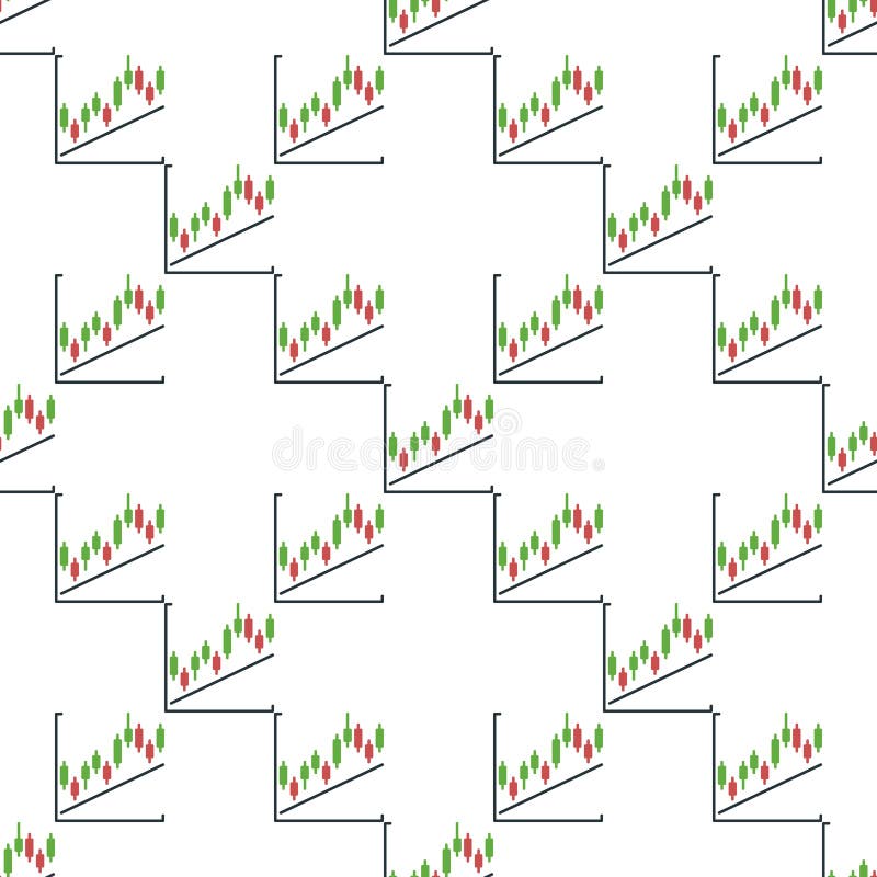
Free with trial Trend and Candlestick Chart vector Crypto Investment concept icon or symbol. Trend decrease vectors Trend and Candlestick Chart vector Crypto Investment icon or symbol
Free with trial This image features two variations of a graph icon showing a downward trend. One is a simple outline, while the other is a solid black silhouette. Both depict a graph with a sharp decline, represented by a line with a downward-pointing arrow. The icons are suitable for illustrating concepts like financial loss, economic downturn, negative growth, or any situation involving a decrease in value or performance. Trend decrease illustrations Declining Graph Icon Set. This image features two variations of a graph icon showing a downward trend. One is a simple outline, while the other is a solid black silhouette. Both depict a graph with a sharp decline, represented by a line with a downward-pointing arrow. The icons are suitable for illustrating concepts like financial loss, economic downturn, negative growth, or any situation involving a decrease in value or performance.
Free with trial A three-dimensional green arrow pointing diagonally downward with a percentage sign ("%") embossed on its surface. The arrow has smooth edges and a glossy finish, suggesting a decrease or downward trend, possibly in a financial or statistical context. The bright green color emphasizes a sense of activity or alertness. The background is plain white, drawing all attention to the arrow and its symbolic significance. Trend decrease illustrations A three-dimensional green arrow pointing diagonally downward with a percentag
Free with trial A simple, flat design icon depicting a downward trend. The image features a red graph line descending from the top left to the bottom right, with an arrow indicating the direction. The graph is set against a clean white background, emphasizing the visual impact of the trend. This graphic is suitable for illustrating concepts such as financial decline, decreasing sales, or negative performance in business, economics, or data analysis. Trend decrease vectors Downward Trend Graph Icon. A simple, flat design icon depicting a downward trend. The image features a red graph line descending from the top left to the bottom right, with an arrow indicating the direction. The graph is set against a clean white background, emphasizing the visual impact of the trend. This graphic is suitable for illustrating concepts such as financial decline, decreasing sales, or negative performance in business, economics, or data analysis.
Free with trial A red J is on a table with a graph behind it. The graph shows a downward trend, which could represent a decrease in value or a negative outcome. The red J could symbolize a warning or a call to action. Trend decrease illustrations A red J is on a table with a graph behind it
Free with trial This image depicts a downward trending arrow formed by a series of red dots against a bright blue sky with fluffy white clouds. The trajectory is clearly negative, visually representing a decline or decrease. This graphic was generated by AI, offering a simple yet effective visual representation of. Trend decrease illustrations AI Generated Downward Trend. This image depicts a downward trending arrow formed by a series of red dots against a bright blue sky with fluffy white clouds. The trajectory is clearly negative, visually representing a decline or decrease. This graphic was generated by AI, offering a simple yet effective visual representation of
Free with trial Trend and Candlestick Chart vector Crypto Investment concept seamless pattern. Trend decrease vectors Trend and Candlestick Chart vector Crypto Investment seamless pattern
Free with trial An abstract financial chart with a downward trend in blue, representing market decline, economic downturn, and potential investment risks in the stock market. Trend decrease illustrations Abstract financial chart with downward trend in blue. An abstract financial chart with a downward trend in blue, representing market decline, economic downturn, and potential investment risks in the stock market
Free with trial Oil gas refinery or petrochemical plant. Include arrow, graph or bar chart. Decrease trend or low of production, market price, demand, supply. Concept of business, industry, fuel, power energy. Trend decrease illustrations Oil gas refinery or petrochemical plant with concept of business. Oil gas refinery or petrochemical plant. Include arrow, graph or bar chart. Decrease trend or low of production, market price, demand, supply. Concept of business, industry, fuel, power energy
Free with trial A line graph with a decreasing trend is commonly used to depict scenarios like declining sales, decreasing stock prices, or any situation where a decrease in values over time or across categories is a significant aspect of the data. It provides a clear and intuitive way to understand trends and make informed interpretations about the decreasing values being represented. Trend decrease illustrations Chart with decreasing line graph. A line graph with a decreasing trend is commonly used to depict scenarios like declining sales, decreasing stock prices, or any situation where a decrease in values over time or across categories is a significant aspect of the data. It provides a clear and intuitive way to understand trends and make informed interpretations about the decreasing values being represented.
Free with trial This image showcases a colorful bar graph with a downward-pointing arrow, generated by AI, illustrating a negative trend or decline. The vibrant colors and simplistic design make the message clear and easily understood. The image is perfect for representing economic downturns, market dips, or any s. Trend decrease illustrations Downward Trend Visualization. This image showcases a colorful bar graph with a downward-pointing arrow, generated by AI, illustrating a negative trend or decline. The vibrant colors and simplistic design make the message clear and easily understood. The image is perfect for representing economic downturns, market dips, or any s
Free with trial The image shows a neon-style graph illustrating a business downturn. the graph features an orange line depicting a downward trend, punctuated by blue vertical lines that may represent key milestones or events. the background is dark, emphasizing the neon glow of the graph elements. the graph suggests a decline in business performance, with the orange line representing a decrease in value or profit over time. Trend decrease illustrations Business downturn neon chart illustration. the image shows a neon-style graph illustrating a business downturn. the graph features an orange line depicting a downward trend, punctuated by blue vertical lines that may represent key milestones or events. the background is dark, emphasizing the neon glow of the graph elements. the graph suggests a decline in business performance, with the orange line representing a decrease in value or profit over time.
Free with trial A simple line graph illustration showing fluctuations and an upward trend. The graph is drawn on a grid with a black line and red data points, indicating a period of increase, followed by a decrease, and then a final increase. This image can be used to represent business trends, financial analysis, stock market data, or any data that shows changes over time. Trend decrease vectors Line Graph with Fluctuations. A simple line graph illustration showing fluctuations and an upward trend. The graph is drawn on a grid with a black line and red data points, indicating a period of increase, followed by a decrease, and then a final increase. This image can be used to represent business trends, financial analysis, stock market data, or any data that shows changes over time.
Free with trial This image shows a 3D rendering of a red line graph sharply declining, resting on a white cube. The graphic is generated by AI, and visually represents a negative trend or downturn, suitable for presentations or reports on market analysis, economic forecasts, or business performance. Trend decrease illustrations Declining Trend Visualization. This image shows a 3D rendering of a red line graph sharply declining, resting on a white cube. The graphic is generated by AI, and visually represents a negative trend or downturn, suitable for presentations or reports on market analysis, economic forecasts, or business performance.
Free with trial Data disintegrating line graph illustration trend dec, decrease fall, analysis visualization data disintegrating line graph. Trend decrease illustrations Data disintegrating line graph
Free with trial Red 3D arrow descends on deep blue background, indicating downward trend prominently Generative AI. Trend decrease illustrations Red 3D arrow descends on deep blue background, indicating downward trend prominently
Free with trial Red 3D arrow descends on deep blue background, indicating downward trend prominently Generative AI. Trend decrease illustrations Red 3D arrow descends on deep blue background, indicating downward trend prominently
Free with trial Red 3D arrow descends on deep blue background, indicating downward trend prominently Generative AI. Trend decrease illustrations Red 3D arrow descends on deep blue background, indicating downward trend prominently
Free with trial Red 3D arrow descends on deep blue background, indicating downward trend prominently Generative AI. Trend decrease illustrations Red 3D arrow descends on deep blue background, indicating downward trend prominently
Free with trial A clean, minimalist 3D render of a blue bar chart with a blue trend line connecting circular data points. The bars vary in height, illustrating growth and fluctuations. The background is a bright, clean white, emphasizing the chart's elements. This graphic is ideal for representing financial data, business growth, market trends, statistics, and performance analysis in a modern and professional style. Trend decrease illustrations 3D Blue Bar Chart with Trend Line. A clean, minimalist 3D render of a blue bar chart with a blue trend line connecting circular data points. The bars vary in height, illustrating growth and fluctuations. The background is a bright, clean white, emphasizing the chart's elements. This graphic is ideal for representing financial data, business growth, market trends, statistics, and performance analysis in a modern and professional style.
Free with trial This image depicts a white pillar with a red downward trending arrow, generated by AI. It symbolizes economic decline, market instability, or a negative trend in a specific industry. The clean, minimalist style emphasizes the severity of the drop. Trend decrease illustrations Falling Market Trend. This image depicts a white pillar with a red downward trending arrow, generated by AI. It symbolizes economic decline, market instability, or a negative trend in a specific industry. The clean, minimalist style emphasizes the severity of the drop.
Free with trial A bold, 3D blue arrow gracefully curves downward, visually representing a shift in direction, decline, or changing trend. Perfect for financial reports, data analysis, or conceptual graphics. Trend decrease vectors Dynamic blue arrow curves downward signaling a trend change. A bold, 3D blue arrow gracefully curves downward, visually representing a shift in direction, decline, or changing trend. Perfect for financial reports, data analysis, or conceptual graphics
Free with trial A stock chart illustrates a bearish trend with red and green candlesticks against a dark blue background, used for financial analysis. Trend decrease illustrations Stock Chart Showing Downward Trend. A stock chart illustrates a bearish trend with red and green candlesticks against a dark blue background, used for financial analysis
Free with trial Downward trend arrow and percentage symbol isolated on a white background, representing financial or economic decline. 3D Rendering. Trend decrease illustrations Downward trend arrow and percentage symbol on a white background. 3D Rendering. Downward trend arrow and percentage symbol isolated on a white background, representing financial or economic decline. 3D Rendering
Free with trial A captivating image featuring a descending bar graph composed of miniature candy canes against a bokeh background of twinkling Christmas lights and miniature snow-covered evergreen trees. The candy canes, in classic red and white stripes, visually represent a declining trend or decrease. The scene evokes a festive yet subtly concerning mood, ideal for illustrating concepts related to holiday. Trend decrease illustrations Christmas Candy Cane Graph Decline. A captivating image featuring a descending bar graph composed of miniature candy canes against a bokeh background of twinkling Christmas lights and miniature snow-covered evergreen trees. The candy canes, in classic red and white stripes, visually represent a declining trend or decrease. The scene evokes a festive yet subtly concerning mood, ideal for illustrating concepts related to holiday
Free with trial A bold, red, downward-pointing arrow graphic on a clean white background. This simple yet impactful visual represents decline, decrease, or negative trends. The design is clean and modern, making it suitable for various applications. It can be used to illustrate financial losses, falling sales, or any downward movement or negative trend. The image is versatile and can be used in presentations, reports, websites, and infographics. Trend decrease vectors Red Downward Arrow Icon on White Background. A bold, red, downward-pointing arrow graphic on a clean white background. This simple yet impactful visual represents decline, decrease, or negative trends. The design is clean and modern, making it suitable for various applications. It can be used to illustrate financial losses, falling sales, or any downward movement or negative trend. The image is versatile and can be used in presentations, reports, websites, and infographics.
Free with trial Trend Line and Candlestick Chart vector Crypto Trading concept colored seamless pattern. Trend decrease vectors Trend Line and Candlestick Chart vector Crypto Trading colored seamless pattern
Free with trial This image showcases a downward trending graph, generated by AI, represented by a red arrow descending within a transparent glass structure. The visual effectively communicates decline or negative growth. The clean, minimalist design enhances the impact of the falling trend. Trend decrease illustrations Decreasing Trend: AI-Generated Graph. This image showcases a downward trending graph, generated by AI, represented by a red arrow descending within a transparent glass structure. The visual effectively communicates decline or negative growth. The clean, minimalist design enhances the impact of the falling trend.
Free with trial A 3D rendered, vibrant red arrow pointing downwards and to the right, isolated on a transparent background. The arrow has a modern, sleek design. It can be used to represent concepts like decrease, decline, direction, navigation, or a downward trend. The clean background makes it easy to integrate into various designs and projects. Trend decrease illustrations Red Arrow Pointing Down
Free with trial Line graph is representing market trend with data points. Trend decrease vectors Line graph showing market trend with data points. Line graph is representing market trend with data points
Free with trial This image shows a whiteboard displaying a bar graph with a downward trend, generated by AI. The graph illustrates a clear decline in performance over time, potentially indicating financial losses or market setbacks. The simple, clean presentation highlights the severity of the decrease. Trend decrease illustrations Declining Business Graph. This image shows a whiteboard displaying a bar graph with a downward trend, generated by AI. The graph illustrates a clear decline in performance over time, potentially indicating financial losses or market setbacks. The simple, clean presentation highlights the severity of the decrease.
Free with trial A dynamic vector icon of a curved arrow pointing down and to the right. This graphic is useful for indicating direction, showing a decrease or downward trend, or as a navigational element in user interfaces. vector design Generative AI. Trend decrease vectors Curved Arrow Pointing Downward Vector Icon, vector design Generative AI. A dynamic vector icon of a curved arrow pointing down and to the right. This graphic is useful for indicating direction, showing a decrease or downward trend, or as a navigational element in user interfaces. vector design Generative AI
Free with trial Color megaphone icon with word decrease in white banner on blue background. Trend decrease vectors Color megaphone with word decrease in white banner on blue background
Free with trial The image depicts a red arrow graph with a blue glow, indicating a downward trend. it is set against a dark gray, textured wall illuminated by a spotlight from above, creating a dramatic effect. the arrow starts high on the left and descends sharply towards the bottom right, suggesting a significant decline in performance, such as in business or finance. the floor is a smooth, dark surface that reflects the light, adding depth to the scene. Trend decrease illustrations Red arrow graph showing downward trend. the image depicts a red arrow graph with a blue glow, indicating a downward trend. it is set against a dark gray, textured wall illuminated by a spotlight from above, creating a dramatic effect. the arrow starts high on the left and descends sharply towards the bottom right, suggesting a significant decline in performance, such as in business or finance. the floor is a smooth, dark surface that reflects the light, adding depth to the scene.
Free with trial Long, three dimensional arrow pointing downwards, symbolizing a decrease or decline. Trend decrease illustrations Isometric arrow pointing down representing decrease. Long, three dimensional arrow pointing downwards, symbolizing a decrease or decline
Free with trial Decrease glowing style sales graph split illustration profit revenue, analysis forecast, growth decline decrease glowing style sales graph split. Trend decrease illustrations Decrease glowing style sales graph split
Free with trial A candlestick chart showing a significant downward trend. The chart features black candlesticks indicating price fluctuations over time, with red, green, and orange lines tracing different moving averages. A bar graph at the bottom provides additional data. This image can be used to represent financial loss, market downturns, or economic recession. Trend decrease illustrations Downward Trend Candlestick Chart. A candlestick chart showing a significant downward trend. The chart features black candlesticks indicating price fluctuations over time, with red, green, and orange lines tracing different moving averages. A bar graph at the bottom provides additional data. This image can be used to represent financial loss, market downturns, or economic recession.
Free with trial Trend Line and Candlestick Chart vector Crypto Trading concept colored icon or design element. Trend decrease vectors Trend Line and Candlestick Chart vector Crypto Trading colored icon or design element
Free with trial Downward Trend Financial Graph Illustration. Trend decrease vectors Downward Trend Financial Graph Illustration
Free with trial 3D icon featuring a golden bear and a descending red arrow above blue bars, symbolizing a bearish trend in financial markets. Trend decrease vectors Bear Market Graph with Downward Trend 3D Icon. 3D icon featuring a golden bear and a descending red arrow above blue bars, symbolizing a bearish trend in financial markets
Free with trial A whiteboard displays a hand-drawn graph showing a significant downward trend. The graph illustrates a sharp decline, suggesting a negative market trend or economic downturn. Red markers and erasers are visible at the bottom. Trend decrease illustrations Downward Trend on Whiteboard. A whiteboard displays a hand-drawn graph showing a significant downward trend. The graph illustrates a sharp decline, suggesting a negative market trend or economic downturn. Red markers and erasers are visible at the bottom.
Free with trial Colourful decrease arrow chart icon template. Business icon. Trend decrease vectors Colourful decrease arrow chart icon template
Free with trial A vector icon depicting a line chart with a downward trend. Represents decline, decrease, negative trend, or falling statistics. Useful for finance apps, business reports, stock market monitoring, or visualizing negative data changes, vector design Generative AI. Trend decrease vectors Decreasing Line Chart Icon Vector Illustration, vector design Generative AI. A vector icon depicting a line chart with a downward trend. Represents decline, decrease, negative trend, or falling statistics. Useful for finance apps, business reports, stock market monitoring, or visualizing negative data changes, vector design Generative AI
Free with trial Stacks of coins decrease in height alongside a red arrow pointing downwards, illustrating financial loss or market downturn, for use in business or economic content. Trend decrease illustrations Coin Decrease with Red Arrow Showing Loss. Stacks of coins decrease in height alongside a red arrow pointing downwards, illustrating financial loss or market downturn, for use in business or economic content
Free with trial This image shows a whiteboard displaying a graph with a downward trending red line, generated by AI. The visual clearly represents a negative trend or decline in a certain metric. The use of a whiteboard suggests a presentation or meeting context. Trend decrease illustrations Declining Trend on Whiteboard. This image shows a whiteboard displaying a graph with a downward trending red line, generated by AI. The visual clearly represents a negative trend or decline in a certain metric. The use of a whiteboard suggests a presentation or meeting context.
Free with trial Line graph is representing a market trend with decreasing values. Trend decrease vectors Line graph showing market trend with decreasing values. Line graph is representing a market trend with decreasing values
Free with trial Abstract financial graph with a candlestick chart and a large downward arrow on a dark background with a world map. This image represents a stock market crash, bearish trend, and global economic crisis. The red and blue candles illustrate market volatility and a significant price drop. It's a powerful visual concept for topics like financial recession, investment risk, economic downturn, and business failure. Ideal for financial news, reports, presentations, and web design related to finance, trading, and the global economy. Trend decrease illustrations Global Stock Market Crash and Bearish Trend. Abstract financial graph with a candlestick chart and a large downward arrow on a dark background with a world map. This image represents a stock market crash, bearish trend, and global economic crisis. The red and blue candles illustrate market volatility and a significant price drop. It's a powerful visual concept for topics like financial recession, investment risk, economic downturn, and business failure. Ideal for financial news, reports, presentations, and web design related to finance, trading, and the global economy.
Free with trial This 3D rendered image shows a red arrow pointing downwards, illustrating a negative trend. The graphic, generated by AI, is a visual representation of declining values or a market downturn, perfect for illustrating economic reports or presentations. Trend decrease illustrations Red Downward Trend. This 3D rendered image shows a red arrow pointing downwards, illustrating a negative trend. The graphic, generated by AI, is a visual representation of declining values or a market downturn, perfect for illustrating economic reports or presentations.
Free with trial This minimalist vector illustration features two identical line graphs, presented in contrasting black and white themes. The left graph displays a black line on a white background, while the right shows a white line on a black background. Both graphs depict a clear downward trend with jagged fluctuations, symbolizing decline, loss, or negative growth over time. This versatile icon set is ideal for illustrating concepts such as economic downturns, financial losses, market crashes, business failures, or any data showing a significant decrease. Perfect for presentations, reports, infographics, and web design. Trend decrease vectors Declining Line Graph Icon Set - Black and White. This minimalist vector illustration features two identical line graphs, presented in contrasting black and white themes. The left graph displays a black line on a white background, while the right shows a white line on a black background. Both graphs depict a clear downward trend with jagged fluctuations, symbolizing decline, loss, or negative growth over time. This versatile icon set is ideal for illustrating concepts such as economic downturns, financial losses, market crashes, business failures, or any data showing a significant decrease. Perfect for presentations, reports, infographics, and web design.
Free with trial Four red and blue arrows are pointing down, illustrating a negative trend. Trend decrease vectors Red and blue arrows pointing down showing negative trend. Four red and blue arrows are pointing down, illustrating a negative trend
Free with trial A simple and bold black curved arrow icon, isolated on a clean white background. This minimalist graphic element points downwards and to the right, symbolizing direction, movement, and flow. It can represent concepts such as decline, decrease, or a downward trend in business charts and infographics. This versatile vector-style illustration is perfect for use as a pointer, a navigation symbol in web design and user interfaces, or to guide attention in presentations and documents. The high contrast and clean design make it easy to integrate into any project. Trend decrease vectors Curved Black Arrow Pointing Down and Right Icon. A simple and bold black curved arrow icon, isolated on a clean white background. This minimalist graphic element points downwards and to the right, symbolizing direction, movement, and flow. It can represent concepts such as decline, decrease, or a downward trend in business charts and infographics. This versatile vector-style illustration is perfect for use as a pointer, a navigation symbol in web design and user interfaces, or to guide attention in presentations and documents. The high contrast and clean design make it easy to integrate into any project.
Free with trial Dark gray arrow is pointing down, which can represent a negative trend. Trend decrease illustrations Dark gray arrow pointing down representing negative trend. Dark gray arrow is pointing down, which can represent a negative trend
Free with trial This 3D bar graph, generated by AI, visually represents a significant downward trend. The red bars show a decrease in value over time, culminating in a sharp drop indicated by the prominent red arrow. This image is ideal for illustrating economic downturns, market crashes, or any scenario depicting. Trend decrease illustrations Declining Bar Graph. This 3D bar graph, generated by AI, visually represents a significant downward trend. The red bars show a decrease in value over time, culminating in a sharp drop indicated by the prominent red arrow. This image is ideal for illustrating economic downturns, market crashes, or any scenario depicting
Free with trial Sad face, downward trend line on graph, atom model, and HTML tag. Ideal for data analysis, failure, decline, coding, education emotions technology as simple flat metaphor. Trend decrease vectors Declining Trend Chart with Sad Face and Web Development Symbol. Sad face, downward trend line on graph, atom model, and HTML tag. Ideal for data analysis, failure, decline, coding, education emotions technology as simple flat metaphor