Free with trial The image shows a magnifying glass closely inspecting a section of a document that contains financial charts and bar graphs. The charts likely represent data trends, possibly related to market analysis or financial performance. The background includes additional graphs and handwritten notes, suggesting a detailed examination of financial information or research. Analysis decrease illustrations Magnifying glass examining financial data and bar charts on documents. The image shows a magnifying glass closely inspecting a section of a document that contains financial charts and bar graphs. The charts likely represent data trends, possibly related to market analysis or financial performance. The background includes additional graphs and handwritten notes, suggesting a detailed examination of financial information or research
Free with trial 3D illustration of a red downward arrow symbolizing financial loss, business decline, or economic downturn. This concept represents crisis, failure, loss of profit, decrease in sales, stock market fall, and negative performance. Ideal for finance, economy, business analysis, and crisis-related projects. Analysis decrease illustrations 3D Red Downward Arrow Representing Financial Loss, Decline, or Economic Crisis. 3D illustration of a red downward arrow symbolizing financial loss, business decline, or economic downturn. This concept represents crisis, failure, loss of profit, decrease in sales, stock market fall, and negative performance. Ideal for finance, economy, business analysis, and crisis-related projects.
Free with trial Decreasing Bar Chart With Downward Arrow Line Icon. Financial Decline, Economic Downturn, And Business Loss Outline Symbol. Market Analysis. Editable Stroke. Isolated Vector Illustration. Analysis decrease vectors Decreasing Bar Chart With Downward Arrow Line Icon. Financial Decline, Economic Downturn, And Business Loss Outline
Free with trial Pencil draws diagram with line going down on checkered paper. Falling graph, business decline concept. Investment risk. Market crash, financial loss. Crisis analysis, business strategy. Analysis decrease illustrations Pencil draws diagram with line going down on checkered paper. Falling graph, business decline concept. Investment risk. Market
Free with trial Exploring real estate investment strategies. hand interacting with blocks representing financial growth, property market trends, and investment planning. a visual concept for wealth management. Analysis decrease illustrations Real estate investment strategy planning financial growth property market trends and analysis concept. exploring real estate investment strategies. hand interacting with blocks representing financial growth, property market trends, and investment planning. a visual concept for wealth management.
Free with trial The image depicts a series of blue ascending bars representing a growth trend, transitioning into a red descending line, symbolizing a decline or downturn. The yellow line at the top of the bars adds emphasis to the peak before the decline begins, indicating a pivotal point in the trend. This visual metaphor is often used in business, economics, or market analysis to represent shifts from positive. Analysis decrease illustrations Graphic illustrating a decline after a period of growth and stability. The image depicts a series of blue ascending bars representing a growth trend, transitioning into a red descending line, symbolizing a decline or downturn. The yellow line at the top of the bars adds emphasis to the peak before the decline begins, indicating a pivotal point in the trend. This visual metaphor is often used in business, economics, or market analysis to represent shifts from positive
Free with trial Red arrow pointing downwards financial chart. Economic recession. Financial crisis, stock market crash. Losses, decline, decrease, financial risk. Graph shows falling sales revenue. Analysis decrease illustrations Red arrow pointing downwards financial chart. Economic recession. Financial crisis, stock market crash. Losses, decline
Free with trial Blue arrow pointing downward on a grid. Business graph with falling trend line. Digital stock market data visualization for investment analysis. Analysis decrease illustrations Blue arrow pointing downward on a grid. Business graph with falling trend line
Free with trial A vertical bar graph displays monthly service reach statistics with six colored sections representing different months, showing service growth from approximately $20,000 to $30,000 in the first quarter, fluctuations between 1,500 and 2,500 in the second quarter, a decrease followed by slight recovery in service requests during the third quarter, and a significant increase from around 3,500 to 4,. Analysis decrease illustrations Business growth bar chart showing monthly service reach statistics with colorful data visualization and performance metrics. A vertical bar graph displays monthly service reach statistics with six colored sections representing different months, showing service growth from approximately $20,000 to $30,000 in the first quarter, fluctuations between 1,500 and 2,500 in the second quarter, a decrease followed by slight recovery in service requests during the third quarter, and a significant increase from around 3,500 to 4,
Free with trial A downward trending graph chart isolated on a white background, representing financial loss, downturn, or market analysis. Analysis decrease illustrations Downward graph chart on white background. A downward trending graph chart isolated on a white background, representing financial loss, downturn, or market analysis
Free with trial A bar graph showing a decrease in CO2 emissions with a green cloud and downward trend arrow. Analysis decrease illustrations Reducing carbon dioxide emissions over time as shown in the bar graph. A bar graph showing a decrease in CO2 emissions with a green cloud and downward trend arrow
Free with trial Computer screen displaying a simple statistical business graph, perfect for illustrating concepts like data analysis. Analysis decrease illustrations Computer showing statistical business graph on screen. Computer screen displaying a simple statistical business graph, perfect for illustrating concepts like data analysis
Free with trial Simple vector illustration of a green up arrow and a red down arrow icon for financial charts and analysis. Analysis decrease illustrations Green up arrow and red down arrow symbols representing growth and decline trends. Simple vector illustration of a green up arrow and a red down arrow icon for financial charts and analysis
Free with trial This is a 3D rendering of a bar chart depicting a decrease in data. The bars are colored red, blue, and yellow on a transparent backdrop. Analysis decrease vectors Minimalist chart bars showing decrease trend on transparent background. This is a 3D rendering of a bar chart depicting a decrease in data. The bars are colored red, blue, and yellow on a transparent backdrop.
Free with trial A collection of nine simple, solid black icons on a white background, illustrating concepts of decline, loss, and negative trends using various charts like bar graphs, line graphs, and pie charts with downward pointing arrows. Analysis decrease vectors Set of black icons representing financial decrease and downward trends. A collection of nine simple, solid black icons on a white background, illustrating concepts of decline, loss, and negative trends using various charts like bar graphs, line graphs, and pie charts with downward pointing arrows
Free with trial This image features a bar chart with four bars. The first bar is the tallest, and the subsequent bars decrease in height. The third bar has an arrow pointing downwards, and the fourth bar has an arrow pointing upwards, indicating a slight increase. Analysis decrease illustrations Bar chart showing a downward trend with a slight upward shift at the end. This image features a bar chart with four bars. The first bar is the tallest, and the subsequent bars decrease in height. The third bar has an arrow pointing downwards, and the fourth bar has an arrow pointing upwards, indicating a slight increase
Free with trial The image shows a whiteboard with a bar chart illustrating a series of bars that decrease in height. A red downward arrow is drawn over the bars, indicating a decline or negative trend. The whiteboard is set on a simple wooden easel with a small wooden figure on top, emphasizing the visual message of a downward trajectory in data or performance metrics. Analysis decrease illustrations Declining growth represented by a bar chart with a downward trend arrow. The image shows a whiteboard with a bar chart illustrating a series of bars that decrease in height. A red downward arrow is drawn over the bars, indicating a decline or negative trend. The whiteboard is set on a simple wooden easel with a small wooden figure on top, emphasizing the visual message of a downward trajectory in data or performance metrics
Free with trial The image shows a bar chart with five bars of varying heights, arranged from left to right. The bars are in shades of blue, with the leftmost bar being the tallest and the rightmost bar being the shortest. The bars gradually decrease in height from left to right. Analysis decrease illustrations A bar chart with five bars of varying heights in shades of blue. The image shows a bar chart with five bars of varying heights, arranged from left to right. The bars are in shades of blue, with the leftmost bar being the tallest and the rightmost bar being the shortest. The bars gradually decrease in height from left to right
Free with trial Comprehensive vector silhouette icon set featuring essential financial concepts and business analytics. This professional collection includes 3D growth charts, economic downfall trends, global trade networks, magnifying glass market research, currency balance scales, and intersecting risk analysis arrows. Perfect for corporate presentations, fintech applications, stock market reports, banking graphics, and economic data visualization. Clean, high-contrast, and isolated on a pure white background for versatile commercial use. Analysis decrease vectors Financial Analytics and Global Market Trends Vector Silhouette Icon Set. Comprehensive vector silhouette icon set featuring essential financial concepts and. Comprehensive vector silhouette icon set featuring essential financial concepts and business analytics. This professional collection includes 3D growth charts, economic downfall trends, global trade networks, magnifying glass market research, currency balance scales, and intersecting risk analysis arrows. Perfect for corporate presentations, fintech applications, stock market reports, banking graphics, and economic data visualization. Clean, high-contrast, and isolated on a pure white background for versatile commercial use.
Free with trial The image displays three separate visual representations of waveforms, likely depicting sound or audio signals. The top waveform shows a dense and irregular pattern, indicating varying frequencies and amplitudes. The middle waveform appears more structured with a gradual increase and decrease in amplitude, forming a smooth, elongated shape. The bottom waveform consists of multiple overlapping,. Analysis decrease illustrations Three distinct waveforms illustrating sound wave intensity and patterns. The image displays three separate visual representations of waveforms, likely depicting sound or audio signals. The top waveform shows a dense and irregular pattern, indicating varying frequencies and amplitudes. The middle waveform appears more structured with a gradual increase and decrease in amplitude, forming a smooth, elongated shape. The bottom waveform consists of multiple overlapping,
Free with trial Stylized graphic shows two graphs trending downwards against a yellow background. A line graph shows minor fluctuations while another heavier, bolder line with an arrow accentuates the downward trend. Image may illustrate loss, decline, or decrease in reports and presentations. Vector illustration. Analysis decrease illustrations Declining trend graphic falling line chart with downward arrow indicator. Stylized graphic shows two graphs trending downwards against a yellow background. A line graph shows minor fluctuations while another heavier, bolder line with an arrow accentuates the downward trend. Image may illustrate loss, decline, or decrease in reports and presentations. Vector illustration
Free with trial A person in a blue shirt is analyzing cost reduction strategies using a laptop computer A financial chart highlights decreasing costs symbolized by a downward trending red line and green bars indicating financial performance The image conveys themes of business success financial efficiency and strategic cost management in a digital age The focus on technology and financial analysis is evident. Analysis decrease illustrations Analyzing Cost Reduction Strategy with Laptop and Financial Chart Showing Decreasing Costs for Business Success and Efficiency. A person in a blue shirt is analyzing cost reduction strategies using a laptop computer A financial chart highlights decreasing costs symbolized by a downward trending red line and green bars indicating financial performance The image conveys themes of business success financial efficiency and strategic cost management in a digital age The focus on technology and financial analysis is evident
Free with trial A graph showing a downward trend with a red arrow pointing downwards, indicating a decline or decrease in value over time, set against a blue gradient background. Analysis decrease illustrations Downward trend indicated by red arrow on graph showing decline over time. A graph showing a downward trend with a red arrow pointing downwards, indicating a decline or decrease in value over time, set against a blue gradient background
Free with trial The image shows a bar chart with five red bars of decreasing height. Each bar has a downward-pointing arrow above it, indicating a downward trend or decrease in the data represented by the bars. Analysis decrease illustrations A bar chart with arrows pointing downwards indicating a decreasing trend. The image shows a bar chart with five red bars of decreasing height. Each bar has a downward-pointing arrow above it, indicating a downward trend or decrease in the data represented by the bars
Free with trial A graph with a grid background displaying a downward trend indicated by a red line and arrow, symbolizing a significant decrease or loss. Analysis decrease illustrations Graph showing a sharp decline in trend with a red arrow pointing downwards. A graph with a grid background displaying a downward trend indicated by a red line and arrow, symbolizing a significant decrease or loss
Free with trial The image shows a canvas propped up on an easel displaying a bar chart with bars of varying heights that decrease from left to right. A red arrow points downward from the top right corner of the canvas, symbolizing a decline or downward trend. Analysis decrease illustrations Declining bar chart illustration on an easel with a red downward arrow. The image shows a canvas propped up on an easel displaying a bar chart with bars of varying heights that decrease from left to right. A red arrow points downward from the top right corner of the canvas, symbolizing a decline or downward trend
Free with trial An overhead shot captures hands engaged in meticulous financial planning on a rustic wooden desk. Stacks of US quarters, a calculator, and a notebook filled with handwritten charts and graphs illustrate concepts of budgeting, savings, and investment. The scene suggests careful analysis of financial data, strategizing for future growth, or managing personal and business finances. Eyeglasses, a pen, and a coffee cup complete this focused work environment, ideal for themes of economy, wealth management, and financial success. Analysis decrease illustrations Financial Planning and Savings: Hands Analyzing Data with Coins and Calculator. An overhead shot captures hands engaged in meticulous financial planning on a rustic wooden desk. Stacks of US quarters, a calculator, and a notebook filled with handwritten charts and graphs illustrate concepts of budgeting, savings, and investment. The scene suggests careful analysis of financial data, strategizing for future growth, or managing personal and business finances. Eyeglasses, a pen, and a coffee cup complete this focused work environment, ideal for themes of economy, wealth management, and financial success.
Free with trial Red down arrow and green up arrow with percentage signs represent financial rate changes market fluctuations price adjustments and economic trends. Analysis decrease vectors Percentage up and down arrows indicating financial rate increase and decrease. Red down arrow and green up arrow with percentage signs represent financial rate changes market fluctuations price adjustments and economic trends
Free with trial Abstract line graph with four distinct data points connected by red line, indicating trend analysis and progress. Simple design. Analysis decrease vectors Line graph with colored points showing data points and trend on white background. Abstract line graph with four distinct data points connected by red line, indicating trend analysis and progress. Simple design
Free with trial The image displays a graph with a red line trending downward, suggesting a decrease or decline in the represented data over a period of time. The background of the graph is gray with a grid pattern, and the red line has fluctuations but overall points downwards, ending with a red arrowhead at the bottom right. Analysis decrease illustrations A graph showing a downward trend with a red line indicating decline over time. The image displays a graph with a red line trending downward, suggesting a decrease or decline in the represented data over a period of time. The background of the graph is gray with a grid pattern, and the red line has fluctuations but overall points downwards, ending with a red arrowhead at the bottom right
Free with trial This abstract digital artwork features a blue and gray bar graph with data points highlighting growth trends on a dark background, ideal for business and analytics themes Generative AI. Analysis decrease illustrations Blue and Gray Bar Graph with Data Points Representing Growth Trends and Statistical Analysis in Digital Format on Dark Background. This abstract digital artwork features a blue and gray bar graph with data points highlighting growth trends on a dark background, ideal for business and analytics themes Generative AI
Free with trial Minimalist graphic depicting the Euro currency falling in value, ideal for financial news, business reports, and economic analysis on market trends. Analysis decrease illustrations Euro currency symbol with downward red arrow indicating financial decline. Minimalist graphic depicting the Euro currency falling in value, ideal for financial news, business reports, and economic analysis on market trends
Free with trial A bright red arrow points upwards symbolizing growth and profit, while a vibrant green arrow points downwards signifying a decrease or loss. Ideal for finance and business concepts. Analysis decrease illustrations Red up arrow and green down arrow symbols representing financial growth and decline. A bright red arrow points upwards symbolizing growth and profit, while a vibrant green arrow points downwards signifying a decrease or loss. Ideal for finance and business concepts
Free with trial A 3D bar graph with red bars decreasing in height from left to right, accompanied by a red arrow pointing downwards, indicating a decline or decrease in the represented values. Analysis decrease illustrations A graph showing a decline in values over time with a red downward trend arrow. A 3D bar graph with red bars decreasing in height from left to right, accompanied by a red arrow pointing downwards, indicating a decline or decrease in the represented values
Free with trial This is an detailed collection of line icons depicting market fluctuations, financial downturns, recovery patterns, and technical analysis indicators. Analysis decrease vectors Market volatility and financial loss icons with bull and bear market cycle symbols. This is an detailed collection of line icons depicting market fluctuations, financial downturns, recovery patterns, and technical analysis indicators
Free with trial A set of six black outline icons depicting magnifying glasses, graphs, a computer monitor displaying a waveform, and network connections. Analysis decrease vectors Magnifying glass and data analysis icons with graphs and monitor search. A set of six black outline icons depicting magnifying glasses, graphs, a computer monitor displaying a waveform, and network connections
Free with trial A hand holds a magnifying glass over a red upward arrow, surrounded by black downward arrows. Symbolizes growth analysis, business trends, and investment opportunities. Analysis decrease illustrations A hand holding a magnifying glass over a red upward arrow amidst downward black arrows on a light background. A hand holds a magnifying glass over a red upward arrow, surrounded by black downward arrows. Symbolizes growth analysis, business trends, and investment opportunities.
Free with trial Design anemia blood with few blood cells medical red blood cell volume decrease black silhouette. Analysis decrease illustrations Anemia blood with few blood cells medical red blood cell volume decrease black silhouette
Free with trial Line chart with bars and a red arrow going downwards to signify a financial decrease. Analysis decrease vectors Declining stock market chart with red arrow indicating loss, economy crisis. Line chart with bars and a red arrow going downwards to signify a financial decrease.
Free with trial The image illustrates a combination of bar and line graphs to represent business performance trends. The bars show an overall upward trend in growth, while the red line indicates a recent decline after a period of increase. This visualization is often used in financial reports, market analysis, or business presentations to depict fluctuations in data over time, such as revenue, market share, or. Analysis decrease illustrations Growth and decline in business performance visualized with bar and line graphs. The image illustrates a combination of bar and line graphs to represent business performance trends. The bars show an overall upward trend in growth, while the red line indicates a recent decline after a period of increase. This visualization is often used in financial reports, market analysis, or business presentations to depict fluctuations in data over time, such as revenue, market share, or
Free with trial This 3D illustration depicts a financial report represented by a document with a bar chart and a line graph. The bar chart shows alternating red and blue bars, while a blue line graph with an upward arrow indicates a positive trend. A yellow and purple magnifying glass is positioned over the chart, suggesting analysis and scrutiny. The artwork is set against a subtle light purple background. Analysis decrease illustrations 3D illustration of a financial report with a magnifying glass and bar chart on a light purple background. This 3D illustration depicts a financial report represented by a document with a bar chart and a line graph. The bar chart shows alternating red and blue bars, while a blue line graph with an upward arrow indicates a positive trend. A yellow and purple magnifying glass is positioned over the chart, suggesting analysis and scrutiny. The artwork is set against a subtle light purple background
Free with trial A circular icon with a golden border features a golden DNA double helix on the left and a golden downward-trending graph on the right, set against a black background. The icon represents scientific data or genetic analysis with a negative trend. Analysis decrease illustrations Golden DNA helix and downward trending graph icon on black circle dna helix genetic. A circular icon with a golden border features a golden DNA double helix on the left and a golden downward-trending graph on the right, set against a black background. The icon represents scientific data or genetic analysis with a negative trend
Free with trial Nine flat design icons depict various data charts and graphs in muted blue and teal tones. Analysis decrease vectors Collection of nine flat design data charts and graphs analysis statistics. Nine flat design icons depict various data charts and graphs in muted blue and teal tones.
Free with trial This image depicts a candlestick chart, a type of financial chart used to describe price movements of securities, derivatives, or currencies. The chart shows a series of green and red vertical bars, with each bar representing a specific time period. The green bars indicate a price increase, while the red bars indicate a price decrease. Each bar has a rectangular body and thin lines, or wicks,. Analysis decrease illustrations Candlestick chart showing the rise and fall of stock prices over time. This image depicts a candlestick chart, a type of financial chart used to describe price movements of securities, derivatives, or currencies. The chart shows a series of green and red vertical bars, with each bar representing a specific time period. The green bars indicate a price increase, while the red bars indicate a price decrease. Each bar has a rectangular body and thin lines, or wicks,
Free with trial A modern 3D rendering of a vertical bar graph titled COST ANALYSIS displays multiple stacked bars of varying heights representing different percentages, with the tallest green bar at the bottom and shorter blue bars ascending upward against a dark blue background featuring a subtle grid pattern, creating a professional data visualization for financial reports, business presentations, or analytical. Analysis decrease illustrations 3D rendered bar graph chart showing cost analysis with percentage data visualization in green and blue colors on dark background. A modern 3D rendering of a vertical bar graph titled COST ANALYSIS displays multiple stacked bars of varying heights representing different percentages, with the tallest green bar at the bottom and shorter blue bars ascending upward against a dark blue background featuring a subtle grid pattern, creating a professional data visualization for financial reports, business presentations, or analytical
Free with trial A set of hand drawn black and white graphs and charts for business analysis. Analysis decrease illustrations A collection of six hand drawn graphs and charts in black and white .ai generate. a set of hand drawn black and white graphs and charts for business analysis.
Free with trial An image of a wooden easel holding a whiteboard with a bar graph and a red arrow indicating a downward trend, symbolizing a decrease or decline. Analysis decrease illustrations A graph on an easel showing a decline in values over time with a downward trend. An image of a wooden easel holding a whiteboard with a bar graph and a red arrow indicating a downward trend, symbolizing a decrease or decline
Free with trial The image displays a simple bar chart composed of five red bars of varying heights. Each bar has arrows pointing upward or downward, indicating an increase or decrease in values. The chart visually represents fluctuations in data, with the tallest bar in the center and the shortest bars on the far left and right. Analysis decrease illustrations Red bar chart with upward and downward directional arrows indicating trends. The image displays a simple bar chart composed of five red bars of varying heights. Each bar has arrows pointing upward or downward, indicating an increase or decrease in values. The chart visually represents fluctuations in data, with the tallest bar in the center and the shortest bars on the far left and right
Free with trial A world map with a red line trending downwards from left to right, indicating a decline or decrease across different geographical locations marked by red arrows. Analysis decrease illustrations Graph showing a downward trend across the world map with marked data points. A world map with a red line trending downwards from left to right, indicating a decline or decrease across different geographical locations marked by red arrows
Free with trial The image shows a bar graph with a red line trending downward, indicating a significant decline in data points over time. The bars start tall on the left and gradually decrease in height towards the right, with the red line following the same downward trajectory, ending with a large red arrow pointing downwards. Analysis decrease illustrations A downward trending graph illustrating a significant decline in data points. The image shows a bar graph with a red line trending downward, indicating a significant decline in data points over time. The bars start tall on the left and gradually decrease in height towards the right, with the red line following the same downward trajectory, ending with a large red arrow pointing downwards
Free with trial Bar chart with downward trending arrow, representing loss, decrease, or recession. Analysis decrease vectors Bar chart with downward trending arrow, representing loss, decrease, or recession
Free with trial Black silhouette of a jagged line graph showing a decrease over time on a white background. Analysis decrease illustrations Black silhouette of a jagged line graph decreasing over time chart economics. Black silhouette of a jagged line graph showing a decrease over time on a white background
Free with trial A businessman examines a declining cost graph on a laptop, indicating financial analysis and planning Generative AI. Analysis decrease illustrations Businessman analyzing cost graph on laptop with financial data visualization. A businessman examines a declining cost graph on a laptop, indicating financial analysis and planning Generative AI
Free with trial A business professional analyzes a cost reduction strategy presented as a decreasing bar graph pointing downwards indicating financial efficiency improvement and effective planning He is using a digital pen to examine the data and implement solutions while utilizing a laptop suggesting technological integration for business growth. Analysis decrease illustrations Cost Reduction Strategy Analysis with Decreasing Bar Graph and Executive Action Plan Showing Efficiency Improvement and Financial. A business professional analyzes a cost reduction strategy presented as a decreasing bar graph pointing downwards indicating financial efficiency improvement and effective planning He is using a digital pen to examine the data and implement solutions while utilizing a laptop suggesting technological integration for business growth
Free with trial A 3D rendered bar graph displays a series of six distinct bars, arranged in descending order of height from left to right. The bars are colored in a gradient from blue to orange, resting on a white, slightly angled platform. A subtle shadow is cast to the left, emphasizing the three-dimensional nature of the graphic. The visual represents a downward trend or decrease in data. Analysis decrease illustrations 3D rendered bar graph showing a downward trend with colorful bars on a white platform chart statistics. A 3D rendered bar graph displays a series of six distinct bars, arranged in descending order of height from left to right. The bars are colored in a gradient from blue to orange, resting on a white, slightly angled platform. A subtle shadow is cast to the left, emphasizing the three-dimensional nature of the graphic. The visual represents a downward trend or decrease in data
Free with trial The image shows a framed bar chart with red and green bars. The bars represent data trends over time, with the green bars showing an increase and the red bars showing a decrease. The chart is displayed on a white background with a wooden frame. Analysis decrease illustrations A framed bar chart with red and green bars representing data trends over time. The image shows a framed bar chart with red and green bars. The bars represent data trends over time, with the green bars showing an increase and the red bars showing a decrease. The chart is displayed on a white background with a wooden frame
Free with trial The image shows an easel holding a white poster with a blue bar and line chart. The chart depicts a series of vertical bars that gradually decrease in height, accompanied by a line graph that rises initially and then declines. The easel is positioned on a plain, light-colored background, emphasizing the visual data presentation on the poster. Analysis decrease illustrations Easel displaying a bar and line chart illustrating financial or data trends. The image shows an easel holding a white poster with a blue bar and line chart. The chart depicts a series of vertical bars that gradually decrease in height, accompanied by a line graph that rises initially and then declines. The easel is positioned on a plain, light-colored background, emphasizing the visual data presentation on the poster
Free with trial The image shows a central upward-pointing red arrow with a percent sign, indicating an increase, flanked by two downward-pointing red arrows on either side, symbolizing decreases or fluctuations in percentage values. This visual metaphor is often used to represent changes in metrics, financial trends, or statistical variations. Analysis decrease illustrations Graphic illustrating percentage increase and decrease with directional arrows. The image shows a central upward-pointing red arrow with a percent sign, indicating an increase, flanked by two downward-pointing red arrows on either side, symbolizing decreases or fluctuations in percentage values. This visual metaphor is often used to represent changes in metrics, financial trends, or statistical variations
Free with trial The image shows a bar graph with three bars of decreasing height, representing a downward trend. A red arrow is pointing downwards, emphasizing the decline in values over time. Analysis decrease illustrations A downward trend graph with a red arrow indicating a decrease in values over time. The image shows a bar graph with three bars of decreasing height, representing a downward trend. A red arrow is pointing downwards, emphasizing the decline in values over time
Free with trial This candlestick chart displays the price movements of a stock over a period. The green and red bars represent price changes, with green indicating an increase and red indicating a decrease. The chart shows a clear upward trend, suggesting a bullish market sentiment. The x-axis represents time, while the y-axis represents the stock price. Analysis decrease illustrations Candlestick chart showing a significant upward trend in stock prices over time. This candlestick chart displays the price movements of a stock over a period. The green and red bars represent price changes, with green indicating an increase and red indicating a decrease. The chart shows a clear upward trend, suggesting a bullish market sentiment. The x-axis represents time, while the y-axis represents the stock price
Free with trial This stylized bar graph shows a downward trending line, representing decrease or loss in a flat graphic style with blue and gray hues. Analysis decrease vectors Downward trend graph indicating loss or decline in a modern simple style. This stylized bar graph shows a downward trending line, representing decrease or loss in a flat graphic style with blue and gray hues.
Free with trial A stylized black and white illustration shows a bar chart with bars of decreasing height, leading to a sharp downward-pointing arrow. Analysis decrease vectors Decreasing bar chart with downward arrow decrease downward recession statistics negative. A stylized black and white illustration shows a bar chart with bars of decreasing height, leading to a sharp downward-pointing arrow
Free with trial Detailed collection of linear icons representing various business trends, financial growth metrics, and candlestick market data. Analysis decrease vectors Financial business graph and chart line icons for data analysis and kpi tracking. detailed collection of linear icons representing various business trends, financial growth metrics, and candlestick market data
Free with trial A visual representation of a steep financial or performance decrease, indicated by a series of descending bars and directional arrows. Analysis decrease illustrations 3D bar chart showing a significant decline from 100% to 10% with downward arrows. A visual representation of a steep financial or performance decrease, indicated by a series of descending bars and directional arrows
Free with trial A red graph with a downward trend, indicating a decline or decrease, set against a grid background with a prominent red arrow pointing downwards, symbolizing a significant drop or loss. Analysis decrease illustrations Financial downturn indicated by red graph and downward arrow on grid background. A red graph with a downward trend, indicating a decline or decrease, set against a grid background with a prominent red arrow pointing downwards, symbolizing a significant drop or loss
Free with trial The image shows two large arrows, one red pointing upward and one green pointing downward, both with a three-dimensional appearance. These arrows are often used to symbolize positive growth and negative decline, respectively, in various contexts such as finance, performance metrics, or general trend analysis. Analysis decrease illustrations Contrasting arrows indicating upward and downward trends in a bold color scheme. The image shows two large arrows, one red pointing upward and one green pointing downward, both with a three-dimensional appearance. These arrows are often used to symbolize positive growth and negative decline, respectively, in various contexts such as finance, performance metrics, or general trend analysis
Free with trial A 3D bar chart visually represents a financial or performance decline. The bars decrease in height from left to right, labeled with percentages indicating a downward trend. This graphic signifies loss or reduction. Analysis decrease illustrations Declining blue bar chart showing percentage decrease from 100 percent downwards. A 3D bar chart visually represents a financial or performance decline. The bars decrease in height from left to right, labeled with percentages indicating a downward trend. This graphic signifies loss or reduction
Free with trial A computer screen shows a graph with red and blue lines. The graph is showing a downward trend, which could indicate a decrease in value or a negative outcome. Scene is somewhat ominous. Analysis decrease illustrations A computer screen shows a graph with red and blue lines
Free with trial The image shows two large, opposing arrows side by side. The arrow on the left is red and points downward, symbolizing a decline or decrease. The arrow on the right is green and points upward, representing growth or increase. Both arrows are bold and filled with their respective colors. Analysis decrease illustrations Opposing directional arrows indicating decline and growth in contrasting colors. The image shows two large, opposing arrows side by side. The arrow on the left is red and points downward, symbolizing a decline or decrease. The arrow on the right is green and points upward, representing growth or increase. Both arrows are bold and filled with their respective colors
Free with trial The image shows a bar graph with a series of decreasing bars, each bar shorter than the previous one, indicating a downward trend. A red arrow extends diagonally from the top left to the bottom right, emphasizing the decline. The graph suggests a significant decrease in value or performance over time. Analysis decrease illustrations A downward trending graph with a red arrow indicating a significant decline in value. The image shows a bar graph with a series of decreasing bars, each bar shorter than the previous one, indicating a downward trend. A red arrow extends diagonally from the top left to the bottom right, emphasizing the decline. The graph suggests a significant decrease in value or performance over time
Free with trial A detailed graph illustrating the decrease in federal reserve rate cuts, with a prominent red line indicating a downward trend and various colored bars representing different data points. Analysis decrease illustrations Graph showing decline in federal reserve rate cuts over time with downward trend. A detailed graph illustrating the decrease in federal reserve rate cuts, with a prominent red line indicating a downward trend and various colored bars representing different data points
Free with trial The image shows a bar graph with a red line trending downward, indicating a significant decline in data points over time. The bars start tall on the left and gradually decrease in height towards the right, with the red line sharply descending, emphasizing the negative trend. Analysis decrease illustrations A downward trend graph illustrating a significant decline in data points over time. The image shows a bar graph with a red line trending downward, indicating a significant decline in data points over time. The bars start tall on the left and gradually decrease in height towards the right, with the red line sharply descending, emphasizing the negative trend
Free with trial A 3D bar graph with red bars of decreasing height from left to right, accompanied by a red arrow that trends downward, indicating a decline or decrease in the represented data over a certain period. Analysis decrease illustrations A bar graph showing a decline in values over time with a red arrow trending downward. A 3D bar graph with red bars of decreasing height from left to right, accompanied by a red arrow that trends downward, indicating a decline or decrease in the represented data over a certain period
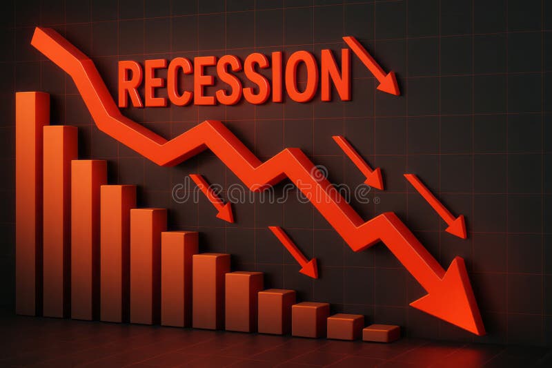
Free with trial This image visually represents an economic recession through downward trends and statistics. The vibrant red arrows emphasize the significant decline in growth, making it an impactful visual for financial analysis. Analysis decrease illustrations Dramatic Decline in Economic Growth with Recession Indicator and Downward Arrows in Red. This image visually represents an economic recession through downward trends and statistics. The vibrant red arrows emphasize the significant decline in growth, making it an impactful visual for financial analysis
Free with trial The image depicts a graph with a downward trend, featuring a red arrow that points to a substantial decrease in value. The graph is set against a red gradient background, which adds to the overall sense of decline. Analysis decrease illustrations A downward trending graph with a red arrow indicating a significant decline in value. The image depicts a graph with a downward trend, featuring a red arrow that points to a substantial decrease in value. The graph is set against a red gradient background, which adds to the overall sense of decline
Free with trial The image depicts five transparent cylindrical bars arranged in ascending order of height. The first four bars increase progressively in height, while the fifth bar, which is the tallest, has a red downward-pointing arrow indicating a decline or decrease. This visual often represents a concept of growth followed by a downturn or setback. Analysis decrease illustrations A graphical illustration showing a declining trend in ascending cylindrical bars. The image depicts five transparent cylindrical bars arranged in ascending order of height. The first four bars increase progressively in height, while the fifth bar, which is the tallest, has a red downward-pointing arrow indicating a decline or decrease. This visual often represents a concept of growth followed by a downturn or setback
Free with trial Conceptual image illustrating the idea of risk reduction or mitigation. The word 'RISK' is shown in a textured, fragmented font, with a prominent red arrow pointing downwards beneath it, symbolizing a decrease or management of potential dangers and uncertainties. Analysis decrease illustrations Risk Reduction Concept with Downward Arrow. Conceptual image illustrating the idea of risk reduction or mitigation. The word 'RISK' is shown in a textured, fragmented font, with a prominent red arrow pointing downwards beneath it, symbolizing a decrease or management of potential dangers and uncertainties
Free with trial This image depicts a central golden dollar sign symbolizing financial aspects, flanked by a red downward arrow indicating a decline and a green upward arrow showing growth. Additionally, a pie chart with three segments in different colors suggests analysis or distribution of financial data. Analysis decrease illustrations Visual representation of economic fluctuations and financial performance metrics. This image depicts a central golden dollar sign symbolizing financial aspects, flanked by a red downward arrow indicating a decline and a green upward arrow showing growth. Additionally, a pie chart with three segments in different colors suggests analysis or distribution of financial data