Free with trial Graph or block diagram shows the increase or decrease of shares, which means financial loss or gain -. Analysis decrease illustrations Graph or block diagram shows the increase or decrease of shares, which means financial loss or gain
Free with trial Two 3D arrows, one red pointing down and one green pointing up, symbolizing contrasting financial trends or data analysis. Visual representation of market fluctuations. Analysis decrease illustrations Arrow chart up and down on. Two 3D arrows, one red pointing down and one green pointing up, symbolizing contrasting financial trends or data analysis. Visual representation of market fluctuations
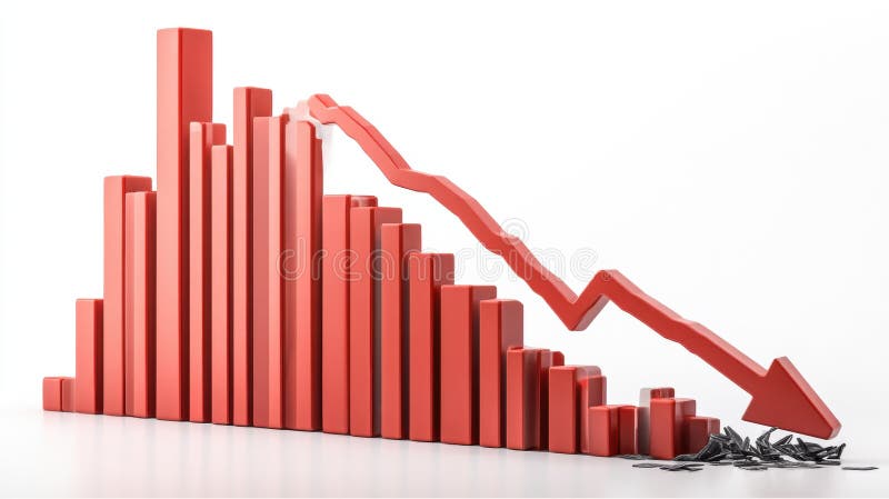
Free with trial A 3D rendering of a bar graph depicting a sharp decline in values. The red bars decrease in size, culminating in a large downward red arrow, symbolizing a significant economic downturn or market crash. The broken pieces at the bottom represent the loss or damage incurred. Analysis decrease illustrations Red Bar Graph Showing Decline. A 3D rendering of a bar graph depicting a sharp decline in values. The red bars decrease in size, culminating in a large downward red arrow, symbolizing a significant economic downturn or market crash. The broken pieces at the bottom represent the loss or damage incurred.
Free with trial Graph or block diagram shows the increase or decrease of shares, which means financial loss or gain -. Analysis decrease illustrations Graph or block diagram shows the increase or decrease of shares, which means financial loss or gain
Free with trial Graph or block diagram shows the increase or decrease of shares, which means financial loss or gain -. Analysis decrease illustrations Graph or block diagram shows the increase or decrease of shares, which means financial loss or gain
Free with trial Graph or block diagram shows the increase or decrease of shares, which means financial loss or gain -. Analysis decrease illustrations Graph or block diagram shows the increase or decrease of shares, which means financial loss or gain
Free with trial Graph or block diagram shows the increase or decrease of shares, which means financial loss or gain -. Analysis decrease illustrations Graph or block diagram shows the increase or decrease of shares, which means financial loss or gain
Free with trial Graph or block diagram shows the increase or decrease of shares, which means financial loss or gain -. Analysis decrease illustrations Graph or block diagram shows the increase or decrease of shares, which means financial loss or gain
Free with trial Graph or block diagram shows the increase or decrease of shares, which means financial loss or gain -. Analysis decrease illustrations Graph or block diagram shows the increase or decrease of shares, which means financial loss or gain
Free with trial Graph or block diagram shows the increase or decrease of shares, which means financial loss or gain -. Analysis decrease illustrations Graph or block diagram shows the increase or decrease of shares, which means financial loss or gain
Free with trial Graph or block diagram shows the increase or decrease of shares, which means financial loss or gain -. Analysis decrease illustrations Graph or block diagram shows the increase or decrease of shares, which means financial loss or gain
Free with trial Graph or block diagram shows the increase or decrease of shares, which means financial loss or gain -. Analysis decrease illustrations Graph or block diagram shows the increase or decrease of shares, which means financial loss or gain
Free with trial Graph or block diagram shows the increase or decrease of shares, which means financial loss or gain -. Analysis decrease illustrations Graph or block diagram shows the increase or decrease of shares, which means financial loss or gain
Free with trial Graph or block diagram shows the increase or decrease of shares, which means financial loss or gain -. Analysis decrease illustrations Graph or block diagram shows the increase or decrease of shares, which means financial loss or gain
Free with trial Graph or block diagram shows the increase or decrease of shares, which means financial loss or gain -. Analysis decrease illustrations Graph or block diagram shows the increase or decrease of shares, which means financial loss or gain
Free with trial Graph or block diagram shows the increase or decrease of shares, which means financial loss or gain -. Analysis decrease illustrations Graph or block diagram shows the increase or decrease of shares, which means financial loss or gain
Free with trial Graph or block diagram shows the increase or decrease of shares, which means financial loss or gain -. Analysis decrease illustrations Graph or block diagram shows the increase or decrease of shares, which means financial loss or gain
Free with trial Graph or block diagram shows the increase or decrease of shares, which means financial loss or gain -. Analysis decrease illustrations Graph or block diagram shows the increase or decrease of shares, which means financial loss or gain
Free with trial Graph or block diagram shows the increase or decrease of shares, which means financial loss or gain -. Analysis decrease illustrations Graph or block diagram shows the increase or decrease of shares, which means financial loss or gain
Free with trial Graph or block diagram shows the increase or decrease of shares, which means financial loss or gain -. Analysis decrease illustrations Graph or block diagram shows the increase or decrease of shares, which means financial loss or gain
Free with trial Graph or block diagram shows the increase or decrease of shares, which means financial loss or gain -. Analysis decrease illustrations Graph or block diagram shows the increase or decrease of shares, which means financial loss or gain
Free with trial Graph or block diagram shows the increase or decrease of shares, which means financial loss or gain -. Analysis decrease illustrations Graph or block diagram shows the increase or decrease of shares, which means financial loss or gain
Free with trial Graph or block diagram shows the increase or decrease of shares, which means financial loss or gain -. Analysis decrease illustrations Graph or block diagram shows the increase or decrease of shares, which means financial loss or gain
Free with trial Graph or block diagram shows the increase or decrease of shares, which means financial loss or gain -. Analysis decrease illustrations Graph or block diagram shows the increase or decrease of shares, which means financial loss or gain
Free with trial 3D Isometric Flat Vector Illustration of Market Analysis, Business or Startup Success. Analysis decrease vectors 3D Isometric Flat Vector Illustration of Market Analysis
Free with trial Fluctuations red graph illustration business meeting, computer analysis, trends presentation fluctuations red graph. Analysis decrease illustrations Fluctuations red graph
Free with trial Decline food sales data illustration fruits vegetables, items year, trend analysis decline food sales data. Analysis decrease illustrations Decline food sales data
Free with trial Graph chart infographic report set with statistic arrow data elements for financial market analysis and planning in business performance research for your illustration. Analysis decrease vectors Graph chart infographic report set
Free with trial Graph chart infographic report set with statistic arrow data elements for financial market analysis and planning in business performance research for your illustration. Analysis decrease vectors Graph chart infographic report set
Free with trial Graph chart infographic report set with statistic arrow data elements for financial market analysis and planning in business performance research for your illustration. Analysis decrease vectors Graph chart infographic report set
Free with trial A dynamic 3D illustration of a glossy red arrow pointing downwards in a jagged, volatile path. Isolated on a white background, this graphic icon is a powerful symbol for negative concepts. It represents decline, decrease, failure, loss, and crisis. This visual is perfect for illustrating stock market crashes, economic recession, financial downturns, poor business performance, or any downward trend in data and statistics. An ideal element for reports, presentations, and financial news, with ample copy space. Analysis decrease illustrations Red Jagged Arrow of Decline - Financial Crisis Concept. A dynamic 3D illustration of a glossy red arrow pointing downwards in a jagged, volatile path. Isolated. A dynamic 3D illustration of a glossy red arrow pointing downwards in a jagged, volatile path. Isolated on a white background, this graphic icon is a powerful symbol for negative concepts. It represents decline, decrease, failure, loss, and crisis. This visual is perfect for illustrating stock market crashes, economic recession, financial downturns, poor business performance, or any downward trend in data and statistics. An ideal element for reports, presentations, and financial news, with ample copy space.
Free with trial A close-up of a magnifying glass revealing intricate lines of code, generated by AI. The image evokes a sense of mystery and technological advancement, hinting at the power and potential of artificial intelligence in data analysis and cybersecurity. Analysis decrease illustrations AI Magnifies Code. A close-up of a magnifying glass revealing intricate lines of code, generated by AI. The image evokes a sense of mystery and technological advancement, hinting at the power and potential of artificial intelligence in data analysis and cybersecurity.
Free with trial A person is analyzing a bar graph with a downward trend line, indicating a decrease in stock value. Vector art design using ai tool. Analysis decrease vectors Sell Stock Graph Illustration. A person is analyzing a bar graph with a downward trend line, indicating a decrease in stock value. Vector art design using ai tool.
Free with trial Market fluctuation in British Pound or Sterling currency. Devaluation and decrease in exchange rate value of Sterling. Recession, inflation, depression and falling economy. 3D render. Analysis decrease illustrations Market fluctuation in British Pound or Sterling currency
Free with trial Financial chart illustrating stock price trends with candlestick patterns. Vertical and horizontal axes display price and time, respectively. A prominent green upward arrow indicates profit, while a red 'Put tag suggests a potential decrease. Blue and red candlestick bars detail price movements. Curved lines highlight trend directions. Labels like Profit add contextual information. The overall theme suggests a focus on cryptocurrency or stock market analysis. Analysis decrease illustrations Option Trading Chart AI generated. Financial chart illustrating stock price trends with candlestick patterns. Vertical and horizontal axes display price and time, respectively. A prominent green upward arrow indicates profit, while a red 'Put tag suggests a potential decrease. Blue and red candlestick bars detail price movements. Curved lines highlight trend directions. Labels like Profit add contextual information. The overall theme suggests a focus on cryptocurrency or stock market analysis.
Free with trial Chdata replicating revenue chart illustration analysis growth, sales profit, trends visualization chdata replicating revenue chart. Analysis decrease illustrations Chdata replicating revenue chart
Free with trial Analyzing the business failure and decline. White magnifying glass analyzing a growth chart on a blue background, representing market analysis and business growth. 3D render. Analysis decrease illustrations Magnifying glass analyzing growth chart on blue background. Analyzing the business failure and decline. White magnifying glass analyzing a growth chart on a blue background, representing market analysis and business growth. 3D render
Free with trial Data merging loss graph illustration analysis metrics, performance validation, accuracy convergence data merging loss graph. Analysis decrease illustrations Data merging loss graph
Free with trial Data merging sales graph illustration analysis trends, revenue performance, forecast comparison data merging sales graph. Analysis decrease illustrations Data merging sales graph
Free with trial This image features two variations of a graph icon showing a downward trend. One is a simple outline, while the other is a solid black silhouette. Both depict a graph with a sharp decline, represented by a line with a downward-pointing arrow. The icons are suitable for illustrating concepts like financial loss, economic downturn, negative growth, or any situation involving a decrease in value or performance. Analysis decrease illustrations Declining Graph Icon Set. This image features two variations of a graph icon showing a downward trend. One is a simple outline, while the other is a solid black silhouette. Both depict a graph with a sharp decline, represented by a line with a downward-pointing arrow. The icons are suitable for illustrating concepts like financial loss, economic downturn, negative growth, or any situation involving a decrease in value or performance.
Free with trial Chdissolve dissolving revenue chart illustration analysis data, trends visualization, metrics performance chdissolve dissolving revenue chart. Analysis decrease illustrations Chdissolve dissolving revenue chart
Free with trial Three red, 3D arrows curving downwards, generated by AI, symbolize decline, decrease, or downturn. The image offers a visual representation of negative trends or a downward trajectory, suitable for presentations or reports. Analysis decrease illustrations Red Arrows Pointing Down. Three red, 3D arrows curving downwards, generated by AI, symbolize decline, decrease, or downturn. The image offers a visual representation of negative trends or a downward trajectory, suitable for presentations or reports.
Free with trial A simple, flat design icon depicting a downward trend. The image features a red graph line descending from the top left to the bottom right, with an arrow indicating the direction. The graph is set against a clean white background, emphasizing the visual impact of the trend. This graphic is suitable for illustrating concepts such as financial decline, decreasing sales, or negative performance in business, economics, or data analysis. Analysis decrease vectors Downward Trend Graph Icon. A simple, flat design icon depicting a downward trend. The image features a red graph line descending from the top left to the bottom right, with an arrow indicating the direction. The graph is set against a clean white background, emphasizing the visual impact of the trend. This graphic is suitable for illustrating concepts such as financial decline, decreasing sales, or negative performance in business, economics, or data analysis.
Free with trial This image features two variations of a decreasing graph icon. One is an outline version, and the other is a solid black version. Both show a bar graph with descending bars and a curved arrow pointing downwards, symbolizing a decline or decrease. These icons are suitable for illustrating concepts like loss, recession, negative trends, or falling statistics in various contexts. Analysis decrease illustrations Decreasing Graph Icon Set. This image features two variations of a decreasing graph icon. One is an outline version, and the other is a solid black version. Both show a bar graph with descending bars and a curved arrow pointing downwards, symbolizing a decline or decrease. These icons are suitable for illustrating concepts like loss, recession, negative trends, or falling statistics in various contexts.
Free with trial Comparison comparing data illustration analysis graph, traffic website, overlay divergence comparison comparing data. Analysis decrease illustrations Comparison comparing data
Free with trial A red J is on a table with a graph behind it. The graph shows a downward trend, which could represent a decrease in value or a negative outcome. The red J could symbolize a warning or a call to action. Analysis decrease illustrations A red J is on a table with a graph behind it
Free with trial This image shows a detailed close-up of a stock market graph depicting a significant decline. The red color emphasizes the negative trend, illustrating potential losses or economic downturn. This visualization was generated by AI for analysis and presentation purposes. Analysis decrease illustrations Red Market Decline Graph. This image shows a detailed close-up of a stock market graph depicting a significant decline. The red color emphasizes the negative trend, illustrating potential losses or economic downturn. This visualization was generated by AI for analysis and presentation purposes.
Free with trial The image displays a candlestick chart, commonly used in financial markets to represent price movements of an asset over time. the chart features red and green candlesticks, where green indicates a price increase and red indicates a price decrease. a yellow line overlays the candlesticks, likely representing a moving average, which is a common technical indicator used to smooth out price data and identify trends. the chart is set against a dark blue background with grid lines, and time intervals are marked along the x-axis. a scale on the right side shows the price values. the overall impression is that of a tool used for technical analysis in trading or investment. Analysis decrease illustrations Stock market candlestick chart with moving average. the image displays a candlestick chart, commonly used in financial markets to represent price movements of an asset over time. the chart features red and green candlesticks, where green indicates a price increase and red indicates a price decrease. a yellow line overlays the candlesticks, likely representing a moving average, which is a common technical indicator used to smooth out price data and identify trends. the chart is set against a dark blue background with grid lines, and time intervals are marked along the x-axis. a scale on the right side shows the price values. the overall impression is that of a tool used for technical analysis in trading or investment.
Free with trial This image depicts a downward trending arrow formed by a series of red dots against a bright blue sky with fluffy white clouds. The trajectory is clearly negative, visually representing a decline or decrease. This graphic was generated by AI, offering a simple yet effective visual representation of. Analysis decrease illustrations AI Generated Downward Trend. This image depicts a downward trending arrow formed by a series of red dots against a bright blue sky with fluffy white clouds. The trajectory is clearly negative, visually representing a decline or decrease. This graphic was generated by AI, offering a simple yet effective visual representation of
Free with trial 3D illustration of a bar graph showing a declining trend. Red bars of decreasing height are set against a backdrop of a light gray frame. The image is perfect for presentations, reports, or any visual representation of negative growth, decline, or decrease in data. Suitable for use in business, finance, and educational contexts. Analysis decrease vectors Declining Trend Bar Graph. 3D illustration of a bar graph showing a declining trend. Red bars of decreasing height are set against a backdrop of a light gray frame. The image is perfect for presentations, reports, or any visual representation of negative growth, decline, or decrease in data. Suitable for use in business, finance, and educational contexts.
Free with trial A visually striking image capturing a bar chart, line graph, and pie chart meticulously drawn in the wet sand on a beach. The artwork is illuminated by the warm, golden light of a sunset, with gentle waves lapping at the shore. This represents concepts of financial growth, market analysis, and business success in a unique, natural setting. The image evokes themes of planning, progress, and the cyclical nature of markets. Analysis decrease illustrations Financial Growth Chart and Pie Chart Drawn in Sand at Sunset. A visually striking image capturing a bar chart, line graph, and pie chart meticulously drawn in the wet sand on a beach. The artwork is illuminated by the warm, golden light of a sunset, with gentle waves lapping at the shore. This represents concepts of financial growth, market analysis, and business success in a unique, natural setting. The image evokes themes of planning, progress, and the cyclical nature of markets.
Free with trial A line graph with a decreasing trend is commonly used to depict scenarios like declining sales, decreasing stock prices, or any situation where a decrease in values over time or across categories is a significant aspect of the data. It provides a clear and intuitive way to understand trends and make informed interpretations about the decreasing values being represented. Analysis decrease illustrations Chart with decreasing line graph. A line graph with a decreasing trend is commonly used to depict scenarios like declining sales, decreasing stock prices, or any situation where a decrease in values over time or across categories is a significant aspect of the data. It provides a clear and intuitive way to understand trends and make informed interpretations about the decreasing values being represented.
Free with trial A visual representation of data, showcasing trends and comparisons through a green bar chart. This graphic illustrates statistical information and growth patterns effectively. Analysis decrease illustrations Bar chart data analysis on. A visual representation of data, showcasing trends and comparisons through a green bar chart. This graphic illustrates statistical information and growth patterns effectively
Free with trial Stock crisis red price drop arrow down chart fall. Stock market exchange analysis or forex graph business and finance money losing moving economic inflation deflation investment loss crash. Illustration. Analysis decrease illustrations Stock crisis red price drop arrow down chart fall
Free with trial Stock crisis red price drop arrow down chart fall. Stock market exchange analysis or forex graph business and finance money losing moving economic inflation deflation investment loss crash. Illustration. Analysis decrease illustrations Stock crisis red price drop arrow down chart fall
Free with trial Stock crisis red price drop arrow down chart fall. Stock market exchange analysis or forex graph business and finance money losing moving economic inflation deflation investment loss crash. Illustration. Analysis decrease illustrations Stock crisis red price drop arrow down chart fall
Free with trial Stock crisis red price drop arrow down chart fall. Stock market exchange analysis or forex graph business and finance money losing moving economic inflation deflation investment loss crash. Illustration. Analysis decrease illustrations Stock crisis red price drop arrow down chart fall
Free with trial A 3D icon featuring a red downward arrow, commonly representing a decline, decrease, or negative trend in financial and business metrics. Analysis decrease vectors 3D Red Downward Trend Arrow Icon. A 3D icon featuring a red downward arrow, commonly representing a decline, decrease, or negative trend in financial and business metrics
Free with trial Image of a stock market chart with a red and blue candlestick pattern, plotted on a dark grid, suggesting financial trends and investment analysis. Image is generated using AI. Analysis decrease illustrations Stock Market Chart on a Grid. Image of a stock market chart with a red and blue candlestick pattern, plotted on a dark grid, suggesting financial trends and investment analysis. Image is generated using AI
Free with trial This image shows a 3D rendering of a red line graph sharply declining, resting on a white cube. The graphic is generated by AI, and visually represents a negative trend or downturn, suitable for presentations or reports on market analysis, economic forecasts, or business performance. Analysis decrease illustrations Declining Trend Visualization. This image shows a 3D rendering of a red line graph sharply declining, resting on a white cube. The graphic is generated by AI, and visually represents a negative trend or downturn, suitable for presentations or reports on market analysis, economic forecasts, or business performance.
Free with trial A tablet displays a colorful bar graph, showcasing data trends. The image emphasizes visual data analysis and modern business tools. The warm wood background adds a professional yet inviting feel. Analysis decrease illustrations Tablet Showing Business Graph. A tablet displays a colorful bar graph, showcasing data trends. The image emphasizes visual data analysis and modern business tools. The warm wood background adds a professional yet inviting feel.
Free with trial This image shows multiple yellow sticky notes, each with a downward-pointing black arrow, generated by AI. It represents a concept of decline or negative progression, perhaps in business or data analysis. The consistent pattern suggests a systematic downward trend. Analysis decrease illustrations Downward Trending Sticky Notes. This image shows multiple yellow sticky notes, each with a downward-pointing black arrow, generated by AI. It represents a concept of decline or negative progression, perhaps in business or data analysis. The consistent pattern suggests a systematic downward trend.
Free with trial A graph with a red line and a green line. This could represent a decrease in one variable and an increase in another. Analysis decrease illustrations A graph with a red line and a green line
Free with trial Close-up of a smartphone displaying a stock trading application. The screen shows real-time stock charts, including candlestick charts and line graphs, with green and red indicators representing price increases and decreases. The app also features portfolio summaries and details for various stocks, such as AAPL, GOOG, and MSFT. The image represents investment, finance, and the use of technology in stock market analysis. Analysis decrease illustrations Stock Trading App on Smartphone. Close-up of a smartphone displaying a stock trading application. The screen shows real-time stock charts, including candlestick charts and line graphs, with green and red indicators representing price increases and decreases. The app also features portfolio summaries and details for various stocks, such as AAPL, GOOG, and MSFT. The image represents investment, finance, and the use of technology in stock market analysis.
Free with trial A minimalist white 3D bar graph illustrates a significant downward trend. The bars decrease in height from left to right, connected by a dashed line that forms a descending path, culminating in an arrow pointing downwards. The graphic is rendered in an isometric perspective on a white background, representing decline, loss, or negative performance. Analysis decrease illustrations White 3D Bar Graph Showing a Downward Trend chart decline. A minimalist white 3D bar graph illustrates a significant downward trend. The bars decrease in height from left to right, connected by a dashed line that forms a descending path, culminating in an arrow pointing downwards. The graphic is rendered in an isometric perspective on a white background, representing decline, loss, or negative performance
Free with trial A 3D bar chart illustrating financial data with green bars indicating growth and red bars indicating decline, presented in a clean visual format for analysis. Analysis decrease illustrations Bar chart growth and decline on. A 3D bar chart illustrating financial data with green bars indicating growth and red bars indicating decline, presented in a clean visual format for analysis
Free with trial Simple lineart icon of an eye looking at a bar chart, representing market analysis. Analysis decrease vectors Human eye monitoring business bar chart icon. Simple lineart icon of an eye looking at a bar chart, representing market analysis
Free with trial This 3D bar graph, generated by AI, visually represents a sharp market decline. The red bars show a dramatic decrease in value, culminating in a broken arrow symbolizing a complete market crash. The image powerfully illustrates economic downturn. Analysis decrease illustrations Declining Bar Graph: Market Crash. This 3D bar graph, generated by AI, visually represents a sharp market decline. The red bars show a dramatic decrease in value, culminating in a broken arrow symbolizing a complete market crash. The image powerfully illustrates economic downturn.
Free with trial A clean, minimalist 3D render of a blue bar chart with a blue trend line connecting circular data points. The bars vary in height, illustrating growth and fluctuations. The background is a bright, clean white, emphasizing the chart's elements. This graphic is ideal for representing financial data, business growth, market trends, statistics, and performance analysis in a modern and professional style. Analysis decrease illustrations 3D Blue Bar Chart with Trend Line. A clean, minimalist 3D render of a blue bar chart with a blue trend line connecting circular data points. The bars vary in height, illustrating growth and fluctuations. The background is a bright, clean white, emphasizing the chart's elements. This graphic is ideal for representing financial data, business growth, market trends, statistics, and performance analysis in a modern and professional style.
Free with trial Open notebook displaying sales data with charts, graphs, and the word sales highlighted, illuminated by a desk lamp, symbolizing business analysis and strategy. Analysis decrease illustrations Sales report with charts and graphs illuminated by desk lamp. Open notebook displaying sales data with charts, graphs, and the word sales highlighted, illuminated by a desk lamp, symbolizing business analysis and strategy
Free with trial A bold, 3D blue arrow gracefully curves downward, visually representing a shift in direction, decline, or changing trend. Perfect for financial reports, data analysis, or conceptual graphics. Analysis decrease vectors Dynamic blue arrow curves downward signaling a trend change. A bold, 3D blue arrow gracefully curves downward, visually representing a shift in direction, decline, or changing trend. Perfect for financial reports, data analysis, or conceptual graphics
Free with trial Money loss and economic crisis, money market crash and global financial downturn, vector line icons. Economic crisis icons of bankruptcy, price decrease with money inflation and unemployment growth. Analysis decrease vectors Money loss and economic crisis, money market crash
Free with trial A stock chart illustrates a bearish trend with red and green candlesticks against a dark blue background, used for financial analysis. Analysis decrease illustrations Stock Chart Showing Downward Trend. A stock chart illustrates a bearish trend with red and green candlesticks against a dark blue background, used for financial analysis
Free with trial A simple, flat design graphic illustrating a downward trend in a graph. A stylized person with flames above their head is positioned below the declining line graph, symbolizing stress, loss, or a negative impact. Suitable for presentations, articles, or social media posts related to business performance, market analysis, personal development, or any situation involving a downward trend. The flat design makes it versatile and easily adaptable for various uses. Analysis decrease vectors Declining Graph with Stressed Person. A simple, flat design graphic illustrating a downward trend in a graph. A stylized person with flames above their head is positioned below the declining line graph, symbolizing stress, loss, or a negative impact. Suitable for presentations, articles, or social media posts related to business performance, market analysis, personal development, or any situation involving a downward trend. The flat design makes it versatile and easily adaptable for various uses.
Free with trial A green downward trending stock chart is displayed on an orange grid, suggesting a negative financial trend for analysis. Analysis decrease illustrations Green Stock Chart with Orange Grid. A green downward trending stock chart is displayed on an orange grid, suggesting a negative financial trend for analysis
Free with trial Abstract 3D rendering of a blue bar chart receding into the distance. The bars are arranged in descending order, suggesting a decline or downward trend. The reflective surface adds depth and visual interest, creating a clean and modern aesthetic. This image can be used to illustrate concepts such as financial downturn, market analysis, or statistical data representation. Analysis decrease illustrations Abstract Blue Bar Chart. Abstract 3D rendering of a blue bar chart receding into the distance. The bars are arranged in descending order, suggesting a decline or downward trend. The reflective surface adds depth and visual interest, creating a clean and modern aesthetic. This image can be used to illustrate concepts such as financial downturn, market analysis, or statistical data representation.
Free with trial Strategic Decisions: Integrating Business Analytics with Strategic Thinking. This visual portrays the dynamic interaction between business analytics and strategic thinking, showcasing how analytical insights drive strategic planning and decision-making. It emphasizes the synergy between data analysis and strategic foresight in achieving business goals. --chaos 10 --ar 16:9 --style raw --stylize, immersive wallpaper background. Analysis decrease illustrations Hand Drawn Colorful Bar Charts and Pie Charts. Strategic Decisions: Integrating Business Analytics with Strategic Thinking. This visual portrays the dynamic interaction between business analytics and strategic thinking, showcasing how analytical insights drive strategic planning and decision-making. It emphasizes the synergy between data analysis and strategic foresight in achieving business goals. --chaos 10 --ar 16:9 --style raw --stylize, immersive wallpaper background
Free with trial This image shows a whiteboard displaying a bar graph with a downward trend, generated by AI. The graph illustrates a clear decline in performance over time, potentially indicating financial losses or market setbacks. The simple, clean presentation highlights the severity of the decrease. Analysis decrease illustrations Declining Business Graph. This image shows a whiteboard displaying a bar graph with a downward trend, generated by AI. The graph illustrates a clear decline in performance over time, potentially indicating financial losses or market setbacks. The simple, clean presentation highlights the severity of the decrease.
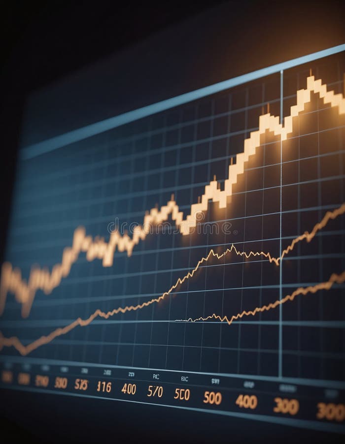
Free with trial A close-up view of a laptop displaying a stock market chart with fluctuating trends, illustrating concepts of financial volatility and market analysis - generated AI. Analysis decrease illustrations Stock market crash concept with graph on laptop screen. A close-up view of a laptop displaying a stock market chart with fluctuating trends, illustrating concepts of financial volatility and market analysis - generated AI
Free with trial A versatile set of business and finance icons isolated on a white background. This collection features various data visualization elements, including bar charts, line graphs, pie charts, and diagrams. The clean, vector style represents concepts like statistical analysis, market growth, financial reporting, and economic trends. These infographic elements are perfect for presentations, business reports, websites, and marketing materials to illustrate progress, performance, and data-driven insights. Analysis decrease vectors Business and Finance Chart and Graph Icon Set. A versatile set of business and finance icons isolated on a white background. This collection features various data visualization elements, including bar charts, line graphs, pie charts, and diagrams. The clean, vector style represents concepts like statistical analysis, market growth, financial reporting, and economic trends. These infographic elements are perfect for presentations, business reports, websites, and marketing materials to illustrate progress, performance, and data-driven insights.