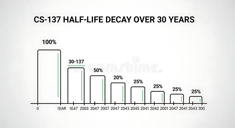
Free with trial A line graph illustrating the decrease in half-life over 30 years with bars representing percentage decay at different years, demonstrating long-term decline suitable for scientific, educational, or research presentations. Analysis decrease illustrations Half-life Decay Over 30 Years Chart Showing Decrease in Value or Effectiveness. A line graph illustrating the decrease in half-life over 30 years with bars representing percentage decay at different years, demonstrating long-term decline suitable for scientific, educational, or research presentations
Free with trial Data Visualization Colorful Chart and Graph Design, Analytics, Business Intelligence Data analysis, Infographic , This photo was created using generative AI. Analysis decrease illustrations Data Visualization Colorful Chart and Graph Design, Analytics, Business Intelligence Data analysis, Infographic
Free with trial A minimalist black icon depicting a business data chart. It features a bar graph with multiple vertical bars, overlaid by two distinct line graphs. One line graph shows an upward trend with data points, symbolizing growth and success, while the other illustrates a downward trend, representing decline or loss. This versatile vector illustration is ideal for conveying concepts related to financial analysis, market trends, business performance, statistics, and economic fluctuations. Perfect for web interfaces, presentations, reports, and infographics. Analysis decrease vectors Business Data Analysis Chart Icon with Trends. A minimalist black icon depicting a business data chart. It features a bar graph with multiple vertical bars, overlaid by two distinct line graphs. One line graph shows an upward trend with data points, symbolizing growth and success, while the other illustrates a downward trend, representing decline or loss. This versatile vector illustration is ideal for conveying concepts related to financial analysis, market trends, business performance, statistics, and economic fluctuations. Perfect for web interfaces, presentations, reports, and infographics.
Free with trial Sales word with a decrease chart. Financial crisis. Analysis decrease illustrations Sales word with a decrease chart. Financial crisis
Free with trial Sales word with a decrease chart. Financial crisis. Analysis decrease illustrations Sales word with a decrease chart. Financial crisis
Free with trial Sales word with a decrease chart. Financial crisis. Analysis decrease illustrations Sales word with a decrease chart. Financial crisis
Free with trial Sales word with a decrease chart. Financial crisis. Analysis decrease illustrations Sales word with a decrease chart. Financial crisis
Free with trial Sales word with a decrease chart. Financial crisis. Analysis decrease illustrations Sales word with a decrease chart. Financial crisis
Free with trial Sales word with a decrease chart. Financial crisis. Analysis decrease illustrations Sales word with a decrease chart. Financial crisis
Free with trial Sales word with a decrease chart. Financial crisis. Analysis decrease illustrations Sales word with a decrease chart. Financial crisis
Free with trial A stylized illustration of a downward arrow pointing towards a dollar sign inside a circular frame symbolizing financial decline or decrease with a clean minimalistic design perfect for financial analysis and economic topics. Analysis decrease illustrations Downward Arrow with Dollar Sign in Circular Frame Financial Concept Illustration. A stylized illustration of a downward arrow pointing towards a dollar sign inside a circular frame symbolizing financial decline or decrease with a clean minimalistic design perfect for financial analysis and economic topics
Free with trial Increase and decrease arrows on black background. Analysis decrease illustrations Increase and decrease arrows on black
Free with trial A conceptual vector illustration depicting business analysis and market research. A hand holds a magnifying glass, focusing on a colorful financial chart with bar and line graphs labeled 'Market Trends'. Surrounding icons represent key business metrics like growth, decline, market share, and innovation. This flat design graphic is ideal for presentations, reports, and web content related to data analytics, strategic planning, and financial performance evaluation, symbolizing the scrutiny of data to identify opportunities and understand market dynamics. Analysis decrease illustrations Business Analysis and Market Trends Concept with Magnifying Glass. A conceptual vector illustration depicting business analysis and market research. A hand holds a magnifying glass, focusing on a colorful financial chart with bar and line graphs labeled 'Market Trends'. Surrounding icons represent key business metrics like growth, decline, market share, and innovation. This flat design graphic is ideal for presentations, reports, and web content related to data analytics, strategic planning, and financial performance evaluation, symbolizing the scrutiny of data to identify opportunities and understand market dynamics.
Free with trial Set of twelve black and white icons representing business and finance concepts such as graphs charts analysis tools and targets isolated on transparent background. Analysis decrease vectors Collection of business and finance icons including graphs charts and analysis tools for presentations and reports. Set of twelve black and white icons representing business and finance concepts such as graphs charts analysis tools and targets isolated on transparent background
Free with trial A flat vector icon showing a line graph with a distinct downward trend. Represents decline, decrease, negative growth, or falling performance. Suitable for business analysis, financial reports, or graphics illustrating negative progress or statistics, vector design Generative AI. Analysis decrease vectors Downward line graph icon representing negative trend decline, vector design Generative AI. A flat vector icon showing a line graph with a distinct downward trend. Represents decline, decrease, negative growth, or falling performance. Suitable for business analysis, financial reports, or graphics illustrating negative progress or statistics, vector design Generative AI
Free with trial A simple bar chart with a falling line, symbolizing financial decline, economic downturn, decreased profits, market loss, or negative business results. Ideal for illustrating risks, challenges, crisis situations, and economic analysis. Analysis decrease vectors Declining financial chart icon with downward trend showing loss, decrease and negative business performance. A simple bar chart with a falling line, symbolizing financial decline, economic downturn, decreased profits, market loss, or negative business results. Ideal for illustrating risks, challenges, crisis situations, and economic analysis.
Free with trial Outline vector icon of a line graph showing a downward trend. Represents decline, loss, decrease, failure, or negative performance in line art. Suitable for financial reports, data analysis, business presentations, and illustrating negative change, vector design Generative AI. Analysis decrease vectors Downward Trend Graph Icon Outline, Decline Loss Failure Symbol, vector design Generative AI. Outline vector icon of a line graph showing a downward trend. Represents decline, loss, decrease, failure, or negative performance in line art. Suitable for financial reports, data analysis, business presentations, and illustrating negative change, vector design Generative AI
Free with trial This image shows a calculator, tablet, and financial charts, all generated by AI for illustrative purposes. The blue color scheme emphasizes the data-driven nature of modern finance and business analytics. The image suggests efficiency and precision in financial planning and analysis. Analysis decrease illustrations Financial Data Analysis. This image shows a calculator, tablet, and financial charts, all generated by AI for illustrative purposes. The blue color scheme emphasizes the data-driven nature of modern finance and business analytics. The image suggests efficiency and precision in financial planning and analysis.
Free with trial Understanding bar graph charts data analysis and visualization for business and financial performance metrics. Analysis decrease vectors Understanding bar graph charts data analysis and visualization for business
Free with trial Business data is visually represented in black and white through various charts and graphs illustrating growth analysis and strategic planning for financial reporting showing a clear picture of market. Analysis decrease vectors Black and white business data visualization with charts and graphs showing growth and analysis for financial reporting and. Business data is visually represented in black and white through various charts and graphs illustrating growth analysis and strategic planning for financial reporting showing a clear picture of market
Free with trial Cityscape financial data analysis on tablet, high-resolution background Generative AI. Analysis decrease illustrations Cityscape financial data analysis on tablet
Free with trial Financial data analysis tools, vibrant background Generative AI. Analysis decrease illustrations Financial data analysis tools
Free with trial Hand drawn style bar graph displaying a continuous downward trend and data decrease arrow. Analysis decrease vectors Hand drawn style bar graph displaying a continuous downward trend and data decrease arrow
Free with trial The image depicts a bar chart with a downward trend. The bars, colored in blue, gradually decrease in height, indicating a decline. A large red arrow, pointing downwards, further emphasizes the downward trend. The chart is displayed on an easel, suggesting a presentation or analysis context. Analysis decrease illustrations Chart showing decline. The image depicts a bar chart with a downward trend. The bars, colored in blue, gradually decrease in height, indicating a decline. A large red arrow, pointing downwards, further emphasizes the downward trend. The chart is displayed on an easel, suggesting a presentation or analysis context
Free with trial Declining steps with downward arrow symbolizing business market decrease economic downturn. Analysis decrease vectors Declining steps with downward arrow symbolizing business market decrease economic downturn
Free with trial Trend melting line graph illustration analysis visualization, ice decrease, plot statistics trend melting line graph. Analysis decrease illustrations Trend melting line graph
Free with trial Bar chart with a declining arrow, representing decrease, business, finance, economic recession. Analysis decrease vectors Bar chart with a declining arrow, representing decrease, business, finance, economic recession
Free with trial Red arrow pointing downward over a dilapidated house. Concept of real estate market decline, property value decrease, and foreclosure. Analysis decrease illustrations Red arrow pointing downward over a dilapidated house. Concept of real estate market decline, property value decrease
Free with trial A stark bar graph illustrates a clear downward trend, symbolized by a descending arrow. This image represents decline, decrease, or negative progression in data. Analysis decrease vectors Vector art of bar graph with a downward trend line indicating decline or decrease in data. A stark bar graph illustrates a clear downward trend, symbolized by a descending arrow. This image represents decline, decrease, or negative progression in data
Free with trial Set line Dollar rate decrease, Global economic crisis, news and icon. Vector. Analysis decrease vectors Set line Dollar rate decrease, Global economic crisis, news and icon. Vector
Free with trial Blue graphs and charts depicting financial analysis and market trends with fountain pen. Analysis decrease illustrations Blue graphs and charts depicting financial analysis and market trends with
Free with trial A bold line graph icon displays business data with trend analysis, featuring circles marking data points and horizontal lines indicating value levels. Analysis decrease vectors Bold Line Graph Icon: Business Data Visualization with Trend Analysis. A bold line graph icon displays business data with trend analysis, featuring circles marking data points and horizontal lines indicating value levels
Free with trial Broker trader analyzing economic crisis. Trade exchange, financial decrease, bed business strategy, digital asset, loss investment fund, online broker, stock collapse and crisis concept. Analysis decrease illustrations Broker trader analyzing economic crisis. Trade exchange, financial decrease
Free with trial Conceptual image depicting real estate market analysis. A magnifying glass focuses on a brightly lit house model, surrounded by other house models and a rising graph, all set on a reflective surface. The scene suggests research, investment, and growth in the housing market. Ideal for illustrating articles or presentations on real estate trends, property valuation, and housing market forecasts. Analysis decrease illustrations Real Estate Market Analysis
Free with trial A digital illustration of a black rectangular device with a dark blue background features a blue line graph on its screen, where an orange arrow points downward to indicate a decrease in frequency, with the x-axis representing time and the y-axis showing frequency, creating a visually striking and modern design for technology and data analysis concepts. Analysis decrease illustrations Digital device displaying a blue line graph with orange arrow on dark background. A digital illustration of a black rectangular device with a dark blue background features a blue line graph on its screen, where an orange arrow points downward to indicate a decrease in frequency, with the x-axis representing time and the y-axis showing frequency, creating a visually striking and modern design for technology and data analysis concepts
Free with trial Line Graph Trend Analysis Line And Solid Icon Set. Data Visualization, Business Growth, Statistical Analysis Symbol Collection. Financial And Market Insights. Isolated Vector Illustration. Analysis decrease vectors Line Graph Trend Analysis Line And Solid Icon Set. Data Visualization, Business Growth, Statistical Analysis Symbol
Free with trial Workers Productivity Decrease 3D Icon, symbolizing challenges in workplace efficiency, motivation, and overall performance. Analysis decrease illustrations Workers Productivity Decrease 3D Icon
Free with trial A clean and modern vector illustration of a line graph, isolated on a white background. This flat design icon features two distinct lines, one blue and one brown, plotting various data points to show trends and comparisons over time. It's a versatile graphic representing concepts like data analysis, business analytics, financial statistics, market research, and performance tracking. Ideal for use in presentations, infographics, websites, business reports, and marketing materials to visualize progress, growth, or economic fluctuations. Analysis decrease vectors Data Analysis Line Graph Icon. A clean and modern vector illustration of a line graph, isolated on a white background. This flat design icon features two distinct lines, one blue and one brown, plotting various data points to show trends and comparisons over time. It's a versatile graphic representing concepts like data analysis, business analytics, financial statistics, market research, and performance tracking. Ideal for use in presentations, infographics, websites, business reports, and marketing materials to visualize progress, growth, or economic fluctuations.
Free with trial Magnifying glass with minus sign symbolizing zoom out or decrease concept sketch illustration. Analysis decrease vectors Magnifying glass with minus sign symbolizing zoom out or decrease concept sketch illustration
Free with trial Business decline bar chart icon vector. Decrease, loss, and financial collapse sign symbol on black circle. Analysis decrease vectors Business decline bar chart icon. Decrease, loss, and financial collapse sign symbol on black circle
Free with trial Close up shot of a businessman analyzing cost reduction strategies using a laptop and pen highlighting a declining graph representing reduced expenses he is focused on achieving business success through financial analysis and efficiency improvements the image highlights the use of modern digital tools in cost management and financial planning. Analysis decrease illustrations Analyzing Cost Reduction Strategies with Digital Tools and Data Analysis for Business Success. Close up shot of a businessman analyzing cost reduction strategies using a laptop and pen highlighting a declining graph representing reduced expenses he is focused on achieving business success through financial analysis and efficiency improvements the image highlights the use of modern digital tools in cost management and financial planning
Free with trial Red world map overlay on wet surface with vertical bar charts. Global finance data analysis. Economic recession risk market crash. Stock market decline information visualization. Analysis decrease illustrations Red world map overlay on wet surface with vertical bar charts. Global finance data analysis. Economic recession risk, market. Red world map overlay on wet surface with vertical bar charts. Global finance data analysis. Economic recession risk market crash. Stock market decline information visualization.
Free with trial Broker trader analyzing economic crisis. Trade exchange, financial decrease, bed business strategy, digital asset, loss investment fund, online broker, stock collapse and crisis concept. Analysis decrease illustrations Broker trader analyzing economic crisis. Trade exchange, financial decrease
Free with trial A businessman is using wooden blocks to represent financial growth and decline. the image represents business strategy, investment planning and market analysis for online business success now. Analysis decrease illustrations Business growth strategy and financial planning for investment and market analysis success online now. a businessman is using wooden blocks to represent financial growth and decline. the image represents business strategy, investment planning and market analysis for online business success now.
Free with trial Hand pointing at bar chart with different colored bars featuring statistics, data, analysis with. Analysis decrease vectors Hand pointing at bar chart with different colored bars featuring statistics, data, analysis with.
Free with trial A versatile vector icon representing a decrease or download process. Analysis decrease vectors Data Download or Decrease Vector Icon. A versatile vector icon representing a decrease or download process
Free with trial Image is a digital graphic featuring a blurred background with a person in a dark suit, partially visible, pointing towards the camera. The focus is on the text 'PRICE' in bold, white, uppercase letters, positioned prominently in the center-left of the image. Adjacent to the text is a red downward arrow, enclosed in a square bracket, symbolizing a decrease. The overall color scheme is dark, with. Analysis decrease illustrations Price decrease graphic with businessman. Image is a digital graphic featuring a blurred background with a person in a dark suit, partially visible, pointing towards the camera. The focus is on the text 'PRICE' in bold, white, uppercase letters, positioned prominently in the center-left of the image. Adjacent to the text is a red downward arrow, enclosed in a square bracket, symbolizing a decrease. The overall color scheme is dark, with
Free with trial A photorealistic 3D render depicts a smartphone displaying a stock market trading analysis app. The screen shows a prominent red downward trending line graph overlaid on blue bar graphs. Surrounding the phone are 3D rendered dollar signs and bills, suggesting a financial context. The overall color scheme is dark with vibrant accents of red and blue in the graphs. The style is clean and modern,. Analysis decrease illustrations 3 D Stock Trading Analysis App Smartphone Displaying Red Downward Trend Graph. A photorealistic 3D render depicts a smartphone displaying a stock market trading analysis app. The screen shows a prominent red downward trending line graph overlaid on blue bar graphs. Surrounding the phone are 3D rendered dollar signs and bills, suggesting a financial context. The overall color scheme is dark with vibrant accents of red and blue in the graphs. The style is clean and modern,
Free with trial Colorful bar chart analysis on a dark background ,Generative ai. Analysis decrease illustrations Colorful bar chart analysis, data visualization on a dark background colorful. Colorful bar chart analysis on a dark background ,Generative ai
Free with trial Decline bar chart with downward trend arrow icon vector. Decrease, loss, and financial drop symbol. Editable stroke. Analysis decrease vectors Decline bar chart with downward trend arrow icon. Decrease, loss, and financial drop symbol. Editable stroke
Free with trial A close-up shot reveals golden bars and coins, alongside a magnifying glass focusing on stock market data. The composition emphasizes financial scrutiny and investment. The overall scene suggests wealth, market analysis, and economic trends. This image was generated by AI to evoke a sense of financi. Analysis decrease illustrations Financial Analysis. A close-up shot reveals golden bars and coins, alongside a magnifying glass focusing on stock market data. The composition emphasizes financial scrutiny and investment. The overall scene suggests wealth, market analysis, and economic trends. This image was generated by AI to evoke a sense of financi
Free with trial A bar chart displayed on an easel, illustrating a negative trend. The bars, a mix of blue and grey, show a progressive decrease in value. A prominent red arrow curves downwards across the chart, signifying a decline or loss. The presentation suggests a financial report or business analysis with unfavorable results. Analysis decrease illustrations Bar chart showing a downward trend with a red arrow indicating decline. A bar chart displayed on an easel, illustrating a negative trend. The bars, a mix of blue and grey, show a progressive decrease in value. A prominent red arrow curves downwards across the chart, signifying a decline or loss. The presentation suggests a financial report or business analysis with unfavorable results
Free with trial Declining Graph With Cursor Line And Solid Icon Set. Economic Downturn, Market Analysis, And Financial Decline Symbol Collection. Business Performance Tracking. Isolated Vector Illustration. Analysis decrease vectors Declining Graph With Cursor Line And Solid Icon Set. Economic Downturn, Market Analysis, And Financial Decline Symbol
Free with trial Business decline bar chart icon. Decrease, loss, and financial collapse sign symbol vector. Analysis decrease vectors Business decline bar chart icon. Decrease, loss, and financial collapse sign symbol
Free with trial A set of three distinct candlestick chart icons, rendered in a clean, flat vector style against a white background. The green candle typically represents a bullish trend or price increase, the red candle signifies a bearish trend or price decrease, and the gray candle can denote neutrality or indecision in the market. These versatile symbols are ideal for illustrating financial concepts, stock market analysis, trading platforms, investment apps, economic reports, and educational materials related to forex, cryptocurrency, and general business trends. Analysis decrease vectors Candlestick Chart Icons for Financial Analysis. A set of three distinct candlestick chart icons, rendered in a clean, flat vector style against a white background. The green candle typically represents a bullish trend or price increase, the red candle signifies a bearish trend or price decrease, and the gray candle can denote neutrality or indecision in the market. These versatile symbols are ideal for illustrating financial concepts, stock market analysis, trading platforms, investment apps, economic reports, and educational materials related to forex, cryptocurrency, and general business trends.
Free with trial This image features a candlestick chart isolated on a white background. The chart displays price movements over time with green and red candlesticks, where green indicates an increase in price and red indicates a decrease. The chart is commonly used in financial analysis and trading. Analysis decrease illustrations Candlestick chart isolated on white background. This image features a candlestick chart isolated on a white background. The chart displays price movements over time with green and red candlesticks, where green indicates an increase in price and red indicates a decrease. The chart is commonly used in financial analysis and trading
Free with trial Shiny blue bar graph depicts growth then decline, presented on a financial document Useful for showcasing data analysis and reporting. Analysis decrease illustrations Analyzing Business Graph Illustration Showing Decrease and Growth Statistics Report. Shiny blue bar graph depicts growth then decline, presented on a financial document Useful for showcasing data analysis and reporting
Free with trial The image shows a red downward-pointing arrow with a percentage symbol, indicating a decrease. Next to it, there is a green upward-pointing arrow shaped like a house with a percentage symbol, indicating an increase. Analysis decrease illustrations Illustration of percentage increase and decrease with arrows and house shapes. The image shows a red downward-pointing arrow with a percentage symbol, indicating a decrease. Next to it, there is a green upward-pointing arrow shaped like a house with a percentage symbol, indicating an increase
Free with trial Decline bar chart with downward trend arrow icon. Decrease, loss, and financial crisis sign symbol vector. Analysis decrease vectors Decline bar chart with downward trend arrow icon. Decrease, loss, and financial crisis sign symbol
Free with trial This vibrant image features a white cube with a prominent black percentage symbol, seemingly floating above a row of five identical white cubes, each displaying a clear black downward arrow. Set against a bright yellow background, the composition powerfully symbolizes a concept of reduction, decline, or decrease. It's ideal for illustrating topics such as falling interest rates, economic downturns, sales reductions, discounts, negative trends, or any financial or business concept involving a downward movement in percentages. The clean, minimalist design offers versatility for various editorial and commercial uses. Analysis decrease illustrations Percentage Decrease Concept with Downward Arrows. This vibrant image features a white cube with a prominent black percentage symbol, seemingly floating above a row of five identical white cubes, each displaying a clear black downward arrow. Set against a bright yellow background, the composition powerfully symbolizes a concept of reduction, decline, or decrease. It's ideal for illustrating topics such as falling interest rates, economic downturns, sales reductions, discounts, negative trends, or any financial or business concept involving a downward movement in percentages. The clean, minimalist design offers versatility for various editorial and commercial uses.
Free with trial Set of black and white vector icons featuring downward trending bar graphs, magnifying glass analysis, and presentation charts illustrating data decline. Generative AI. Analysis decrease vectors Black and white icons of declining bar graph data and analysis. Set of black and white vector icons featuring downward trending bar graphs, magnifying glass analysis, and presentation charts illustrating data decline. Generative AI
Free with trial Image is a digital graphic featuring a blurred background with a person in a dark suit, partially visible, pointing towards the camera. The focus is on the text 'PRICE' in bold, white, uppercase letters, positioned prominently in the center-left of the image. Adjacent to the text is a red downward arrow, enclosed in a square bracket, symbolizing a decrease. The overall color scheme is dark, with. Analysis decrease illustrations Price decrease announcement with blurred background. Image is a digital graphic featuring a blurred background with a person in a dark suit, partially visible, pointing towards the camera. The focus is on the text 'PRICE' in bold, white, uppercase letters, positioned prominently in the center-left of the image. Adjacent to the text is a red downward arrow, enclosed in a square bracket, symbolizing a decrease. The overall color scheme is dark, with
Free with trial An image showing two arrows, one red pointing up with a percentage symbol and a white upward arrow inside, and one green pointing down with a percentage symbol and a white downward arrow inside, likely used to represent increase and decrease in percentages. Analysis decrease illustrations Up and down percentage arrows for increase and decrease. An image showing two arrows, one red pointing up with a percentage symbol and a white upward arrow inside, and one green pointing down with a percentage symbol and a white downward arrow inside, likely used to represent increase and decrease in percentages
Free with trial Decrease rate chia cryptocurrency online trade market line icon vector. decrease rate chia cryptocurrency online trade market sign. isolated symbol illustration. Analysis decrease vectors Decrease rate chia cryptocurrency online trade market icon color illustration. decrease rate chia cryptocurrency online trade market line icon vector. decrease rate chia cryptocurrency online trade market sign. isolated symbol illustration
Free with trial A minimalist line icon depicting strategic analysis. Analysis decrease illustrations Strategic Analysis Knight, Graph, Magnifying Glass Icon. A minimalist line icon depicting strategic analysis.
Free with trial Stock and economic crisis graph background. Trade exchange, financial decrease, bed business strategy, digital asset, loss investment fund, online broker, stock collapse and crisis concept. Analysis decrease illustrations Stock and economic crisis graph background. Trade exchange, financial decrease
Free with trial The image depicts a 3D bar graph with three orange bars of varying heights. A blue arrow curves downward from left to right, pointing to the percentage symbol on the right side of the image. The graph appears to illustrate a substantial decrease in percentage, likely representing a decline in data or performance. The background is a plain white surface, allowing the graph and its elements to take. Analysis decrease illustrations A bar graph showing a significant decrease in percentage. The image depicts a 3D bar graph with three orange bars of varying heights. A blue arrow curves downward from left to right, pointing to the percentage symbol on the right side of the image. The graph appears to illustrate a substantial decrease in percentage, likely representing a decline in data or performance. The background is a plain white surface, allowing the graph and its elements to take
Free with trial Laptop displaying a bar chart indicating growth and analysis ,Generative ai. Analysis decrease illustrations Laptop with bar chart, visualizing growth, analysis, and business trends. Laptop displaying a bar chart indicating growth and analysis ,Generative ai
Free with trial Conceptual image depicting declining sales and the need for analysis. Analysis decrease illustrations Declining Sales Analysis Magnifying Glass, Chart, Calendar. Conceptual image depicting declining sales and the need for analysis.
Free with trial This image shows two pie charts, representing data segments and fractions. Perfect for business presentations, reports, and statistical analysis. Clean and simple. Analysis decrease vectors Vector art of pie chart showing data segments isolated on white background for business analysis and presentation. This image shows two pie charts, representing data segments and fractions. Perfect for business presentations, reports, and statistical analysis. Clean and simple
Free with trial Chart icon and graph for statistic line or bar diagram with growth pie and graphic data. Use for analysis trend and pictogram by profit algorithm report. Business infographic title. Vector. Analysis decrease vectors Chart icon and graph for statistic line or bar diagram with growth pie and graphic data. Use for analysis trend and
Free with trial Close-up view of a graph illustrating data analysis, trends, and financial growth ,Generative ai. Analysis decrease illustrations Closeup, graph analysis, trends, and financial growth insights on table closeup. Close-up view of a graph illustrating data analysis, trends, and financial growth ,Generative ai
Free with trial A critical flat vector icon showing a downward trending line graph, symbolizing business decline, negative statistics, and falling values. Essential for financial warnings, market analysis, risk assessment, or performance reviews. It clearly visualizes a decrease in metrics and potential challenges, vector design Generative AI. Analysis decrease vectors Downward Trending Line Graph Icon for Business Decline, vector design Generative AI. A critical flat vector icon showing a downward trending line graph, symbolizing business decline, negative statistics, and falling values. Essential for financial warnings, market analysis, risk assessment, or performance reviews. It clearly visualizes a decrease in metrics and potential challenges, vector design Generative AI
Free with trial Decline bar chart with downward trend arrow outline icon vector. Decrease, loss, and financial drop symbol in circular line. Analysis decrease vectors Decline bar chart with downward trend arrow outline icon. Decrease, loss, and financial drop symbol in circular line