Free with trial Business growth and decline icon in circular outline. Up and down trend chart symbol illustration. Increase and decrease bar graph concept. Bar chart decrease vectors Business growth and decline icon in circular outline. Up and down trend chart symbol. Increase and decrease bar graph concept
Free with trial A black bar chart icon with bars of decreasing height and a downward arrow indicating a decline. Bar chart decrease illustrations Black Bar Chart Icon Showing Decline With Downward Arrow graph decrease. A black bar chart icon with bars of decreasing height and a downward arrow indicating a decline
Free with trial The image shows a bar chart with a red downward-sloping line overlay, illustrating a clear decline in values over a series of intervals. The bars progressively decrease in height from left to right, emphasizing a consistent downward trend in the data represented. Bar chart decrease illustrations Decline in performance or value represented by a downward trending bar chart. The image shows a bar chart with a red downward-sloping line overlay, illustrating a clear decline in values over a series of intervals. The bars progressively decrease in height from left to right, emphasizing a consistent downward trend in the data represented
Free with trial A black bar chart graph with a falling arrow on a white background, indicating decline and decrease in data or business performance. Scalable format print and digital media. and projects. Bar chart decrease vectors Black bar chart graph with falling arrow decline. A black bar chart graph with a falling arrow on a white background, indicating decline and decrease in data or business performance. Scalable format print and digital media. and projects
Free with trial A blue bar chart with four bars of decreasing height and a large blue downward arrow on the left side, indicating a decline or decrease in value. Scalable format print and digital media. Bar chart decrease vectors Decreasing bar chart with downward arrow blue graph. A blue bar chart with four bars of decreasing height and a large blue downward arrow on the left side, indicating a decline or decrease in value. Scalable format print and digital media
Free with trial A modern flat design graphic set featuring two icons: opposing arrows indicating increase decrease and a bar chart showing financial growth or decline, perfect for business concepts. Bar chart decrease vectors Increase and decrease arrows with bar chart icon. A modern flat design graphic set featuring two icons: opposing arrows indicating increase decrease and a bar chart showing financial growth or decline, perfect for business concepts
Free with trial Bar chart with descending bars and dashed arrow illustrating decline in value or trend analysis. Ideal for business, finance, economy, performance, forecasting, data, and growth planning. Simple flat. Bar chart decrease illustrations Declining Bar Chart with Dashed Arrow Representing Decrease and Trend Analysis. Bar chart with descending bars and dashed arrow illustrating decline in value or trend analysis. Ideal for business, finance, economy, performance, forecasting, data, and growth planning. Simple flat
Free with trial Simple black and white vector illustration showing bar charts indicating increase and decrease, perfect for financial or data concepts. Bar chart decrease vectors Bar chart icon showing increase and decrease data. Simple black and white vector illustration showing bar charts indicating increase and decrease, perfect for financial or data concepts
Free with trial A dark blue bar chart with four bars and a large blue downward arrow crossing through it, indicating a downward trend or decrease in value. Scalable format print and digital media. Bar chart decrease vectors Bar chart with downward trend line blue arrow graph statistics. A dark blue bar chart with four bars and a large blue downward arrow crossing through it, indicating a downward trend or decrease in value. Scalable format print and digital media
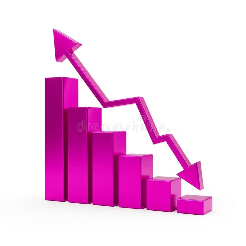
Free with trial A vibrant pink 3D bar chart illustrates financial data with a prominent downward-trending arrow superimposed. The bars decrease in height from left to right, signifying a decline. An upward-pointing arrow is positioned at the top left, indicating a contrasting upward trend. The graphic is isolated on a white background, making it suitable for presentations on financial performance, market trends,. Bar chart decrease illustrations 3D Pink Bar Chart with Downward Trend Arrow and Upward Trend Arrow graph statistics. A vibrant pink 3D bar chart illustrates financial data with a prominent downward-trending arrow superimposed. The bars decrease in height from left to right, signifying a decline. An upward-pointing arrow is positioned at the top left, indicating a contrasting upward trend. The graphic is isolated on a white background, making it suitable for presentations on financial performance, market trends,
Free with trial A 3D rendered bar chart illustrating a significant downward trend. Three blue, rounded bars are displayed on a clean white background with subtle grid lines. A prominent, bold red arrow sharply descends across the bars, clearly indicating a decline, decrease, or negative progression. This graphic is ideal for representing financial losses, market downturns, business challenges, economic recession, or any statistical data showing a negative trend. It conveys concepts of risk, failure, and reduction in a clear, impactful visual manner for presentations, reports, and analytical content. Bar chart decrease vectors Downward Trend Bar Chart with Red Arrow. A 3D rendered bar chart illustrating a significant downward trend. Three blue, rounded bars are displayed on a clean white background with subtle grid lines. A prominent, bold red arrow sharply descends across the bars, clearly indicating a decline, decrease, or negative progression. This graphic is ideal for representing financial losses, market downturns, business challenges, economic recession, or any statistical data showing a negative trend. It conveys concepts of risk, failure, and reduction in a clear, impactful visual manner for presentations, reports, and analytical content.
Free with trial A 3D bar chart rendered in a vibrant pink color illustrates a significant downward trend. The bars decrease in height from left to right, culminating in a very short bar. A bold pink arrow, also in 3D, starts high on the left and sharply descends to the right, mirroring the decline shown by the bars. The entire graphic is isolated on a clean white background. Bar chart decrease illustrations Pink 3D Bar Chart Showing a Downward Trend with an Arrow graph decline. A 3D bar chart rendered in a vibrant pink color illustrates a significant downward trend. The bars decrease in height from left to right, culminating in a very short bar. A bold pink arrow, also in 3D, starts high on the left and sharply descends to the right, mirroring the decline shown by the bars. The entire graphic is isolated on a clean white background
Free with trial A 3D rendering of a bar chart featuring three colorful columns: blue, orange, and green, increasing in height from left to right. Two prominent red downward arrows are positioned above the tallest green bar, clearly indicating a decline, decrease, or negative trend. The minimalist design on a clean white background makes it ideal for illustrating business performance, financial reports, economic downturns, sales drops, or any data visualization requiring a clear representation of a negative change or warning. Perfect for presentations, infographics, and analytical content. Bar chart decrease vectors 3D Bar Chart with Red Downward Arrows Showing Decline. A 3D rendering of a bar chart featuring three colorful columns: blue, orange, and green, increasing in height from left to right. Two prominent red downward arrows are positioned above the tallest green bar, clearly indicating a decline, decrease, or negative trend. The minimalist design on a clean white background makes it ideal for illustrating business performance, financial reports, economic downturns, sales drops, or any data visualization requiring a clear representation of a negative change or warning. Perfect for presentations, infographics, and analytical content.
Free with trial A 3D bar chart rendered in a vibrant pink color illustrates a downward trend. The bars decrease in height from left to right, representing a decline in data or performance. A thick pink arrow with a sharp point follows the descending path of the bars, reinforcing the concept of a decrease. The chart is presented in isolation against a clean white background, making the visual elements stand out. Bar chart decrease illustrations Pink Bar Chart with a Downward Trending Arrow Symbolizing Decline graph magenta. A 3D bar chart rendered in a vibrant pink color illustrates a downward trend. The bars decrease in height from left to right, representing a decline in data or performance. A thick pink arrow with a sharp point follows the descending path of the bars, reinforcing the concept of a decrease. The chart is presented in isolation against a clean white background, making the visual elements stand out
Free with trial A stylized, flat design illustration of a bar chart depicting a downward trend. The bars are colored red, yellow, and blue, arranged in decreasing height from left to right. A prominent red arrow points downwards across the chart, emphasizing the decline. The graphic is set against a clean white background, making it ideal for presentations, reports, and financial concepts related to loss, decrease, or negative performance. Bar chart decrease illustrations Declining Bar Chart with Downward Arrow. A stylized, flat design illustration of a bar chart depicting a downward trend. The bars are colored red, yellow, and blue, arranged in decreasing height from left to right. A prominent red arrow points downwards across the chart, emphasizing the decline. The graphic is set against a clean white background, making it ideal for presentations, reports, and financial concepts related to loss, decrease, or negative performance.
Free with trial A series of golden, metallic bars are arranged in a descending order, forming a bar chart that clearly illustrates a downward trend. The bars decrease in height from left to right, with the leftmost bar being the tallest and the rightmost bar being the shortest and widest. The reflective golden surface of the bars catches the light, highlighting their three-dimensional form. The chart is presented. Bar chart decrease illustrations Golden Bar Chart Showing A Downward Trend On A White Background graph financial. A series of golden, metallic bars are arranged in a descending order, forming a bar chart that clearly illustrates a downward trend. The bars decrease in height from left to right, with the leftmost bar being the tallest and the rightmost bar being the shortest and widest. The reflective golden surface of the bars catches the light, highlighting their three-dimensional form. The chart is presented
Free with trial A 3D bar chart illustrates a downward trend against a white background. The bars, colored red, yellow, green, and blue, decrease in height from left to right. A thick black arrow curves downwards, pointing towards the shortest bar, visually reinforcing the concept of decline or loss. Bar chart decrease illustrations Downward Trend Bar Chart with Red Yellow Green Blue Bars and Black Arrow on White Background. A 3D bar chart illustrates a downward trend against a white background. The bars, colored red, yellow, green, and blue, decrease in height from left to right. A thick black arrow curves downwards, pointing towards the shortest bar, visually reinforcing the concept of decline or loss
Free with trial A 3D golden bar chart illustrates a declining trend, with a sharp downward arrow indicating a significant decrease in performance or value. Isolated on a white background. Bar chart decrease illustrations Golden downward trending bar chart with arrow. A 3D golden bar chart illustrates a declining trend, with a sharp downward arrow indicating a significant decrease in performance or value. Isolated on a white background
Free with trial A visual representation of a declining trend, depicted by a blue bar chart with a prominent downward-pointing arrow, indicating a decrease in performance or value. Bar chart decrease illustrations Blue bar chart with a downward trending arrow. A visual representation of a declining trend, depicted by a blue bar chart with a prominent downward-pointing arrow, indicating a decrease in performance or value
Free with trial Financial crisis, economic downturn, bankruptcy concept. 3D blue glass bar chart icon with arrow down, recession graph. Falling price, decline profit or asset value, decrease in sales. 3D illustration. Bar chart decrease illustrations Financial crisis, economic downturn, bankruptcy concept. 3D blue glass bar chart icon with arrow down, recession graph. Falling
Free with trial A colorful bar chart illustrates a downward trend, with a prominent red arrow indicating a significant decrease in data. Bar chart decrease illustrations Bar chart showing declining trend with red arrow. A colorful bar chart illustrates a downward trend, with a prominent red arrow indicating a significant decrease in data
Free with trial A 3D red bar chart shows a declining trend against a white grid background. The bars decrease in height from left to right, with a red line graph following the downward trajectory. Bar chart decrease illustrations Red 3 D bar chart with downward trend line on white grid background graph line graph. A 3D red bar chart shows a declining trend against a white grid background. The bars decrease in height from left to right, with a red line graph following the downward trajectory
Free with trial A red downward arrow and a red bar chart showing a decline are presented on a white background. Bar chart decrease illustrations Red Downward Arrow and Bar Chart Symbolizing Decrease and Decline Keywords: decrease, decline, down, arrow, bar. A red downward arrow and a red bar chart showing a decline are presented on a white background
Free with trial A visual representation of a financial or business trend showing a steady decrease over time. The bar chart illustrates negative performance with a prominent downward arrow. Bar chart decrease illustrations Declining bar chart showing downward trend with arrow. A visual representation of a financial or business trend showing a steady decrease over time. The bar chart illustrates negative performance with a prominent downward arrow
Free with trial Two flat design icons with color. One depicts an upward bar chart with a blue arrow and percentage, the other a downward bar chart with a grey arrow and percentage. Bar chart decrease vectors Color Bar Chart Icons for Increase and Decrease graph Ai-Generated. Two flat design icons with color. One depicts an upward bar chart with a blue arrow and percentage, the other a downward bar chart with a grey arrow and percentage
Free with trial Colorful bar chart illustrating a gradual decrease against a transparent background, highlighting a decline in data and signaling a negative financial trend or recession. Bar chart decrease vectors Bar chart gradually decreasing with transparent background. Colorful bar chart illustrating a gradual decrease against a transparent background, highlighting a decline in data and signaling a negative financial trend or recession
Free with trial Business graph data in a bar chart showing increase and decrease with blue line illustration on plain background. Bar chart decrease vectors Business graph data in a bar chart showing increase and decrease with blue line illustration on plain background
Free with trial Circular bar chart with red upward arrow and dark gray downward arrow icon for growth and analytics featuring improvement, decrease, trend with. Bar chart decrease vectors Circular bar chart with red upward arrow and dark gray downward arrow icon for growth
Free with trial The image depicts a flip chart with a combination of a bar graph and a line graph, both showing a downward trend. The bar graph starts with taller bars that gradually decrease in height, indicating a decline over time. The line graph above it also trends downward, reinforcing the concept of a negative trajectory or economic downturn. The visual is likely used to represent financial loss, market. Bar chart decrease illustrations Economic decline illustrated by a combination of bar and line graphs on a flip chart. The image depicts a flip chart with a combination of a bar graph and a line graph, both showing a downward trend. The bar graph starts with taller bars that gradually decrease in height, indicating a decline over time. The line graph above it also trends downward, reinforcing the concept of a negative trajectory or economic downturn. The visual is likely used to represent financial loss, market
Free with trial A striking 3D rendering showcases a red bar chart dramatically illustrating an economic downturn and financial decline. The downward trending bar chart, emphasized by a prominent red color and a downward-pointing arrow, conveys a sense of decrease and loss within business, finance, and the global economy. This graphic effectively represents concepts such as recession, a bearish market, and. Bar chart decrease illustrations Red bar chart depicting economic downturn or financial decline business and investment concerns. A striking 3D rendering showcases a red bar chart dramatically illustrating an economic downturn and financial decline. The downward trending bar chart, emphasized by a prominent red color and a downward-pointing arrow, conveys a sense of decrease and loss within business, finance, and the global economy. This graphic effectively represents concepts such as recession, a bearish market, and
Free with trial A red bar chart illustrates a steep downward trend with a red arrow indicating a significant decrease in value. Bar chart decrease illustrations Red bar chart showing sharp decline. A red bar chart illustrates a steep downward trend with a red arrow indicating a significant decrease in value
Free with trial A flat design illustration of a bar chart showing a declining trend, with a red arrow pointing downwards, symbolizing a decrease in performance or value. Bar chart decrease illustrations Bar chart with a downward trend isolated on white background. A flat design illustration of a bar chart showing a declining trend, with a red arrow pointing downwards, symbolizing a decrease in performance or value
Free with trial Red bar chart depicting a downward trend on a white background. The bars progressively decrease in height from left to right. An upward-pointing arrow emerges from the first bar, indicating initial growth. A curved, downward-pointing arrow overlays the bars, emphasizing the overall decline. The clear design conveys concepts of financial loss, decreasing statistics, or declining data points. Bar chart decrease vectors Red bar chart showing a downward trend with an upward arrow and a falling arrow isolated on white background. Red bar chart depicting a downward trend on a white background. The bars progressively decrease in height from left to right. An upward-pointing arrow emerges from the first bar, indicating initial growth. A curved, downward-pointing arrow overlays the bars, emphasizing the overall decline. The clear design conveys concepts of financial loss, decreasing statistics, or declining data points.
Free with trial A bar chart displayed on an easel, illustrating a negative trend. The bars, a mix of blue and grey, show a progressive decrease in value. A prominent red arrow curves downwards across the chart, signifying a decline or loss. The presentation suggests a financial report or business analysis with unfavorable results. Bar chart decrease illustrations Bar chart showing a downward trend with a red arrow indicating decline. A bar chart displayed on an easel, illustrating a negative trend. The bars, a mix of blue and grey, show a progressive decrease in value. A prominent red arrow curves downwards across the chart, signifying a decline or loss. The presentation suggests a financial report or business analysis with unfavorable results
Free with trial Modern vector icon showing a downward arrow over a bar chart with progressively smaller bars indicating decline or decrease. Bar chart decrease illustrations Downward arrow with decreasing bar chart graphic. Modern vector icon showing a downward arrow over a bar chart with progressively smaller bars indicating decline or decrease
Free with trial A three-dimensional bar chart constructed from shiny golden bars depicts a clear downward trend. The bars decrease in height from left to right, creating a visual representation of decline or loss. The metallic gold material reflects light, giving the chart a polished and impactful appearance. The entire graphic is isolated on a clean white background, making the data visualization the sole focus. Bar chart decrease illustrations Golden 3D bar chart showing a downward trend on a white background graph data. A three-dimensional bar chart constructed from shiny golden bars depicts a clear downward trend. The bars decrease in height from left to right, creating a visual representation of decline or loss. The metallic gold material reflects light, giving the chart a polished and impactful appearance. The entire graphic is isolated on a clean white background, making the data visualization the sole focus
Free with trial A black and white circular icon depicting a bar chart with three bars of decreasing height. A diagonal arrow points downwards from the tallest bar to the shortest, indicating a downward trend or decline. The icon is set against a white background. Bar chart decrease illustrations Black and White Icon of a Downward Trending Bar Chart in a Circle graph decrease. A black and white circular icon depicting a bar chart with three bars of decreasing height. A diagonal arrow points downwards from the tallest bar to the shortest, indicating a downward trend or decline. The icon is set against a white background
Free with trial Gray bar chart with red line graph and downward arrow, illustrating decline, decrease, loss, and negative trend. Bar chart decrease vectors Bar chart with downward red arrow, symbolizing decline. Gray bar chart with red line graph and downward arrow, illustrating decline, decrease, loss, and negative trend
Free with trial Bar graph showing a downward trend, business decline, economic decrease, market analysis, financial chart. Bar chart decrease vectors Bar chart with downward trend arrow business decline graph. Bar graph showing a downward trend, business decline, economic decrease, market analysis, financial chart
Free with trial A clean, minimalist 3D rendering of a declining bar chart in a monochromatic pastel pink color scheme. The bars are arranged in descending order, clearly illustrating a concept of decrease, loss, or a downward trend. This abstract and modern graphic is perfect for business and financial presentations, reports, or infographics about recession, economic downturn, sales reduction, or negative growth. The soft lighting and ample copy space make it a versatile background for various data visualization and corporate concepts. Bar chart decrease illustrations Minimalist Pink 3D Bar Chart Showing a Downward Trend. A clean, minimalist 3D rendering of a declining bar chart in a monochromatic pastel pink color scheme. The bars are arranged in descending order, clearly illustrating a concept of decrease, loss, or a downward trend. This abstract and modern graphic is perfect for business and financial presentations, reports, or infographics about recession, economic downturn, sales reduction, or negative growth. The soft lighting and ample copy space make it a versatile background for various data visualization and corporate concepts.
Free with trial A 3D rendered bar chart illustrating a downward trend. The bars, colored black, green, orange, red, and a lighter red, decrease in height from left to right. A vibrant purple arrow points downwards, diagonally across the bars, signifying a decrease or negative movement. The object is isolated on a white background. Bar chart decrease illustrations 3D Bar Chart with Purple Downward Arrow on White Background. A 3D rendered bar chart illustrating a downward trend. The bars, colored black, green, orange, red, and a lighter red, decrease in height from left to right. A vibrant purple arrow points downwards, diagonally across the bars, signifying a decrease or negative movement. The object is isolated on a white background
Free with trial The image depicts a bar chart showing a significant decline in values across five categories, accompanied by a bold downward red arrow emphasizing the sharp decrease. The bars progressively shorten from left to right, indicating a continuous drop in whatever metric is being measured. Bar chart decrease illustrations Declining trend illustrated with bar chart and downward arrow. The image depicts a bar chart showing a significant decline in values across five categories, accompanied by a bold downward red arrow emphasizing the sharp decrease. The bars progressively shorten from left to right, indicating a continuous drop in whatever metric is being measured
Free with trial The image shows an easel holding a canvas with a bar chart. The bar chart displays a series of green vertical bars that initially increase in height but then decrease, illustrating a downward trend. A red line with an arrowhead at the end emphasizes the declining trend. Bar chart decrease illustrations Illustration of a bar chart on an easel showing a downward trend. The image shows an easel holding a canvas with a bar chart. The bar chart displays a series of green vertical bars that initially increase in height but then decrease, illustrating a downward trend. A red line with an arrowhead at the end emphasizes the declining trend
Free with trial 3D silver column chart depicting a decreasing sequence of bars from left to right. Each bar is rectangular and has a metallic finish, giving a sleek and reflective appearance. The chart suggests a downward trend, possibly illustrating declining values or losses. The bars are evenly spaced on a flat surface with no additional labels or axes visible. Suitable for representing financial data or general decrease in values. Bar chart decrease vectors Silver 3D column chart or bar chart showing decreasing financial values and losses. 3D silver column chart depicting a decreasing sequence of bars from left to right. Each bar is rectangular and has a metallic finish, giving a sleek and reflective appearance. The chart suggests a downward trend, possibly illustrating declining values or losses. The bars are evenly spaced on a flat surface with no additional labels or axes visible. Suitable for representing financial data or general decrease in values.
Free with trial The image shows a bar chart with green bars that progressively decrease in height from left to right, illustrating a downward trend. A bold red diagonal arrow points downward, emphasizing the decline in values or performance over time. Bar chart decrease illustrations Decline in bar chart growth represented by a downward red arrow. The image shows a bar chart with green bars that progressively decrease in height from left to right, illustrating a downward trend. A bold red diagonal arrow points downward, emphasizing the decline in values or performance over time
Free with trial A hand-drawn illustration showing a bar chart with a downward arrow, symbolizing a decline in values, recession, decrease, or negative trends. The minimalistic sketch represents loss, degradation, or economic downturn. Bar chart decrease illustrations Hand-Drawn Declining Bar Chart with Arrow Illustrating Negative Growth Trend. A hand-drawn illustration showing a bar chart with a downward arrow, symbolizing a decline in values, recession, decrease, or negative trends. The minimalistic sketch represents loss, degradation, or economic downturn
Free with trial Abstract data reduction concept showing declining metrics in a bar chart sequence, perfect for finance analysts and business presentations. This compelling AI-generated visual provides a clear metaphor for optimization, cost-cutting, or efficiency improvements in corporate reporting and digital design projects. Bar chart decrease illustrations Visual decrease in bar chart values indicated by a directional arrow. Abstract data reduction concept showing declining metrics in a bar chart sequence, perfect for finance analysts and business presentations. This compelling AI-generated visual provides a clear metaphor for optimization, cost-cutting, or efficiency improvements in corporate reporting and digital design projects.
Free with trial The image displays a bar chart with eight vertical bars of varying heights. Each bar is colored in teal, and there are red arrows pointing downward on top of each bar, suggesting a decrease in the values they represent. The bars are arranged in a slightly irregular pattern, with the tallest bar positioned in the center of the chart. Bar chart decrease illustrations A bar chart with red arrows indicating a downward trend in data values. The image displays a bar chart with eight vertical bars of varying heights. Each bar is colored in teal, and there are red arrows pointing downward on top of each bar, suggesting a decrease in the values they represent. The bars are arranged in a slightly irregular pattern, with the tallest bar positioned in the center of the chart
Free with trial The image features a visual representation of a declining trend using a bar chart on an easel. The bars decrease in height from left to right, transitioning from blue to green, and are topped with a bold red downward arrow, symbolizing a downward trend or decline. Bar chart decrease illustrations Declining bar chart illustrated on an easel with a red downward arrow. The image features a visual representation of a declining trend using a bar chart on an easel. The bars decrease in height from left to right, transitioning from blue to green, and are topped with a bold red downward arrow, symbolizing a downward trend or decline
Free with trial This image features a bar chart with four bars. The first bar is the tallest, and the subsequent bars decrease in height. The third bar has an arrow pointing downwards, and the fourth bar has an arrow pointing upwards, indicating a slight increase. Bar chart decrease illustrations Bar chart showing a downward trend with a slight upward shift at the end. This image features a bar chart with four bars. The first bar is the tallest, and the subsequent bars decrease in height. The third bar has an arrow pointing downwards, and the fourth bar has an arrow pointing upwards, indicating a slight increase
Free with trial The image shows a whiteboard with a bar chart illustrating a series of bars that decrease in height. A red downward arrow is drawn over the bars, indicating a decline or negative trend. The whiteboard is set on a simple wooden easel with a small wooden figure on top, emphasizing the visual message of a downward trajectory in data or performance metrics. Bar chart decrease illustrations Declining growth represented by a bar chart with a downward trend arrow. The image shows a whiteboard with a bar chart illustrating a series of bars that decrease in height. A red downward arrow is drawn over the bars, indicating a decline or negative trend. The whiteboard is set on a simple wooden easel with a small wooden figure on top, emphasizing the visual message of a downward trajectory in data or performance metrics
Free with trial The image shows a bar chart with five bars of varying heights, arranged from left to right. The bars are in shades of blue, with the leftmost bar being the tallest and the rightmost bar being the shortest. The bars gradually decrease in height from left to right. Bar chart decrease illustrations A bar chart with five bars of varying heights in shades of blue. The image shows a bar chart with five bars of varying heights, arranged from left to right. The bars are in shades of blue, with the leftmost bar being the tallest and the rightmost bar being the shortest. The bars gradually decrease in height from left to right
Free with trial The image shows a bar chart with five red bars of decreasing height. Each bar has a downward-pointing arrow above it, indicating a downward trend or decrease in the data represented by the bars. Bar chart decrease illustrations A bar chart with arrows pointing downwards indicating a decreasing trend. The image shows a bar chart with five red bars of decreasing height. Each bar has a downward-pointing arrow above it, indicating a downward trend or decrease in the data represented by the bars
Free with trial The image shows a canvas propped up on an easel displaying a bar chart with bars of varying heights that decrease from left to right. A red arrow points downward from the top right corner of the canvas, symbolizing a decline or downward trend. Bar chart decrease illustrations Declining bar chart illustration on an easel with a red downward arrow. The image shows a canvas propped up on an easel displaying a bar chart with bars of varying heights that decrease from left to right. A red arrow points downward from the top right corner of the canvas, symbolizing a decline or downward trend
Free with trial The image displays a simple bar chart composed of five red bars of varying heights. Each bar has arrows pointing upward or downward, indicating an increase or decrease in values. The chart visually represents fluctuations in data, with the tallest bar in the center and the shortest bars on the far left and right. Bar chart decrease illustrations Red bar chart with upward and downward directional arrows indicating trends. The image displays a simple bar chart composed of five red bars of varying heights. Each bar has arrows pointing upward or downward, indicating an increase or decrease in values. The chart visually represents fluctuations in data, with the tallest bar in the center and the shortest bars on the far left and right
Free with trial Bar chart with downward trending arrow, representing loss, decrease, or recession. Bar chart decrease vectors Bar chart with downward trending arrow, representing loss, decrease, or recession
Free with trial The image shows a framed bar chart with red and green bars. The bars represent data trends over time, with the green bars showing an increase and the red bars showing a decrease. The chart is displayed on a white background with a wooden frame. Bar chart decrease illustrations A framed bar chart with red and green bars representing data trends over time. The image shows a framed bar chart with red and green bars. The bars represent data trends over time, with the green bars showing an increase and the red bars showing a decrease. The chart is displayed on a white background with a wooden frame
Free with trial The image shows an easel holding a white poster with a blue bar and line chart. The chart depicts a series of vertical bars that gradually decrease in height, accompanied by a line graph that rises initially and then declines. The easel is positioned on a plain, light-colored background, emphasizing the visual data presentation on the poster. Bar chart decrease illustrations Easel displaying a bar and line chart illustrating financial or data trends. The image shows an easel holding a white poster with a blue bar and line chart. The chart depicts a series of vertical bars that gradually decrease in height, accompanied by a line graph that rises initially and then declines. The easel is positioned on a plain, light-colored background, emphasizing the visual data presentation on the poster
Free with trial A stylized black and white illustration shows a bar chart with bars of decreasing height, leading to a sharp downward-pointing arrow. Bar chart decrease vectors Decreasing bar chart with downward arrow decrease downward recession statistics negative. A stylized black and white illustration shows a bar chart with bars of decreasing height, leading to a sharp downward-pointing arrow
Free with trial A 3D bar chart visually represents a financial or performance decline. The bars decrease in height from left to right, labeled with percentages indicating a downward trend. This graphic signifies loss or reduction. Bar chart decrease illustrations Declining blue bar chart showing percentage decrease from 100 percent downwards. A 3D bar chart visually represents a financial or performance decline. The bars decrease in height from left to right, labeled with percentages indicating a downward trend. This graphic signifies loss or reduction
Free with trial This image depicts a 3D bar chart with red and gray bars arranged in a pyramid shape. The bars gradually decrease in height from the center to the edges, creating a symmetrical and visually appealing data distribution. The red bars represent one data set, while the gray bars represent another, providing a clear comparison between the two. Bar chart decrease illustrations A 3d bar chart with red and gray bars showing data distribution in a pyramid shape. This image depicts a 3D bar chart with red and gray bars arranged in a pyramid shape. The bars gradually decrease in height from the center to the edges, creating a symmetrical and visually appealing data distribution. The red bars represent one data set, while the gray bars represent another, providing a clear comparison between the two
Free with trial Bar chart graphic showing a downward trend with an orange arrow indicating decrease. Bar chart decrease vectors Bar chart graphic showing a downward trend with an orange arrow indicating decrease
Free with trial The image shows a gold coin with a dollar sign on it placed in front of a bar chart with a downward trend. The bars are gray and the trend line is red, indicating a decrease in value or performance over time. Bar chart decrease illustrations A gold coin with a dollar sign on it sits in front of a bar chart with a downward trend. The image shows a gold coin with a dollar sign on it placed in front of a bar chart with a downward trend. The bars are gray and the trend line is red, indicating a decrease in value or performance over time
Free with trial A 3D rendered bar chart illustrates a downward trend. Two tall green bars are followed by two shorter pink bars, representing a decrease in value. A bright yellow arrow sharply descends from right to left, crossing over the bars and emphasizing the decline. The composition is set against a solid light blue background. Bar chart decrease illustrations 3D Bar Chart with Falling Yellow Arrow Indicating Decline on Blue Background graph. A 3D rendered bar chart illustrates a downward trend. Two tall green bars are followed by two shorter pink bars, representing a decrease in value. A bright yellow arrow sharply descends from right to left, crossing over the bars and emphasizing the decline. The composition is set against a solid light blue background
Free with trial The image depicts a bar chart with a superimposed red line showing a clear downward trend. Each bar represents a progressively smaller value, indicating a consistent decrease in data over time. The chart uses a gradient from taller to shorter bars, suggesting a significant drop in the measured quantity, which is reinforced by the downward-sloping line connecting the tops of the bars. Bar chart decrease illustrations Declining bar chart graph illustrating a downward trend in data values over time. The image depicts a bar chart with a superimposed red line showing a clear downward trend. Each bar represents a progressively smaller value, indicating a consistent decrease in data over time. The chart uses a gradient from taller to shorter bars, suggesting a significant drop in the measured quantity, which is reinforced by the downward-sloping line connecting the tops of the bars
Free with trial A 3D bar chart shows a significant downward trend with a prominent red arrow indicating a steep financial decline and market drop. Bar chart decrease illustrations Financial downturn declining bar chart with red arrow symbolizing loss and decrease. A 3D bar chart shows a significant downward trend with a prominent red arrow indicating a steep financial decline and market drop
Free with trial The image shows a 3D-rendered easel holding a canvas with a bar and line chart. The bar chart illustrates a declining trend in growth, with the first bar being the tallest and each subsequent bar progressively shorter. Overlaid on the bars is a red downward-sloping line, emphasizing the decrease. The scene is set against a plain white background, highlighting the chart's elements clearly. Bar chart decrease illustrations Easing economic growth depicted through a declining bar and line chart on an easel. The image shows a 3D-rendered easel holding a canvas with a bar and line chart. The bar chart illustrates a declining trend in growth, with the first bar being the tallest and each subsequent bar progressively shorter. Overlaid on the bars is a red downward-sloping line, emphasizing the decrease. The scene is set against a plain white background, highlighting the chart's elements clearly
Free with trial The image depicts a combination of bar and line charts. The bar chart shows three descending bars in orange, yellow, and a lighter shade, indicating a decline in values. Overlaid on this is a downward-sloping line chart, reinforcing the trend of decrease. The overall design suggests a visual representation of a downward market trend or decline in performance metrics over time. Bar chart decrease illustrations Graphic illustration of declining market trends with bar and line chart combination. The image depicts a combination of bar and line charts. The bar chart shows three descending bars in orange, yellow, and a lighter shade, indicating a decline in values. Overlaid on this is a downward-sloping line chart, reinforcing the trend of decrease. The overall design suggests a visual representation of a downward market trend or decline in performance metrics over time
Free with trial A 3D illustration depicts a bar chart with bars of varying colors (blue, grey, yellow) showing a downward trend. Above the chart, a red triangular warning sign with a white exclamation mark signifies an alert or danger. The composition is set against a soft pink background, conveying a message of financial or business decline and risk. Bar chart decrease illustrations 3D Bar Chart Showing Decline with a Red Exclamation Mark Warning Sign Above graph decrease. A 3D illustration depicts a bar chart with bars of varying colors (blue, grey, yellow) showing a downward trend. Above the chart, a red triangular warning sign with a white exclamation mark signifies an alert or danger. The composition is set against a soft pink background, conveying a message of financial or business decline and risk
Free with trial This image features a bar chart with orange bars representing performance metrics that steadily decrease over time, accompanied by a downward-sloping line graph that tracks the same trend against a blurred office background. Bar chart decrease illustrations A bar chart showing a steady decline in performance metrics over a series of sequential periods. This image features a bar chart with orange bars representing performance metrics that steadily decrease over time, accompanied by a downward-sloping line graph that tracks the same trend against a blurred office background
Free with trial The image depicts a downward trend using a combination of bar and line chart elements. The yellow bars gradually decrease in height from left to right, indicating a consistent decline. A red line overlays the bars, further emphasizing the downward trajectory, ending with a large red arrow pointing downwards to signify a significant drop. This visual representation is often used to show reductions. Bar chart decrease illustrations Declining trend illustrated through bar and line chart visualization isolated on white background. The image depicts a downward trend using a combination of bar and line chart elements. The yellow bars gradually decrease in height from left to right, indicating a consistent decline. A red line overlays the bars, further emphasizing the downward trajectory, ending with a large red arrow pointing downwards to signify a significant drop. This visual representation is often used to show reductions
Free with trial A clean vector illustration of a bar chart graph featuring pink striped bars and a yellow highlighted section against a white background. The chart is flat design style, ideal for data visualization, business presentations, or infographics. The bars decrease in height from left to right, with the yellow section emphasizing the bottom area. Bar chart decrease illustrations Striped bar chart graph with yellow highlight and pink bars on white background vector illustration. A clean vector illustration of a bar chart graph featuring. A clean vector illustration of a bar chart graph featuring pink striped bars and a yellow highlighted section against a white background. The chart is flat design style, ideal for data visualization, business presentations, or infographics. The bars decrease in height from left to right, with the yellow section emphasizing the bottom area
Free with trial Graphic representation of declining business. Bar chart shows falling trend. Arrow points downwards. Silhouettes of people signify workforce reduction. Concept for economic downturn, negative growth, or company challenges. Bar chart decrease illustrations Declining bar chart with downward arrow and silhouettes of people representing decrease in workforce or business performance loss. Graphic representation of declining business. Bar chart shows falling trend. Arrow points downwards. Silhouettes of people signify workforce reduction. Concept for economic downturn, negative growth, or company challenges
Free with trial Flat design vector of a dollar coin and a falling bar chart. Perfect for finance, business, and loss themes. Isolated on white. Bar chart decrease vectors Dollar Decrease Bar Chart Icon. Flat design vector of a dollar coin and a falling bar chart. Perfect for finance, business, and loss themes. Isolated on white
Free with trial Red 3D bar chart with descending trend line and arrow, set against a dark gradient background. The tallest bar on the left progressively declines toward the right, illustrating a decrease. The entire structure has a glossy finish, emphasizing the downward movement indicated by the arrowhead at the end of the line. The chart appears suspended centrally, providing a clear visual representation of a downward trend, often used in financial or analytical contexts to denote loss or decline. Bar chart decrease illustrations Red 3D bar chart with descending trend line and arrow, set against a dark gradient
Free with trial A 3D white bar chart shows a significant downward trend indicated by a sharp, angled arrow pointing downwards. The bars decrease in height from left to right, illustrating a concept of decline or loss. The clean white background emphasizes the minimalist design and the stark visual representation of negative growth. Bar chart decrease illustrations 3D White Bar Chart with Downward Trending Arrow on White Background graph decline. A 3D white bar chart shows a significant downward trend indicated by a sharp, angled arrow pointing downwards. The bars decrease in height from left to right, illustrating a concept of decline or loss. The clean white background emphasizes the minimalist design and the stark visual representation of negative growth
Free with trial A stark vector illustration of a bar chart showing a sharp decrease, indicated by a downward-pointing red arrow. This icon effectively represents economic downturns, financial losses, declining trends, or negative performance metrics. Ideal for business reports, financial analysis, or news graphics, vector design Generative AI. Bar chart decrease vectors . A stark vector illustration of a bar chart showing a sharp decrease, indicated by a downward-pointing red arrow. This icon effectively represents economic downturns, financial losses, declining trends, or negative performance metrics. Ideal for business reports, financial analysis, or news graphics, vector design Generative AI
Free with trial A 3D rendered bar chart displaying a downward trend. The bars, colored black, blue, green, yellow, and orange, decrease in height from left to right. A bold red arrow points downwards, diagonally across the bars, indicating a decline or loss. The chart is presented on a white background. Bar chart decrease illustrations 3D Bar Chart with Red Downward Arrow on White Background. A 3D rendered bar chart displaying a downward trend. The bars, colored black, blue, green, yellow, and orange, decrease in height from left to right. A bold red arrow points downwards, diagonally across the bars, indicating a decline or loss. The chart is presented on a white background