Free with trial A green bar chart profit with an upward arrow, while a red bar chart loss with a downward arrow, presented on a white background. Bar chart decrease illustrations Representation of profit and loss with ascending green bar chart and descending red bar chart on a white background. A green bar chart profit with an upward arrow, while a red bar chart loss with a downward arrow, presented on a white background
Free with trial A clean, vector-style icon featuring a bar chart that displays a clear downward trend, symbolizing economic decline, financial loss, or diminishing performance metrics in a professional or digital context. Bar chart decrease vectors A minimalist black and white icon showing a downward trend bar chart representing financial loss. A clean, vector-style icon featuring a bar chart that displays a clear downward trend, symbolizing economic decline, financial loss, or diminishing performance metrics in a professional or digital context
Free with trial Blue bar graph with a downward trending arrow and a red heart above, representing a decrease in love or affection. Bar chart decrease vectors Blue bar graph showing decrease in love and affection. Blue bar graph with a downward trending arrow and a red heart above, representing a decrease in love or affection
Free with trial Financial data analysis bar chart icon with upward trend showing business growth. Bar chart decrease vectors Financial data analysis bar chart icon with upward trend showing business growth
Free with trial 3D bar chart with red upward and downward arrows indicating growth and decline trends. Bar chart decrease vectors Graphic illustration showing upward and downward trend arrows with bar chart. 3D bar chart with red upward and downward arrows indicating growth and decline trends
Free with trial Growth and decline bar chart icon illustration. Upward and downward arrow graph symbol. Business up and down trend concept. Bar chart decrease vectors Growth and decline bar chart icon. Upward and downward arrow graph symbol. Business up and down trend concept
Free with trial A 3D rendered bar graph displays a series of six distinct bars, arranged in descending order of height from left to right. The bars are colored in a gradient from blue to orange, resting on a white, slightly angled platform. A subtle shadow is cast to the left, emphasizing the three-dimensional nature of the graphic. The visual represents a downward trend or decrease in data. Bar chart decrease illustrations 3D rendered bar graph showing a downward trend with colorful bars on a white platform chart statistics. A 3D rendered bar graph displays a series of six distinct bars, arranged in descending order of height from left to right. The bars are colored in a gradient from blue to orange, resting on a white, slightly angled platform. A subtle shadow is cast to the left, emphasizing the three-dimensional nature of the graphic. The visual represents a downward trend or decrease in data
Free with trial The image shows a whiteboard with a red bar chart that initially rises and then sharply declines, accompanied by a downward-sloping red arrow. The chart is set against a white background and is placed on a wooden easel stand, indicating a visual representation of a downward trend or decline in data. Bar chart decrease illustrations Whiteboard displaying a declining trend with a red bar chart and downward arrow. The image shows a whiteboard with a red bar chart that initially rises and then sharply declines, accompanied by a downward-sloping red arrow. The chart is set against a white background and is placed on a wooden easel stand, indicating a visual representation of a downward trend or decline in data
Free with trial Red Bar Chart on Grunge Background Data Visualization Concept, data analysis, chart , This photo was created using generative AI. design. Bar chart decrease illustrations Red Bar Chart on Grunge Background Data Visualization Concept, data analysis, chart design. Red Bar Chart on Grunge Background Data Visualization Concept, data analysis, chart , This photo was created using generative AI. design
Free with trial A 3D rendered graphic displays a colorful bar chart with bars in orange, green, yellow, and pink. A yellow line with white dots connects points above the bars, forming a trend graph. A blue rectangular background with a white strip containing green, orange, and blue dots sits at the top. The object is isolated on a white background. Bar chart decrease vectors 3 D colorful bar chart graph with line and dots on blue background statistics. A 3D rendered graphic displays a colorful bar chart with bars in orange, green, yellow, and pink. A yellow line with white dots connects points above the bars, forming a trend graph. A blue rectangular background with a white strip containing green, orange, and blue dots sits at the top. The object is isolated on a white background
Free with trial The image shows a series of vertical bars in descending order of height, colored from dark blue to light purple. A bold red diagonal arrow overlays the bars, pointing downward, symbolizing a decline or reduction in values over time. This visual is often used to represent a decrease in metrics such as sales, performance, or other quantifiable data trends. Bar chart decrease illustrations Declining bar chart with downward trend arrow indicating a decrease in values. The image shows a series of vertical bars in descending order of height, colored from dark blue to light purple. A bold red diagonal arrow overlays the bars, pointing downward, symbolizing a decline or reduction in values over time. This visual is often used to represent a decrease in metrics such as sales, performance, or other quantifiable data trends
Free with trial This image depicts a bar chart with a symmetrical, bell-shaped distribution. The bars increase in height from the left, peak in the center with the highest bar, and then decrease symmetrically towards the right. This type of chart is often used to represent normal distributions or central tendencies in data sets. Bar chart decrease illustrations A bar chart displaying a distribution with a peak in the middle and tapering ends. This image depicts a bar chart with a symmetrical, bell-shaped distribution. The bars increase in height from the left, peak in the center with the highest bar, and then decrease symmetrically towards the right. This type of chart is often used to represent normal distributions or central tendencies in data sets
Free with trial Decreasing Bar Chart With Downward Arrow Line Icon. Financial Decline, Economic Downturn, And Business Loss Outline Symbol. Market Analysis. Editable Stroke. Isolated Vector Illustration. Bar chart decrease vectors Decreasing Bar Chart With Downward Arrow Line Icon. Financial Decline, Economic Downturn, And Business Loss Outline
Free with trial Three dimensional red bar chart graphic illustrating a continuous downward trend in business statistics or performance indicators. Bar chart decrease vectors Three dimensional red bar chart showing decreasing metrics on white background. Three dimensional red bar chart graphic illustrating a continuous downward trend in business statistics or performance indicators.
Free with trial The image shows a whiteboard with a red bar chart that initially rises and then sharply declines, accompanied by a downward-sloping red arrow. The chart is set against a white background and is placed on a wooden easel stand, indicating a visual representation of a downward trend or decline in data. Bar chart decrease illustrations Whiteboard displaying a declining trend with a red bar chart and downward arrow. The image shows a whiteboard with a red bar chart that initially rises and then sharply declines, accompanied by a downward-sloping red arrow. The chart is set against a white background and is placed on a wooden easel stand, indicating a visual representation of a downward trend or decline in data
Free with trial Bar Chart With Arrows Line And Solid Icon Set. Financial Growth And Decline Trend Analysis Symbol Collection. Economic Performance Indicators. Isolated Vector Illustration. Bar chart decrease vectors Bar Chart With Arrows Line And Solid Icon Set. Financial Growth And Decline Trend Analysis Symbol Collection. Economic
Free with trial Line art illustration of a bar chart depicting financial decrease for business analysis. Bar chart decrease vectors Line art illustration of a bar chart depicting financial decrease for business analysis
Free with trial Black icon of a bar chart with a downward arrow pointing to a broken bar, signifying reduction on a white. Bar chart decrease illustrations Black icon of a bar chart with a downward arrow indicating reduction graph decline. Black icon of a bar chart with a downward arrow pointing to a broken bar, signifying reduction on a white
Free with trial A 3D golden financial graph depicts a downward trend, with a prominent descending line and accompanying bar chart elements. The metallic gold material and smooth, wavy lines flowing beneath create a sense of dynamic movement. The dark blue background provides contrast to the golden elements. Bar chart decrease illustrations Golden Downward Trend Financial Graph with Wavy Lines and Bar Chart decline loss. A 3D golden financial graph depicts a downward trend, with a prominent descending line and accompanying bar chart elements. The metallic gold material and smooth, wavy lines flowing beneath create a sense of dynamic movement. The dark blue background provides contrast to the golden elements
Free with trial A colorful 3D rendering showing a bar chart in descending order with yellow, red, blue and pink bars on a transparent background. Bar chart decrease vectors 3D colorful decreasing bar chart showing market trends on transparent background. A colorful 3D rendering showing a bar chart in descending order with yellow, red, blue and pink bars on a transparent background.
Free with trial Growth and decline bar chart icon illustration. Upward and downward arrow graph symbol. Business up and down trend concept in black circle. Bar chart decrease vectors Growth and decline bar chart icon. Upward and downward arrow graph symbol. Business up and down trend concept in black circle
Free with trial Heights showing black bar chart icon with varying heights on white background keywords: bar chart, graph. Bar chart decrease illustrations Black bar chart icon with varying heights on white background Keywords: bar chart, graph, data. Heights showing black bar chart icon with varying heights on white background keywords: bar chart, graph
Free with trial The image depicts a stylized 3D bar chart with alternating red and blue bars representing fluctuations in data trends. The bars ascend and descend, symbolizing periods of growth and decline. The chart has a modern, gradient design with a clear upward trajectory at the end, suggesting recovery or improvement after a period of instability. The visual representation emphasizes the variability and. Bar chart decrease illustrations Dynamic 3d bar chart illustrating fluctuating growth and decline trends over time. The image depicts a stylized 3D bar chart with alternating red and blue bars representing fluctuations in data trends. The bars ascend and descend, symbolizing periods of growth and decline. The chart has a modern, gradient design with a clear upward trajectory at the end, suggesting recovery or improvement after a period of instability. The visual representation emphasizes the variability and
Free with trial The image shows a bar chart with eight bars of varying heights, illustrating a trend that starts low, gradually increases, peaks twice, dips in the middle, and then rises significantly at the end. The bars are outlined in blue with a slight gradient fill, and the chart is set against a plain light blue background. This type of chart is often used to represent data changes over time or different. Bar chart decrease illustrations A varied bar chart displaying fluctuating data trends across different categories. The image shows a bar chart with eight bars of varying heights, illustrating a trend that starts low, gradually increases, peaks twice, dips in the middle, and then rises significantly at the end. The bars are outlined in blue with a slight gradient fill, and the chart is set against a plain light blue background. This type of chart is often used to represent data changes over time or different
Free with trial Declining Bar Chart With Downward Arrow Line And Solid Icon Set. Financial Loss, Economic Downturn, And Business Decline Symbol Collection. Risk Assessment. Isolated Vector Illustration. Bar chart decrease vectors Declining Bar Chart With Downward Arrow Line And Solid Icon Set. Financial Loss, Economic Downturn, And Business Decline
Free with trial A 3D bar chart composed of four colored bars (orange, green, white, and blue) stands on a black base. A line graph with red dots connects the tops of the bars, showing a fluctuating trend that culminates in a sharp downward movement indicated by a red arrow. This visual represents a negative financial trend or economic decline. Bar chart decrease illustrations 3D Bar Chart with Downward Trend Line and Arrow Indicating Financial Decline graph. A 3D bar chart composed of four colored bars (orange, green, white, and blue) stands on a black base. A line graph with red dots connects the tops of the bars, showing a fluctuating trend that culminates in a sharp downward movement indicated by a red arrow. This visual represents a negative financial trend or economic decline
Free with trial Glass display with a bar chart, analysis of trends, transparent screen with data visualization ,Generative ai. Bar chart decrease illustrations Glass display bar chart, data visualization, trend analysis, and transparent screen technology. Glass display with a bar chart, analysis of trends, transparent screen with data visualization ,Generative ai
Free with trial Colorful bar chart analysis: growth, trends, and data visualization on a wooden table ,Generative ai. Bar chart decrease illustrations Colorful bar chart data analysis, visualizing growth trends and performance on a wooden table. Colorful bar chart analysis: growth, trends, and data visualization on a wooden table ,Generative ai
Free with trial A 3D bar chart made of red and blue cubes arranged in ascending and descending steps against a white background. Bar chart decrease illustrations 3D Red and Blue Cubes Arranged in Ascending Bar Chart Formation on White graph data. A 3D bar chart made of red and blue cubes arranged in ascending and descending steps against a white background
Free with trial This 3D rendering shows a bar chart featuring three vertical bars of decreasing height, colored in blue, green-yellow, and yellow. They stand against a black background. Bar chart decrease vectors Three 3D rendering bar chart elements in decreasing order on transparent background. This 3D rendering shows a bar chart featuring three vertical bars of decreasing height, colored in blue, green-yellow, and yellow. They stand against a black background.
Free with trial This image displays a series of vertical bars arranged in a gradient color spectrum from green to red. Each bar varies in height, suggesting a comparison of different values or quantities. The bars start tall on the left in green, gradually decrease in height towards the center, and then increase again towards the right, ending with the tallest bar on the far right in red. The gradient color. Bar chart decrease illustrations Colorful bar chart showing varying heights in a gradient spectrum from green to red. This image displays a series of vertical bars arranged in a gradient color spectrum from green to red. Each bar varies in height, suggesting a comparison of different values or quantities. The bars start tall on the left in green, gradually decrease in height towards the center, and then increase again towards the right, ending with the tallest bar on the far right in red. The gradient color
Free with trial Decrease bar graph icon on black circle. Market crash illustration concept. Bar chart decrease vectors Decrease bar graph icon on black circle. Market crash concept. Decrease bar graph icon on black circle. Market crash illustration concept
Free with trial A white rectangular featuring a bar chart with blue and gray bars and a line graph with blue and gray lines. Upward and downward arrows with horizontal bars are positioned to the right of the. Bar chart decrease illustrations Blue and gray bar chart with upward and downward arrows on a white background line graph. A white rectangular featuring a bar chart with blue and gray bars and a line graph with blue and gray lines. Upward and downward arrows with horizontal bars are positioned to the right of the
Free with trial Minimalist bar chart created with natural wooden blocks, symbolizing data, financial trends, market fluctuations, and business analysis on a white surface. Bar chart decrease illustrations Wooden blocks bar chart illustrating business data progression on a white background. Minimalist bar chart created with natural wooden blocks, symbolizing data, financial trends, market fluctuations, and business analysis on a white surface.
Free with trial Simple black bar chart with two bars of different heights on a white background graph. Bar chart decrease illustrations Simple black bar chart with two bars of different heights on a white background graph
Free with trial Red 3D bar graph a downward trend with a red arrow indicating decline. graph, chart, bar. red bar graph with downward trending. Bar chart decrease vectors Red bar graph with downward trending arrow isolated on a transparent background chart. Red 3D bar graph a downward trend with a red arrow indicating decline. graph, chart, bar. red bar graph with downward trending
Free with trial The image depicts a bar chart with a descending red arrow overlay, illustrating a significant decline in values. The bars transition from tall blue to shorter purple, symbolizing a downward trend in metrics such as sales, performance, or growth over time. Bar chart decrease illustrations Graphic representation of declining performance or downward trend in bar chart format. The image depicts a bar chart with a descending red arrow overlay, illustrating a significant decline in values. The bars transition from tall blue to shorter purple, symbolizing a downward trend in metrics such as sales, performance, or growth over time
Free with trial A 3D bar chart and a partial pie chart illustrating data and growth, with percentage labels, on a white background. Bar chart decrease illustrations 3D Bar Chart and Pie Chart Showing Growth and Data Analysis on White Background graph statistics. A 3D bar chart and a partial pie chart illustrating data and growth, with percentage labels, on a white background
Free with trial The image shows a bar chart with three bars of decreasing height in blue, representing a downward trend. A red diagonal arrow overlays the bars, emphasizing a sharp decline, often used to symbolize financial downturns, reduced performance, or negative market trends. Bar chart decrease illustrations Graphic illustrating a decline in performance or market trend with bar and arrow chart. The image shows a bar chart with three bars of decreasing height in blue, representing a downward trend. A red diagonal arrow overlays the bars, emphasizing a sharp decline, often used to symbolize financial downturns, reduced performance, or negative market trends
Free with trial 3D bar chart with red arrow pointing down and colorful gears on easel Clear details and vibrant c. Bar chart decrease illustrations 3D Bar Chart Showing Downward Trend with Gears graph decline. 3D bar chart with red arrow pointing down and colorful gears on easel Clear details and vibrant c
Free with trial Descending bar graph on blue background. 3D render data visualization. Financial market chart, business analysis concept. Economic loss, falling sales, statistics. Ideal for. Bar chart decrease illustrations Descending bar graph on blue background. 3D render data visualization. Financial market chart, business analysis concept.
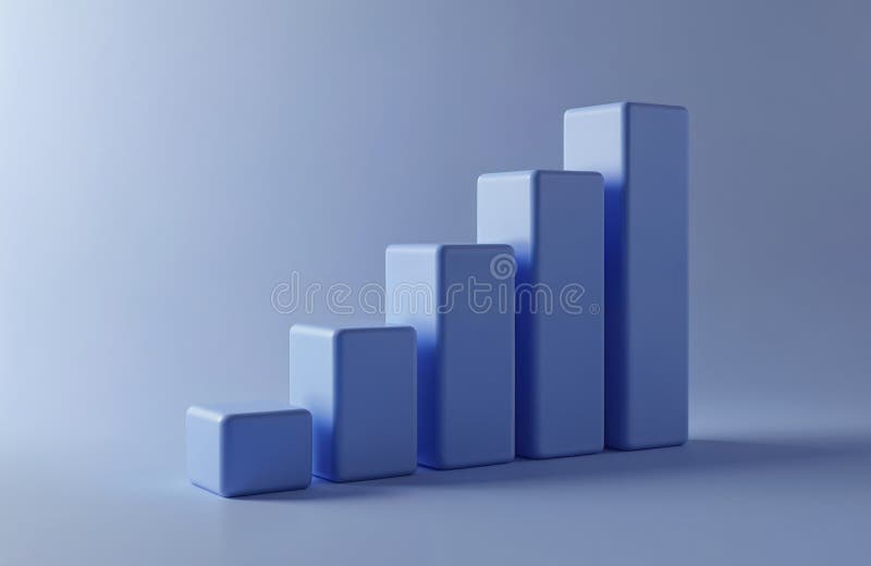
Free with trial Minimalist 3D bar chart with colorful pastel blocks representing data on a clean white background. Bar chart decrease illustrations Minimalist 3D bar chart with colorful pastel blocks representing data on a clean white background
Free with trial Downward bar chart with red arrow indicating economic downturn or business failure illustration. Bar chart decrease vectors Downward bar chart with red arrow indicating economic downturn or business failure illustration
Free with trial A 3D illustration depicts a bar graph with a downward red trend line, accompanied by icons for a calculator, gears, and pie chart, illustrating cost. Bar chart decrease illustrations Bar Chart with Downward Trend Line and Icons Representing Cost Optimization and Expense Control. A 3D illustration depicts a bar graph with a downward red trend line, accompanied by icons for a calculator, gears, and pie chart, illustrating cost
Free with trial A bar chart shows a downward trend with a red arrow on a wooden easel. Clear details and vibrant. Bar chart decrease illustrations Downward Trend Bar Chart with Red Arrow on Easel graph business. A bar chart shows a downward trend with a red arrow on a wooden easel. Clear details and vibrant
Free with trial A minimalist 3D rendering of a white bar chart isolated on a clean white background. The graph features columns of varying heights that rise and then decline, with a prominent white diagonal arrow pointing downwards across the bars to illustrate a financial loss, market crash, or negative economic trend. Bar chart decrease illustrations A 3d rendered white bar chart showing a downward trend with a diagonal arrow on a white background. A minimalist 3D rendering of a white bar chart isolated on a clean white background. The graph features columns of varying heights that rise and then decline, with a prominent white diagonal arrow pointing downwards across the bars to illustrate a financial loss, market crash, or negative economic trend
Free with trial A luminous wireframe hand interacts with a bar chart displaying a downward trend, set against a dark, textured background. Bar chart decrease illustrations Wireframe Hand Adjusting Bar Chart Graph with Declining Trend on Dark Background image photo. A luminous wireframe hand interacts with a bar chart displaying a downward trend, set against a dark, textured background
Free with trial A 3D bar chart illustrates a significant decline in various business categories including operations, marketing, and salaries. Bar chart decrease illustrations 3D Bar Chart Showing Declining Figures for Business Operations and Departments graph decline. A 3D bar chart illustrates a significant decline in various business categories including operations, marketing, and salaries
Free with trial The image shows a three-dimensional bar chart with alternating red and green bars, each varying in height. The bars are arranged on a green circular base, suggesting a comparison of data points, possibly financial metrics like stock prices, market performance, or growth analysis. The red bars indicate a decline or negative value, while the green bars suggest an increase or positive value. Bar chart decrease illustrations Colorful 3d bar chart illustration depicting financial market trends or growth metrics. The image shows a three-dimensional bar chart with alternating red and green bars, each varying in height. The bars are arranged on a green circular base, suggesting a comparison of data points, possibly financial metrics like stock prices, market performance, or growth analysis. The red bars indicate a decline or negative value, while the green bars suggest an increase or positive value
Free with trial Colorful bar chart on a blue background showing data analysis and statistical growth. Generative AI. Bar chart decrease illustrations Colorful bar chart on a blue background showing data analysis and statistical growth
Free with trial Flat design illustration showing colorful bar graph combined with a line chart, both displaying data trends against a simple black background. Bar chart decrease vectors Colorful Bar Graph and Line Chart on Black Background Illustrating Data Analysis and Trends. Flat design illustration showing colorful bar graph combined with a line chart, both displaying data trends against a simple black background.
Free with trial This is a minimalist, high-contrast black icon depicting a bar chart with an overlaying arrow pointing downwards, symbolizing a decline, recession, loss, or negative financial performance. Bar chart decrease vectors A black and white icon representing a downward trend in a financial bar chart or business analysis. This is a minimalist, high-contrast black icon depicting a bar chart with an overlaying arrow pointing downwards, symbolizing a decline, recession, loss, or negative financial performance
Free with trial This 3D visualization displays a bar chart with declining bars in blue and yellow, indicating a downward trend. Above the chart, a red triangular warning sign with a white exclamation mark is prominently featured, emitting subtle red lines. The composition is set against a soft pink background, conveying a sense of financial risk, crisis, or negative performance. Bar chart decrease illustrations 3D Bar Chart Showing Decline with Warning Sign and Exclamation Mark on Pink Background graph. This 3D visualization displays a bar chart with declining bars in blue and yellow, indicating a downward trend. Above the chart, a red triangular warning sign with a white exclamation mark is prominently featured, emitting subtle red lines. The composition is set against a soft pink background, conveying a sense of financial risk, crisis, or negative performance
Free with trial Descending bar graph icon with downward arrow, decline in sales or profits, loss chart, bad investment. Bar chart decrease vectors Descending bar graph icon with downward arrow, decline in sales or profits, loss chart, bad investment
Free with trial Bar chart illustration showing a downward trend with a red arrow indicating a significant drop in values. Bar chart decrease vectors Bar chart illustration showing a downward trend with a red arrow indicating a significant drop in values
Free with trial Bar chart illustrates financial decline. Dollar coin and downward arrow indicate loss and economic downturn. Represents decreasing revenue, poor performance and market slump. Bar chart decrease illustrations Declining bar chart with dollar coin and downward arrow showing financial loss and economic downturn. Bar chart illustrates financial decline. Dollar coin and downward arrow indicate loss and economic downturn. Represents decreasing revenue, poor performance and market slump
Free with trial Iconographic display of economic downturn and business challenges. A black bar graph accompanied by a descending arrow, representing loss, decrease, and negative market trends. Useful for financial reports and risk analysis. Bar chart decrease illustrations Black bar chart with downward arrow signifying financial decline and negative market performance. Iconographic display of economic downturn and business challenges. A black bar graph accompanied by a descending arrow, representing loss, decrease, and negative market trends. Useful for financial reports and risk analysis
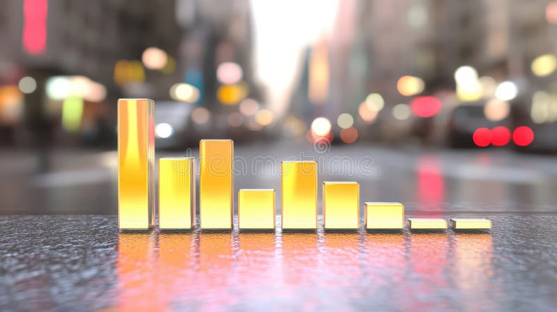
Free with trial Close-up view of city street with bar chart overlay, visualizing urban data analysis ,Generative AI. Bar chart decrease illustrations Urban data analysis, closeup view of city street with bar chart visualization closeup. Close-up view of city street with bar chart overlay, visualizing urban data analysis ,Generative AI
Free with trial Loss Bar Chart Icon vector set collection for web vector set collection for app ui. Bar chart decrease vectors Loss Bar Chart Icon vector set collection for web
Free with trial PNG 3D Bar Chart Data Visualization Business Analytics Performance Metrics Colorful Graph against transparent Background. Bar chart decrease illustrations PNG 3D Bar Chart Data Visualization Business Analytics Performance Metrics Colorful Graph against transparent Background
Free with trial A neon bar chart with downward arrow showing decline in data, glowing pink and blue on black background. Generative AI. Bar chart decrease illustrations Neon bar chart with downward arrow showing decline in data glowing pink and blue on black background. A neon bar chart with downward arrow showing decline in data, glowing pink and blue on black background. Generative AI
Free with trial Business bar chart showing decreasing values and a prominent downward arrow indicating decline or loss. Bar chart decrease vectors Business bar chart showing decreasing values and a prominent downward arrow indicating decline or loss
Free with trial Description: A vibrant 3D rendering showcasing a bar chart with orange, blue, and yellow bars, representing upward financial trends or business growth. Ideal for presentations and reports. Bar chart decrease illustrations Colorful 3D Bar Chart: Business Growth and Financial Success. Description: A vibrant 3D rendering showcasing a bar chart with orange, blue, and yellow bars, representing upward financial trends or business growth. Ideal for presentations and reports.
Free with trial 3d man analyzing bar chart, a visual representation of growth, business performance, and investment strategy ,Generative ai. Bar chart decrease illustrations 3d man analyzing bar chart, a visual representation of growth, business performance, and investment strategy
Free with trial A flat icon of a bar chart with a downward arrow and a dollar symbol, representing financial loss, market decline, decreased revenue, negative performance, economic downturns, and investment risks in business environments. Bar chart decrease vectors Declining financial chart icon with downward arrow showing loss decrease and negative dollar trend. A flat icon of a bar chart with a downward arrow and a dollar symbol, representing financial loss, market decline, decreased revenue, negative performance, economic downturns, and investment risks in business environments.
Free with trial Minimalist icon of a falling bar chart showing a negative market trend. Bar chart decrease vectors Negative market trend shown on graph with falling bar chart. Minimalist icon of a falling bar chart showing a negative market trend
Free with trial Red bar chart with a red downward arrow and clouds on a teal background. Clear details and vibran. Bar chart decrease illustrations Red Bar Chart with Downward Arrow and Clouds on Teal Background Keywords: decline, chart, graph. Red bar chart with a red downward arrow and clouds on a teal background. Clear details and vibran
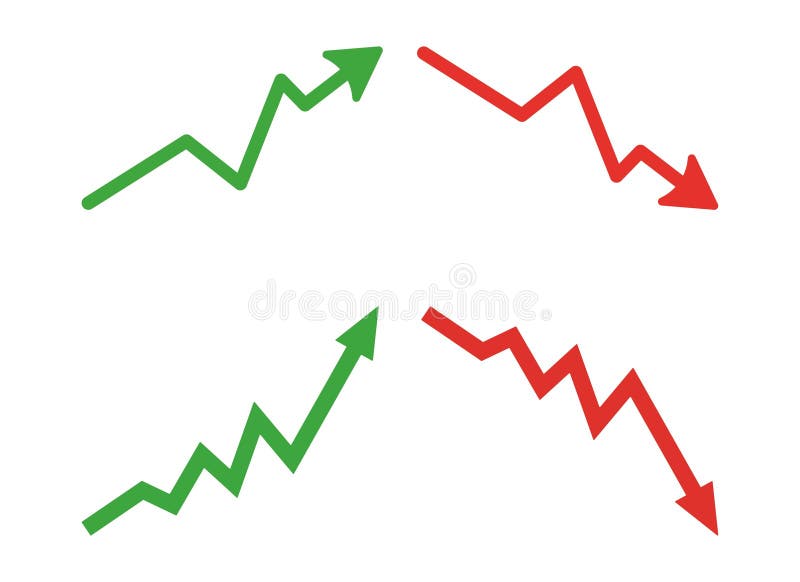
Free with trial Graph going Up and Down sign with green and red arrows vector. Flat design vector illustration concept of sales bar chart symbol icon with arrow moving down and sales bar chart with arrow moving up. Bar chart decrease vectors Graph going Up and Down sign with green and red arrows vector. Flat design vector illustration concept of sales bar chart symbol. Graph going Up and Down sign with green and red arrows vector. Flat design vector illustration concept of sales bar chart symbol icon with arrow moving down and sales bar chart with arrow moving up.
Free with trial A colorful business bar graph illustration showing a downward trend and financial loss. The chart features a red arrow pointing down with dollar sign icons, symbolizing economic recession, bankruptcy, or decreasing revenue in a simple style. Bar chart decrease vectors Business bar chart showing financial decline and money loss with a downward red arrow isolated on white background. A colorful business bar graph illustration. A colorful business bar graph illustration showing a downward trend and financial loss. The chart features a red arrow pointing down with dollar sign icons, symbolizing economic recession, bankruptcy, or decreasing revenue in a simple style
Free with trial This image showcases a 3D bar chart with four distinct vertical bars. The bars vary in height, forming a pattern that. Bar chart decrease illustrations A 3D bar chart displays a downward trend on a smooth light surface suggesting diminishing returns or financial decline. This image showcases a 3D bar chart with four distinct vertical bars. The bars vary in height, forming a pattern that.
Free with trial Line art declining coin bar chart with stack coin icon logo vector illustration design, for business and finance symbol. Bar chart decrease illustrations Line art declining coin bar chart with stack coin icon logo vector illustration design
Free with trial 3D isometric business chart showing a downward trend with a red arrow and colorful bar graphs on a grid background, isolated on white. Bar chart decrease illustrations 3D isometric business chart showing a downward trend with a red arrow and colorful bar graphs on a grid background, isolated on
Free with trial Colorful bar chart displayed on a polished wooden table, representing data analysis and visualization ,Generative ai. Bar chart decrease illustrations Colorful bar chart on wooden table, visualizing data analysis, trends, and performance metrics for business insights. Colorful bar chart displayed on a polished wooden table, representing data analysis and visualization ,Generative ai
Free with trial Bar chart showing decreasing bars, with silhouetted heads and a downward arrow. Represents decline, loss, negative trend, recession, or drop in performance. Useful for financial reports, business analysis, or social trends. Bar chart decrease illustrations Downward trending bar chart with silhouette heads and arrow signifying decline in economy or popularity vector graphic. Bar chart showing decreasing bars, with silhouetted heads and a downward arrow. Represents decline, loss, negative trend, recession, or drop in performance. Useful for financial reports, business analysis, or social trends
Free with trial A red bar chart on a dark background symbolizes a stock market crash and financial crisis, indicating an economic downturn and potential losses. Bar chart decrease illustrations Red Stock Market Crash Depicts Financial Crisis with Declining Bar Chart on Dark Background. A red bar chart on a dark background symbolizes a stock market crash and financial crisis, indicating an economic downturn and potential losses
Free with trial Decreasing Bar Chart with Arrow: Economic Decline Visualization, Business Graph, Financial Performance Overview, Downward Trend Graphic. Bar chart decrease vectors Decreasing Bar Chart with Arrow: Economic Decline Visualization, Business Graph, Financial Performance Overview, Downward Trend
Free with trial Graph going Up and Down sign with green and red arrows vector set. Flat design vector set of a concept of sales bar chart symbol icon with arrow moving down and sales bar chart with arrow moving up. Bar chart decrease vectors Graph going Up and Down sign with green and red arrows vector set. Flat design vector set of a concept of sales bar chart arrows. Graph going Up and Down sign with green and red arrows vector set. Flat design vector set of a concept of sales bar chart symbol icon with arrow moving down and sales bar chart with arrow moving up.
Free with trial A detailed data visualization illustrating market trends over time. The infographic combines a line chart, which shows fluctuating values and percentages, with a bar chart representing data for specific time intervals. The line chart highlights key data points, such as peaks annotated with values like '1. 24%' and '500K'. The x-axis represents a timeline from January to March, while the y-axis. Bar chart decrease illustrations A modern market trend analysis visualization combining a bar and line chart for financial data isolated on white background. A detailed data visualization illustrating market trends over time. The infographic combines a line chart, which shows fluctuating values and percentages, with a bar chart representing data for specific time intervals. The line chart highlights key data points, such as peaks annotated with values like '1.24%' and '500K'. The x-axis represents a timeline from January to March, while the y-axis
Free with trial Abstract blue 3D bar chart with glowing line graph shows market growth. Digital data visualization indicates positive trend. Financial analysis graphic, with bokeh. Bar chart decrease illustrations Abstract blue 3D bar chart with glowing line graph shows market growth. Digital data visualization indicates positive trend.