Free with trial The image shows a visual representation of a downward trend using a bar chart and a bold red arrow pointing downward. The chart is displayed on a light-colored easel with a small figure standing behind it, suggesting a presentation or analysis of decreasing values over time, possibly in a business or financial context. Bar chart decrease illustrations Declining trend illustrated with bar chart and arrow on easel. The image shows a visual representation of a downward trend using a bar chart and a bold red arrow pointing downward. The chart is displayed on a light-colored easel with a small figure standing behind it, suggesting a presentation or analysis of decreasing values over time, possibly in a business or financial context
Free with trial Chart declining business icon with down arrow, bar graph, broken gear and lightning bolt, thumbs down symbol for recession, failure, crisis, loss and risk. Bar chart decrease vectors Chart declining business icon with down arrow, bar graph, broken gear and lightning bolt, thumbs
Free with trial A visually appealing abstract bar chart illustration featuring pastel color bars on a dark teal background. The design is clean, modern, and versatile, suitable for presentations, reports, websites, or any project requiring data visualization. The simple style allows for easy customization and integration into various design projects. Bar chart decrease vectors Abstract Bar Chart Infographic Design. A visually appealing abstract bar chart illustration featuring pastel color bars on a dark teal background. The design is clean, modern, and versatile, suitable for presentations, reports, websites, or any project requiring data visualization. The simple style allows for easy customization and integration into various design projects.
Free with trial Black silhouette of descending bar chart with arrow, isolated on white background. concept of financial decline, statistics, economic downturn, data analysis, business graph. Bar chart decrease vectors Black silhouette of descending bar chart with arrow, isolated on white background. concept of financial decline, statistics
Free with trial Falling bar chart with up and right arrows illustrating declining business trends. Bar chart decrease vectors Falling bar chart with up and right arrows illustrating declining business trends
Free with trial Bar chart collapse icon with downward arrow. Decline and negative trend sign symbol vector. Bar chart decrease vectors Bar chart collapse icon with downward arrow. Decline and negative trend sign symbol
Free with trial This vibrant 3D bar chart illustrates strong business growth and upward progress. The colorful, glossy bars represent data points, clearly showing an increase. Ideal for presentations and reports. Bar chart decrease illustrations Colorful 3D Bar Chart Showing Business Growth and Progress. This vibrant 3D bar chart illustrates strong business growth and upward progress. The colorful, glossy bars represent data points, clearly showing an increase. Ideal for presentations and reports.
Free with trial Interface displaying downward-trending bar chart and dotted line on dashboard, with ticker symbols. Finance, analytics, data visualization, investment, technological, corporate, digital. Bar chart decrease illustrations Interface displaying downward-trending bar chart and dotted line on dashboard, with ticker symbols
Free with trial A simple bar chart and line graph with a downward arrow illustrates a negative trend like recession or business failure ideal for financial reports about crisis or loss. Bar chart decrease illustrations Declining Blue Bar Chart and Line Graph Showing Financial Loss on Gray Background. A simple bar chart and line graph with a downward arrow illustrates a negative trend like recession or business failure ideal for financial reports about crisis or loss
Free with trial Up and down arrow on bar chart icon set. Growth and decline graph symbol illustration. Financial trend concept. Bar chart decrease vectors Up and down arrow on bar chart icon set. Growth and decline graph symbol. Financial trend concept
Free with trial Colorful Bar Chart Graph Showing Growth and Performance Over Time with Upward Trend. Bar chart decrease vectors Colorful Bar Chart Graph Showing Growth and Performance Over Time with Upward Trend
Free with trial A simple bar chart with a falling line, symbolizing financial decline, economic downturn, decreased profits, market loss, or negative business results. Ideal for illustrating risks, challenges, crisis situations, and economic analysis. Bar chart decrease vectors Declining financial chart icon with downward trend showing loss, decrease and negative business performance. A simple bar chart with a falling line, symbolizing financial decline, economic downturn, decreased profits, market loss, or negative business results. Ideal for illustrating risks, challenges, crisis situations, and economic analysis.
Free with trial 3D bar chart with red arrows pointing upwards, reflecting off a shiny, blue surface. The clean, minimalist design symbolizes financial growth, business success, and positive market trends. Ideal for use in presentations, financial reports, and marketing materials related to investment, stock market, and economic progress. Bar chart decrease illustrations Financial Growth 3D Bar Chart with Red Arrows. 3D bar chart with red arrows pointing upwards, reflecting off a shiny, blue surface. The clean, minimalist design symbolizes financial growth, business success, and positive market trends. Ideal for use in presentations, financial reports, and marketing materials related to investment, stock market, and economic progress
Free with trial Business growth and loss icon. Bar chart with rising and falling arrow symbol illustration. Bar chart decrease vectors Business growth and loss icon. Bar chart with rising and falling arrow symbol
Free with trial Hand drawn style bar graph displaying a continuous downward trend and data decrease arrow. Bar chart decrease vectors Hand drawn style bar graph displaying a continuous downward trend and data decrease arrow
Free with trial The image depicts a bar chart with a downward trend. The bars, colored in blue, gradually decrease in height, indicating a decline. A large red arrow, pointing downwards, further emphasizes the downward trend. The chart is displayed on an easel, suggesting a presentation or analysis context. Bar chart decrease illustrations Chart showing decline. The image depicts a bar chart with a downward trend. The bars, colored in blue, gradually decrease in height, indicating a decline. A large red arrow, pointing downwards, further emphasizes the downward trend. The chart is displayed on an easel, suggesting a presentation or analysis context
Free with trial A minimalist, black and white vector icon representing a bar chart or graph. The icon features a series of vertical bars of varying heights, set against a base of horizontal lines. This clean and modern design is ideal for representing data, statistics, progress, growth, or financial information in digital and print media. Its simple aesthetic makes it versatile for use in presentations, websites, apps, and infographics. Bar chart decrease vectors Abstract Bar Chart Icon. A minimalist, black and white vector icon representing a bar chart or graph. The icon features a series of vertical bars of varying heights, set against a base of horizontal lines. This clean and modern design is ideal for representing data, statistics, progress, growth, or financial information in digital and print media. Its simple aesthetic makes it versatile for use in presentations, websites, apps, and infographics.
Free with trial A stark bar graph illustrates a clear downward trend, symbolized by a descending arrow. This image represents decline, decrease, or negative progression in data. Bar chart decrease vectors Vector art of bar graph with a downward trend line indicating decline or decrease in data. A stark bar graph illustrates a clear downward trend, symbolized by a descending arrow. This image represents decline, decrease, or negative progression in data
Free with trial A cartoon illustration of a man interacting with a bar chart. The man is depicted in a simple, clean style, wearing a blue shirt and brown pants. He is holding a green bar, seemingly adjusting or interacting with the colorful bars displayed on a table. The illustration is suitable for conveying concepts related to data analysis, business, finance, and presentation. Bar chart decrease illustrations Cartoon Man and Bar Chart. A cartoon illustration of a man interacting with a bar chart. The man is depicted in a simple, clean style, wearing a blue shirt and brown pants. He is holding a green bar, seemingly adjusting or interacting with the colorful bars displayed on a table. The illustration is suitable for conveying concepts related to data analysis, business, finance, and presentation.
Free with trial This image displays a bar graph visualizing a clear downward trend. Nine vertical blue bars gradually decrease in height from left to right, signifying a consistent decline in values. A white arrowed line diagonally descends across the graph, reinforcing the negative trend. Blue horizontal and vertical grid lines aid in alignment. The background is green screen, allowing for chroma key use. This chart effectively communicates decline in areas like business, finance, or performance. Bar chart decrease illustrations Downward Bar Graph Showing Financial Decline on Green Screen. This image displays a bar graph visualizing a clear downward trend. Nine vertical blue bars gradually decrease in height from left to right, signifying a consistent decline in values. A white arrowed line diagonally descends across the graph, reinforcing the negative trend. Blue horizontal and vertical grid lines aid in alignment. The background is green screen, allowing for chroma key use. This chart effectively communicates decline in areas like business, finance, or performance.
Free with trial Downward trend bar chart with red arrow icon. Financial loss, decline, or economic crisis symbol vector. Bar chart decrease vectors Downward trend bar chart with red arrow icon. Financial loss, decline, or economic crisis symbol
Free with trial Up and down curved arrow chart icon illustration. Business trend bar symbol in black circle. Bar chart decrease vectors Up and down curved arrow chart icon. Business trend bar symbol in black circle
Free with trial Up and down graph icon on black circle. Outline bar chart with uptrend and downtrend arrow symbol vector. Bar chart decrease vectors Up and down graph icon on black circle. Outline bar chart with uptrend and downtrend arrow symbol
Free with trial This vibrant 3D rendering showcases a bar chart and pie chart, illustrating data growth and proportions. Ideal for presentations, reports, or educational materials. The colorful design makes it visually appealing and easy to understand. Bar chart decrease illustrations Colorful 3D Bar Chart and Pie Chart Data Presentation. This vibrant 3D rendering showcases a bar chart and pie chart, illustrating data growth and proportions. Ideal for presentations, reports, or educational materials. The colorful design makes it visually appealing and easy to understand.
Free with trial This image displays a financial growth chart, featuring both a candlestick chart and a bar graph, laid out on a wooden surface. The candlestick chart illustrates stock market fluctuations with red and green candles, while the bar graph shows increasing values over time. The overall composition suggests positive financial trends, investment performance, and economic progress. It's ideal for representing concepts like business growth, market analysis, financial planning, and investment strategies. Bar chart decrease illustrations Financial Growth Chart with Candlestick and Bar Graph. This image displays a financial growth chart, featuring both a candlestick chart and a bar graph, laid out on a wooden surface. The candlestick chart illustrates stock market fluctuations with red and green candles, while the bar graph shows increasing values over time. The overall composition suggests positive financial trends, investment performance, and economic progress. It's ideal for representing concepts like business growth, market analysis, financial planning, and investment strategies.
Free with trial Abstract 3D render of a descending bar chart made of blue glass rectangles. The bars are reflected on a glossy surface, creating a clean and modern aesthetic. The image can be used to represent data visualization, financial trends, business performance, or concepts like decline, recession, or negative growth. The cool blue color palette adds a sense of calm and professionalism. Bar chart decrease illustrations Abstract Blue Glass Bar Chart. Abstract 3D render of a descending bar chart made of blue glass rectangles. The bars are reflected on a glossy surface, creating a clean and modern aesthetic. The image can be used to represent data visualization, financial trends, business performance, or concepts like decline, recession, or negative growth. The cool blue color palette adds a sense of calm and professionalism.
Free with trial Chart icon with descending bar graph, gear with cross, and downward arrow with dollar symbol, minimal black silhouette for finance loss and cost reduction concept. Bar chart decrease vectors Chart icon with descending bar graph, gear with cross, and downward arrow with dollar symbol
Free with trial A 3D bar chart shows a downward trend with a prominent red arrow indicating a significant decrease in value. Bar chart decrease illustrations Red arrow graph showing steep decline in bar chart data. A 3D bar chart shows a downward trend with a prominent red arrow indicating a significant decrease in value
Free with trial A 3D rendered icon of a bar chart with four ascending bars. The bars are a deep blue color and are heavily covered in realistic ice and snow, dripping from the tops. The chart is framed by metallic gray and dark gray. The icon is presented on a white background. Bar chart decrease illustrations 3D Bar Chart Icon With Blue Bars Covered in Ice and Snow. A 3D rendered icon of a bar chart with four ascending bars. The bars are a deep blue color and are heavily covered in realistic ice and snow, dripping from the tops. The chart is framed by metallic gray and dark gray. The icon is presented on a white background
Free with trial A clean, minimalist illustration featuring a combined line graph and bar chart on a white background. The line graph, with circular data points, shows an upward trend with fluctuations. It is overlaid on a series of vertical bars, alternating in black and white, representing discrete data values. The grid lines behind the charts suggest a data analysis or financial context. This graphic is ideal for presentations, reports, and websites related to statistics, business growth, market trends, and data visualization. Bar chart decrease vectors Line and Bar Chart Combination. A clean, minimalist illustration featuring a combined line graph and bar chart on a white background. The line graph, with circular data points, shows an upward trend with fluctuations. It is overlaid on a series of vertical bars, alternating in black and white, representing discrete data values. The grid lines behind the charts suggest a data analysis or financial context. This graphic is ideal for presentations, reports, and websites related to statistics, business growth, market trends, and data visualization.
Free with trial Bar chart icon with downward arrow showing declining business performance, financial loss, recession, negative trend, market crash analytics and falling sales report. Bar chart decrease vectors Bar chart icon with downward arrow showing declining business performance, financial
Free with trial A bar chart with five teal bars of decreasing height and a red arrow pointing downward. Bar chart decrease illustrations A bar chart with a downward trend. a bar chart with five teal bars of decreasing height and a red arrow pointing downward
Free with trial Graph going down and up sign with green and red arrows vector. Bar chart symbol icon with arrow moving down and sales bar chart with arrow moving up. Bar chart decrease vectors Graph going down and up sign with green and red arrows vector. Bar chart symbol icon with arrow moving down and sales bar chart
Free with trial This image depicts a bar and line chart illustrating a significant decline in values. The bars represent discrete data points that decrease progressively, while the line chart overlays the bars, emphasizing the downward trend. The chart uses a blue color scheme for both the bars and the line, with a clear visual representation of a negative progression. The overall design is minimalistic and. Bar chart decrease vectors Downward trend chart showing a decline in values over time. This image depicts a bar and line chart illustrating a significant decline in values. The bars represent discrete data points that decrease progressively, while the line chart overlays the bars, emphasizing the downward trend. The chart uses a blue color scheme for both the bars and the line, with a clear visual representation of a negative progression. The overall design is minimalistic and
Free with trial Colorful bar chart on a red background displaying data ,Generative ai. Bar chart decrease illustrations Vibrant colorful bar chart on red background, data visualization and analysis colorful. Colorful bar chart on a red background displaying data ,Generative ai
Free with trial A simple bar chart with alternating blue and green bars illustrates a clear downward trend over time. Bar chart decrease illustrations Bar chart showing declining trend. A simple bar chart with alternating blue and green bars illustrates a clear downward trend over time
Free with trial 3d render of clean air compliance showing carbon emission decrease with bar chart, gauge, recycle button, and carbon coin, on transparent background. Bar chart decrease illustrations Clean air compliance showing carbon emission decrease with transparent background. 3d render of clean air compliance showing carbon emission decrease with bar chart, gauge, recycle button, and carbon coin, on transparent background
Free with trial Growth and decline bar chart icon in flat style. Upward and downward arrow graph symbol illustration. Bar chart decrease vectors Growth and decline bar chart icon in flat style. Upward and downward arrow graph symbol
Free with trial A flat design illustration of a bar chart with bars decreasing in height, accompanied by a red arrow pointing downwards, symbolizing a negative trend or financial loss. Bar chart decrease illustrations Bar chart showing a downward trend. A flat design illustration of a bar chart with bars decreasing in height, accompanied by a red arrow pointing downwards, symbolizing a negative trend or financial loss
Free with trial An abstract 3D visualization of a symmetrical red bar graph or chart on a white background. The bars are arranged in a pattern that rises to a central peak and then descends, resembling a wave or mountain range. The bars are rounded at the top. Bar chart decrease illustrations Abstract Red Bar Graph on White Background chart statistics. An abstract 3D visualization of a symmetrical red bar graph or chart on a white background. The bars are arranged in a pattern that rises to a central peak and then descends, resembling a wave or mountain range. The bars are rounded at the top
Free with trial A minimalistic 3D bar chart with descending glossy columns in blue and green is displayed on a white background. This image represents decline, analysis, and market trends. Bar chart decrease illustrations Minimalistic 3D bar chart with descending glossy columns in blue and green on a white background. A minimalistic 3D bar chart with descending glossy columns in blue and green is displayed on a white background. This image represents decline, analysis, and market trends
Free with trial A clean, minimalist vector illustration of a bar chart featuring three distinct columns. The columns are colored in vibrant orange, teal, and yellow, representing different data points or categories. The chart is set against a white background with a dark blue axis line, making it ideal for presentations, reports, and infographics focused on data visualization, business growth, or financial analysis. Bar chart decrease vectors Simple Bar Chart with Three Columns. A clean, minimalist vector illustration of a bar chart featuring three distinct columns. The columns are colored in vibrant orange, teal, and yellow, representing different data points or categories. The chart is set against a white background with a dark blue axis line, making it ideal for presentations, reports, and infographics focused on data visualization, business growth, or financial analysis.
Free with trial A 3D rendered image of a descending bar chart with teal and gray bars, each progressively lower than the previous, representing a financial or economic downturn. A bold red arrow slants downward across the bars, symbolizing decline. The graph is displayed against a dark background with white grid lines and axis labels, evoking a business or stock market concept. Isolated on a clean, dark surface. Bar chart decrease illustrations 3D rendered bar chart with red arrow showing financial decline. A 3D rendered image of a descending bar chart with teal and gray bars, each progressively lower than the previous, representing a financial or economic downturn. A bold red arrow slants downward across the bars, symbolizing decline. The graph is displayed against a dark background with white grid lines and axis labels, evoking a business or stock market concept. Isolated on a clean, dark surface.
Free with trial Colorful 3D Bar Chart Illustration for indicator economic review. Bar chart decrease illustrations Colorful 3D Bar Chart Illustration
Free with trial A vibrant 3D bar chart, featuring glossy blue and orange rectangular segments, illustrates data progression or comparison. The varying bar heights convey growth or statistical analysis. This modern graphic is ideal for business, finance, and analytical concepts, presented cleanly isolated on a transparent background. Bar chart decrease vectors Glossy 3D bar chart showing data growth and statistics with blue and orange segments, perfect for business and finance presentatio. A vibrant 3D bar chart, featuring glossy blue and orange rectangular segments, illustrates data progression or comparison. The varying bar heights convey growth or statistical analysis. This modern graphic is ideal for business, finance, and analytical concepts, presented cleanly isolated on a transparent background.
Free with trial Hand pointing at bar chart with different colored bars featuring statistics, data, analysis with. Bar chart decrease vectors Hand pointing at bar chart with different colored bars featuring statistics, data, analysis with
Free with trial A bar chart shows a decline, coupled with a sad face, conveying negative trends in a flat design style. Bar chart decrease vectors Declining bar chart with a sad face symbolizing loss, downturn, or negative trends. A bar chart shows a decline, coupled with a sad face, conveying negative trends in a flat design style.
Free with trial A minimalist, flat design illustration of a bar chart featuring three vertical bars of varying heights. The bars are colored teal, orange, and beige, with dark blue outlines. They stand on a light yellow base and are arranged from tallest to shortest, indicating a declining trend. This graphic is ideal for representing data, statistics, financial reports, or progress over time in a clean and modern visual style. Bar chart decrease illustrations Colorful Bar Chart with Declining Trend. A minimalist, flat design illustration of a bar chart featuring three vertical bars of varying heights. The bars are colored teal, orange, and beige, with dark blue outlines. They stand on a light yellow base and are arranged from tallest to shortest, indicating a declining trend. This graphic is ideal for representing data, statistics, financial reports, or progress over time in a clean and modern visual style.
Free with trial Bar Chart with growth green arrow and Bar Chart with falling red arrow, 3D rendering isolated on white background. Bar chart decrease illustrations Bar Chart with growth green arrow and Bar Chart with falling red arrow, 3D rendering
Free with trial Bar graph growth and decline icon in flat style. Up and down arrow chart symbol illustration. Bar chart decrease vectors Bar graph growth and decline icon in flat style. Up and down arrow chart symbol
Free with trial Colorful bar chart analysis on a dark background ,Generative ai. Bar chart decrease illustrations Colorful bar chart analysis, data visualization on a dark background colorful. Colorful bar chart analysis on a dark background ,Generative ai
Free with trial Bar Chart with growth red arrow and crash in the end, 3D rendering isolated on white background. Bar chart decrease illustrations Bar Chart with growth red arrow and crash in the end, 3D rendering
Free with trial A 3D bar chart with a green bar showing an upward trend and a red bar showing a downward trend on a blue base. Bar chart decrease illustrations Bar chart showing upward and downward trends. A 3D bar chart with a green bar showing an upward trend and a red bar showing a downward trend on a blue base
Free with trial A creative, hand-drawn bar chart illustrates a downward trend in data. Bar chart decrease vectors HandDrawn Business Bar Chart Showing Decline. A creative, hand-drawn bar chart illustrates a downward trend in data
Free with trial An isometric bar chart displays a series of rectangular bars arranged in a descending line. The bars transition in color from blue at the tallest end to orange at the shortest end, set against a light, neutral background. Bar chart decrease illustrations Isometric Bar Chart with Decreasing Bars in Gradient Colors graph data. An isometric bar chart displays a series of rectangular bars arranged in a descending line. The bars transition in color from blue at the tallest end to orange at the shortest end, set against a light, neutral background
Free with trial Decrease and increase chart icon illustration with arrow. Negative and positive trend symbol in black circle. Bar chart decrease vectors Decrease and increase chart icon with arrow. Negative and positive trend symbol in black circle
Free with trial A 3D bar chart with purple translucent bars illustrates a declining trend, with a purple arrow pointing downwards. Bar chart decrease illustrations 3D Bar Chart Showing Downward Trend with Arrow. A 3D bar chart with purple translucent bars illustrates a declining trend, with a purple arrow pointing downwards
Free with trial A 3D rendered image displays a collection of business charts on a document. A colorful pie chart with six segments sits to the left of a bar graph with five vertical bars of varying heights and colors. A line graph with multiple colored lines is visible on the document below. The composition is set against a white background. Bar chart decrease illustrations 3D Rendered Pie Chart Bar Graph and Line Graph on a Document data statistics. A 3D rendered image displays a collection of business charts on a document. A colorful pie chart with six segments sits to the left of a bar graph with five vertical bars of varying heights and colors. A line graph with multiple colored lines is visible on the document below. The composition is set against a white background
Free with trial This graphic depicts a simple bar chart with two vertical bars. The left bar, colored blue, is shorter and labeled 'QUALITY' with an upward-pointing arrow, suggesting an increase. The right bar, colored green, is taller and labeled 'COST' with downward-pointing arrows, indicating a decrease. A diagonal arrow connects the top of the quality bar to the bottom of the cost bar, visually representing. Bar chart decrease vectors Bar chart illustrating the inverse relationship between quality and cost. This graphic depicts a simple bar chart with two vertical bars. The left bar, colored blue, is shorter and labeled 'QUALITY' with an upward-pointing arrow, suggesting an increase. The right bar, colored green, is taller and labeled 'COST' with downward-pointing arrows, indicating a decrease. A diagonal arrow connects the top of the quality bar to the bottom of the cost bar, visually representing
Free with trial Declining chart icon. Negative trend graphic. Falling bar symbol. Vector diagram shape. EPS 10. Bar chart decrease vectors Declining chart icon. Negative trend graphic. Falling bar symbol. Vector diagram shape.
Free with trial A minimalist black vector icon illustrating a significant decline or negative trend. The image features three bar chart elements, progressively decreasing in height from left to right, symbolizing a fall in data or performance. A prominent, thick downward-pointing arrow diagonally overlays the bars, reinforcing the concept of reduction, loss, or economic downturn. Isolated on a clean white background, this graphic is ideal for financial reports, business presentations, economic analysis, or any visual communication requiring a clear representation of falling statistics or poor results. Bar chart decrease vectors Business Decline Bar Chart with Down Arrow Icon. A minimalist black vector icon illustrating a significant decline or negative trend. The image features three bar chart elements, progressively decreasing in height from left to right, symbolizing a fall in data or performance. A prominent, thick downward-pointing arrow diagonally overlays the bars, reinforcing the concept of reduction, loss, or economic downturn. Isolated on a clean white background, this graphic is ideal for financial reports, business presentations, economic analysis, or any visual communication requiring a clear representation of falling statistics or poor results.
Free with trial A 3D visualization of financial data, featuring a colorful pie chart and a series of bar graphs placed on top of a financial report document. The document also includes line graphs, illustrating various data trends and analyses. The composition is set against a white background. Bar chart decrease illustrations 3D Bar Chart and Pie Chart on Financial Report with Line Graphs data statistics. A 3D visualization of financial data, featuring a colorful pie chart and a series of bar graphs placed on top of a financial report document. The document also includes line graphs, illustrating various data trends and analyses. The composition is set against a white background
Free with trial An illustrative bar chart where each increasing column features a sad or frowning emoticon. Bar chart decrease vectors Sad Emoticon Bar Chart Showing Negative Results. An illustrative bar chart where each increasing column features a sad or frowning emoticon
Free with trial A three-dimensional bar graph is depicted against a white background, illustrating a clear downward trend. The bars, transitioning from blue at the highest point to red at the lowest, decrease in height from left to right, visually representing a decline or loss. Bar chart decrease illustrations 3D bar graph showing a downward trend with red and blue bars chart data. A three-dimensional bar graph is depicted against a white background, illustrating a clear downward trend. The bars, transitioning from blue at the highest point to red at the lowest, decrease in height from left to right, visually representing a decline or loss
Free with trial Bar chart with downward arrow icon vector. Financial crisis concept. Economy downturn and loss symbol in black circle. Bar chart decrease vectors Bar chart with downward arrow icon. Financial crisis concept. Economy downturn and loss symbol in black circle
Free with trial A simple yet effective visualization showing data via a pie chart and bar graph Ideal for presentations and reports. Bar chart decrease illustrations Colorful Pie Chart and Bar Graph Data Visualization. A simple yet effective visualization showing data via a pie chart and bar graph Ideal for presentations and reports
Free with trial A black icon depicting a bar graph with three bars of decreasing height, representing a downward trend. A black arrow points diagonally downwards from the top right, indicating a decline. The icon is enclosed within a black circle and set against a white background. Bar chart decrease illustrations Black Downward Trend Bar Graph Icon with Arrow Inside Circle chart decrease. A black icon depicting a bar graph with three bars of decreasing height, representing a downward trend. A black arrow points diagonally downwards from the top right, indicating a decline. The icon is enclosed within a black circle and set against a white background
Free with trial A 3D isometric bar chart with a gradient color scheme from blue to red and orange, depicting a downward trend. The bars are arranged in descending order of height, set against a clean white background. This visual represents data analysis, financial decline, or a negative trend. Bar chart decrease illustrations Isometric Gradient Bar Chart Showing Decline on White Background graph data. A 3D isometric bar chart with a gradient color scheme from blue to red and orange. A 3D isometric bar chart with a gradient color scheme from blue to red and orange, depicting a downward trend. The bars are arranged in descending order of height, set against a clean white background. This visual represents data analysis, financial decline, or a negative trend
Free with trial Abstract 3D render of a colorful descending bar chart with cubes. Perfect for data visualization, business presentations, or illustrating trends. Representing financial, statistical or marketing information. Bar chart decrease illustrations Colorful 3D Bar Chart, Data Visualization Concept. Abstract 3D render of a colorful descending bar chart with cubes. Perfect for data visualization, business presentations, or illustrating trends. Representing financial, statistical or marketing information.
Free with trial A 3D rendered golden bar chart displays a clear downward trend. The bars are arranged from tallest on the left to shortest on the right, creating a visual representation of a decreasing value or performance. The metallic gold finish gives the chart a sense of importance and financial significance. The object is isolated on a clean white background. Bar chart decrease illustrations Golden Bar Chart Showing a Downward Trend on a White Background graph metallic. A 3D rendered golden bar chart displays a clear downward trend. The bars are arranged from tallest on the left to shortest on the right, creating a visual representation of a decreasing value or performance. The metallic gold finish gives the chart a sense of importance and financial significance. The object is isolated on a clean white background
Free with trial Bar graph growth and decline icon in flat style. Up and down arrow chart symbol. Infographic elements illustration. Bar chart decrease vectors Bar graph growth and decline icon in flat style. Up and down arrow chart symbol. Infographic elements
Free with trial Bar chart is showing growth and decline with blue and purple bars. Bar chart decrease vectors Blue and purple bar chart showing growth and decline. Bar chart is showing growth and decline with blue and purple bars
Free with trial A 3D bar chart illustrates a significant downward trend in data, emphasized by a bold red arrow pointing downwards. Bar chart decrease illustrations Bar chart showing declining trend with downward arrow. A 3D bar chart illustrates a significant downward trend in data, emphasized by a bold red arrow pointing downwards
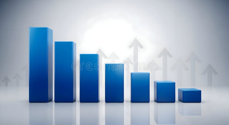
Free with trial A 3D render of a blue bar chart displaying a downward trend, with bars decreasing in height from left to right. The background features a subtle pattern of translucent upward-pointing arrows, suggesting growth or recovery despite the current decline. The scene is set against a clean, gradient gray backdrop with reflections, creating a modern and professional aesthetic. This image is ideal for representing financial downturns, market analysis, economic challenges, or the concept of overcoming obstacles. Bar chart decrease illustrations Declining Blue Bar Chart with Upward Arrows Background. A 3D render of a blue bar chart displaying a downward trend, with bars decreasing in height from left to right. The background features a subtle pattern of translucent upward-pointing arrows, suggesting growth or recovery despite the current decline. The scene is set against a clean, gradient gray backdrop with reflections, creating a modern and professional aesthetic. This image is ideal for representing financial downturns, market analysis, economic challenges, or the concept of overcoming obstacles.
Free with trial A digital bar chart displayed on a dark blue screen with a grid overlay. The bars are predominantly blue, with some white bars indicating significant spikes. The chart fluctuating data with reflections on the glossy surface below. Numbers and percentages are visible on the grid lines. Bar chart decrease illustrations Blue digital bar chart with grid and reflections graph. A digital bar chart displayed on a dark blue screen with a grid overlay. The bars are predominantly blue, with some white bars indicating significant spikes. The chart fluctuating data with reflections on the glossy surface below. Numbers and percentages are visible on the grid lines
Free with trial A red bar chart illustrates a significant decline with a bold red arrow pointing downwards, symbolizing financial loss, market downturn, or negative growth. Bar chart decrease illustrations Red bar chart showing downward trend and falling arrow. A red bar chart illustrates a significant decline with a bold red arrow pointing downwards, symbolizing financial loss, market downturn, or negative growth