Free with trial Financial arrows up icon vector on white background. Chart financial growth decrease vectors Financial arrows up icon vector
Free with trial Several stacks of coins are positioned along a blue line graph on a white background, illustrating financial progress and positive market trends. Chart financial growth decrease illustrations Coins arranged on a financial chart indicating progress. Several stacks of coins are positioned along a blue line graph on a white background, illustrating financial progress and positive market trends
Free with trial Dollar and chart, Bearish icon, falling price, background money, blank template. Chart financial growth decrease vectors Dollar and chart, Bearish icon, falling price, background money, blank
Free with trial Red percentage symbols and arrows indicate financial growth and decline. Abstract concept for sales, discounts, or market fluctuations. Chart financial growth decrease vectors Red percentage signs and arrows pointing up and down upwards. Red percentage symbols and arrows indicate financial growth and decline. Abstract concept for sales. Red percentage symbols and arrows indicate financial growth and decline. Abstract concept for sales, discounts, or market fluctuations
Free with trial Japanese Yen Exchange Chart Illustration Falling. Chart financial growth decrease illustrations Japanese Yen Exchange Chart Illustration Falling
Free with trial Low angle view featuring a toy tank and a businessman standing on stacks of coins, symbolizing financial strategies, growth, and economic challenges. Chart financial growth decrease illustrations Low Angle View of Toy Tank and Businessman on Coin Stacks. Low angle view featuring a toy tank and a businessman standing on stacks of coins, symbolizing financial strategies, growth, and economic challenges
Free with trial Coronabond coronavirus cells covid-19 influenza with color of europe euro, concept of corona bond crisis for economy finance business europe for pandemic health risk recession on multi-color gradient financial economy chart background. Chart financial growth decrease illustrations Coronabond coronavirus cells covid-19 influenza with color of europe euro, concept of corona bond crisis for economy finance
Free with trial Euro and chart, currency decline, Bearish icon, background money,blank template. Chart financial growth decrease vectors Euro and chart, currency decline, Bearish icon, background money,blank
Free with trial Blue bar graph showing a downward trend with a yellow percentage sign and marker Visualize financial loss or negative growth in presentations and reports. Chart financial growth decrease illustrations Declining Bar Graph with Percentage Sign Depicting Economic Downturn. Blue bar graph showing a downward trend with a yellow percentage sign and marker Visualize financial loss or negative growth in presentations and reports
Free with trial A hand with a yellow pen draws a downward arrow on a graph depicting declining bars against a dark background suggesting financial downturn or data analysis. Chart financial growth decrease illustrations Hand Drawing Downward Arrow on Financial Graph Indicating Decline against a Dark Background. A hand with a yellow pen draws a downward arrow on a graph depicting declining bars against a dark background suggesting financial downturn or data analysis
Free with trial A close-up shot of several stacks of coins placed on a financial graph with a blue upward trend line, symbolizing financial growth and investment success. Chart financial growth decrease illustrations Stacks of coins on a financial graph showing upward trend. A close-up shot of several stacks of coins placed on a financial graph with a blue upward trend line, symbolizing financial growth and investment success
Free with trial Statistical bar chart icon with upward and downward curved arrows. Business trend performance symbol illustration. Chart financial growth decrease vectors Statistical bar chart icon with upward and downward curved arrows. Business trend performance symbol
Free with trial A comprehensive set of financial and data visualization icons, perfect for illustrating business and economic concepts. This collection includes a growing bar chart with an upward trend, a declining bar chart with a downward trend, and a mixed bar chart. Also featured are stacks of global currencies (USD, Euro, INR), a segmented pie chart, and a world map colored green and red to signify global market conditions or data distribution. Ideal for presentations, reports, websites, and educational materials related to economics, finance, and market analysis. Chart financial growth decrease vectors Global Financial and Business Data Visualization Icons Set. A comprehensive set of financial and data visualization icons, perfect for illustrating business and economic concepts. This collection includes a growing bar chart with an upward trend, a declining bar chart with a downward trend, and a mixed bar chart. Also featured are stacks of global currencies (USD, Euro, INR), a segmented pie chart, and a world map colored green and red to signify global market conditions or data distribution. Ideal for presentations, reports, websites, and educational materials related to economics, finance, and market analysis.
Free with trial Collection of red percentage signs with up and down arrows. Represents financial growth, decline, discounts, and sales. Chart financial growth decrease vectors Percentage icon set, finance up and down arrows red symbols. Collection of red percentage signs with up and down arrows. Represents financial growth, decline, discounts, and sales
Free with trial Illustration displays key financial indicators like rising charts, currency bags, and gold bars suggesting market analysis or investment decisions. Ideal for finance presentations or educational content. Chart financial growth decrease illustrations Analyzing Financial Market Trends with Gold, Currency, and Global Impact. Illustration displays key financial indicators like rising charts, currency bags, and gold bars suggesting market analysis or investment decisions. Ideal for finance presentations or educational content
Free with trial Golden coins stack with arrow graph showing growth and decline. Financial success and loss concept. Business and finance illustration. Chart financial growth decrease vectors Golden coins stack with upward and downward trending graph. Golden coins stack with arrow graph showing growth and decline. Financial success and loss concept. Business and finance illustration
Free with trial 3D rendering of various financial charts and graphs in red and pink tones on a white background. Concept of business analytics. Chart financial growth decrease illustrations 3D Rendering of financial charts and graphs on a white background. 3D Rendering. 3D rendering of various financial charts and graphs in red and pink tones on a white background. Concept of business analytics
Free with trial Image depicts decreasing stacks of gold coins alongside a downward trending arrow, symbolizing financial downturn. Chart financial growth decrease illustrations Declining Financial Trend: A Visual Representation of Economic Downturn. Image depicts decreasing stacks of gold coins alongside a downward trending arrow, symbolizing financial downturn
Free with trial A pen rests on piece of paper with bar chart, suggesting data analysis, business planning, or financial reporting ,Generative ai. Chart financial growth decrease illustrations Pen and paper with bar chart, a visual representation of data analysis. A pen rests on piece of paper with bar chart, suggesting data analysis, business planning, or financial reporting ,Generative ai
Free with trial A vector illustration of an economic calendar on a white background. The calendar grid shows dates with various financial icons, including bar charts and colorful up and down arrows, symbolizing market trends and volatility. This graphic represents the tracking of important economic events, financial data analysis, and investment planning. It's an ideal concept for topics related to stock market trading, finance, business strategy, economic forecasting, and investment reports. The clean, modern design is perfect for presentations, websites, and financial news articles. Chart financial growth decrease vectors Economic Calendar for Financial Market Analysis and Trading. A vector illustration of an economic calendar on a white background. The calendar grid shows dates with various financial icons, including bar charts and colorful up and down arrows, symbolizing market trends and volatility. This graphic represents the tracking of important economic events, financial data analysis, and investment planning. It's an ideal concept for topics related to stock market trading, finance, business strategy, economic forecasting, and investment reports. The clean, modern design is perfect for presentations, websites, and financial news articles.
Free with trial Reduction chart icon Vector symbol or sign set collection in black and white outline. Chart financial growth decrease vectors Reduction chart icon flat line symbol set. Reduction chart icon Vector symbol or sign set collection in black and white outline
Free with trial This image depicts a large percentage symbol prominently placed over a stylized representation of a stock market graph, indicating trends and fluctuations in financial data. The design suggests a focus on interest rates, investment returns, or financial growth metrics. Chart financial growth decrease illustrations Percentage sign overlaid on a fluctuating stock market graph. This image depicts a large percentage symbol prominently placed over a stylized representation of a stock market graph, indicating trends and fluctuations in financial data. The design suggests a focus on interest rates, investment returns, or financial growth metrics
Free with trial A colorful bar chart with upward and downward arrows and various icons, representing data and analytics. Chart financial growth decrease vectors Colorful Bar Chart with Downward Arrows and Icons graph data. A colorful bar chart with upward and downward arrows and various icons, representing data and analytics
Free with trial Cost and quality control, Businessman use computer laptop with quality control growth graph and cost reduction. Successful corporate strategy, quality control. Chart financial growth decrease illustrations Cost and quality control, Businessman use computer laptop with quality control growth graph and cost reduction. Successful
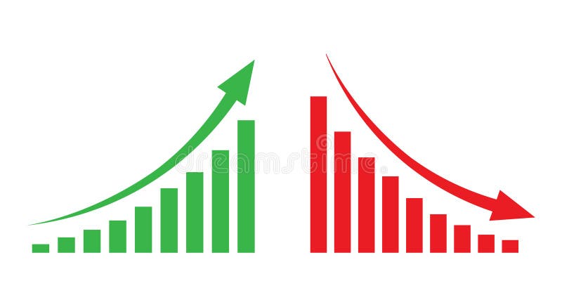
Free with trial Dual trend line graph bar business growth and decline visualization. Chart financial growth decrease vectors Profit growth and loss decline business graph bar. Dual trend line graph bar business growth and decline visualization
Free with trial Malaysia business economy growth country with map and finance condition - vector illustration. Chart financial growth decrease illustrations Malaysia business economy growth country with map and finance condition - vector illustration
Free with trial Increase decrease and arrow vector icon set design, 48x48 pixel perfect and editable stroke. Chart financial growth decrease vectors Increase decrease icon. Increase decrease and arrow vector icon set design, 48x48 pixel perfect and editable stroke
Free with trial US Dollar Exchange Rate Chart Illustration Forecast. Chart financial growth decrease illustrations US Dollar Exchange Rate Chart Illustration Forecast
Free with trial A glossy green arrow with a percentage symbol points downwards, symbolizing a decrease in value, sales, or economic performance. Perfect for financial concepts. Chart financial growth decrease illustrations Green percentage symbol arrow shows downward trend indicating price reduction or loss isolated on white background. A glossy green arrow with a percentage symbol points downwards, symbolizing a decrease in value, sales, or economic performance. Perfect for financial concepts
Free with trial Decreasing coin stacks on wood with green bokeh background, for finance concepts. Chart financial growth decrease illustrations Progression of Financial Growth with Stacked Coins. Decreasing coin stacks on wood with green bokeh background, for finance concepts
Free with trial A line art image depicting a magnifying glass focused on a person icon and a downward trending bar chart. Chart financial growth decrease illustrations Declining Sales Analysis Magnifying Glass, Downward Trend Chart. A line art image depicting a magnifying glass focused on a person icon and a downward trending bar chart.
Free with trial Declining Bar Graph with Downward Arrow Showing Loss or Decrease. Chart financial growth decrease vectors Declining Bar Graph with Downward Arrow Showing Loss or Decrease
Free with trial A 3D rendered bar chart displays a series of bars decreasing in height from left to right. The bars are colored with a gradient transitioning from blue to orange, set against a plain white background. The visual represents a downward trend or decline. Chart financial growth decrease illustrations Downward Trending Bar Chart with Gradient Colors on a White Background graph statistics. A 3D rendered bar chart displays a series of bars decreasing in height from left to right. The bars are colored with a gradient transitioning from blue to orange, set against a plain white background. The visual represents a downward trend or decline
Free with trial This image presents an abstract view of financial trends through black and orange bar graphs, symbolizing data analysis and market metrics. Chart financial growth decrease illustrations Abstract representation of financial trends with black and orange bar graphs on dark background. This image presents an abstract view of financial trends through black and orange bar graphs, symbolizing data analysis and market metrics
Free with trial Red arrow pointing downward against a blue background symbolizes financial loss and decline, with a clean and minimalist composition suitable for illustrating economic downturn in business and finance contexts. Chart financial growth decrease illustrations Falling Red Arrow on Blue Background Showing Financial Decline. Red arrow pointing downward against a blue background symbolizes financial loss and decline, with a clean and minimalist composition suitable for illustrating economic downturn in business and finance contexts
Free with trial Visual representation of decline or negative trend. Downward arrow over a multi-colored bar chart, signifying reduction or decrease. Chart financial growth decrease vectors Red arrow pointing down at colorful decreasing bar chart graph. Visual representation of decline or negative trend. Downward arrow over a multi-colored bar chart, signifying reduction or decrease
Free with trial A shiny gold percentage symbol (%) set against a backdrop of red and blue financial graph lines, representing market trends, economic fluctuations, and investment analysis. Ideal for financial reports and business-related topics. Chart financial growth decrease illustrations Gold Percentage Symbol with Red and Blue Financial Graph Trend. A shiny gold percentage symbol (%) set against a backdrop of red and blue financial graph lines, representing market trends, economic fluctuations, and investment analysis. Ideal for financial reports and business-related topics.
Free with trial A dramatic 3D render depicts a large, glowing red downward arrow positioned directly above a scattered collection of metallic coins. The coins are spread across a dark, reflective surface, suggesting a loss or decline in wealth. The stark contrast between the bright arrow and the dark background, along with the scattered coins, visually communicates concepts of financial downturn, economic recession, market crash, or budget cuts. This image is ideal for illustrating financial challenges, investment losses, or economic instability. Chart financial growth decrease illustrations Red Downward Arrow Over Scattered Coins - Financial Crisis Concept. A dramatic 3D render depicts a large, glowing red downward arrow positioned directly above a scattered collection of metallic coins. The coins are spread across a dark, reflective surface, suggesting a loss or decline in wealth. The stark contrast between the bright arrow and the dark background, along with the scattered coins, visually communicates concepts of financial downturn, economic recession, market crash, or budget cuts. This image is ideal for illustrating financial challenges, investment losses, or economic instability.
Free with trial Colorful 3D pie chart render with segments in green, orange, yellow against soft green background. Minimalist design highlights data visualization concept. Useful for business reports. Chart financial growth decrease illustrations Colorful 3D pie chart render with segments in green, orange, yellow against soft green background. Minimalist design highlights
Free with trial Decrease on line graph with panic word on red. Finance, fear, global economic crisis, recession and investment concept. Flat design. EPS 8 vector illustration, no transparency, no gradients. Chart financial growth decrease vectors Panic decrease, crisis, fear. Decrease on line graph with panic word on red. Finance, fear, global economic crisis, recession and investment concept. Flat design. EPS 8 vector illustration, no transparency, no gradients
Free with trial A simple line drawing depicts a magnifying glass focusing on a declining bar chart with a downward arrow and zig-zag. Chart financial growth decrease illustrations Declining Market Analysis Magnifying Glass, Downward Trend Chart. A simple line drawing depicts a magnifying glass focusing on a declining bar chart with a downward arrow and zig-zag.
Free with trial Bar graph illustrating financial downturn, with a red arrow pointing down and a dollar sign. Economic recession concept. Chart financial growth decrease vectors Financial graph showing decline with dollar sign and red arrow. Bar graph illustrating financial downturn, with a red arrow pointing down and a dollar sign. Economic recession concept
Free with trial A shopping cart filled with financial symbols and graphs, representing economic growth and market trends. Chart financial growth decrease illustrations Illustration of shopping cart with financial symbols and graphs. A shopping cart filled with financial symbols and graphs, representing economic growth and market trends
Free with trial A line graph illustrating the gradual decrease in energy consumption over several months, with lightning bolt icons transitioning to leaf icons, symbolizing a shift from high energy usage to sustainable, cost-effective practices. The x-axis represents time in months, and the y-axis shows energy consumption in kWh, clearly indicating a downward trend in energy use and associated costs. Chart financial growth decrease illustrations Energy Consumption Decrease Over Time Leading to Cost Reduction. A line graph illustrating the gradual decrease in energy consumption over several months, with lightning bolt icons transitioning to leaf icons, symbolizing a shift from high energy usage to sustainable, cost-effective practices. The x-axis represents time in months, and the y-axis shows energy consumption in kWh, clearly indicating a downward trend in energy use and associated costs
Free with trial A close-up view of a finger pressing on a stock price chart on a digital device, symbolizing investment strategies and market trends in finance. Chart financial growth decrease illustrations Digital Stock Market Trading Concept with Finger on Price Chart. A close-up view of a finger pressing on a stock price chart on a digital device, symbolizing investment strategies and market trends in finance
Free with trial This image shows a balance scale with upward and downward arrows, symbolizing market trends, economic fluctuations, and financial equilibrium in the economy. Chart financial growth decrease vectors Vector art of balance scale with upward and downward arrows, symbolizing market trends, economic fluctuations, and financial. This image shows a balance scale with upward and downward arrows, symbolizing market trends, economic fluctuations, and financial equilibrium in the economy
Free with trial Thick textbook on economics in hardcover with bookmark inside and colorful statistical chart isolated vector illustration on white background. Chart financial growth decrease vectors Textbook on Economics and Bright Statistical Chart. Thick textbook on economics in hardcover with bookmark inside and colorful statistical chart isolated vector illustration on white background.
Free with trial Economic recession, financial crisis or stock market crash concept with worried businessman investor or business owner. Red down arrow. Vector illustration. Chart financial growth decrease vectors Economic recession, financial crisis or stock market crash concept
Free with trial Modern laptop shows real time financial data analytics with line graphs bar charts and a pie chart. Chart financial growth decrease illustrations Laptop Screen Displaying Live Business Data Charts and Analytics. Modern laptop shows real time financial data analytics with line graphs bar charts and a pie chart
Free with trial A red bar graph showing a decline with a downward pointing arrow above it. Clear details and vibr. Chart financial growth decrease illustrations Red Bar Graph Showing Decline With Downward Arrow chart decrease. A red bar graph showing a decline with a downward pointing arrow above it. Clear details and vibr
Free with trial A line drawing depicts a money bag, a downward trending graph, and a magnifying glass, symbolizing financial loss. Chart financial growth decrease illustrations Financial Loss Analysis Money Bag, Downward Graph, Magnifying Glass. A line drawing depicts a money bag, a downward trending graph, and a magnifying glass, symbolizing financial loss.
Free with trial A comprehensive set of icons representing various aspects of business, finance, data analysis, growth, and strategy. Chart financial growth decrease vectors Collection of Business and Finance Icons for Data Analysis and Growth. A comprehensive set of icons representing various aspects of business, finance, data analysis, growth, and strategy
Free with trial Japanese Yen Exchange Rate Chart Illustration Forecast. Chart financial growth decrease illustrations Japanese Yen Exchange Rate Chart Illustration Forecast
Free with trial A 3D business growth down sign UI icon, isolated on a white background. Symbolizing a decline in business, finance, or market performance. Chart financial growth decrease illustrations Business Growth Down Sign UI Icon 3D Isolated on White Background. A 3D business growth down sign UI icon, isolated on a white background. Symbolizing a decline in business, finance, or market performance.
Free with trial Increase decrease and arrow vector icon set, 48x48 pixel perfect and editable stroke. Chart financial growth decrease vectors Increase decrease icon. Increase decrease and arrow vector icon set, 48x48 pixel perfect and editable stroke
Free with trial This image represents a declining global economy with a dramatic drop in financial performance illustrated by a bright blue arrow pointing downwards. Chart financial growth decrease illustrations Global economic downturn with financial chart on world map background. This image represents a declining global economy with a dramatic drop in financial performance illustrated by a bright blue arrow pointing downwards
Free with trial Dollar and chart, Bearish icon, falling price, background money, vector. Chart financial growth decrease vectors Dollar and chart, Bearish icon, falling price, background money
Free with trial A vibrant red and orange arrow symbolizes a downward trend against a dark chart. This image represents financial decline, market analysis, and economic challenges. Chart financial growth decrease illustrations Red and Orange Arrow Indicating Downward Trend on Chart Background. A vibrant red and orange arrow symbolizes a downward trend against a dark chart. This image represents financial decline, market analysis, and economic challenges
Free with trial This image captures a downward trend line, symbolizing a financial market decline and representing challenges faced by investors. Chart financial growth decrease illustrations Downward Trend Line Representing Financial Market Decline and Loss. This image captures a downward trend line, symbolizing a financial market decline and representing challenges faced by investors
Free with trial Colorful infographic d "BundenigS" illustrating financial concepts like savings, budgeting, investments, and financial statements, using simple icons. Chart financial growth decrease illustrations Colorful infographic d \'BundenigS\' illustrating financial concep. Colorful infographic d "BundenigS" illustrating financial concepts like savings, budgeting, investments, and financial statements, using simple icons .
Free with trial Icons on a white background depict percentage symbols combined with arrows and bar graphs. The top row includes red, blue, and yellow arrows with percentage symbols. The middle row shows a multicolored bar graph, green percentage symbols, and a black percentage symbol with a black arrow. The bottom row contains a black bar graph, a downward arrow, and a large black percentage symbol. These elements visually represent data trends, growth, and decline. Chart financial growth decrease vectors Percentage Growth and Decline Arrow Icon Set Multi Color and Silhouette. Icons on a white background depict percentage symbols combined with arrows and bar graphs. The top row includes red, blue, and yellow arrows with percentage symbols. The middle row shows a multicolored bar graph, green percentage symbols, and a black percentage symbol with a black arrow. The bottom row contains a black bar graph, a downward arrow, and a large black percentage symbol. These elements visually represent data trends, growth, and decline.
Free with trial Unemployment line icon of unemployed man on labor market, vector symbol. Economic crisis, global financial downturn and bankruptcy icon of economy recession and unemployment problem. Chart financial growth decrease vectors Unemployment line icon, economic financial crisis. Unemployment line icon of unemployed man on labor market, vector symbol. Economic crisis, global financial downturn and bankruptcy icon of economy recession and unemployment problem
Free with trial Increase decrease and arrow vector icon set design, 48x48 pixel perfect and editable stroke. Chart financial growth decrease vectors Increase decrease icon. Increase decrease and arrow vector icon set design, 48x48 pixel perfect and editable stroke
Free with trial Increase decrease and arrow vector icon set design, 48x48 pixel perfect and editable stroke. Chart financial growth decrease vectors Increase decrease icon. Increase decrease and arrow vector icon set design, 48x48 pixel perfect and editable stroke
Free with trial Graph going Up and Down sign with green and red arrows vector. Flat design vector illustration concept of sales bar chart symbol icon with arrow moving down and sales bar chart with arrow moving up. Chart financial growth decrease vectors Graph going Up and Down sign with green and red arrows vector. Flat design vector illustration concept of sales bar chart symbol. Graph going Up and Down sign with green and red arrows vector. Flat design vector illustration concept of sales bar chart symbol icon with arrow moving down and sales bar chart with arrow moving up.
Free with trial A golden percentage symbol (%) with a red and blue financial graph representing stock market analysis, trends, and fluctuations. Ideal for financial reports, investments, and economic topics. Chart financial growth decrease illustrations Gold Percentage Symbol with Red and Blue Financial Graph Background. A golden percentage symbol (%) with a red and blue financial graph representing stock market analysis, trends, and fluctuations. Ideal for financial reports, investments, and economic topics.
Free with trial This image depicts a financial graph illustrating net worth over time, featuring a teal shaded area and a line graph with data points. The graph is presented on a clean white background, making it easy to read and understand. The image is suitable for use in financial reports, presentations, and marketing materials, providing a clear and concise visual representation of financial data. The graph's design is simple, yet effective, allowing viewers to quickly grasp the trend and pattern of net worth changes over time. Chart financial growth decrease vectors A financial graph showing net worth over time with a teal shaded area. This image depicts a financial graph illustrating net worth over time, featuring a teal shaded area and a line graph with data points. The graph is presented on a clean white background, making it easy to read and understand. The image is suitable for use in financial reports, presentations, and marketing materials, providing a clear and concise visual representation of financial data. The graph's design is simple, yet effective, allowing viewers to quickly grasp the trend and pattern of net worth changes over time.
Free with trial A visually appealing bar graph illustration against a sleek black background, showcasing business growth, data analysis, and statistical trends. The illustration is suitable for presentations, reports, and web content related to finance, marketing, and technology. Chart financial growth decrease illustrations Bar Graph Illustration Business Growth, Data Analysis, and Statistics. A visually appealing bar graph illustration against a sleek black background, showcasing business growth, data analysis, and statistical trends. The illustration is suitable for presentations, reports, and web content related to finance, marketing, and technology.
Free with trial A red downward-pointing arrow sits atop a blue bar graph labeled GDP, with white financial data and numbers below on a dark background with a gradient light effect. red, down, arrow. Chart financial growth decrease illustrations Red down arrow on blue bar graph with g d p text and financial data. A red downward-pointing arrow sits atop a blue bar graph labeled GDP, with white financial data and numbers below on a dark background with a gradient light effect. red, down, arrow
Free with trial A golden percentage symbol (%) with a red and blue financial graph representing stock market analysis, trends, and fluctuations. Ideal for financial reports, investments, and economic topics. Chart financial growth decrease illustrations Gold Percentage Symbol with Red and Blue Financial Graph Background. A golden percentage symbol (%) with a red and blue financial graph representing stock market analysis, trends, and fluctuations. Ideal for financial reports, investments, and economic topics.
Free with trial Euro and chart, currency decline, Bearish icon, background money,vector. Chart financial growth decrease vectors Euro and chart, currency decline, Bearish icon, background money
Free with trial A businessman in a suit is drawing a downward sloping graph illustrating the decline of profits against the rise of costs the image represents financial challenges business downturns and the need for cost reduction strategies for improved profitability. Chart financial growth decrease illustrations Business person drawing a graph representing financial decline and reduced profits due to cost. A businessman in a suit is drawing a downward sloping graph illustrating the decline of profits against the rise of costs the image represents financial challenges business downturns and the need for cost reduction strategies for improved profitability
Free with trial Pink bar graph showing a downward trend on a pink background, financial concept. Chart financial growth decrease illustrations Pink bar graph showing a downward trend on a pink background, financial concept
Free with trial A businessman in a suit uses a magnifying glass to show cost reduction with graphs and financial data visuals. Chart financial growth decrease illustrations Businessman demonstrating cost reduction with data and graphs for financial analysis purpose image. A businessman in a suit uses a magnifying glass to show cost reduction with graphs and financial data visuals.
Free with trial Money increase and decrease icons. Low or high total cost icon. Price, sale, rate or profit going up or down symbol with arrow and dollar sign. Chart financial growth decrease illustrations Money increase and decrease icons. Low or high total cost icon. Price, sale, rate or profit going up or down symbol
Free with trial Money increase and decrease icons. Low or high total cost icon. Price, sale, rate or profit going up or down symbol with arrow and dollar sign. Chart financial growth decrease illustrations Money increase and decrease icons. Low or high total cost icon. Price, sale, rate or profit going up or down symbol
Free with trial Red wooden blocks forming a declining bar graph on a financial document. Shows a negative trend in business or market data. Chart financial growth decrease illustrations Red Wooden Blocks Showing Declining Bar Graph on Financial Report Ai generated. Red wooden blocks forming a declining bar graph on a financial document. Shows a negative trend in business or market data
Free with trial A man in a suit presents a digital interface showing a cost reduction chart with a downward arrow, illustrating financial decline and business challenges. Chart financial growth decrease illustrations Man presenting cost reduction chart with downward arrow and percentage sign in a digital interface. a man in a suit presents a digital interface showing a cost reduction chart with a downward arrow, illustrating financial decline and business challenges.
Free with trial A 3D rendered visualization of a stock market candlestick chart is presented on a white background. The chart displays a series of red and green candlesticks, representing price movements over time. Red candles indicate a price decrease, while green candles signify a price increase, illustrating market fluctuations and trends. Chart financial growth decrease illustrations 3D Rendered Candlestick Stock Market Chart with Red and Green Bars on White Background trading. A 3D rendered visualization of a stock market candlestick chart is presented on a white background. The chart displays a series of red and green candlesticks, representing price movements over time. Red candles indicate a price decrease, while green candles signify a price increase, illustrating market fluctuations and trends
Free with trial Simple and clean blue gradient line graph is going up and down showing growth and decline over a period of time. Chart financial growth decrease vectors Blue gradient line graph showing growth and decline over time. Simple and clean blue gradient line graph is going up and down showing growth and decline over a period of time