Free with trial A visual representation of financial losses or declining market trends, ideal for economic reports and business analysis presentations. Decrease arrow chart illustrations Bar chart showing a significant decline, emphasized by a red arrow pointing downwards and a magnifying glass. A visual representation of financial losses or declining market trends, ideal for economic reports and business analysis presentations
Free with trial A bold red arrow curves downwards, indicating a negative trend or a directional choice. This simple yet impactful graphic is isolated for clarity. Decrease arrow chart illustrations Red arrow pointing down on. A bold red arrow curves downwards, indicating a negative trend or a directional choice. This simple yet impactful graphic is isolated for clarity
Free with trial Stacks of coins diminish, mirroring a falling stock market chart against a world map backdrop, symbolizing global economic decline and financial loss. Decrease arrow chart illustrations Global Economic Downturn: Coin Stacks Decline with Bearish Stock Chart. Stacks of coins diminish, mirroring a falling stock market chart against a world map backdrop, symbolizing global economic decline and financial loss
Free with trial Two three-dimensional arrows pointing downwards are presented against a white background. The arrow on the left is bright green, while the arrow on the right is a vibrant red. Both arrows have a highly polished, glossy surface, reflecting light. The arrows are positioned slightly overlapping, creating a sense of movement or comparison. The overall style is clean and simple, suitable for use as. Decrease arrow chart illustrations 3 D Green and Red Down Arrows Shiny Glossy Icons 3d arrow. Two three-dimensional arrows pointing downwards are presented against a white background. The arrow on the left is bright green, while the arrow on the right is a vibrant red. Both arrows have a highly polished, glossy surface, reflecting light. The arrows are positioned slightly overlapping, creating a sense of movement or comparison. The overall style is clean and simple, suitable for use as
Free with trial This image shows a bar graph with a downward trend, indicated by a red arrow. It represents a decline in business, finance, or the economy, isolated on white. Decrease arrow chart illustrations A bar graph showing a downward trend with a red arrow isolated on white background. This image shows a bar graph with a downward trend, indicated by a red arrow. It represents a decline in business, finance, or the economy, isolated on white
Free with trial Blue bars on a graph display a downward trend highlighted by a yellow arrow showing decline Great for illustrating economic concepts and market trends. Decrease arrow chart illustrations Decreasing Bar Graph with Arrow Downward Financial Decline. Blue bars on a graph display a downward trend highlighted by a yellow arrow showing decline Great for illustrating economic concepts and market trends
Free with trial A stock market chart with a downward trend and shattered glass evokes a sense of financial loss and failure, and is used to illustrate economic downturns or market crashes. Decrease arrow chart illustrations Financial Downfall Stock Market Chart with Shattered Glass. A stock market chart with a downward trend and shattered glass evokes a sense of financial loss and failure, and is used to illustrate economic downturns or market crashes
Free with trial A stark red arrow zigzags downwards, powerfully representing economic downturns, market crashes, and negative financial trends. This visual signifies a crisis or significant drop. Decrease arrow chart illustrations Red downward arrow symbolizing financial decline and economic recession trends. A stark red arrow zigzags downwards, powerfully representing economic downturns, market crashes, and negative financial trends. This visual signifies a crisis or significant drop
Free with trial A visual representation of a declining stock market trend, depicted by a bold red arrow descending across a financial graph, symbolizing economic downturn and investment loss. Decrease arrow chart illustrations A red arrow pointing downwards on a stock market graph, isolated on white background. A visual representation of a declining stock market trend, depicted by a bold red arrow descending across a financial graph, symbolizing economic downturn and investment loss
Free with trial A dynamic red jagged arrow plunges downward, visually representing a sharp decline, economic downturn, or negative trend in business and finance. Ideal for charting losses or market drops. Decrease arrow chart illustrations Red jagged arrow pointing down symbolizing financial decline or negative trend. A dynamic red jagged arrow plunges downward, visually representing a sharp decline, economic downturn, or negative trend in business and finance. Ideal for charting losses or market drops
Free with trial A white house is depicted with a prominent red arrow pointing downwards, symbolizing a decline in the market. The image conveys concepts like financial loss, economic downturn, or a decrease in property value. Decrease arrow chart illustrations House with downward arrow isolated on white background. use cases: finance, economy. A white house is depicted with a prominent red arrow pointing downwards, symbolizing a decline in the market. The image conveys concepts like financial loss, economic downturn, or a decrease in property value
Free with trial A graph shows a downward trend. Green bars diminish in height along a timeline. A red arrow underscores the downward movement of the data on the timeline. Decrease arrow chart illustrations Decreasing graph showing green bars plunging downward with a red arrow indication. A graph shows a downward trend. Green bars diminish in height along a timeline. A red arrow underscores the downward movement of the data on the timeline
Free with trial This vibrant 3D bar chart illustrates strong business growth and upward progress. The colorful, glossy bars represent data points, clearly showing an increase. Ideal for presentations and reports. Decrease arrow chart illustrations Colorful 3D Bar Chart Showing Business Growth and Progress. This vibrant 3D bar chart illustrates strong business growth and upward progress. The colorful, glossy bars represent data points, clearly showing an increase. Ideal for presentations and reports.
Free with trial A striking red arrow curves downwards, symbolizing a financial downturn economic recession or declining performance. This graphic conveys a clear message of loss, regression, or negative trends. Decrease arrow chart illustrations Red downward arrow symbol showing decline and negative trend in business and finance. A striking red arrow curves downwards, symbolizing a financial downturn economic recession or declining performance. This graphic conveys a clear message of loss, regression, or negative trends
Free with trial Interface displaying downward-trending bar chart and dotted line on dashboard, with ticker symbols. Finance, analytics, data visualization, investment, technological, corporate, digital. Decrease arrow chart illustrations Interface displaying downward-trending bar chart and dotted line on dashboard, with ticker symbols
Free with trial Decreasing graph line icon. Continuous line big heart. Column chart sign. Market analytics symbol. 3d hearts in heart shaped loop. Decreasing graph single line ribbon. Loop curve pattern. Vector. Decrease arrow chart vectors Decreasing graph line icon. Column chart sign. Continuous line big heart. Vector. Decreasing graph line icon. Continuous line big heart. Column chart sign. Market analytics symbol. 3d hearts in heart shaped loop. Decreasing graph single line ribbon. Loop curve pattern. Vector
Free with trial Stock fall recession economy crisis financial global market chart on red decline background concept with loss price down finance graph or digital crash diagram failure money. Decrease arrow chart illustrations Stock fall recession economy crisis financial global market chart on red decline background concept with loss price down finance
Free with trial Down crisis financial business market graph on investment economy finance chart background of loss money economic crash exchange or stock recession diagram concept. Decrease arrow chart illustrations Down crisis financial business market graph on investment economy finance chart background of loss money economic crash exchange
Free with trial A bold, jagged black arrow descends diagonally, indicating a downward trend or decline, isolated on a clean white background. Decrease arrow chart illustrations A jagged black arrow pointing downward isolated on white background. A bold, jagged black arrow descends diagonally, indicating a downward trend or decline, isolated on a clean white background
Free with trial Colorful Bar Chart Graph Showing Growth and Performance Over Time with Upward Trend. Decrease arrow chart vectors Colorful Bar Chart Graph Showing Growth and Performance Over Time with Upward Trend
Free with trial Laptop on desk showing red falling stock chart, digital graphic style, office background, concept of global financial market crash. 3D Rendering. Decrease arrow chart illustrations Red downward stock market chart on laptop screen showing financial crisis data in modern office with soft lighting and digital. Laptop on desk showing red falling stock chart, digital graphic style, office background, concept of global financial market crash. 3D Rendering
Free with trial Conceptual graph with decrease report. Diagram with recession and bankruptcy progress. Business and finance vector illustration. Decrease arrow chart vectors Conceptual graph with decrease report. Diagram with recession and bankruptcy progress. Business and finance vector
Free with trial Three wooden blocks arranged in a row, featuring a green upward arrow, a percentage sign, and a red downward arrow, all on a clean white background. Decrease arrow chart illustrations Wooden blocks with green up arrow, percentage sign, and red down arrow isolated on white background. Three wooden blocks arranged in a row, featuring a green upward arrow, a percentage sign, and a red downward arrow, all on a clean white background
Free with trial A red arrow points downwards over stacks of coins, illustrating a financial decline. The object is isolated on a white background. Decrease arrow chart illustrations Red downward trend arrow over decreasing coin stacks isolated on white background. A red arrow points downwards over stacks of coins, illustrating a financial decline. The object is isolated on a white background
Free with trial Blue upward bar graph with arrow and falling coin near a sad face. Ideal for finance, economy, investment risks, financial loss, market analysis, emotional impact, business strategies. Simple flat. Decrease arrow chart vectors Financial growth with unhappy outcome reflected by increasing bar chart, falling coin, and sad face. Blue upward bar graph with arrow and falling coin near a sad face. Ideal for finance, economy, investment risks, financial loss, market analysis, emotional impact, business strategies. Simple flat
Free with trial Red downward trend arrow on dark surface. Decrease arrow chart illustrations Red downward trend arrow on dark surface
Free with trial Falling bar chart with a red warning sign signifies financial risk and economic decline, suggesting the need for caution in investing and business strategies. Decrease arrow chart illustrations Declining Chart with Warning Sign Illustrating Market Downturn. Falling bar chart with a red warning sign signifies financial risk and economic decline, suggesting the need for caution in investing and business strategies
Free with trial A visual representation of a declining real estate market, showing smaller houses and a sharp downward trending green arrow. Decrease arrow chart illustrations Real estate market decline illustrated by decreasing house sizes and downward arrow. A visual representation of a declining real estate market, showing smaller houses and a sharp downward trending green arrow
Free with trial Decreasing graph line icon. Halftone dotted pattern. Gradient icon with grain shadow. Column chart sign. Crisis diagram symbol. Line decreasing graph icon. Various designs. Vector. Decrease arrow chart vectors Decreasing graph line icon. Crisis chart sign. Halftone dotted pattern. Vector. Decreasing graph line icon. Halftone dotted pattern. Gradient icon with grain shadow. Column chart sign. Crisis diagram symbol. Line decreasing graph icon. Various designs. Vector
Free with trial Visualize investment loss with this 3D rendering. A downward-pointing red arrow plunges towards scattered coins on a smartphone screen, symbolizing financial decline. Ideal for illustrating market downturns, recession risks, and online banking losses. Use this image for business, finance, or technology content. The purple pastel background adds a modern touch to this digital illustration of a. Decrease arrow chart illustrations Investment loss concept with down arrow and coins on smartphone. Visualize investment loss with this 3D rendering. A downward-pointing red arrow plunges towards scattered coins on a smartphone screen, symbolizing financial decline. Ideal for illustrating market downturns, recession risks, and online banking losses. Use this image for business, finance, or technology content. The purple pastel background adds a modern touch to this digital illustration of a
Free with trial A striking 3D rendering depicts a bold red downward trend arrow overlaid on a subtle grid, immediately conveying a sense of decline and loss. Set against a pristine white background, the graphic powerfully symbolizes financial instability, market downturns, and the potential for recession. This illustration is ideal for conveying concepts of investment risk, negative business trends, and economic. Decrease arrow chart illustrations Red downward trend arrow and grid symbolizing decline or recession on white background. A striking 3D rendering depicts a bold red downward trend arrow overlaid on a subtle grid, immediately conveying a sense of decline and loss. Set against a pristine white background, the graphic powerfully symbolizes financial instability, market downturns, and the potential for recession. This illustration is ideal for conveying concepts of investment risk, negative business trends, and economic
Free with trial A metallic golden arrow with fletching at the tail end curves downwards, pointing towards the bottom right. The object is isolated on a clean white background. Decrease arrow chart illustrations A shiny golden arrow curves downwards indicating a decline isolated on white background. A metallic golden arrow with fletching at the tail end curves downwards, pointing towards the bottom right. The object is isolated on a clean white background
Free with trial This image depicts a bar graph with a downward trend. The bars decrease in height from left to right, indicating a decline in the measured values. A red arrow at the top further emphasizes the downward direction. Decrease arrow chart illustrations Decreasing bar graph. This image depicts a bar graph with a downward trend. The bars decrease in height from left to right, indicating a decline in the measured values. A red arrow at the top further emphasizes the downward direction
Free with trial A black graph on a white background depicts a sharp downward trend with an arrow indicating further decline. Decrease arrow chart illustrations Black graph showing a downward trend on a white background chart decline. A black graph on a white background depicts a sharp downward trend with an arrow indicating further decline
Free with trial A dynamic 3D rendering of a bar graph, depicting a downward trend with vibrant red bars and a prominent white arrow pointing downwards. The scene is set against a dark, subtly textured background, creating a dramatic visual contrast. This image effectively symbolizes decline, loss, negative financial trends, or challenges in business. Decrease arrow chart illustrations 3D Bar Graph with Declining Red Bars and White Arrow Ai Generated. A dynamic 3D rendering of a bar graph, depicting a downward trend with vibrant red bars and a prominent white arrow pointing downwards. The scene is set against a dark, subtly textured background, creating a dramatic visual contrast. This image effectively symbolizes decline, loss, negative financial trends, or challenges in business.
Free with trial Hand drawing a down arrow over a decreasing bar chart on a green chalkboard. Decrease arrow chart illustrations Hand drawing declining bar graph on blackboard. Hand drawing a down arrow over a decreasing bar chart on a green chalkboard
Free with trial A vibrant bar graph shows an upward trend with a green arrow, indicating growth. The bars are blue, yellow, green, and red, set against a clean white background. Decrease arrow chart illustrations Colorful Bar Graph with Upward Trend Line and Green Arrow Indicator on White Background. A vibrant bar graph shows an upward trend with a green arrow, indicating growth. The bars are blue, yellow, green, and red, set against a clean white background
Free with trial This image represents a stock market crash, symbolized by a red arrow pointing downwards on a graph. It signifies economic downturn, financial loss, and investment risk. Decrease arrow chart illustrations Stock market crash with red arrow pointing down on a graph background. This image represents a stock market crash, symbolized by a red arrow pointing downwards on a graph. It signifies economic downturn, financial loss, and investment risk
Free with trial A striking 3D render features a bold red arrow, sharply angled downwards, positioned on a textured wooden surface. The arrow's zigzag path suggests a dynamic decline, making it a powerful visual metaphor for financial downturns, market crashes, or negative trends. The warm tones of the wood contrast with the vibrant red, creating a visually engaging composition. This image is ideal for illustrating concepts related to economic recession, business failure, loss, or any situation involving a downward trajectory. Decrease arrow chart illustrations Red Arrow Pointing Downward on Wooden Background. A striking 3D render features a bold red arrow, sharply angled downwards, positioned on a textured wooden surface. The arrow's zigzag path suggests a dynamic decline, making it a powerful visual metaphor for financial downturns, market crashes, or negative trends. The warm tones of the wood contrast with the vibrant red, creating a visually engaging composition. This image is ideal for illustrating concepts related to economic recession, business failure, loss, or any situation involving a downward trajectory.
Free with trial The concept of a business financial crash depicted by a vibrant 3D rendering of a declining chart. Decrease arrow chart illustrations The concept of a business financial crash depicted by a vibrant 3D rendering of a declining chart.
Free with trial Percent arrows up and down icon set. Income and cost increase and decrease arrow icons. Decrease arrow chart vectors Percent arrows up and down icon set
Free with trial 3D Rendering of world map with red downward arrows and stock chart on blue background, symbolizing global financial crisis and market collapse. Decrease arrow chart illustrations Global financial crisis concept with world map and falling stock market chart. 3D Rendering. 3D Rendering of world map with red downward arrows and stock chart on blue background, symbolizing global financial crisis and market collapse
Free with trial A man is depressed as the stock market goes down as indicated by the red arrow in this 3-d illustration. Decrease arrow chart illustrations A man is depressed as the stock market goes down as indicated by the red arrow
Free with trial Clear graphic illustration showing a downward trend or progression with a red arrow pointing into a smaller contained space, ideal for business or data analysis. Decrease arrow chart vectors Red arrow shows downward progress into smaller box. Clear graphic illustration showing a downward trend or progression with a red arrow pointing into a smaller contained space, ideal for business or data analysis
Free with trial Set line Dollar rate decrease, Global economic crisis, news and icon. Vector. Decrease arrow chart vectors Set line Dollar rate decrease, Global economic crisis, news and icon. Vector
Free with trial Business decline and economic recession concept with a falling bar graph and a downward red arrow. Decrease arrow chart vectors Business decline and economic recession concept with a falling bar graph and a downward red arrow
Free with trial Bearish market and trading concept with perspective view on digital graphic falling red arrow on dark technological background with forex chart indicators. 3D rendering. Decrease arrow chart illustrations Bearish market and trading concept
Free with trial This image displays a bar graph visualizing a clear downward trend. Nine vertical blue bars gradually decrease in height from left to right, signifying a consistent decline in values. A white arrowed line diagonally descends across the graph, reinforcing the negative trend. Blue horizontal and vertical grid lines aid in alignment. The background is green screen, allowing for chroma key use. This chart effectively communicates decline in areas like business, finance, or performance. Decrease arrow chart illustrations Downward Bar Graph Showing Financial Decline on Green Screen. This image displays a bar graph visualizing a clear downward trend. Nine vertical blue bars gradually decrease in height from left to right, signifying a consistent decline in values. A white arrowed line diagonally descends across the graph, reinforcing the negative trend. Blue horizontal and vertical grid lines aid in alignment. The background is green screen, allowing for chroma key use. This chart effectively communicates decline in areas like business, finance, or performance.
Free with trial Abstract downward pointing arrow graphic with three layered chevrons in warm gradient colors. Decrease arrow chart vectors Abstract downward pointing arrow graphic with three layered chevrons in warm gradient colors
Free with trial Business decline icon vector with downward arrow. Loss, failure, or economic crisis symbol with long shadow. Decrease arrow chart vectors Business decline icon with downward arrow. Loss, failure, or economic crisis symbol with long shadow
Free with trial Growth vector icon. Graph or diagram with arrow going up and down. Vector illustration. Decrease arrow chart vectors Growth vector icon. Graph or diagram with arrow going up and down. Vector
Free with trial Arrows percent icons with up and down signs and percentage symbols featuring arrow, icon, symbol with up and graphics elements for illustrations. Decrease arrow chart vectors Arrows percent icons with up and down signs and percentage symbols featuring arrow
Free with trial Candlestick Chart vector Professional Financial Trading concept icon or symbol. Decrease arrow chart vectors Candlestick Chart vector Professional Financial Trading icon or symbol
Free with trial Candlestick Chart Analysis vector Cryptocurrency Trading concept icon or symbol. Decrease arrow chart vectors Candlestick Chart Analysis vector Cryptocurrency Trading icon or symbol
Free with trial A bold red zigzag arrow points downwards, symbolizing a sharp decline or loss, isolated on a clean white background. Decrease arrow chart illustrations Red downward zigzag arrow isolated on white background. A bold red zigzag arrow points downwards, symbolizing a sharp decline or loss, isolated on a clean white background
Free with trial Stylized illustration depicts a black, downward-trending arrow within a graph framework, set against a solid pastel yellow background. The image is suitable for conveying concepts related to market decline, financial downturns, or negative trends in various business or editorial contexts, lending itself well to presentations or reports. Decrease arrow chart illustrations Downward trend arrow graph illustrates market decline and business loss. Stylized illustration depicts a black, downward-trending arrow within a graph framework, set against a solid pastel yellow background. The image is suitable for conveying concepts related to market decline, financial downturns, or negative trends in various business or editorial contexts, lending itself well to presentations or reports
Free with trial Pastel-colored bar graph with downward trending arrow illustrates financial decline or loss This image is suitable for business presentations or economic reports. Decrease arrow chart illustrations Declining Bar Graph with Arrow Showing Downtrend, Financial Loss Concept. Pastel-colored bar graph with downward trending arrow illustrates financial decline or loss This image is suitable for business presentations or economic reports
Free with trial A hand presents a glowing graph illustrating cost reduction. the downward arrow and shrinking bars emphasize decreasing expenses. a visual representation of financial efficiency and savings, ideal for business. Decrease arrow chart illustrations Representation of cost reduction shown above a hand with a downward trending bar graph and arrow. a hand presents a glowing graph illustrating cost reduction. the downward arrow and shrinking bars emphasize decreasing expenses. a visual representation of financial efficiency and savings, ideal for business.
Free with trial The image depicts a bar graph with a downward trend. The graph has blue bars representing data values that decrease from left to right. A large red arrow further emphasizes the downward trend, indicating a significant decline in the data over time. The graph is displayed on an easel with wooden legs. Decrease arrow chart illustrations Graph showing decline in data. The image depicts a bar graph with a downward trend. The graph has blue bars representing data values that decrease from left to right. A large red arrow further emphasizes the downward trend, indicating a significant decline in the data over time. The graph is displayed on an easel with wooden legs
Free with trial Graph with a green arrow pointing upwards. The graph is labeled with numbers and the numbers are increasing. Decrease arrow chart illustrations Graph with a green arrow pointing upwards
Free with trial A sharp red arrow with a jagged line points downwards, indicating a decline or loss, isolated on a white background. Decrease arrow chart illustrations Red downward trend arrow isolated on white background. A sharp red arrow with a jagged line points downwards, indicating a decline or loss, isolated on a white background
Free with trial A sharp red arrow pointing downwards in a zig-zag pattern, isolated on a clean white background. Represents decline or loss. Decrease arrow chart illustrations Red downward trend arrow isolated on white background. A sharp red arrow pointing downwards in a zig-zag pattern, isolated on a clean white background. Represents decline or loss
Free with trial A sharp red arrow indicating a downward trend or decline, isolated on a clean white background. Decrease arrow chart illustrations Red downward trend arrow isolated on white background. A sharp red arrow indicating a downward trend or decline, isolated on a clean white background
Free with trial A jagged red arrow points downwards indicating a negative trend or decline, isolated on a clean white background. Decrease arrow chart illustrations Red downward trend arrow isolated on white background. A jagged red arrow points downwards indicating a negative trend or decline, isolated on a clean white background
Free with trial A vibrant red arrow points downwards, symbolizing a significant drop in stock prices, economic recession, or negative financial trends. This image captures the essence of decline and loss. Decrease arrow chart illustrations Red downward arrow signifying financial decline and economic downturn symbol white background. A vibrant red arrow points downwards, symbolizing a significant drop in stock prices, economic recession, or negative financial trends. This image captures the essence of decline and loss
Free with trial Blue arrow points down beside stack of gold coins with dollar sign. Conceptual graphic represents financial decline, market crash or economic recession. Decrease arrow chart illustrations Blue arrow points down beside stack of gold coins with dollar sign. Conceptual graphic represents financial decline, market
Free with trial Dollar rate increase. Cost rising icon with money sign and growth arrow. Increase price, higher profit. vector. Decrease arrow chart vectors Dollar rate increase. Cost rising icon with money sign and growth arrow. Increase price, higher profit. vector
Free with trial Bold red zigzag arrow pointing downward with sharp angles. Decrease arrow chart illustrations Red downward zigzag arrow icon. Bold red zigzag arrow pointing downward with sharp angles
Free with trial Candlestick Chart Analysis vector Crypto Trading concept colored seamless pattern. Decrease arrow chart vectors Candlestick Chart Analysis vector Crypto Trading colored seamless pattern
Free with trial Decreasing Coin Stacks with Red Arrow Showcasing Financial Loss or Negative Trend Illustration. Decrease arrow chart illustrations Decreasing Coin Stacks with Red Arrow Showcasing Financial Loss or Negative Trend Illustration
Free with trial This hand-drawn bar chart, generated by AI, visually represents growth over time. The chart shows an initial decline followed by a significant upward trend, highlighting potential recovery or resurgence after a setback. The artistic style adds a unique touch. Decrease arrow chart illustrations AI-Generated Growth Chart. This hand-drawn bar chart, generated by AI, visually represents growth over time. The chart shows an initial decline followed by a significant upward trend, highlighting potential recovery or resurgence after a setback. The artistic style adds a unique touch.
Free with trial Neon graph shows falling trend with pink arrow pointing down. Blue bars indicate decline on, dark textured background. Modern abstract finance concept. Decrease arrow chart illustrations Neon graph shows falling trend with pink arrow pointing down. Blue bars indicate decline on dark textured background. Modern. Neon graph shows falling trend with pink arrow pointing down. Blue bars indicate decline on, dark textured background. Modern abstract finance concept.
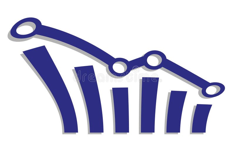
Free with trial This minimalist vector illustration depicts a line chart indicating a negative performance or decline. The design features a clean blue line with circular data points connected by segments, ending in a sharp red arrow pointing downwards. The background is a soft, neutral shade, emphasizing the clear visual representation of financial loss or decreasing statistics. Decrease arrow chart vectors A simple line graph showing a downward trend with a red arrow. This minimalist vector illustration depicts a line chart indicating a negative performance or. This minimalist vector illustration depicts a line chart indicating a negative performance or decline. The design features a clean blue line with circular data points connected by segments, ending in a sharp red arrow pointing downwards. The background is a soft, neutral shade, emphasizing the clear visual representation of financial loss or decreasing statistics
Free with trial Laptop screen showing red downward stock chart and graph, on wooden desk with plant and notebook, concept of global financial crisis. 3D Rendering. Decrease arrow chart illustrations Laptop displaying falling red stock market graph with downward arrow, indicating global financial crisis and economic recession. Laptop screen showing red downward stock chart and graph, on wooden desk with plant and notebook, concept of global financial crisis. 3D Rendering
Free with trial Laptop screen showing red downward stock chart and graph, on wooden desk with plant and notebook, concept of global financial crisis. 3D Rendering. Decrease arrow chart illustrations Laptop displaying falling red stock market graph with downward arrow, indicating global financial crisis and economic recession. Laptop screen showing red downward stock chart and graph, on wooden desk with plant and notebook, concept of global financial crisis. 3D Rendering
Free with trial A 3D render of a vibrant red arrow pointing downwards, visually representing decline, loss, or a stock market crash. Decrease arrow chart illustrations Red Arrow Down Stock Market Crash. A 3D render of a vibrant red arrow pointing downwards, visually representing decline, loss, or a stock market crash.
Free with trial An illustration of a green arrow pointing upwards and a red arrow pointing downwards on a graph background. The green arrow represents growth or increase, while the red arrow represents decline or decrease. The image can be used to symbolize contrasting trends or outcomes in various contexts such as business, finance, or economics. Decrease arrow chart illustrations Green and Red Arrows on a Graph. An illustration of a green arrow pointing upwards and a red arrow pointing downwards on a graph background. The green arrow represents growth or increase, while the red arrow represents decline or decrease. The image can be used to symbolize contrasting trends or outcomes in various contexts such as business, finance, or economics.
Free with trial A bold red arrow sharply descending, symbolizing a financial downturn, market decline, or negative trend, isolated against a clean white background. Decrease arrow chart illustrations Red downward trending arrow isolated on white background. A bold red arrow sharply descending, symbolizing a financial downturn, market decline, or negative trend, isolated against a clean white background
Free with trial A bold red arrow, depicted as a sharp, angular zigzag line pointing downwards and to the right, symbolizing a negative trend or decline, isolated against a stark white backdrop for clear visual emphas. Decrease arrow chart illustrations Red downward trending arrow isolated on white background. A bold red arrow, depicted as a sharp, angular zigzag line pointing downwards and to the right, symbolizing a negative trend or decline, isolated against a stark white backdrop for clear visual emphas
Free with trial A sharp red arrow zigzags downwards, indicating a significant decline or loss in financial markets or business performance. Isolated on a clean white background. Decrease arrow chart illustrations Red downward trending arrow isolated on white background. A sharp red arrow zigzags downwards, indicating a significant decline or loss in financial markets or business performance. Isolated on a clean white background