Free with trial This image depicts a canvas with an easel showing a bar and line graph combination illustrating a downward trend. The bars start high and gradually decline, while the line graph also trends downward, indicating a decrease in values. Such visuals are often used in business to represent declining sales, market performance, or economic downturns over time. Decrease line graph illustrations Visual Representation Of Declining Trends In Business Performance And Market Analysis. This image depicts a canvas with an easel showing a bar and line graph combination illustrating a downward trend. The bars start high and gradually decline, while the line graph also trends downward, indicating a decrease in values. Such visuals are often used in business to represent declining sales, market performance, or economic downturns over time
Free with trial Filled outline Financial growth decrease icon isolated on white background. Increasing revenue. Flat filled outline style with shadow. Vector. Decrease line graph vectors Filled outline Financial growth decrease icon isolated on white background. Increasing revenue. Flat filled outline
Free with trial Close-up view of a graph with vibrant blue background. detailed analysis of data trends, insights, and patterns ,Generative AI. Decrease line graph illustrations Detailed analysis, exploring data trends and patterns in vibrant blue graph. closeup view of business performance market insights. Close-up view of a graph with vibrant blue background. detailed analysis of data trends, insights, and patterns ,Generative AI
Free with trial A hand in a suit holds a magnifying glass over a financial graph showing a downward trend. The graph blue and white bars and a black line indicating a decline in values. The magnifying glass highlights the graph's data points, emphasizing analysis and cost reduction. The background is a dark blue gradient, and the overall style is a clean, flat. Decrease line graph illustrations Hand holding magnifying glass over downward trending financial graph with cost reduction concept. A hand in a suit holds a magnifying glass over a financial graph showing a downward trend. The graph blue and white bars and a black line indicating a decline in values. The magnifying glass highlights the graph's data points, emphasizing analysis and cost reduction. The background is a dark blue gradient, and the overall style is a clean, flat
Free with trial Minimalistic red and white financial graph on downward trend for business design. Decrease line graph illustrations Minimalistic red and white financial graph on downward trend for business design
Free with trial The image depicts a downward trend using a combination of bar and line chart elements. The yellow bars gradually decrease in height from left to right, indicating a consistent decline. A red line overlays the bars, further emphasizing the downward trajectory, ending with a large red arrow pointing downwards to signify a significant drop. This visual representation is often used to show reductions. Decrease line graph illustrations Declining trend illustrated through bar and line chart visualization isolated on white background. The image depicts a downward trend using a combination of bar and line chart elements. The yellow bars gradually decrease in height from left to right, indicating a consistent decline. A red line overlays the bars, further emphasizing the downward trajectory, ending with a large red arrow pointing downwards to signify a significant drop. This visual representation is often used to show reductions
Free with trial A hand points to a bright blue downward trending line graph on a digital screen with a grid background. Decrease line graph illustrations Hand pointing at downward trending graph on digital screen. A hand points to a bright blue downward trending line graph on a digital screen with a grid background
Free with trial A stylized icon depicting a financial downturn, featuring a decreasing graph, falling arrow, stack of coins against a black background in a flat style. Decrease line graph vectors Financial Downturn Icon: Decreasing Graph, Falling Arrow, and Stack of Coins on Black Background. A stylized icon depicting a financial downturn, featuring a decreasing graph, falling arrow, stack of coins against a black background in a flat style.
Free with trial A collection of colorful isometric bar charts and line graphs are displayed on a white background, representing data visualization and analysis. Decrease line graph illustrations Isometric colorful bar charts and line graphs displayed on a white background for data visualization. a collection of colorful isometric bar charts and line graphs are displayed on a white background, representing data visualization and analysis
Free with trial A minimalist illustration of a graph showing a downward trend, accompanied by a cloud and sun, symbolizing economic decline or negative weather patterns. Decrease line graph vectors Vector art of a declining graph with a cloud and sun, representing economic downturn and negative trends. A minimalist illustration of a graph showing a downward trend, accompanied by a cloud and sun, symbolizing economic decline or negative weather patterns
Free with trial Line art icon of a dollar sign inside a map pointer with a downward trending arrow, representing a decrease in value. Decrease line graph vectors Money location falling down arrow icon vector outline. Line art icon of a dollar sign inside a map pointer with a downward trending arrow, representing a decrease in value
Free with trial 3d isometric illustration of a blue line graph decreasing over grey bars, representing a negative trend. Decrease line graph vectors Blue line decreasing over grey bars showing negative trend. 3d isometric illustration of a blue line graph decreasing over grey bars, representing a negative trend
Free with trial This abstract image represents detailed data visualization of financial market trends featuring line graphs and bar charts on a dark backdrop. Decrease line graph illustrations Abstract Data Visualization of Financial Market Trends with Line Graph and Bar Chart on Dark Background. This abstract image represents detailed data visualization of financial market trends featuring line graphs and bar charts on a dark backdrop
Free with trial A digital graphic depicting a financial chart with two prominent line graphs. A blue line trends upward, representing a rising stock price, while a red line trends downward, indicating a decrease in trading volume. The chart is set against a faint, blurred city background, featuring a grid system on the vertical axis labeled 'Volume' and a horizontal axis labeled 'Time', with a red arrow at the. Decrease line graph illustrations A financial line chart showing the inverse relationship between stock price and trading volume data. A digital graphic depicting a financial chart with two prominent line graphs. A blue line trends upward, representing a rising stock price, while a red line trends downward, indicating a decrease in trading volume. The chart is set against a faint, blurred city background, featuring a grid system on the vertical axis labeled 'Volume' and a horizontal axis labeled 'Time', with a red arrow at the
Free with trial Up and down arrow icon set on circle line. Upward and downward direction. Decrease line graph vectors Up and down arrow icon set on circle line
Free with trial Economic Loss icon Black line art vector in black and white outline set collection sign. Decrease line graph vectors Economic Loss icon Black line art vector
Free with trial Businessman falling from the red graph chart arrow, bankruptcy concept. vector illustration. Decrease line graph vectors Businessman falling from the red graph chart arrow, bankruptcy concept. vector illustration.
Free with trial Smartphone showing water scarcity problem with graph going down, concept of climate change. Decrease line graph vectors Smartphone showing water scarcity problem with graph going down
Free with trial Red arrow graph drop arrow down Money losing. Stock crisis finance icon neon glow vector illustration concept. Decrease line graph vectors Red arrow graph drop arrow down Money losing. Stock crisis finance icon neon glow concept. Red arrow graph drop arrow down Money losing. Stock crisis finance icon neon glow vector illustration concept
Free with trial Heartbeat line morphs into falling red arrow on dark grid, showing sudden economic flatline. Vector illustration. Concept of downturn, crisis mode, emergency slowdown, collapse, instability. Decrease line graph illustrations Heartbeat line morphs into falling red arrow on dark grid, showing sudden economic flatline. Vector illustration.
Free with trial A set of twenty-two black chart icons, illustrating various graph types on a white background. The icons feature line graphs, bar graphs, and pie charts, each depicting trends such as growth, decline, and fluctuations. Magnifying glass icons are used to represent analysis. The charts convey concepts of data visualization, statistical analysis, and business metrics tracking. The minimalistic design is characterized by simple, clean lines and solid fill, suitable for use in reports, presentations, or digital interfaces. Decrease line graph vectors Increase and decrease glyph solid icons collection. A set of twenty-two black chart icons, illustrating various graph types on a white background. The icons feature line graphs, bar graphs, and pie charts, each depicting trends such as growth, decline, and fluctuations. Magnifying glass icons are used to represent analysis. The charts convey concepts of data visualization, statistical analysis, and business metrics tracking. The minimalistic design is characterized by simple, clean lines and solid fill, suitable for use in reports, presentations, or digital interfaces.
Free with trial Simple line graph illustration showing trend fluctuations, ideal for financial concepts. Decrease line graph illustrations Outline of ups and downs chart vector icon. Simple line graph illustration showing trend fluctuations, ideal for financial concepts
Free with trial A red financial graph illustrates a stock market decline, showcasing a bearish trend with a downward arrow, indicating loss and a downturn in the market. Decrease line graph illustrations Red Financial Graph Displaying a Stock Market Downturn with Bearish Trends and Decline. A red financial graph illustrates a stock market decline, showcasing a bearish trend with a downward arrow, indicating loss and a downturn in the market
Free with trial Vr headset showing data visualization with decreasing graph and data grid. Decrease line graph vectors Vr headset with display showing decreasing graph and data grid. Vr headset showing data visualization with decreasing graph and data grid
Free with trial Set Isometric line Mobile stock trading, Global economic crisis, Drop crude oil price and Briefcase icon. Vector. Decrease line graph illustrations Set Isometric line Mobile stock trading, Global economic crisis, Drop crude oil price and Briefcase icon. Vector
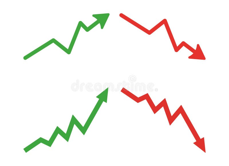
Free with trial Graph going Up and Down sign with green and red arrows vector. Flat design vector illustration concept of sales bar chart symbol icon with arrow moving down and sales bar chart with arrow moving up. Decrease line graph vectors Graph going Up and Down sign with green and red arrows vector. Flat design vector illustration concept of sales bar chart symbol. Graph going Up and Down sign with green and red arrows vector. Flat design vector illustration concept of sales bar chart symbol icon with arrow moving down and sales bar chart with arrow moving up.
Free with trial Uptrend and downtrend arrow line icon on black circle. Rising and falling arrows illustration concept. Decrease line graph vectors Uptrend and downtrend arrow line icon on black circle. Rising and falling arrows concept
Free with trial Line art declining coin bar chart with stack coin icon logo vector illustration design, for business and finance symbol. Decrease line graph illustrations Line art declining coin bar chart with stack coin icon logo vector illustration design
Free with trial Red financial chart with falling line graph and market numbers representing stock market crash economic decline trading loss volatility and financial risk analysis. Decrease line graph illustrations AI generated red financial chart with falling line graph and market numbers representing stock market crash economic decline. red financial chart with falling line graph and market numbers representing stock market crash economic decline trading loss volatility and financial risk analysis
Free with trial The image displays an abstract graph illustrating fluctuating growth trends with associated data points and bar charts representing additional metrics. Decrease line graph illustrations Abstract Graph Showing Growth and Data Trends. The image displays an abstract graph illustrating fluctuating growth trends with associated data points and bar charts representing additional metrics
Free with trial Smartphone displaying a downward trending line graph, depicting recession and economic downturn, business analysis, digital information. Decrease line graph vectors Smartphone displaying a downward trending line graph, depicting recession and economic downturn, business analysis, digital
Free with trial Deflation line icon. Economic crisis sign. Vector illustration. Decrease line graph vectors Deflation line icon. Economic crisis sign
Free with trial This image features multiple percentage decrease icons, symbolizing rate reduction, financial loss, and economic downturn, presented in a minimalist design on white. Decrease line graph vectors Vector art of multiple percentage decrease icons, , representing rate reduction, financial loss, and economic downturn in a. This image features multiple percentage decrease icons, symbolizing rate reduction, financial loss, and economic downturn, presented in a minimalist design on white
Free with trial Simple icon of a businessman analyzing a falling financial graph with a pie chart. Decrease line graph illustrations Businessman analyzing falling financial graph with pie chart icon. Simple icon of a businessman analyzing a falling financial graph with a pie chart
Free with trial 100 coin icons set. Color line set of coin vector icons thin line color flat on white. Decrease line graph illustrations 100 coin icons set, color line style. 100 coin icons set. Color line set of coin vector icons thin line color flat on white
Free with trial The background is a grid with declining line and bar graphs. A 3D rendering is shown. Decrease line graph illustrations The background is a grid with declining line and bar graphs. A 3D rendering is shown
Free with trial Business team together throwing red line graph arrow to hit target for crisis management risk rebalancing and financial loss prevention in difficult economic market situation. Decrease line graph vectors Business team together throwing red line graph arrow to hit target for crisis management risk rebalancing and financial loss. Prevention in difficult economic
Free with trial Graph going Up and Down sign with green and red arrows vector set. Flat design vector set of a concept of sales bar chart symbol icon with arrow moving down and sales bar chart with arrow moving up. Decrease line graph vectors Graph going Up and Down sign with green and red arrows vector set. Flat design vector set of a concept of sales bar chart arrows. Graph going Up and Down sign with green and red arrows vector set. Flat design vector set of a concept of sales bar chart symbol icon with arrow moving down and sales bar chart with arrow moving up.
Free with trial A detailed data visualization illustrating market trends over time. The infographic combines a line chart, which shows fluctuating values and percentages, with a bar chart representing data for specific time intervals. The line chart highlights key data points, such as peaks annotated with values like '1. 24%' and '500K'. The x-axis represents a timeline from January to March, while the y-axis. Decrease line graph illustrations A modern market trend analysis visualization combining a bar and line chart for financial data isolated on white background. A detailed data visualization illustrating market trends over time. The infographic combines a line chart, which shows fluctuating values and percentages, with a bar chart representing data for specific time intervals. The line chart highlights key data points, such as peaks annotated with values like '1.24%' and '500K'. The x-axis represents a timeline from January to March, while the y-axis
Free with trial Factors of production for labour in economics for demand of land and supply of land graph for wages vector. Decrease line graph vectors Factors of production for labour in economics for demand of land and supply of land graph for wages
Free with trial Businessman throwing red line graph arrow to target board for investment rebalancing risk management and financial loss prevention during economic recession crisis concept. Decrease line graph vectors Businessman throwing red line graph arrow to target board for investment rebalancing risk management and financial loss prevention
Free with trial Up and down arrow icon on circle line. Upward and downward sign symbol vector. Decrease line graph vectors Up and down arrow icon on circle line. Upward and downward sign symbol
Free with trial Growth chart icon. Decline line symbol. Vector business graphic. Profit and loss shape. EPS 10. Decrease line graph vectors Growth chart icon. Decline line symbol. Vector business graphic. Profit and loss shape.
Free with trial This vibrant line chart illustrates growth and decline trends with colored circles, making it suitable for business presentations, reports, and educational material. Decrease line graph illustrations Colorful Line Chart Showing Growth and Decline Trends with Green, Yellow, and Red Circles Representing Data Points over Time. This vibrant line chart illustrates growth and decline trends with colored circles, making it suitable for business presentations, reports, and educational material
Free with trial Dynamic red and blue stock market graph with data points and financial charts on a dark background. Generative AI. Decrease line graph illustrations Dynamic red and blue stock market graph with data points and financial charts on a dark background
Free with trial Data analytics descending line graphic outline icon in white and black colors. data analytics descending line graphic flat vector icon from business collection for web, mobile apps and ui. Decrease line graph vectors Data analytics descending line graphic outline icon in white and black colors. data analytics descending line graphic flat vector
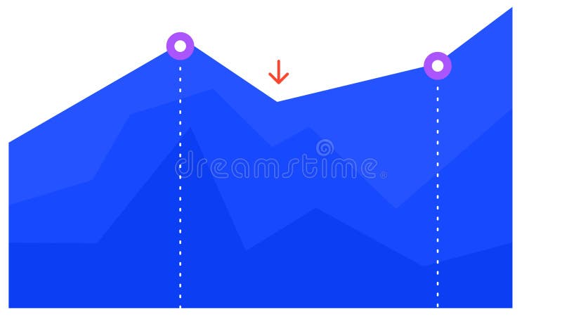
Free with trial Blue graph chart is visually representing growth, decline, and subsequent recovery, with two key points highlighted by purple circles and a red arrow indicating a temporary dip. Decrease line graph illustrations Blue graph chart is visually representing growth, decline, and subsequent recovery, with two key points highlighted by
Free with trial Blue graph chart is visually representing growth, decline, and subsequent recovery, with two key points highlighted by purple circles and a red arrow indicating a temporary dip. Decrease line graph vectors Blue graph chart is visually representing growth, decline, and subsequent recovery, with two key points highlighted by
Free with trial Business and financial concept. Bar graph with upper and lower arrows to show low cost and high quality on black background. Decrease line graph vectors Business and financial concept. Bar graph with upper and lower arrow to show low cost and high quality on black background
Free with trial Set line Drop in crude oil price, Tearing money banknote, Global economic crisis and Money bag. Business infographic template. Vector. Decrease line graph vectors Set line Drop in crude oil price, Tearing money banknote, Global economic crisis and Money bag. Business infographic
Free with trial Set line Many ways directional arrow Arrow Shopping bag with Sale Hierarchy organogram chart Delivery tracking Light bulb and Target icon. Vector. Decrease line graph vectors Set line Many ways directional arrow, Arrow, Shopping bag with Sale, Hierarchy organogram chart, Delivery tracking. Set line Many ways directional arrow Arrow Shopping bag with Sale Hierarchy organogram chart Delivery tracking Light bulb and Target icon. Vector.
Free with trial Linear gear with graph like crisis management icon. concept of key performance indicator or bad strategy. flat simple trend modern outline stats logotype graphic design web element isolated on white. Decrease line graph vectors Linear gear with graph like crisis management icon
Free with trial Trend to go down chart solid icon, world sanction concept. Vector graphics. Dollar currency graph, market pressure sign on white background, style mobile or design. Decrease line graph vectors Trend to go down chart solid icon, world sanction concept. Vector graphics. Dollar currency graph, market pressure sign
Free with trial Filled outline Financial growth decrease icon isolated on white background. Increasing revenue. Vector. Decrease line graph vectors Filled outline Financial growth decrease icon isolated on white background. Increasing revenue. Vector
Free with trial Growth and loss icon on black circle. Increase and decrease sign symbol. Zigzag arrows illustration concept. Decrease line graph vectors Growth and loss icon on black circle. Increase and decrease sign symbol. Zigzag arrows concept
Free with trial Up and down arrow icon in generic style. Increase and decrease sign symbol. Zigzag arrows illustration concept. Decrease line graph vectors Up and down arrow icon in generic style. Increase and decrease sign symbol. Zigzag arrows concept
Free with trial Falling graph trade war tariffs war economic decline coins leaves abstract background business crisis concept vector illustration. Decrease line graph illustrations Falling graph trade war tariffs war economic decline coins leaves abstract background business crisis concept
Free with trial Stock market trading graph in red color as economy 3D illustration background. Decrease line graph illustrations Stock market trading graph in red color as economy 3D illustration
Free with trial Trend to go down chart solid icon, world sanction concept. Vector graphics. Dollar currency graph, market pressure sign on white background, glyph style icon for mobile or web design. Decrease line graph vectors Trend to go down chart solid icon, world sanction concept. Vector graphics. Dollar currency graph, market pressure sign
Free with trial Abstract green dotted financial graph chart sparkling background. Vector minimal tech design. Decrease line graph vectors Abstract green dotted financial graph chart sparkling background
Free with trial Glowing neon line Global economic crisis icon isolated on blue background. World finance crisis. Vector. Decrease line graph illustrations Glowing neon line Global economic crisis icon isolated on blue background. World finance crisis. Vector
Free with trial Loan interest rate doodle icon set. Hand drawn sketch doodle line style bank money loan interest rate icon for house, car discount percentage concept. Trendy cute element. Vector illustration. Decrease line graph vectors Loan interest rate doodle icon set. Hand drawn sketch doodle line style bank money loan interest rate icon for house
Free with trial Scissors cutting financial chart economic crisis downturn coins graph falling trend abstract background website banner Vector illustration. Decrease line graph vectors Scissors cutting financial chart economic crisis downturn coins graph falling trend abstract background website banner
Free with trial Doodle Graph going down illustration. Decrease line graph illustrations Doodle Graph going down
Free with trial Doodle Graph going down illustration. Decrease line graph illustrations Doodle Graph going down
Free with trial Financial Risk line icon. linear style sign for mobile concept and web design. Financial risk diagram outline vector icon. Symbol, logo illustration. Vector graphics. Decrease line graph vectors Financial Risk line icon
Free with trial Line Global economic crisis icon isolated on white background. World finance crisis. Colorful outline concept. Vector. Decrease line graph illustrations Line Global economic crisis icon isolated on white background. World finance crisis. Colorful outline concept. Vector
Free with trial Bear Market, bearish market trend in stocks. Trade exchange background, down arrow graph for decrease in rates. Global economy crash. Decrease line graph vectors Bear Market
Free with trial Line Global economic crisis icon isolated on white background. World finance crisis. Abstract banner with liquid shapes. Vector. Decrease line graph illustrations Line Global economic crisis icon isolated on white background. World finance crisis. Abstract banner with liquid shapes
Free with trial Stock market trading graph in red color as economy 3D illustration background. Decrease line graph illustrations Stock market trading graph in red color as economy 3D
Free with trial Stock market trading graph in red color as economy 3D illustration background. Decrease line graph illustrations Stock market trading graph in red color as economy 3D
Free with trial Stock market trading graph in red color as economy 3D illustration background. Decrease line graph illustrations Stock market trading graph in red color as economy 3D
Free with trial Abstract dotted financial graph chart sparkling background. Vector minimal tech design. Decrease line graph vectors Abstract dotted financial graph chart sparkling background
Free with trial Gold coins stacked with a red downward arrow and graph line on a red background. Concept of economic decline. 3D Rendering. Decrease line graph illustrations Gold coins and downtrend arrow on red background. 3D Rendering. Gold coins stacked with a red downward arrow and graph line on a red background. Concept of economic decline. 3D Rendering
Free with trial Discount card line icons set. Marketing and advertising on Internet. Promotions and special offer, loyalty program. Gift and cashback. Cartoon flat vector illustrations isolated on white background. Decrease line graph vectors Discount card line icons set
Free with trial Graph table graphs illustration data variables, time precision, connection interpret graph table graphs. Decrease line graph illustrations Graph table graphs
Free with trial A graphic representing financial or performance decline featuring an orange arrow pointing downwards over a wavy line, with the word LOSS displayed below. Decrease line graph illustrations Orange downward trend arrow over wavy line with loss text. A graphic representing financial or performance decline featuring an orange arrow pointing downwards over a wavy line, with the word LOSS displayed below
Free with trial A vibrant pink graph line ascends diagonally against a dark background, representing upward growth. The image evokes a sense of dynamic increase. The style is reminiscent of a modern, technological aesthetic. The subtle grid pattern in the background adds depth, created to simulate a data visualizat. Decrease line graph illustrations Uptrend. A vibrant pink graph line ascends diagonally against a dark background, representing upward growth. The image evokes a sense of dynamic increase. The style is reminiscent of a modern, technological aesthetic. The subtle grid pattern in the background adds depth, created to simulate a data visualizat
Free with trial Stock market or forex trading candlestick graph in graphic design for financial investment concept. Motion. Financial data and diagrams showing increase and decrease in profits. Decrease line graph illustrations Stock market or forex trading candlestick graph in graphic design for financial investment concept. Motion. Financial
Free with trial Icon of loss function in AI featuring a computer monitor with a downward loss curve graph and the word LOSS, surrounded by circuit lines. Represents optimization process in machine learning models through minimization of error. Vector pictogram with thin black lines on a transparent background and editable line thickness. Decrease line graph vectors Icon of loss function in AI