Free with trial The image depicts a business professional in a suit interacting with a transparent digital chart displaying a declining trend in business performance. The visualization includes green bar charts and a line graph, complemented by a prominent downward arrow and percentage symbol indicating a decrease. This modern digital interface symbolizes data-driven decision-making, financial analysis, and real-time monitoring of business metrics for strategic planning. Decrease line graph illustrations Business Performance Decline Visualization with Interactive Data Analytics and Percentage Drop Indicator. The image depicts a business professional in a suit interacting with a transparent digital chart displaying a declining trend in business performance. The visualization includes green bar charts and a line graph, complemented by a prominent downward arrow and percentage symbol indicating a decrease. This modern digital interface symbolizes data-driven decision-making, financial analysis, and real-time monitoring of business metrics for strategic planning.
Free with trial Stock market or forex trading candlestick graph in graphic design for financial investment concept. Motion. Financial data and diagrams showing increase and decrease in profits. Decrease line graph illustrations Stock market or forex trading candlestick graph in graphic design for financial investment concept. Motion. Financial
Free with trial Set line Digital speed meter Arrow Financial growth Dollar symbol Mountains with flag and Intersection point icon. Vector. Decrease line graph vectors Set line Digital speed meter, Arrow, Financial growth, Dollar symbol, Mountains with flag, and Intersection point icon
Free with trial Business and financial concept. Bar graph with a drop-down arrow to show low cost on black background. Decrease line graph vectors Business and financial concept. Bar graph with drop-down arrow to show low cost on black background
Free with trial Set Isometric line Global economic crisis, Mobile stock trading, and Briefcase icon. Vector. Decrease line graph illustrations Set Isometric line Global economic crisis, Mobile stock trading, and Briefcase icon. Vector
Free with trial Illustration of a graph showing the growth of the indian rupee in the stock market. the image represents investment, financial analysis and currency exchange rates in the indian economy. the graph shows an upward trend. Decrease line graph illustrations Indian rupee stock market investment graph chart financial growth and currency exchange rate analysis. illustration of a graph showing the growth of the indian rupee in the stock market. the image represents investment, financial analysis and currency exchange rates in the indian economy. the graph shows an upward trend.
Free with trial Business and financial concept. Bar graph with green upper and red lower arrow to show low cost and high quality on black background. Decrease line graph vectors Business and financial concept. Bar graph with green upper and red lower arrow to show low cost and high quality on black
Free with trial Set line Bank building, Global economic crisis, Pie chart infographic and Shutdown of factory icon. Vector. Decrease line graph vectors Set line Bank building, Global economic crisis, Pie chart infographic and Shutdown of factory icon. Vector
Free with trial Bar Chart Growth And Decline Line And Solid Icon Set. Financial Performance, Economic Trends, Business Analysis Symbol Collection. Data Visualization And Market Trends. Isolated Vector Illustration. Decrease line graph vectors Bar Chart Growth And Decline Line And Solid Icon Set. Financial Performance, Economic Trends, Business Analysis Symbol
Free with trial A red fuel pump nozzle points downward like a falling arrow, superimposed over a colorful bar graph and a declining line graph, symbolizing decreasing fuel prices isolated on a white surface. Decrease line graph illustrations Fuel price decrease concept isolated on white background. for economy and finance use cases. A red fuel pump nozzle points downward like a falling arrow, superimposed over a colorful bar graph and a declining line graph, symbolizing decreasing fuel prices isolated on a white surface
Free with trial Minimalist graph icon showing growth and fluctuation. Perfect for finance, business reports, market analysis, and data presentation projects. Decrease line graph vectors Minimalist graph icon showing growth and fluctuation. Perfect for finance, business reports, market analysis, and data
Free with trial Grey line Property and housing market collapse icon isolated seamless pattern on white background. Falling property prices. Real estate stock risk or economic recession. Vector. Decrease line graph illustrations Grey line Property and housing market collapse icon isolated seamless pattern on white background. Falling property
Free with trial Bar Chart With Downward Trend Line Icon. Financial Decline, Economic Recession, And Market Analysis Outline Symbol. Business Performance Tracking. Editable Stroke. Isolated Vector Illustration. Decrease line graph vectors Bar Chart With Downward Trend Line Icon. Financial Decline, Economic Recession, And Market Analysis Outline Symbol
Free with trial A geopolitical infographic map of the Middle East highlighting Iran in red, with a text box labeling it the center of attention. The map features a top banner reading 'Middle East & Oil Crisis: Regional Tensions & Global Impact. ' A red downward-trending line graph is superimposed across the region, alongside small black icons of oil barrels and pumpjacks near the Persian Gulf. A faded United. Decrease line graph illustrations Geopolitical map of the Middle East highlighting Iran and the oil crisis. Infographic featuring a downward trend graph, petroleum. A geopolitical infographic map of the Middle East highlighting Iran in red, with a text box labeling it the center of attention. The map features a top banner reading 'Middle East & Oil Crisis: Regional Tensions & Global Impact.' A red downward-trending line graph is superimposed across the region, alongside small black icons of oil barrels and pumpjacks near the Persian Gulf. A faded United
Free with trial Heartbeat line morphs into falling red arrow on dark grid, showing sudden economic flatline. Vector illustration. Concept of downturn, crisis mode, emergency slowdown, collapse, instability. Decrease line graph vectors Heartbeat line morphs into falling red arrow on dark grid, showing sudden economic flatline. Vector illustration.
Free with trial A 3D render of a business chart illustrating a financial decline with a visual representation of falling data, presented on an artist's easel. Concept for economic downturn. Decrease line graph vectors 3d business graph showing a downward trend with bar chart and line on an easel stand transparent background. A 3D render of a business chart illustrating a financial decline with a visual representation of falling data, presented on an artist's easel. Concept for economic downturn
Free with trial Hand drawn bar graph showing a downward trend with a sale tag for discounts price reductions and market decline. Decrease line graph vectors Hand drawn bar graph showing a downward trend with a sale tag for discounts price reductions and market decline
Free with trial Red arrow pointing downward on colorful vertical bars. Business financial crisis chart with decreasing trend line. Economic data visualization. Decrease line graph illustrations Red arrow pointing downward on colorful vertical bars. Business financial crisis chart with decreasing trend line
Free with trial Grey line Global economic crisis news icon isolated seamless pattern on white background. World finance crisis. Vector. Decrease line graph illustrations Grey line Global economic crisis news icon isolated seamless pattern on white background. World finance crisis. Vector
Free with trial Bar Chart With Downward Arrow Line Icon. Business Decline, Financial Loss, And Market Downturn Outline Symbol. Economic Analysis And Trend Tracking. Editable Stroke. Isolated Vector Illustration. Decrease line graph vectors Bar Chart With Downward Arrow Line Icon. Business Decline, Financial Loss, And Market Downturn Outline Symbol. Economic
Free with trial Decreasing bar graph illustration simple hand drawn financial decline, negative trend analysis chart with arrow axes, AI. Decrease line graph vectors Decreasing bar graph illustration simple hand drawn financial decline, negative trend analysis chart with arrow axes, AI
Free with trial Financial Loss, Economic Downturn, And Business Decline Symbol Collection. Declining Bar Chart With Downward Arrow Line And Solid Icon Set. Market Analysis. Isolated Vector Illustration. Decrease line graph vectors Financial Loss, Economic Downturn, And Business Decline Symbol Collection. Declining Bar Chart With Downward Arrow Line
Free with trial Filled outline Financial growth decrease icon isolated on white background. Increasing revenue. Flat filled outline style with shadow. Vector. Decrease line graph illustrations Filled outline Financial growth decrease icon isolated on white background. Increasing revenue. Flat filled outline
Free with trial Finance icons set in duotone outline stroke design for web. Pack pictograms of money, search, graph, businessman, bank, justice, coins, handshake, deposit, briefcase, atm, other. Vector illustration. Decrease line graph vectors Finance icons set in duotone outline stroke design for web. Pack pictograms of money, search, graph, businessman, bank, justice
Free with trial Set line Storm Prison cell door Global economic crisis Shutdown of factory Stop delivery cargo truck Dollar rate decrease and Gold bars icon. Vector. Decrease line graph illustrations Set line Storm, Prison cell door, Global economic crisis, Shutdown of factory, Stop delivery cargo truck, Dollar rate. Set line Storm Prison cell door Global economic crisis Shutdown of factory Stop delivery cargo truck Dollar rate decrease and Gold bars icon. Vector.
Free with trial Economic critical crisis concept. The red lower arrow and graph icons on white background. Recession financial, cryptocurrency, gold, and the stock market. Losing money and cash. Bearish. Decrease line graph vectors Economic critical crisis concept. The red lower arrow and graph icons on white background. Recession financial, cryptocurrency
Free with trial Filled outline Financial growth decrease icon isolated on white background. Increasing revenue. Vector. Decrease line graph vectors Filled outline Financial growth decrease icon isolated on white background. Increasing revenue. Vector
Free with trial Set line Mobile stock trading Safe Fire burning house Falling property prices Pie chart infographic Drop crude oil and Dollar rate decrease icon. Vector. Decrease line graph illustrations Set line Mobile stock trading, Safe, Fire burning house, Falling property prices, Pie chart infographic, Drop crude oil. Set line Mobile stock trading Safe Fire burning house Falling property prices Pie chart infographic Drop crude oil and Dollar rate decrease icon. Vector.
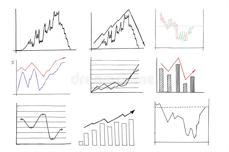
Free with trial A set of hand-drawn financial graph and chart icons. These icons are suitable for business analysis, investment strategies, and economic growth presentations. Decrease line graph vectors Vector art of hand drawn financial graph and chart icons for business analysis, investment, and economic growth in vector format. A set of hand-drawn financial graph and chart icons. These icons are suitable for business analysis, investment strategies, and economic growth presentations
Free with trial Color Financial growth decrease icon isolated on white background. Increasing revenue. Flat filled outline style with shadow. Vector. Decrease line graph illustrations Color Financial growth decrease icon isolated on white background. Increasing revenue. Flat filled outline style with
Free with trial Set line Website with stocks market Search engine Browser setting Financial growth increase window Photo retouching and mail and icon. Vector. Decrease line graph vectors Set line Website with stocks market, Search engine, Browser setting, Financial growth increase, window, Photo retouching. Set line Website with stocks market Search engine Browser setting Financial growth increase window Photo retouching and mail and icon. Vector.
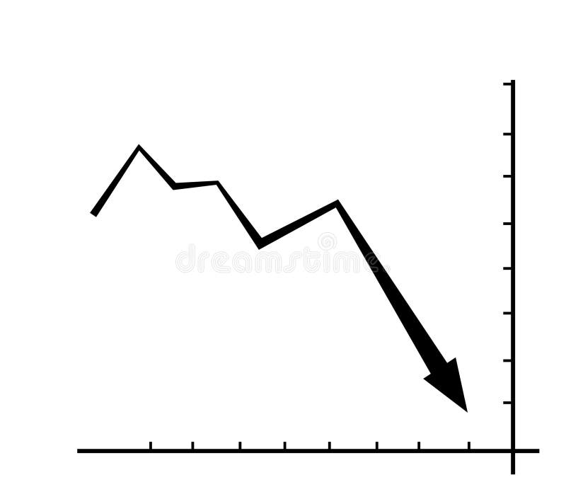
Free with trial Black and white descending graph diagram. loss or decline. flat design style. Suitable for use in reports, illustrations, presentations, etc. vector design template. Decrease line graph vectors Black and white descending graph diagram. loss or decline. flat design style. Suitable for use in reports, illustrations
Free with trial A set of line art icons illustrating financial growth, investment strategies, and market analysis, perfect for business presentations and reports with clean design. Decrease line graph vectors Vector art of line art icons depicting financial growth, investment strategies, and market analysis, ideal for illustrating. A set of line art icons illustrating financial growth, investment strategies, and market analysis, perfect for business presentations and reports with clean design
Free with trial Vibrant red line indicates financial market decline on digital display. Chart shows stock market loss, economy decay, investment risk. Red graph pattern represents trading volatility. Decrease line graph illustrations Vibrant red line indicates financial market decline on digital display. Chart shows stock market loss, economy decay, investment
Free with trial Filled outline Financial growth decrease icon isolated on blue background. Increasing revenue. Turquoise square button. Vector. Decrease line graph vectors Filled outline Financial growth decrease icon isolated on blue background. Increasing revenue. Turquoise square button
Free with trial Chart line set. Graph, finance report, income growth, economy statistic, diagram, infographic, mind map, data visualization vector illustration. Outline signs of analytic. Editable Stroke. Decrease line graph vectors Analytical graphic chart with trend lines, columns set hand drawn ink sketch. Change in time of election results or income, plans. Chart line set. Graph, finance report, income growth, economy statistic, diagram, infographic, mind map, data visualization vector illustration. Outline signs of analytic. Editable Stroke
Free with trial Glowing neon line Global economic crisis news icon isolated on brick wall background. World finance crisis. Vector. Decrease line graph illustrations Glowing neon line Global economic crisis news icon isolated on brick wall background. World finance crisis. Vector
Free with trial Pink and green graph. Motion. Cartoon animation with graphs with a white dot moving to the left. High quality 4k footage. Decrease line graph illustrations Pink and green graph. Motion.Cartoon animation with graphs with a white dot moving to the left.
Free with trial Pink and green graph. Motion. Cartoon animation with graphs with a white dot moving to the left. High quality 4k footage. Decrease line graph illustrations Pink and green graph. Motion.Cartoon animation with graphs with a white dot moving to the left.
Free with trial Pink and green graph. Motion. Cartoon animation with graphs with a white dot moving to the left. High quality 4k footage. Decrease line graph illustrations Pink and green graph. Motion.Cartoon animation with graphs with a white dot moving to the left.
Free with trial Money Loss, risk line flat icon for mobile application, button and website design. Illustration isolated on white background illustration. Decrease line graph illustrations Money Loss, risk line flat icon for mobile application, button and website design. Illustration isolated on white background
Free with trial A Bitcoin piggy bank with a downward trend line, representing cryptocurrency decline, financial loss in the market, and the risks associated with digital investments. Decrease line graph vectors Vector art of bitcoin piggy bank with a downward trend line, representing cryptocurrency decline or financial loss in the market. A Bitcoin piggy bank with a downward trend line, representing cryptocurrency decline, financial loss in the market, and the risks associated with digital investments
Free with trial A graph showing a downward trend of two values over time from 1990 to 2023 with a world map background. Decrease line graph illustrations Global Trend Analysis Graph. A graph showing a downward trend of two values over time from 1990 to 2023 with a world map background. A graph showing a downward trend of two values over time from 1990 to 2023 with a world map background.
Free with trial Pop art line Global economic crisis icon isolated on color background. World finance crisis. Vector. Decrease line graph illustrations Pop art line Global economic crisis icon isolated on color background. World finance crisis. Vector
Free with trial Set line Pie chart infographic Global economic crisis and Drop crude oil price icon. Vector. Decrease line graph vectors Set line Pie chart infographic, Global economic crisis and Drop crude oil price icon. Vector
Free with trial Stock market trading graph in red color as economy 3D illustration background, Generative AI. Decrease line graph illustrations Stock market trading graph in red color as economy 3D illustration background, Generative AI
Free with trial Stock market trading graph in red color as economy 3D illustration background, Generative AI. Decrease line graph illustrations Stock market trading graph in red color as economy 3D illustration background, Generative AI
Free with trial Stock market trading graph in red color as economy 3D illustration background, Generative AI. Decrease line graph illustrations Stock market trading graph in red color as economy 3D illustration background, Generative AI
Free with trial Stock market trading graph in red color as economy 3D illustration background, Generative AI. Decrease line graph illustrations Stock market trading graph in red color as economy 3D illustration background, Generative AI
Free with trial Graph going Up and Down sign with green and red arrows vector. Flat design vector illustration concept of sales bar chart symbol icon with arrow moving down and sales bar chart with arrow moving up. Decrease line graph vectors Graph going Up and Down sign with green and red arrows vector. Flat design vector illustration concept of sales bar chart symbol
Free with trial Isometric line Global economic crisis icon isolated on yellow background. World finance crisis. Black circle button. Vector. Decrease line graph vectors Isometric line Global economic crisis icon isolated on yellow background. World finance crisis. Black circle button
Free with trial Glowing neon line Global economic crisis icon isolated on black background. World finance crisis. Vector. Decrease line graph illustrations Glowing neon line Global economic crisis icon isolated on black background. World finance crisis. Vector
Free with trial Stock market or forex trading candlestick graph in graphic design for financial investment concept. Motion. Financial data and diagrams showing increase and decrease in profits. Decrease line graph illustrations Stock market or forex trading candlestick graph in graphic design for financial investment concept. Motion. Financial
Free with trial Stock market or forex trading candlestick graph in graphic design for financial investment concept. Motion. Financial data and diagrams showing increase and decrease in profits. Decrease line graph illustrations Stock market or forex trading candlestick graph in graphic design for financial investment concept. Motion. Financial
Free with trial Filled outline Financial growth decrease icon isolated on blue background. Increasing revenue. Vector. Decrease line graph vectors Filled outline Financial growth decrease icon isolated on blue background. Increasing revenue. Vector
Free with trial Filled outline Financial growth decrease icon isolated on blue background. Increasing revenue. Vector. Decrease line graph illustrations Filled outline Financial growth decrease icon isolated on blue background. Increasing revenue. Vector
Free with trial Filled outline Financial growth decrease icon isolated on white background. Increasing revenue. Vector. Decrease line graph vectors Filled outline Financial growth decrease icon isolated on white background. Increasing revenue. Vector
Free with trial Glowing neon line Global economic crisis icon isolated on brick wall background. World finance crisis. Vector. Decrease line graph illustrations Glowing neon line Global economic crisis icon isolated on brick wall background. World finance crisis. Vector
Free with trial The graph illustrates a significant decline in value from 2018 to 2022. The value starts at 100 in 2018 and steadily decreases each year, reaching near zero by 2022. The shaded blue area represents the range of values, with the dark blue line indicating the average trend. Decrease line graph illustrations Decline in value over time. The graph illustrates a significant decline in value from 2018 to 2022. The value starts at 100 in 2018 and steadily decreases each year, reaching near zero by 2022. The shaded blue area represents the range of values, with the dark blue line indicating the average trend
Free with trial Loan Related Vector Line Icon. Contains such Icon as Interest Rate, Investment Plan, Percentage Diagram and more. Pixel Perfect. Decrease line graph vectors Loan Related Vector Line Icon. Contains such Icon as Interest Rate, Investment Plan, Percentage Diagram and more.
Free with trial Loan Related Vector Line Icon. Contains such Icon as Interest Rate, Investment Plan, Percentage Diagram and more. Pixel Perfect. Decrease line graph vectors Loan Related Vector Line Icon. Contains such Icon as Interest Rate, Investment Plan, Percentage Diagram and more.
Free with trial Loan Related Vector Line Icon. Contains such Icon as Interest Rate, Investment Plan, Percentage Diagram and more. Pixel Perfect. Decrease line graph vectors Loan Related Vector Line Icon. Contains such Icon as Interest Rate, Investment Plan, Percentage Diagram and more.
Free with trial Loan Related Vector Line Icon. Contains such Icon as Interest Rate, Investment Plan, Percentage Diagram and more. Pixel Perfect. Decrease line graph vectors Loan Related Vector Line Icon. Contains such Icon as Interest Rate, Investment Plan, Percentage Diagram and more.
Free with trial Loan Related Vector Line Icon. Contains such Icon as Interest Rate, Investment Plan, Percentage Diagram and more. Pixel Perfect. Decrease line graph vectors Loan Related Vector Line Icon. Contains such Icon as Interest Rate, Investment Plan, Percentage Diagram and more.
Free with trial Loan Related Vector Line Icon. Contains such Icon as Interest Rate, Investment Plan, Percentage Diagram and more. Pixel Perfect. Decrease line graph vectors Loan Related Vector Line Icon. Contains such Icon as Interest Rate, Investment Plan, Percentage Diagram and more.
Free with trial Loan Related Vector Line Icon. Contains such Icon as Interest Rate, Investment Plan, Percentage Diagram and more. Pixel Perfect. Decrease line graph vectors Loan Related Vector Line Icon. Contains such Icon as Interest Rate, Investment Plan, Percentage Diagram and more.
Free with trial Loan Related Vector Line Icon. Contains such Icon as Interest Rate, Investment Plan, Percentage Diagram and more. Pixel Perfect. Decrease line graph vectors Loan Related Vector Line Icon. Contains such Icon as Interest Rate, Investment Plan, Percentage Diagram and more.
Free with trial Loan Related Vector Line Icon. Contains such Icon as Interest Rate, Investment Plan, Percentage Diagram and more. Pixel Perfect. Decrease line graph vectors Loan Related Vector Line Icon. Contains such Icon as Interest Rate, Investment Plan, Percentage Diagram and more.
Free with trial Loan Related Vector Line Icon. Contains such Icon as Interest Rate, Investment Plan, Percentage Diagram and more. Pixel Perfect. Decrease line graph vectors Loan Related Vector Line Icon. Contains such Icon as Interest Rate, Investment Plan, Percentage Diagram and more.
Free with trial Loan Related Vector Line Icon. Contains such Icon as Interest Rate, Investment Plan, Percentage Diagram and more. Pixel Perfect. Decrease line graph vectors Loan Related Vector Line Icon. Contains such Icon as Interest Rate, Investment Plan, Percentage Diagram and more.
Free with trial Loan Related Vector Line Icon. Contains such Icon as Interest Rate, Investment Plan, Percentage Diagram and more. Pixel Perfect. Decrease line graph vectors Loan Related Vector Line Icon. Contains such Icon as Interest Rate, Investment Plan, Percentage Diagram and more.
Free with trial Loan Related Vector Line Icon. Contains such Icon as Interest Rate, Investment Plan, Percentage Diagram and more. Pixel Perfect. Decrease line graph vectors Loan Related Vector Line Icon. Contains such Icon as Interest Rate, Investment Plan, Percentage Diagram and more.
Free with trial Loan Related Vector Line Icon. Contains such Icon as Interest Rate, Investment Plan, Percentage Diagram and more. Pixel Perfect. Decrease line graph vectors Loan Related Vector Line Icon. Contains such Icon as Interest Rate, Investment Plan, Percentage Diagram and more.
Free with trial Loan Related Vector Line Icon. Contains such Icon as Interest Rate, Investment Plan, Percentage Diagram and more. Pixel Perfect. Decrease line graph vectors Loan Related Vector Line Icon. Contains such Icon as Interest Rate, Investment Plan, Percentage Diagram and more.
Free with trial Line Global economic crisis icon isolated on grey background. World finance crisis. Colorful outline concept. Vector. Decrease line graph vectors Line Global economic crisis icon isolated on grey background. World finance crisis. Colorful outline concept. Vector
Free with trial Line Global economic crisis icon isolated on white background. World finance crisis. Colorful outline concept. Vector. Decrease line graph vectors Line Global economic crisis icon isolated on white background. World finance crisis. Colorful outline concept. Vector
Free with trial Isometric line Global economic crisis icon isolated on grey background. World finance crisis. Yellow and orange square button. Vector. Decrease line graph illustrations Isometric line Global economic crisis icon isolated on grey background. World finance crisis. Yellow and orange square
Free with trial Generated with the use of AI. Stock market trading graph in red as economy 3D illustration background. Trading trends and economic statistics. Generative AI. Decrease line graph illustrations Stock market trading graph in red as economy 3D illustration background. Trading trends and economic statistics. Generative AI
Free with trial Generated with the use of AI. Stock market trading graph in red as economy 3D illustration background. Trading trends and economic statistics. Generative AI. Decrease line graph illustrations Stock market trading graph in red as economy 3D illustration background. Trading trends and economic statistics. Generative AI
Free with trial Generated with the use of AI. Stock market trading graph in red as economy 3D illustration background. Trading trends and economic statistics. Generative AI. Decrease line graph illustrations Stock market trading graph in red as economy 3D illustration background. Trading trends and economic statistics. Generative AI