Free with trial Diagram chart line icon. Neumorphic, Flat shadow, 3d buttons. Presentation graph sign. Market analytics symbol. Line diagram chart icon. Social media icons. Vector. Increase decrease graph vectors Diagram chart line icon. Presentation graph sign. Neumorphic buttons. Vector. Diagram chart line icon. Neumorphic, Flat shadow, 3d buttons. Presentation graph sign. Market analytics symbol. Line diagram chart icon. Social media icons. Vector
Free with trial Flat design illustration showing colorful bar graph combined with a line chart, both displaying data trends against a simple black background. Increase decrease graph vectors Colorful Bar Graph and Line Chart on Black Background Illustrating Data Analysis and Trends. Flat design illustration showing colorful bar graph combined with a line chart, both displaying data trends against a simple black background.
Free with trial Black and white icon representing a bar graph with rising and falling values indicated by arrows. Increase decrease graph illustrations Simple bar graph icon with arrows. Black and white icon representing a bar graph with rising and falling values indicated by arrows
Free with trial Diagram chart line icon. Neumorphic, Flat shadow, 3d buttons. Presentation graph sign. Market analytics symbol. Line diagram chart icon. Social media icons. Vector. Increase decrease graph illustrations Diagram chart line icon. Presentation graph sign. Neumorphic buttons. Vector. Diagram chart line icon. Neumorphic, Flat shadow, 3d buttons. Presentation graph sign. Market analytics symbol. Line diagram chart icon. Social media icons. Vector
Free with trial A financial graph displays growth using stacked segments made from black tire treads. The graph is on a dark, textured surface that enhances the design. Increase decrease graph illustrations Financial graph made of black rubber tire treads shows growth trend on a dark surface. A financial graph displays growth using stacked segments made from black tire treads. The graph is on a dark, textured surface that enhances the design
Free with trial This colorful bar graph is representing market trends and data analysis. Increase decrease graph vectors Colorful bar graph showing market trends and data analysis. This colorful bar graph is representing market trends and data analysis
Free with trial Clipboard with bar graph showcasing data analysis and reporting ,Generative ai. Increase decrease graph illustrations Clipboard with bar graph, data analysis, reporting, and business performance visualization. Clipboard with bar graph showcasing data analysis and reporting ,Generative ai
Free with trial This image displays a graph illustrating trends and data progression over time with bars and a line chart. Increase decrease graph illustrations Graph showing trends and data progression over time isolated on white background. This image displays a graph illustrating trends and data progression over time with bars and a line chart
Free with trial Dynamic graph with one decreasing line and another increasing line in shades of orange. , Generated by AI. Increase decrease graph illustrations Dynamic graph with one decreasing line and another increasing line in shades of orange.
Free with trial Pie chart line icon. Continuous line with share plane. Presentation graph sign. Market analytics symbol. 3d heart in speech bubble. Pie chart single line ribbon. Loop curve pattern. Vector. Increase decrease graph vectors Pie chart line icon. Presentation graph sign. Continuous line with plane. Vector. Pie chart line icon. Continuous line with share plane. Presentation graph sign. Market analytics symbol. 3d heart in speech bubble. Pie chart single line ribbon. Loop curve pattern. Vector
Free with trial Pie chart line icon. Halftone dotted pattern. Gradient icon with grain shadow. Presentation graph sign. Market analytics symbol. Line pie chart icon. Various designs. Vector. Increase decrease graph illustrations Pie chart line icon. Presentation graph sign. Halftone dotted pattern. Vector. Pie chart line icon. Halftone dotted pattern. Gradient icon with grain shadow. Presentation graph sign. Market analytics symbol. Line pie chart icon. Various designs. Vector
Free with trial Pie chart line icon. Halftone dotted pattern. Gradient icon with grain shadow. Presentation graph sign. Market analytics symbol. Line pie chart icon. Various designs. Vector. Increase decrease graph illustrations Pie chart line icon. Presentation graph sign. Halftone dotted pattern. Vector. Pie chart line icon. Halftone dotted pattern. Gradient icon with grain shadow. Presentation graph sign. Market analytics symbol. Line pie chart icon. Various designs. Vector
Free with trial Growth and decline bar chart icon illustration. Upward and downward arrow graph symbol. Business up and down trend concept in black circle. Increase decrease graph vectors Growth and decline bar chart icon. Upward and downward arrow graph symbol. Business up and down trend concept in black circle
Free with trial Black line graph icon with data points showing fluctuations on a white background Clear details and vibrant co. Increase decrease graph illustrations Black line graph icon showing fluctuating data points on a white background chart. Black line graph icon with data points showing fluctuations on a white background Clear details and vibrant co
Free with trial Heights showing black bar chart icon with varying heights on white background keywords: bar chart, graph. Increase decrease graph illustrations Black bar chart icon with varying heights on white background Keywords: bar chart, graph, data. Heights showing black bar chart icon with varying heights on white background keywords: bar chart, graph
Free with trial A digital bar graph transitions from exploding orange bars to a glowing green upward trend line with text. Increase decrease graph illustrations Broken plan fixed plan Exploding orange bar graph transforming into green upward trend. A digital bar graph transitions from exploding orange bars to a glowing green upward trend line with text
Free with trial This image depicts a stock market graph with a clear upward trend, featuring significant fluctuations and notable peaks and troughs over a specified period. The graph includes trend lines and an arrow indicating the overall upward movement. Increase decrease graph illustrations Stock market graph showing upward trend with significant fluctuations over time. This image depicts a stock market graph with a clear upward trend, featuring significant fluctuations and notable peaks and troughs over a specified period. The graph includes trend lines and an arrow indicating the overall upward movement
Free with trial Set line Hierarchy organogram chart Many ways directional arrow Graph diagram Dollar symbol Financial growth decrease Clock Intersection point and Arrow icon. Vector. Increase decrease graph vectors Set line Hierarchy organogram chart, Many ways directional arrow, Graph, diagram, Dollar symbol, Financial growth. Set line Hierarchy organogram chart Many ways directional arrow Graph diagram Dollar symbol Financial growth decrease Clock Intersection point and Arrow icon. Vector.
Free with trial Graph line icon. Continuous line with share plane. Column chart sign. Growth diagram symbol. 3d heart in speech bubble. Graph chart single line ribbon. Loop curve pattern. Vector. Increase decrease graph illustrations Graph line icon. Column chart sign. Continuous line with plane. Vector. Graph line icon. Continuous line with share plane. Column chart sign. Growth diagram symbol. 3d heart in speech bubble. Graph chart single line ribbon. Loop curve pattern. Vector
Free with trial Graph line icon. Continuous line with share plane. Column chart sign. Growth diagram symbol. 3d heart in speech bubble. Graph chart single line ribbon. Loop curve pattern. Vector. Increase decrease graph illustrations Graph line icon. Column chart sign. Continuous line with plane. Vector. Graph line icon. Continuous line with share plane. Column chart sign. Growth diagram symbol. 3d heart in speech bubble. Graph chart single line ribbon. Loop curve pattern. Vector
Free with trial Graph line icon. Continuous line with share plane. Column chart sign. Growth diagram symbol. 3d heart in speech bubble. Graph chart single line ribbon. Loop curve pattern. Vector. Increase decrease graph vectors Graph line icon. Column chart sign. Continuous line with plane. Vector. Graph line icon. Continuous line with share plane. Column chart sign. Growth diagram symbol. 3d heart in speech bubble. Graph chart single line ribbon. Loop curve pattern. Vector
Free with trial A minimalist black line graph with circular data points and vertical bars is depicted on a white background. Increase decrease graph illustrations Simple black line graph with bars and circles on white background chart statistics. A minimalist black line graph with circular data points and vertical bars is depicted on a white background
Free with trial Analyzing Data: Person Presenting Graph Showing Progress and Growth Pointing to Top Data Peak, Achievement Concept. Increase decrease graph illustrations Analyzing Data: Person Presenting Graph Showing Progress and Growth Pointing to Top Data Peak, Achievement Concept
Free with trial A man in a dark suit and blue tie points with a glowing pen at a bar graph showing declining profits and increasing costs. Increase decrease graph illustrations Businessman pointing at declining profits graph with increasing costs chart decline. A man in a dark suit and blue tie points with a glowing pen at a bar graph showing declining profits and increasing costs
Free with trial This image displays a series of vertical bars arranged in a gradient color spectrum from green to red. Each bar varies in height, suggesting a comparison of different values or quantities. The bars start tall on the left in green, gradually decrease in height towards the center, and then increase again towards the right, ending with the tallest bar on the far right in red. The gradient color. Increase decrease graph illustrations Colorful bar chart showing varying heights in a gradient spectrum from green to red. This image displays a series of vertical bars arranged in a gradient color spectrum from green to red. Each bar varies in height, suggesting a comparison of different values or quantities. The bars start tall on the left in green, gradually decrease in height towards the center, and then increase again towards the right, ending with the tallest bar on the far right in red. The gradient color
Free with trial A vibrant neon bar graph shows financial growth. The data visualization uses blue, green, and purple hues against a dark background. Modern and abstract design. Increase decrease graph illustrations Neon bar graph data visualization financial growth chart illustration generative ai. A vibrant neon bar graph shows financial growth. The data visualization uses blue, green, and purple hues against a dark background. Modern and abstract design
Free with trial The image shows a line graph with yellow data points connected by lines, set against a blue grid background. The graph depicts various peaks and troughs, indicating fluctuations in the data over time. Increase decrease graph illustrations A dynamic graph illustrating fluctuating data points on a blue grid background. The image shows a line graph with yellow data points connected by lines, set against a blue grid background. The graph depicts various peaks and troughs, indicating fluctuations in the data over time
Free with trial A white bar graph icon with bars of different heights is displayed within a black circle, representing data and analytics. Increase decrease graph illustrations White bar graph icon with varying height bars inside a black circle chart statistics. A white bar graph icon with bars of different heights is displayed within a black circle, representing data and analytics
Free with trial A white rectangular featuring a bar chart with blue and gray bars and a line graph with blue and gray lines. Upward and downward arrows with horizontal bars are positioned to the right of the. Increase decrease graph illustrations Blue and gray bar chart with upward and downward arrows on a white background line graph. A white rectangular featuring a bar chart with blue and gray bars and a line graph with blue and gray lines. Upward and downward arrows with horizontal bars are positioned to the right of the
Free with trial Line art bar graph icon set featuring upward and downward trend arrows for business analysis. Increase decrease graph vectors Line art bar graph icon set featuring upward and downward trend arrows for business analysis
Free with trial This image is a line graph with a shaded area underneath the line. The x-axis is labeled 'Time' and the y-axis is labeled 'Value'. The data points show an overall upward trend with some fluctuations. The shaded area under the line is filled with a light purple color, and the line itself is a darker purple. Increase decrease graph illustrations A graph displaying the upward trend of data points over a period of time with a shaded area. This image is a line graph with a shaded area underneath the line. The x-axis is labeled 'Time' and the y-axis is labeled 'Value'. The data points show an overall upward trend with some fluctuations. The shaded area under the line is filled with a light purple color, and the line itself is a darker purple
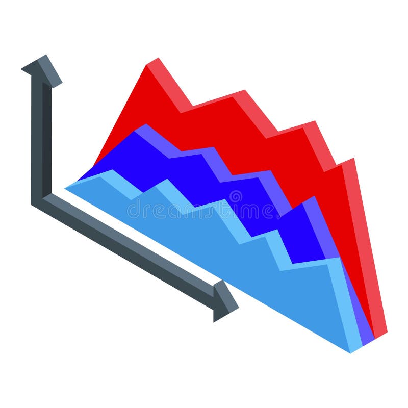
Free with trial Isometric graph showing different trends with ups and downs, concept of trading and business analysis. Increase decrease graph illustrations Isometric graph showing different trends with ups and downs
Free with trial A white bar graph icon with a metallic silver rim is presented within a black circle on a dark gray background. Increase decrease graph illustrations White bar graph icon with metallic rim inside a black circle on a dark background chart. A white bar graph icon with a metallic silver rim is presented within a black circle on a dark gray background
Free with trial Red 3D bar graph a downward trend with a red arrow indicating decline. graph, chart, bar. red bar graph with downward trending. Increase decrease graph vectors Red bar graph with downward trending arrow isolated on a transparent background chart. Red 3D bar graph a downward trend with a red arrow indicating decline. graph, chart, bar. red bar graph with downward trending
Free with trial A graph with a dollar sign. A growing trend. Financial Flat vector illustration isolated on white background. Increase decrease graph vectors A graph with a dollar sign
Free with trial Line Graph Chart Line And Solid Icon Set. Data Analysis, Trend Visualization, And Business Growth Symbol Collection. Statistical Representation And Performance Tracking. Isolated Vector Illustration. Increase decrease graph vectors Line Graph Chart Line And Solid Icon Set. Data Analysis, Trend Visualization, And Business Growth Symbol Collection
Free with trial A golden wallet with percentage symbols is illuminated by a magnifying glass revealing a golden bar graph against a dark background. Increase decrease graph illustrations Golden wallet with magnifying glass over financial graph and percentage symbols money. A golden wallet with percentage symbols is illuminated by a magnifying glass revealing a golden bar graph against a dark background
Free with trial Vector illustration of a statistical bar graph, with a green arrow with an upward trend. Increase decrease graph vectors Statistical bar graph
Free with trial This image depicts a black and white bar graph illustrating financial growth over a period. The graph shows a steady upward trend with some fluctuations, indicating periods of growth and decline. The bars are arranged in a chronological order, with the height of each bar representing the financial value at a specific time. Increase decrease graph illustrations A detailed black and white bar graph showing financial growth over time. This image depicts a black and white bar graph illustrating financial growth over a period. The graph shows a steady upward trend with some fluctuations, indicating periods of growth and decline. The bars are arranged in a chronological order, with the height of each bar representing the financial value at a specific time
Free with trial The image displays two sets of vertical bars, one in green and one in red, each accompanied by arrows indicating trends. The green bars show an initial decrease followed by an increase, while the red bars show an initial increase followed by a decrease. The visual is labeled 'Word 100' at the bottom right, potentially indicating a specific data point or category. Increase decrease graph illustrations Comparison of increasing and decreasing bar trends in a visual chart labeled word 100. The image displays two sets of vertical bars, one in green and one in red, each accompanied by arrows indicating trends. The green bars show an initial decrease followed by an increase, while the red bars show an initial increase followed by a decrease. The visual is labeled 'Word 100' at the bottom right, potentially indicating a specific data point or category
Free with trial Colorful bar chart graph with long shadow in circular background represents data analytics. Increase decrease graph vectors Colorful bar chart graph with long shadow in circular background represents data analytics
Free with trial Green Financial growth decrease icon isolated on purple-blue background. Increasing revenue. Minimalism concept. 3D render illustration. Increase decrease graph illustrations Green Financial growth decrease icon isolated on purple-blue background. Increasing revenue. Minimalism concept. 3D
Free with trial Growth vector icon. Graph or diagram with arrow going up and down. Vector illustration. Increase decrease graph vectors Growth vector icon. Graph or diagram with arrow going up and down. Vector
Free with trial White Financial growth decrease icon isolated on blue background. Increasing revenue. Vector. Increase decrease graph illustrations White Financial growth decrease icon isolated on blue background. Increasing revenue. Vector
Free with trial A single yellow coin with the prominent Bitcoin symbol is centrally placed on a white background. To its left is a green circular icon with an upward-pointing arrow, signifying an increase or positive trend. To its right is a red circular icon with a downward-pointing arrow, representing a decrease or negative trend. The composition visually represents the fluctuating nature of cryptocurrency. Increase decrease graph illustrations Bitcoin symbol coin with green up arrow and red down arrow on a white background cryptocurrency. A single yellow coin with the prominent Bitcoin symbol is centrally placed on a white background. To its left is a green circular icon with an upward-pointing arrow, signifying an increase or positive trend. To its right is a red circular icon with a downward-pointing arrow, representing a decrease or negative trend. The composition visually represents the fluctuating nature of cryptocurrency
Free with trial Growth vector icon. Graph or diagram with arrow going up and down. Vector illustration. Increase decrease graph vectors Growth vector icon. Graph or diagram with arrow going up and down. Vector
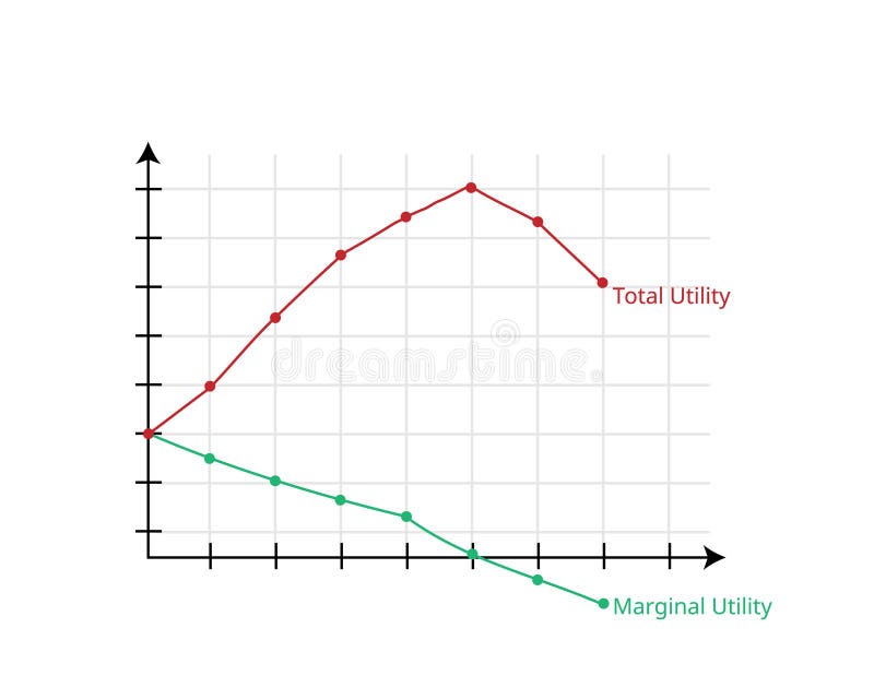
Free with trial Marginal utility and total utility theory graph in economics vector. Increase decrease graph vectors Marginal utility and total utility theory graph in economics
Free with trial Dynamic graph showcasing a decreasing line and an increasing line in vibrant shades of orange, Generated by AI. Increase decrease graph illustrations Dynamic graph showcasing a decreasing line and an increasing line in vibrant shades of orange
Free with trial Economy growth graph down vector icon illustration. Increase decrease graph vectors Economy growth graph down icon design. economy growth graph down vector icon illustration
Free with trial Stacks of gold coins are illuminated with a glowing blue financial stock market graph overlay in a dark, abstract. Increase decrease graph illustrations Stacks of gold coins with a glowing blue financial stock market graph overlay in a dark setting. Stacks of gold coins are illuminated with a glowing blue financial stock market graph overlay in a dark, abstract
Free with trial The "Vector Up and Down Graph Icon" is a graphic symbol designed to represent data trends, changes, or comparisons within a graph or chart. Increase decrease graph vectors Vector Up And Down Graph Icon. Up And Down Chart Icon. Growth Diagram Icon. The "Vector Up and Down Graph Icon" is a graphic symbol designed to represent data trends, changes, or comparisons within a graph or chart.
Free with trial The "Vector Up and Down Graph Icon" is a graphic symbol designed to represent data trends, changes, or comparisons within a graph or chart. Increase decrease graph vectors Vector Up And Down Graph Icon. Up And Down Chart Icon. Growth Diagram Icon. The "Vector Up and Down Graph Icon" is a graphic symbol designed to represent data trends, changes, or comparisons within a graph or chart
Free with trial The image shows a stack of gold-colored coins with two red arrows superimposed on it. One arrow points upward, indicating an increase, while the other points downward, suggesting a decrease, which visually represents financial fluctuations or market volatility. The coins are neatly piled, symbolizing wealth or economic stability, contrasted by the arrows depicting instability or changes in value. Increase decrease graph illustrations Stack of coins with upward and downward trending red arrows indicating financial volatility. The image shows a stack of gold-colored coins with two red arrows superimposed on it. One arrow points upward, indicating an increase, while the other points downward, suggesting a decrease, which visually represents financial fluctuations or market volatility. The coins are neatly piled, symbolizing wealth or economic stability, contrasted by the arrows depicting instability or changes in value
Free with trial Performance showing colorful graph with magnifying glass and pie chart on white background keywords: graph, chart, data, analytics, statistics. Increase decrease graph illustrations Colorful graph with magnifying glass and pie chart on white background Keywords: graph, chart, data, analytics
Free with trial This infographic showcases a variety of graphs and charts, including bar graphs, line graphs, and pie charts, in a range of colors such as blue, green, and red. The image represents business data analysis, with arrows indicating growth, increase, and decrease trends. The infographic is a visual representation of market research, economy indicators, and metrics, making it a useful tool for business strategy and planning. Increase decrease graph vectors A colorful infographic featuring various graphs and charts to represent business data analysis. This infographic showcases a variety of graphs and charts, including bar graphs, line graphs, and pie charts, in a range of colors such as blue, green, and red. The image represents business data analysis, with arrows indicating growth, increase, and decrease trends. The infographic is a visual representation of market research, economy indicators, and metrics, making it a useful tool for business strategy and planning.
Free with trial This image shows a red bar graph with a downward trend indicated by a down arrow, and an upward trend indicated by an up arrow, set against a white background. Increase decrease graph vectors Vector art of red bar graph showing a downward trend with an arrow pointing down and an upward trend with an arrow pointing up. This image shows a red bar graph with a downward trend indicated by a down arrow, and an upward trend indicated by an up arrow, set against a white background
Free with trial Growth chart line icon. Halftone dotted pattern. Gradient icon with grain shadow. Column graph sign. Market analytics symbol. Line growth chart icon. Various designs. Vector. Increase decrease graph illustrations Growth chart line icon. Column graph sign. Halftone dotted pattern. Vector. Growth chart line icon. Halftone dotted pattern. Gradient icon with grain shadow. Column graph sign. Market analytics symbol. Line growth chart icon. Various designs. Vector
Free with trial Growth chart line icon. Halftone dotted pattern. Gradient icon with grain shadow. Column graph sign. Market analytics symbol. Line growth chart icon. Various designs. Vector. Increase decrease graph vectors Growth chart line icon. Column graph sign. Halftone dotted pattern. Vector. Growth chart line icon. Halftone dotted pattern. Gradient icon with grain shadow. Column graph sign. Market analytics symbol. Line growth chart icon. Various designs. Vector
Free with trial Vertical stack of silver and gold shipping containers surrounded by a dynamic green line graph. Isolated on a clean white background, symbolizing global logistics and economic trends. Increase decrease graph illustrations Stacked Shipping Containers with Fluctuating Green Line Graph on White: Global Supply Chain Trends. Vertical stack of silver and gold shipping containers. Vertical stack of silver and gold shipping containers surrounded by a dynamic green line graph. Isolated on a clean white background, symbolizing global logistics and economic trends.
Free with trial A modern graphic illustration of cryptocurrency coins and market trends. this image shows a fluctuating line graph representing the ups and downs of digital currency trading and financial investment concepts. Increase decrease graph vectors Modern graphic illustration of cryptocurrency coins with a fluctuating financial market line graph. a modern graphic illustration of cryptocurrency coins and market trends. this image shows a fluctuating line graph representing the ups and downs of digital currency trading and financial investment concepts
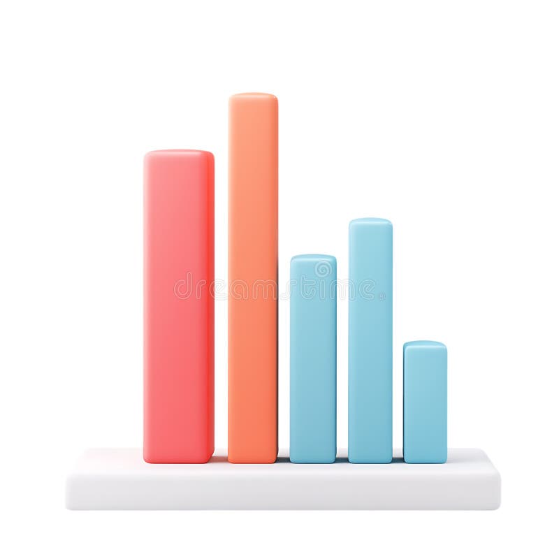
Free with trial PNG 3D Bar Chart Data Visualization Business Analytics Performance Metrics Colorful Graph against transparent Background. Increase decrease graph illustrations PNG 3D Bar Chart Data Visualization Business Analytics Performance Metrics Colorful Graph against transparent Background
Free with trial A line graph displaying fluctuating values over a 28-day period with notable peaks at day 14 and day 21. Increase decrease graph illustrations Graph showing fluctuating values over time with peaks at day 14 and day 21 isolated on white background. A line graph displaying fluctuating values over a 28-day period with notable peaks at day 14 and day 21
Free with trial A man is giving a business presentation, pointing to a graph on a whiteboard. He is using a laptop and explaining the data. The scene is set in an office. Increase decrease graph illustrations Business presentation with a man pointing to a graph isolated on white background. A man is giving a business presentation, pointing to a graph on a whiteboard. He is using a laptop and explaining the data. The scene is set in an office
Free with trial Horizontal chart line icon. Neumorphic, Red gradient, 3d pin buttons. Column graph sign. Market analytics symbol. Line icons. Neumorphic buttons with outline signs. Vector. Increase decrease graph illustrations Horizontal chart line icon. Column graph sign. Line icons. Vector. Horizontal chart line icon. Neumorphic, Red gradient, 3d pin buttons. Column graph sign. Market analytics symbol. Line icons. Neumorphic buttons with outline signs. Vector
Free with trial The image displays a line graph with a blue line that increases over time, with a shaded area underneath it, the graph has a white background with a light blue gradient and features various small icons related to business and finance such as bar graphs, pie charts, and dollar signs, the icons are light blue and scattered around the graph, the overall design is simple and clean, making it easy to. This image was generated using artificial intelligence. Increase decrease graph illustrations A line graph showing revenue growth over time with various icons surrounding it to represent different aspects of business and. the image displays a line graph with a blue line that increases over time, with a shaded area underneath it, the graph has a white background with a light blue gradient and features various small icons related to business and finance such as bar graphs, pie charts, and dollar signs, the icons are light blue and scattered around the graph, the overall design is simple and clean, making it easy to. This image was generated using artificial intelligence.
Free with trial Graph depicting contrasting trends one line decreasing while the other increases in orange hues, Generated by AI. Increase decrease graph illustrations Graph depicting contrasting trends one line decreasing while the other increases in orange hues
Free with trial Two contrasting icons depict upward trends. On the left, a black percentage symbol inside a circle overlaps with two ascending black arrows on a white background. On the right, the design is reversed: a white percentage symbol and arrows on a black background. Both icons illustrate concepts of growth or increase, commonly associated with financial or statistical data. Increase decrease graph vectors Increase Icon. Solid glyph series icon. Two contrasting icons depict upward trends. On the left, a black percentage symbol inside a circle overlaps with two ascending black arrows on a white background. On the right, the design is reversed: a white percentage symbol and arrows on a black background. Both icons illustrate concepts of growth or increase, commonly associated with financial or statistical data.
Free with trial A magnifying glass hovers over a grid paper background displaying two line graphs, one red and one blue. The red graph a general upward trend with several peaks and valleys, while the blue graph a downward trend. The magnifying glass focuses on a prominent red upward arrow within the red graph, highlighting an increase. Increase decrease graph illustrations Magnifying glass over red and blue upward and downward trending graphs on grid paper chart data analysis. A magnifying glass hovers over a grid paper background displaying two line graphs, one red and one blue. The red graph a general upward trend with several peaks and valleys, while the blue graph a downward trend. The magnifying glass focuses on a prominent red upward arrow within the red graph, highlighting an increase
Free with trial Two contrasting graphs are displayed on a white background. The left graph a green upward trending arrow and dotted line representing profit. The. Increase decrease graph illustrations Upward green arrow graph indicating profit growth next to downward red arrow graph showing financial loss on white. Two contrasting graphs are displayed on a white background. The left graph a green upward trending arrow and dotted line representing profit. The
Free with trial Two contrasting graphs are displayed on a white background. The left graph a green upward trending arrow and dotted line representing profit. The. Increase decrease graph illustrations Upward green arrow graph indicating profit growth next to downward red arrow graph showing financial loss on white. Two contrasting graphs are displayed on a white background. The left graph a green upward trending arrow and dotted line representing profit. The
Free with trial Set line Percent up arrow Arrow and Financial growth decrease icon. Vector. Increase decrease graph illustrations Set line Percent up arrow, Arrow and Financial growth decrease icon. Vector
Free with trial A collection of silver bars arranged in perspective with a green line graph superimposed over them, suggesting a rising trend. The bars are reflective and metallic, representing financial concepts related to silver investments. The image conveys notions of value appreciation and economic analysis. Increase decrease graph illustrations Silver bars with a green line graph. a rising trend in the price or value of silver. financial concepts design element. A collection of silver bars arranged in perspective with a green line graph superimposed over them, suggesting a rising trend. The bars are reflective and metallic, representing financial concepts related to silver investments. The image conveys notions of value appreciation and economic analysis.
Free with trial A line graph displays two curves, one in green and one in red, indicating fluctuations in data over a set. Increase decrease graph illustrations Graph showing statistical trends with positive and negative fluctuations over time in a simple line format. A line graph displays two curves, one in green and one in red, indicating fluctuations in data over a set
Free with trial This bar graph on a computer screen illustrates progress or growth, providing a visual representation of data for analysis and decision-making processes. Increase decrease graph vectors Vector art of a bar graph is displayed on a computer screen, showing the progress of a project or the growth of a company. This bar graph on a computer screen illustrates progress or growth, providing a visual representation of data for analysis and decision-making processes
Free with trial Glowing neon line Financial growth decrease icon isolated on red background. Increasing revenue. Vector. Increase decrease graph illustrations Glowing neon line Financial growth decrease icon isolated on red background. Increasing revenue. Vector
Free with trial Pie chart line icon. Neumorphic, Green gradient, 3d pin buttons. Presentation 3d graph sign. Market analytics symbol. Line icons. Neumorphic buttons with outline signs. Vector. Increase decrease graph vectors Pie chart line icon. Presentation 3d graph sign. Line icons. Vector. Pie chart line icon. Neumorphic, Green gradient, 3d pin buttons. Presentation 3d graph sign. Market analytics symbol. Line icons. Neumorphic buttons with outline signs. Vector
Free with trial Set line Arrow, Infographic element, and Financial growth decrease. Glowing neon icon on brick wall. Vector. Increase decrease graph illustrations Set line Arrow, Infographic element, and Financial growth decrease. Glowing neon icon on brick wall. Vector
Free with trial Businessman falling from the red graph chart arrow, bankruptcy concept. vector illustration. Increase decrease graph vectors Businessman falling from the red graph chart arrow, bankruptcy concept. vector illustration.
Free with trial A line art illustration shows a bar graph with arrows and a star on a purple background. It represents business growth, success, and achievement of goals. Increase decrease graph vectors Vector art of line art illustration of a bar graph with arrows and a star on a purple background business growth concept. A line art illustration shows a bar graph with arrows and a star on a purple background. It represents business growth, success, and achievement of goals