Free with trial Open notebook displaying sales data with charts, graphs, and the word sales highlighted, illuminated by a desk lamp, symbolizing business analysis and strategy. Performance decrease illustrations Sales report with charts and graphs illuminated by desk lamp. Open notebook displaying sales data with charts, graphs, and the word sales highlighted, illuminated by a desk lamp, symbolizing business analysis and strategy
Free with trial An illustrative concept of economic downturn, where a declining bar graph with a red arrow rests on a precarious, floating island. Performance decrease vectors Financial Crisis Chart on a Floating Island. An illustrative concept of economic downturn, where a declining bar graph with a red arrow rests on a precarious, floating island
Free with trial A minimalist line drawing of a bar chart, representing data, statistics and growth. Simple, bold and clean graphic icon. Performance decrease vectors Simple Line Chart Bar Statistic Graphic Icon. A minimalist line drawing of a bar chart, representing data, statistics and growth. Simple, bold and clean graphic icon.
Free with trial Upward and downward zigzag arrow line icon vector with long shadow. Performance decrease vectors Upward and downward zigzag arrow line icon with long shadow
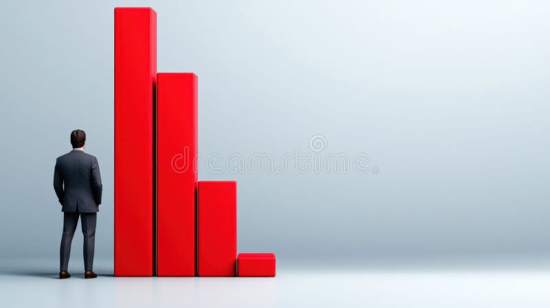
Free with trial Businessman Analyzing Declining Red Bar Chart. High quality illustration. Performance decrease illustrations Businessman Analyzing Declining Red Bar Chart
Free with trial A stylized illustration depicts a bar chart with blue bars of varying heights against a dark blue grid background. A prominent red and yellow arrow, symbolizing a downward trend, dramatically descends across the chart. This graphic represents financial decline, market crash, economic recession, or negative growth. Its clean, vector-style design makes it suitable for presentations, reports, and articles on business, finance, and economics. Performance decrease illustrations Declining Bar Chart with Red Arrow. A stylized illustration depicts a bar chart with blue bars of varying heights against a dark blue grid background. A prominent red and yellow arrow, symbolizing a downward trend, dramatically descends across the chart. This graphic represents financial decline, market crash, economic recession, or negative growth. Its clean, vector-style design makes it suitable for presentations, reports, and articles on business, finance, and economics.
Free with trial Wooden blocks with arrow up and down with percentage icon. Business planning for target achievement. Measure of performance for a specific objective. 3d render. Performance decrease illustrations Wooden blocks with arrow up and down with percentage icon
Free with trial Glass down arrow sign with the word Down. Performance decrease illustrations Glass down arrow sign with the word Down.
Free with trial A green downward trending stock chart is displayed on an orange grid, suggesting a negative financial trend for analysis. Performance decrease illustrations Green Stock Chart with Orange Grid. A green downward trending stock chart is displayed on an orange grid, suggesting a negative financial trend for analysis
Free with trial A visual representation of a business downturn. This blue bar chart with a descending arrow illustrates a period of negative growth, financial loss, or economic recession. Performance decrease vectors Business Decline Graph Vector Icon. A visual representation of a business downturn. This blue bar chart with a descending arrow illustrates a period of negative growth, financial loss, or economic recession
Free with trial The image shows a series of colorful wooden blocks arranged in ascending order of height, resembling a bar graph. the blocks are placed on a weathered wooden surface, adding a rustic and natural feel to the composition. the colors of the blocks range from orange to purple, creating a visually appealing gradient. the background is blurred, suggesting an outdoor setting with natural light filtering through. the focus is on the blocks, highlighting their texture and the interplay of colors. Performance decrease illustrations Colorful wooden blocks on rustic wood surface. the image shows a series of colorful wooden blocks arranged in ascending order of height, resembling a bar graph. the blocks are placed on a weathered wooden surface, adding a rustic and natural feel to the composition. the colors of the blocks range from orange to purple, creating a visually appealing gradient. the background is blurred, suggesting an outdoor setting with natural light filtering through. the focus is on the blocks, highlighting their texture and the interplay of colors.
Free with trial Checklist line icon. Neumorphic, Green gradient, 3d pin buttons. Graph chart sign. Growth diagram symbol. Line icons. Neumorphic buttons with outline signs. Vector. Performance decrease vectors Checklist line icon. Graph chart sign. Line icons. Vector. Checklist line icon. Neumorphic, Green gradient, 3d pin buttons. Graph chart sign. Growth diagram symbol. Line icons. Neumorphic buttons with outline signs. Vector
Free with trial Decreasing bar graph behind magnifying glass. 3d render. Performance decrease illustrations Decreasing bar graph behind magnifying glass
Free with trial Line graph is representing market trend with data points. Performance decrease vectors Line graph showing market trend with data points. Line graph is representing market trend with data points
Free with trial Graphic illustration of a downward trending red arrow over blue and red vertical bar graph on a light grey background. Image. Performance decrease illustrations Bar Graph with Decreasing Trend Line. Graphic illustration of a downward trending red arrow over blue and red vertical bar graph on a light grey background. Image
Free with trial Collection of red infographic elements including charts, graphs, diagrams and icons. Perfect for presentations, reports, and data visualization. Clean, modern design. Performance decrease illustrations Red Infographic Elements
Free with trial A worrying business report showing a sharp decline, generated by AI, rests on a wooden desk in an office setting. The red graph line dramatically falls, symbolizing potential losses or market downturn. This AI-generated image is perfect for illustrating financial instability or economic crisis. Performance decrease illustrations Declining Business Graph. A worrying business report showing a sharp decline, generated by AI, rests on a wooden desk in an office setting. The red graph line dramatically falls, symbolizing potential losses or market downturn. This AI-generated image is perfect for illustrating financial instability or economic crisis.
Free with trial Financial chart with red and orange bars on a dark background. Concept of market crash, recession, and falling stock index. 3D Rendering. Performance decrease illustrations Financial chart displaying a downward trend with red and orange bars. 3D Rendering. Financial chart with red and orange bars on a dark background. Concept of market crash, recession, and falling stock index. 3D Rendering
Free with trial Web report line icon. Neumorphic, Red gradient, 3d pin buttons. Column graph sign. Growth diagram symbol. Line icons. Neumorphic buttons with outline signs. Vector. Performance decrease illustrations Web report line icon. Column graph sign. Line icons. Vector. Web report line icon. Neumorphic, Red gradient, 3d pin buttons. Column graph sign. Growth diagram symbol. Line icons. Neumorphic buttons with outline signs. Vector
Free with trial Upward and downward zigzag arrow line icon vector on square background. Performance decrease vectors Upward and downward zigzag arrow line icon on square background
Free with trial Upward and downward zigzag arrow line icon vector on circle background. Performance decrease vectors Upward and downward zigzag arrow line icon on circle background
Free with trial This simple icon depicts a line graph with one line trending upwards and one trending downwards. Performance decrease vectors Line graph showing upward and downward trends icon. This simple icon depicts a line graph with one line trending upwards and one trending downwards
Free with trial Money graphs show growth with bars and charts rising on paper. Performance decrease illustrations Money graphs show growth with bars and charts rising on paper
Free with trial Abstract financial chart with red bars and lines representing market decline, emphasizing data analysis and economics. Generative AI. Performance decrease illustrations Abstract financial chart with red bars and lines representing market decline, emphasizing data analysis and economics
Free with trial A minimalist 3D rendering showcases a bar chart with an upward arrow and a diverging arrow on a round platform, symbolizing business growth and decline and is suitable for presentations or website graphics. Performance decrease illustrations 3d Bar Chart with Arrow, Growth Concept. A minimalist 3D rendering showcases a bar chart with an upward arrow and a diverging arrow on a round platform, symbolizing business growth and decline and is suitable for presentations or website graphics
Free with trial Graph phone line icon. Neumorphic, Red gradient, 3d pin buttons. Column chart sign. Growth diagram symbol. Line icons. Neumorphic buttons with outline signs. Vector. Performance decrease vectors Graph phone line icon. Column chart sign. Line icons. Vector. Graph phone line icon. Neumorphic, Red gradient, 3d pin buttons. Column chart sign. Growth diagram symbol. Line icons. Neumorphic buttons with outline signs. Vector
Free with trial A bar chart representing a sharp decline makes a dramatic splash in clear water. This conceptual image visualizes a financial crisis, liquidity problems, or the impactful consequences of negative data and market failure. Performance decrease illustrations Economic Downturn Graph Splashing Down. A bar chart representing a sharp decline makes a dramatic splash in clear water. This conceptual image visualizes a financial crisis, liquidity problems, or the impactful consequences of negative data and market failure
Free with trial Abstract financial chart with red bars and lines representing market decline, emphasizing data analysis and economics. Generative AI. Performance decrease illustrations Abstract financial chart with red bars and lines representing market decline, emphasizing data analysis and economics
Free with trial Abstract financial chart with red bars and lines representing market decline, emphasizing data analysis and economics. Generative AI. Performance decrease illustrations Abstract financial chart with red bars and lines representing market decline, emphasizing data analysis and economics
Free with trial This vibrant, wavy graph, generated by AI, displays data progression using a color-coded system. The gradual color shift from green to red signifies a change in values, making it ideal for representing various trends or metrics. The accompanying key provides additional clarity. Performance decrease illustrations Colorful AI-Generated Data Visualization. This vibrant, wavy graph, generated by AI, displays data progression using a color-coded system. The gradual color shift from green to red signifies a change in values, making it ideal for representing various trends or metrics. The accompanying key provides additional clarity.
Free with trial Downward Arrow Icon – Flat Vector Design. Performance decrease vectors . Downward Arrow Icon – Flat Vector Design
Free with trial Downward Arrow Icon – Flat Vector Design. Performance decrease vectors . Downward Arrow Icon – Flat Vector Design
Free with trial Downward Arrow Icon – Flat Vector Design. Performance decrease vectors . Downward Arrow Icon – Flat Vector Design
Free with trial Downward Arrow Icon – Flat Vector Design. Performance decrease vectors . Downward Arrow Icon – Flat Vector Design
Free with trial Downward Arrow Icon – Flat Vector Design. Performance decrease vectors . Downward Arrow Icon – Flat Vector Design
Free with trial Downward Arrow Icon – Flat Vector Design. Performance decrease vectors . Downward Arrow Icon – Flat Vector Design
Free with trial Downward Arrow Icon – Flat Vector Design. Performance decrease vectors . Downward Arrow Icon – Flat Vector Design
Free with trial Downward Arrow Icon – Flat Vector Design. Performance decrease vectors . Downward Arrow Icon – Flat Vector Design
Free with trial Graph laptop line icon. Neumorphic, Purple gradient, 3d pin buttons. Column chart sign. Growth diagram symbol. Line icons. Neumorphic buttons with outline signs. Vector. Performance decrease vectors Graph laptop line icon. Column chart sign. Line icons. Vector. Graph laptop line icon. Neumorphic, Purple gradient, 3d pin buttons. Column chart sign. Growth diagram symbol. Line icons. Neumorphic buttons with outline signs. Vector
Free with trial A candlestick chart showing a significant downward trend. The chart features black candlesticks indicating price fluctuations over time, with red, green, and orange lines tracing different moving averages. A bar graph at the bottom provides additional data. This image can be used to represent financial loss, market downturns, or economic recession. Performance decrease illustrations Downward Trend Candlestick Chart. A candlestick chart showing a significant downward trend. The chart features black candlesticks indicating price fluctuations over time, with red, green, and orange lines tracing different moving averages. A bar graph at the bottom provides additional data. This image can be used to represent financial loss, market downturns, or economic recession.
Free with trial This image showcases two contrasting bar charts, constructed from red and white blocks, generated by AI. One chart depicts growth, while the other illustrates decline, offering a visual representation of opposing trends. The use of color and simple shapes makes it easily understandable. Performance decrease illustrations AI-Generated Block Charts: Growth & Decline. This image showcases two contrasting bar charts, constructed from red and white blocks, generated by AI. One chart depicts growth, while the other illustrates decline, offering a visual representation of opposing trends. The use of color and simple shapes makes it easily understandable.
Free with trial 3D icon featuring a golden bear and a descending red arrow above blue bars, symbolizing a bearish trend in financial markets. Performance decrease vectors Bear Market Graph with Downward Trend 3D Icon. 3D icon featuring a golden bear and a descending red arrow above blue bars, symbolizing a bearish trend in financial markets
Free with trial Multiple line charts showing data trends over months on a grid background. Concept of data analysis and financial growth. 3D Rendering. Performance decrease illustrations Multiple line charts showing data trends over months on grid background. 3D Rendering. Multiple line charts showing data trends over months on a grid background. Concept of data analysis and financial growth. 3D Rendering
Free with trial A conceptual image illustrating a decline in the cocoa market. In the foreground, a pile of raw cocoa beans sits on a white surface. Behind them, a 3D bar chart shows a steep downward trend, with tall green bars transitioning to shorter red bars, symbolizing falling prices, reduced production, or financial loss. This graphic is ideal for representing economic downturns, agricultural commodity trading, market analysis, business reports, and news related to the chocolate industry's performance, supply chain issues, or crop failure. Performance decrease illustrations Cocoa Market Decline with Beans and Graph. A conceptual image illustrating a decline in the cocoa market. In the foreground, a pile of raw cocoa beans sits on a white surface. Behind them, a 3D bar chart shows a steep downward trend, with tall green bars transitioning to shorter red bars, symbolizing falling prices, reduced production, or financial loss. This graphic is ideal for representing economic downturns, agricultural commodity trading, market analysis, business reports, and news related to the chocolate industry's performance, supply chain issues, or crop failure.
Free with trial Decreasing bar graph isolated on white background. Investment statistics. Economic data. Financial report. Interest rate. Business concept. Top view. 3d render. Performance decrease illustrations Decreasing bar graph isolated on white background
Free with trial Wooden blocks with arrow up and down on Balance scale of percentage icon. Business planning for target achievement. Measure of performance for a specific objective. 3d render. Performance decrease illustrations Wooden blocks with arrow up and down on Balance scale of percentage icon
Free with trial A downward-trending red line graph overlays a dark screen displaying financial data with glowing red and green numbers. Image. Performance decrease illustrations Stock Market Ticker with Red Decline Line. A downward-trending red line graph overlays a dark screen displaying financial data with glowing red and green numbers. Image
Free with trial Decline flat style spiraling revenue chart illustration profit loss, trend data, visualization finance decline flat style spiraling revenue chart. Performance decrease illustrations Decline flat style spiraling revenue chart
Free with trial Red decreasing bar graph on light gray background. Investment statistics. Economic data. Financial report. Interest rate. Business concept. Top view. 3d render. Performance decrease illustrations Red decreasing bar graph on light gray background
Free with trial Explore the dynamic world of crypto trading with insights on market trends and financial strategies. Discover how fluctuations can impact investment decisions. Performance decrease illustrations Crypto Trading Trends and Future Perspectives. Explore the dynamic world of crypto trading with insights on market trends and financial strategies. Discover how fluctuations can impact investment decisions
Free with trial A simple black and white graphic depicts a bar chart with decreasing bars and a downward trending arrow, indicating a decline. Performance decrease illustrations Bar chart showing downward trend and arrow. A simple black and white graphic depicts a bar chart with decreasing bars and a downward trending arrow, indicating a decline
Free with trial A conceptual business image showing a torn paper design with a red downward arrow cutting through the center, symbolizing financial decline. The top portion displays a black and white line graph trending downward, while the bottom reveals bold 'PROFIT LOSS' text and placeholder text below. Ideal for illustrating economic downturn, company loss, financial crisis, negative growth, or poor performance in business reports and presentations. Performance decrease illustrations Red Arrow Piercing Paper Over Profit Loss Report with Declining Graph. A conceptual business image showing a torn paper design with a red downward arrow cutting through the center, symbolizing financial decline. The top portion displays a black and white line graph trending downward, while the bottom reveals bold 'PROFIT LOSS' text and placeholder text below. Ideal for illustrating economic downturn, company loss, financial crisis, negative growth, or poor performance in business reports and presentations.
Free with trial Green arrow pointing down representing negative trend in business. Performance decrease illustrations Long green arrow is pointing down on a white background. Green arrow pointing down representing negative trend in business
Free with trial An isometric illustration depicting a blue bar chart showing growth, with a red arrow forming a slide that goes downwards, symbolizing a business decline or setback. Performance decrease illustrations Business growth chart with a downward slide. An isometric illustration depicting a blue bar chart showing growth, with a red arrow forming a slide that goes downwards, symbolizing a business decline or setback
Free with trial This image shows a person's hand holding a smartphone displaying a stock market chart. In the background, a larger monitor mirrors similar stock data. The scene conveys trading, investment, and financial analysis through technology. The focus is on digital finance, with the smartphone symbolizing accessibility and immediacy in market engagement. The red and green lines in the graphs represent market fluctuations, essential for traders monitoring stock performance. Performance decrease illustrations Stock Trading on Smartphone: Analyzing Market Data. This image shows a person's hand holding a smartphone displaying a stock market chart. In the background, a larger monitor mirrors similar stock data. The scene conveys trading, investment, and financial analysis through technology. The focus is on digital finance, with the smartphone symbolizing accessibility and immediacy in market engagement. The red and green lines in the graphs represent market fluctuations, essential for traders monitoring stock performance.
Free with trial Decreasing graph line icon. Neumorphic, Green gradient, 3d pin buttons. Column chart sign. Crisis diagram symbol. Line icons. Neumorphic buttons with outline signs. Vector. Performance decrease illustrations Decreasing graph line icon. Crisis chart sign. Line icons. Vector. Decreasing graph line icon. Neumorphic, Green gradient, 3d pin buttons. Column chart sign. Crisis diagram symbol. Line icons. Neumorphic buttons with outline signs. Vector
Free with trial Cost and Quality control, business strategy and project management technology concept. Businessman working on digital tablet with quality control growth graph and cost reduction, effective business. Performance decrease illustrations Cost and Quality control, business strategy and project management technology concept.
Free with trial Visualization collapsing data analytics chart illustration trend analysis, dashboard metrics, anomaly decline visualization collapsing data analytics chart. Performance decrease illustrations Visualization collapsing data analytics chart
Free with trial A clean, minimalist bar chart illustration set against a solid green background. The chart features three white vertical bars of different heights, representing data points or progress over time. A simple white grid and axes are visible, indicating a clear visual representation of statistics. This versatile graphic is ideal for conveying concepts of business growth, financial analysis, market trends, statistical reporting, or educational content in a modern, easy-to-understand format. Perfect for presentations, infographics, websites, and applications. Performance decrease vectors Minimalist Bar Chart Icon on Green Background. A clean, minimalist bar chart illustration set against a solid green background. The chart features three white vertical bars of different heights, representing data points or progress over time. A simple white grid and axes are visible, indicating a clear visual representation of statistics. This versatile graphic is ideal for conveying concepts of business growth, financial analysis, market trends, statistical reporting, or educational content in a modern, easy-to-understand format. Perfect for presentations, infographics, websites, and applications.
Free with trial Laptop Displays Business Analytics Graph Data. Performance decrease illustrations Laptop Displays Business Analytics Graph Data
Free with trial Report statistics line icon. Neumorphic, Green gradient, 3d pin buttons. Column graph sign. Growth diagram symbol. Line icons. Neumorphic buttons with outline signs. Vector. Performance decrease vectors Report statistics line icon. Column graph sign. Line icons. Vector. Report statistics line icon. Neumorphic, Green gradient, 3d pin buttons. Column graph sign. Growth diagram symbol. Line icons. Neumorphic buttons with outline signs. Vector
Free with trial A comprehensive collection of black and white icons representing various financial and business charts, including bar, line, and pie graphs, for data visualization. Performance decrease vectors Assortment of financial and business chart icons. A comprehensive collection of black and white icons representing various financial and business charts. A comprehensive collection of black and white icons representing various financial and business charts, including bar, line, and pie graphs, for data visualization
Free with trial Business data visualization with various charts white background. Performance decrease illustrations Business data visualization with various charts
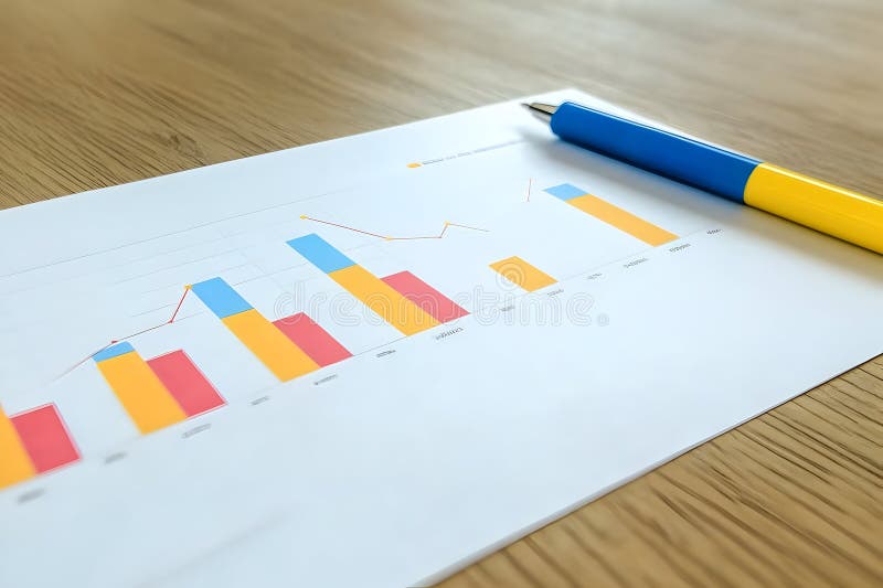
Free with trial Business graph chart report pen on wood table. Performance decrease illustrations Business graph chart report pen on wood table
Free with trial A clipboard displays a checklist, symbolizing the process of evaluation and decision-making. Performance decrease vectors Ranking and Prioritizing Tasks on a Clipboard. A clipboard displays a checklist, symbolizing the process of evaluation and decision-making
Free with trial A hand-drawn illustration depicting a presentation on data trends. A stick figure presenter, holding a microphone, points to a chart on a screen labeled "DATA TRENDS. " The chart displays a line graph and bar graphs, suggesting growth and analysis. This image is suitable for illustrating business concepts, data analysis, presentations, and financial reports. It conveys a sense of information, communication, and progress. Performance decrease vectors Data Presentation: Business Trends and Analysis. A hand-drawn illustration depicting a presentation on data trends. A stick figure presenter, holding a microphone, points to a chart on a screen labeled "DATA TRENDS." The chart displays a line graph and bar graphs, suggesting growth and analysis. This image is suitable for illustrating business concepts, data analysis, presentations, and financial reports. It conveys a sense of information, communication, and progress.
Free with trial A 3D render illustrating the concept of financial decline and economic crisis. The image features a bar chart with progressively smaller bars and a prominent red arrow pointing downwards, signifying a sharp downturn. This visual metaphor represents a stock market crash, business failure, investment loss, or recession. The minimalist design on a yellow background is perfect for financial reports, business presentations, economic news articles, and web graphics discussing negative growth, losses, or bankruptcy. A small stack of coins reinforces the monetary theme. Performance decrease illustrations 3D Financial Decline Graph with Downward Arrow. A 3D render illustrating the concept of financial decline and economic crisis. The image features a bar chart with progressively smaller bars and a prominent red arrow pointing downwards, signifying a sharp downturn. This visual metaphor represents a stock market crash, business failure, investment loss, or recession. The minimalist design on a yellow background is perfect for financial reports, business presentations, economic news articles, and web graphics discussing negative growth, losses, or bankruptcy. A small stack of coins reinforces the monetary theme.
Free with trial Line chart going down on a website, showing a negative trend in statistics. Performance decrease illustrations Website showing a graph representing decreasing statistics. Line chart going down on a website, showing a negative trend in statistics
Free with trial Isometric illustration of a marketing team analyzing a falling financial chart on a tablet. Performance decrease illustrations Marketing team analyzing falling financial chart on tablet. Isometric illustration of a marketing team analyzing a falling financial chart on a tablet
Free with trial Stacks of gold coins, financial growth, investment generative ai image. Performance decrease illustrations Stacks of gold coins, financial growth, investment
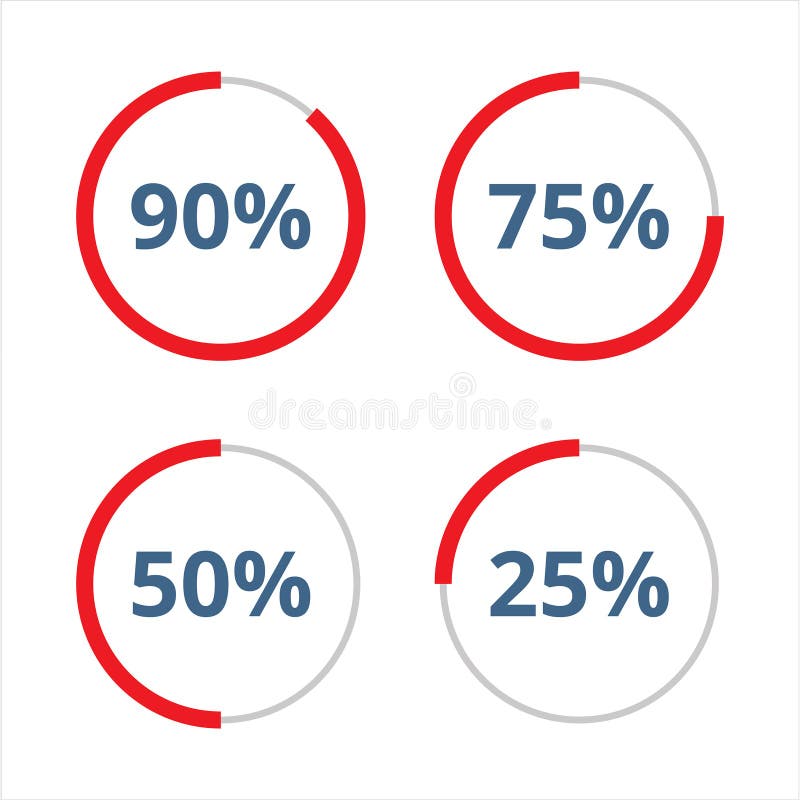
Free with trial Four round percentage signs in blue and red on a white background. Performance decrease vectors Round percentage signs in blue and red on a white background
Free with trial A vibrant and modern illustration showcasing various data visualization elements. The image features a collection of charts, graphs, and diagrams, including line graphs, bar graphs, pie charts, and circular diagrams, all rendered in a colorful and abstract style. The design incorporates gradients and geometric shapes, suggesting growth, analysis, and business concepts. Ideal for presentations, reports, websites, and marketing materials related to finance, economics, and data analysis. Performance decrease illustrations Abstract Data Visualization and Business Charts. A vibrant and modern illustration showcasing various data visualization elements. The image features a collection of charts, graphs, and diagrams, including line graphs, bar graphs, pie charts, and circular diagrams, all rendered in a colorful and abstract style. The design incorporates gradients and geometric shapes, suggesting growth, analysis, and business concepts. Ideal for presentations, reports, websites, and marketing materials related to finance, economics, and data analysis.
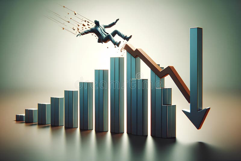
Free with trial A 3D figure of a person in a business suit falling from a declining chart. Performance decrease illustrations A 3D figure of a person in a business suit falling from a declining chart
Free with trial A simple graphic showing a downward trend with a red line graph and several vertical bars of varying heights and colors. Performance decrease vectors Downward trending bar and line graph chart data. A simple graphic showing a downward trend with a red line graph and several vertical bars of varying heights and colors
Free with trial Businessman stick figure character analyze declining collapsing domino bar graph effect. Business loss, investment forecast recession, negative return concept. hand drawn vector doodle illustration. Performance decrease vectors Businessman stick figure character analyze declining collapsing domino bar graph effect. Business loss, investment forecast
Free with trial A vibrant collection of hand-drawn business charts and graphs, rendered in shades of blue with a sketch-like aesthetic. The set includes various types of visualizations like bar charts, line graphs, pie charts, and donut charts, representing data, growth, and analysis. This versatile illustration is perfect for presentations, reports, infographics, and any project requiring a visual representation of financial or statistical information with a creative, hand-crafted feel. Performance decrease illustrations Hand-Drawn Business Charts and Graphs Collection. A vibrant collection of hand-drawn business charts and graphs, rendered in shades of blue with a sketch-like aesthetic. The set includes various types of visualizations like bar charts, line graphs, pie charts, and donut charts, representing data, growth, and analysis. This versatile illustration is perfect for presentations, reports, infographics, and any project requiring a visual representation of financial or statistical information with a creative, hand-crafted feel.
Free with trial Business growth presentation with charts and graphs showing progress, statistics, and performance. The image showcases key financial indicators in a clear, concise format. Performance decrease vectors Financial Data Analysis Report on Screen Display. Business growth presentation with charts and graphs showing progress, statistics, and performance. The image showcases key financial indicators in a clear, concise format.
Free with trial Generated with the use of AI. Business Analyst Touching a Glowing Cost Reduction Graph on a Virtual Interface Above Laptop Indicating Financial Strategy. Performance decrease illustrations Business Analyst Touching a Glowing Cost Reduction Graph on a Virtual Interface Above Laptop Indicating Financial Strategy
Free with trial Simple line chart is showing a critical error with an exclamation point symbol. Performance decrease vectors Business chart showing critical error with exclamation point. Simple line chart is showing a critical error with an exclamation point symbol
Free with trial The image shows a downward trending line graph on a digital grid, representing a decline in the stock market. Performance decrease illustrations Abstract Blue Digital Stock Market Graph Decline. The image shows a downward trending line graph on a digital grid, representing a decline in the stock market
 Sign in