Free with trial Business refers to the organized efforts and activities of individuals or groups to produce, buy, sell, and exchange goods or services for profit. Performance decrease illustrations The piggy bank and coins for Business concept 3d rendering. Business refers to the organized efforts and activities of individuals or groups to produce, buy, sell, and exchange goods or services for profit
Free with trial Risk Minimization spotlighted dark or night mode web, landing. Professionals navigate financial charts, with rising arrows denoting growth. Compass points to reduced risk. Flat vector illustration. Performance decrease vectors Risk Minimization spotlighted. Professionals navigate financial charts. Risk Minimization spotlighted dark or night mode web, landing. Professionals navigate financial charts, with rising arrows denoting growth. Compass points to reduced risk. Flat vector illustration.
Free with trial A collection of hand-drawn, black and white icons representing growth, decline, and financial concepts. The set includes upward and downward arrows, percentage symbols, and a bar graph illustrating trends. The simple line art style makes these icons versatile for various applications, including presentations, infographics, and website design. They convey concepts of progress, success, loss, and market fluctuations. Performance decrease illustrations Growth and Decline Icons Set. A collection of hand-drawn, black and white icons representing growth, decline, and financial concepts. The set includes upward and downward arrows, percentage symbols, and a bar graph illustrating trends. The simple line art style makes these icons versatile for various applications, including presentations, infographics, and website design. They convey concepts of progress, success, loss, and market fluctuations.
Free with trial Business refers to the organized efforts and activities of individuals or groups to produce, buy, sell, and exchange goods or services for profit. Performance decrease illustrations The Arrow down and coins for Business concept 3d rendering. Business refers to the organized efforts and activities of individuals or groups to produce, buy, sell, and exchange goods or services for profit
Free with trial Business refers to the organized efforts and activities of individuals or groups to produce, buy, sell, and exchange goods or services for profit. Performance decrease illustrations The piggy bank and coins for Business concept 3d rendering. Business refers to the organized efforts and activities of individuals or groups to produce, buy, sell, and exchange goods or services for profit
Free with trial Business refers to the organized efforts and activities of individuals or groups to produce, buy, sell, and exchange goods or services for profit. Performance decrease illustrations The Arrow down and coins for Business concept 3d rendering. Business refers to the organized efforts and activities of individuals or groups to produce, buy, sell, and exchange goods or services for profit
Free with trial Business refers to the organized efforts and activities of individuals or groups to produce, buy, sell, and exchange goods or services for profit. Performance decrease illustrations The Arrow down and coins for Business concept 3d rendering. Business refers to the organized efforts and activities of individuals or groups to produce, buy, sell, and exchange goods or services for profit
Free with trial Business refers to the organized efforts and activities of individuals or groups to produce, buy, sell, and exchange goods or services for profit. Performance decrease illustrations The Arrow down and coins for Business concept 3d rendering. Business refers to the organized efforts and activities of individuals or groups to produce, buy, sell, and exchange goods or services for profit
Free with trial A digital financial chart with downward trending arrows, symbolizing a market crash or economic crisis on a dark background with red and blue accents. 3D Rendering. Performance decrease illustrations A digital financial chart with downward trending arrows, symbolizing a market crash or economic crisis on a dark background with
Free with trial Set of Chart presentation, Report, Increase growth graph icons. Design shape elements. Graph line icons. Analytics testing, Falling demand, Pie chart report. Calendar statistics, Stats. Vector. Performance decrease vectors Graph line icons. Set of Chart presentation, Report and Increase growth graph icons. Design elements. Vector. Set of Chart presentation, Report, Increase growth graph icons. Design shape elements. Graph line icons. Analytics testing, Falling demand, Pie chart report. Calendar statistics, Stats. Vector
Free with trial Goods boxes with dollar symbol and down arrow, indicating revenue drop Generative AI. Performance decrease illustrations Goods boxes with dollar symbol and down arrow, indicating revenue drop
Free with trial Goods boxes with dollar symbol and down arrow, indicating revenue drop Generative AI. Performance decrease illustrations Goods boxes with dollar symbol and down arrow, indicating revenue drop
Free with trial A businessman pushing a dollar coin to resist a red down arrow. Financial crisis and economic downturn. A minimal style of an effect of inflation, recession, bankruptcy, and financial failure. Performance decrease vectors A businessman pushing a dollar coin to resist a red down arrow. Financial crisis and economic downturn. A minimal style of an
Free with trial A businessman pushing a stack of banknotes to resist a red down arrow. Financial crisis and economic downturn. A minimal style of an effect of inflation, recession, bankruptcy, and financial failure. Performance decrease vectors A businessman pushing a stack of banknotes to resist a red down arrow. Financial crisis and economic downturn. A minimal style of
Free with trial Businessmen team pushing a stack of money to resist a red down arrow. Financial crisis and economic downturn. A minimal style of an effect of inflation, recession, bankruptcy, and financial failure. Performance decrease vectors Businessmen team pushing a stack of money to resist a red down arrow. Financial crisis and economic downturn. A minimal style of
Free with trial 3D Isometric Flat Vector Illustration of Cost Cutting And Efficiency, Price Management. Performance decrease vectors 3D Isometric Flat Vector Illustration of Cost Cutting And Efficiency
Free with trial 3D render icon Line graph tracking energy consumption with a playful narrative icon 3d analysis. Generative AI. Performance decrease illustrations 3D render icon Line graph tracking energy consumption with a playful narrative icon 3d analysis
Free with trial Businessmen team pushing stack of banknotes to resist a red down arrow. Financial crisis and economic downturn. A minimal style of an effect of inflation, recession, bankruptcy, and financial failure. Performance decrease vectors Businessmen team pushing stack of banknotes to resist a red down arrow. Financial crisis and economic downturn. A minimal style of
Free with trial Open laptop displaying colorful bar graphs and data analysis on screen, representing growth and business analytics ,Generative AI. Performance decrease illustrations Open laptop displaying colorful bar graphs and data analysis on screen, representing growth and business analytics
Free with trial Stock exchange market trade bull vs bear concept vector. Performance decrease vectors Stock exchange market trade bull vs bear concept
Free with trial Calculator, coin, dollar sign, green arrows, up, down. Performance decrease vectors Calculator, coin, dollar sign
Free with trial Economic downturn shown with large red arrow pointing down, financial decline and recession graph concept. Performance decrease illustrations Economic downturn shown with large red arrow pointing down
Free with trial Businessmen team pushing banknotes to resist a red down arrow. Financial crisis and economic downturn. A minimal style of an effect of inflation, recession, bankruptcy, and financial failure. Performance decrease vectors Businessmen team pushing banknotes to resist a red down arrow. Financial crisis and economic downturn. A minimal style of an
Free with trial Decline graph prohibited. No downturn allowed signs. Anti-recession symbols. Vector illustration. EPS 10. Stock image. Performance decrease vectors Decline graph prohibited. No downturn allowed signs. Anti-recession symbols. Vector illustration. EPS 10.
Free with trial Glowing neon bullish vs bearish stock trading background vector. Performance decrease illustrations Glowing neon bullish vs bearish stock trading background
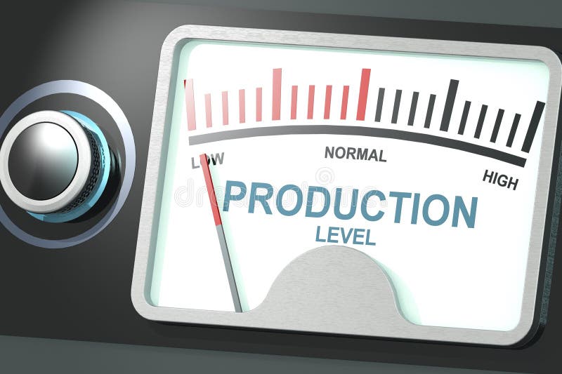
Free with trial Indicator for low production level, 3d rendering. Performance decrease illustrations Indicator for low production level
Free with trial Bull growth vs bear decline market trend concept background vector. Performance decrease vectors Bull growth vs bear decline market trend concept background
Free with trial A chart displaying data trends on a white background. 3D Rendering. Performance decrease illustrations Graphical representation of data trends. 3D Rendering. A chart displaying data trends on a white background. 3D Rendering
Free with trial Icon of loss function in AI featuring a computer monitor with a downward loss curve graph and the word LOSS, surrounded by circuit lines. Represents optimization process in machine learning models through minimization of error. Vector pictogram with thin black lines on a transparent background and editable line thickness. Performance decrease vectors Icon of loss function in AI
Free with trial A glowing digital bull surrounded by stock market data, representing financial growth and bullish market trends. Performance decrease illustrations A glowing digital bull surrounded by stock market data, representing financial growth and bullish market trends
Free with trial Decline food sales data illustration fruits vegetables, items year, trend analysis decline food sales data. Performance decrease illustrations Decline food sales data
Free with trial Global stock market bear vs bull volatility with dollar symbol vector. Performance decrease illustrations Global stock market bear vs bull volatility with dollar symbol
Free with trial This image shows a red line graph with a downward trend on a blue background. Vector illustration design using ai tool. Performance decrease vectors Financial crisis graph. This image shows a red line graph with a downward trend on a blue background. Vector illustration design using ai tool.
Free with trial Businessman analyzing declining graph, worried about financial loss. Office setting with a plant and documents. Corporate challenges vector illustration. Performance decrease vectors Businessman analyzing declining graph, worried about financial loss. Office setting with a plant and documents
Free with trial Flat bullish vs bearish upward downward market trend background vector. Performance decrease illustrations Flat bullish vs bearish upward downward market trend background
Free with trial Stacked gold coins next to a red downward arrow on a gray grid background, representing financial decline. 3D Rendering. Performance decrease illustrations Stack of coins with red downward arrow on grid background. 3D Rendering. Stacked gold coins next to a red downward arrow on a gray grid background, representing financial decline. 3D Rendering
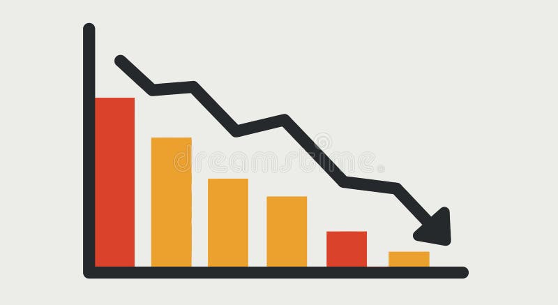
Free with trial This image shows a bar chart with a downward trend line, indicating economic decline. Vector illustration design using ai tool. Performance decrease vectors Economic recession chart. This image shows a bar chart with a downward trend line, indicating economic decline. Vector illustration design using ai tool.
Free with trial Red downward trend in digital abstract futuristic tech background. Generative AI. Performance decrease illustrations Red downward trend in digital abstract futuristic tech background
Free with trial Growth layering revenue chart illustration profit income, forecast trends, metrics visualization growth layering revenue chart. Performance decrease illustrations Growth layering revenue chart
Free with trial A close-up of a magnifying glass revealing intricate lines of code, generated by AI. The image evokes a sense of mystery and technological advancement, hinting at the power and potential of artificial intelligence in data analysis and cybersecurity. Performance decrease illustrations AI Magnifies Code. A close-up of a magnifying glass revealing intricate lines of code, generated by AI. The image evokes a sense of mystery and technological advancement, hinting at the power and potential of artificial intelligence in data analysis and cybersecurity.
Free with trial Confident businessman holding a large gold arrow pointing down. Professional challenges and market downturn concept. Vector illustration. Performance decrease vectors Businessman. Flat Vector Illustration. Confident businessman holding a large gold arrow pointing down. Professional challenges and market downturn concept. Vector illustration.
Free with trial Income Arrow Down : Income Arrow Down represents a decrease in earnings or financial performance. Performance decrease vectors Income Arrow Down
Free with trial Bullish profit vs bearish loss stock market trend concept background vector. Performance decrease vectors Bullish profit vs bearish loss stock market trend concept background
Free with trial Blue and red lines show economic decline. Vector illustration design using ai tool. Performance decrease vectors Recession chart. Blue and red lines show economic decline. Vector illustration design using ai tool.
Free with trial Company graphs data illustration time valleys, volatility market, background trend company graphs data. Performance decrease illustrations Company graphs data
Free with trial Chdata replicating revenue chart illustration analysis growth, sales profit, trends visualization chdata replicating revenue chart. Performance decrease illustrations Chdata replicating revenue chart
Free with trial Analyzing the business failure and decline. White magnifying glass analyzing a growth chart on a blue background, representing market analysis and business growth. 3D render. Performance decrease illustrations Magnifying glass analyzing growth chart on blue background. Analyzing the business failure and decline. White magnifying glass analyzing a growth chart on a blue background, representing market analysis and business growth. 3D render
Free with trial Digital analyst showcases Bounce Rate on a comprehensive dashboard. Monitoring user retention, pinpointing site issues. Ensuring optimal user experience and web engagement. Flat vector illustration. Performance decrease vectors Digital analyst showcases Bounce Rate on a comprehensive dashboard
Free with trial This image shows a rolled-up graph with a red line depicting a downturn, generated by AI. It visually represents a negative trend or decline in data, potentially illustrating economic recession, market loss, or other negative statistical trends. The clean design allows for easy visualization of the. Performance decrease illustrations Declining Graph Report. This image shows a rolled-up graph with a red line depicting a downturn, generated by AI. It visually represents a negative trend or decline in data, potentially illustrating economic recession, market loss, or other negative statistical trends. The clean design allows for easy visualization of the
Free with trial Illustration of reduce risk level concept. Businessman pull risk indicators to low. Illustrations for websites, landing pages, mobile apps, posters and banners. Performance decrease vectors Illustration of reduce risk level concept
Free with trial Comparison comparing data illustration analysis graph, traffic website, overlay divergence comparison comparing data. Performance decrease illustrations Comparison comparing data
Free with trial This image shows a detailed close-up of a stock market graph depicting a significant decline. The red color emphasizes the negative trend, illustrating potential losses or economic downturn. This visualization was generated by AI for analysis and presentation purposes. Performance decrease illustrations Red Market Decline Graph. This image shows a detailed close-up of a stock market graph depicting a significant decline. The red color emphasizes the negative trend, illustrating potential losses or economic downturn. This visualization was generated by AI for analysis and presentation purposes.
Free with trial Red downward arrow graph isolated on transparent background. Performance decrease illustrations Red downward arrow graph
Free with trial An abstract financial chart with a downward trend in blue, representing market decline, economic downturn, and potential investment risks in the stock market. Performance decrease illustrations Abstract financial chart with downward trend in blue. An abstract financial chart with a downward trend in blue, representing market decline, economic downturn. An abstract financial chart with a downward trend in blue, representing market decline, economic downturn, and potential investment risks in the stock market
Free with trial Decreasing bar graph in ice cube. 3d illustration. Performance decrease illustrations Decreasing bar graph in ice cube
Free with trial Descending white cylinder steps. Empty podium for product display. Bar chart and business decline or failure. Financial profit loss and economic crisis. 3D render. Performance decrease illustrations Descending white cylinder steps. Empty podium for product display
Free with trial A simple graphic illustration of a bar chart. The chart features four bars of varying heights, indicating growth or progress. The design is clean and minimalist, making it suitable for a wide range of applications such as presentations, reports, and infographics. The black bars stand out against the white background, providing a clear visual representation of data. Performance decrease illustrations Bar Chart Icon. A simple graphic illustration of a bar chart. The chart features four bars of varying heights, indicating growth or progress. The design is clean and minimalist, making it suitable for a wide range of applications such as presentations, reports, and infographics. The black bars stand out against the white background, providing a clear visual representation of data.
Free with trial Two 3D arrows, one red pointing down and one green pointing up, symbolizing contrasting financial trends or data analysis. Visual representation of market fluctuations. Performance decrease illustrations Arrow chart up and down on. Two 3D arrows, one red pointing down and one green pointing up, symbolizing contrasting financial trends or data analysis. Visual representation of market fluctuations
Free with trial Three orange bar graphs illustrating different data patterns increasing, decreasing, and varied. Ideal for presentations or data visualization. Simple and visually appealing design. Performance decrease illustrations Orange Bar Graph Variations. Three orange bar graphs illustrating different data patterns increasing, decreasing, and varied. Ideal for presentations or data visualization. Simple and visually appealing design.
Free with trial Profit growth icon logo sign vector outline in black and white color. Performance decrease vectors Profit growth icon logo set vector. profit growth icon logo sign vector outline in black and white color
Free with trial Revenue absorbing sales graph illustration growth metrics, visualization insights, forecast dashboard revenue absorbing sales graph. Performance decrease illustrations Revenue absorbing sales graph
Free with trial This image showcases a dynamic data visualization, generated by AI, depicting a flowing wave pattern over a gridded background. The abstract design uses cool blue tones and suggests growth, movement, or change in data trends. The wave's form is both aesthetically pleasing and symbolic of complex in. Performance decrease illustrations Abstract Data Wave. This image showcases a dynamic data visualization, generated by AI, depicting a flowing wave pattern over a gridded background. The abstract design uses cool blue tones and suggests growth, movement, or change in data trends. The wave's form is both aesthetically pleasing and symbolic of complex in
Free with trial A 3D rendering showing stacks of coins under a magnifying glass focusing on a bar graph, generated by AI. This image symbolizes financial analysis, investment, and wealth management. It's perfect for illustrating articles or presentations related to economic trends and monetary growth. Performance decrease illustrations Financial Analysis Magnifier. A 3D rendering showing stacks of coins under a magnifying glass focusing on a bar graph, generated by AI. This image symbolizes financial analysis, investment, and wealth management. It's perfect for illustrating articles or presentations related to economic trends and monetary growth.
Free with trial Hand drawn charts and clock showing business growth and speed. Performance decrease illustrations Business Growth Speed Concept. Hand drawn charts and clock showing business growth and speed
Free with trial This image depicts a dramatic stock market decline, visualized as a falling graph in intense orange and red hues, generated by AI. The dark background emphasizes the severity of the downturn, suggesting potential financial instability or market volatility. The bokeh effect adds a sense of depth and. Performance decrease illustrations AI-Generated Stock Market Dip. This image depicts a dramatic stock market decline, visualized as a falling graph in intense orange and red hues, generated by AI. The dark background emphasizes the severity of the downturn, suggesting potential financial instability or market volatility. The bokeh effect adds a sense of depth and
Free with trial A tablet displays a colorful bar graph, showcasing data trends. The image emphasizes visual data analysis and modern business tools. The warm wood background adds a professional yet inviting feel. Performance decrease illustrations Tablet Showing Business Graph. A tablet displays a colorful bar graph, showcasing data trends. The image emphasizes visual data analysis and modern business tools. The warm wood background adds a professional yet inviting feel.
Free with trial Analytics morphing sales graph illustration growth metrics, dashboard insights, revenue forecast analytics morphing sales graph. Performance decrease illustrations Analytics morphing sales graph
Free with trial Two words low cost or high cost. Choose low cost on stacked wooden cubes on the table. Business and finance concept. Performance decrease illustrations Two words low cost or high cost. Choose low cost on stacked wooden cubes on the table. Business and finance concept
Free with trial This illustration, generated by AI, depicts a man looking worried at a downward trending graph on his laptop. The image symbolizes economic downturn, market decline, or financial stress. It's a perfect visual for articles or presentations about financial anxieties. Performance decrease illustrations AI-Generated Worried Man & Graph. This illustration, generated by AI, depicts a man looking worried at a downward trending graph on his laptop. The image symbolizes economic downturn, market decline, or financial stress. It's a perfect visual for articles or presentations about financial anxieties.
Free with trial Flipping of wooden blocks with arrow up and down. Business planning for target achievement. Measure of performance for a specific objective. 3d render. Performance decrease illustrations Flipping of wooden blocks with arrow up and down
Free with trial Flipping of wooden blocks with arrow up and down. Business planning for target achievement. Measure of performance for a specific objective. 3d render. Performance decrease illustrations Flipping of wooden blocks with arrow up and down
Free with trial This image, generated by AI, depicts a hand placing a small, metallic object onto a graph showing a sharp market decline. It visually represents the fragility and potential for sudden drops in financial markets. The image is a high-quality 3D rendering. Performance decrease illustrations AI-Generated Market Crash Image. This image, generated by AI, depicts a hand placing a small, metallic object onto a graph showing a sharp market decline. It visually represents the fragility and potential for sudden drops in financial markets. The image is a high-quality 3D rendering.
Free with trial Up-Down 3D Icon isolated on white background. Performance decrease illustrations Up-Down 3D Icon isolated on white background
Free with trial Loss money arrow bar graph icon on white background depicting financial decline. Performance decrease illustrations Loss money arrow bar graph icon
Free with trial A 3D bar chart illustrating financial data with green bars indicating growth and red bars indicating decline, presented in a clean visual format for analysis. Performance decrease illustrations Bar chart growth and decline on. A 3D bar chart illustrating financial data with green bars indicating growth and red bars indicating decline, presented in a clean visual format for analysis
Free with trial Simple lineart icon of an eye looking at a bar chart, representing market analysis. Performance decrease vectors Human eye monitoring business bar chart icon. Simple lineart icon of an eye looking at a bar chart, representing market analysis
Free with trial A minimalist, flat design illustration of a bar chart featuring three vertical bars of varying heights. The bars are colored in orange, teal, and a lighter orange, set against a clean white background. This graphic represents data visualization, trends, and comparisons, suitable for business reports, educational materials, or web design elements. Performance decrease illustrations Simple Bar Chart with Three Bars. A minimalist, flat design illustration of a bar chart featuring three vertical bars of varying heights. The bars are colored in orange, teal, and a lighter orange, set against a clean white background. This graphic represents data visualization, trends, and comparisons, suitable for business reports, educational materials, or web design elements.
Free with trial Downward arrow on blue bar chart. Performance decrease illustrations Downward arrow on blue bar chart
Free with trial A businessman in a suit interacts with a digital interface illustrating the relationship between quality and cost. The image features a visual representation of increasing quality and decreasing cost, with checkmarks indicating positive outcomes. This concept is ideal for illustrating business strategies, efficiency, and financial planning. The scene includes a clipboard with charts, adding a professional context. Performance decrease illustrations Quality vs. Cost: Business Concept. A businessman in a suit interacts with a digital interface illustrating the relationship between quality and cost. The image features a visual representation of increasing quality and decreasing cost, with checkmarks indicating positive outcomes. This concept is ideal for illustrating business strategies, efficiency, and financial planning. The scene includes a clipboard with charts, adding a professional context.
Free with trial This image showcases six vibrant icons representing various data visualization methods, including pie charts, bar graphs, and gauges. These colorful and engaging visuals are perfect for presentations or reports and were generated by AI. They offer a quick and easy way to represent data in a clear a. Performance decrease illustrations Colorful Data Visualization Icons. This image showcases six vibrant icons representing various data visualization methods, including pie charts, bar graphs, and gauges. These colorful and engaging visuals are perfect for presentations or reports and were generated by AI. They offer a quick and easy way to represent data in a clear a
 Sign in