Free with trial Digital landscape of market analytics, glowing arrows charting successes and setbacks. Generative AI. Performance decrease illustrations Digital landscape of market analytics glowing arrows charting successes and setbacks. Digital landscape of market analytics, glowing arrows charting successes and setbacks. Generative AI
Free with trial This image features an intricate bar graph displaying colorful statistical data trends, perfect for business reports and presentations. Analyze metrics effectively. Performance decrease illustrations Colorful Data Visualization with Bar Graphs and Trends Displaying Statistical Information on a White Background. This image features an intricate bar graph displaying colorful statistical data trends, perfect for business reports and presentations. Analyze metrics effectively
Free with trial Calendar graph line icon. Neumorphic, Orange gradient, 3d pin buttons. Column chart sign. Growth diagram symbol. Line icons. Neumorphic buttons with outline signs. Vector. Performance decrease vectors Calendar graph line icon. Column chart sign. Line icons. Vector. Calendar graph line icon. Neumorphic, Orange gradient, 3d pin buttons. Column chart sign. Growth diagram symbol. Line icons. Neumorphic buttons with outline signs. Vector
Free with trial Digital landscape of market analytics, glowing arrows charting successes and setbacks. Generative AI. Performance decrease illustrations Digital landscape of market analytics glowing arrows charting successes and setbacks. Digital landscape of market analytics, glowing arrows charting successes and setbacks. Generative AI
Free with trial Comprehensive data visualization, graphs and charts on a computer monitor for trend analysis reporting ,Generative AI. Performance decrease illustrations Comprehensive data visualization, graphs and charts on a computer monitor for trend analysis reporting
Free with trial A visually stunning digital depiction of stock market analysis featuring colorful graphs and bars that represent current finance trends and data insights. Performance decrease illustrations Stock market analysis with colorful graphs and bars indicating data trends in a futuristic digital space. A visually stunning digital depiction of stock market analysis featuring colorful graphs and bars that represent current finance trends and data insights
Free with trial Businessman falling from the red graph chart arrow, bankruptcy concept. vector illustration. Performance decrease vectors Businessman falling from the red graph chart arrow, bankruptcy concept. vector illustration.
Free with trial A visual representation of a downward trend in finance or business. The graphic features a series of descending blue bars accompanied by a sharp red arrow signifying a decline. Performance decrease illustrations Financial decline graph with red arrow indicating downtrend and decreasing bars isolated on white background. A visual representation of a downward trend in finance or business. The graphic features a series of descending blue bars accompanied by a sharp red arrow signifying a decline
Free with trial Business man with floating icon show uptrend of business. Performance decrease illustrations Business man with floating icon show uptrend of business
Free with trial This image depicts a sharp decrease in wealth and investment value illustrated by tumbling currency alongside a plummeting chart signifying market instability. Performance decrease illustrations A dramatic financial downturn with falling gold coins and declining market graph representing economic recession. This image depicts a sharp decrease in wealth and investment value illustrated by tumbling currency alongside a plummeting chart signifying market instability
Free with trial Bar graph depicting a decline, representing economic downturn, stock market decline, and company insolvency with a dropping red arrow. Performance decrease vectors Bar chart illustrating a downward trend, symbolizing financial loss, market crash, and business failure with a falling red arrow. Bar graph depicting a decline, representing economic downturn, stock market decline, and company insolvency with a dropping red arrow
Free with trial Image depicting a downward trend in business costs, visualized with wooden blocks spelling 'COST' and a falling graph. Performance decrease illustrations Decreasing Business Costs: Financial Strategy and Economic Downturn Impact on Expenses. Image depicting a downward trend in business costs, visualized with wooden blocks spelling 'COST' and a falling graph
Free with trial Illustration symbolizing economic decline with a descending bar graph and dollar sign. Performance decrease vectors Economic downturn concept with bar chart. Illustration symbolizing economic decline with a descending bar graph and dollar sign
Free with trial A line art illustration shows a bar graph with arrows and a star on a purple background. It represents business growth, success, and achievement of goals. Performance decrease vectors Vector art of line art illustration of a bar graph with arrows and a star on a purple background business growth concept. A line art illustration shows a bar graph with arrows and a star on a purple background. It represents business growth, success, and achievement of goals
Free with trial Financial report with a declining bar graph, suggesting a negative trend in business performance. Performance decrease vectors Financial report showing declining bar graph and statistics. Financial report with a declining bar graph, suggesting a negative trend in business performance
Free with trial The red futuristic with a neon lights background. Hi-tech backdrop. Generative AI. Performance decrease illustrations The red futuristic with a neon lights background. Hi-tech backdrop. Generative AI
Free with trial Green up and red down 3d arrow graph showing rising, descending trend, business result, profit or loss symbol symbol. Business arrow, goals concept. 3d world money symbols. Financial growth vector isolated. Performance decrease vectors Green up and red down 3d arrow graph showing rising, descending trend, business result, profit. world money symbols. Green up and red down 3d arrow graph showing rising, descending trend, business result, profit or loss symbol symbol. Business arrow, goals concept. 3d world money symbols. Financial growth vector isolated
Free with trial Green up and red down 3d arrow graph showing rising, descending trend, business result, profit or loss symbol symbol. Business arrow, goals concept. 3d world money symbols. Financial growth vector isolated. Performance decrease vectors Green up and red down 3d arrow graph showing rising, descending trend, business result, profit. world money symbols. Green up and red down 3d arrow graph showing rising, descending trend, business result, profit or loss symbol symbol. Business arrow, goals concept. 3d world money symbols. Financial growth vector isolated
Free with trial Simple line graph illustration showing trend fluctuations, ideal for financial concepts. Performance decrease illustrations Outline of ups and downs chart vector icon. Simple line graph illustration showing trend fluctuations, ideal for financial concepts
Free with trial A 3D rendering of a downward-trending yellow line graph on a dark red grid background. The line sharply drops, indicating a significant decline or negative performance, which suggests concepts such as economic recession, market crash, or business failure, possibly related to a global crisis or pandemic, as indicated by the blurred red circular shapes in the background. AI generates this image. Performance decrease illustrations A yellow line graph dramatically declines on a red grid background, symbolizing a financial crisis or market downturn. A 3D rendering of a downward-trending yellow line graph on a dark red grid background. The line sharply drops, indicating a significant decline or negative performance, which suggests concepts such as economic recession, market crash, or business failure, possibly related to a global crisis or pandemic, as indicated by the blurred red circular shapes in the background. AI generates this image.
Free with trial Graph line icon. Neumorphic, Orange gradient, 3d pin buttons. Column chart sign. Growth diagram symbol. Line icons. Neumorphic buttons with outline signs. Vector. Performance decrease illustrations Graph line icon. Column chart sign. Line icons. Vector. Graph line icon. Neumorphic, Orange gradient, 3d pin buttons. Column chart sign. Growth diagram symbol. Line icons. Neumorphic buttons with outline signs. Vector
Free with trial A downward trending arrow chart on a dark background symbolizing financial recession, market collapse, and economic loss in a minimalist 3D business concept. Performance decrease illustrations A downward trending arrow chart on a dark background symbolizing financial recession, market collapse, and economic loss in a
Free with trial Document is being analyzed with a bar graph and pie chart representing market data. Performance decrease vectors Document with charts showing market analysis and financial report. Document is being analyzed with a bar graph and pie chart representing market data
Free with trial Visualize the global financial downturn with this striking image featuring a red-toned world map and dollar icons, highlighted by descending 3D arrows. Performance decrease illustrations Downward Financial Trends Indicated by Red 3D Arrows on World Map. Visualize the global financial downturn with this striking image featuring a red-toned world map and dollar icons, highlighted by descending 3D arrows.
Free with trial A colorful business bar graph illustration showing a downward trend and financial loss. The chart features a red arrow pointing down with dollar sign icons, symbolizing economic recession, bankruptcy, or decreasing revenue in a simple style. Performance decrease vectors Business bar chart showing financial decline and money loss with a downward red arrow isolated on white background. A colorful business bar graph illustration. A colorful business bar graph illustration showing a downward trend and financial loss. The chart features a red arrow pointing down with dollar sign icons, symbolizing economic recession, bankruptcy, or decreasing revenue in a simple style
Free with trial Businessman carrying Bitcoin on falling red arrow while competitors with currencies on rising graphs, crypto crash vs fiat recovery concept. Performance decrease vectors Businessman carrying Bitcoin on falling red arrow while competitors with currencies on rising graphs, crypto crash vs fiat
Free with trial This image showcases a 3D bar chart with four distinct vertical bars. The bars vary in height, forming a pattern that. Performance decrease illustrations A 3D bar chart displays a downward trend on a smooth light surface suggesting diminishing returns or financial decline. This image showcases a 3D bar chart with four distinct vertical bars. The bars vary in height, forming a pattern that.
Free with trial Laptop screen with two graphs showing opposite trends. Perfect for illustrating financial data, market analysis, business statistics in presentations. Performance decrease illustrations Laptop screen with two graphs showing opposite trends.
Free with trial This image illustrates market trends with arrows and graphs. It represents economic instability, showing both growth and decline, crucial for financial analysis. Performance decrease vectors Vector art of illustration depicting fluctuating market trends with upward and downward arrows and bar graphs, , conveying. This image illustrates market trends with arrows and graphs. It represents economic instability, showing both growth and decline, crucial for financial analysis
Free with trial Black and white line icons depicting currency devaluation, falling stocks, and market data analysis. Performance decrease vectors Financial downturn and market analysis icons. Black and white line icons depicting currency devaluation, falling stocks, and market data analysis
Free with trial Isometric illustration of a chart board displaying upward and downward trend lines. Performance decrease vectors Isometric graph chart with trends on display. Isometric illustration of a chart board displaying upward and downward trend lines
Free with trial A document with bar and line graphs is being examined with a magnifying glass. This suggests a detailed analysis of data, trends, and insights. It is isolated on white background. Performance decrease vectors Vector art of analyzing data with a magnifying glass on a report it shows bar graphs and a line graph indicating trends and. A document with bar and line graphs is being examined with a magnifying glass. This suggests a detailed analysis of data, trends, and insights. It is isolated on white background
Free with trial This compelling macro photography showcases a stark decline in investment fund values. The blue cubes, transitioning to red arrows pointing downward, vividly illustrate the negative trends in the stock market. This visual representation of investment data highlights the critical need for in-depth financial analysis and proactive investment strategies. The chart, created using advanced AI. Performance decrease illustrations Macro Financial Chart Depicts Declining Investment Funds A Visual Analysis of Market Trends and Potential Risks. This compelling macro photography showcases a stark decline in investment fund values. The blue cubes, transitioning to red arrows pointing downward, vividly illustrate the negative trends in the stock market. This visual representation of investment data highlights the critical need for in-depth financial analysis and proactive investment strategies. The chart, created using advanced AI
Free with trial Colorful vector illustration in flat design of three melting bars, simulating a declining graph. Performance decrease illustrations Flat design illustration of melting bars graph. Colorful vector illustration in flat design of three melting bars, simulating a declining graph
Free with trial Analytics graph line icon. Neumorphic, Green gradient, 3d pin buttons. Column chart sign. Growth diagram symbol. Line icons. Neumorphic buttons with outline signs. Vector. Performance decrease vectors Analytics graph line icon. Column chart sign. Line icons. Vector. Analytics graph line icon. Neumorphic, Green gradient, 3d pin buttons. Column chart sign. Growth diagram symbol. Line icons. Neumorphic buttons with outline signs. Vector
Free with trial Bar Chart With Downward Arrow Line Icon. Business Decline, Financial Loss, And Market Downturn Outline Symbol. Economic Analysis And Trend Tracking. Editable Stroke. Isolated Vector Illustration. Performance decrease vectors Bar Chart With Downward Arrow Line Icon. Business Decline, Financial Loss, And Market Downturn Outline Symbol. Economic
Free with trial This icon represents seven percent, symbolizing a discount, interest rate, or statistical value in various contexts such as finance, sales, and data analysis. Performance decrease vectors Vector art of seven percent icon, representing a discount, interest rate, or statistical value in finance, sales, and data. This icon represents seven percent, symbolizing a discount, interest rate, or statistical value in various contexts such as finance, sales, and data analysis
Free with trial The image displays an abstract graph illustrating fluctuating growth trends with associated data points and bar charts representing additional metrics. Performance decrease illustrations Abstract Graph Showing Growth and Data Trends. The image displays an abstract graph illustrating fluctuating growth trends with associated data points and bar charts representing additional metrics
Free with trial Energy reduction icon Vector symbol or sign set collection in black and white outline. Performance decrease vectors Energy reduction flat line icon set. Energy reduction Thin line illustration vector. Energy reduction icon Vector symbol or sign set collection in black and white outline
Free with trial Bar graph showing profit loss and growth on screen. Performance decrease illustrations A modern business bar chart displaying profit growth loss and financial data on a digital screen with a dark background. Bar graph showing profit loss and growth on screen
Free with trial The background is a grid with declining line and bar graphs. A 3D rendering is shown. Performance decrease illustrations The background is a grid with declining line and bar graphs. A 3D rendering is shown
Free with trial Red downward and green upward percentage-marked arrows. Three-dimensional visual graphs for discounts, interest rates, stock market changes, and economic data. Performance decrease illustrations Red downward and green upward percentage-marked arrows. Three-dimensional visual graphs for discounts, interest rates, stock
Free with trial Colorful pie chart is showing positive statistics and business growth, target and financial analysis and marketing report, data with copy space. Performance decrease illustrations Colorful pie chart is showing positive statistics and business growth, target and financial analysis and marketing
Free with trial A graphic illustration depicting the fluctuating value of digital currency, shown with a price performance chart and coins. this visual represents market ups and downs and financial trends. Performance decrease vectors Stylized illustration showing digital currency market volatility and virtual coin price trends on financial growth chart. a graphic illustration depicting the fluctuating value of digital currency, shown with a price performance chart and coins. this visual represents market ups and downs and financial trends
Free with trial Percentage sign icon, related to accounting, ideal for financial, tax, or business-related designs. Performance decrease vectors Professional Percentage Sign Icon for Accounting Purposes. Percentage sign icon, related to accounting, ideal for financial, tax, or business-related designs.
Free with trial Percentage sign icon, related to accounting, ideal for financial, tax, or business-related designs. Performance decrease vectors Professional Percentage Sign Icon for Accounting Purposes. Percentage sign icon, related to accounting, ideal for financial, tax, or business-related designs.
Free with trial Red arrow 3D down shows decreasing sales. Conceptual vector illustration. Performance decrease vectors Red arrow down increasing sales vector. Red arrow 3D down shows decreasing sales. Conceptual vector illustration
Free with trial This vibrant abstract graph illustrates the dynamic trends in financial markets, highlighting fluctuations in trading data and investment opportunities. Performance decrease illustrations Abstract financial trading graph with vibrant color scheme showcasing fluctuating market trends and data analysis visuals. This vibrant abstract graph illustrates the dynamic trends in financial markets, highlighting fluctuations in trading data and investment opportunities
Free with trial A detailed data visualization illustrating market trends over time. The infographic combines a line chart, which shows fluctuating values and percentages, with a bar chart representing data for specific time intervals. The line chart highlights key data points, such as peaks annotated with values like '1. 24%' and '500K'. The x-axis represents a timeline from January to March, while the y-axis. Performance decrease illustrations A modern market trend analysis visualization combining a bar and line chart for financial data isolated on white background. A detailed data visualization illustrating market trends over time. The infographic combines a line chart, which shows fluctuating values and percentages, with a bar chart representing data for specific time intervals. The line chart highlights key data points, such as peaks annotated with values like '1.24%' and '500K'. The x-axis represents a timeline from January to March, while the y-axis
Free with trial Abstract blue 3D bar chart with glowing line graph shows market growth. Digital data visualization indicates positive trend. Financial analysis graphic, with bokeh. Performance decrease illustrations Abstract blue 3D bar chart with glowing line graph shows market growth. Digital data visualization indicates positive trend.
Free with trial Business analytics, data visualization, market research, financial reports, and growth strategies are symbolized in this image. Elegant empty space crafted for branding, ads, and product presentations. Suitable for marketing campaigns and creative displays. . Generative AI. Performance decrease illustrations Colorful Data Charts and Graphs on White Background Business analytics data visualization market research financial reports. Business analytics, data visualization, market research, financial reports, and growth strategies are symbolized in this image. Elegant empty space crafted for branding, ads, and product presentations. Suitable for marketing campaigns and creative displays. . Generative AI
Free with trial Professional vector illustration of downward sloping bar graph and connected dots line represents decreasing profits market loss economic recession data analysis results reduction in growth levels and monthly revenue falling. Performance decrease illustrations Descending bar chart icon with line graph showing negative business trends and financial decline on transparent background. Professional vector illustration of downward sloping bar graph and connected dots line represents decreasing profits market loss economic recession data analysis results reduction in growth levels and monthly revenue falling
Free with trial This vibrant image features a collection of colorful 3D bar graphs representing data trends, perfect for visualizing statistics in business presentations and analyses. Performance decrease illustrations Colorful Bar Graph with 3D Shapes Representing Data Trends and Visualizing Statistics in Business and Finance Environments. This vibrant image features a collection of colorful 3D bar graphs representing data trends, perfect for visualizing statistics in business presentations and analyses
Free with trial Colorful business graph illustrating a decline in data, featuring a bold red arrow pointing downward. Ideal for enhancing presentations and finance reports with clear visual analysis. Performance decrease vectors Colorful business graph illustrating a decline in data, featuring a bold red arrow pointing downward. Ideal for
Free with trial A colorful bar chart overlays blueprint showcasing data visualization for business analysis colorful on top of blueprinted paper ,Generative ai. Performance decrease illustrations A vibrant and informative colorful bar chart displayed on top of detailed blueprinted paper for comprehensive data analysis. A colorful bar chart overlays blueprint showcasing data visualization for business analysis colorful on top of blueprinted paper ,Generative ai
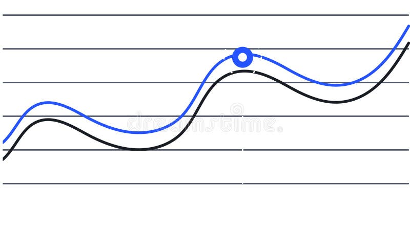
Free with trial Two lines are representing data progression over time, one blue and one black, creating a visual representation of trends and a key intersection point is marked with a blue circle. Performance decrease illustrations Two lines are representing data progression over time, one blue and one black, creating a visual representation of
Free with trial Two lines are representing data progression over time, one blue and one black, creating a visual representation of trends and a key intersection point is marked with a blue circle. Performance decrease vectors Two lines are representing data progression over time, one blue and one black, creating a visual representation of
Free with trial This close-up image showcases the effect of a cloudy day on solar panel performance. While solar panels are a crucial component of renewable energy systems, the presence of clouds significantly reduces the amount of sunlight reaching the panels' surface. This decrease in solar irradiance directly impacts the energy conversion process. Visible in the image are the solar panels' photovoltaic. Performance decrease illustrations Cloudy Skies Diminish Solar Panel Efficiency A CloseUp Look at the Impact of Weather on Renewable Energy Production. This close-up image showcases the effect of a cloudy day on solar panel performance. While solar panels are a crucial component of renewable energy systems, the presence of clouds significantly reduces the amount of sunlight reaching the panels' surface. This decrease in solar irradiance directly impacts the energy conversion process. Visible in the image are the solar panels' photovoltaic
Free with trial Financial market downturn stock chart arrows falling business decline. Performance decrease illustrations Visual representation of financial market decline with falling stock charts and downward arrows signifying economic recession. Financial market downturn stock chart arrows falling business decline
Free with trial A three-dimensional chart displaying colorful lines and coin representations illustrates trends in data, highlighting key financial insights and fluctuations over time. Performance decrease illustrations Trend Analysis with Colorful Graph Lines and Currency Coins Representing Data Points on a Three-Dimensional Chart. A three-dimensional chart displaying colorful lines and coin representations illustrates trends in data, highlighting key financial insights and fluctuations over time
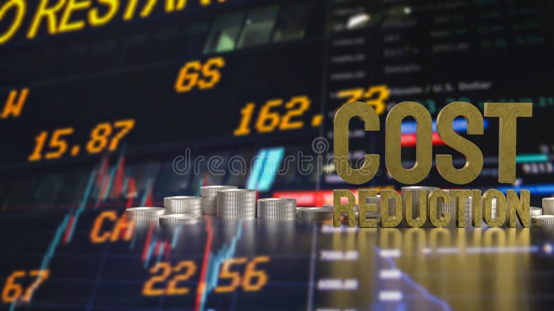
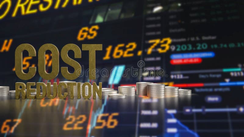
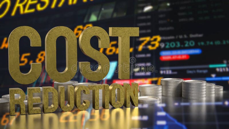
Free with trial The Cost reduction and coins for Business concept 3d rendering. Performance decrease illustrations The Cost reduction and coins for Business concept 3d rendering
Free with trial The Cost reduction and coins for Business concept 3d rendering. Performance decrease illustrations The Cost reduction and coins for Business concept 3d rendering
Free with trial The Cost reduction and coins for Business concept 3d rendering. Performance decrease illustrations The Cost reduction and coins for Business concept 3d rendering
Free with trial The Cost reduction and coins for Business concept 3d rendering. Performance decrease illustrations The Cost reduction and coins for Business concept 3d rendering
Free with trial The Cost reduction and coins for Business concept 3d rendering. Performance decrease illustrations The Cost reduction and coins for Business concept 3d rendering
Free with trial The Cost reduction and coins for Business concept 3d rendering. Performance decrease illustrations The Cost reduction and coins for Business concept 3d rendering
Free with trial A vibrant line graph visually representing fluctuating data trends over time, highlighting growth with colorful markers in green, yellow, and orange for better insights. Performance decrease illustrations Colorful Line Graph Showing Data Trends with Green, Yellow, and Orange Indicators Representing Growth and Fluctuations Across. A vibrant line graph visually representing fluctuating data trends over time, highlighting growth with colorful markers in green, yellow, and orange for better insights
Free with trial The Cost reduction and coins for Business concept 3d rendering. Performance decrease illustrations The Cost reduction and coins for Business concept 3d rendering
Free with trial The Cost reduction and coins for Business concept 3d rendering. Performance decrease illustrations The Cost reduction and coins for Business concept 3d rendering
Free with trial The Cost reduction and coins for Business concept 3d rendering. Performance decrease illustrations The Cost reduction and coins for Business concept 3d rendering
Free with trial The Cost reduction and coins for Business concept 3d rendering. Performance decrease illustrations The Cost reduction and coins for Business concept 3d rendering
Free with trial The Cost reduction and coins for Business concept 3d rendering. Performance decrease illustrations The Cost reduction and coins for Business concept 3d rendering
Free with trial The Cost reduction and coins for Business concept 3d rendering. Performance decrease illustrations The Cost reduction and coins for Business concept 3d rendering
Free with trial Red arrow pointing down with stacks of gold coins. Represents financial market decline, economic recession, and investment loss. Business downturn and decreasing profits. Performance decrease illustrations Red arrow pointing down with stacks of gold coins financial market decline recession. Red arrow pointing down with stacks of gold coins. Represents financial market decline, economic recession, and investment loss. Business downturn and decreasing profits
Free with trial This illustration features two colorful bar graphs on a white background, showcasing data comparison with distinct color palettes for engaging visual analysis and presentations. Performance decrease illustrations Colorful Bar Graphs on White Background Representing Data Comparison and Growth with Different Color Schemes for Visual Analysis. This illustration features two colorful bar graphs on a white background, showcasing data comparison with distinct color palettes for engaging visual analysis and presentations
Free with trial Energy reduction icon logo sign vector outline in black and white color. Performance decrease vectors Energy reduction icon symbol set collection. Energy reduction simple vector sign bundle. Energy reduction icon logo sign vector outline in black and white color
Free with trial This vibrant bar graph displays data trends through colorful segments, ideal for marketing and business presentations. Utilize this minimalistic design for impactful insights. Performance decrease illustrations Colorful Bar Graph Showing Data Trends with Various Heights and Colors in a Minimalistic Style for Business and Marketing. This vibrant bar graph displays data trends through colorful segments, ideal for marketing and business presentations. Utilize this minimalistic design for impactful insights
Free with trial The visual depicts a financial bar chart in a minimalist style, showcasing a decline with bars in gradient hues, creating a striking contrast against a dark background. Performance decrease illustrations A minimalist representation of a collapsing financial bar chart with vibrant colors. The visual depicts a financial bar chart in a minimalist style, showcasing a decline with bars in gradient hues, creating a striking contrast against a dark background.
Free with trial This vibrant line chart illustrates growth and decline trends with colored circles, making it suitable for business presentations, reports, and educational material. Performance decrease illustrations Colorful Line Chart Showing Growth and Decline Trends with Green, Yellow, and Red Circles Representing Data Points over Time. This vibrant line chart illustrates growth and decline trends with colored circles, making it suitable for business presentations, reports, and educational material
Free with trial This vibrant image features a collection of colorful 3D bar graphs representing data trends, perfect for visualizing statistics in business presentations and analyses. Performance decrease illustrations Colorful Bar Graph with 3D Shapes Representing Data Trends and Visualizing Statistics in Business and Finance Environments. This vibrant image features a collection of colorful 3D bar graphs representing data trends, perfect for visualizing statistics in business presentations and analyses