Free with trial The Cost reduction and coins for Business concept 3d rendering. Performance decrease illustrations The Cost reduction and coins for Business concept 3d rendering
Free with trial Graph line icon. Neumorphic, Green gradient, 3d pin buttons. Column chart sign. Growth diagram symbol. Line icons. Neumorphic buttons with outline signs. Vector. Performance decrease vectors Graph line icon. Column chart sign. Line icons. Vector. Graph line icon. Neumorphic, Green gradient, 3d pin buttons. Column chart sign. Growth diagram symbol. Line icons. Neumorphic buttons with outline signs. Vector
Free with trial Magnifying glass focuses on downward trend in financial spreadsheet during recession. Spreadsheet data shows, significant decline. Economic downturn evident. Detailed financial analysis. Performance decrease illustrations Magnifying glass focuses on downward trend in financial spreadsheet during recession. Spreadsheet data shows significant decline. Magnifying glass focuses on downward trend in financial spreadsheet during recession. Spreadsheet data shows, significant decline. Economic downturn evident. Detailed financial analysis.
Free with trial The Cost reduction and coins for Business concept 3d rendering. Performance decrease illustrations The Cost reduction and coins for Business concept 3d rendering
Free with trial The Cost reduction and coins for Business concept 3d rendering. Performance decrease illustrations The Cost reduction and coins for Business concept 3d rendering
Free with trial The Cost reduction and coins for Business concept 3d rendering. Performance decrease illustrations The Cost reduction and coins for Business concept 3d rendering
Free with trial The Cost reduction and coins for Business concept 3d rendering. Performance decrease illustrations The Cost reduction and coins for Business concept 3d rendering
Free with trial A vibrant line graph visually representing fluctuating data trends over time, highlighting growth with colorful markers in green, yellow, and orange for better insights. Performance decrease illustrations Colorful Line Graph Showing Data Trends with Green, Yellow, and Orange Indicators Representing Growth and Fluctuations Across. A vibrant line graph visually representing fluctuating data trends over time, highlighting growth with colorful markers in green, yellow, and orange for better insights
Free with trial The Cost reduction and coins for Business concept 3d rendering. Performance decrease illustrations The Cost reduction and coins for Business concept 3d rendering
Free with trial The Cost reduction and coins for Business concept 3d rendering. Performance decrease illustrations The Cost reduction and coins for Business concept 3d rendering
Free with trial The Cost reduction and coins for Business concept 3d rendering. Performance decrease illustrations The Cost reduction and coins for Business concept 3d rendering
Free with trial The Cost reduction and coins for Business concept 3d rendering. Performance decrease illustrations The Cost reduction and coins for Business concept 3d rendering
Free with trial The Cost reduction and coins for Business concept 3d rendering. Performance decrease illustrations The Cost reduction and coins for Business concept 3d rendering
Free with trial The Cost reduction and coins for Business concept 3d rendering. Performance decrease illustrations The Cost reduction and coins for Business concept 3d rendering
Free with trial Red arrow pointing down with stacks of gold coins. Represents financial market decline, economic recession, and investment loss. Business downturn and decreasing profits. Performance decrease illustrations Red arrow pointing down with stacks of gold coins financial market decline recession. Red arrow pointing down with stacks of gold coins. Represents financial market decline, economic recession, and investment loss. Business downturn and decreasing profits
Free with trial This illustration features two colorful bar graphs on a white background, showcasing data comparison with distinct color palettes for engaging visual analysis and presentations. Performance decrease illustrations Colorful Bar Graphs on White Background Representing Data Comparison and Growth with Different Color Schemes for Visual Analysis. This illustration features two colorful bar graphs on a white background, showcasing data comparison with distinct color palettes for engaging visual analysis and presentations
Free with trial Energy reduction icon logo sign vector outline in black and white color. Performance decrease vectors Energy reduction icon symbol set collection. Energy reduction simple vector sign bundle. Energy reduction icon logo sign vector outline in black and white color
Free with trial This vibrant bar graph displays data trends through colorful segments, ideal for marketing and business presentations. Utilize this minimalistic design for impactful insights. Performance decrease illustrations Colorful Bar Graph Showing Data Trends with Various Heights and Colors in a Minimalistic Style for Business and Marketing. This vibrant bar graph displays data trends through colorful segments, ideal for marketing and business presentations. Utilize this minimalistic design for impactful insights
Free with trial The visual depicts a financial bar chart in a minimalist style, showcasing a decline with bars in gradient hues, creating a striking contrast against a dark background. Performance decrease illustrations A minimalist representation of a collapsing financial bar chart with vibrant colors. The visual depicts a financial bar chart in a minimalist style, showcasing a decline with bars in gradient hues, creating a striking contrast against a dark background.
Free with trial This vibrant line chart illustrates growth and decline trends with colored circles, making it suitable for business presentations, reports, and educational material. Performance decrease illustrations Colorful Line Chart Showing Growth and Decline Trends with Green, Yellow, and Red Circles Representing Data Points over Time. This vibrant line chart illustrates growth and decline trends with colored circles, making it suitable for business presentations, reports, and educational material
Free with trial This vibrant image features a collection of colorful 3D bar graphs representing data trends, perfect for visualizing statistics in business presentations and analyses. Performance decrease illustrations Colorful Bar Graph with 3D Shapes Representing Data Trends and Visualizing Statistics in Business and Finance Environments. This vibrant image features a collection of colorful 3D bar graphs representing data trends, perfect for visualizing statistics in business presentations and analyses
Free with trial A person holding a glowing globe with arrows indicating rising quality and falling costs. Performance decrease illustrations Concept of improving quality while reducing costs with a global view. A person holding a glowing globe with arrows indicating rising quality and falling costs
Free with trial Isolated red and green arrows for infographics representing economic trends and indicators. Performance decrease illustrations Isolated red and green arrows for infographics representing economic trends and indicators
Free with trial Concept Financial Decline, Red Candlestick Graph, Stock Market, Economic Downturn, Financial Crisis Decline in financial status illustrated by red candlestick background in stock market graph. Performance decrease illustrations Decline in financial status illustrated by red candlestick background in stock market graph. Concept Financial Decline, Red Candlestick Graph, Stock Market, Economic Downturn, Financial Crisis Decline in financial status illustrated by red candlestick background in stock market graph
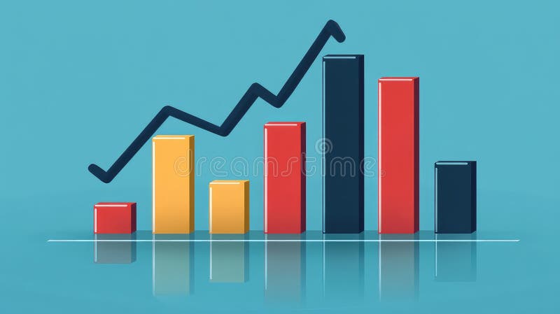
Free with trial Colorful bar chart with a line graph presenting trends and data growth over time, ideal for business analysis, marketing presentations, and financial reports. Performance decrease illustrations Colorful Bar Chart with Line Graph Illustrating Trends and Data Growth over Time For Business, Marketing, Finance and Analysis Use. Colorful bar chart with a line graph presenting trends and data growth over time, ideal for business analysis, marketing presentations, and financial reports
Free with trial Four colorful bar charts are displayed on a graph, representing trends, statistics, and timeline data, with a potential focus on business infographics elements. Performance decrease illustrations Four colorful bar charts are displayed on a graph, representing trends, statistics, and timeline data, with a potential
Free with trial Report timer line icon. Neumorphic, Orange gradient, 3d pin buttons. Column graph sign. Growth diagram chart symbol. Line icons. Neumorphic buttons with outline signs. Vector. Performance decrease vectors Report timer line icon. Column graph sign. Line icons. Vector. Report timer line icon. Neumorphic, Orange gradient, 3d pin buttons. Column graph sign. Growth diagram chart symbol. Line icons. Neumorphic buttons with outline signs. Vector
Free with trial This illustration features two colorful bar graphs on a white background, showcasing data comparison with distinct color palettes for engaging visual analysis and presentations. Performance decrease illustrations Colorful Bar Graphs on White Background Representing Data Comparison and Growth with Different Color Schemes for Visual Analysis. This illustration features two colorful bar graphs on a white background, showcasing data comparison with distinct color palettes for engaging visual analysis and presentations
Free with trial This abstract data visualization features smooth blue waves representing trends and fluctuations, ideal for business reports, finance presentations, and analytical insights. Performance decrease illustrations Abstract Blue Data Visualization Depicting Trends and Fluctuations in Graphical Format for Business and Finance Presentations. This abstract data visualization. This abstract data visualization features smooth blue waves representing trends and fluctuations, ideal for business reports, finance presentations, and analytical insights
Free with trial Vector illustration of a graph with a downward arrow, representing decline or negative growth. Performance decrease vectors Professional Graph with Arrow Down Outline Icon Vector Illustration. Vector illustration of a graph with a downward arrow, representing decline or negative growth.
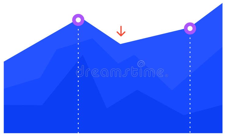
Free with trial Blue graph chart is visually representing growth, decline, and subsequent recovery, with two key points highlighted by purple circles and a red arrow indicating a temporary dip. Performance decrease illustrations Blue graph chart is visually representing growth, decline, and subsequent recovery, with two key points highlighted by
Free with trial Blue graph chart is visually representing growth, decline, and subsequent recovery, with two key points highlighted by purple circles and a red arrow indicating a temporary dip. Performance decrease vectors Blue graph chart is visually representing growth, decline, and subsequent recovery, with two key points highlighted by
Free with trial Vibrant and colorful bar chart illustrating various data metrics, perfect for business or marketing use, highlighting trends and insights visually engaging for audiences. Performance decrease illustrations Colorful Bar Chart Showing Data Variations in a Bright and Engaging Style Suitable for Business Presentations or Marketing. Vibrant and colorful bar chart illustrating various data metrics, perfect for business or marketing use, highlighting trends and insights visually engaging for audiences
Free with trial An analytical hand holding a magnifying glass over a stock market chart, symbolizing investment analysis and financial insight, Generative AI. Performance decrease illustrations An analytical hand holding a magnifying glass over a stock market chart, symbolizing investment analysis and financial insight
Free with trial A visually appealing line graph illustrates data fluctuations and trends over time. The minimalist design makes it suitable for presentations and reports in various fields. Performance decrease illustrations Line graph depicting data trends with fluctuations and peaks over time in a minimalist style, showcasing analytical insights and. A visually appealing line graph illustrates data fluctuations and trends over time. The minimalist design makes it suitable for presentations and reports in various fields
Free with trial Abstract 3D bar graph representation showcasing various data trends with vibrant colors and shadows. Ideal for presentations, reports, and analytics purposes. Performance decrease illustrations 3D Visualization of Colorful Bar Graph Illustrating Data Trends with Shadows and Depth in a Minimalistic Style for Data Analysis. Abstract 3D bar graph representation showcasing various data trends with vibrant colors and shadows. Ideal for presentations, reports, and analytics purposes
Free with trial Exploring property loan interest rates for buying homes a detailed review with t bbfc in natural settings generative ai illustration. Performance decrease illustrations Exploring property loan interest rates for buying homes a detailed review with t bbfc in natural settings
Free with trial Vector illustration stacked coins and arrow trending down, decreasing statistical graphic concept. Performance decrease vectors Vector illustration stack coin arrow downup trend. vector illustration stacked coins and arrow trending down, decreasing statistical graphic concept
Free with trial Featuring four vibrant business charts illustrating increasing, decreasing, fluctuating, and peaking trends, perfect for enhancing presentations and reports with clear visual data analysis. Performance decrease vectors Featuring four vibrant business charts illustrating increasing, decreasing, fluctuating, and peaking trends, perfect for
Free with trial This vibrant line graph showcases multiple data series, illustrating trends and fluctuations over time with a clear light grid background, perfect for reports. Performance decrease illustrations Colorful Line Graph Representing Data Trends Over Time with Multiple Data Series and Fluctuating Values on a Light Grid Background. This vibrant line graph showcases multiple data series, illustrating trends and fluctuations over time with a clear light grid background, perfect for reports
Free with trial Two colorful lines are representing data points over time, creating a visual representation of trends and fluctuations, with a highlighted period marked in red. Performance decrease vectors Two colorful lines are representing data points over time, creating a visual representation of trends and fluctuations
Free with trial This abstract financial stock market trading chart with a gold arrow downtrend on a blue background conveys the concept of market volatility and uncertainty. The downward trend of the gold arrow symbolizes a decrease in stock prices or economic instability. The blue background may represent calmness or trust in the financial system despite the fluctuations. This image captures the essence of the dynamic nature of the stock market and the importance of monitoring trends for successful trading strategies. Performance decrease illustrations Abstract Financial Stock Market Trading Chart with Gold Arrow Downtrend on Blue Background. This abstract financial stock market trading chart with a gold arrow downtrend on a blue background conveys the concept of market volatility and uncertainty. The downward trend of the gold arrow symbolizes a decrease in stock prices or economic instability. The blue background may represent calmness or trust in the financial system despite the fluctuations. This image captures the essence of the dynamic nature of the stock market and the importance of monitoring trends for successful trading strategies.
Free with trial Graph depicting 3D line and bar data visualization in red, white background, financial trends concept. Performance decrease illustrations Graph showing 3D line and bar data visualization in red, white background, financial trends concept
Free with trial Bright and colorful bar graph created with blocks illustrates data visualization in a contemporary business context. Ideal for finance and marketing materials. Performance decrease illustrations Colorful bar graph made of building blocks representing data visualization and analysis in modern business graphics on a clean. Bright and colorful bar graph created with blocks illustrates data visualization in a contemporary business context. Ideal for finance and marketing materials
Free with trial This vibrant 3D bar graph showcases data trends with a colorful aesthetic, perfect for presentations in business, finance, or technology sectors emphasizing analytics. Performance decrease illustrations Colorful Bar Graph Visualization of Data Trends in Modern Business Environment with 3D Perspective and Vibrant Gradient Colors. This vibrant 3D bar graph showcases data trends with a colorful aesthetic, perfect for presentations in business, finance, or technology sectors emphasizing analytics
Free with trial Productivity , diagram bar with gear icon symbol. Vector illustration. Performance decrease vectors Productivity , diagram bar with gear icon. Vector illustration
Free with trial Concept Declining Financial Market, Red Candlestick Background, Stock Market Graph, Economic Downturn Decline in financial market illustrated by red candlestick background in stock market graph. Performance decrease illustrations Decline in financial market illustrated by red candlestick background in stock market graph. Concept Declining Financial Market, Red Candlestick Background, Stock Market Graph, Economic Downturn Decline in financial market illustrated by red candlestick background in stock market graph
Free with trial This abstract artwork illustrates financial market dynamics with intricate lines and colors, representing stock price movements and trading patterns artistically. Performance decrease illustrations Abstract financial market analysis with intricate lines depicting stock price movements and trading patterns in shades of black. This abstract artwork illustrates financial market dynamics with intricate lines and colors, representing stock price movements and trading patterns artistically
Free with trial The visualization displays a collapsing financial bar chart, illustrating a significant decrease in financial metrics with a clean, minimalist aesthetic. Performance decrease illustrations Visual representation of financial decline using a collapsing bar chart in a modern design. The visualization displays a collapsing financial bar chart, illustrating a significant decrease in financial metrics with a clean, minimalist aesthetic.
Free with trial Featuring four vibrant business charts illustrating increasing, decreasing, fluctuating, and peaking trends, perfect for enhancing presentations and reports with clear visual data analysis. Performance decrease illustrations Featuring four vibrant business charts illustrating increasing, decreasing, fluctuating, and peaking trends, perfect for
Free with trial Decline chart icon. Falling arrow symbol. Economic downturn illustration. Vector trend design. EPS 10. Performance decrease vectors Decline chart icon. Falling arrow symbol. Economic downturn illustration. Vector trend design.
Free with trial Two colorful lines are representing data points over time, creating a visual representation of trends and fluctuations, with a highlighted period marked in red. Performance decrease illustrations Two colorful lines are representing data points over time, creating a visual representation of trends and fluctuations
Free with trial Glowing Candlestick Chart Depicting Downward Trend in Market Generative AI Illustration. Performance decrease illustrations Glowing Candlestick Chart Depicting Downward Trend in Market
Free with trial Stock market charts depicting a downward trend, symbolizing a financial crisis, set on a dark, abstract background, illustrating the concept of economic decline. Performance decrease illustrations Stock market charts depicting a downward trend, symbolizing a financial crisis, set on a dark, abstract background, illustrating
Free with trial Upward and downward arrows with a percentage symbol. An illustration of arrows pointing up and down, often used to represent changes, fluctuations, or progress, along with a percentage symbol. Performance decrease vectors Upward and Downward Arrows with Percentage, Financial Growth and Decline Concept. Upward and downward arrows with a percentage symbol. An illustration of arrows pointing up and down, often used to represent changes, fluctuations, or progress, along with a percentage symbol.
Free with trial Upward and downward arrows with a percentage symbol. An illustration of arrows pointing up and down, often used to represent changes, fluctuations, or progress, along with a percentage symbol. Performance decrease vectors Upward and Downward Arrows with Percentage, Financial Growth and Decline Concept. Upward and downward arrows with a percentage symbol. An illustration of arrows pointing up and down, often used to represent changes, fluctuations, or progress, along with a percentage symbol.
Free with trial Upward and downward arrows with a percentage symbol. An illustration of arrows pointing up and down, often used to represent changes, fluctuations, or progress, along with a percentage symbol. Performance decrease vectors Upward and Downward Arrows with Percentage, Financial Growth and Decline Concept. Upward and downward arrows with a percentage symbol. An illustration of arrows pointing up and down, often used to represent changes, fluctuations, or progress, along with a percentage symbol.
Free with trial Male and female characters beside a financial downfall chart, vector illustration on a blue background, concept of business success. Flat cartoon vector illustration. Performance decrease vectors Male and female characters beside a financial downfall chart, vector illustration
Free with trial Analytics graph line icon. Neumorphic, Red gradient, 3d pin buttons. Column chart sign. Growth diagram symbol. Line icons. Neumorphic buttons with outline signs. Vector. Performance decrease illustrations Analytics graph line icon. Column chart sign. Line icons. Vector. Analytics graph line icon. Neumorphic, Red gradient, 3d pin buttons. Column chart sign. Growth diagram symbol. Line icons. Neumorphic buttons with outline signs. Vector
Free with trial Image displaying stock market chart, rising or falling trends Generative AI. Performance decrease illustrations Image displaying stock market chart, rising or falling trends
Free with trial Financial data shows downward trend. Spreadsheet exhibits economic decline. Magnifying glass focuses on, negative indicators. Business recession impacting market. Stock loss visible. Performance decrease illustrations Financial data shows downward trend. Spreadsheet exhibits economic decline. Magnifying glass focuses on negative indicators. Financial data shows downward trend. Spreadsheet exhibits economic decline. Magnifying glass focuses on, negative indicators. Business recession impacting market. Stock loss visible.
Free with trial Magnifying glass focuses on declining spreadsheet numbers during economic downturn. Financial data shows significant drop in figures. Business analyst examines, alarming trend. Performance decrease illustrations Magnifying glass focuses on declining spreadsheet numbers during economic downturn. Financial data shows significant drop in
Free with trial Report document line icon. Neumorphic, Purple gradient, 3d pin buttons. Column graph sign. Growth diagram, pie chart symbol. Line icons. Neumorphic buttons with outline signs. Vector. Performance decrease vectors Report document line icon. Column graph sign. Line icons. Vector. Report document line icon. Neumorphic, Purple gradient, 3d pin buttons. Column graph sign. Growth diagram, pie chart symbol. Line icons. Neumorphic buttons with outline signs. Vector
Free with trial Financial decline highlighted by magnifying glass over spreadsheet. Red arrow chart trend downward on document during recession. Analysis of negative market indicator, with business. Performance decrease illustrations Financial decline highlighted by magnifying glass over spreadsheet. Red arrow chart trend downward on document during recession.
Free with trial Stacked coins and a red arrow graph representing financial crisis on a dark blue background, concept of market crash. 3D Rendering. Performance decrease illustrations Stacked coins and a red arrow graph representing financial crisis on a dark blue background, concept of market crash.
Free with trial 3D delivery truck with arrow graph, transportation and inflation concept Generative AI. Performance decrease illustrations 3D delivery truck with arrow graph, transportation and inflation concept
Free with trial Flat Design Illustration of NPL Risk Analysis with Declining Bar Chart, Highlighting Financial Trends and Risks. Ideal. Performance decrease illustrations Flat Design Illustration of NPL Risk Analysis with Declining Bar Chart, Highlighting Financial Trends and Risks. Ideal
Free with trial Graph line icon. Neumorphic, Purple gradient, 3d pin buttons. Column chart sign. Growth diagram symbol. Line icons. Neumorphic buttons with outline signs. Vector. Performance decrease vectors Graph line icon. Column chart sign. Line icons. Vector. Graph line icon. Neumorphic, Purple gradient, 3d pin buttons. Column chart sign. Growth diagram symbol. Line icons. Neumorphic buttons with outline signs. Vector
Free with trial Dynamic chart displaying a downward trend with red lines, illustrating financial decline or market volatility, Generative AI. Performance decrease illustrations Dynamic chart displaying a downward trend with red lines, illustrating financial decline or market volatility
Free with trial 3D Isometric Flat Vector Illustration of Business Chart, Data and Statistic. Performance decrease vectors 3D Isometric Flat Vector Illustration of Business Chart
Free with trial Red And Yellow Lines Trending Upwards On A Line Graph. Business, Finance, Investment Concept, Generated by AI. Performance decrease illustrations Red And Yellow Lines Trending Upwards On A Line Graph. Business, Finance, Investment Concept
Free with trial Graph line icon. Neumorphic, Blue gradient, 3d pin buttons. Column chart sign. Growth diagram symbol. Line icons. Neumorphic buttons with outline signs. Vector. Performance decrease vectors Graph line icon. Column chart sign. Line icons. Vector. Graph line icon. Neumorphic, Blue gradient, 3d pin buttons. Column chart sign. Growth diagram symbol. Line icons. Neumorphic buttons with outline signs. Vector
Free with trial Multicolored graph trending downward icon. Performance decrease illustrations Wfh140125. Multicolored graph trending downward icon
Free with trial 3D Isometric Flat Vector Illustration of Interest Rate Fall, Economic Downturn, Impact Of Falling Inflation, and Stock Market Value Loss. Performance decrease vectors 3D Isometric Flat Vector Illustration of Interest Rate Fall
Free with trial Business refers to the organized efforts and activities of individuals or groups to produce, buy, sell, and exchange goods or services for profit. Performance decrease illustrations The Arrow down and coins for Business concept 3d rendering. Business refers to the organized efforts and activities of individuals or groups to produce, buy, sell, and exchange goods or services for profit
Free with trial Business refers to the organized efforts and activities of individuals or groups to produce, buy, sell, and exchange goods or services for profit. Performance decrease illustrations The Arrow down and coins for Business concept 3d rendering. Business refers to the organized efforts and activities of individuals or groups to produce, buy, sell, and exchange goods or services for profit
Free with trial Business refers to the organized efforts and activities of individuals or groups to produce, buy, sell, and exchange goods or services for profit. Performance decrease illustrations The Arrow down and coins for Business concept 3d rendering. Business refers to the organized efforts and activities of individuals or groups to produce, buy, sell, and exchange goods or services for profit
Free with trial Business refers to the organized efforts and activities of individuals or groups to produce, buy, sell, and exchange goods or services for profit. Performance decrease illustrations The piggy bank and coins for Business concept 3d rendering. Business refers to the organized efforts and activities of individuals or groups to produce, buy, sell, and exchange goods or services for profit
Free with trial Business refers to the organized efforts and activities of individuals or groups to produce, buy, sell, and exchange goods or services for profit. Performance decrease illustrations The piggy bank and coins for Business concept 3d rendering. Business refers to the organized efforts and activities of individuals or groups to produce, buy, sell, and exchange goods or services for profit
Free with trial Business refers to the organized efforts and activities of individuals or groups to produce, buy, sell, and exchange goods or services for profit. Performance decrease illustrations The Arrow down and coins for Business concept 3d rendering. Business refers to the organized efforts and activities of individuals or groups to produce, buy, sell, and exchange goods or services for profit
 Sign in