Free with trial A shiny golden arrow forms a path that initially moves upward, then dips down, and finally turns upward again, presented in a 3D render against a clean white background. This abstract representation symbolizes financial growth, market fluctuations, and business progress. Trend decrease illustrations Golden Arrow Graph Showing Upward Trend and Downturn on White Background chart. A shiny golden arrow forms a path that initially moves upward, then dips down, and finally turns upward again, presented in a 3D render against a clean white background. This abstract representation symbolizes financial growth, market fluctuations, and business progress
Free with trial A 3D rendered image features two glossy, red arrows in a dynamic, circular arrangement. One arrow points upwards, signifying growth or increase, while the other points downwards, representing decline or decrease. The arrows are highly reflective and are presented against a clean white background, emphasizing their form and the concept of opposing directions or change. Trend decrease illustrations Glossy Red Arrows Pointing Up and Down in a Circular Motion on a White Background image photo. A 3D rendered image features two glossy, red arrows in a dynamic, circular arrangement. One arrow points upwards, signifying growth or increase, while the other points downwards, representing decline or decrease. The arrows are highly reflective and are presented against a clean white background, emphasizing their form and the concept of opposing directions or change
Free with trial A bar chart displays four vertical bars in red, yellow, green, and blue, arranged in descending height from left to right. A thick, black arrow curves downwards from the top right, pointing towards the bars and indicating a downward trend or decline. The chart is presented on a plain white background. Trend decrease illustrations Downward Trending Bar Chart with Red Yellow Green Blue Bars and Black Arrow graph statistics. A bar chart displays four vertical bars in red, yellow, green, and blue, arranged in descending height from left to right. A thick, black arrow curves downwards from the top right, pointing towards the bars and indicating a downward trend or decline. The chart is presented on a plain white background
Free with trial Analysis stretching line graph illustration chvisualization axis, points curve, increase decrease analysis stretching line graph. Trend decrease illustrations Analysis stretching line graph
Free with trial Design red down arrow illustration symbol direction, pointer navigation, indicator decrease design red down arrow. Trend decrease illustrations Design red down arrow
Free with trial A detailed red financial graph illustrates a sharp downward trend in stock prices. Candlestick bars and a wavy line graph show a significant decline, with red arrows reinforcing the negative movement. The dark background features a grid, and a bright light emanates from the left side of the image. Trend decrease illustrations Red Financial Graph with Falling Stock Prices stock market. A detailed red financial graph illustrates a sharp downward trend in stock prices. Candlestick bars and a wavy line graph show a significant decline, with red arrows reinforcing the negative movement. The dark background features a grid, and a bright light emanates from the left side of the image
Free with trial This image displays a stock market chart that shows the daily price fluctuations of a particular stock over a period from January 1 to February 1. The chart includes green and red candlesticks representing price movements, with green indicating an increase and red indicating a decrease. The y-axis represents the stock price ranging from 5000 to 12000, while the x-axis shows the timeline. The chart. Trend decrease illustrations Stock market chart showing daily price fluctuations. This image displays a stock market chart that shows the daily price fluctuations of a particular stock over a period from January 1 to February 1. The chart includes green and red candlesticks representing price movements, with green indicating an increase and red indicating a decrease. The y-axis represents the stock price ranging from 5000 to 12000, while the x-axis shows the timeline. The chart
Free with trial Visualization melting line chart illustration trend graph, temperature plot, axis series visualization melting line chart. Trend decrease illustrations Visualization melting line chart
Free with trial This 3D render visually represents a financial crisis or economic recession. Four stacks of gold coins, decreasing in height from left to right, are depicted. A prominent red arrow, symbolizing a downward trend, points towards the smallest coin stack, emphasizing a significant decline. The clean, minimalist background with a reflective surface enhances the focus on the financial concept. This image is ideal for illustrating concepts like market crash, investment loss, bankruptcy, or economic instability. Trend decrease vectors Financial Downturn: Declining Coin Stacks and Red Arrow. This 3D render visually represents a financial crisis or economic recession. Four stacks of gold coins, decreasing in height from left to right, are depicted. A prominent red arrow, symbolizing a downward trend, points towards the smallest coin stack, emphasizing a significant decline. The clean, minimalist background with a reflective surface enhances the focus on the financial concept. This image is ideal for illustrating concepts like market crash, investment loss, bankruptcy, or economic instability.
Free with trial A professional 3D rendering of a bar chart representing a negative trend or financial loss. The illustration features three textured blue metallic columns with a prominent, jagged red arrow pointing downwards across them. This graphic symbolizes economic recession, market crashes, or decreasing sales figures. It is mounted on a sleek grey base and isolated on a white background, making it perfect for business presentations, investment risk analysis, and economic reports. Trend decrease vectors 3D Downward Bar Chart with Red Arrow - Financial Loss & Recession Concept. A professional 3D rendering of a bar chart representing a negative trend or financial loss. The illustration features three textured blue metallic columns with a prominent, jagged red arrow pointing downwards across them. This graphic symbolizes economic recession, market crashes, or decreasing sales figures. It is mounted on a sleek grey base and isolated on a white background, making it perfect for business presentations, investment risk analysis, and economic reports.
Free with trial Falling bar chart with downward arrow representing business decline and financial problems. Ideal for risk, loss, and economic downturn concepts. Trend decrease vectors Business decline chart downward trend problem failure vector silhouette illustration design. Falling bar chart with downward arrow representing business decline and financial problems. Ideal for risk, loss, and economic downturn concepts
Free with trial Declining business graph. Financial crisis chart. Negative market trend. Black and white economic vector icons. Trend decrease vectors Financial loss bar chart icon set with falling arrow and dollar sign for economic recession. Declining business graph. Financial crisis chart. Negative market trend. Black and white economic vector icons
Free with trial Declining business graph. Financial crisis chart. Negative market trend. Black and white economic vector icons. Trend decrease illustrations Financial loss bar chart icon set with falling arrow and dollar sign for economic recession. Declining business graph. Financial crisis chart. Negative market trend. Black and white economic vector icons.
Free with trial A bright red 3d arrow pointing downwards, symbolizing a decrease or decline, often used in financial contexts. Trend decrease vectors Red downward arrow indicates economic decline. A bright red 3d arrow pointing downwards, symbolizing a decrease or decline, often used in financial contexts.
Free with trial Composite trend artwork sketch image 3D photo collage of team two young lady work office walk arrow way down clock deadline attention. Trend decrease illustrations Composite trend artwork sketch image 3D photo collage of team two young lady work office walk arrow way down clock
Free with trial A circular golden coin with a black glossy face. On the black surface, a golden bar graph shows a downward trend, with the bars decreasing in height from left to right. A golden arrow points downwards, emphasizing the decline. The coin is isolated on a white background. Trend decrease illustrations Golden Coin with Black Background Featuring a Falling Bar Graph and Downward Arrow falling graph. A circular golden coin with a black glossy face. On the black surface, a golden bar graph shows a downward trend, with the bars decreasing in height from left to right. A golden arrow points downwards, emphasizing the decline. The coin is isolated on a white background
Free with trial A clean line drawing showcases a magnifying glass focusing on a hand holding a declining bar graph with a downward. Trend decrease illustrations Declining Market Analysis Magnifying Glass on Loss Trend. A clean line drawing showcases a magnifying glass focusing on a hand holding a declining bar graph with a downward.
Free with trial Bearish disintegrating stock chart illustration trend selloff, downturn crash, correction recession bearish disintegrating stock chart. Trend decrease illustrations Bearish disintegrating stock chart
Free with trial A 3D illustration of a financial chart showing a dramatic downward trend. A large red arrow points sharply down over a series of declining blue bar graphs, symbolizing a stock market crash, economic recession, or business failure. The background features complex data and grids, representing financial analysis and market data. This image is perfect for concepts related to economic crisis, investment loss, financial risk, bankruptcy, and negative business reports. Trend decrease illustrations Stock Market Crash Financial Graph. A 3D illustration of a financial chart showing a dramatic downward trend. A large red arrow points sharply down over a series of declining blue bar graphs, symbolizing a stock market crash, economic recession, or business failure. The background features complex data and grids, representing financial analysis and market data. This image is perfect for concepts related to economic crisis, investment loss, financial risk, bankruptcy, and negative business reports.
Free with trial A visual representation of economic downturn, featuring eight identical red arrows, each adorned with a percentage symbol. The arrows are arranged in two rows of four, all directed downwards, suggesting a negative trend in financial markets, sales, or other quantifiable metrics. The gradient on the arrows adds a sense of depth and visual interest to the graphic. Trend decrease illustrations Eight red arrows pointing down with percentage signs symbolizing financial decline. A visual representation of economic downturn, featuring eight identical red arrows, each adorned with a percentage symbol. The arrows are arranged in two rows of four, all directed downwards, suggesting a negative trend in financial markets, sales, or other quantifiable metrics. The gradient on the arrows adds a sense of depth and visual interest to the graphic
Free with trial A 3D illustration depicting a series of stacks of gold coins decreasing in height from left to right, accompanied by a red arrow trending downwards, symbolizing financial loss, economic downturn, or decreasing wealth. Trend decrease vectors Financial Decline: Stacks of Gold Coins with Downward Trend. A 3D illustration depicting a series of stacks of gold coins decreasing in height from left to right, accompanied by a red arrow trending downwards, symbolizing financial loss, economic downturn, or decreasing wealth.
Free with trial A 3D bar chart displays four vertical bars of different heights and colors: red, yellow, green, and blue, arranged from left to right. A thick black arrow with a curved trajectory descends from the top right, pointing downwards and passing over the bars, indicating a negative trend or decline. The entire graphic is set against a plain white background. Trend decrease illustrations Downward Trending Bar Chart with a Black Arrow on White Background graph statistics. A 3D bar chart displays four vertical bars of different heights and colors: red, yellow, green, and blue, arranged from left to right. A thick black arrow with a curved trajectory descends from the top right, pointing downwards and passing over the bars, indicating a negative trend or decline. The entire graphic is set against a plain white background
Free with trial Conceptual line art depicting a decrease in gold prices. Trend decrease illustrations Gold Price Drop Magnifying Glass Showing Decreasing Value. Conceptual line art depicting a decrease in gold prices.
Free with trial A 3D cartoon illustration depicts a stylized hand with a black suit cuff pointing a finger downwards towards a red bar graph. The graph shows a clear downward trend with bars decreasing in height from left to right, colored green, yellow, orange, and red. A red arrow reinforces the concept of decline. The image is set against a white background. Trend decrease illustrations 3D Cartoon Hand Pointing Down at a Declining Bar Graph on White Background business. A 3D cartoon illustration depicts a stylized hand with a black suit cuff pointing a finger downwards towards a red bar graph. The graph shows a clear downward trend with bars decreasing in height from left to right, colored green, yellow, orange, and red. A red arrow reinforces the concept of decline. The image is set against a white background
Free with trial This image showcases a dynamic stock market graph, generated by AI, depicting a sharp downward trend in red. The vibrant red line against the black background creates a dramatic visual representation of market volatility. The image is perfect for illustrating concepts of risk, investment, and fina. Trend decrease illustrations Red Market Dip. This image showcases a dynamic stock market graph, generated by AI, depicting a sharp downward trend in red. The vibrant red line against the black background creates a dramatic visual representation of market volatility. The image is perfect for illustrating concepts of risk, investment, and fina
Free with trial The image depicts a red, three-dimensional arrow pointing downwards. The arrow has a wavy design, indicating a downward trend or decline. The arrow is set against a plain white background, emphasizing its vibrant red color and dynamic shape. Trend decrease illustrations Red downward arrow. The image depicts a red, three-dimensional arrow pointing downwards. The arrow has a wavy design, indicating a downward trend or decline. The arrow is set against a plain white background, emphasizing its vibrant red color and dynamic shape
Free with trial Visualization flat style streaming sales graph illustration trend revenue, chperformance metrics, dashboard report visualization flat style streaming sales graph. Trend decrease illustrations Visualization flat style streaming sales graph
Free with trial An empty corporate conference room featuring a large wooden table, office chairs, and a whiteboard displaying a hand-drawn graph indicating a downward trend in performance. Trend decrease illustrations Modern Office Conference Room Showing Financial Loss Chart. An empty corporate conference room featuring a large wooden table, office chairs, and a whiteboard displaying a hand-drawn graph indicating a downward trend in performance
Free with trial Modern black and white vector icons depicting financial trends like rising, falling, and stable graphs, dollar signs, and investment arrows for business presentations and reports. Trend decrease vectors Financial trend icons vector illustration showing profit loss growth and investment flat design. Modern black and white vector icons depicting financial trends like rising, falling, and stable graphs, dollar signs, and investment arrows for business presentations and reports.
Free with trial A 3D icon depicts a financial graph. The icon features a rounded purple square with a lighter purple top edge. Inside, a yellow line chart with circular data points shows an upward trend, overlaid on a series of yellow vertical bars representing a bar chart. The overall design is clean and modern, symbolizing data analysis, business growth, and financial performance. Trend decrease illustrations 3D icon representing a financial graph with bars and a line chart on a purple background. A 3D icon depicts a financial graph. The icon features a rounded purple square with a lighter purple top edge. Inside, a yellow line chart with circular data points shows an upward trend, overlaid on a series of yellow vertical bars representing a bar chart. The overall design is clean and modern, symbolizing data analysis, business growth, and financial performance
Free with trial A glowing neon red bar chart shows a significant downward trend, symbolizing financial loss or negative growth on a black backdrop. Trend decrease illustrations Neon red bar chart illustrating a steep decline in financial performance against a dark background. A glowing neon red bar chart shows a significant downward trend, symbolizing financial loss or negative growth on a black backdrop
Free with trial 3D chart illustration showing a red arrow and decreasing blue bars on a light background, representing loss, decline or negative trend. Trend decrease illustrations . 3D chart illustration showing a red arrow and decreasing blue bars on a light background, representing loss, decline or negative trend
Free with trial Two simple arrows on a white background. The red arrow points diagonally downward to the left, while the green arrow points diagonally upward to the right. Both arrows have a clean design with bold lines and sharp arrowheads, indicating contrast or opposing directions. Trend decrease vectors Up and Down Growth Arrows - Stock Market Trend Vector Symbols. Two simple arrows on a white background. The red arrow points diagonally downward to the left, while the green arrow points diagonally upward to the right. Both arrows have a clean design with bold lines and sharp arrowheads, indicating contrast or opposing directions.
Free with trial Golden showing a shiny golden downward pointing arrow on a white background keywords: arrow, gold, golden, down, downward, direction, decline, decrease, falling, negative trend, loss, recession, stock market, finance, business, economy, chart, graph, symbol, icon, 3d, render, isolated, white background, metallic, shiny, polished, pointing, movement, strategy, progress, setback, negative, downturn. Trend decrease illustrations A Shiny Golden Downward Pointing Arrow on a White Background Keywords: arrow, gold, golden, down, downward, direction, decline
Free with trial Black and white graph with dollar signs and decreasing trend line on white background. Trend decrease vectors Black map pin icon with white circle in center. Black and white graph with dollar signs and decreasing trend line on white background
Free with trial A straightforward and clear vector graphic of a bar chart illustrating a negative trend. The solid black bars steadily decrease in height from left to right. A thick diagonal arrow points downward, connecting the top of the first bar to the end of the chart, visually emphasizing the decline. This minimalist design is perfect for representing losses, financial downturns, or decreasing statistics. Trend decrease illustrations Declining Bar Chart Icon, AI Generated. A straightforward and clear vector graphic of a bar chart illustrating a negative trend. The solid black bars steadily decrease in height from left to right. A thick diagonal arrow points downward, connecting the top of the first bar to the end of the chart, visually emphasizing the decline. This minimalist design is perfect for representing losses, financial downturns, or decreasing statistics.
Free with trial A 3D rendered cartoon hand with a black cuff and white shirt sleeve points its index finger downwards towards a red bar chart. The chart displays a clear downward trend with bars of decreasing height in green, yellow, orange, and red, set on a dark gray base against a white background. Trend decrease illustrations 3D Cartoon Hand Pointing Down at Declining Bar Chart on White Background graph decline. A 3D rendered cartoon hand with a black cuff and white shirt sleeve points its index finger downwards towards a red bar chart. The chart displays a clear downward trend with bars of decreasing height in green, yellow, orange, and red, set on a dark gray base against a white background
Free with trial This image features a decreasing bar graph with a red downward arrow, isolated on a white background. The graph illustrates a downward trend in data, with blue bars progressively getting shorter. The white background provides a clean and clear contrast, emphasizing the visual elements of the graph. Trend decrease illustrations Decreasing bar graph arrow down isolated on white background. This image features a decreasing bar graph with a red downward arrow, isolated on a white background. The graph illustrates a downward trend in data, with blue bars progressively getting shorter. The white background provides a clean and clear contrast, emphasizing the visual elements of the graph
Free with trial Collection of simple black vector icons representing financial charts, data analysis graphs, and business statistics. Includes trend arrows, magnifier, and settings symbols. Trend decrease vectors Set of black business graph and chart icons for data analysis. Collection of simple black vector icons representing financial charts, data analysis graphs, and business statistics. Includes trend arrows, magnifier, and settings symbols
Free with trial A visual representation of a stock market candlestick chart is depicted with a downward trend. The chart features alternating red and green candlesticks, indicating price fluctuations. A subtle shadow is cast on the white background, adding depth to the financial data visualization. Trend decrease illustrations Downward Trending Stock Market Candlestick Chart with Red and Green Bars and Shadow finance. A visual representation of a stock market candlestick chart is depicted with a downward trend. The chart features alternating red and green candlesticks, indicating price fluctuations. A subtle shadow is cast on the white background, adding depth to the financial data visualization
Free with trial A magnifying glass focuses on a downward trend graph and briefcase, symbolizing economic downturn analysis and market. Trend decrease illustrations Economic Downturn Analysis Magnifying Glass on Market Decline. A magnifying glass focuses on a downward trend graph and briefcase, symbolizing economic downturn analysis and market.
Free with trial The image depicts a currency exchange concept with a prominent yen symbol at the center. Surrounding the yen symbol are two arrows, one in blue and one in red. The blue arrow points downward, indicating a decrease or downward trend, while the red arrow points upward, indicating an increase or upward trend. The background is plain white, which makes the blue and red arrows stand out clearly. The. Trend decrease vectors Currency exchange concept with yen symbol and arrows in blue and red. The image depicts a currency exchange concept with a prominent yen symbol at the center. Surrounding the yen symbol are two arrows, one in blue and one in red. The blue arrow points downward, indicating a decrease or downward trend, while the red arrow points upward, indicating an increase or upward trend. The background is plain white, which makes the blue and red arrows stand out clearly. The
Free with trial This image illustrates a bar graph showing an upward trend in financial growth, accompanied by a line graph depicting market fluctuations over time. Trend decrease illustrations Graphical representation of financial growth and fluctuation. This image illustrates a bar graph showing an upward trend in financial growth, accompanied by a line graph depicting market fluctuations over time
Free with trial This image shows a simple line graph with increasing and decreasing trends, ideal for visualizing data analysis and presenting key findings. The graph uses a clean, minimalist design to highlight the data points and overall trend. Perfect for presentations and reports. Trend decrease illustrations Analyze Your Data. This image shows a simple line graph with increasing and decreasing trends, ideal for visualizing data analysis and presenting key findings. The graph uses a clean, minimalist design to highlight the data points and overall trend. Perfect for presentations and reports.
Free with trial A pair of three-dimensional arrows, rendered in shades of gray, are presented against a white background. One arrow points upwards, signifying growth or progress, while the other points downwards, indicating decline or a decrease. The arrows are constructed from layered chevron shapes, creating a textured and modern appearance. Trend decrease illustrations 3D rendering of an upward and downward pointing chevron arrow pair on a white background. A pair of three-dimensional arrows, rendered in shades of gray, are presented against a white background. One arrow points upwards, signifying growth or progress, while the other points downwards, indicating decline or a decrease. The arrows are constructed from layered chevron shapes, creating a textured and modern appearance
Free with trial A striking red arrow points downwards on a soft gray background, signifying a negative trend. Trend decrease illustrations Bold red downward arrow symbol against a subtle gradient background illustrating decline. A striking red arrow points downwards on a soft gray background, signifying a negative trend
Free with trial A blue holographic graph showing a downward trend with bars and a line chart is projected over a dark conference table and chairs. Trend decrease illustrations Holographic graph displaying insurance reimbursement delays over a conference table chart. A blue holographic graph showing a downward trend with bars and a line chart is projected over a dark conference table and chairs
Free with trial A bold red zigzag arrow points downward, illustrating decline or decrease effectively. Trend decrease vectors Red zigzag arrow pointing downward on white background. A bold red zigzag arrow points downward, illustrating decline or decrease effectively.
Free with trial A bold, glossy red arrow curves downwards, pointing sharply to the left. It signifies a downward trend or direction. Trend decrease illustrations Vibrant red downward curved arrow symbol. A bold, glossy red arrow curves downwards, pointing sharply to the left. It signifies a downward trend or direction
Free with trial An image showing a series of stacked gold coins in descending order, with a large red downward-pointing arrow indicating a financial decline or economic downturn. Trend decrease illustrations Downward economic trend depicted by stacked coins and red arrow. An image showing a series of stacked gold coins in descending order, with a large red downward-pointing arrow indicating a financial decline or economic downturn
Free with trial A minimalist 3D icon rendered in white is presented against a light gray background. The icon features a square frame with rounded corners, containing a prominent downward-pointing arrow. Below the arrow, two percentage symbols are visible. The overall design suggests concepts of reduction, discount, or a downward trend. Trend decrease illustrations White 3D icon with a downward arrow and percentage symbols inside a square frame image photo. A minimalist 3D icon rendered in white is presented against a light gray background. The icon features a square frame with rounded corners, containing a prominent downward-pointing arrow. Below the arrow, two percentage symbols are visible. The overall design suggests concepts of reduction, discount, or a downward trend
Free with trial This image depicts a stack of coins with a downward trending arrow, symbolizing a decrease in cost-effectiveness. Trend decrease illustrations Illustration of decreasing cost-effectiveness with stacked coins. This image depicts a stack of coins with a downward trending arrow, symbolizing a decrease in cost-effectiveness
Free with trial A thick black arrow pointing downwards at an angle, indicating a decline on a white background. Trend decrease illustrations Downward trending arrow indicating a sharp decline fall decrease. A thick black arrow pointing downwards at an angle, indicating a decline on a white background
Free with trial This image features a clear financial chart on a plain white background, illustrating a significant downward trend. A bold red line with an arrow points sharply downwards, symbolizing decline, loss, or a crisis. A grey line, possibly representing historical data or another metric, also shows a general downward movement. This visual effectively conveys concepts of economic recession, market crash, poor business performance, or financial distress. It's ideal for presentations, reports, news articles, or any content discussing negative economic indicators, investment risks, or strategic challenges. Trend decrease vectors Financial Chart Illustrating Economic Decline and Market Downturn. This image features a clear financial chart on a plain white background, illustrating a significant downward trend. A bold red line with an arrow points sharply downwards, symbolizing decline, loss, or a crisis. A grey line, possibly representing historical data or another metric, also shows a general downward movement. This visual effectively conveys concepts of economic recession, market crash, poor business performance, or financial distress. It's ideal for presentations, reports, news articles, or any content discussing negative economic indicators, investment risks, or strategic challenges.
Free with trial A 3D rendered red bar chart and line graph show a downward trend against a white grid background. The graph reflects a decline with a red arrow pointing down. Trend decrease illustrations Red downward trending bar chart and line graph on white grid image. A 3D rendered red bar chart and line graph show a downward trend against a white grid background. The graph reflects a decline with a red arrow pointing down
Free with trial This image visually represents a decreasing financial trend. Stacks of gold coins are arranged on a rustic wooden surface, decreasing in height from left to right. A prominent red downward-pointing arrow overlays the coins, clearly illustrating a negative economic trajectory or a decline in wealth, investments, or profits. The dark, textured wood background enhances the serious tone of financial downturn. The overall effect is a compelling visual metaphor for economic recession or loss. Trend decrease illustrations Declining Financial Growth Shown by Coins and Arrow. This image visually represents a decreasing financial trend. Stacks of gold coins are arranged on a rustic wooden surface, decreasing in height from left to right. A prominent red downward-pointing arrow overlays the coins, clearly illustrating a negative economic trajectory or a decline in wealth, investments, or profits. The dark, textured wood background enhances the serious tone of financial downturn. The overall effect is a compelling visual metaphor for economic recession or loss.
Free with trial A black downward arrow with a cracked surface, symbolizing decline on a white background. Trend decrease illustrations Downward Arrow Icon Showing Decline With Cracked Surface decrease. A black downward arrow with a cracked surface, symbolizing decline on a white background
Free with trial Black fair value icon with downward arrow pointing to two horizontal lines. Clear details and vibrant colors e. Trend decrease illustrations Fair Value Downward Arrow Icon Indicating Decrease In Value image photo. Black fair value icon with downward arrow pointing to two horizontal lines. Clear details and vibrant colors e
Free with trial A 3D render of a shiny red arrow curving downwards, indicating a negative trend or decline. Isolated on a clean white background for clarity. Trend decrease illustrations A glossy red arrow pointing downwards, isolated on white background. A 3D render of a shiny red arrow curving downwards, indicating a negative trend or decline. Isolated on a clean white background for clarity
Free with trial A set of four vibrant, glossy 3D arrows in red, orange, cyan, and green, all curved and pointing downwards to indicate a decrease, download or direction. Trend decrease vectors Four Colorful 3D Curved Arrows Pointing Downwards. A set of four vibrant, glossy 3D arrows in red, orange, cyan, and green, all curved and pointing downwards to. A set of four vibrant, glossy 3D arrows in red, orange, cyan, and green, all curved and pointing downwards to indicate a decrease, download or direction
Free with trial This image depicts a bar graph on an easel showing a clear downward trend. The bars are blue, and a large red arrow points downward, indicating a decline. Trend decrease illustrations Decline in data represented by a descending bar graph on an easel. This image depicts a bar graph on an easel showing a clear downward trend. The bars are blue, and a large red arrow points downward, indicating a decline
Free with trial An isolated vector illustration featuring two prominent, stylized arrows on a clean white background. One arrow, colored in shades of red and pink, points diagonally upwards and to the right, symbolizing growth, increase, or positive trends. The other arrow, rendered in blue and cyan tones, points diagonally downwards and to the left, representing decline, decrease, or negative movement. Both arrows have a modern, slightly textured or sketchy appearance, making them ideal for infographics, business presentations, financial reports, or conceptual designs illustrating contrasting directions, market changes, or comparative data. Trend decrease illustrations Growth and Decline Arrows with Sketchy Style. An isolated vector illustration featuring two prominent, stylized arrows on a clean white background. One arrow, colored in shades of red and pink, points diagonally upwards and to the right, symbolizing growth, increase, or positive trends. The other arrow, rendered in blue and cyan tones, points diagonally downwards and to the left, representing decline, decrease, or negative movement. Both arrows have a modern, slightly textured or sketchy appearance, making them ideal for infographics, business presentations, financial reports, or conceptual designs illustrating contrasting directions, market changes, or comparative data.
Free with trial A striking 3D rendering depicts a significant financial market decline, symbolized by a bold red arrow sharply pointing downwards across a dark grey background. The scene includes a subtle line graph and bar charts in shades of red and grey, illustrating a negative trend in data. This image effectively conveys concepts of economic recession, stock market crash, business losses, and financial crisis. Ideal for articles, presentations, and reports discussing market downturns, investment risks, or economic challenges. Trend decrease illustrations Financial Market Decline with Red Arrow Chart. A striking 3D rendering depicts a significant financial market decline, symbolized by a bold red arrow sharply pointing downwards across a dark grey background. The scene includes a subtle line graph and bar charts in shades of red and grey, illustrating a negative trend in data. This image effectively conveys concepts of economic recession, stock market crash, business losses, and financial crisis. Ideal for articles, presentations, and reports discussing market downturns, investment risks, or economic challenges.
Free with trial Two distinct bar charts are depicted against a white background. The left chart a downward trend with bars in blue, yellow, and purple, accompanied by a yellow coin with a dollar sign and an arrow pointing down towards it from a small graph indicating a rising trend. The right chart an upward trend with bars in red, green, and blue, and a green coin with a dollar sign connected to a circle with a. Trend decrease illustrations Bar charts showing financial growth and decline with dollar symbols. Two distinct bar charts are depicted against a white background. The left chart a downward trend with bars in blue, yellow, and purple, accompanied by a yellow coin with a dollar sign and an arrow pointing down towards it from a small graph indicating a rising trend. The right chart an upward trend with bars in red, green, and blue, and a green coin with a dollar sign connected to a circle with a
Free with trial Four simple bar chart are displayed against a white background. Two are solid black, one showing an upward trend with an arrow, and the other a downward trend with an arrow. The remaining two. Trend decrease vectors Four bar chart showing upward and downward trends graph. Four simple bar chart are displayed against a white background. Two are solid black, one showing an upward trend with an arrow, and the other a downward trend with an arrow. The remaining two
Free with trial A dynamic, futuristic digital display showing a falling stock market chart. This detailed financial graph features glowing red candlestick patterns and line charts indicating a significant downward trend and high volatility. The image represents concepts like an economic crisis, bear market, financial recession, investment risk, and a stock market crash. It's an ideal visual for business reports, financial news, technology articles, and presentations on global economics, trading, or fintech, conveying a sense of urgency and downturn. Trend decrease illustrations Stock Market Crash and Financial Downturn Graph. A dynamic, futuristic digital display showing a falling stock market chart. This detailed financial graph features glowing red candlestick patterns and line charts indicating a significant downward trend and high volatility. The image represents concepts like an economic crisis, bear market, financial recession, investment risk, and a stock market crash. It's an ideal visual for business reports, financial news, technology articles, and presentations on global economics, trading, or fintech, conveying a sense of urgency and downturn.
Free with trial A 3D rendered candlestick stock market chart displays a downward trend. Green bars, indicating upward movement, are followed by red bars, signifying a decline. The chart is angled diagonally across a white background, with a subtle shadow cast beneath it, emphasizing the concept of financial loss or market downturn. Trend decrease illustrations Downward Trending Stock Market Candlestick Chart with Red and Green Bars on a White Background. A 3D rendered candlestick stock market chart displays a downward trend. Green bars, indicating upward movement, are followed by red bars, signifying a decline. The chart is angled diagonally across a white background, with a subtle shadow cast beneath it, emphasizing the concept of financial loss or market downturn
Free with trial An illustration of a simple line graph showing a decline or decrease, accompanied by an exclamation mark inside a triangle, indicating a warning, danger or risk. Suitable for topics like financial loss, market crash, or economic downturn. Trend decrease vectors Simple Line Decline Graph with Exclamation Mark Attention Icon Design. An illustration of a simple line graph showing a decline or decrease, accompanied by an exclamation mark inside a triangle, indicating a warning, danger or risk. Suitable for topics like financial loss, market crash, or economic downturn.
Free with trial A 3D rendered illustration of a stock market candlestick chart is shown against a light blue background. The chart displays a mix of red and green candlesticks, indicating price fluctuations. A prominent red arrow points downwards, signifying a market decline. A white zigzag line also charts a downward trend. To the right, a red exclamation mark and a red dot serve as a warning or alert symbol. Trend decrease illustrations 3D Rendered Stock Market Candlestick Chart with Falling Red Arrow and Exclamation Mark finance. A 3D rendered illustration of a stock market candlestick chart is shown against a light blue background. The chart displays a mix of red and green candlesticks, indicating price fluctuations. A prominent red arrow points downwards, signifying a market decline. A white zigzag line also charts a downward trend. To the right, a red exclamation mark and a red dot serve as a warning or alert symbol
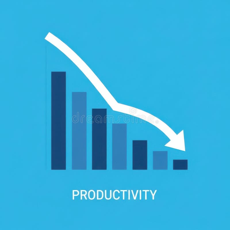
Free with trial A bar graph visually represents a downward trend in productivity over time, indicating a decline in efficiency or output. Trend decrease illustrations Decreasing Productivity Graph Showing Decline. A bar graph visually represents a downward trend in productivity over time, indicating a decline in efficiency or output
Free with trial Vector illustration showing oil price decrease with dollar sign drop barrel fuel pump and declining graph representing economic impact and market trends in black and white style calm. Generative AI. Trend decrease vectors Oil price drop concept with dollar sign barrel pump and graph vector illustration. Vector illustration showing oil price decrease with dollar sign drop barrel fuel pump and declining graph representing economic impact and market trends in black and white style calm. Generative AI
Free with trial This graphic illustration depicts a stark representation of declining business performance. It features a bar chart with three colorful bars (yellow, orange, green) suggesting varying data points, overlaid with three distinct lines in yellow, blue, and orange, all sharply descending downwards. A prominent red arrow points downwards, emphasizing the negative trend. A small yellow plus sign is also visible, potentially signifying a point of reference or a contrasting element. The clean white background isolates the graphical elements, making them ideal for conveying concepts of loss, recession, or negative growth. Trend decrease illustrations Declining Business Graph with Downward Arrows. This graphic illustration depicts a stark representation of declining business performance. It features a bar chart with three colorful bars (yellow, orange, green) suggesting varying data points, overlaid with three distinct lines in yellow, blue, and orange, all sharply descending downwards. A prominent red arrow points downwards, emphasizing the negative trend. A small yellow plus sign is also visible, potentially signifying a point of reference or a contrasting element. The clean white background isolates the graphical elements, making them ideal for conveying concepts of loss, recession, or negative growth.
Free with trial Two bar graphs, one green showing growth and one red showing decline, with trend lines indicating opposite directions. Trend decrease illustrations Bar graphs showing upward and downward trends. Two bar graphs, one green showing growth and one red showing decline, with trend lines indicating opposite directions
Free with trial This image depicts a visual representation of financial or business growth and decline using a series of ascending and descending three-dimensional bar charts, where the left side shows smaller bars gradually increasing in height, transitioning through a central flat bar, and shifting to taller bars on the right side that progressively decrease, all set against a plain white background to. Trend decrease illustrations Growth and progress concept with ascending and descending bar charts illustrating business success and financial improvement over. This image depicts a visual representation of financial or business growth and decline using a series of ascending and descending three-dimensional bar charts, where the left side shows smaller bars gradually increasing in height, transitioning through a central flat bar, and shifting to taller bars on the right side that progressively decrease, all set against a plain white background to
Free with trial Vibrant candlestick patterns and descending trend lines illustrate a market downturn, highlighting analysis tools amid a somber financial atmosphere. Trend decrease illustrations Stock market decline with colorful candlestick charts and trend lines. Vibrant candlestick patterns and descending trend lines illustrate a market downturn, highlighting analysis tools amid a somber financial atmosphere
Free with trial A magnifying glass focuses on a declining bar graph and a file folder, symbolizing a decrease in sales and the need for. Trend decrease illustrations Declining Sales Analysis Magnifying Glass, Downward Graph. A magnifying glass focuses on a declining bar graph and a file folder, symbolizing a decrease in sales and the need for.
Free with trial A bold outline illustration of a computer screen displaying a downward trending line, representing financial loss or negative growth. Trend decrease vectors Bold Outline Computer Screen with Falling Trend Line Icon Illustration. A bold outline illustration of a computer screen displaying a downward trending line, representing financial loss or negative growth.
Free with trial An isometric 3D bar graph with three descending steps, made of a glossy, reflective material with a blue and purple gradient. This illustrates a decrease or decline. Concept of financial loss or reduced metrics. Trend decrease vectors Blue and Purple Isometric Bar Graph Showing a Downtrend. An isometric 3D bar graph with three descending steps, made of a glossy, reflective material with a blue and purple gradient. This illustrates a decrease or decline. Concept of financial loss or reduced metrics
Free with trial A minimalist black and white line icon showing a stylized woman next to a descending arrow. This symbol represents concepts like failure, demotion, loss, or a downward trend. Trend decrease vectors Female figure with downward arrow icon symbolizing demotion or decline. A minimalist black and white line icon showing a stylized woman next to a descending arrow. This symbol represents concepts like failure, demotion, loss, or a downward trend
Free with trial A collection of nine simple, solid black icons on a white background, illustrating concepts of decline, loss, and negative trends using various charts like bar graphs, line graphs, and pie charts with downward pointing arrows. Trend decrease vectors Set of black icons representing financial decrease and downward trends. A collection of nine simple, solid black icons on a white background, illustrating concepts of decline, loss, and negative trends using various charts like bar graphs, line graphs, and pie charts with downward pointing arrows