Free with trial Image is a digital graphic featuring a person in a dark suit, blurred in the background, with a focus on their hand pointing forward. The background is dark, creating a contrast with the bright text in the foreground. The word 'PRICE' is prominently displayed in bold, white, uppercase letters. Next to the text is a red downward arrow enclosed in a square bracket, symbolizing a decrease. The. Trend decrease illustrations Price reduction concept with focused hand gesture. Image is a digital graphic featuring a person in a dark suit, blurred in the background, with a focus on their hand pointing forward. The background is dark, creating a contrast with the bright text in the foreground. The word 'PRICE' is prominently displayed in bold, white, uppercase letters. Next to the text is a red downward arrow enclosed in a square bracket, symbolizing a decrease. The
Free with trial The image features a large black Euro currency symbol with a green upward arrow and a red downward arrow, set against a white background. The green arrow suggests growth or increase, while the red arrow indicates decline or decrease. This visual representation can be used to illustrate financial concepts such as fluctuating currency values, economic trends, or market performance. Trend decrease vectors Euro currency symbol with green up and red down arrows. The image features a large black Euro currency symbol with a green upward arrow and a red downward arrow, set against a white background. The green arrow suggests growth or increase, while the red arrow indicates decline or decrease. This visual representation can be used to illustrate financial concepts such as fluctuating currency values, economic trends, or market performance.
Free with trial The image displays two percentage symbols, one red with the word 'decline' beneath it and another green with the word 'growth' beneath it. The red symbol is crossed out, indicating a negative trend, while the green symbol has a check mark, indicating a positive trend. The design is simple and visually contrasts decline and growth concepts. Trend decrease vectors Percentage indicators showing decline and growth trends. The image displays two percentage symbols, one red with the word 'decline' beneath it and another green with the word 'growth' beneath it. The red symbol is crossed out, indicating a negative trend, while the green symbol has a check mark, indicating a positive trend. The design is simple and visually contrasts decline and growth concepts
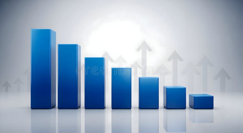
Free with trial The image depicts a graph with a red downward sloping line and blue bars that decrease in height from left to right, indicating a decline in values. Trend decrease illustrations Graph showing downward trend with declining bars. The image depicts a graph with a red downward sloping line and blue bars that decrease in height from left to right, indicating a decline in values
Free with trial Conceptual image depicting a decrease in the value of gold. Trend decrease illustrations Gold Price Drop Magnifying Glass on Falling Gold Value. Conceptual image depicting a decrease in the value of gold.
Free with trial A set of black industrial oil barrels aligned in a row with a bold red downward arrow symbol, representing decline, reduction, or decrease in oil prices, supply, or usage. Perfect for business, energy, and financial stock imagery. Trend decrease illustrations Black Oil Barrels with Downward Red Arrow Symbol. A set of black industrial oil barrels aligned in a row with a bold red downward arrow symbol, representing decline, reduction, or decrease in oil prices, supply, or usage. Perfect for business, energy, and financial stock imagery
Free with trial This image features four distinct icons representing financial performance indicators. The top left icon shows a green percentage symbol with an upward arrow, indicating growth or increase. The top right icon displays a red percentage symbol with a downward arrow, symbolizing decline or decrease. The bottom left icon illustrates a series of green bar graphs, indicating positive trends or growth. Trend decrease illustrations Financial performance indicators
Free with trial Modern vector icon showing a downward arrow over a bar chart with progressively smaller bars indicating decline or decrease. Trend decrease illustrations Downward arrow with decreasing bar chart graphic. Modern vector icon showing a downward arrow over a bar chart with progressively smaller bars indicating decline or decrease
Free with trial A red arrow chart illustrates an economic recession and financial downturn. The arrow points downward, signifying a decline in the economy. The graph shows a decrease in financial value. Trend decrease illustrations Simple Presentation of Red Arrow Depicting Economic Recession and Financial Downturn. A red arrow chart illustrates an economic recession and financial downturn. The arrow points downward, signifying a decline in the economy. The graph shows a decrease in financial value.
Free with trial A vibrant blue, transparent, three-dimensional arrow curves and points downward against a clean white background. The arrow has a glossy, smooth finish, and a subtle shadow is visible beneath it, suggesting depth. This graphic element clearly indicates a downward direction or trend. Trend decrease illustrations Blue Transparent Arrow Pointing Downward on a White Background image photo. A vibrant blue, transparent, three-dimensional arrow curves and points downward against a clean white background. The arrow has a glossy, smooth finish, and a subtle shadow is visible beneath it, suggesting depth. This graphic element clearly indicates a downward direction or trend
Free with trial This image features a 3D red arrow pointing downward, indicating a decrease. The arrow is isolated on a transparent background, making it suitable for various design applications. The image is clear and SEO-friendly. Trend decrease illustrations Red arrow decreasing isolated on black background. This image features a 3D red arrow pointing downward, indicating a decrease. The arrow is isolated on a transparent background, making it suitable for various design applications. The image is clear and SEO-friendly
Free with trial Several stacks of gold coins are arranged in descending order of height from left to right against a stark white background. The coins are uniform in appearance, creating a visual representation of financial decline or a decreasing trend in value. The lighting highlights the metallic sheen of the gold. Trend decrease illustrations Stacks of Gold Coins Decreasing in Height on White Background money finance. Several stacks of gold coins are arranged in descending order of height from left to right against a stark white background. The coins are uniform in appearance, creating a visual representation of financial decline or a decreasing trend in value. The lighting highlights the metallic sheen of the gold
Free with trial Financial business graph with bars decreasing and red arrow pointing down. Concept for economic recession or stock market decline. Trend decrease vectors Financial graph showing downward trend with arrow. Financial business graph with bars decreasing and red arrow pointing down. Concept for economic recession or stock market decline
Free with trial Bar chart showing decline, red arrow points down, financial crisis, recession, negative growth. Trend decrease illustrations Downward trend graph with white bars and red arrow. Bar chart showing decline, red arrow points down, financial crisis, recession, negative growth
Free with trial A 3D isometric bar chart with a gradient color scheme from blue to red and orange, depicting a downward trend. The bars are arranged in descending order of height, set against a clean white background. This visual represents data analysis, financial decline, or a negative trend. Trend decrease illustrations Isometric Gradient Bar Chart Showing Decline on White Background graph data. A 3D isometric bar chart with a gradient color scheme from blue to red and orange, depicting a downward trend. The bars are arranged in descending order of height, set against a clean white background. This visual represents data analysis, financial decline, or a negative trend
Free with trial A 3d graph with a purple arrow pointing down and a yellow warning sign on top, indicating a decrease or warning in the data being represented. Trend decrease illustrations A colorful graph with a purple arrow pointing down. a 3d graph with a purple arrow pointing down and a yellow warning sign on top, indicating a decrease or warning in the data being represented
Free with trial This 3D illustration features a series of vertical bars arranged in a descending sequence, representing a decline in data. A smooth, continuous line graph follows the top of the bars, emphasizing the negative trajectory. The color palette uses shades of blue and light gray against a clean white background, creating a professional and minimalist aesthetic suitable for financial or analytical. Trend decrease vectors A three dimensional bar chart showing a downward trend with a line graph overlay. This 3D illustration features a series of vertical bars arranged in a descending sequence, representing a decline in data. A smooth, continuous line graph follows the top of the bars, emphasizing the negative trajectory. The color palette uses shades of blue and light gray against a clean white background, creating a professional and minimalist aesthetic suitable for financial or analytical
Free with trial Silhouette of a businessman facing a city skyline with a falling graph. Trend decrease illustrations Business recession economy decline downward trend. Silhouette of a businessman facing a city skyline with a falling graph
Free with trial A graph displays a downward trend line colored in red, indicating a significant decline in data over a period of time. The background is dark, emphasizing the red color of the line. Trend decrease illustrations Graph shows sharp decline in performance over time. A graph displays a downward trend line colored in red, indicating a significant decline in data over a period of time. The background is dark, emphasizing the red color of the line
Free with trial Housing price falling down, Businessman investor and homeowner experiencing a decrease in the housing market. Trend decrease vectors Housing price falling down, Businessman investor and homeowner experiencing a decrease in the housing market
Free with trial A 3D render shows a financial bar graph with grey concrete bars decreasing in height from left to right. A thick white arrow points downwards across the graph, intersecting a thin red line that follows the downward trend. The background is a blurred cityscape at dusk with soft lighting. Trend decrease illustrations White arrow pointing down over grey bar graph chart. A 3D render shows a financial bar graph with grey concrete bars decreasing in height from left to right. A thick white arrow points downwards across the graph, intersecting a thin red line that follows the downward trend. The background is a blurred cityscape at dusk with soft lighting
Free with trial A dynamic collection of eight distinct dollar sign symbols, each uniquely rendered in a bold, grunge, and street art style. Featuring dripping ink effects, distressed textures, and halftone patterns, these black and white icons are integrated with various arrows depicting financial trends. The arrows illustrate upward growth, downward decline, and fluctuating market movements, conveying concepts of profit, loss, and economic change. This versatile set is perfect for modern designs related to finance, investment, business, and urban culture, suitable for web, print, and creative projects. Trend decrease vectors Grunge Dollar Signs with Financial Trend Arrows Set. A dynamic collection of eight distinct dollar sign symbols, each uniquely rendered in a bold, grunge, and street art style. Featuring dripping ink effects, distressed textures, and halftone patterns, these black and white icons are integrated with various arrows depicting financial trends. The arrows illustrate upward growth, downward decline, and fluctuating market movements, conveying concepts of profit, loss, and economic change. This versatile set is perfect for modern designs related to finance, investment, business, and urban culture, suitable for web, print, and creative projects.
Free with trial Symbolic representation of negative financial trends. Red and green arrows pointing downwards, signifying market downturn, loss, or reduction in value. Trend decrease vectors Red and green down arrows symbolizing decrease and loss. Symbolic representation of negative financial trends. Red and green arrows pointing downwards, signifying market downturn, loss, or reduction in value
Free with trial Financial data chart, glowing lines, digital display. Stock image showing trends. Trend decrease illustrations Digital financial graph with candlestick chart, data analytics, stock market trend, technology concept. Financial data chart, glowing lines, digital display. Stock image showing trends
Free with trial Financial decline downward arrow trend business target. Trend decrease vectors RED Financial decline downward arrow trend business icon. Financial decline downward arrow trend business target
Free with trial Set of six black percent symbols combined with up and down arrows in flat vector style representing increase decrease and adjustment concepts. Generative AI. Trend decrease vectors Black percent symbols with up and down arrows flat vector icons. Set of six black percent symbols combined with up and down arrows in flat vector style representing increase decrease and adjustment concepts. Generative AI
Free with trial A screen shows a declining market trend with bar graphs and data visuals, useful for financial market analysis presentations. Trend decrease illustrations Analyzing Declining Market Trends Showing Data on Screen Display. A screen shows a declining market trend with bar graphs and data visuals, useful for financial market analysis presentations
Free with trial A 3D rendered bar graph composed of six vertical bars arranged in a descending sequence. The bars transition in color from a deep blue at the tallest end to a bright orange at the shortest end, showcasing a gradient of blues, purples, and reds. The graph is set against a clean white background with subtle shading, emphasizing the visual representation of a declining trend. Trend decrease illustrations Decreasing Bar Graph with Gradient Colors on White Background chart statistics. A 3D rendered bar graph composed of six vertical bars arranged in a descending sequence. The bars transition in color from a deep blue at the tallest end to a bright orange at the shortest end, showcasing a gradient of blues, purples, and reds. The graph is set against a clean white background with subtle shading, emphasizing the visual representation of a declining trend
Free with trial Silhouette of a businessman facing a city skyline with a falling graph. Trend decrease illustrations Business recession economy decline downward trend. Silhouette of a businessman facing a city skyline with a falling graph
Free with trial A red arrow pointing downwards with a zigzag pattern, indicating a decline or decrease. Trend decrease illustrations A red arrow trending downwards with a zigzag pattern. A red arrow pointing downwards with a zigzag pattern, indicating a decline or decrease
Free with trial The image illustrates a downward trend in the value of the euro currency using a series of stacked blocks with euro symbols, each level decreasing in size. A large downward-pointing arrow emphasizes the decline, suggesting economic challenges or currency depreciation. Trend decrease vectors Decline in euro currency value depicted with falling blocks and downward arrow. The image illustrates a downward trend in the value of the euro currency using a series of stacked blocks with euro symbols, each level decreasing in size. A large downward-pointing arrow emphasizes the decline, suggesting economic challenges or currency depreciation
Free with trial A 3D model of a house with a glowing blue door and pink roof is prominently displayed in the foreground, with a pink neon line trending downward across the line begins in the left corner and ends with an arrow pointing downward in the bottom right corner. Behind the main house, several other houses are visible, also glowing with blue light. The background is dark, with a blue and pink reflection. Trend decrease illustrations Neon lit houses with a pink downward trend line blue. A 3D model of a house with a glowing blue door and pink roof is prominently displayed in the foreground, with a pink neon line trending downward across the line begins in the left corner and ends with an arrow pointing downward in the bottom right corner. Behind the main house, several other houses are visible, also glowing with blue light. The background is dark, with a blue and pink reflection
Free with trial The image features a 3D bar graph showing an upward trend in growth, represented by increasing bar heights, followed by a sharp decline indicated by a downward arrow. A green upward arrow emphasizes the growth phase, while a downward arrow highlights the decline phase. Trend decrease illustrations Growth and decline illustrated with bar graph and arrows. The image features a 3D bar graph showing an upward trend in growth, represented by increasing bar heights, followed by a sharp decline indicated by a downward arrow. A green upward arrow emphasizes the growth phase, while a downward arrow highlights the decline phase
Free with trial This minimalist graphic illustration features a bold red line chart trending downwards against a clean background. Several small downward-pointing arrows are positioned along the slope to emphasize the decline. The composition uses a flat design aesthetic with high contrast, conveying a clear message of loss, reduction, or negative performance in a professional context. Trend decrease vectors A red line graph showing a sharp downward trend with multiple directional arrows. This minimalist graphic illustration features a bold red line chart trending downwards against a clean background. Several small downward-pointing arrows are positioned along the slope to emphasize the decline. The composition uses a flat design aesthetic with high contrast, conveying a clear message of loss, reduction, or negative performance in a professional context
Free with trial A 3D rendered image depicts a golden downward-sloping arrow positioned over a series of golden bars representing a declining bar chart. A golden coin with a dollar symbol and the inscription "ONE COONIT ES OF BERIC 1909" is shown above the chart, further emphasizing a financial downturn. The image is set against a white background. Trend decrease illustrations Golden Downward Trend Arrow Over Declining Bar Chart with Coin finance economy. A 3D rendered image depicts a golden downward-sloping arrow positioned over a series of golden bars representing a declining bar chart. A golden coin with a dollar symbol and the inscription "ONE COONIT ES OF BERIC 1909" is shown above the chart, further emphasizing a financial downturn. The image is set against a white background
Free with trial High-quality 3D render of wooden blocks displaying a green upward arrow, black percentage symbol, and red downward arrow, symbolizing financial trends, interest rates, and economic changes for business and investment concepts. Trend decrease vectors Interest rate trend wooden blocks up down percentage. High-quality 3D render of wooden blocks displaying a green upward arrow, black percentage symbol, and red downward arrow, symbolizing financial trends, interest rates, and economic changes for business and investment concepts
Free with trial High-quality image of wooden blocks with upward and downward arrows and percentage symbol, illustrating financial growth, profit trends, and investment concepts in a clean, professional setting. Trend decrease vectors Financial growth trend wooden blocks increase profit. High-quality image of wooden blocks with upward and downward arrows and percentage symbol, illustrating financial growth, profit trends, and investment concepts in a clean, professional setting
Free with trial The image depicts a visual metaphor for economic decline or decreasing financial growth. It features four progressively smaller stacks of coins, symbolizing diminishing wealth or savings, with a bold red downward-pointing arrow indicating a downward trend in value or performance. This graphic is often used to illustrate financial losses, market downturns, or economic recession. Trend decrease illustrations Declining financial growth represented by stacks of coins and a downward arrow. The image depicts a visual metaphor for economic decline or decreasing financial growth. It features four progressively smaller stacks of coins, symbolizing diminishing wealth or savings, with a bold red downward-pointing arrow indicating a downward trend in value or performance. This graphic is often used to illustrate financial losses, market downturns, or economic recession
Free with trial The image depicts two bar graphs side by side. The left graph shows an upward trend with green bars increasing in height from left to right, accompanied by a green upward arrow, and is labeled 'Growth. ' The right graph shows a downward trend with red bars decreasing in height from left to right, accompanied by a red downward arrow, and is labeled 'Decline. ' The visual effectively contrasts the. Trend decrease illustrations Illustrative comparison of growth and decline trends. The image depicts two bar graphs side by side. The left graph shows an upward trend with green bars increasing in height from left to right, accompanied by a green upward arrow, and is labeled 'Growth.' The right graph shows a downward trend with red bars decreasing in height from left to right, accompanied by a red downward arrow, and is labeled 'Decline.' The visual effectively contrasts the
Free with trial The image features a striking red downward arrow with a jagged, zigzag pattern. The arrow is bold and prominent, indicating a significant decline or decrease in a clear and impactful manner. Trend decrease illustrations A bold red downward arrow with a jagged, zigzag pattern. The image features a striking red downward arrow with a jagged, zigzag pattern. The arrow is bold and prominent, indicating a significant decline or decrease in a clear and impactful manner
Free with trial A sharp red arrow zigzags downwards, indicating a significant decline or loss, isolated on a plain white background. Trend decrease illustrations Red downward trend arrow isolated on white background. A sharp red arrow zigzags downwards, indicating a significant decline or loss, isolated on a plain white background
Free with trial A sharp red zigzag arrow points downwards, indicating a decline or fall, isolated on a white background. Trend decrease illustrations Red downward trend arrow isolated on white background. A sharp red zigzag arrow points downwards, indicating a decline or fall, isolated on a white background
Free with trial A graphic showing a downward trend with a Bitcoin symbol inside a prohibition sign. Trend decrease illustrations Declining bitcoin symbol isolated on white background. A graphic showing a downward trend with a Bitcoin symbol inside a prohibition sign
Free with trial Three blue apple icons are depicted. The top apple stands alone, and the two below have arrows beside them. The left apple has a downward arrow, indicating a decrease, while the right apple is paired with an upward arrow, suggesting an increase. Each apple is solid blue with a small leaf, symbolizing fruit-related data or trends. The arrangement is simple and symmetrical on a white background, with the icons representing changes in quantity or direction. Trend decrease vectors Apples with up and down arrows with fruit icon with directional arrows. Three blue apple icons are depicted. The top apple stands alone, and the two below have arrows beside them. The left apple has a downward arrow, indicating a decrease, while the right apple is paired with an upward arrow, suggesting an increase. Each apple is solid blue with a small leaf, symbolizing fruit-related data or trends. The arrangement is simple and symmetrical on a white background, with the icons representing changes in quantity or direction.
Free with trial The image depicts a blue globe with a large red downward arrow pointing at it, indicating a decline or negative trend. Next to the globe, there are two blue sacks with dollar signs on them, symbolizing money or financial resources. Additionally, there is a red exclamation mark, suggesting a warning or alert. The overall image conveys a sense of economic downturn or financial crisis. Trend decrease illustrations Global economic downturn and financial crisis warning. The image depicts a blue globe with a large red downward arrow pointing at it, indicating a decline or negative trend. Next to the globe, there are two blue sacks with dollar signs on them, symbolizing money or financial resources. Additionally, there is a red exclamation mark, suggesting a warning or alert. The overall image conveys a sense of economic downturn or financial crisis
Free with trial A visual representation of a stock market crash, showing falling arrows and declining charts. Illustrates financial crisis, economic downturn, and investment loss. A symbolic depiction of recession. Trend decrease illustrations Stock market crash financial crisis recession investment loss downward trend economic downturn chart analysis. A visual representation of a stock market crash, showing falling arrows and declining charts. Illustrates financial crisis, economic downturn, and investment loss. A symbolic depiction of recession.
Free with trial 3D graphic depicts a steeply declining bar graph in red hues, showing economic loss. A downward-sloping arrow extends over the bars, illustrating the negative trend. The text reads "-40% PROFIT," emphasizing financial decline. The bars decrease in height from left to right, indicating progressive loss. The background is a dark grid, enhancing the focus on the graph. The visual conveys the concept of significant profit reduction and economic downturn. Trend decrease illustrations 3D Financial Concept of Profit Loss and Economic Decline. 3D graphic depicts a steeply declining bar graph in red hues, showing economic loss. A downward-sloping arrow extends over the bars, illustrating the negative trend. The text reads "-40% PROFIT," emphasizing financial decline. The bars decrease in height from left to right, indicating progressive loss. The background is a dark grid, enhancing the focus on the graph. The visual conveys the concept of significant profit reduction and economic downturn.
Free with trial A chart showing a decrease with an arrow pointing down, isolated on a white background, representing a decline in data or performance. Trend decrease illustrations Decreasing chart with arrow isolated on white background. A chart showing a decrease with an arrow pointing down, isolated on a white background, representing a decline in data or performance
Free with trial A vivid red zig-zag arrow illustrates a downward trend, symbolizing financial decline, market volatility, or negative progress. This versatile graphic is perfect for business and finance presentations. Trend decrease vectors Red zig zag arrow isolated on transparent background transparent background. A vivid red zig-zag arrow illustrates a downward trend, symbolizing financial decline, market volatility, or negative progress. This versatile graphic is perfect for business and finance presentations
Free with trial A red arrow graphic with a jagged line that initially points upward then turns to point downward. Trend decrease illustrations A red arrow pointing downward with an upward trend. a red arrow graphic with a jagged line that initially points upward then turns to point downward
Free with trial A 3D render of a red thermometer with a white liquid column indicating a low temperature, positioned next to a blue square icon featuring three white downward-pointing arrows. The objects are isolated on a clean white background, suggesting a concept of decreasing temperature or a negative trend. Trend decrease illustrations Red Thermometer Icon With Down Arrow Symbol On White Background temperature cold. A 3D render of a red thermometer with a white liquid column indicating a low temperature, positioned next to a blue square icon featuring three white downward-pointing arrows. The objects are isolated on a clean white background, suggesting a concept of decreasing temperature or a negative trend
Free with trial The image shows a stylized downward-pointing arrow integrated into a pyramid shape. The arrow is bold and black, suggesting a decline or decrease, while the pyramid base is filled with a gradient pattern. This combination is often used to symbolize financial downturns, market crashes, or reductions in value over time. Trend decrease illustrations Graphic of a downward trending arrow with a pyramid base. The image shows a stylized downward-pointing arrow integrated into a pyramid shape. The arrow is bold and black, suggesting a decline or decrease, while the pyramid base is filled with a gradient pattern. This combination is often used to symbolize financial downturns, market crashes, or reductions in value over time
Free with trial A 3D render of a blue bar chart displaying a downward trend, with bars decreasing in height from left to right. The background features a subtle pattern of translucent upward-pointing arrows, suggesting growth or recovery despite the current decline. The scene is set against a clean, gradient gray backdrop with reflections, creating a modern and professional aesthetic. This image is ideal for representing financial downturns, market analysis, economic challenges, or the concept of overcoming obstacles. Trend decrease illustrations Declining Blue Bar Chart with Upward Arrows Background. A 3D render of a blue bar chart displaying a downward trend, with bars decreasing in height from left to right. The background features a subtle pattern of translucent upward-pointing arrows, suggesting growth or recovery despite the current decline. The scene is set against a clean, gradient gray backdrop with reflections, creating a modern and professional aesthetic. This image is ideal for representing financial downturns, market analysis, economic challenges, or the concept of overcoming obstacles.
Free with trial A red bar chart illustrates a significant decline with a bold red arrow pointing downwards, symbolizing financial loss, market downturn, or negative growth. Trend decrease illustrations Red bar chart showing downward trend and falling arrow. A red bar chart illustrates a significant decline with a bold red arrow pointing downwards, symbolizing financial loss, market downturn, or negative growth
Free with trial A 3D illustration shows a red arrow graph descending sharply over a series of stacked white coins. The coins are arranged in decreasing height, visually representing a financial decline or loss. The composition is set against a clean white background. Trend decrease illustrations A red arrow graph showing a downward trend over stacked white coins on a white background. A 3D illustration shows a red arrow graph descending sharply over a series of stacked white coins. The coins are arranged in decreasing height, visually representing a financial decline or loss. The composition is set against a clean white background
Free with trial Stock market graph with red candlesticks and downward arrow, displayed on a light background. Concept of economic decline. 3D Rendering. Trend decrease illustrations Financial stock market graph with downward trend and arrow on light background. 3D Rendering. Stock market graph with red candlesticks and downward arrow, displayed on a light background. Concept of economic decline. 3D Rendering
Free with trial This scientific infographic presents astrophysical data visualization on a dark blue background with elegant gold border, featuring a prominent black hole labeled Galaxy Mass with 10X Decrease notation on the left side, accompanied by two smaller black holes below labeled Black Hole Mass and 100x Decrease respectively, while the right side displays analytical graphs including a bar graph showing. Trend decrease illustrations Scientific infographic showing galaxy mass decreasing tenfold with black hole mass decreasing one hundred times on dark blue. This scientific infographic presents astrophysical data visualization on a dark blue background with elegant gold border, featuring a prominent black hole labeled Galaxy Mass with 10X Decrease notation on the left side, accompanied by two smaller black holes below labeled Black Hole Mass and 100x Decrease respectively, while the right side displays analytical graphs including a bar graph showing
Free with trial Business finance chart illustrating decline. Red arrow points down, indicating loss or recession. Dollar symbol beside bars. Trend decrease vectors Financial graph showing downward trend with dollar sign. Business finance chart illustrating decline. Red arrow points down, indicating loss or recession. Dollar symbol beside bars
Free with trial A dramatic red digital financial chart with candlesticks and line graphs indicating a sharp market decline or economic crash against a dark, textured background. Trend decrease illustrations Red Stock Market Chart Showing Financial Downward Trend. A dramatic red digital financial chart with candlesticks and line graphs indicating a sharp market decline or economic crash against a dark, textured background
Free with trial A golden icon depicting a downward trending bar graph with a sharp arrow indicating a decline. The graph and arrow are set against a black circular background, which is framed by a polished gold rim. The icon is presented in a 3D perspective on a white background. Trend decrease illustrations Golden Downward Trend Graph Icon with Arrow on Black Circular Background with Gold Rim. A golden icon depicting a downward trending bar graph with a sharp arrow indicating a decline. The graph and arrow are set against a black circular background, which is framed by a polished gold rim. The icon is presented in a 3D perspective on a white background
Free with trial A graph with two lines, one red and one blue. The red line is higher than the blue line, indicating a positive trend. Trend decrease vectors A graph with a red line and a blue line. A graph with two lines, one red and one blue. The red line is higher than the blue line, indicating a positive trend
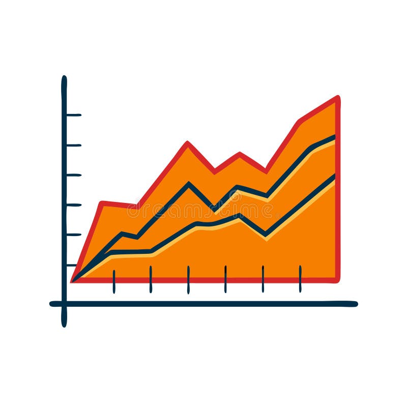
Free with trial A detailed data visualization illustrating market trends over time. The infographic combines a line chart, which shows fluctuating values and percentages, with a bar chart representing data for specific time intervals. The line chart highlights key data points, such as peaks annotated with values like '1. 24%' and '500K'. The x-axis represents a timeline from January to March, while the y-axis. Trend decrease illustrations A modern market trend analysis visualization combining a bar and line chart for financial data isolated on white background. A detailed data visualization illustrating market trends over time. The infographic combines a line chart, which shows fluctuating values and percentages, with a bar chart representing data for specific time intervals. The line chart highlights key data points, such as peaks annotated with values like '1.24%' and '500K'. The x-axis represents a timeline from January to March, while the y-axis
Free with trial A futuristic illustration of a hand manipulating glowing financial icons, including upward trend, percentage, dollar sign, and charts in a dark digital space. Trend decrease illustrations Digital finance hand controlling growth and profit icons. A futuristic illustration of a hand manipulating glowing financial icons, including upward trend, percentage, dollar sign, and charts in a dark digital space
Free with trial The image depicts a red zigzag line with an arrow at the end pointing downward. The line has multiple peaks and troughs, indicating fluctuations, followed by a downward trend. The arrow emphasizes the downward movement. Trend decrease illustrations Red zigzag arrow decreasing isolated on white background. The image depicts a red zigzag line with an arrow at the end pointing downward. The line has multiple peaks and troughs, indicating fluctuations, followed by a downward trend. The arrow emphasizes the downward movement
Free with trial The image depicts a bold dollar sign symbol with the number 324 placed to its left, suggesting a monetary value. Below the symbol, there are dashed lines indicating the dollar sign is sinking or disappearing into the lines, which could symbolize loss, spending, or a financial decrease. Trend decrease vectors Visual representation of three hundred twenty-four dollars in sinking money effect. The image depicts a bold dollar sign symbol with the number 324 placed to its left, suggesting a monetary value. Below the symbol, there are dashed lines indicating the dollar sign is sinking or disappearing into the lines, which could symbolize loss, spending, or a financial decrease
Free with trial Conceptual illustration showing a stock market crash. Red arrows pointing down against a chart background, symbolizing financial loss, economic downturn, and investment risk. Recession and crisis. Trend decrease illustrations Stock market crash financial crisis recession investment loss economic downturn red arrows downward trend chart. Conceptual illustration showing a stock market crash. Red arrows pointing down against a chart background, symbolizing financial loss, economic downturn, and investment risk. Recession and crisis.
Free with trial A light blue umbrella shelters from a downpour of red downward-pointing arrows, symbolizing protection against market decline. A large red arrow also falls, emphasizing the overall negative trend. The scene is set against a cloudy sky on a gray ground. Trend decrease illustrations Blue Umbrella Sheltering from Falling Red Arrows. A light blue umbrella shelters from a downpour of red downward-pointing arrows, symbolizing protection against market decline. A large red arrow also falls, emphasizing the overall negative trend. The scene is set against a cloudy sky on a gray ground
Free with trial A line drawing of a magnifying glass focusing on a podcast microphone icon and a declining bar graph with a downward. Trend decrease illustrations Podcast Analytics Decline Magnifying Glass, Downward Trend. A line drawing of a magnifying glass focusing on a podcast microphone icon and a declining bar graph with a downward.
Free with trial A close-up of torn paper showing a downward trend graph symbolizing market decline. This image reflects financial uncertainty and critical loss analysis. Trend decrease illustrations Torn Paper with Red Graph Decline on Financial Background. A close-up of torn paper showing a downward trend graph symbolizing market decline. This image reflects financial uncertainty and critical loss analysis
Free with trial An image featuring a bold, red zigzag arrow that points downwards against a clean, white background, symbolizing decline or decrease. Trend decrease illustrations Red zigzag arrow pointing downwards on a white background. An image featuring a bold, red zigzag arrow that points downwards against a clean, white background, symbolizing decline or decrease
Free with trial A vector illustration depicting a red downward trending line graph with a coin falling below it. The word FAILURE is prominently displayed alongside the graph. The color palette is primarily red and maroon against a light gray background. The style is simple and minimalist, suitable for presentations or reports related to financial loss or business failure. The image conveys a sense of decline and. Trend decrease illustrations Red Downward Trend Graph Coin Failure Vector Illustration. A vector illustration depicting a red downward trending line graph with a coin falling below it. The word FAILURE is prominently displayed alongside the graph. The color palette is primarily red and maroon against a light gray background. The style is simple and minimalist, suitable for presentations or reports related to financial loss or business failure. The image conveys a sense of decline and
Free with trial Abstract 3D bar chart with a downward trending arrow, representing financial data and market decline, set against a neutral background. Trend decrease illustrations 3D bar chart showing financial decline with downward trend. Abstract 3D bar chart with a downward trending arrow, representing financial data and market decline. Abstract 3D bar chart with a downward trending arrow, representing financial data and market decline, set against a neutral background
Free with trial The image displays two black arrows positioned side by side. The arrow on the left points upward, symbolizing an increase or upward direction, while the arrow on the right points downward, indicating a decrease or downward direction. Both arrows are simple and bold, with no additional embellishments. Trend decrease illustrations Upward and downward arrows indicating opposing directions. The image displays two black arrows positioned side by side. The arrow on the left points upward, symbolizing an increase or upward direction, while the arrow on the right points downward, indicating a decrease or downward direction. Both arrows are simple and bold, with no additional embellishments
Free with trial Blue bar graph showing a downward trend with a yellow percentage sign and marker Visualize financial loss or negative growth in presentations and reports. Trend decrease illustrations Declining Bar Graph with Percentage Sign Depicting Economic Downturn. Blue bar graph showing a downward trend with a yellow percentage sign and marker Visualize financial loss or negative growth in presentations and reports
Free with trial Ward green down arrow illustration drop reduction, fall trend, loss diminish ward green down arrow. Trend decrease illustrations Ward green down arrow
Free with trial The image shows two bar charts side by side, each representing different financial trends. The chart on the left, depicted in green, shows an upward trend with increasing bar heights and an upward-pointing arrow, indicating growth. The chart on the right, depicted in red, shows a downward trend with decreasing bar heights and a downward-pointing arrow, indicating decline. Both charts use a 3D. Trend decrease illustrations Contrasting trends in financial growth and decline charts. The image shows two bar charts side by side, each representing different financial trends. The chart on the left, depicted in green, shows an upward trend with increasing bar heights and an upward-pointing arrow, indicating growth. The chart on the right, depicted in red, shows a downward trend with decreasing bar heights and a downward-pointing arrow, indicating decline. Both charts use a 3D
Free with trial Illustration of a bar chart showing a downward trend with a red arrow pointing to a star. The bars decrease in height from left to right, transitioning through various colors. The chart visually represents a decline in value or performance. Trend decrease illustrations Declining bar chart with star isolated on white background. Illustration of a bar chart showing a downward trend with a red arrow pointing to a star. The bars decrease in height from left to right, transitioning through various colors. The chart visually represents a decline in value or performance
Free with trial The image displays six identical red arrows pointing downward, each containing a white percentage symbol. These arrows are arranged in a two-by-three grid pattern on a neutral, slightly textured background, symbolizing a decrease or decline in percentages, often used in financial or statistical contexts to indicate a reduction or drop. Trend decrease illustrations Six red downward percentage arrows on a neutral background. The image displays six identical red arrows pointing downward, each containing a white percentage symbol. These arrows are arranged in a two-by-three grid pattern on a neutral, slightly textured background, symbolizing a decrease or decline in percentages, often used in financial or statistical contexts to indicate a reduction or drop
Free with trial A comprehensive set of financial and data visualization icons, perfect for illustrating business and economic concepts. This collection includes a growing bar chart with an upward trend, a declining bar chart with a downward trend, and a mixed bar chart. Also featured are stacks of global currencies (USD, Euro, INR), a segmented pie chart, and a world map colored green and red to signify global market conditions or data distribution. Ideal for presentations, reports, websites, and educational materials related to economics, finance, and market analysis. Trend decrease vectors Global Financial and Business Data Visualization Icons Set. A comprehensive set of financial and data visualization icons, perfect for illustrating business and economic concepts. This collection includes a growing bar chart with an upward trend, a declining bar chart with a downward trend, and a mixed bar chart. Also featured are stacks of global currencies (USD, Euro, INR), a segmented pie chart, and a world map colored green and red to signify global market conditions or data distribution. Ideal for presentations, reports, websites, and educational materials related to economics, finance, and market analysis.